Van Courtland Blue
The Historical Collection blue-gray builders quietly reach for on front doors and cabinets, reviewed honestly: the light where it turns true blue, the light where it goes green, and what to pick instead.

Jessica has spec'd whites and neutrals for more than 300 rooms and keeps a sample wall of painted drawdowns in her studio. Every color review is checked against real reader rooms in the comments and re-tested when a formula changes. About the testing process →
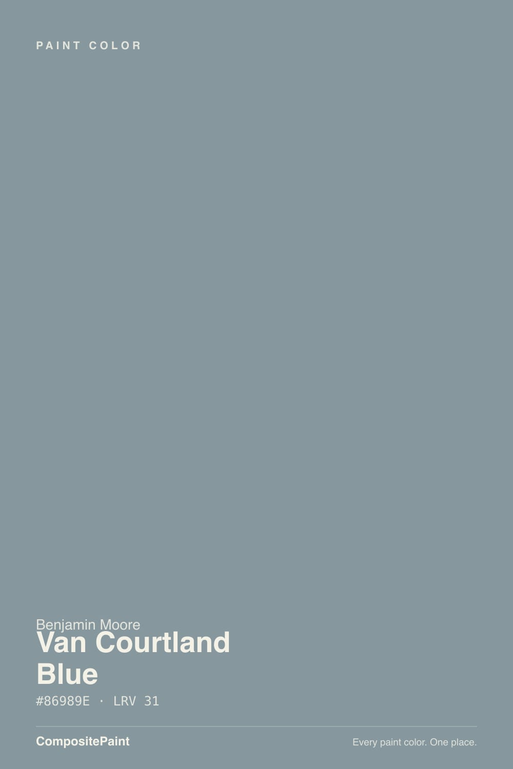
- 1Salamander6
- 2Hidden Gem14
- 3Van Courtland Blue31
- 4Green Meets Blue36
- 5Wythe Blue48
The Fast Verdict
Van Courtland Blue is what a blue looks like after Benjamin Moore's Historical Collection ages it: a grayed, faintly green-leaning slate-blue that reads like weathered shutters on an old colonial, not a paint-chip blue. At LRV 31 it holds real depth without going navy-dark, which is exactly why it keeps showing up on front doors and kitchen islands instead of whole rooms. It is not a flashy color — most people who love it can't quite agree whether it reads blue or gray, and that ambiguity is the compliment, not the complaint.
Front doors and shutters on colonial or traditional homes · a kitchen island or full run of cabinets with brass hardware · a bedroom wall that wants calm blue without going nautical · anyone who wants a blue that reads sophisticated instead of preppy
You want an unmistakable, saturated navy · your kitchen gets strong warm morning sun through east windows · you want a color every guest instantly names as "blue" on sight · you're pairing with honey oak floors and want zero undertone drama
- A genuinely different blue-gray — reads old-world, not paint-store
- Deep enough (LRV 31) to hold its color at dusk and in shade
- The reference front-door and shutter blue-gray on colonial homes
- Cabinets and small rooms take its complexity well
- Grayed enough to avoid a divisive turquoise or nautical read
- Genuinely reads green in warm east-morning light
- Clashes with honey oak and golden wood tones
- Too muted for anyone who wants a clean, obvious navy
- Flattens toward gray in a dim, north-facing room
What Color Is Van Courtland Blue, Really?
A blue-gray with a genuine green lean, not a marketing footnote: grey most mid-blues down and they go flat, but Van Courtland Blue keeps a slate-teal cast that reads like fog over stone rather than plain gray-blue. Benjamin Moore files it under HC — Historical Collection — the same numbering family that holds Van Deusen Blue and Hale Navy, and it wears that heritage honestly. This is a color built for colonial front doors and old shutters, not a 2020s trend chip, and the deck's own paler cousin, Woodlawn Blue, sits a few numbers over showing the same green-blue-gray lean at a much lighter depth.
At LRV 31 it sits in the workhorse mid-tone range — deep enough to read as a real color decision, light enough that it never goes navy-dark the way Hale Navy or Van Deusen Blue do. In strong, direct sun it brightens toward a cleaner sky blue, which is the flattering read most owners hope for when they buy the sample pot. Pull the light down — an overcast afternoon, a shaded porch, a north wall — and the green comes forward, and it settles into something closer to a smoky sage-blue. Neither read is wrong. Both are the same paint being honest about a genuinely two-toned undertone.
Undertone in one line: blue-gray with a real green lean, never violet, never a beach-house turquoise. The one light to watch is warm east-facing morning sun — several owners report the green showing up strongest in the first hour of daylight, before the room's other light sources take over. If your sample looks distinctly teal or aqua at 8am, that is this color doing exactly what its undertone predicts, not a bad can of paint.
Where It Shines
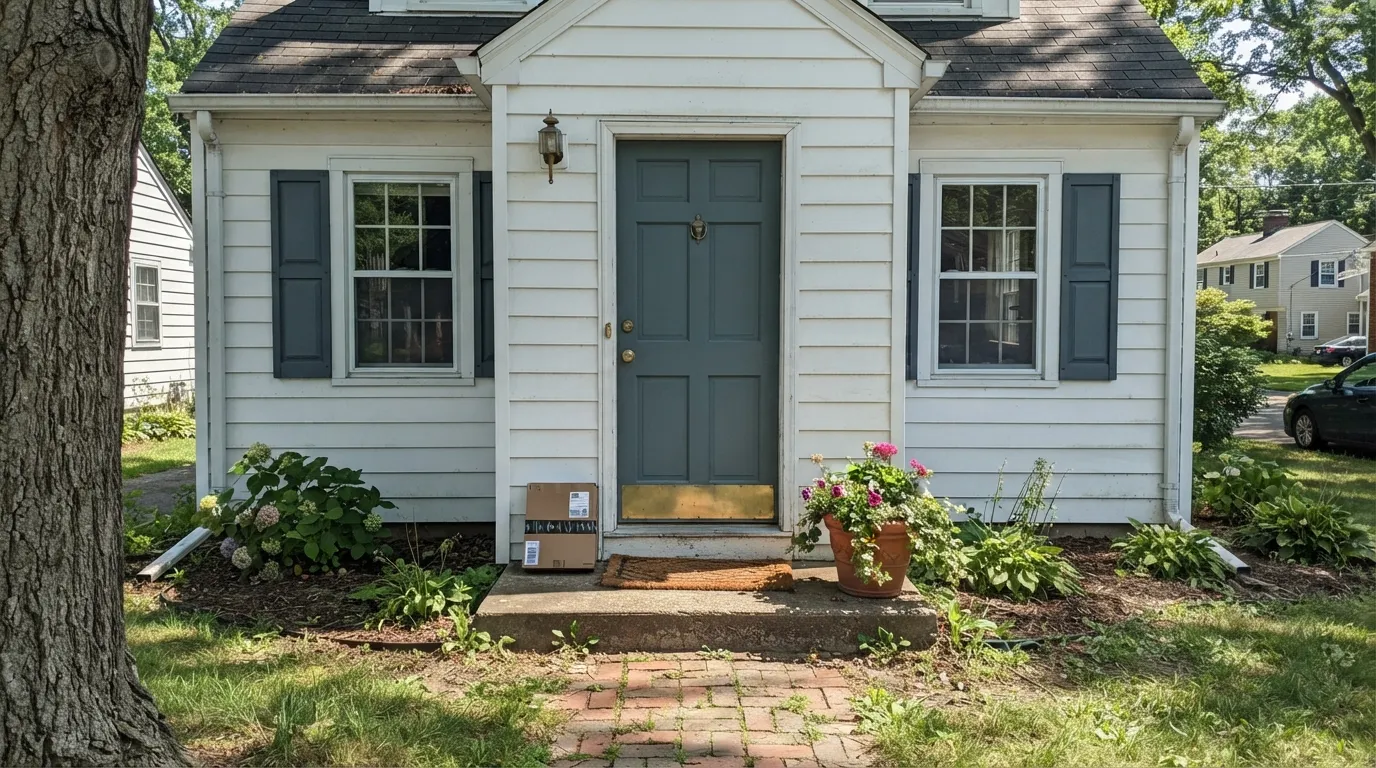
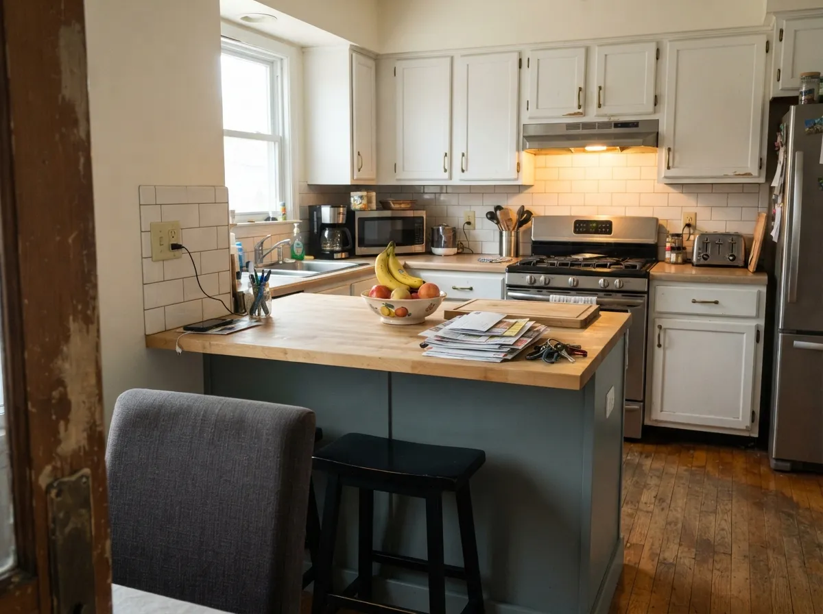
Give it a front door, a set of shutters, or a run of cabinets and it earns its Historical Collection pedigree. On exterior trim against a white, cream, or brick house it reads as old-world blue-gray instead of hardware-store blue, and the LRV 31 depth means it holds its color at dusk instead of going flat the way a paler blue would. Inside, it is at its best in doses — an island, a powder room, a bedroom wall with real daylight — where the slate-teal complexity gets to read as intentional instead of confusing.
Where It Fails
Almost every disappointed review of Van Courtland Blue comes down to one of three mismatches, and each one is predictable before the first coat goes on. None of them are the paint failing — they are a shopper expecting one color and a genuinely two-toned undertone delivering the other.
Van Courtland Blue is grayed and green-tinted on purpose — next to a true navy like Hale Navy it can look almost gray. If the goal is unmistakable, saturated blue, this color will read as a compromise every time you look at it. Go Hale Navy or Van Deusen Blue instead, and let this one stay the quiet option.
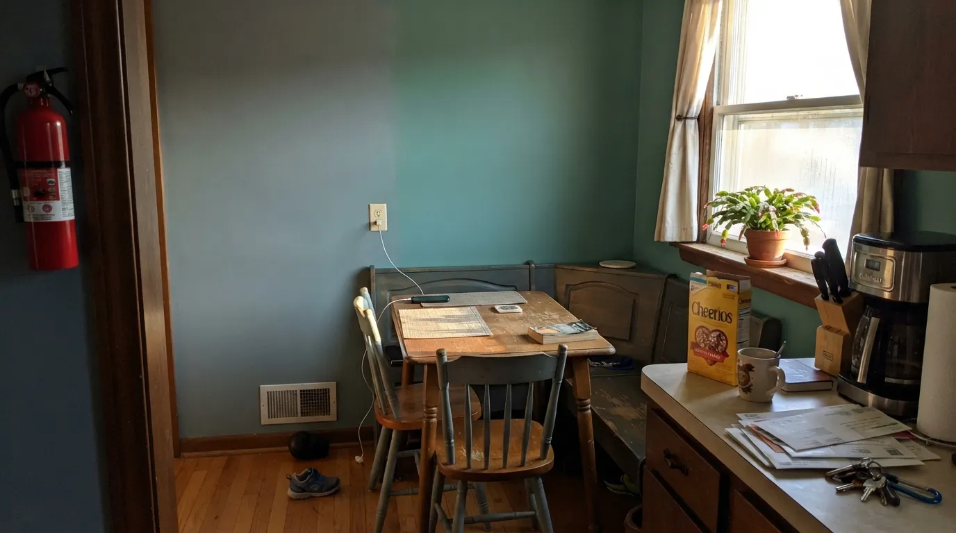
Owners who sample it in an east-facing kitchen or breakfast nook report a genuine teal-green cast in early sun that fades by mid-morning. It is real, it is the undertone doing its job, and it is the single most common surprise in owner photos. Sample it on the actual wall at 8am before committing a whole room.
Golden wood pushes any blue-gray toward its cooler, greener extreme — the wood reads more orange, the wall reads more green, and neither side wins. Pair it with white oak, walnut, or painted trim instead, and keep golden honey oak floors away from a full room of this color.
Room by Room
This is where the Historical Collection heritage pays off: on a painted door against white, cream, or brick siding it reads as old-world blue-gray, not a sample-pot blue. Semi-gloss holds up to weather and shows the depth without going glossy-plastic.
On a run of cabinets under white or cream counters with brass hardware it is genuinely striking: deep enough to anchor the room, gray enough not to fight with stone. Watch the east-light warning above if your kitchen windows face sunrise.
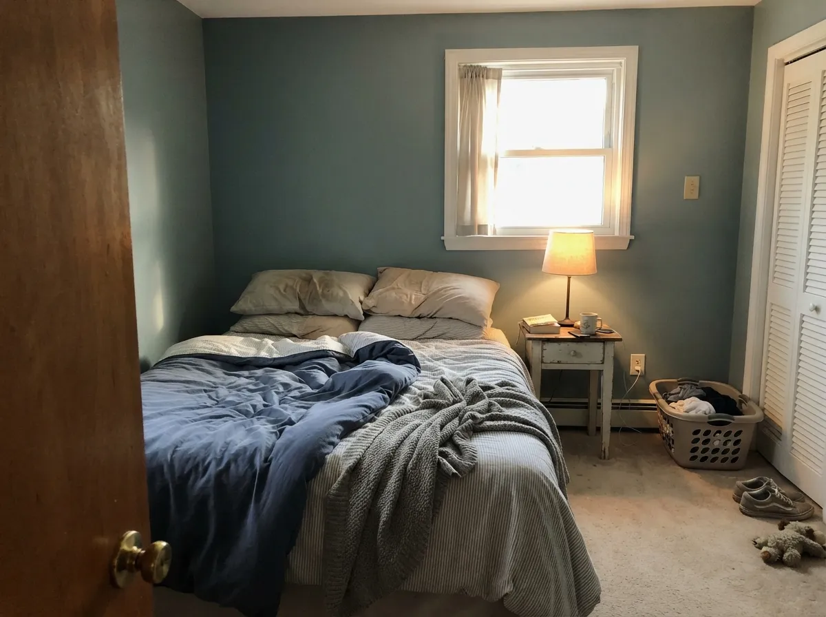
A calm, grown-up blue that never tips nautical. Best with south or west light; in a dim north room it can slide toward flat slate-gray, which some owners love and some find underwhelming — sample before committing four walls.
Small rooms take depth well, and this color's complexity reads as custom rather than themed in a space you only spend a few minutes in. Pairs well with white or marble-look tile and brass or matte-black fixtures.
Handsome as an accent wall or a painted built-in; riskier as the whole room's color, where it has to negotiate with every other undertone in an open floor plan. Keep the trim a true white for a clean edge.
On a full facade the color reads darker and flatter than it does on a door, and it loses the crisp contrast that makes it work as an accent. Save it for the door, shutters, or trim, and let a lighter neutral carry the siding.
Your Light Is the Risk
Full, strong daylight brightens it toward a cleaner sky blue and keeps the green in check — the most flattering read, especially on an exterior door.
Warm early sun pulls the green forward hardest; owners report a distinct teal cast in the first hour of daylight. Sample at 8am if this is the light you have.
Cloudy skies and north walls settle it into a quieter, flatter slate-gray-blue — calmer, but it loses some of its blue identity.
2700K lamps warm it slightly and mute the green; cool LEDs push it back toward gray. Warm bulbs are the easy fix if the room reads too flat at night.
Most complaints about Van Courtland Blue are a light mismatch. Upload a photo of your actual room and see it on your walls — then ask for the same wall in north light or evening lamps before you buy a single sample.
Need It From Another Brand?
Any paint counter can custom-tint Benjamin Moore HC-145 directly. If you would rather stay in one brand's own deck, these are the closest stock matches, measured as ΔE2000. Under 2 is a difference you will not see on the wall.
| Brand | Closest color | ΔE | LRV | |
|---|---|---|---|---|
| Sherwin-Williams | Morning at SeaSW 9634 · Sherwin-Williams | 1.9 | 29 | Color page → |
| Behr | Rainy SeasonMQ5-27 · Behr | 1.6 | 30 | Color page → |
| Valspar | Evening Eclipse4007-3C · Valspar | 2.5 | 29.5 | Color page → |
| PPG / Glidden | SeastonePPG10-11 · PPG / Glidden | 2.7 | 30 | Color page → |
| Glidden | SeastonePPG10-11 · Glidden | 2.7 | 30 | Color page → |
| Dutch Boy | Neptune's Rings431-3DB · Dutch Boy | 1.8 | 31 | Color page → |
Similar Benjamin Moore Colors
The nearest shades to Van Courtland Blue within Benjamin Moore's own range, ranked by perceptual color distance — useful when you want the same look a touch lighter, darker, or warmer.
WCAG 2.1: AA is 4.5 : 1 for normal text, 3 : 1 for large text, AAA is 7 : 1.
Van Courtland Blue vs the Colors You're Also Considering
Every Van Courtland Blue sample board has the same rivals on it. The numbers show the real lightness gap — then it comes down to which risk you would rather live with.
Pick this for more color — Van Courtland Blue is the one that actually reads as blue once real light hits it.
Benjamin Moore HC-165 · LRV 36Boothbay GrayPick this if you want the quieter cousin that reads gray more often than blue — Boothbay Gray drops most of the green lean.
Pick this for a lighter, more versatile mid-tone that can carry a whole kitchen, not just an accent.
Benjamin Moore HC-156 · LRV 11Van Deusen BluePick this for a true, saturated, unmistakable blue with real depth — Van Deusen Blue skips the gray-green hedging entirely.
Water's Edge 1635 is the closest call in the line. It carries the same hex #86989E and the same LRV 31, so on a wall you will not tell them apart; the choice is about which deck you are working from.
Province Blue 2135-40 at LRV 32 and hex #829BA1 is a hair lighter and slightly greener. Amsterdam AF-550 at LRV 29 and #81949D goes the other way, a little darker and a little bluer, which suits a room that already gets strong light.
Across brands the field is crowded. Behr Rainy Season MQ5-27 at deltaE 1.6, Sherwin-Williams Morning at Sea SW 9634 at 1.87, and Hirshfield's Standish Blue H0048 at 1.63 all land close enough to look visually identical in normal room light. Farrow and Ball Oval Room Blue No. 85 at deltaE 3.39 is very close but worth sampling first, and Magnolia Home Sir Drake JG-02 at deltaE 4.49 is close yet visibly greener side by side.
Van Courtland Blue Coordinating Colors
The rule for coordinating with Van Courtland Blue: stay cool-to-neutral and let it carry the temperature. It flatters crisp and warm whites, near-black accents, and paler members of its own blue-gray family — and it argues with golden, yellow-warm wood and beige. These are the partners that keep showing up in rooms and exteriors that work:
Van Courtland Blue's Historical Collection Story
The HC prefix on the can is the whole story: Van Courtland Blue lives in Benjamin Moore's Historical Collection, the deck built around colors documented from actual old American buildings rather than invented for a season. It sits numerically near Hale Navy and Van Deusen Blue, and shares a paler, greener cousin two doors down in Woodlawn Blue — a small family of grayed blue-greens built for shutters, doors, and old-house trim rather than trend walls.
It has never carried a Color of the Year title and it is not chasing a viral moment. What it has instead is steady, quiet praise: design blogs describe it as a midtone that steps outside the neutral zone without going dark or moody, and it turns up again and again in Houzz threads from people restoring or updating colonial and traditional homes. That is an honest kind of popularity — not a spike, a habit.
Van Courtland Blue With Wood Tones and Metals
White oak, walnut, and painted millwork are the easy partners — cool or neutral wood tones let the blue-gray stay exactly as complex as it wants to be. The one honest no is golden honey oak: yellow-orange sits opposite blue-gray on the color wheel, so the floor reads more orange and the wall reads more green, and no amount of extra coats fixes that geometry. A large rug helps if the golden floor is staying put.
Metals are more forgiving. Unlacquered brass and warm gold hardware soften the green and add exactly the warmth the color is missing on its own; matte black and aged bronze play it cool-on-cool and read modern; polished chrome is the only finish that tips the whole pairing colder than most rooms want.
Three Ready Palettes Built on Van Courtland Blue
A color is never alone on the wall. These are complete combinations in the 60-30-10 pattern, with the reason each one holds together. Every one opens in the visualizer.
A crisp white siding lets the door do the talking; Kendall Charcoal on porch details or house numbers adds one dark note so the blue-gray doesn't have to fight for attention.
Try this palette in your roomWhite Dove upper cabinets keep the room bright while the island carries the color; warm Natural Cream walls make sure brass hardware and butcher block don't fight the blue-gray's cool-green side.
Try this palette in your roomCloud White trim keeps the edges soft instead of stark; French Toile in a closet or nook echoes the same blue-gray family at a paler depth, so the room reads as one considered palette instead of a color and its opposite.
Try this palette in your roomVan Courtland Blue FAQ
Is Van Courtland Blue more blue or more gray?
Genuinely both, and that's not a dodge. At LRV 31 it has real depth, and in strong direct light it reads as a clear blue-gray with a blue lean. Drop the light — an overcast day, a north wall — and the gray takes over and the blue recedes. It depends on your light more than most colors this deck sells.
Does Van Courtland Blue look green?
In warm east-facing morning light, yes — genuinely and predictably. The undertone has a real green component, and low-angle warm morning sun brings it forward hardest, usually fading by mid-morning as the light shifts. In direct midday sun or under cool north light it reads blue-gray, not green. Sample on your actual wall before deciding either way.
What is Van Courtland Blue best used for?
Front doors and shutters on colonial or traditional homes, where its Historical Collection heritage shows most clearly. It is also a strong pick for a kitchen island or a full run of cabinets, and it works well as a bedroom or powder-room wall color with real daylight.
Does it work with honey oak floors?
Not well. Golden, honey-toned oak sits opposite blue-gray on the color wheel, so the wood pushes the wall toward its greenest extreme while the wall pushes the floor toward orange. White oak, walnut, or painted trim are much easier partners.
What trim white goes with Van Courtland Blue?
Cloud White or Chantilly Lace both work — Cloud White if the room runs cool or you want the softest edge, Chantilly Lace for a crisper, more modern contrast on an exterior door or shutters. A yellow-leaning cream white will fight the green undertone; keep the trim neutral to cool.
Is Van Courtland Blue a trending color or a Color of the Year?
Neither, and that is part of its appeal. It has never been named a Benjamin Moore Color of the Year, and it isn't chasing a current trend — it has sat quietly in the Historical Collection for decades as a front-door and shutter standby. Design blogs and Houzz threads bring it up steadily, not virally: a dependable heritage pick rather than a moment.
Have you painted with Van Courtland Blue?
Rate it — one tap helps the next reader decide.
Ask a Question