Rainy Season
The muted blue-gray everyone samples as gray, reviewed honestly: the bedrooms where it turns to wet slate, the light that turns it green, and what to pick instead.

Jessica has spec'd whites and neutrals for more than 300 rooms and keeps a sample wall of painted drawdowns in her studio. Every color review is checked against real reader rooms in the comments and re-tested when a formula changes. About the testing process →
- 1Salamander6
- 2Hidden Gem14
- 3Rainy Season30
- 4Peacock Blue35
- 5Wythe Blue48
The Fast Verdict
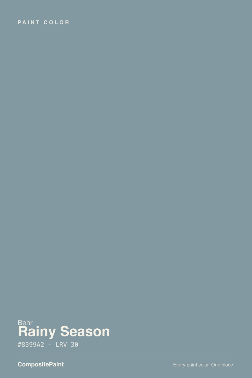
Rainy Season is a mid-dark blue-gray with the saturation turned almost all the way down: slate in daylight, a quieter gray-green after dark, never navy and never a true gray. At LRV 30 it has enough depth for four bedroom walls and enough softness for a cabinet run or a set of shutters, which is exactly where it keeps showing up. Buy it for a room that should feel like weather. Do not buy it hoping the wall will stay the gray it looked like on the chip.
Mid-dark bedrooms · vanities and cabinet runs · shutters on a light house · powder rooms · anyone who wants slate-blue without going navy
You actually want gray · your floors are honey oak or golden builder beige · the room is dim, north, and lamp-free · you need a whole-house neutral for resale
- Slate-blue that behaves like a mood color, not a theme
- Deep enough (LRV 30) to hold on four bedroom walls without going navy
- Earns its keep on vanities, cabinet runs, and shutters
- Low chroma means it ages like a weathered neutral, not a trend blue
- Warm lamps turn it gray-green and restful instead of cold
- Not gray — buyers expecting gray see blue by the second wall
- Fights honey oak, golden beige, and everything yellow-warm
- Dim north light turns it into hard, slightly dirty slate
- Too much color for an open main floor or a resale-safe whole house
What Color Is Rainy Season, Really?
A grayed medium blue with a green thread — slate first, teal second. Most mid-blues people sample for a moody bedroom are either a clear denim or a purple-leaning steel. Rainy Season is the muddied one: chroma so low it passes for gray on a chip, then the blue-green shows the moment it covers a wall. It is not navy, not spa aqua, not a greige. Behr sells it as a medium blue-gray; the green is quiet until daylight or a warm neighbor pulls it forward.
At LRV 30 it is a genuine mid-dark. Roughly a third of the light that hits the wall comes back; the rest gets swallowed. That is why it can drench a bedroom without going cave-dark, and why a dim living room feels smaller after the second coat. In even daylight it leans slate — the wet-stone read the name is aiming at. After dark it drops a step and the gray-green comes forward. Plan for the wall to read deeper and bluer than the chip. Every low-chroma blue-gray does this, and it is the number-one surprise on a sample board.
Undertone in one line: cool blue-green, slate first — never purple, never beige. If your sample looks flat gray, the light is dim or the bulbs are warm. If it looks like sea glass, that is south sun or a green neighbor doing it. Both versions are the same paint being honest about the room.
Where It Shines
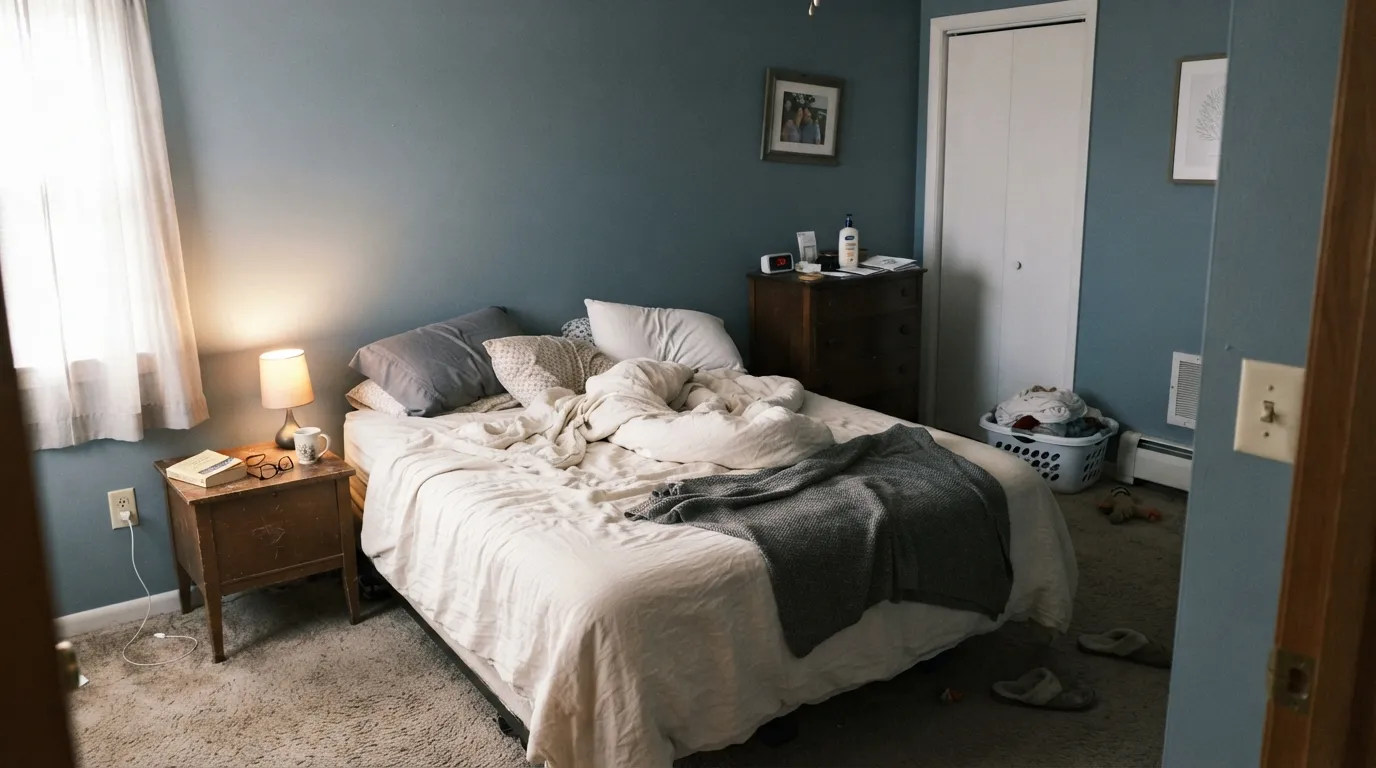
This color is built for rooms you use at night and look at in soft daylight. In a bedroom with White Dove trim, linen, and 2700K lamps it reads like weather on the walls — calm, a little cool, finished. Its second home is the smaller commitment: a vanity, a cabinet run, a set of shutters on a light house, where the mid-dark slate looks custom without betting every wall on blue. Give it pale oak, walnut, brushed nickel or unlacquered brass, and it behaves.

Where It Fails
Almost every regret story about Rainy Season follows one of three scripts, and all three are predictable before the first coat. None of them are the paint's fault — but if your room matches one, this is not your color, and sampling bigger will only confirm it.
On the chip it passes for a moody mid gray. On four walls the blue-green is unmistakable — depth multiplies undertone. If your goal is gray with a little personality, this is too much personality; look at Stonington Gray instead and let it stay a true gray.
Yellow-orange sits across the wheel from this blue-green, so honey-oak floors, orange-stained trim and builder-beige carpet all amplify the teal while the walls push the floor toward orange. Both sides lose. Rainy Season needs walnut, espresso, pale white oak or a big rug between it and anything golden.
Cool, low north light strips the softness and leaves a hard, slightly dirty slate — wet concrete instead of wet stone. At LRV 30 there is not enough bounce to rescue a dark room. Warm 2700K bulbs are part of this paint job. If the room is dim and you refuse lamps, pick a color that does not drink the light.
Room by Room
Dusk on the walls all day, slate at noon, gray-green at night. Matte finish hides wall texture and deepens the color; White Dove trim keeps the edges soft instead of icy. With cream or white bedding and warm lamps it is the rare mid-dark blue that still reads restful. A Reddit parent painted a son's room this color and called it a cozy muted blue — the point is weather, not a theme.
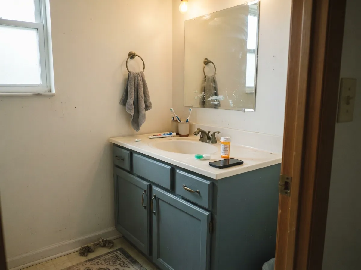
Behr mixes this color in cabinet-and-trim enamel for a reason. Satin Rainy Season on a vanity or a lower run under Alabaster or White Dove walls grounds the room without the weight of navy. Brass, black, or brushed nickel all sit cleanly on it. A full kitchen of slate-blue cabinets is a real commitment; an island or a bath vanity is the dose that works.
Small rooms take mid-dark color well because you never see a long wall of it. Drench the four walls, keep the ceiling Ultra Pure White, and the little room reads considered. Satin in a steamy bath. White tile and nickel love it; cream tile and honey vanity wood argue. Sample above the actual tile before you commit.
Enough color to feel chosen, not enough to distract from a screen. East or south light keeps it slate instead of concrete. Eggshell for scuff resistance where a chair back hits the wall. Pair with pale oak, a warm white, and one darker note — Hale Navy on a door or Hidden Gem on a bookcase.
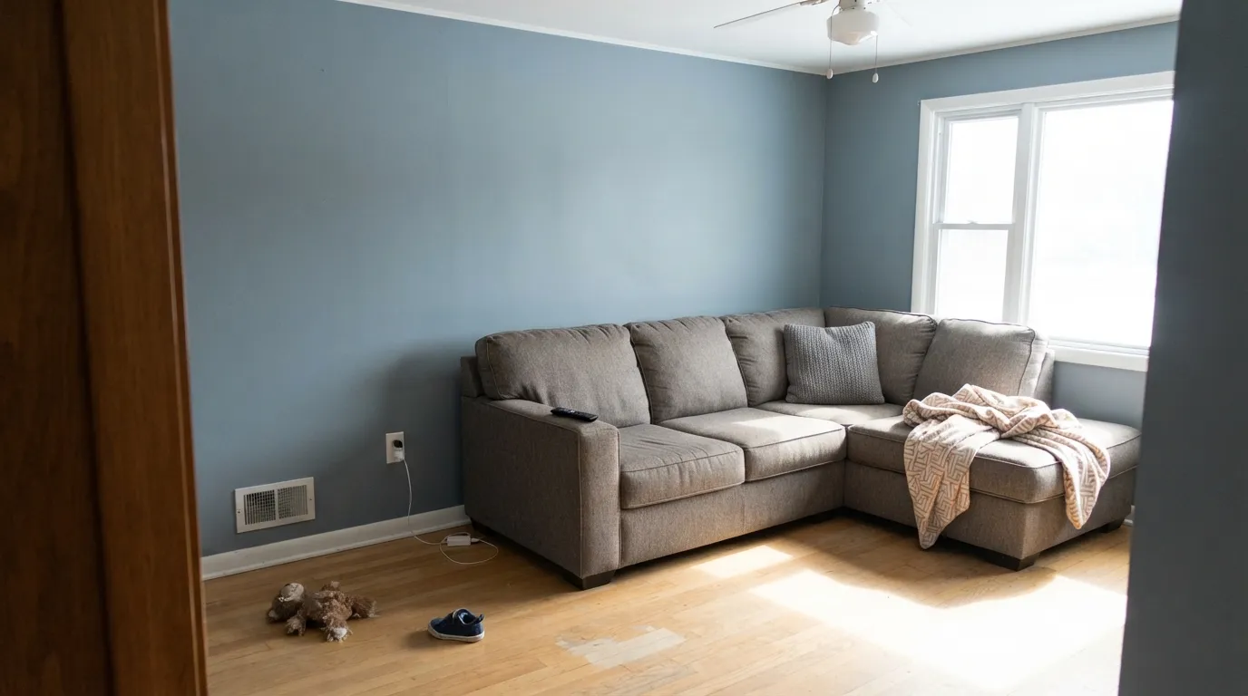
Beautiful in a closed, daylit living room with walnut and cream. Riskier in an open plan, where it has to negotiate with a greige kitchen and whatever the adjacent rooms wear. From across a great room this is clearly a color, not a backdrop. If you love it here, put it on the built-ins or one wall — not on the field of a family room you also have to sell.
Behr itself lists this color for shutters, and that is the honest exterior job: Rainy Season slats on a White Dove or Alabaster body, Hale Navy or Cracked Pepper on the door. Full outdoor sun keeps it a weathered blue-gray; a shaded north facade goes cold and a little dirty from the curb. A whole body in LRV 30 only works on a house that already has light and a crisp white trim. Do not use it as siding on a dark lot.
Your Light Is the Risk
East rooms and filtered south light give the honest wet-slate read — blue-gray, a little muddied, not icy. This is the light the color was mixed for.
Cool gray daylight strips the softness and leaves a hard, slightly dirty slate. Fine if you half-wanted gray; disappointing if you wanted weather.
Morning light keeps it cooler and more clearly blue. West sun and golden hour pull the green thread forward and it goes sea-gray for an hour. Same paint, two honest reads.
2700K bulbs mute the blue and leave a cozy gray-green — the bedroom version. Cool 4000K LEDs restore the blue and can make a small room feel clinical. Swap the bulbs before you blame the paint.
Most complaints about Rainy Season are a light mismatch. Upload a photo of your actual room and see it on your walls — then ask for the same wall in north light or evening lamps before you buy a single sample.
Need It From Another Brand?
Any paint counter can custom-tint Behr MQ5-27 directly. If you would rather stay in one brand's own deck, these are the closest stock matches, measured as ΔE2000. Under 2 is a difference you will not see on the wall.
| Brand | Closest color | ΔE | LRV | |
|---|---|---|---|---|
| Sherwin-Williams | Tranquil AquaSW 7611 · Sherwin-Williams | 3.5 | 30 | Color page → |
| Benjamin Moore | Water's Edge1635 · Benjamin Moore | 1.6 | 31 | Color page → |
| Valspar | Maritime HushT693 · Valspar | 1.4 | 30.9 | Color page → |
| PPG / Glidden | SeastonePPG10-11 · PPG / Glidden | 1.7 | 30 | Color page → |
| Glidden | SeastonePPG10-11 · Glidden | 1.7 | 30 | Color page → |
| Dutch Boy | Neptune's Rings431-3DB · Dutch Boy | 0.9 | 31 | Color page → |
Similar Behr Colors
The nearest shades to Rainy Season within Behr's own range, ranked by perceptual color distance — useful when you want the same look a touch lighter, darker, or warmer.
WCAG 2.1: AA is 4.5 : 1 for normal text, 3 : 1 for large text, AAA is 7 : 1.
Rainy Season vs the Colors You're Also Considering
Every Rainy Season sample board has the same rivals on it. The numbers show the real lightness gap — then it comes down to which risk you would rather live with.
Pick this when you want the slightly muddier, more weathered Behr read, and a Home Depot mix.
Benjamin Moore HC-145 · LRV 31Van Courtland BluePick this if you want the Historic Color version — same depth, a slate-blue that reads gray until the light says otherwise.
Pick this when you still want four bedroom walls, not a near-navy cabinet color.
Behr N480-5 · LRV 22Adirondack BluePick this for the deeper workhorse on the same family — cabinets, doors, and garage floors at a step that reads almost steel.
The Behr neighbors split by undertone. Lakeview ECC-56-3 (#819AA0, LRV 30) is greener. Approaching Dusk ICC-103 (#8B97A5, LRV 30) leans blue-violet instead. Blue Dusk PPF-28 (#8C959D, LRV 30) is grayer and quieter. Blue Agave PMD-35 (#7C9B9B, LRV 30) is the most obviously green of the set. All four share roughly the same lightness, so the choice is entirely about which way you want the undertone to go.
Across brands, Dutch Boy Neptune's Rings 431-3DB (LRV 31) is a deltaE of 0.91, close enough to call the same color. Valspar Maritime Hush T693 (deltaE 1.42) and Benjamin Moore Water's Edge 1635 (deltaE 1.6) are visually identical in normal room light.
Sherwin-Williams Tranquil Aqua SW 7611 (deltaE 3.48) is close but visibly different side by side, reading greener. Farrow and Ball Oval Room Blue No. 85 (deltaE 4.43) is further still, softer and clearly more green.
Rainy Season Coordinating Colors
The rule for coordinating with Rainy Season: warm whites, deeper slates, and one near-navy — and keep everything yellow at arm's length. It pairs with cream far better than with beige, loves pale oak and walnut, and layers cleanly with darker members of its own blue-gray family. These are the partners that keep showing up in rooms that work:
Cabinets, Shutters, and a Color That Never Went Viral
Rainy Season has no Color of the Year sticker and no TV-house fame. It sits in Behr's Marquee strip as a working mid-blue, mixed at the Home Depot desk, sold in interior, cabinet-and-trim, and exterior formulas. Behr's own color page files it with shutters as an extra, which is the tell: this is a color the brand expects to see on a second surface, not on a magazine cover.
The real rooms that do turn up are modest. A Reddit parent painted a son's bedroom and treated it as the cozy muted blue. Kitchen threads recommend it next to brown cabinets — sometimes beside Blueprint — when someone wants a muted blue at the same intensity as the wood. Honest obscurity is the point. You get weathered slate without a timestamp, and if the blue-gray moment passes, a muddied mid-tone ages closer to stone than to accent-wall teal.
Rainy Season With Wood Tones and Floors
This decision gets made at the floor, not the paint store. Walnut and espresso are the color's best friends — the dark red-brown depth makes the slate read deliberate. Pale white oak and gray-washed floors are safe and give the room a quieter coastal cast. Cream carpet is fine; true gray carpet is fine.
The one honest no is golden: honey oak floors, orange-stained trim, yellow-beige carpet. Yellow-orange sits opposite this blue-green on the wheel, so each side exaggerates the other — the floor reads more orange, the walls read more teal, and no amount of coats fixes geometry. If the golden floor is staying, put a large rug between it and this paint, or choose Stonington Gray and keep the mood without the fight.
Metals are the easy part: unlacquered brass, antique bronze, matte black and brushed nickel all work. Polished chrome is the only one that leans a little cold against it, and even that is fine in a white-tile bath.
Three Ready Palettes Built on Rainy Season
A color is never alone on the wall. These are complete combinations in the 60-30-10 pattern, with the reason each one holds together. Every one opens in the visualizer.
Two depths of the same slate family, separated by a warm white. White Dove matters here — a stark bright trim white would make the walls read dusty and cold. Adirondack Blue on one piece of furniture keeps the room tonal instead of themed.
Try this palette in your roomAlabaster is a cabinet-friendly soft white, so the slate on the boxes has something warm to push against. Hale Navy on one island or door supplies the single dark note; give that navy real light so it stays navy instead of going black.
Try this palette in your roomThis is the exterior job Behr already had in mind: a light body, slate shutters, one navy door. Full sun keeps Rainy Season weathered instead of dirty; walk the north side with a sample before you commit the shady elevation.
Try this palette in your roomRainy Season FAQ
Is Rainy Season blue or gray?
Blue-gray — quietly, but unmistakably once it is on a wall. In dim light or under warm bulbs it can pass for a smoky gray-green, and in even daylight it leans slate, but on four walls nobody will call it gray. If gray is what you actually want, this is the wrong color; that mismatch is the usual reason people talk themselves out of it.
What trim white goes with Rainy Season?
A warm, soft white — White Dove is the default, Alabaster if the rest of the house is already in Sherwin-Williams. Ultra Pure White is unbeatable on the ceiling, where you want bounce; next to these walls a warmer trim white keeps the slate from reading cold. Semi-gloss on the trim, matte or eggshell on the walls.
Is it good for a bedroom?
It is the best room for it. Mid-dark slate is calmest in soft daylight and warm lamps — exactly a bedroom's operating conditions. Use matte, keep the bulbs at 2700K, and pair with cream or white bedding rather than beige, which reads yellow against the blue-green.
Does Rainy Season work with oak floors?
Depends entirely on the oak. Walnut, espresso and pale unstained white oak are excellent. Golden honey oak is the one genuine clash: yellow-orange sits opposite this blue-green, so the floor goes more orange and the walls go more teal. A large rug helps, but with wall-to-wall honey tones pick a different color.
Can I use it on kitchen cabinets or shutters?
Yes — both are stronger uses than a whole main floor. Behr mixes the color in cabinet-and-trim enamel and lists it for shutters. A vanity, a lower cabinet run, or shutters on a light house is the dose that looks custom. A whole kitchen of slate-blue boxes is a bold bet. Satin enamel either way.
Will a muted blue-gray date itself?
Saturated navy-and-teal moments date. Rainy Season is grayed down far enough to sit closer to weathered stone than to a trend blue, and it never had a Color of the Year campaign to timestamp it. It carries more repaint risk than a greige, less than almost any clearer blue at this depth.
Have you painted with Rainy Season?
Rate it — one tap helps the next reader decide.
Ask a Question