Peacock Blue
The jewel-tone blue-green that's quietly been a front-door favorite for years, reviewed honestly: the light that turns it emerald, the rooms where it goes murky, and what to pick instead.

Jessica has spec'd whites and neutrals for more than 300 rooms and keeps a sample wall of painted drawdowns in her studio. Every color review is checked against real reader rooms in the comments and re-tested when a formula changes. About the testing process →
- 1Salamander6
- 2Hidden Gem14
- 3Peacock Blue35
- 4Wythe Blue48
- 5Ocean Boulevard53
The Fast Verdict
Peacock Blue is a genuine blue-green jewel tone — saturated enough to read as a real color choice, gray-muted enough to avoid looking like a swimming pool. It has never had a Color of the Year moment and probably never will, but it has quietly been one of Benjamin Moore's most reliable front-door colors for decades. Give it real daylight and it earns the name; shut it in a dim room and it goes dark fast.
Front doors and small accent moments · kitchen islands and cabinets · powder rooms and vanities · anyone who wants a jewel tone that won't look dated in five years
Your room gets little or no direct light · you want a bright, clear turquoise rather than a grayed-down teal · you're shopping for this year's trend color · your hardware and trim are all cool-toned chrome
- Genuine blue-green jewel tone — saturated without tipping into novelty turquoise
- One of Benjamin Moore's most dependable front-door colors, not a passing trend
- Small doses — door, island, powder room — deliver real personality with low commitment
- Fully mixable in any BM paint line despite the boutique-sounding collection name
- Holds its color in bright light instead of washing out like paler teals do
- Needs genuine daylight — dim rooms make it read dark, even murky
- Green comes forward in strong sun, which can surprise buyers expecting a calmer blue
- A full room is a real commitment, not a safe whole-house default
- Cool-toned trim and chrome hardware flatten its warmth
What Color Is Peacock Blue, Really?
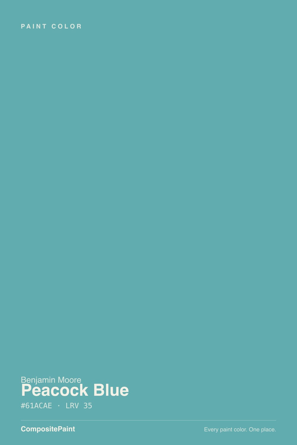
A blue-green with a clear gray cast holding the green in check — that gray is the whole trick. Push the green forward and you get a candy-bright turquoise; push the blue forward and you get a plain teal. Peacock Blue sits right between them, saturated enough to feel like a real decision and muted enough to read as a jewel tone instead of a novelty color. It belongs to Benjamin Moore's Color Preview collection, a deck of roughly 1,232 deeply saturated colors — despite the boutique-sounding name, it is fully mixable at any BM dealer in Aura, Regal Select, or Advance, not a special-order or discontinued color.
At LRV 35 it sits in genuine mid-depth territory: dark enough to hold real color on a wall, light enough that it is not a near-black accent shade. That depth is also why the light in the room matters so much. In strong, direct daylight the green comes forward and the color reads lively and verdant, almost alive. In lower or artificial light the blue takes over and it settles into something quieter and more sophisticated — the same paint reading two different moods depending on when you look at it.
Undertone in one line: blue-green with a gray base, leaning blue after dark and green in full sun — never a bright candy turquoise, never a flat navy. If your sample looks murky rather than jewel-toned, the room simply isn't giving it enough light, not a flaw in the paint.
Where It Shines
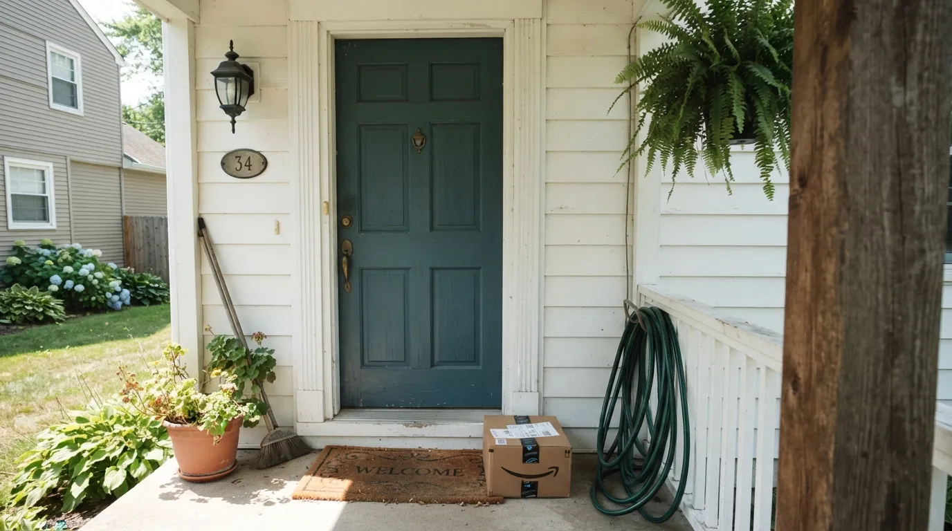
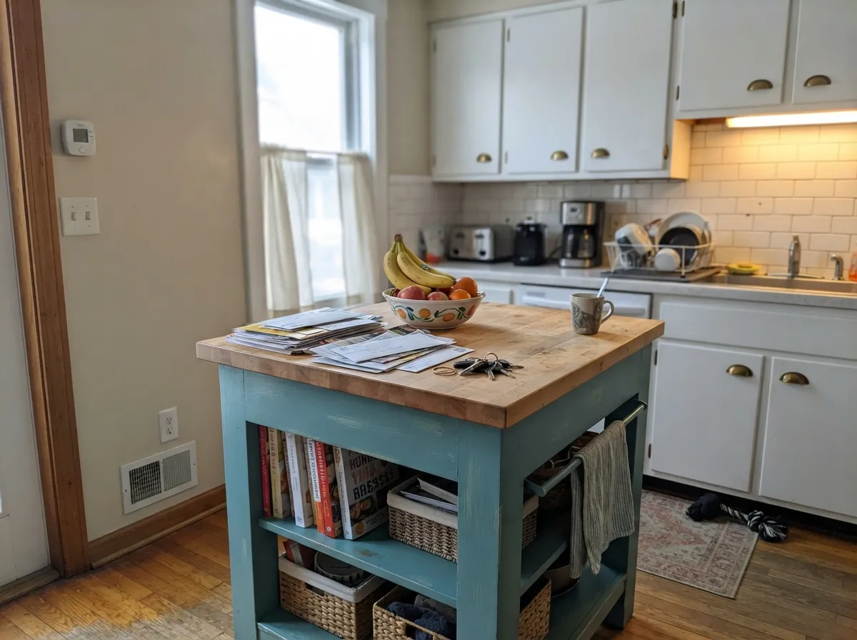
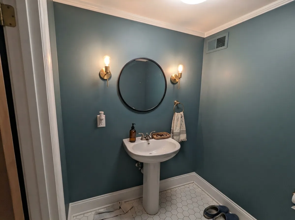
This is a color built for small, well-lit commitments rather than whole-house risk. The front door is its calling card — decades of use have made it one of the dependable blue-green door colors, the kind a painter suggests without having to sell you on it. Its second home is anywhere a homeowner wants a jewel tone without repainting a whole room: a kitchen island, a powder room, a vanity. Give it brass hardware, warm wood, and a bright white partner and it looks intentional rather than trendy.
Where It Fails
Almost every disappointed story about Peacock Blue traces back to one of three predictable situations, and none of them are really the paint's fault — they're a mismatch between the color and the room it landed in.
This is the single most common complaint online: "beautiful color, but too dark for me." Without real daylight the jewel tone collapses into a flat, muddy dark blue-green, especially in corners away from any window. If the room only gets indirect or artificial light, sample a large board there before committing — or step up to a lighter teal like Palladian Blue.
Blue-greens read best against warm whites; a stark, cool-toned trim white pulls the temperature down and can make Peacock Blue look flat and slightly gray instead of jewel-bright. White Dove or Alabaster on the trim keeps the color glowing; a builder's cool white fights it.
Buyers who picked this color from a screen expecting a calm, restrained blue are sometimes surprised by how green it reads in strong, direct sun — the exact light where the green undertone comes forward most. If blue with zero green is the goal, Van Deusen Blue is the safer pick.
Room by Room
Semi-gloss or high-gloss Peacock Blue against white siding, brick, or gray stone is a classic that has never gone out of style. It reads confident without the starkness of a true navy door.
An island or lower run of cabinets in Peacock Blue under warm white uppers, with brass or unlacquered hardware, is the low-risk way to get the color into a kitchen without repainting every wall. Satin cabinet enamel wipes clean.
Small rooms take deep, saturated color well, and a powder room is the classic place to be bold without living with the risk daily. Drench all four walls, keep the trim bright white, and let the mirror and fixtures do the rest.
Behind a headboard with warm lamps and cream bedding it reads moody and calm. A full bedroom in Peacock Blue is a bigger bet — bedrooms often run low on daylight at exactly the hours you're in them, which is this color's weak spot.
Rooms that live under lamplight rather than noon sun flatter the blue side of this color. Walnut shelving and brass reading lamps are its natural company here.
Across a whole house facade it can read heavy and lose its jewel-tone quality against the sky. Contained to a door, shutters, or a small accent building, it works exactly the way it does indoors: a confident, contained pop of color.
Your Light Is the Risk
Full sun pulls the green forward and the color reads lively and jewel-bright — the light a front door or sunny kitchen gets most of the day.
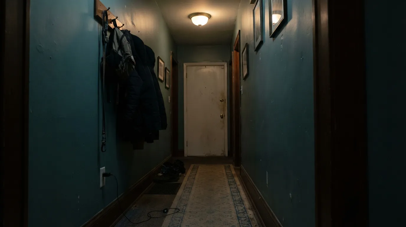
In a room that never catches real sun it goes dark and can look almost black in the corners — the exact situation behind the "too dark for me" reviews.
Cooler and more blue in early light, greener and more saturated as the sun climbs, then it settles back toward blue-gray at dusk. Test a sample through a full day if you can.
Warm 2700K bulbs keep it moody and blue after dark, closer to sophisticated than dark. Cool LEDs flatten it toward a plainer gray-teal — swap the bulb before you blame the paint.
Most complaints about Peacock Blue are a light mismatch. Upload a photo of your actual room and see it on your walls — then ask for the same wall in north light or evening lamps before you buy a single sample.
Need It From Another Brand?
Any paint counter can custom-tint Benjamin Moore 2049-40 directly. If you would rather stay in one brand's own deck, these are the closest stock matches, measured as ΔE2000. Under 2 is a difference you will not see on the wall.
| Brand | Closest color | ΔE | LRV | |
|---|---|---|---|---|
| Behr | Waterscape530F-5 · Behr | 3.0 | 36 | Color page → |
| Valspar | Smoky Mountain SpringV067-4 · Valspar | 3.6 | 32.1 | Color page → |
| PPG / Glidden | Artesian WellPPG1231-5 · PPG / Glidden | 4.5 | 37 | Color page → |
| Glidden | Sea Of Turquoise90GG 37/212 · Glidden | 2.6 | 37 | Color page → |
| Dutch Boy | Western Green233-6DB · Dutch Boy | 3.8 | 32 | Color page → |
| HGTV Home by Sherwin-Williams | September SkiesHGSW 1333 · HGTV Home by Sherwin-Williams | 4.3 | 32 | Color page → |
Similar Benjamin Moore Colors
The nearest shades to Peacock Blue within Benjamin Moore's own range, ranked by perceptual color distance — useful when you want the same look a touch lighter, darker, or warmer.
WCAG 2.1: AA is 4.5 : 1 for normal text, 3 : 1 for large text, AAA is 7 : 1.
Peacock Blue vs the Colors You're Also Considering
Every Peacock Blue sample board has the same rivals on it. The numbers show the real lightness gap — then it comes down to which risk you would rather live with.
Pick this for the depth and saturation a pale spa color like Palladian Blue simply doesn't have.
Benjamin Moore HC-144 · LRV 53Palladian BluePick this for a paler, softer teal-gray that's safe to use across a whole room instead of just an accent.
Pick this for a real jewel tone — Rainwashed is a whisper of color, not a statement.
Sherwin-Williams SW 6211 · LRV 47RainwashedPick this if your painter works in Sherwin-Williams and you want a light, watery green-blue with almost no commitment.
Within the brand, Florida Keys Blue 2050-40 at LRV 34 is the closest sibling and reads slightly greener at the same depth. Gulf Stream 670 and Harbor Side Blue 740 at LRV 39 are four points lighter, which is enough to feel noticeably airier on a full wall. Santa Clara 753 at LRV 35 is the colder option and holds its blue better in warm light.
Across brands, the nearest values still show a gap. Glidden Sea Of Turquoise 90GG 37/212 at LRV 37 has a deltaE of 2.57 and Dunn-Edwards Veranda DET543 at LRV 34 sits at 2.62, so both are very close but worth sampling first. Behr Waterscape 530F-5 at LRV 36 is 3.03 away, in the same territory. Valspar Smoky Mountain Spring V067-4 at LRV 32.1 is 3.57 and PPG and Glidden Artesian Well PPG1231-5 at LRV 37 is 4.5, both close but visibly different side by side.
Peacock Blue Coordinating Colors
The rule for coordinating with Peacock Blue is simple: warm whites, warm metals, and near-black — and keep cool grays and chrome at arm's length. It pairs with cream and warm white far more comfortably than with stark cool white, and it takes a warm neutral wall partner well when it's used only as an accent. These are the colors that keep showing up next to it in rooms that work:
Peacock Blue's Own Story
Peacock Blue has never had a Color of the Year moment, and that is the honest, quietly useful thing about it. It belongs to Benjamin Moore's Color Preview collection — a deck built for saturated, confident color rather than the safe neutrals most of the brand's marketing centers on — and it has sat there for years as a dependable front-door and accent choice while trend colors have cycled in and out around it.
That is a different story from a color like Aegean Teal, which arrived as a 2021 Color of the Year darling and rode a wave of designer attention. Peacock Blue's gray-muted base keeps it from ever looking quite as "of the moment" as a brighter turquoise trend color would — which is exactly why it has aged well on doors painted a decade ago. If you want a blue-green that won't announce which year you painted it, this is the more honest bet of the two.
Peacock Blue With Wood Tones and Metals
Warm woods are this color's best company: walnut, aged oak, and reclaimed timber all deepen the blue-green rather than fighting it, which is why it works so well on a kitchen island under wood open shelving. Bright orange-toned builder oak is the harder pairing — orange sits opposite blue-green on the color wheel, so the two can visually argue rather than blend; a warm rug or a darker wood stain closes the gap.
Metals split cleanly: brass and unlacquered bronze warm the color up and are the classic front-door hardware pairing, matte black and oil-rubbed bronze push it moodier and more contemporary, and polished chrome or nickel is the one finish that reliably reads cold against it.
Three Ready Palettes Built on Peacock Blue
A color is never alone on the wall. These are complete combinations in the 60-30-10 pattern, with the reason each one holds together. Every one opens in the visualizer.
A warm white body keeps the door from reading cold against brick or siding, and the near-black hardware picks up the door's gray base without competing with it. This is the pairing behind most of the door's decades of quiet popularity.
Try this palette in your roomWhite Dove uppers give the island room to stand out without shouting, and a near-black hood repeats the island's gray base overhead so the kitchen reads planned, not accidental.
Try this palette in your roomSmall rooms carry deep, saturated color better than large ones, and a bright trim white keeps the room crisp instead of cave-like. Near-black fixtures add the one dark note the scheme needs.
Try this palette in your roomPeacock Blue FAQ
Is Peacock Blue more blue or more green?
Both, depending on the light. It's built on a genuine blue-green with a gray base, so in strong daylight the green comes forward and it reads verdant; under lamplight or on overcast days the blue takes over and it reads calmer and more restrained. It is never a bright, clear turquoise and never a flat navy.
Will Peacock Blue look too dark in my house?
It can, if the room gets little direct light — that's the most common complaint online. At LRV 35 it needs real daylight to read as a jewel tone rather than a dark, murky color. Sample a large board in the actual room before committing, especially away from the windows.
What white trim goes best with Peacock Blue?
A warm white — White Dove or Alabaster — keeps the color glowing. A cool, stark builder's white pulls the temperature down and can make the blue-green look flat instead of jewel-bright.
Is Peacock Blue a good front door color?
Yes — it's one of the dependable, long-running blue-green door colors in the BM deck, not a passing trend. It reads confident against white siding, brick, or gray stone, and semi-gloss or high-gloss keeps it durable against weather and handling.
Does Peacock Blue work with brass hardware?
Very well. Brass and unlacquered warm metals bring out the color's green side and keep it from reading cold; polished chrome or nickel is the one hardware finish that argues with it.
How is Peacock Blue different from a color like Aegean Teal?
Peacock Blue is the more saturated, more clearly blue-green of the two — a real jewel tone rather than a muted, grayed-down teal. Aegean Teal leans softer and quieter, closer to a neutral that happens to be teal. Pick Peacock Blue when you want the color itself to be the statement.
Have you painted with Peacock Blue?
Rate it — one tap helps the next reader decide.
Ask a Question