Cavern Clay
The 2019 terracotta that started the desert revival, reviewed honestly: the sun that makes it glow like adobe, and the sun that makes it too loud.

Jessica has spec'd whites and neutrals for more than 300 rooms and keeps a sample wall of painted drawdowns in her studio. Every color review is checked against real reader rooms in the comments and re-tested when a formula changes. About the testing process →
- 1Turkish Coffee5
- 2Porpoise13
- 3Cavern Clay20
- 4Modern Mocha25
- 5Redend Point30
The Fast Verdict
Cavern Clay is Sherwin-Williams' 2019 Color of the Year, and it earned that title by doing something most trend colors don't: it took 1970s burnt-orange terracotta and grayed it down until it read sophisticated instead of dated. It is a genuine clay red-brown, not a safe greige with a warm streak, and it behaves like one — glowing like sunbaked adobe in real sun, going flat and muddy in anything dim, and occasionally flashing louder and more orange than the chip promised when direct light hits it head-on. Commit to the light it needs and it is one of the great American terracottas. Guess wrong on your exposure and you will call a painter within the year.
South- or west-facing rooms and facades with real direct sun · stucco, adobe and Mediterranean-style exteriors · front doors, breeze-block walls and single accent walls · midcentury-modern and desert-modern kitchens with ample light
Your room only gets north or indirect light · you actually want a warm neutral, not a color statement · your existing palette is cool (white oak, gray tile, chrome) · you want the safer, quieter version of this idea (get Redend Point instead)
- A genuine sophisticated terracotta — not the flat 1970s burnt orange it descends from
- Reads like sunbaked adobe on stucco and Mediterranean-style exteriors
- Deep enough (LRV 20) to hold real color instead of washing out
- Still specified by designers years after its 2019 Color of the Year run — it did not date itself
- Strong, confident single-commitment use: front door, island, one accent wall
- Direct, unbroken sun can push it louder and more orange than the chip promised
- Goes dull, muddy and noticeably darker in north or dim rooms
- Clashes with cool gray, white oak and chrome — needs warm company
- A genuine commitment color; hard to live with if you actually wanted a warm neutral
What Color Is Cavern Clay, Really?
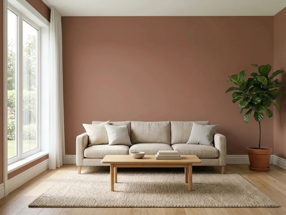
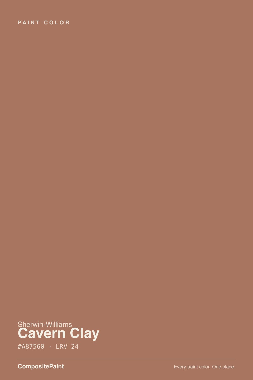
A terracotta with the saturation dialed down on purpose. When Sherwin-Williams named Cavern Clay its 2019 Color of the Year, the company described it as midcentury modern with the soul of the American Southwest — desert modern, in their language. What that means on the wall is a warm, reddish clay color that carries the same DNA as the burnt-orange terracottas of 1970s Southwest kitchens, but muted with enough brown and gray that it reads as sophisticated adobe rather than a decade you're trying to bring back. That muting is the whole reason it outlasted its Color of the Year year: most annual picks look dated within twelve months, and Cavern Clay is still on designer shortlists and still one of the most-specified warm terracottas going into 2026.
At an LRV of 20 it is a genuine mid-depth color with real pigment load, not a tinted neutral you can talk yourself into as a safe choice. That depth is exactly what makes it convincing as stucco, clay pottery, or sun-baked canyon rock — thin, pale terracottas look like a craft-paint mistake, and Cavern Clay never does. Owners and design bloggers who've lived with it describe it shifting through the day: warmer and more orange in morning light, deepening toward red-brown as the sun lowers in the afternoon and evening. It is not a static color, and that is the appeal for the people who love it.
Undertone in one line: warm red-brown clay, built on an iron-oxide base — never a clean citrus orange, never a flat chocolate brown. Which side shows depends entirely on the light hitting it, and that dependency is both the character and the risk.
Where It Shines
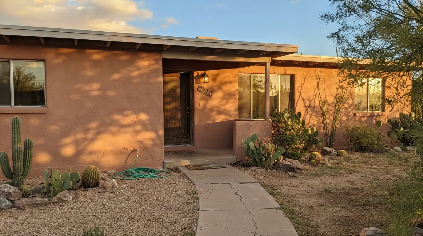
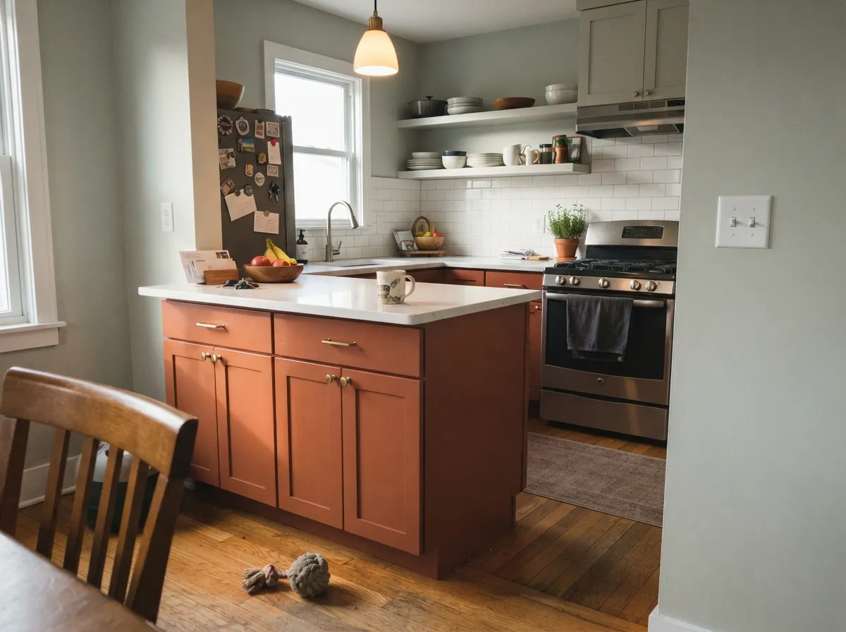
This is a sun color. Give it a real south- or west-facing exposure and it does exactly what the name promises: the wall or facade reads like sun-warmed clay, canyon rock, or an adobe wall that's been standing for a hundred years. It is the gold standard for stucco bodies on Southwest and Mediterranean-style homes, and it is the reason Palm Springs breeze-block walls, carport panels, and front doors keep reaching for this exact chip — the desert-modern movement built around midcentury architecture and Frank Lloyd Wright's Taliesin West palette leans on colors like this one. Indoors, it does the same job on a single accent wall, a front door, or a kitchen island with real daylight: warm, confident, and unmistakably a design decision rather than an accident.
Where It Fails
Almost every disappointed review of Cavern Clay comes from one of three light situations, and all three are predictable before the first coat goes on. None of them are the paint's fault — but if your room or facade matches one, this is not your color, or at least not without a serious sample test first.
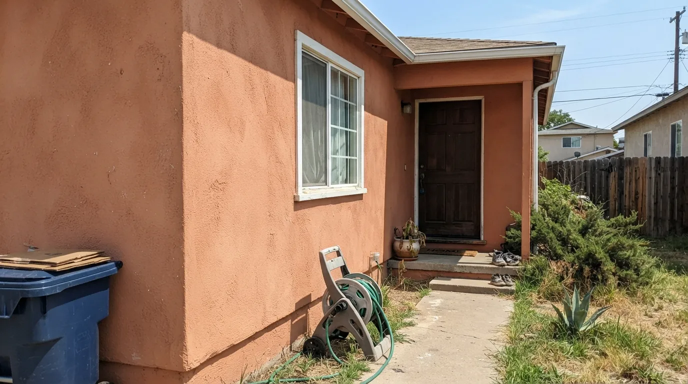
The same directness that makes Cavern Clay glow like adobe in golden-hour light can flip it loud in the middle of a bright, cloudless afternoon — the muted terracotta flashes closer to a bright construction-cone orange than the sophisticated clay the chip suggested. This is the complaint behind most "it's too much" exterior reviews. Test on the actual wall at noon, not just at sunset.
Cool, indirect north light strips the red out and leaves the clay muting behind: the color goes dull, heavy, and muddy-brown, and readers report the room feels noticeably darker than the chip in the store led them to expect. The color did not fail — the light did. This is not a north-room color without serious lamp help.
Cavern Clay was built to sit with warm woods, brass, and earthy greens. Next to cool gray floors, white cabinets and chrome fixtures it reads like a mistake instead of a statement — the temperature clash is the color's fault as much as the room's, since this is a genuinely warm color with nowhere to hide.
Room by Room
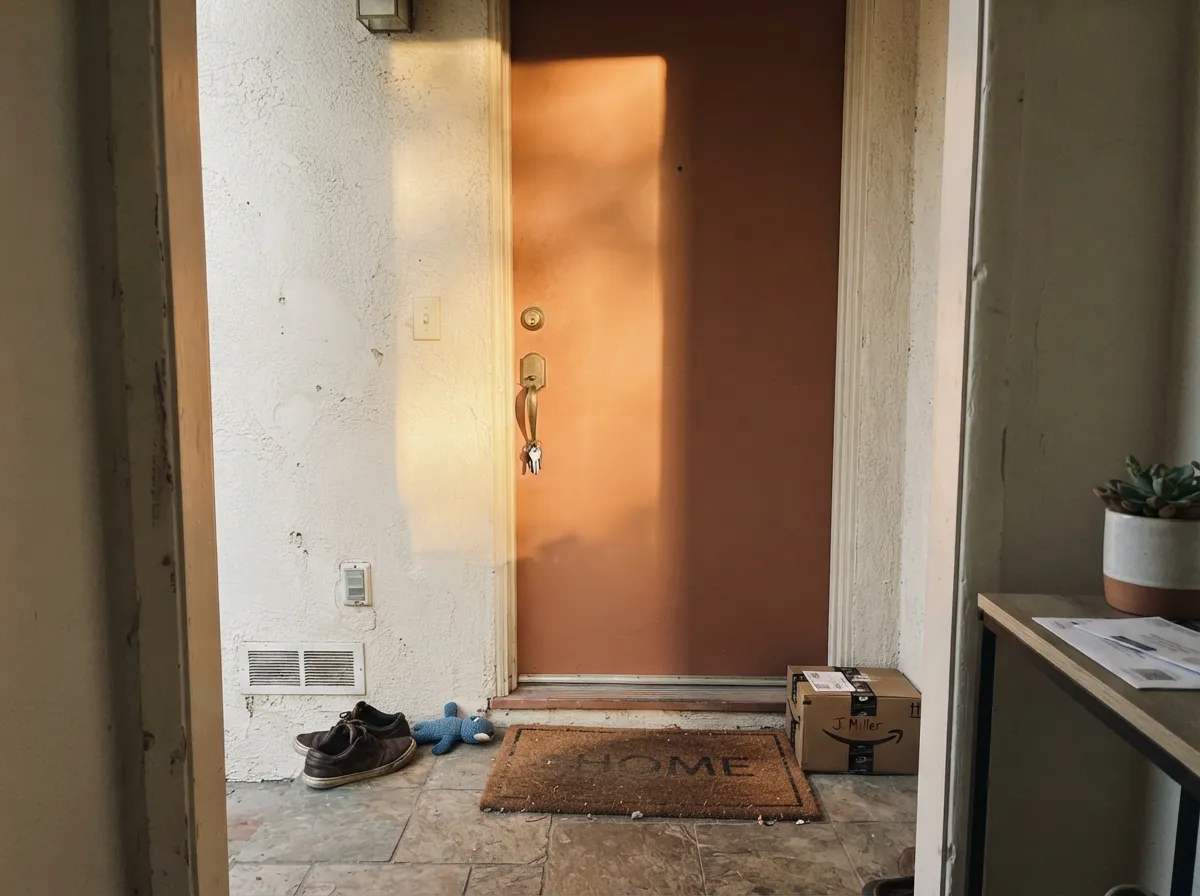
This is where most first-time Cavern Clay owners start, and it works: a single door absorbs the risk of a color this saturated while still reading as a real design choice. Satin finish, and pair it with a soft white or warm-toned facade rather than stark white or cool gray siding.
The gold-standard use. On stucco, adobe, or Mediterranean-style architecture it reads as sun-baked clay rather than paint. Walk the full elevation before committing — the shaded north side of a house will read noticeably duller and browner than the sun-facing side, and that gap is bigger with this color than with most.
On an island or accent cabinetry under ample daylight, with light countertops and warm brass or bronze hardware, it looks intentional and expensive. A full kitchen of Cavern Clay cabinets is a much bigger bet and only works with genuinely generous natural light.
As a single wall behind a sofa or fireplace, with the rest of the room in a soft white or warm neutral, it anchors the space without overwhelming it. Painted on all four walls in anything but the brightest daylight, it can feel like living inside a terracotta pot.
It can work as a cozy, cave-like accent wall behind a headboard with warm 2700K lamps and no cool overhead LEDs. In a dim or north-facing bedroom it reads heavy and closes the room in rather than cocooning it — know which effect you're chasing before you commit to four walls.
A small, enclosed room with good lighting is the cheapest way to live with this color before betting a whole exterior on it. Deep, saturated colors typically flatter small rooms, and Cavern Clay is no exception when the light is right.
Your Light Is the Risk
The color it was built for — glows like sun-warmed clay, especially in late-afternoon and golden-hour light.
Cool, indirect light drains the red and leaves a flat, muddy brown that reads darker than the chip. Sample big before committing a whole room.
Many owners report it reading more orange in morning light and deepening toward red-brown as the sun lowers. It is an active color across the day, not a flat one.
Unbroken midday sun on an exterior wall can flash it brighter and more orange than the golden-hour version everyone photographs. Check the color at noon, not just at sunset.
Most complaints about Cavern Clay are a light mismatch. Upload a photo of your actual room and see it on your walls — then ask for the same wall in north light or evening lamps before you buy a single sample.
Need It From Another Brand?
Any paint counter can custom-tint Sherwin-Williams SW 7701 directly. If you would rather stay in one brand's own deck, these are the closest stock matches, measured as ΔE2000. Under 2 is a difference you will not see on the wall.
| Brand | Closest color | ΔE | LRV | |
|---|---|---|---|---|
| Behr | Orange FlambeMQ1-28 · Behr | 2.1 | 21 | Color page → |
| Benjamin Moore | Audubon RussetHC-51 · Benjamin Moore | 1.0 | 21 | Color page → |
| Valspar | Pajarito Red2001-7B · Valspar | 3.8 | 19.3 | Color page → |
| PPG / Glidden | NutmegPPG1068-6 · PPG / Glidden | 2.6 | 21 | Color page → |
| Glidden | NutmegPPG1068-6 · Glidden | 2.6 | 21 | Color page → |
| HGTV Home by Sherwin-Williams | Cavern ClayHGSW 7701 · HGTV Home by Sherwin-Williams | 0.0 | 20 | Color page → |
Similar Sherwin-Williams Colors
The nearest shades to Cavern Clay within Sherwin-Williams's own range, ranked by perceptual color distance — useful when you want the same look a touch lighter, darker, or warmer.
WCAG 2.1: AA is 4.5 : 1 for normal text, 3 : 1 for large text, AAA is 7 : 1.
Cavern Clay vs the Colors You're Also Considering
Every Cavern Clay sample board has the same rivals on it. The numbers show the real lightness gap — then it comes down to which risk you would rather live with.
Pick this when you actually want the real terracotta — next to Cavern Clay, Redend Point reads as a warm neutral, not a color decision.
Sherwin-Williams SW 9081 · LRV 27Redend PointPick this if Cavern Clay feels like too much commitment — Redend Point is the same warm-clay family turned down to a livable blush-beige neutral.
Pick this when orange is the point — next to Stone Hearth, Cavern Clay is the one with actual pigment and personality.
Benjamin Moore 984 · LRV 30Stone HearthPick this for the same sunbaked-desert warmth without any orange — Stone Hearth is a tan-khaki that skips terracotta entirely.
Pick this for the honest terracotta — Cinnamon Slate is a beautiful mood color, but it never quite commits to Cavern Clay's clay-orange.
Benjamin Moore 2113-40 · LRV 19Cinnamon SlatePick this for a deeper, rosier warm neutral that leans mauve-brown instead of orange — safer next to cool grays and marble.
Pick this when a greige would look like you chickened out — Cavern Clay is the version with an actual story behind it.
Sherwin-Williams SW 7043 · LRV 57Worldly GrayPick this if the room needs Cavern Clay's warmth but none of its saturation — Worldly Gray is a warm greige with the volume turned all the way down.
Spiced Cider SW 7702 at LRV 23 and hex #B0785C is the closest Sherwin-Williams neighbor and reads slightly lighter and more orange. Rojo Dust SW 9006 at LRV 23 and hex #B57466 carries more red and comes across pinker, while Smokey Topaz SW 6117 at LRV 22 and hex #A57955 shifts toward tan and loses some of the clay character.
Across brands, Behr Cider Spice S210-5 at LRV 22 is the closest match at a deltaE of 0.92, close enough to call the same color. C2 Brownstone C2-601 at LRV 23, Farrow and Ball Fox Red No. 48 at LRV 21, PPG Nutmeg PPG1068-6 at LRV 21, Benjamin Moore Fox Run 1229 at LRV 23, and Dunn-Edwards Arizona Clay DET454 at LRV 22 all sit under a deltaE of 2, which means they are visually identical in normal room light. Dutch Boy Saddle Stitch 409-5DB at LRV 23 is very close, so sample first. Valspar Rustic Oak 2007-7B at LRV 21.9 is close but visibly different side by side, reading more golden brown.
Cavern Clay Coordinating Colors
Cavern Clay was designed to sit with warm woods, soft whites, aged brass, and earthy greens — and it argues with anything cold. Designers reach for gray-greens and olives to cool it without fighting it, soft warm whites to frame it without competing, and near-black to anchor it. These are the partners that keep showing up in rooms and facades that work:
The Story: A 2019 Color of the Year That Started a Desert Revival
Sherwin-Williams named Cavern Clay its 2019 Color of the Year and described it as midcentury modern crossed with the soul of the American Southwest — desert modern, in the brand's own language. That framing was deliberate: the late 2010s had spent years in gray, and Cavern Clay was an early, confident signal that warm earth tones were coming back, arriving well before the 2020s terracotta and clay wave hit the broader market.
The color also tapped into a specific architectural moment. Palm Springs midcentury restoration was having a cultural revival, and Cavern Clay reads as the sun-faded terracotta-orange those homes were originally built around — a nod to the desert palette Frank Lloyd Wright used at Taliesin West. It became the default pick for breeze-block accent walls, carport panels, and front doors on midcentury-modern renovations, and it never fully receded once its official Color of the Year year ended.
The reason it outlasted the usual twelve-month trend cycle is the muting: a saturated, undiluted burnt orange dates itself the way avocado green does, but Cavern Clay's gray-brown undercurrent keeps it reading as material — clay, stucco, sun-baked earth — rather than as a decorating fad. Sherwin-Williams later released Redend Point, a softer, less saturated member of the same clay family, as a direct acknowledgment that Cavern Clay had staying power worth building on.
Cavern Clay on Stucco and Adobe Exteriors
This is the color's home turf. On stucco, adobe-style render, or any Mediterranean or Southwest-influenced facade, Cavern Clay reads as a building material rather than a paint job — the effect designers and reviewers both describe as sun-baked adobe, especially in late-afternoon and golden-hour light. It is one of the most-specified warm terracottas for exactly this use, and it is a far more convincing choice on real architecture than it is as an arbitrary accent on a house with no Southwest or Mediterranean cues at all.
The catch is that exteriors get the full range of light in a single day, and Cavern Clay is honest about all of it. Walk the entire elevation with a large sample before committing: the sun-facing walls will glow warm and rich, the shaded north side will read distinctly duller and browner, and unbroken midday sun on a west- or south-facing wall can flash brighter and more orange than the same wall photographed at sunset. None of that is a defect — it is the same behavior that makes real clay and stucco interesting — but it means one sample chip in one light is not enough information to paint an entire house.
Three Ready Palettes Built on Cavern Clay
A color is never alone on the wall. These are complete combinations in the 60-30-10 pattern, with the reason each one holds together. Every one opens in the visualizer.
Cavern Clay does its best work as a full stucco body, not a trim color — a soft white keeps the facade from reading as one flat orange block, and a near-black door supplies the single dark anchor a desert-modern elevation needs.
Try this palette in your roomSea Salt's gray-green keeps the room from tipping into a full terracotta box, so the island gets to be the one loud, confident piece of furniture instead of a wall color that overstays its welcome.
Try this palette in your roomThe two clays are close enough in family to feel intentional side by side and far enough apart in saturation to read layered rather than matchy — Redend Point carries the walls quietly while Cavern Clay gets to be the one true color decision in the room.
Try this palette in your roomCavern Clay FAQ
Is Cavern Clay orange or brown?
Both, depending on the light — that is the whole character of the color. It is built on an iron-oxide red-brown base, muted enough that it rarely reads as a clean citrus orange. In strong direct sun the orange comes forward; in dim or north light it settles into a duller brown. It is never a flat, static color the way a true neutral is.
Will it look too bright or too orange on my house exterior?
It can, in unbroken midday sun — this is the single most common exterior complaint. Sample a large board and check it at noon in direct light, not just at golden hour when every terracotta photographs beautifully. On the shaded side of the same house, expect a noticeably duller, browner read.
What white trim goes with Cavern Clay?
A soft, warm white rather than a stark, cool one — Alabaster is the standard pairing, and Eider White or Snowbound work as slightly deeper options. A cold, blue-white trim fights the clay's warmth and can make the whole facade look like a mismatch rather than a pairing.
Cavern Clay or Redend Point — which one should I pick?
Pick Cavern Clay if you want an actual terracotta statement — a stucco exterior, a front door, a bold kitchen island. Pick Redend Point if you want that same warm-clay family softened into something closer to a warm neutral you can live with on every wall without a second thought. They layer well together if you want both in one scheme.
Does Cavern Clay work in a north-facing room?
Not well without help. North light is cool and drains the red out, leaving a flat, muddy brown that most owners describe as disappointing next to the in-store chip. If the room is north-facing and you love the color, use it as a small accent — a door, a vanity — under warm 2700K lamps, rather than betting the whole room on it.
Is a 2019 Color of the Year going to look dated by now?
Less than most. Cavern Clay is still turning up on designer shortlists and is still one of the most-specified terracottas for desert-modern and Southwest-style homes years after its Color of the Year run ended — the muted, grayed-down formulation is exactly what kept it out of the trend-color graveyard that swallows most annual picks.
Have you painted with Cavern Clay?
Rate it — one tap helps the next reader decide.
Ask a Question