Cinnamon Slate
Benjamin Moore's dusty mauve Color of the Year, reviewed honestly: the rooms where it glows like cinnamon, the light that turns it lilac, and what to buy instead.

Jessica has spec'd whites and neutrals for more than 300 rooms and keeps a sample wall of painted drawdowns in her studio. Every color review is checked against real reader rooms in the comments and re-tested when a formula changes. About the testing process →
- 1Rumors8
- 2Million Dollar Red13
- 3Cinnamon Slate19
- 4Daring25
- 5Rejuvenate30
The Fast Verdict
Cinnamon Slate is the rare dark color that feels soft instead of heavy — a grayed-out red that lands somewhere between plum, brown, and old velvet. In good daylight and under warm lamps it is genuinely lovely, and on cabinets or a small dining room it looks expensive. The problem is that its saturation is so low that the light decides what color it is: warm sun gives you cinnamon, cool north light gives you lilac. Sample it big, on two walls, and look at it again after dark before you commit.
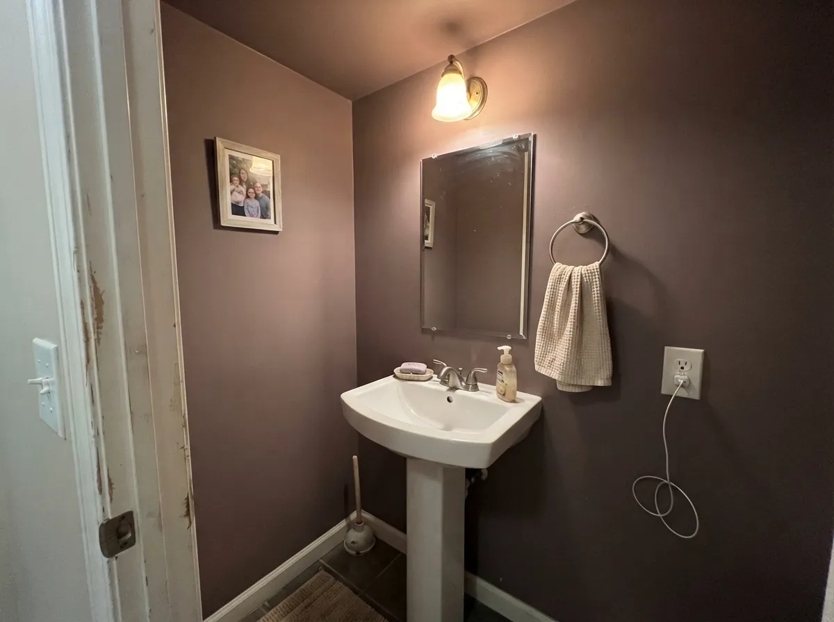
Bedrooms you want to feel enclosed and quiet · dining rooms used mostly at night · kitchen islands and built-ins with brass and oak · powder rooms painted walls-and-ceiling
Your room faces north and gets no direct sun · you want a color that looks the same all day · your counters are cool gray quartz or marble · you need the room to feel bigger
- Dark and cocooning without the coldness of charcoal or navy
- Reads soft and lived-in — more old velvet than trendy accent
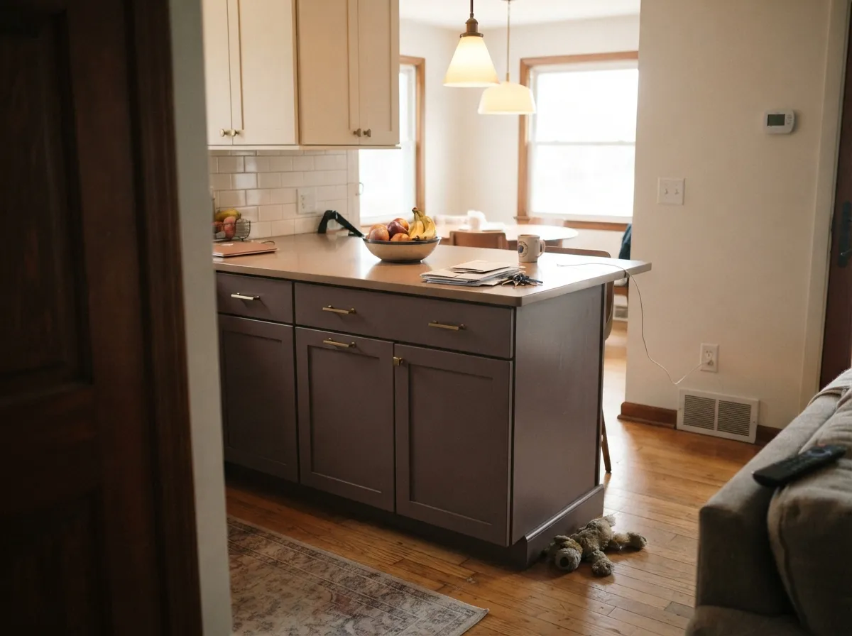
- Excellent on cabinets, islands and built-ins with brass and oak
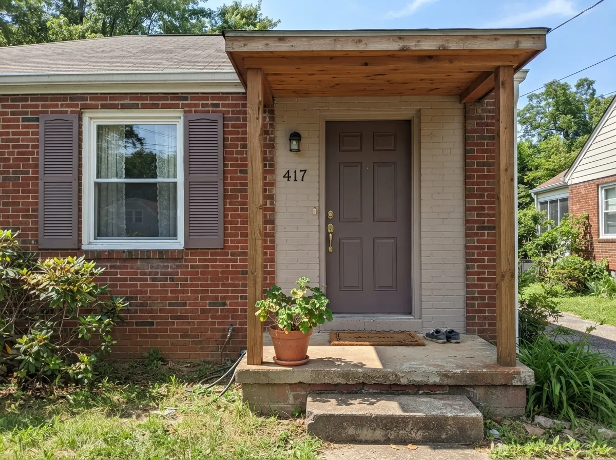
- Flatters warm wood, cane, terracotta and red brick
- Small dark rooms — powder rooms, dens — feel deliberate in it
- Flips between brown and lilac depending on light and bulbs
- Goes muddy and colorless in dim or north-facing rooms
- Fights cool gray marble, quartz and blue-gray tile
- At LRV 19 it makes an already small room feel smaller
What Color Is Cinnamon Slate, Really?
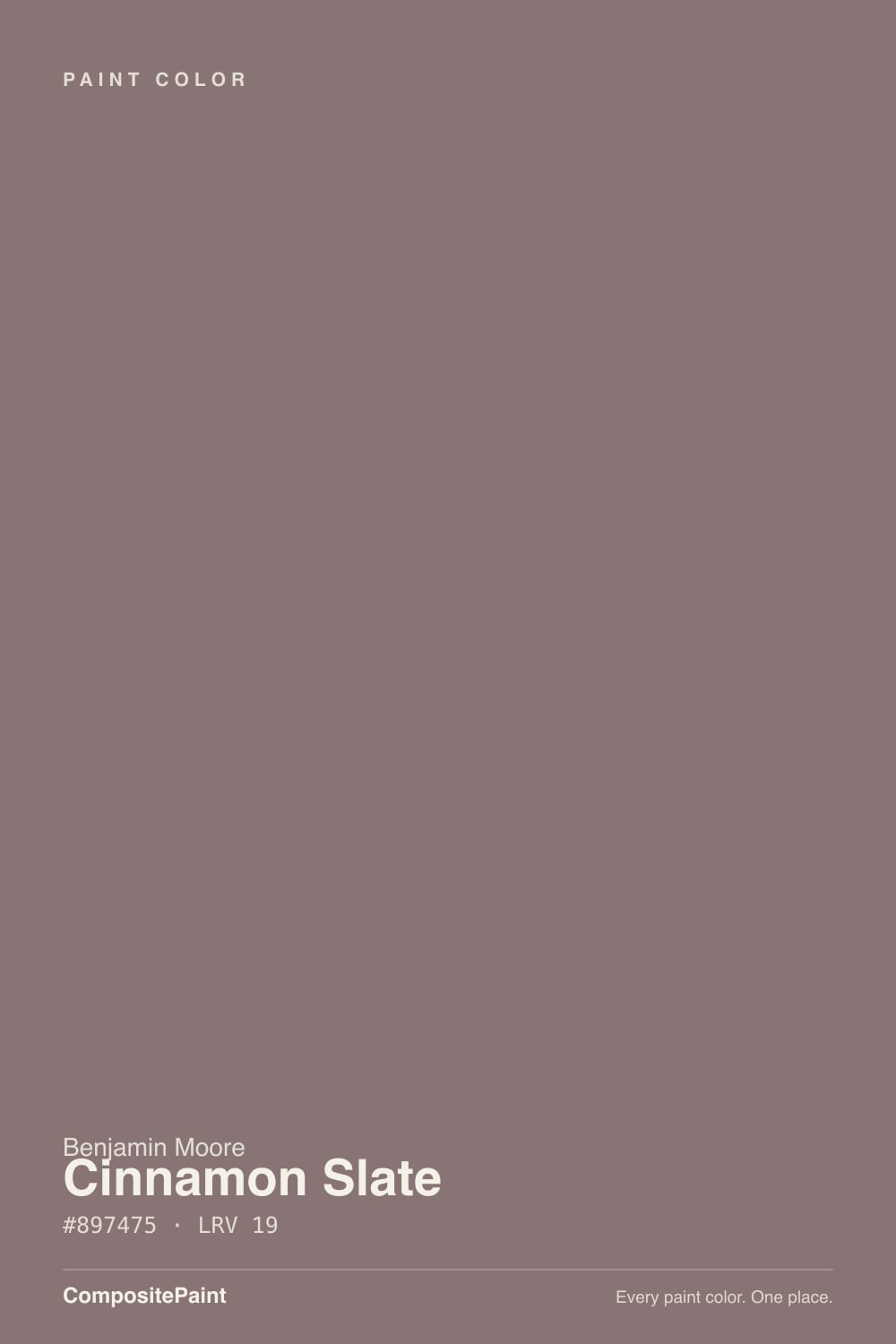
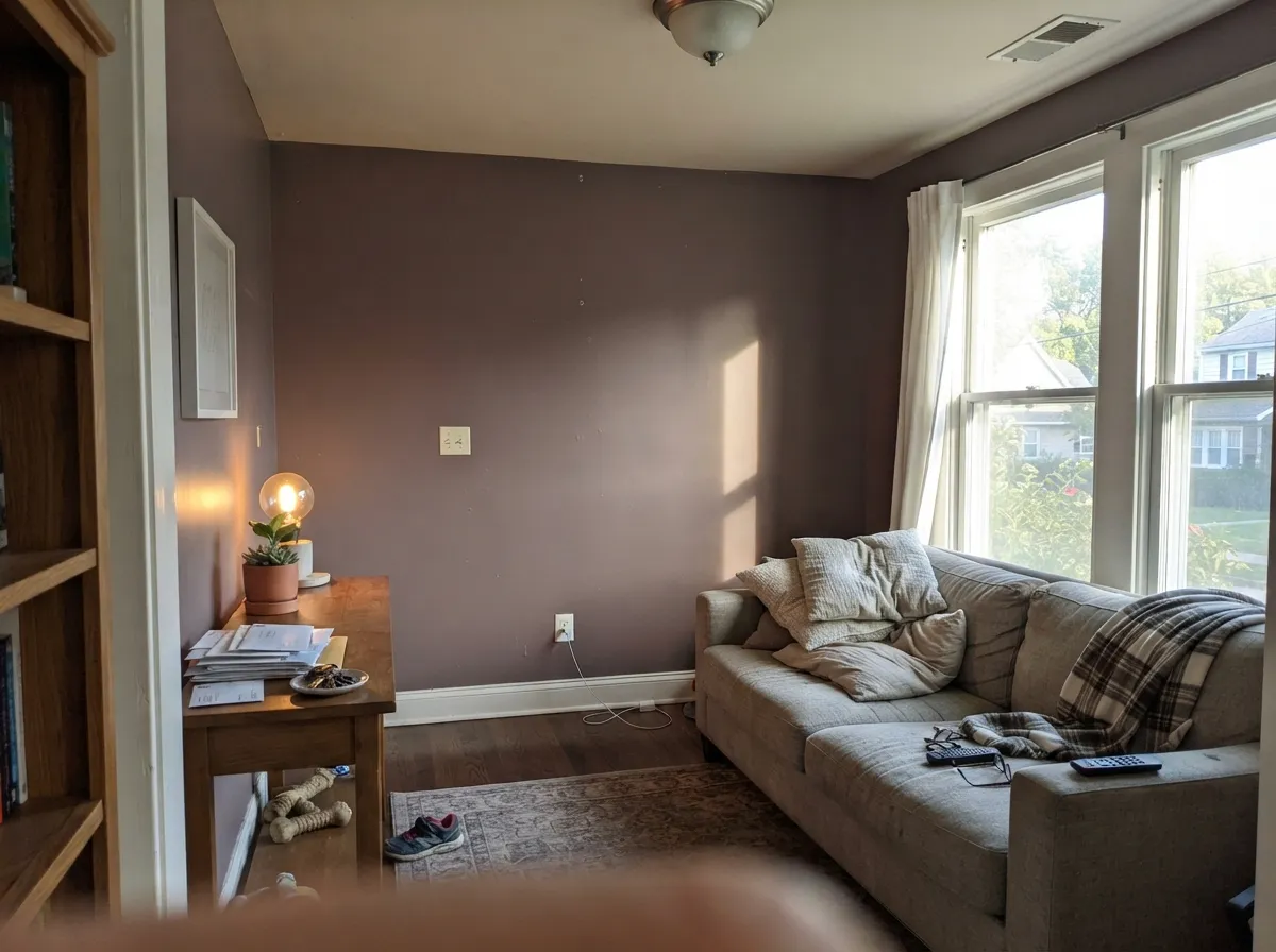
A dark dusty mauve built on red — but almost all of the red has been grayed out. That is the whole personality. At only about 8 percent saturation there is not enough color left to hold a single identity, so the wall borrows from whatever light and materials surround it. Warm sun and warm bulbs pull the brown forward and you get the cinnamon the name promises. Cool, indirect light pulls the red toward violet and you get a dusty lilac. Both are the same paint. People who love it call it velvety; people who return it say it changed on them.
At LRV 19 this is a genuinely dark color, not a moody mid-tone. For scale, Evergreen Fog (SW 9130) sits at LRV 30 and already reads deep on a wall — Cinnamon Slate absorbs meaningfully more light than that, while still stopping well short of a true dark like Hale Navy (HC-154) at LRV 8. In practice that means it will make a room feel smaller and quieter, and it will need lamps to stay a color after sunset rather than turning into a shadow.
Undertone in one line: grayed red — mauve in cool light, brown in warm light, never pink. If your sample looks flat gray-brown, the room is short on light, not the paint.
Where It Shines
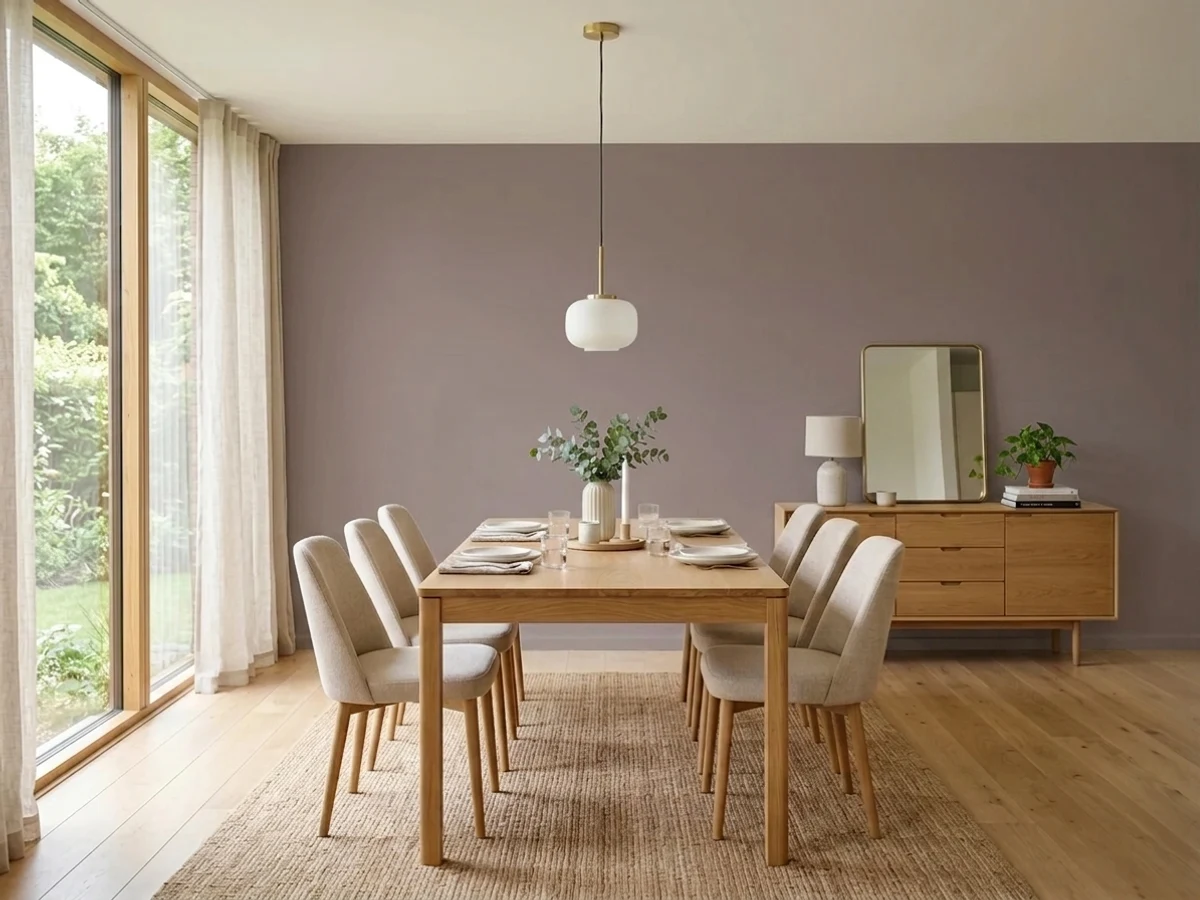
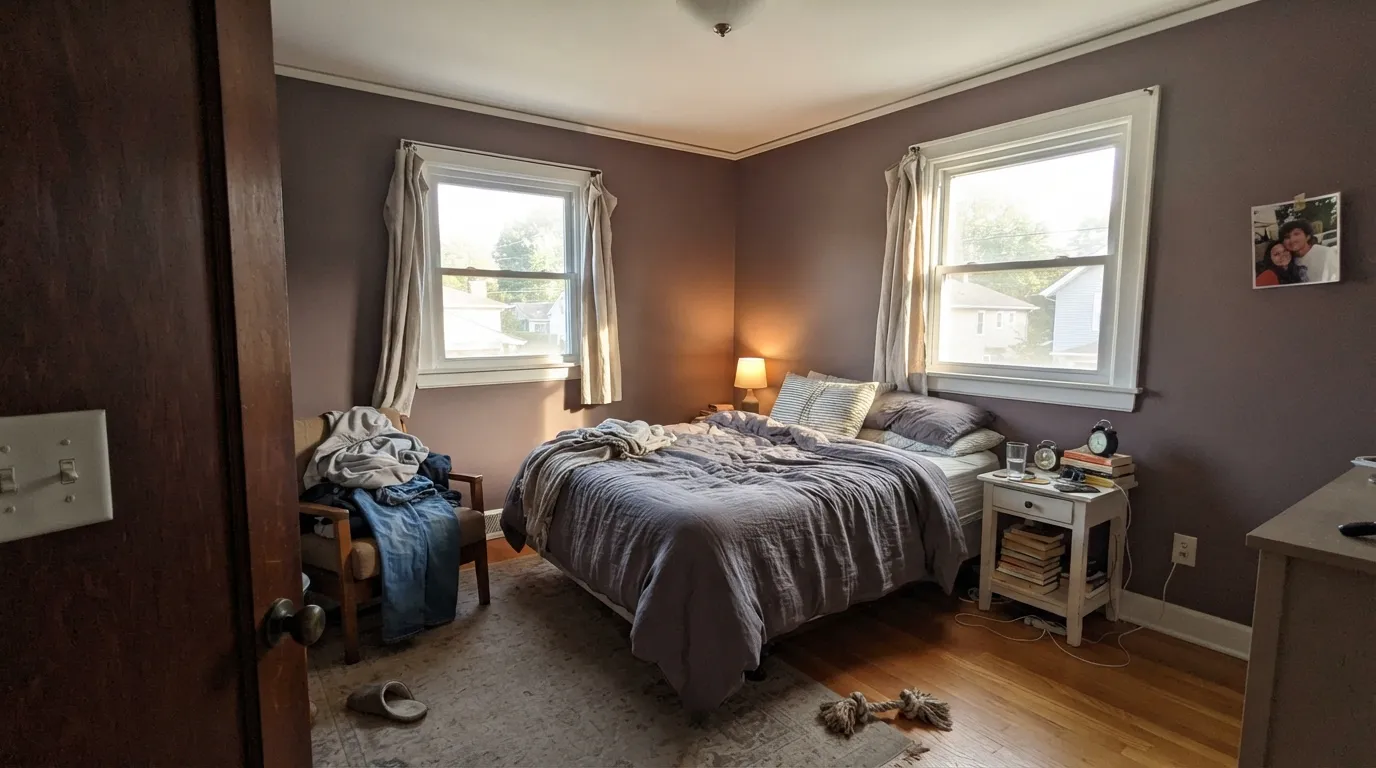
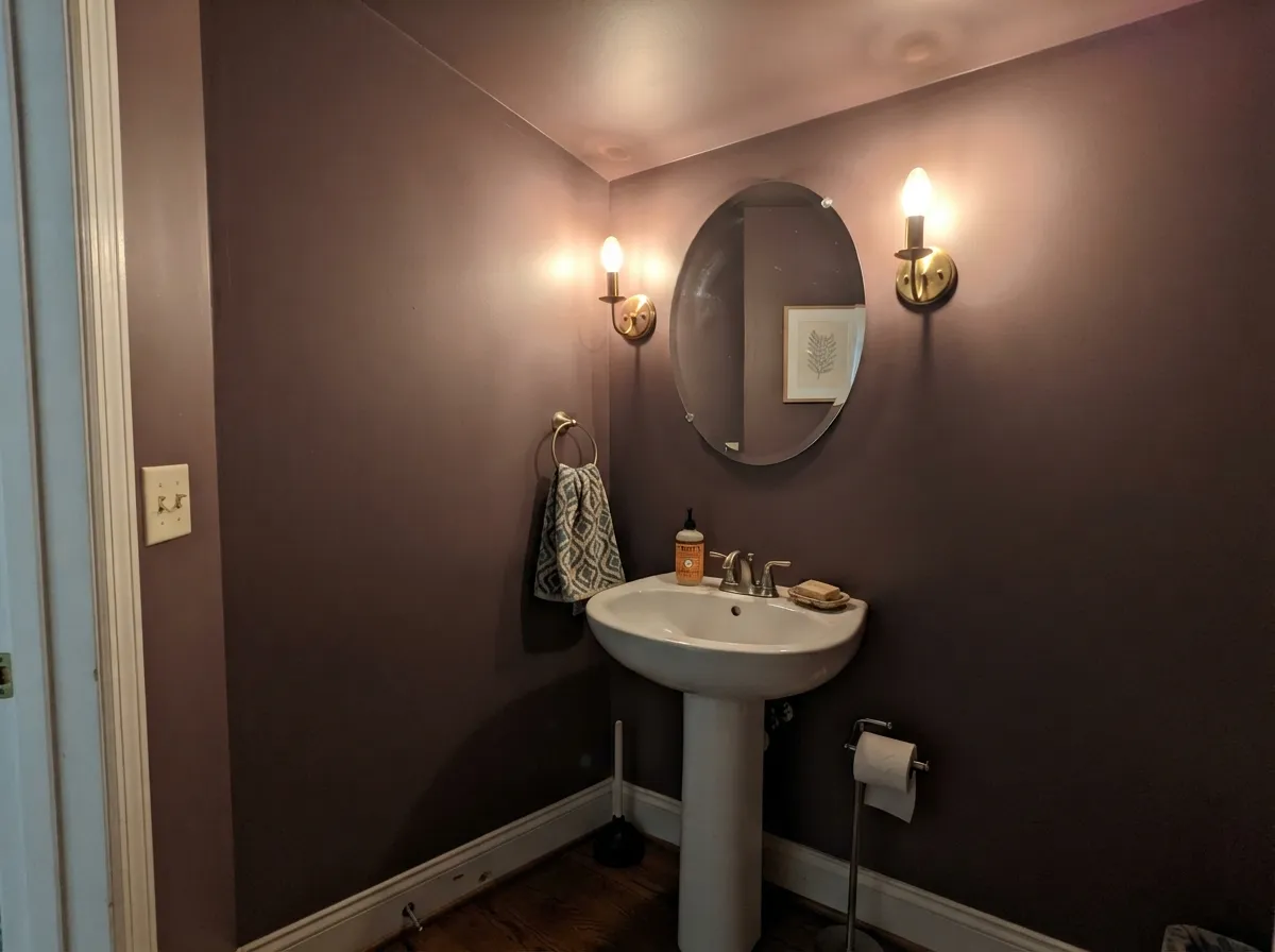
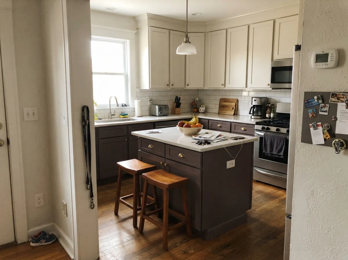
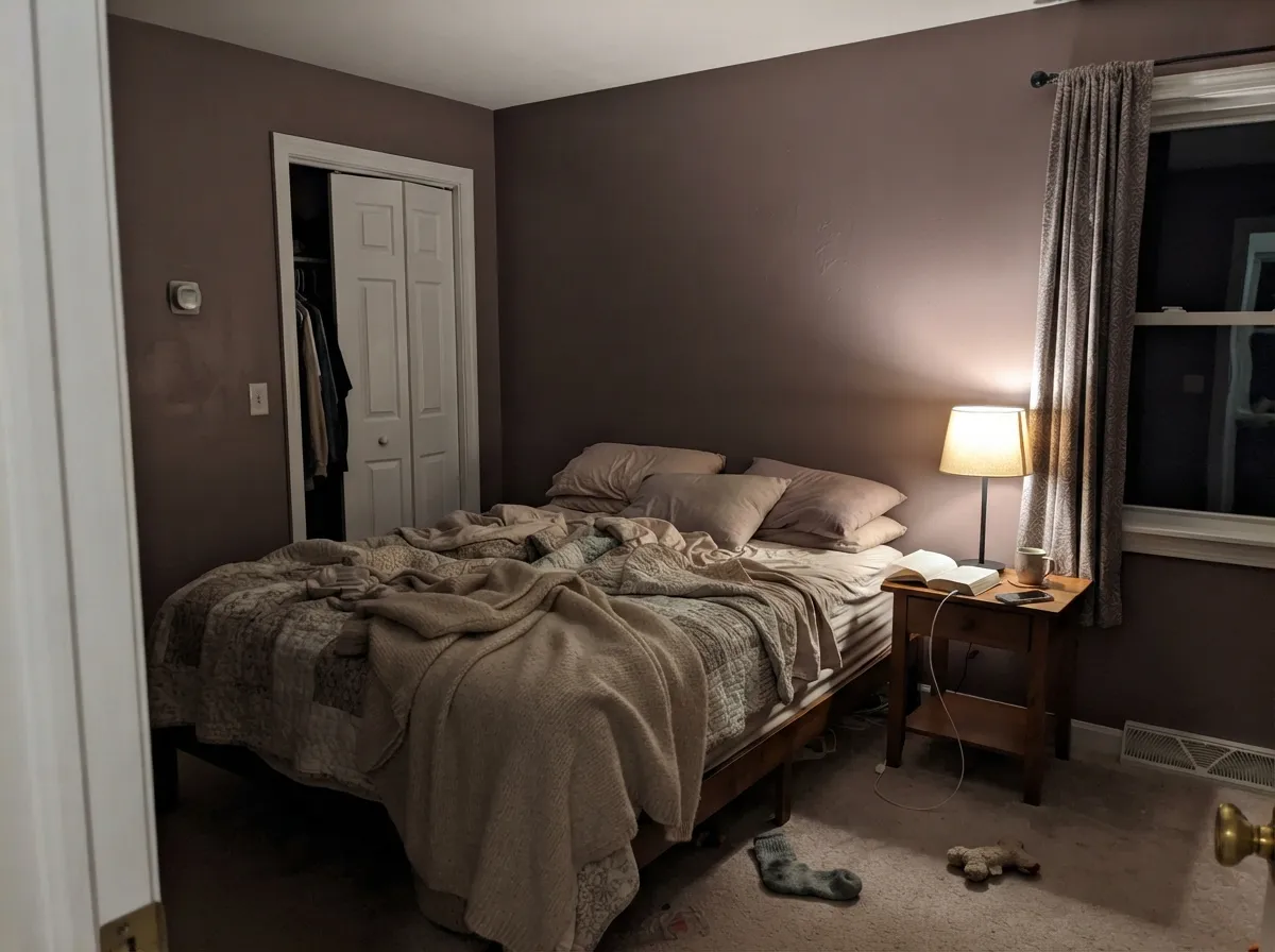
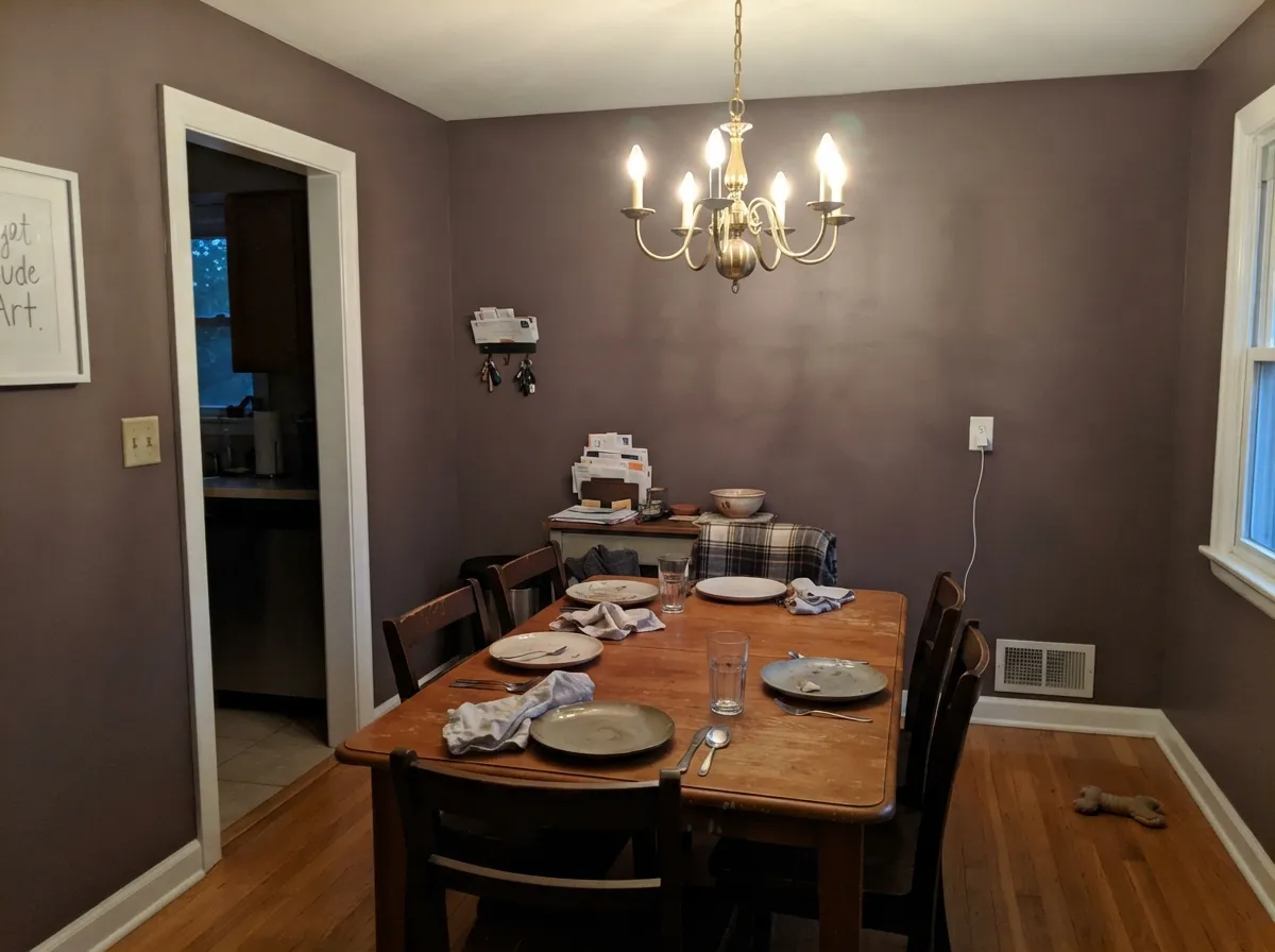
Its best rooms are the ones you already wanted to feel enclosed: bedrooms, a dining room used at night, a powder room done top to bottom. It also does something charcoal cannot — it gives cabinetry and millwork real depth while still reading warm, which is why it turns up on islands and built-ins next to brass and oak.
Where It Fails
The one-star stories about Cinnamon Slate are all the same three stories, and none of them are about coverage or quality. They are about light and about what sits next to it. If your room matches one of these, no second coat will save it.
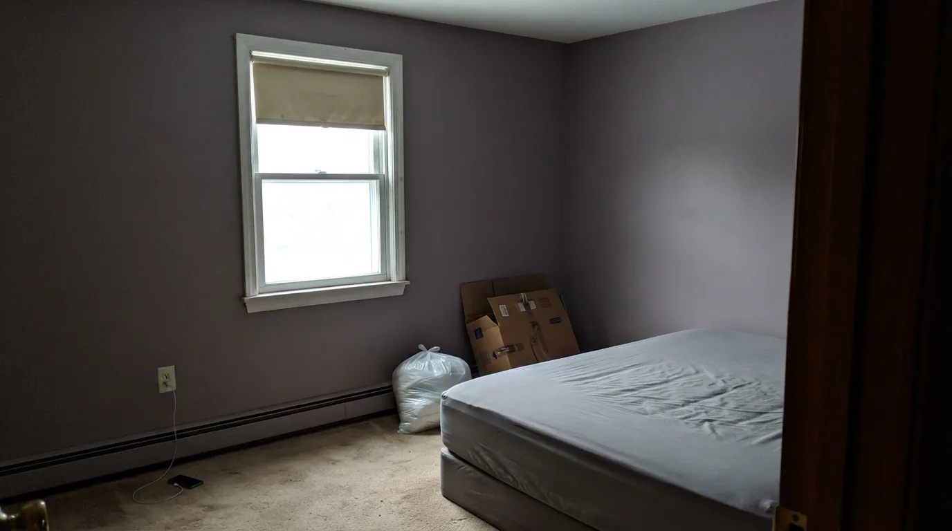
Cool, flat north light strips out the brown and leaves the violet side exposed — people expecting cinnamon end up with a dusty lilac bedroom. It is the most common complaint by a wide margin. If you want the same depth without the purple flip, use Chocolate Velvet (BM CSP-235) at the same LRV 20.
At LRV 19 there is very little light to give back. In a dim den or a hallway with no fixture aimed at the wall, the color stops reading as mauve at all and goes muddy brown-gray. Either add lamps pointed at the walls, or step way up in the same family with Balboa Mist (BM OC-27) at LRV 67.
Put it beside a beige or taupe of similar weight and both colors look undecided — the beige goes yellow and Cinnamon Slate goes purple. This color needs a big gap to read clearly: pair it with something much lighter like White Dove (BM OC-17) or much darker like Hale Navy (BM HC-154), not with a same-depth greige.
Room by Room
Your Light Is the Risk
Direct sun brings the cinnamon out — warm, red-brown and rich right through the afternoon.
Cool flat daylight pulls the violet forward and the brown vanishes. Sample here first.
2700K lamps make it brown and cozy. 4000K LEDs turn it gray-purple — change bulbs, not paint.
Too little light to reflect at LRV 19; the mauve flattens into muddy brown-gray.
Most complaints about Cinnamon Slate are a light mismatch. Upload a photo of your actual room and see it on your walls — then ask for the same wall in north light or evening lamps before you buy a single sample.
Need It From Another Brand?
Any paint counter can custom-tint Benjamin Moore 2113-40 directly. If you would rather stay in one brand's own deck, these are the closest stock matches, measured as ΔE2000. Under 2 is a difference you will not see on the wall.
| Brand | Closest color | ΔE | LRV | |
|---|---|---|---|---|
| Sherwin-Williams | SoulmateSW 6270 · Sherwin-Williams | 3.1 | 20 | Color page → |
| Behr | Smokey ClaretHDC-AC-28 · Behr | 1.9 | 18 | Color page → |
| PPG / Glidden | Choo ChooPPG1047-6 · PPG / Glidden | 1.5 | 19 | Color page → |
| Glidden | Choo ChooPPG1047-6 · Glidden | 1.8 | 19 | Color page → |
| Dutch Boy | Weathered Plum403-5DB · Dutch Boy | 4.0 | 20 | Color page → |
| HGTV Home by Sherwin-Williams | Alder BranchHGSW 3423 · HGTV Home by Sherwin-Williams | 4.0 | 20 | Color page → |
Similar Benjamin Moore Colors
The nearest shades to Cinnamon Slate within Benjamin Moore's own range, ranked by perceptual color distance — useful when you want the same look a touch lighter, darker, or warmer.
WCAG 2.1: AA is 4.5 : 1 for normal text, 3 : 1 for large text, AAA is 7 : 1.
Cinnamon Slate vs the Colors You're Also Considering
Every Cinnamon Slate sample board has the same rivals on it. The numbers show the real lightness gap — then it comes down to which risk you would rather live with.
Pick this when you want more brown and less obvious purple.
Benjamin Moore CSP-415 · LRV 21Quietly VioletPick this for a slightly lighter, softer mauve in a dim bedroom.
Pick this if you want the color quiet, dusty and undecided on purpose.
Benjamin Moore AF-625 · LRV 21AplombPick this when you actually want plum, not a maybe-brown.
Quietly Violet CSP-415 at LRV 21 is the closest relative. At #917876 it is a shade lighter and slightly more purple than Cinnamon Slate at #897475, so it feels softer and less brown. Aplomb AF-625 at LRV 21, hex #94717D, pushes further toward plum and reads as a clearer mauve.
Going the other way, Chocolate Velvet CSP-235 at LRV 20 and Beachcomber 993 at LRV 19 drop the red and land in warm brown territory. Granite AF-660 at LRV 21 removes almost all the hue and reads as a plain warm gray.
Across brands, PPG Choo Choo PPG1047-6 at deltaE 1.48 and Glidden Choo Choo PPG1047-6 at 1.8 are visually identical in normal room light, as is Behr Smokey Claret HDC-AC-28 at 1.93. Rodda Essence R117 at 2.11 and Sherwin-Williams Soulmate SW 6270 at 3.15 are very close, but sample first. Dunn-Edwards Cave of the Winds DE6040 at 3.44 and Dutch Boy Weathered Plum 403-5DB at 4 are close but visibly different side by side.
Cinnamon Slate Coordinating Colors
The rule with this color is contrast in value, not more color. It is dark and low in saturation, so anything of similar depth sitting next to it turns both colors to mud. Give it partners that are clearly lighter or clearly darker and it snaps into focus.
Warm whites keep the scheme soft and traditional; a cool white sharpens the edges and pulls the purple side forward, which can be exactly right in a modern powder room. On the darker end, a navy or a brown of real depth gives it something to sit against. These are the partners that do the most work:
Cinnamon Slate on Cabinets and Islands
This is where the color earns its money. Cabinets get seen up close and under task lighting, which is the one situation where its low saturation stops being a liability — the light is consistent, so the color stays put. An island in Cinnamon Slate under lighter perimeter cabinets is the safest version, and it gives the same weight as a charcoal island without the cold gray edge.
Materials decide it. Brass, aged bronze, oak, walnut, cane and warm quartz all pull the red base forward and make the cabinets look considered. Cool gray marble and blue-gray tile do the opposite and leave the doors looking purple and stranded. Use a cabinet-grade enamel in satin — a matte cabinet in a dark color shows every fingerprint around the pulls.
Lighter and Darker Versions of Cinnamon Slate
If the color is right but the depth is wrong, you do not have to leave the family. Going lighter is the usual fix, because most of the regret stories are really about a room that could not carry LRV 19. Balboa Mist at LRV 67 is a much lighter warm gray with the same faint violet in it, and Quietly Violet is only a step lighter but noticeably more open and purple.
Staying at the same depth and changing the direction is the other move. Chocolate Velvet keeps the weight and drops the purple risk entirely; Granite keeps the weight and drops nearly all of the color, which is what you want if the mauve turned out to be the part you disliked.
Three Ready Palettes Built on Cinnamon Slate
A color is never alone on the wall. These are complete combinations in the 60-30-10 pattern, with the reason each one holds together. Every one opens in the visualizer.
White Dove is warm enough to keep the mauve soft while still being 60 points lighter, which is the gap this color needs to read as a hue instead of a shadow. Balboa Mist carries the same faint violet-gray base into the hallway, so the doorway feels like a step down in volume, not a change of subject.
Try this palette in your roomThe dark cabinetry does the 60 percent work at eye level while the walls stay quiet and light, which keeps the kitchen from closing in. Revere Pewter's warm greige sits on the same warm side of the fence, so uppers and lowers relate instead of competing — and both of them love brass and oak.
Try this palette in your roomPainting the ceiling too removes the line that makes a small dark room feel low, and Chantilly Lace gives the hard bright edge that keeps the mauve legible in lamplight. The brown door pins the color's warm side down so the whole room cannot drift purple after dark.
Try this palette in your roomCinnamon Slate FAQ
Cinnamon Slate or Quietly Violet — which one?
Quietly Violet is a shade lighter and more openly purple; Cinnamon Slate holds more brown and reads older. If the room gets good sun and you want the cozy cinnamon side, take Cinnamon Slate. If the room is cooler and you would rather commit to the mauve than fight it, Quietly Violet is the honest choice.
What sheen should I use on the walls?
Matte, or eggshell in a bathroom or a hallway that gets touched. Dark colors show every roller lap and every wall dent, and shine makes both worse. A flat, washable matte in a premium line gives the velvety look people want from this color and still wipes clean.
How many coats over a light wall?
Two over an existing light color, but only if you prime with a gray-tinted primer first. Deep bases carry less white pigment and hide poorly, so going straight over builder beige usually means three coats. Tinted primer turns that into two and saves you a gallon.
Can I paint the ceiling the same color?
In a powder room or a small den, yes, and it is the better move — one color overhead removes the line that makes a dark room feel like a box. In a bedroom with an eight-foot ceiling it starts to feel heavy. Keep the ceiling in White Dove OC-17 there instead.
What floors go with it?
Warm wood is the easy answer: oak, walnut, and honey-toned engineered floors all pick up the red base. Cool gray LVP and gray-washed wood are where it gets awkward, because the gray floor pushes the wall toward purple. Terracotta tile and warm stone are excellent with it.
Is it too trendy to live with?
Being a Color of the Year does date it a little, but the underlying color is an old one — grayed reds have been on walls for a century. It will read less current in a few years than it does now, and on cabinets it will read as furniture rather than as a trend. Walls repaint in a weekend either way.
Does it work in a rental or a room I cannot test properly?
No. This is the last color to buy unsampled, because it changes more than almost anything else in the deck. Get a large peel-and-stick sample or paint two coats on a poster board, and move it to a different wall and look again at night.
Have you painted with Cinnamon Slate?
Rate it — one tap helps the next reader decide.
Ask a Question