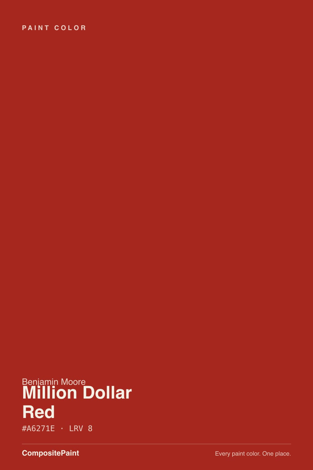
Million Dollar Red
The classic dramatic dining-room red, reviewed honestly: the rooms it was made for, the three coats nobody warns you about, and what to pick instead.

Jessica has spec'd whites and neutrals for more than 300 rooms and keeps a sample wall of painted drawdowns in her studio. Every color review is checked against real reader rooms in the comments and re-tested when a formula changes. About the testing process →
- 1Rookwood Dark Red3
- 2Rumors8
- 3Million Dollar Red13
- 4Cinnamon Slate19
- 5Rejuvenate30
The Fast Verdict
Million Dollar Red is a true, saturated red at near-black depth — not a barn red, not a wine, not a muted heritage brick. Under warm lamps and candles it glows like lacquer and makes a dining room feel like a restaurant you had to book. In flat daylight, or in a room without lamps, the same paint sinks into a heavy brick-brown that swallows the light. It is a spectacular one-room color and a genuinely difficult paint to apply — budget the primer and the third coat before you fall in love with it.
Dining rooms that get used after dark · powder rooms drenched wall-to-ceiling · front doors on a pale house · libraries, studies and one committed accent wall
You wanted a soft brick, oxblood or wine red · the room is dim with no lamp plan · you are painting it yourself in one weekend · you repaint often, or the house is going on the market
- A real, unapologetic red — not a muted brick pretending to be brave
- Glows like lacquer under warm lamps and candlelight
- LRV 13 makes small dark rooms feel intentional instead of cramped
- Powder rooms and front doors: huge effect for one gallon
- Flatters brass, cream, walnut, leather and white china
- Needs gray-tinted primer and two to three finish coats
- Shows every roller mark and lap line, permanently
- Casts pink on ceilings, trim and faces nearby
- Brighter and more theatrical than the wine reds trending now
What Color Is Million Dollar Red, Really?
A full-strength red — the kind that shows up on a lacquered door or a dining room in an old-money house, not the kind that softens into terracotta. Benjamin Moore files it in Color Preview, the collection of clean, saturated statement colors, and that is exactly the right shelf for it. There is a faint orange lean in the pigment, just enough to keep it warm-blooded and stop it turning cold or lipstick-pink, but nobody would call this an earthy red. It is red doing red.
At LRV 13 it belongs to the same depth class as a navy or a near-black: the wall gives you almost nothing back. That has two consequences most people learn after the first coat. First, a red this deep behaves like a dark color before it behaves like a red — the room gets smaller, cozier, more enclosed, which is the whole point in a dining room and a problem in a family room. Second, the little paint chip lies. Two inches of it under store lights reads bright and cheerful; four walls of it reads deep, heavy and considerably more serious.
Undertone in one line: warm red with a faint orange lean — never pink, never plum, never wine. Under 2700K lamps it comes forward and glows; on an overcast afternoon it retreats toward brick-brown. Both are the same paint telling the truth about your light.
Where It Shines
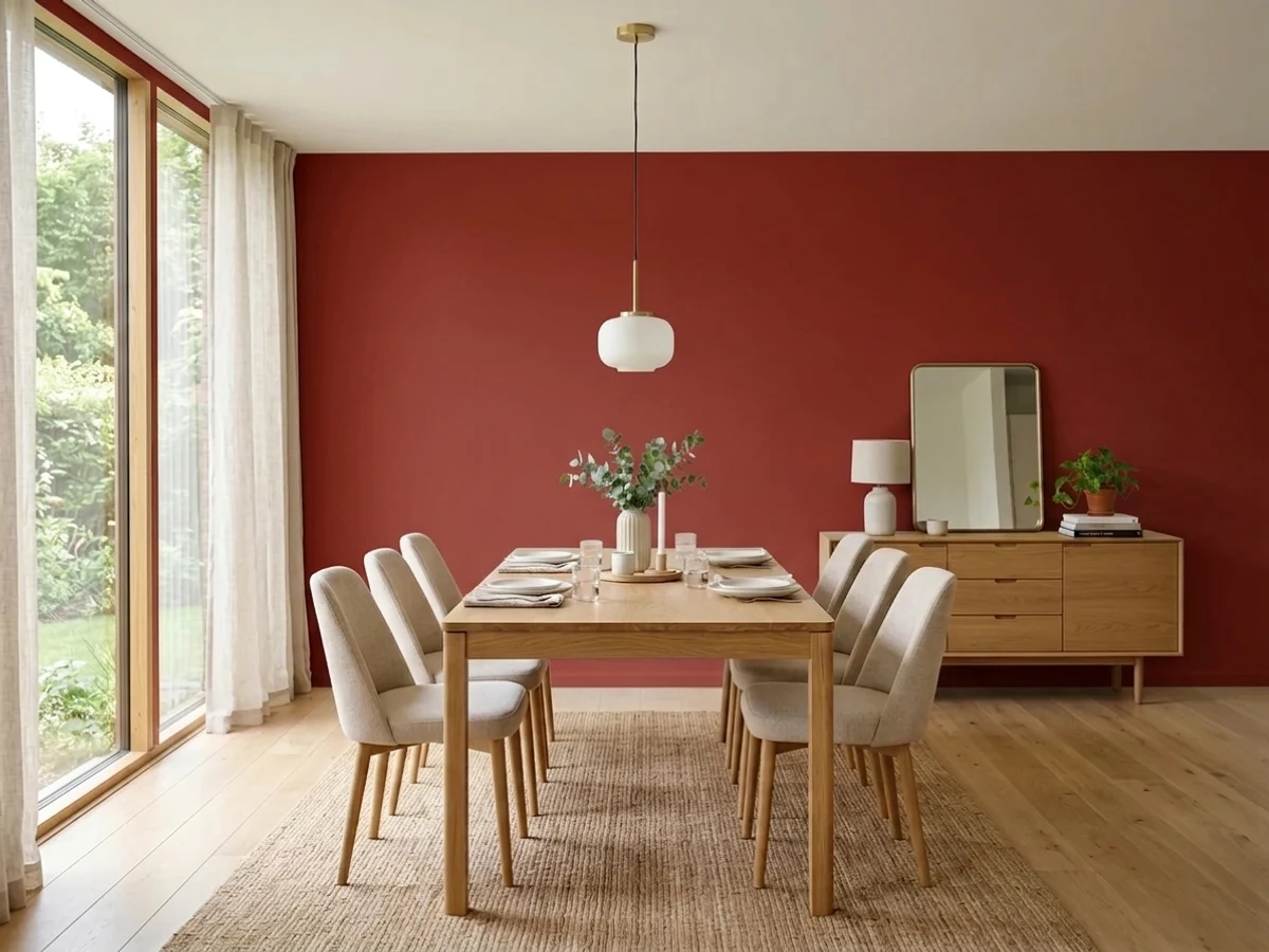
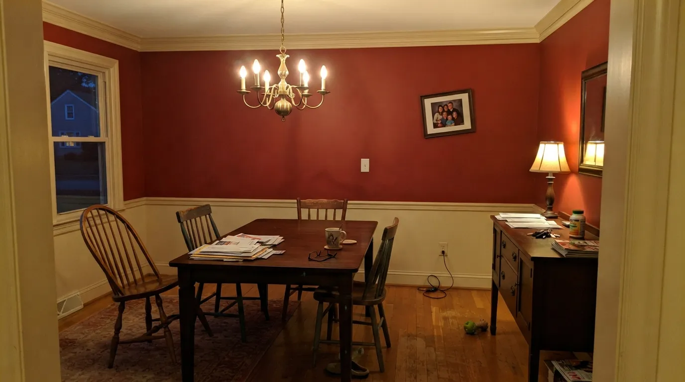
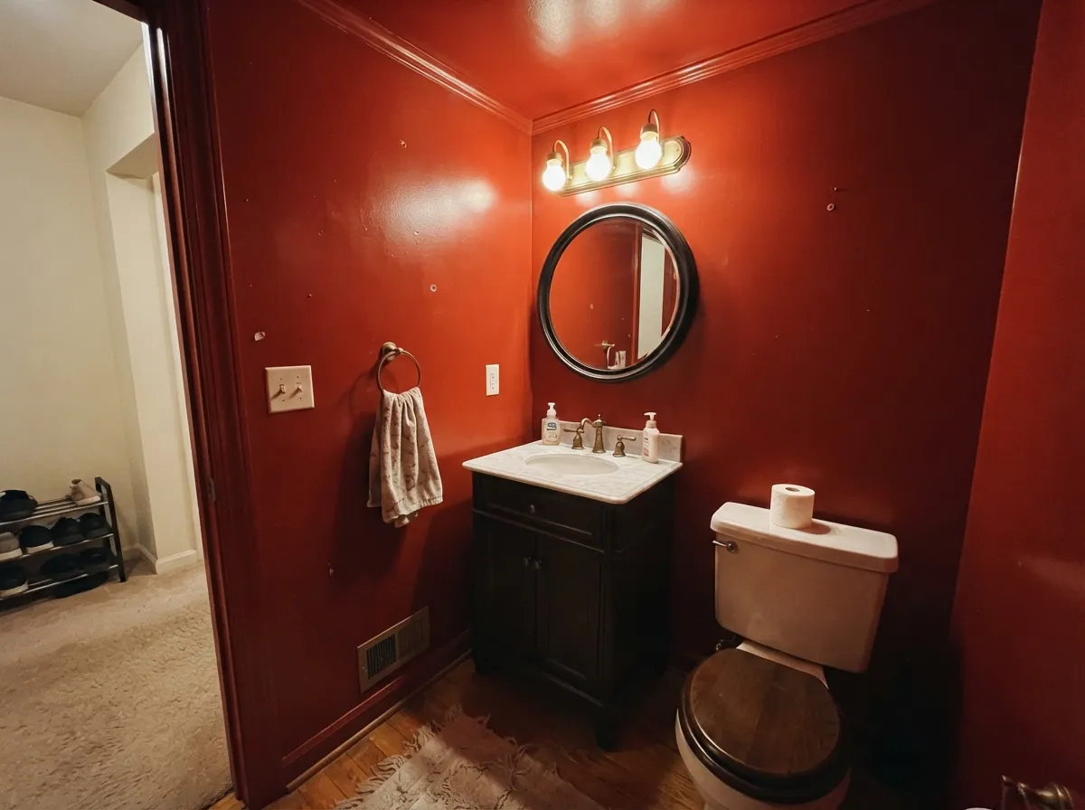
This color is built for rooms that turn on their lamps. A dining room used at night is its home address — warm bulbs and candles wake the red up, the low LRV pulls the walls in around the table, and white china, brass and dark wood all look better against it than against anything neutral. Its second home is the small brave room: a powder room drenched walls-and-ceiling, an interior door, a study lined with books. Give it cream rather than stark white, brass rather than chrome, and one near-black note somewhere in the room, and it reads expensive instead of loud.

Where It Fails
The bad reviews of Million Dollar Red are unusually consistent, and almost none of them are about the color being ugly. Two are about application and one is about expectations. All three are predictable before you open the can — and if your situation matches, no number of coats will save it.
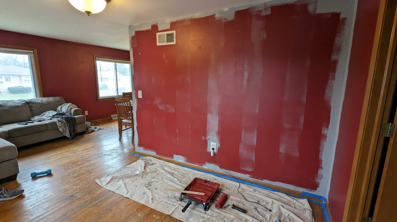
Saturated reds are built on pigments with weak hiding power, so a red this strong routinely needs a gray-tinted primer plus two to three finish coats — and the paint store will tint that primer to the specific gray this red wants if you ask. Worse, red shows every roller mark and lap line, and unlike a beige those marks do not flatten out as the paint dries. Keep a wet edge, use a medium-nap roller rather than a smooth one, and do not try to lay it on thick to save a coat. That is exactly how the blotchy jobs happen.
LRV 13 means the walls stop giving light back, so a room that was merely cozy becomes genuinely dim after sunset. On top of that, a saturated red bounces color: the ceiling picks up a pink cast, white trim reads faintly rosy, and people notice it on faces at the dinner table. In a dining room that is flattering. In a bedroom or a family room where you actually need light, it is the complaint that ends with a repaint.
This is the mismatch behind most regret stories. The 2026 red revival is mostly burgundy, mahogany and earthy clay — muted, browned, grown-up. Million Dollar Red is none of those. It is the older, brighter, more theatrical red, and on four walls it is louder than the chip suggested. If your inspiration photos are wine-dark, look at Bewitched or Behr Rumors instead and keep the mood without the volume.
Room by Room
The classic use, and it still works. Eggshell walls, White Dove or Linen White trim, warm bulbs on a dimmer, and the low LRV does the rest: the table becomes the lit part of the room. Rooms used mostly at night win here; a breakfast room in flat morning light does not.
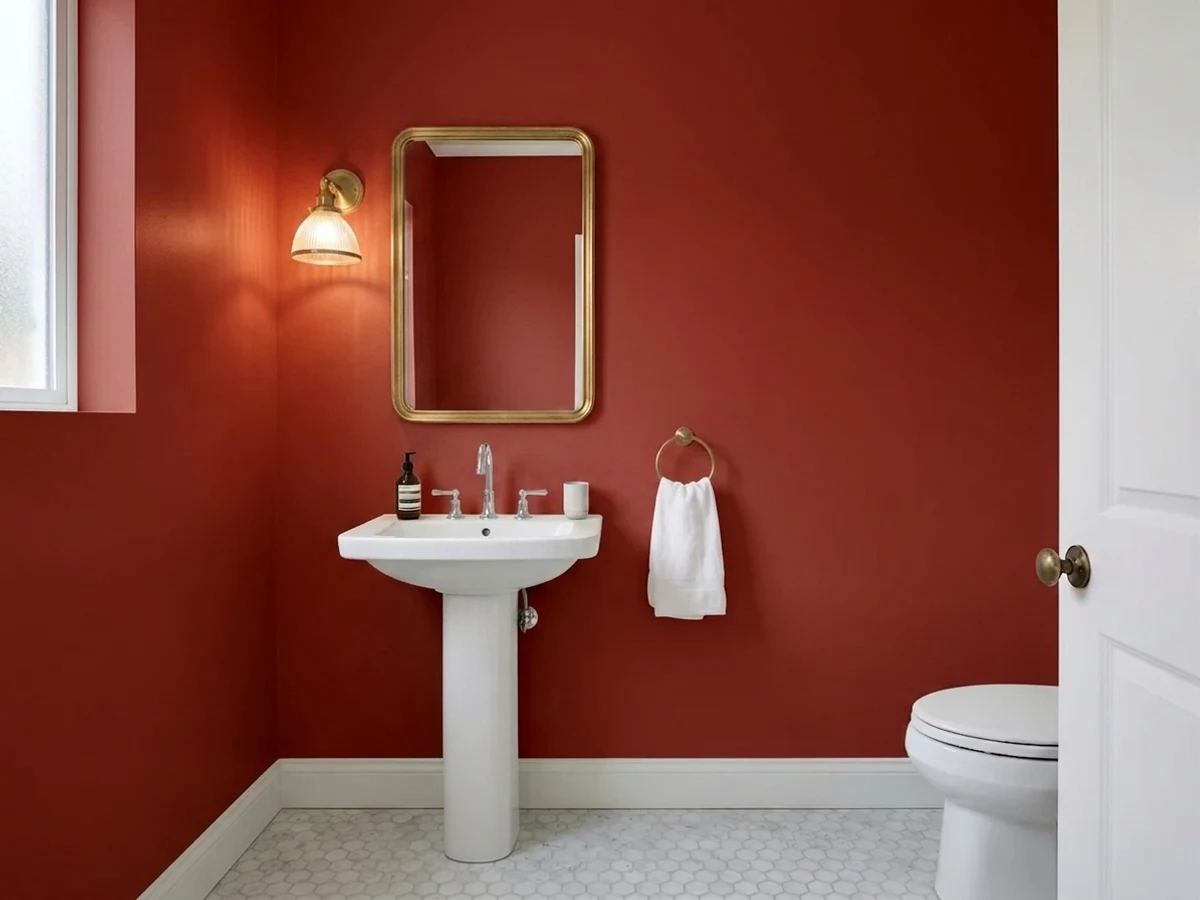
The best small-budget use of this color. Walls, ceiling and trim all in Million Dollar Red at satin or lacquer-gloss turns a windowless closet of a room into the most memorable spot in the house. No daylight means no bad light, and gloss doubles the color off the mirror. Brass fixtures, one dark vanity, done.
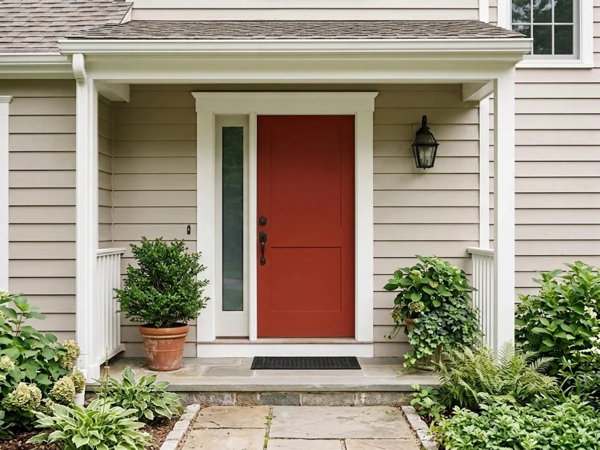
A red front door on a white, cream or pale-gray house is about as safe as bold gets, and semi-gloss keeps it crisp. Inside, an entry hall in red is a genuine traditional move — but only if the hall gets daylight or has real lighting. A dark windowless entry in LRV 13 just reads like a tunnel.
Rooms that never expected to be bright are the easiest place for a deep red. Books, leather and walnut are its natural company, and lamplight is the operating condition it was designed for. Eggshell on walls; if there is millwork, painting it the same red at semi-gloss beats fighting it with white.
Red kitchen walls are a dated look and hard to live with next to food and appliances. A red island or a freestanding hutch under warm off-white cabinets is a different story — charming, deliberate, and reversible for the price of one piece. Satin urethane-fortified cabinet enamel, and expect three coats there too.
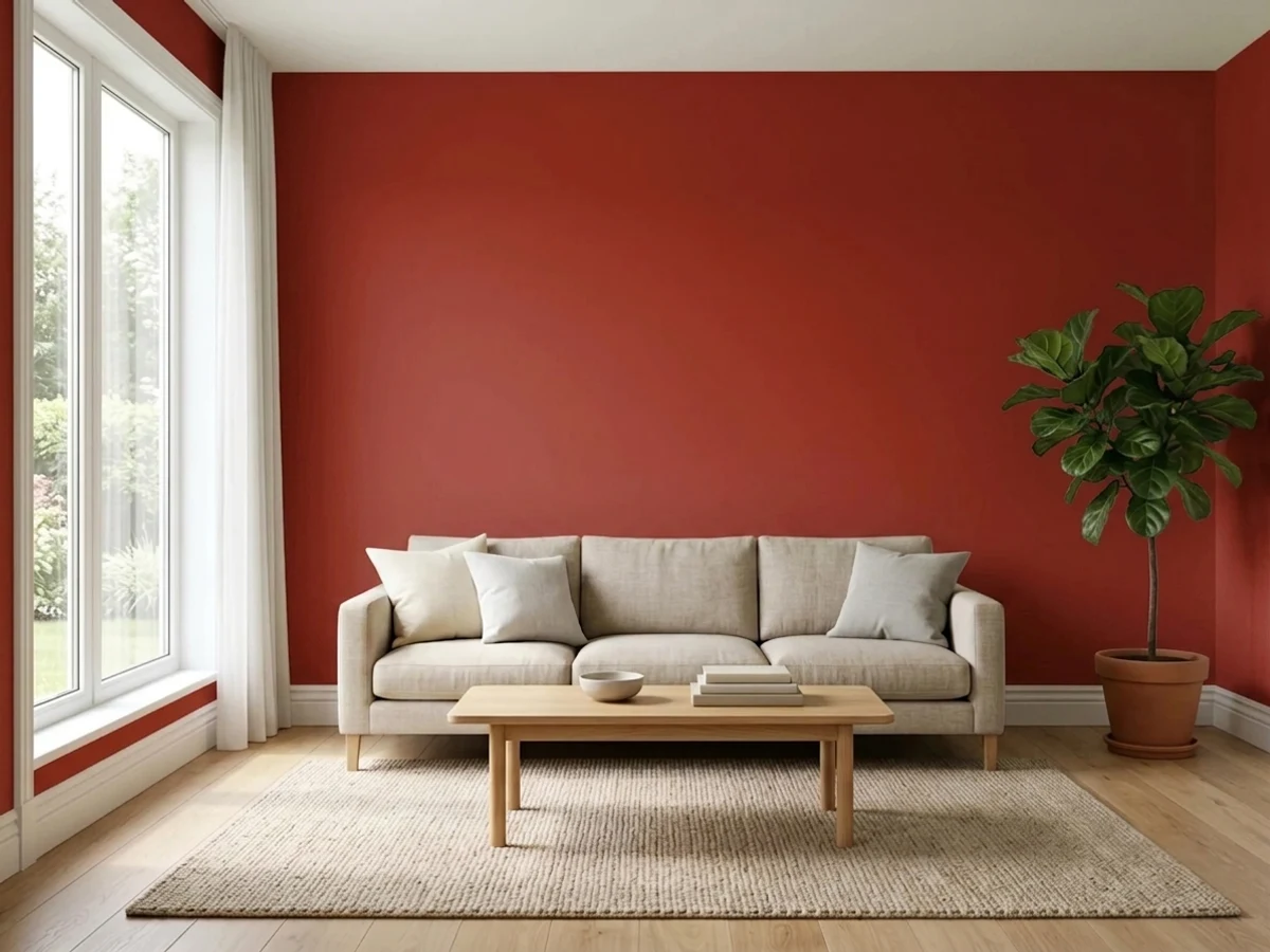
This is the boundary. Red is stimulating and dark at the same time, which is the wrong combination for sleeping and for the rooms where kids and screens live. It also has nowhere to go in an open plan — it needs a doorway to stop at. One room, with a wall to end on.
Your Light Is the Risk
Warm lamps and candles are what this red was made for — the color comes forward, goes glossy-deep and stops looking like paint. Buy it for this light or do not buy it.
Cool gray daylight drains the glow and leaves a heavy brick-brown that reads dull rather than dramatic. A north room with no lamps is where this color disappoints.
Bright and hot at midday, deepening steadily toward wine after four. West rooms get a spectacular hour at golden hour; east rooms get their best light at breakfast and go flat by afternoon.
2700K warm bulbs enrich it and are effectively part of the paint job. Cool 4000K LEDs flatten it into a hard, plasticky fire-engine red — the cheapest fix in decorating is swapping those bulbs, not the walls.
Most complaints about Million Dollar Red are a light mismatch. Upload a photo of your actual room and see it on your walls — then ask for the same wall in north light or evening lamps before you buy a single sample.
Need It From Another Brand?
Any paint counter can custom-tint Benjamin Moore 2003-10 directly. If you would rather stay in one brand's own deck, these are the closest stock matches, measured as ΔE2000. Under 2 is a difference you will not see on the wall.
| Brand | Closest color | ΔE | LRV | |
|---|---|---|---|---|
| Sherwin-Williams | Red ObsessionSW 7590 · Sherwin-Williams | 1.1 | 13 | Color page → |
| Behr | Edgy RedUL110-7 · Behr | 3.5 | 13 | Color page → |
| Valspar | Oh So Red1009-1 · Valspar | 2.7 | 14.3 | Color page → |
| PPG / Glidden | Red GumballPPG1187-7 · PPG / Glidden | 4.9 | 12 | Color page → |
| Glidden | Crimson Red31YR 10/591 · Glidden | 4.6 | 10 | Color page → |
| Dutch Boy | Poppied Red106-7DB · Dutch Boy | 4.1 | 14 | Color page → |
Similar Benjamin Moore Colors
The nearest shades to Million Dollar Red within Benjamin Moore's own range, ranked by perceptual color distance — useful when you want the same look a touch lighter, darker, or warmer.
WCAG 2.1: AA is 4.5 : 1 for normal text, 3 : 1 for large text, AAA is 7 : 1.
Million Dollar Red vs the Colors You're Also Considering
Every Million Dollar Red sample board has the same rivals on it. The numbers show the real lightness gap — then it comes down to which risk you would rather live with.
Pick this when you want the warmer, more lacquered version of the same depth, and the room is lamplit.
Benjamin Moore AF-290 · LRV 8CalientePick this for the balanced benchmark red — Benjamin Moore's 2018 Color of the Year sits a touch cooler and stays read-as-red in more kinds of light.
Pick this when Cottage Red looks muddy to you and you want the clean, saturated version.
Benjamin Moore HC-184 · LRV 11Cottage RedPick this if you actually want barn red — browner, softer, far easier to live with on four walls.
Million Dollar Red Coordinating Colors
The rule for coordinating with a saturated red: go warm and creamy on the light side, near-black on the dark side, and keep stark cool whites out of the room. Red rewards cream, brass, walnut and leather; it fights icy white trim, chrome and blue-gray stone. These are the partners that keep showing up in red rooms that actually work:
Where the Dramatic Red Dining Room Came From — and Where It Is Going
The formal red dining room is not a trend, it is an inheritance. It runs from eighteenth-century English dining rooms through Colonial Revival America to the 1990s, when almost every builder-traditional house in the country got a red dining room and a wallpaper border. That last wave is why the look spent the gray decade in exile: people did not stop liking red, they stopped liking the version of red they grew up with.
Red is back, but it came back wearing different clothes. The 2026 forecasts are full of burgundy, mahogany and earthy clay reds — muted, browned, easy to sit in — and the technique everyone is using is color drenching, where walls, trim and ceiling all take the same shade. Million Dollar Red is not one of those muted reds. It is the older, cleaner, more theatrical one, which is either the reason to choose it or the reason not to.
The honest read: if you want the current mood, a wine red will get you there with less risk. If you want the room that made the mood — the lacquered dining room where the walls hold candlelight and nobody has to ask whether you meant it — this is the actual color, and it has been in the deck for decades waiting for you to be brave.
Million Dollar Red With Wood, Metal and Floors
Dark wood is this color's oldest friendship. Walnut, mahogany and antique cherry share its warmth and depth, so a red dining room with a dark table reads like one idea rather than two. Espresso floors do the same job. Pale white oak works too and gives a more current, less period result — the contrast keeps the room from feeling heavy.
The one wood tone that needs care is orange-leaning golden oak. It is not a clash in the way it is with a violet or a gray, since both sides are warm, but the room can tip entirely orange with no cool note anywhere. The fix is easy and cheap: a large rug, cream trim rather than white, and one dark or green element in the room to break the monotone.
Metals are the easy part. Unlacquered brass and antique bronze are made for this color, matte black works, and even gold leaf on a mirror frame stops looking like too much next to a red this saturated. Polished chrome is the only one that reads cold and slightly clinical against it. For stone, warm marble and soapstone are safe; cool blue-gray granite is the pairing to sample before you commit.
Three Ready Palettes Built on Million Dollar Red
A color is never alone on the wall. These are complete combinations in the 60-30-10 pattern, with the reason each one holds together. Every one opens in the visualizer.
Cream, not stark white, is the historical partner for a red this saturated — Linen White keeps the trim from cutting the walls like a candy-cane stripe, and it flatters the same brass and candlelight the red needs. Wrought Iron on the doors gives the scheme one near-black anchor so it reads deliberate rather than festive.
Try this palette in your roomDrenching every surface in one gloss red removes the edges, which is why tiny powder rooms take this treatment better than big rooms do. Tricorn Black on the vanity stops the red from reading like a single flat block, and the soft Swiss Coffee hallway outside makes opening the door feel like a reveal instead of a collision.
Try this palette in your roomThis is how most people should actually buy this color: one saturated room inside a quiet house. Pale Oak is quiet enough that the handoff at the dining room doorway feels planned rather than abrupt, and running White Dove trim through both rooms is the thread that ties the red back to everything else.
Try this palette in your roomMillion Dollar Red FAQ
How many coats does Million Dollar Red need?
Plan on a gray-tinted primer plus two to three finish coats, and be pleasantly surprised if you get away with two. Deep reds use pigments with weak hiding power, so bare drywall or any pale existing color will ghost through. Ask the paint store to tint the primer to the gray this specific red calls for — it is free, and it is the difference between two coats and four.
Is Million Dollar Red warm or cool?
Warm, with a faint orange lean — it is a true red rather than a blue-red or a wine. That is what lets it glow under lamplight instead of turning cold. It is not a brick or a terracotta either; there is no brown mixed into it, which is exactly why it reads brighter on four walls than most people expect.
Is it too dark for a small room?
Small dark rooms are the best case, not the worst. At LRV 13 the color makes a powder room or a windowless dining room feel intentional and enclosed rather than cramped — the failure mode is a big room you need to be bright, like a family room or a bedroom. The rule of thumb: if the room is used at night and has a door, deep red works.
What trim white goes with it?
A warm white or a cream — White Dove is the default, Linen White or Swiss Coffee if you want the traditional cream-and-red look. Avoid a stark bright white such as Chantilly Lace, which is crisp and cool-toned; against a saturated red it reads like a hard graphic stripe rather than trim. Semi-gloss on the trim, eggshell on the walls.
What finish should I use on red walls?
Eggshell for most rooms. Dead flat hides roller marks best but burnishes into shiny patches wherever a red this deep gets touched, and full gloss on big walls magnifies every drywall flaw. The exception is a small powder room, where satin or a proper lacquer-gloss is the whole point — the shine bouncing off the mirror is what makes those rooms photograph well.
Is red hard to paint over later?
Yes — harder than almost any other color. Going back to a white or a light neutral means a gray or white-tinted primer and usually three finish coats, because the red keeps pushing through as a pink haze. Factor that into the decision if you repaint often or the house may be listed soon. It is not a reason to avoid the color, just a reason to be sure.
Have you painted with Million Dollar Red?
Rate it — one tap helps the next reader decide.
Ask a Question