Cottage Red
The deepest barn red in the Benjamin Moore deck, reviewed honestly: where it reads like oxblood, the shade that turns it to mud, and what to pick instead.

Jessica has spec'd whites and neutrals for more than 300 rooms and keeps a sample wall of painted drawdowns in her studio. Every color review is checked against real reader rooms in the comments and re-tested when a formula changes. About the testing process →

- 1Redwood0
- 2Cottage Red7
- 3Million Dollar Red13
- 4Cinnamon Slate19
The Fast Verdict
Cottage Red is not a red — it is a red pretending to be a brown, or a brown pretending to be a red, depending on the hour. At LRV 5 it sits deep in near-black territory, a Historic Color collection classic built for barn boards, front doors and shutters, not for four walls. In direct or late-day sun the red comes forward and it looks like oxblood leather. In shade it collapses to a flat brownish-black that reads more like a stain than a paint color. Buy it for what it is — a small, saturated, light-hungry accent — and it earns its keep.
Front doors and shutters · barns, sheds and garage doors · a color-drenched dining room or den with real warm light · a kitchen island under warm pendant light
You want a true, bright red · the surface sits in shade most of the day · you were hoping to paint more than an accent · you need it to read the same at every hour
- A genuinely historic, correctly brown-red barn color — not a costume version of one
- Reads as expensive oxblood under warm light, indoors or out
- Classic against White Dove or Simply White trim and siding
- Deep enough (LRV 5) to hold its color in full sun without washing out
- Small-surface commitment — a door or shutters, not a whole house
- Reads more brown than red for buyers expecting a true red
- Goes flat, muddy and nearly black in shade or low light
- Too dark and too saturated for most whole rooms
- Chip and store lighting undersell it — sample it outdoors in real sun before committing
What Color Is Cottage Red, Really?
A deep, browned-down barn red — Benjamin Moore files it in the Historic Color collection, and it wears that heritage honestly. This is not a fire-engine red or a cheerful apple red; it is the color of an old painted barn door or a century-old front door that has weathered into something richer than red. The brown is not a flaw, it is the entire character: strip it out and you get Caliente or Heritage Red, brighter true reds built for a different job.
At LRV 5 it is genuinely dark — deep enough to sit near Benjamin Moore's near-black grays and browns rather than its mid-tone reds. That depth is why the chip can look almost chocolate-brown in the store: red pigment needs light to bounce back at you, and a swatch under fluorescent showroom lighting simply does not give it enough. On a sunlit door it reads unmistakably red-brown; in a shaded breezeway the same paint can look nearly black. Expect the color to move more than almost any other color in the deck depending on the hour and the exposure.
Undertone in one line: brown first, red second, never orange, never purple. If your sample looks flat and cocoa-brown, that is a lack of direct light — not a bad batch. If it looks bright brick-red, that is strong afternoon sun doing exactly what this color was built for.
Where It Shines
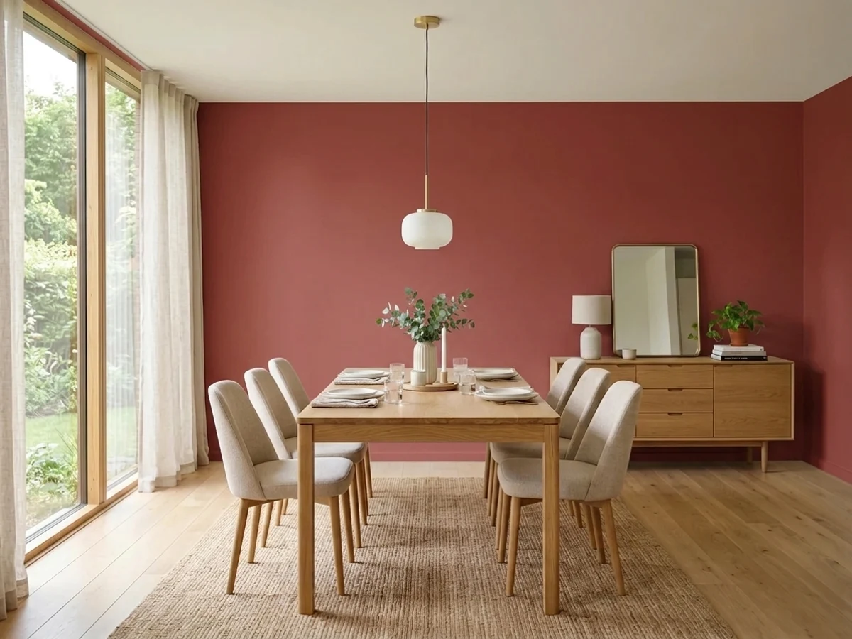
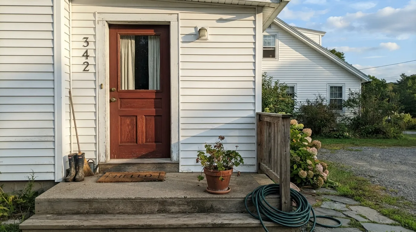
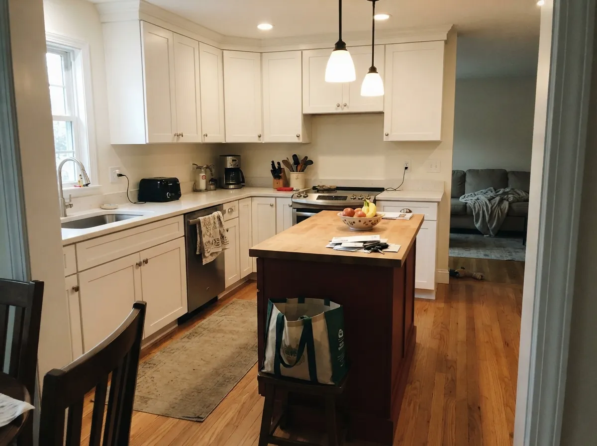
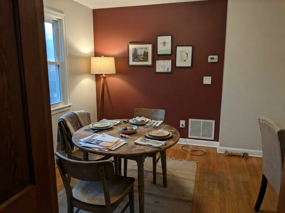
Give it real direct sun and it is one of the most convincing barn reds a paint store sells — deep, leathery, historically correct, the color people mean when they say "old red door." It is built for small, high-contrast surfaces: a front door against white or cream siding, painted shutters, a barn or shed with plenty of open sky overhead. Under warm pendant or lamp light indoors — a dining room, a kitchen island — it turns almost oxblood, which is the effect most people are chasing when they reach for a color this deep.
Where It Fails
Nearly every disappointed story about Cottage Red comes down to one of three mismatches, and all three show up before the paint dries. None of them are the paint's fault — the color is doing exactly what a deep, browned-down red does — but if your project matches one of these, this is the wrong pick.
This is the single most common regret, and it starts at the paint chip: next to Classic Burgundy or Heritage Red, Cottage Red reads noticeably more brown, and some buyers only notice the difference once the door is dry. If you want the color people picture when they say "red door," test Heritage Red or Caliente side by side with Cottage Red before you commit — the brown is not subtle.
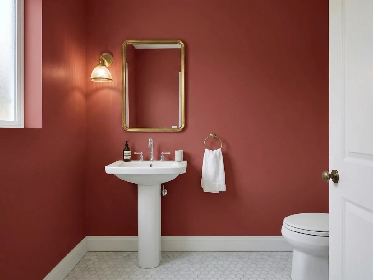
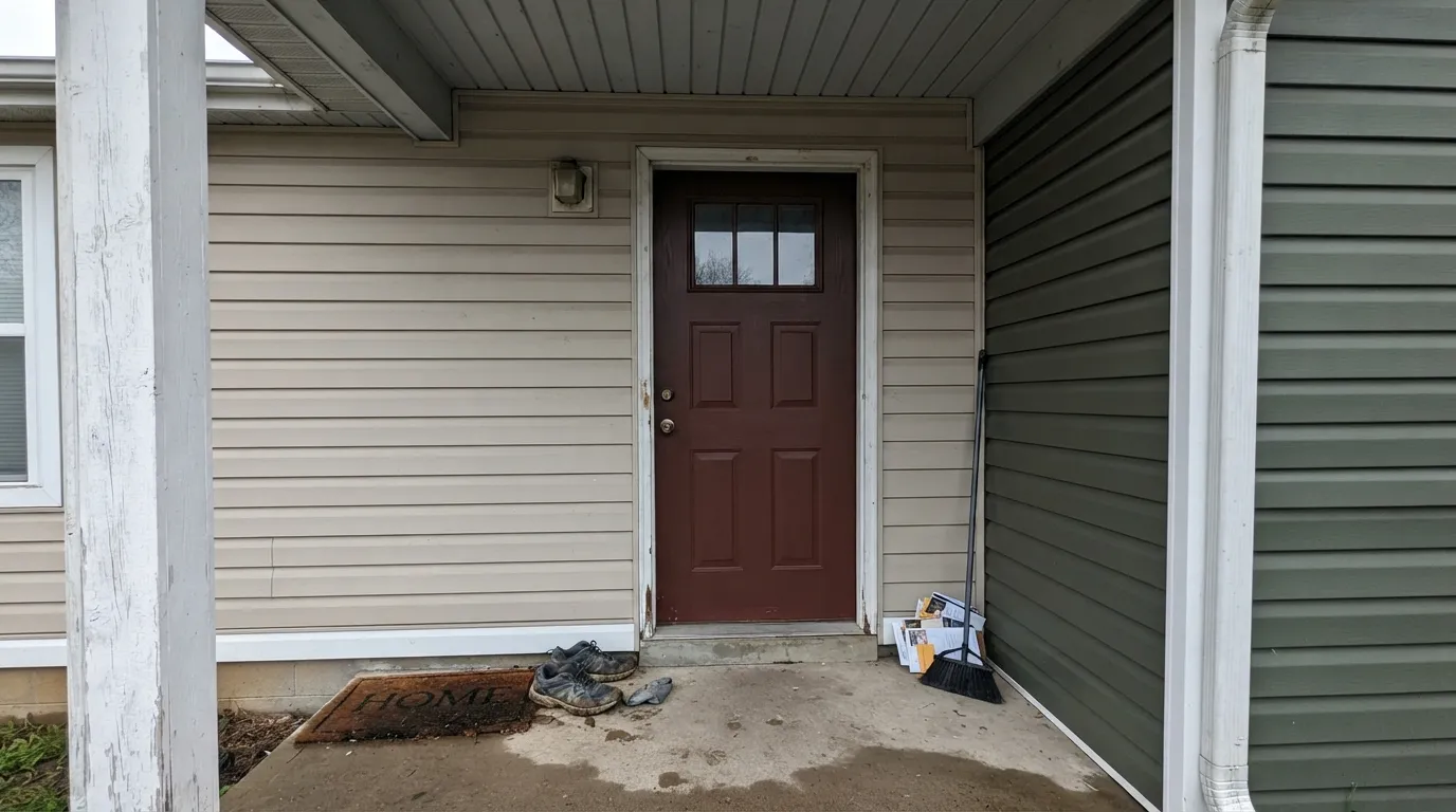
A shaded north wall, a covered porch, an interior corner with no direct light — any of these turn Cottage Red flat and nearly black, losing the red entirely. At LRV 5 there is almost no light to bounce back without help. If the spot doesn't get real sun for at least part of the day, the color will read as a dark brown-black smudge, not a red.
This color was built for a door, a shed, a set of shutters, a dining-room accent wall — not a whole room. Four full walls of LRV 5 in most rooms turn cave-dark by evening and swallow furniture edges and trim lines. Readers who tried it whole-room in anything but a large, bright space report the room feeling smaller and heavier than they expected.
Room by Room
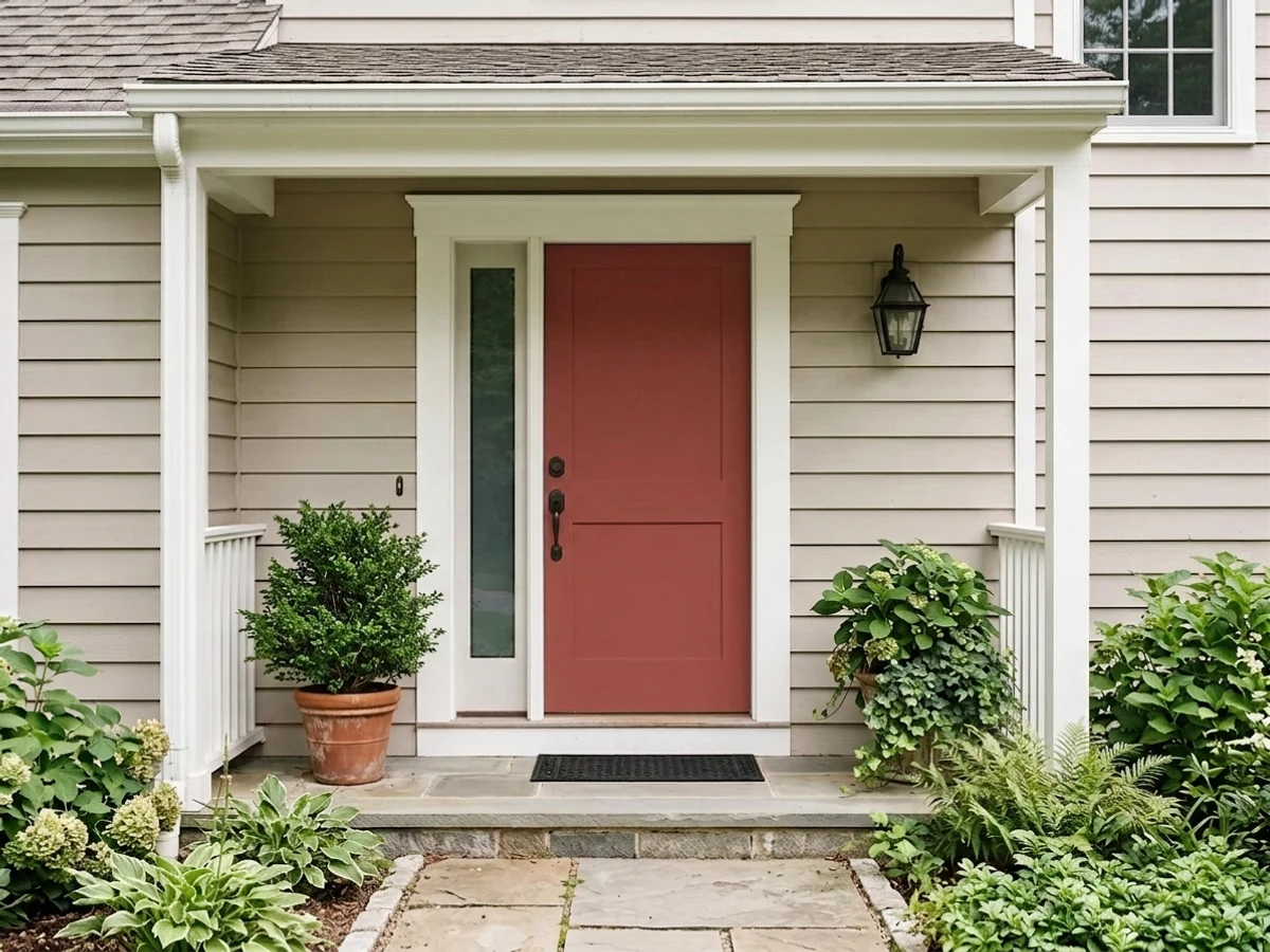
This is what the color was made for. Against White Dove or Simply White siding, in real daylight, it is the classic old-red-door look. Two coats of a proper exterior door enamel, satin or semi-gloss, and prime bare wood first — dark colors show every brush mark on a poorly prepped door.
The color's actual namesake job. Full sun and open sky let it read as a proper barn red rather than a stain. Shutters against a light-colored house body are the second-most-common sighting, and they earn the same daylight requirement as the door.
Walls and trim in one color, warm bulbs, and it turns into the kind of moody, expensive-feeling dining room designers photograph at dusk. Needs a window with real daylight during the day or the room reads muddy rather than rich.
One island under warm pendant light against White Dove or Swiss Coffee perimeter cabinets is a genuinely good look. A full kitchen of Cottage Red cabinetry is a much bigger commitment and needs abundant natural light to avoid looking like dark plywood by evening.
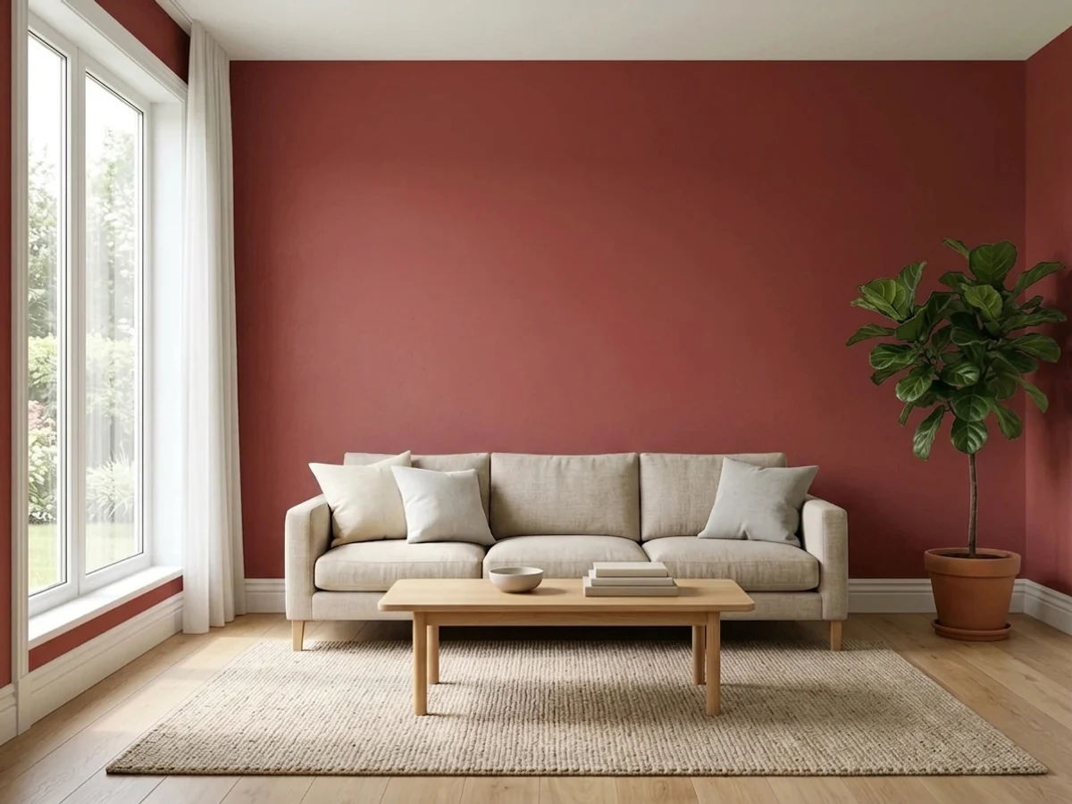
One wall, ideally the one that catches afternoon sun, can anchor a room beautifully with leather and walnut furniture. Four walls in most living rooms is too much depth for daily living — reserve the full-room treatment for a library or den you use mainly at night.
The depth and the brown-red instability under low bedroom lamp light make this a poor fit for a room meant to feel restful. If you want the warmth, use it on a single piece of furniture or a headboard nook instead of the walls.
Your Light Is the Risk
Full afternoon sun is what unlocks the red — the color turns rich, leathery oxblood instead of flat brown. This is the light it was built for.
Without direct light the red drops out and the paint reads as a dark, muddy brown-black. Test on the actual wall or door, not just a sunny sample board.
Vivid red-brown at the sun hours, quiet near-black the rest of the day. The swing is bigger than almost any other color in the deck — expect it, don't fight it.
2700K warm bulbs bring the oxblood back after dark. Cool white LEDs flatten it toward gray-brown — swap the bulbs before you consider repainting.
Most complaints about Cottage Red are a light mismatch. Upload a photo of your actual room and see it on your walls — then ask for the same wall in north light or evening lamps before you buy a single sample.
Need It From Another Brand?
Any paint counter can custom-tint Benjamin Moore HC-184 directly. If you would rather stay in one brand's own deck, these are the closest stock matches, measured as ΔE2000. Under 2 is a difference you will not see on the wall.
| Brand | Closest color | ΔE | LRV | |
|---|---|---|---|---|
| Sherwin-Williams | Sun Dried TomatoSW 7585 · Sherwin-Williams | 2.2 | 5 | Color page → |
| Valspar | VoluptuousM123 · Valspar | 4.8 | 4.9 | Color page → |
| Magnolia Home | By The FireplaceJG-29 · Magnolia Home | 4.9 | 6 | Color page → |
| Backdrop | Stage BeautyBD-SB · Backdrop | 4.8 | 5 | Color page → |
Similar Benjamin Moore Colors
The nearest shades to Cottage Red within Benjamin Moore's own range, ranked by perceptual color distance — useful when you want the same look a touch lighter, darker, or warmer.
WCAG 2.1: AA is 4.5 : 1 for normal text, 3 : 1 for large text, AAA is 7 : 1.
Cottage Red vs the Colors You're Also Considering
Every Cottage Red sample board has the same rivals on it. The numbers show the real lightness gap — then it comes down to which risk you would rather live with.
Pick this for the deeper, more weathered, more historically brown version of the same idea.
Benjamin Moore PM-18 · LRV 8Heritage RedPick this if you want the barn-and-door red to actually read red on the chip, not brown.
Pick this if you want the earthier, more rustic barn character instead of a polished wine red.
Benjamin Moore HC-182 · LRV 7Classic BurgundyPick this for a wine-red door with no brown in it at all — the color most people picture when they hear "burgundy door."
Cottage Red Coordinating Colors
The rule for coordinating with Cottage Red: keep the whites clean and warm, and let it be the only saturated color in the frame. It pairs best with warm and true whites for siding or walls, and near-black neutrals for a second dark note — but it does not want company from other browns, oranges or terracottas, which flatten the contrast that makes it read as red in the first place. These are the partners that keep showing up in projects that work:
A Historic Color, Not a Trend Color
Cottage Red lives in Benjamin Moore's Historic Color collection — a set of colors drawn from period buildings rather than seasonal forecasting. That placement explains why the color behaves the way it does: it was matched to the look of century-old barn doors and painted farm buildings, where pigment had already weathered toward brown, not to a fresh, saturated modern red. It shows up most often on farmhouse and colonial-style exteriors, on barns and sheds, and on front doors of older homes being restored rather than remodeled.
That heritage is also why it resists trend cycles better than a seasonal red would: it was never chasing a moment, so it can't fall out of one. The tradeoff is the opposite of a trend color's problem — it will never look dated, but it will also never look like a bright, cheerful red no matter how you light it.
Cottage Red With Wood, Stone and Roofing
Outside, the materials around Cottage Red matter more than usual because the color is already borrowing from brown. Stained cedar shakes, natural stone and warm brick all sit close to it in temperature, which can make the door disappear into the house rather than stand out — save those pairings for a lighter door color and let Cottage Red work against a painted, not natural, surface. Dark asphalt or slate roofing reads as a clean, cool contrast overhead and keeps the door from feeling like an extension of the roofline.
Indoors, where the color shows up mainly as an accent wall or an island, warm wood floors — oak, walnut, reclaimed barnwood — genuinely flatter it; the shared warmth reads as intentional rather than clashing. The one floor to test carefully is a cool gray-washed wood, which can make the wall look more brown and less red by contrast, the same effect the color has outdoors against stone.
Three Ready Palettes Built on Cottage Red
A color is never alone on the wall. These are complete combinations in the 60-30-10 pattern, with the reason each one holds together. Every one opens in the visualizer.
The oldest trick in the exterior book: a warm white body, a near-black shutter, and one saturated red door as the single loud note. White Dove keeps the siding from fighting the door; Wrought Iron gives the eye a second dark anchor so the red doesn't stand alone.
Try this palette in your roomWalls and trim in one color removes the cut-lines a dark saturated color usually fights with, and a light ceiling keeps the room from feeling like a box. Kendall Charcoal gives the room one more dark note without competing for the red's job.
Try this palette in your roomOne saturated island against calm White Dove perimeter cabinets is the way to use a color this deep without darkening the whole kitchen. Wrought Iron on the hood ties the island's darkness to one more surface so it doesn't look like an accident.
Try this palette in your roomCottage Red FAQ
Is Cottage Red actually red, or is it brown?
Both, depending on the light. It is officially a red in Benjamin Moore's Historic Color collection, but the undertone is genuinely brown, and in anything less than direct sun it reads more brown than red. If you want a color that stays unmistakably red at every hour, look at Heritage Red or Caliente instead.
What exterior colors pair with Cottage Red?
Warm or true whites (White Dove, Simply White) for siding and trim, and a near-black (Wrought Iron, Kendall Charcoal) for shutters or a second door if you want more contrast. Avoid pairing it with anything already brown or orange-leaning — the door needs to read as the one saturated note, not blend into a brown house.
Can I paint a whole room in Cottage Red?
You can, but only in a room with strong daylight and a use pattern that suits a dark, enclosing space — a den, a library, a dining room used mostly at night. In an average bedroom or living room, LRV 5 on four walls reads cave-dark by early evening. An accent wall gets you the color without the commitment.
What's the difference between Cottage Red and Classic Burgundy?
Classic Burgundy is a true wine red — no brown in it. Cottage Red is browner and earthier, closer to an old barn door than a glass of wine. Put the two chips side by side before choosing; buyers who wanted "burgundy" and got Cottage Red are the most common source of regret with this color.
How many coats does Cottage Red need?
Two coats over a similar mid-to-dark color. Going over a lighter existing color or bare wood, use a gray-tinted or deep-base primer first — three finish coats of a color this saturated over a light substrate is the expensive way to find out you needed a primer.
Does Cottage Red work on kitchen cabinets or an island?
Very well on an island specifically — one saturated piece against lighter perimeter cabinets is a strong, popular look. A full kitchen of Cottage Red cabinetry needs real natural light all day or it reads dark and heavy by evening. Use a satin urethane-fortified cabinet enamel either way.
Have you painted with Cottage Red?
Rate it — one tap helps the next reader decide.
Ask a Question