Heritage Red
The Bicentennial barn-red everyone assumes is a soft, muddy brick — reviewed honestly against the true, saturated red Benjamin Moore actually mixes: where it earns its keep, the paint-can surprise that catches owners off guard, and what to pick instead.

Jessica has spec'd whites and neutrals for more than 300 rooms and keeps a sample wall of painted drawdowns in her studio. Every color review is checked against real reader rooms in the comments and re-tested when a formula changes. About the testing process →

- 1Redwood0
- 2Mahogany5
- 3Heritage Red10
- 4Cinnamon Slate19
- 5Rejuvenate30
The Fast Verdict
Heritage Red comes out of Benjamin Moore's 1976 Bicentennial Historical Colors collection, and the name and the collection make everyone assume a soft, browned-down barn red. Sample the actual chip and you get something more confident: a true, saturated crimson-red with almost no brown in it — closer to a fire-engine or signal red than a muddy barn hue. It is a superb door, barn, and accent color that rewards direct sun and punishes shade, and the paint itself has a real reputation for being difficult to apply.
Front doors and entryways · barns, sheds, and garage doors · a kitchen island or one sunlit accent wall · anyone who wants a genuine, saturated red — not a muted brick
You actually want a soft, brownish barn red · your door or wall sits in shade most of the day · you're painting more than one wall or a whole exterior · you're not ready for a thin, self-priming paint that needs constant stirring
- A genuinely pure, saturated true red — brighter and cleaner than its brownish-barn-red reputation
- A proven American classic from BM's 1976 Bicentennial Historical Colors collection
- Full sun brings out a vivid, confident red that photographs beautifully on a door or barn
- Small doses — a door, an island, one wall — read deliberate and custom, never garish
- Pairs easily with crisp or warm white trim and black or charcoal hardware
- Overcast or shaded light drags it toward a dull, brownish red instead of the vivid chip color
- The self-priming formula is genuinely fussy — separates fast, needs frequent stirring, doesn't roll on smoothly
- Too saturated and specific for a full room or a whole exterior
- Buyers expecting a soft, muted barn brown get a louder, purer red instead
What Color Is Heritage Red, Really?
A true, saturated red with a whisper of blue-crimson rather than orange-brick. Plenty of reference sites describe Heritage Red as a muted, earthy, brownish barn red — and on an overcast day, in a photo, that read is understandable. But the deck formula is cleaner and more assertive than that reputation: red channel high, green channel very low, blue channel a touch higher than green. That is the signature of a true signal red with a cool, crimson lean, not a warm orange-brick lean. It is named for a decades-old American collection, but the chip itself is louder than "historical" usually sounds.
At LRV 8 it is a near-black-value color despite reading as a bright hue — deep, saturated colors always score low on the reflectance scale even when the color itself feels vivid. That gap between depth and vividness is exactly what makes the light behavior so dramatic: full midday sun pushes it toward a true, confident red, while overcast exterior light and shade pull it back toward a dull, brownish red. Owners who sample it under one kind of light and paint under another are the source of most of the surprised reviews.
Undertone in one line: crimson-red first, with a cool blue-red lean — never orange, never true brown. One real owner account describes opening the can and finding "it's not red, it's bright pink" before it goes on and cures to full depth — a fair description of a wet, thin, highly saturated red base before it settles. That same account calls the paint itself, a self-priming two-in-one formula, genuinely difficult: it separates and needs stirring roughly every hour, and it does not lay down smoothly with a brush, roller, or foam brush.
Where It Shines
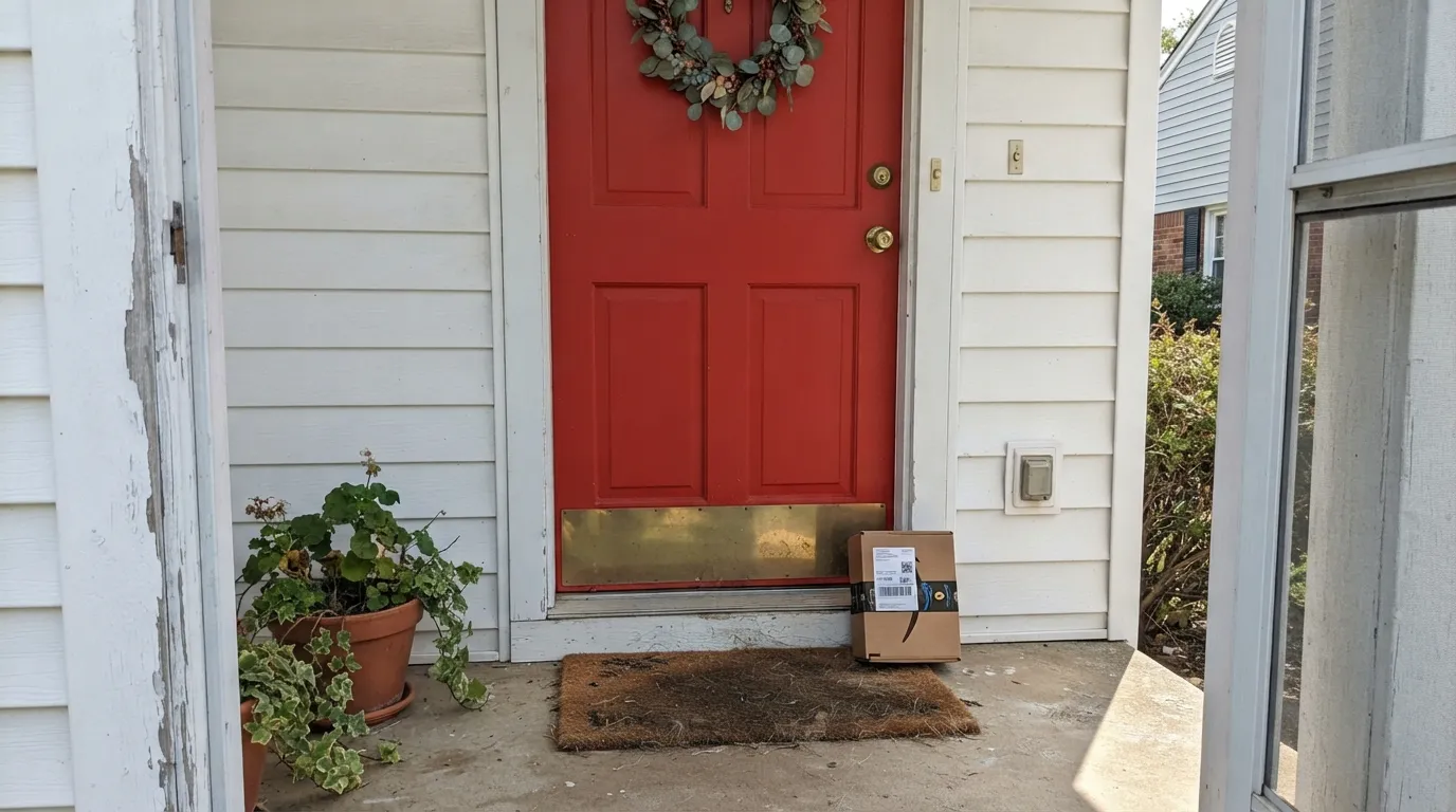
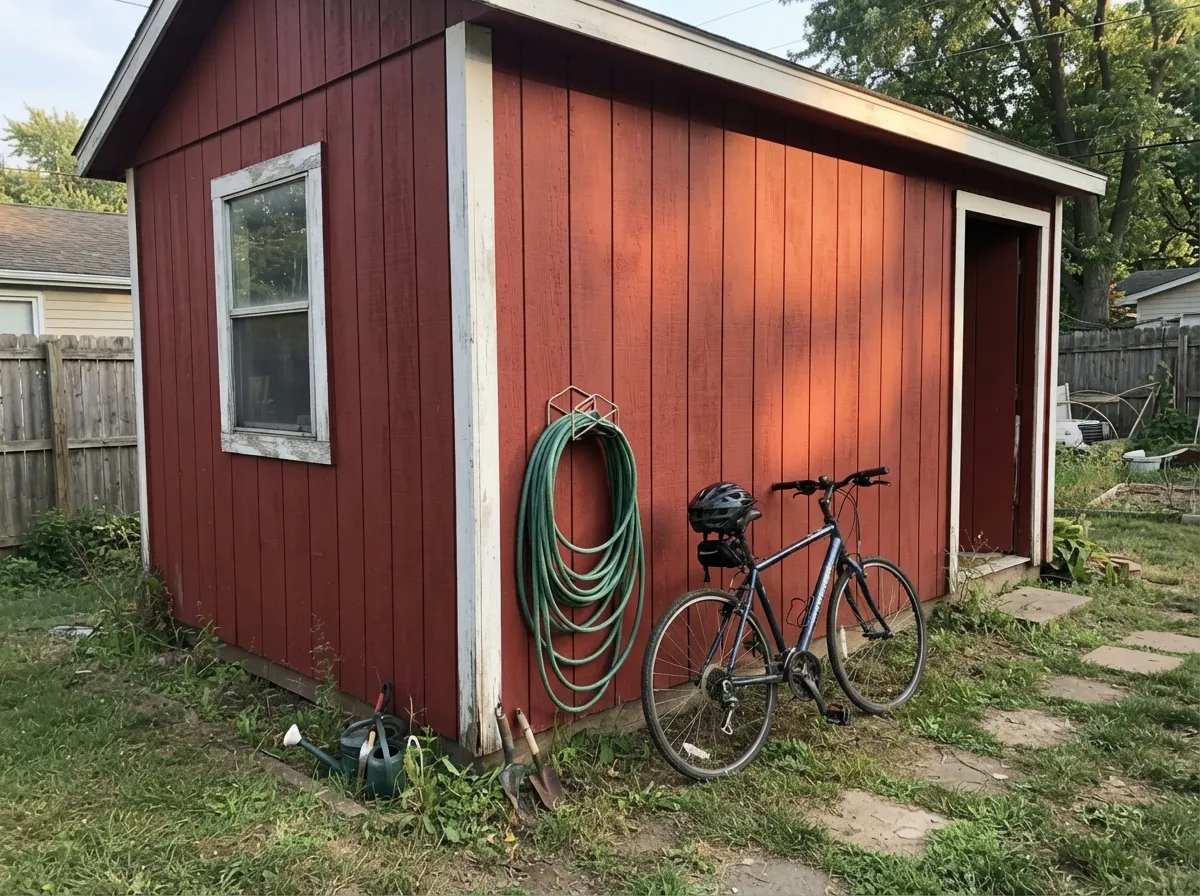
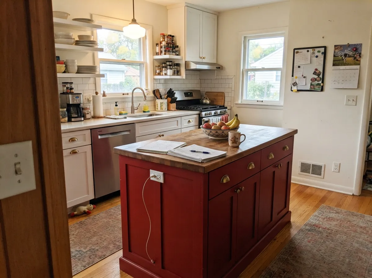
This is a color built for a small, sunlit target, and in that role it is close to unbeatable. On a front door in real midday light it reads as a confident, true red — dramatic without tipping into orange or candy-apple. It is one of the classic American picks for barns, sheds, and garage doors, which is exactly the use the 1976 Historical Colors collection was built around, and in a kitchen it makes a genuinely striking island or single accent wall against white cabinets and warm wood.
Where It Fails
Almost every regret story about Heritage Red comes from one of three situations, and all three are predictable before the first coat goes on. None of them are really the color's fault — but if your project matches one, this is not your red, or at least not without changing your plan first.
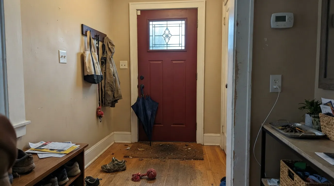
The vivid, true-red read depends on direct sun. Under cloud cover, on a north-facing door, or in the shadow of a porch roof, Heritage Red drags toward a dull, brownish red that looks closer to old brick than the sample promised. If your door or barn doesn't get real sun for most of the day, sample it in that exact light before committing.
The "Heritage"/barn-red name and the 1976 collection it belongs to lead a lot of buyers to expect a browned-down, historic barn color. What you actually get is a purer, more saturated true red. If the muddier traditional barn look is what you're after, Benjamin Moore's own Cottage Red is the browner, muddier color in the same collection — use that instead.
This is a real, well-documented complaint, not a light problem: the self-priming two-in-one formula is thin and separates fast, needs re-stirring roughly every hour on the job, and does not roll or brush on smoothly — expect drips and splatters on your first coat. Budget for a slower, more careful application than a normal exterior paint, and don't judge the final color from the wet first coat.
Room by Room
Semi-gloss Heritage Red against a crisp or warm white house is the classic American front-door move, and full sun is exactly the light it wants. Expect the color to shift noticeably darker and browner on cloudy days — that is normal, not a defect.
This is the color's original job and it still does it best. Large sun-facing surfaces read as a proper, saturated barn red; shaded elevations of the same building will look meaningfully duller, which is worth knowing before you commit to all four sides.
A striking, custom-feeling choice on a single island or one wall against white perimeter cabinets and warm wood or brass. A full kitchen of Heritage Red cabinetry is a much bigger, riskier bet — most rooms are better served by using it in one dose.
In a closed, lamplit dining room it turns rich and enveloping at night; under 2700K bulbs the red deepens toward wine. Skip it if the room relies on cool overhead LEDs or gets little natural light during the day.
This is a saturated, near-black-value color built to be a dose, not a backdrop. Four walls of Heritage Red in anything but a small, deliberately dramatic room reads as overwhelming rather than confident.
Heritage Red is a door and barn color, not a field siding color for a whole house. Used across large expanses of siding it loses the punch that makes it work on a door, and the shade-versus-sun color shift becomes a visible patchwork across the facade.
Your Light Is the Risk
Direct sunlight is what unlocks the true, vivid red — this is the light a front door or a barn actually gets, and the color was made for it.
Cloud cover or a shaded porch mutes it toward a dull, brownish red — the exact gap between the sunny sample and the finished job that surprises owners.
An east-facing door reads brightest early; a west-facing one holds its red longest into the afternoon. Either way, expect the color to visibly calm down once direct sun leaves it.
2700K warm bulbs pull it toward a deep wine, almost oxblood, at night. Cool LEDs keep it closer to true red but flatten the depth — warm bulbs suit this color better.
Most complaints about Heritage Red are a light mismatch. Upload a photo of your actual room and see it on your walls — then ask for the same wall in north light or evening lamps before you buy a single sample.
Need It From Another Brand?
Any paint counter can custom-tint Benjamin Moore HC-181 directly. If you would rather stay in one brand's own deck, these are the closest stock matches, measured as ΔE2000. Under 2 is a difference you will not see on the wall.
| Brand | Closest color | ΔE | LRV | |
|---|---|---|---|---|
| Sherwin-Williams | RedwingSW 2909 · Sherwin-Williams | 1.3 | 7 | Color page → |
| Valspar | Quite Red1011-3 · Valspar | 3.0 | 6.9 | Color page → |
Similar Benjamin Moore Colors
The nearest shades to Heritage Red within Benjamin Moore's own range, ranked by perceptual color distance — useful when you want the same look a touch lighter, darker, or warmer.
WCAG 2.1: AA is 4.5 : 1 for normal text, 3 : 1 for large text, AAA is 7 : 1.
Heritage Red vs the Colors You're Also Considering
Every Heritage Red sample board has the same rivals on it. The numbers show the real lightness gap — then it comes down to which risk you would rather live with.
Pick this for the purer, brighter signal red with less brown in it.
Benjamin Moore AF-290 · LRV 9CalientePick this if you want BM's other true-red benchmark, a shade deeper and slightly more brick than Heritage Red.
Pick this for a barn or door red that stays visibly red, not brown, even without full sun.
Benjamin Moore PM-15 · LRV 5Cottage RedPick this if the soft, muddy barn-brown look is what you actually wanted — it's the browner color in the same historical collection.
Heritage Red Coordinating Colors
The rule for coordinating with Heritage Red is simple: let it be the only saturated color in the room or on the facade, and surround it with quiet, confident neutrals. Crisp or warm whites, charcoal, and near-black all let the red do the work without a second color competing for attention.
The Historical Colors Story
Heritage Red comes from Benjamin Moore's Historical Colors collection, launched for the U.S. Bicentennial in 1976, when the brand mined early American paint archives — barns, farmhouses, colonial doors — for a lineup of period-accurate shades. Cottage Red and Boston Brick sit in the same family, and the name "Heritage" is doing double duty: it signals the color's American-farmhouse pedigree, and it primes buyers to expect something soft and time-worn.
That expectation is the source of most of the confusion around this color. The actual PM-18 formula is a purer, more saturated red than a typical faded barn hue — closer in spirit to a signal red than to the browned-down Cottage Red one collection over. The history is real; the muted-brick assumption is not.
Heritage Red on Barns, Doors, and Exterior Trim
This color was built for exteriors, and the practical advice is mostly about managing light and application, not color theory. Expect a real, visible difference between a sun-facing elevation and a shaded one on the same building — walk around your house or barn with a large sample before committing to all four sides, and don't be surprised if the north wall reads a full step browner than the south wall in the same photo.
On application: budget more time than usual. Heritage Red's self-priming two-in-one formula is genuinely thinner and more prone to separating than a standard exterior paint, several real accounts describe needing to re-stir it roughly every hour, and it can drip or splatter more than expected with a brush or roller. Two coats over a primed or previously painted light surface is standard; a saturated color like this will still look brighter and slightly pink on the wet first coat before it settles to its true, deep red.
Three Ready Palettes Built on Heritage Red
A color is never alone on the wall. These are complete combinations in the 60-30-10 pattern, with the reason each one holds together. Every one opens in the visualizer.
A crisp cool white keeps the whole facade quiet so the door can carry the color. Wrought Iron shutters echo the door's darkness without competing with its saturation — this is the pairing behind most classic red-door houses.
Try this palette in your roomThis is the pairing behind the American red barn, updated with a warm rather than stark white trim. Kendall Charcoal grounds the doors and rooflines so the red reads deliberate, not just weathered.
Try this palette in your roomWhite Dove keeps the perimeter calm and lets the island carry the statement; Kendall Charcoal on shelving or a range hood gives the room a second dark note so the red doesn't stand alone.
Try this palette in your roomHeritage Red FAQ
Is Heritage Red actually a muted, brownish barn red?
No — that is the color's reputation, not the actual chip. Benjamin Moore's Heritage Red is a true, saturated crimson-red with very little brown in it. The brownish read people describe usually comes from photos taken in overcast or shaded light, where the color genuinely does dull down. In direct sun it reads as a clean, confident red.
What white goes best with a Heritage Red front door?
A crisp white like Chantilly Lace keeps the whole facade quiet and lets the door carry the color; a warmer white like White Dove softens the contrast slightly. Either works — the choice comes down to whether you want the crisp modern-classic look or something a touch softer.
Is Heritage Red good for a whole room?
Not usually. At this saturation and depth it is built to be a dose — a door, an island, one accent wall — rather than a backdrop for four walls. Used everywhere in a room it overwhelms; used once, it reads intentional.
Why do people say this paint is hard to work with?
It's a real, documented issue: Heritage Red's self-priming two-in-one formula is thin and separates quickly, so it needs stirring roughly every hour during application, and it doesn't lay down as smoothly as a standard paint with a brush, roller, or foam applicator. Budget extra time and expect the wet first coat to look brighter and pinker than the cured, final color.
Does Heritage Red fade or go dull in shade?
It doesn't fade in the pigment sense, but it does read very differently depending on light. Full sun brings out a vivid true red; overcast days and shaded doors or walls pull the same color toward a dull, brownish red. Sample it in the actual light your door or barn gets before committing.
Heritage Red vs. Caliente — what's the real difference?
Both are Benjamin Moore true-red benchmarks at a similar depth (LRV 8 vs. 9), but Caliente carries a touch more brick and brown in it, while Heritage Red is the purer, brighter signal red of the two. If you want the loudest, cleanest red on the shelf, Heritage Red is it.
Have you painted with Heritage Red?
Rate it — one tap helps the next reader decide.
Ask a Question