Raspberry Truffle
The deep Benjamin Moore red that is not a fire engine, reviewed honestly: the rooms where it turns velvet, the light that turns it brown, and what it costs to roll.

Jessica has spec'd whites and neutrals for more than 300 rooms and keeps a sample wall of painted drawdowns in her studio. Every color review is checked against real reader rooms in the comments and re-tested when a formula changes. About the testing process →
- 1Rookwood Dark Red3
- 2Raspberry Truffle9
- 3Cinnamon Slate19
- 4Rejuvenate30
The Fast Verdict
Raspberry Truffle is the red you choose when you want depth instead of noise. At LRV 9 it sits at near-black depth with a plum-brown shade running under the red, so it turns velvet under lamps and almost chocolate in a dark corner. It is a small-room color and a door color — powder room, dining room, study, front door — and it is genuinely beautiful in all four. Give it four dim walls and no lamps and it stops reading red at all.
Powder rooms drenched top to bottom · dining rooms used at night · studies and libraries with books and leather · front doors and entries · anyone who wants red without a fire-engine wall
The room is dim and has no lamps · you want a bright, cheerful red · your floors and trim are golden honey oak · it is an open plan where the color would touch every room · you might repaint it light in a year or two
- Deep red without the fire-engine loudness — berry and plum, never brick
- Drenched powder rooms and lamplit dining rooms look genuinely expensive
- Flatters brass, walnut, leather, cream and gold-framed art
- One of the best front-door reds in the Benjamin Moore deck
- A long-standing Color Preview color, not a trend release that will be discontinued
- LRV 9 — in a dim room it reads brown-black, not red
- Deep base hides poorly: gray-tinted primer plus two coats, or it goes streaky
- Cool LEDs and low-quality bulbs drain the red and leave it flat
- The hardest kind of color to paint over later, and the most repaint risk if you sell
What Color Is Raspberry Truffle, Really?
A deep true red with a plum-brown shade underneath — berry, not brick. That distinction is the whole point of this color. Most deep reds in a paint deck lean orange (barn red, brick red, Tuscan red); Raspberry Truffle sits on the other side of pure red, with a faint blue-plum tilt that keeps it from ever looking rusty. Benjamin Moore files it in Color Preview, the deck's saturated-color collection, and the official description leans on words like velvety and chocolate. Chocolate here is a mood, not an undertone: there is no orange in it, and it is nowhere near a brown.
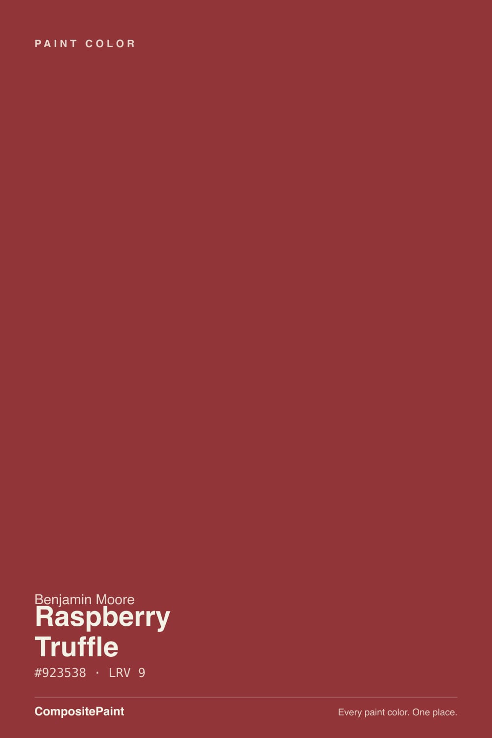
At LRV 9 it is a genuinely dark color — the same depth band as the deck's near-blacks and navies. That is why the chip lies twice. In the store the little card catches light from every side and looks like a rich raspberry; on four walls the color is one clear step darker, and in shadow it collapses toward a very dark plum-brown. Deep reds like this are also mixed in a deep base with almost no white pigment, which means thin coverage: plan on a gray-tinted primer and two finish coats, not two coats over your old beige.
Undertone in one line: red first, plum second, a brown-black shade third — never orange, never pink. If your sample looks brown, the light is too dim; if it looks nearly purple, you are seeing it under a cool LED. Both versions are the same paint reporting on your room.
Where It Shines
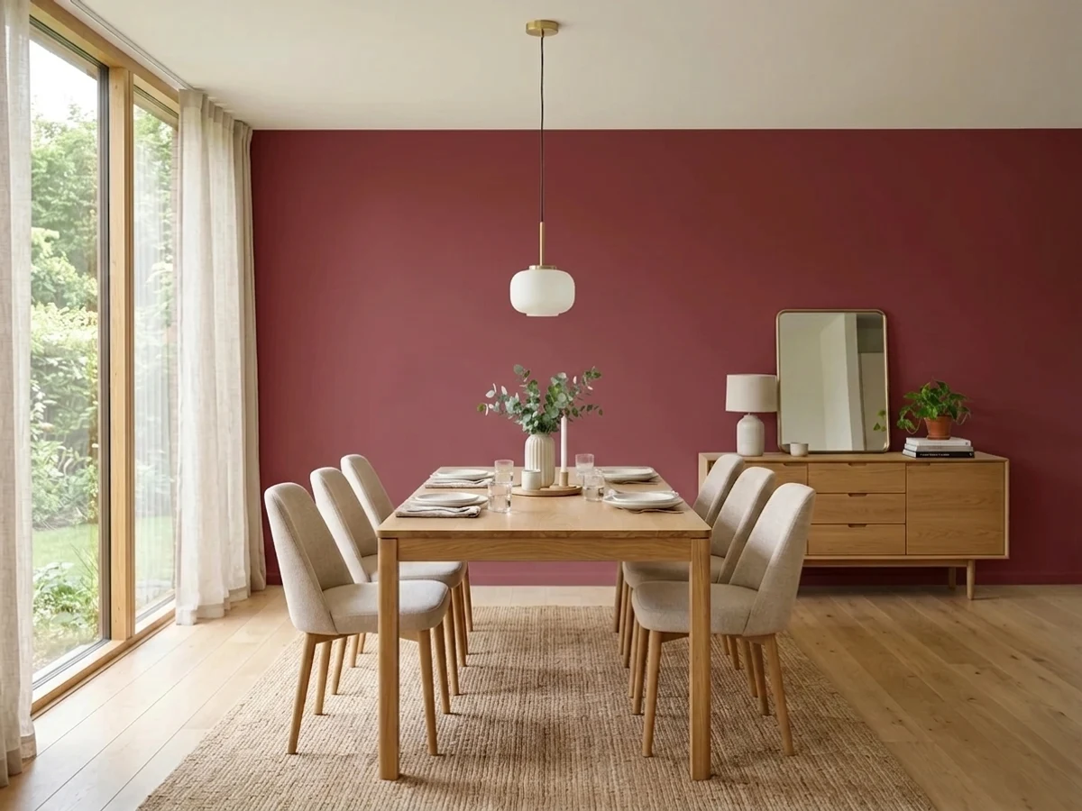
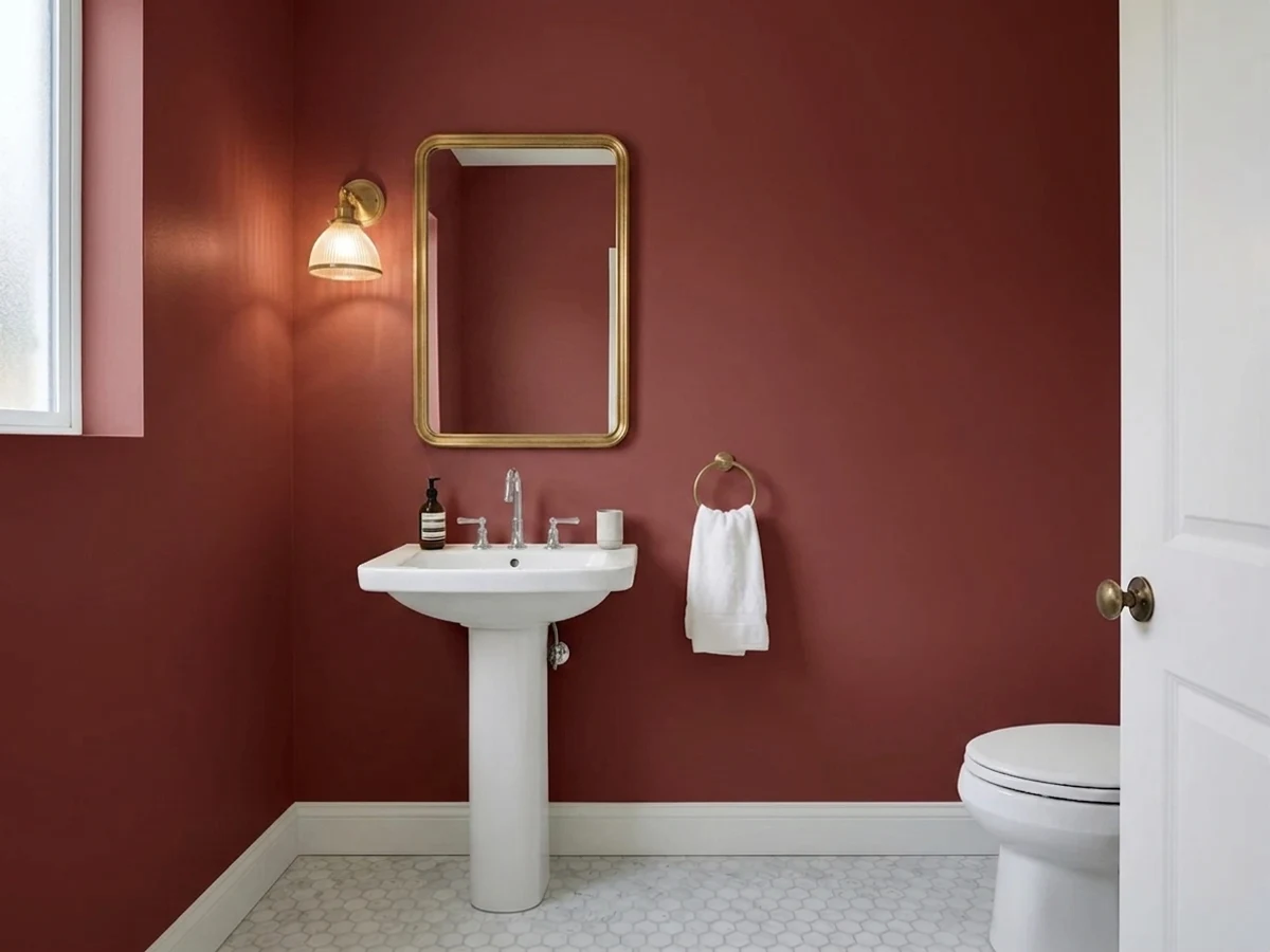
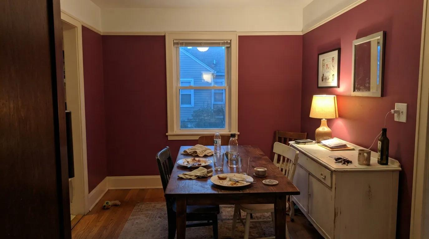
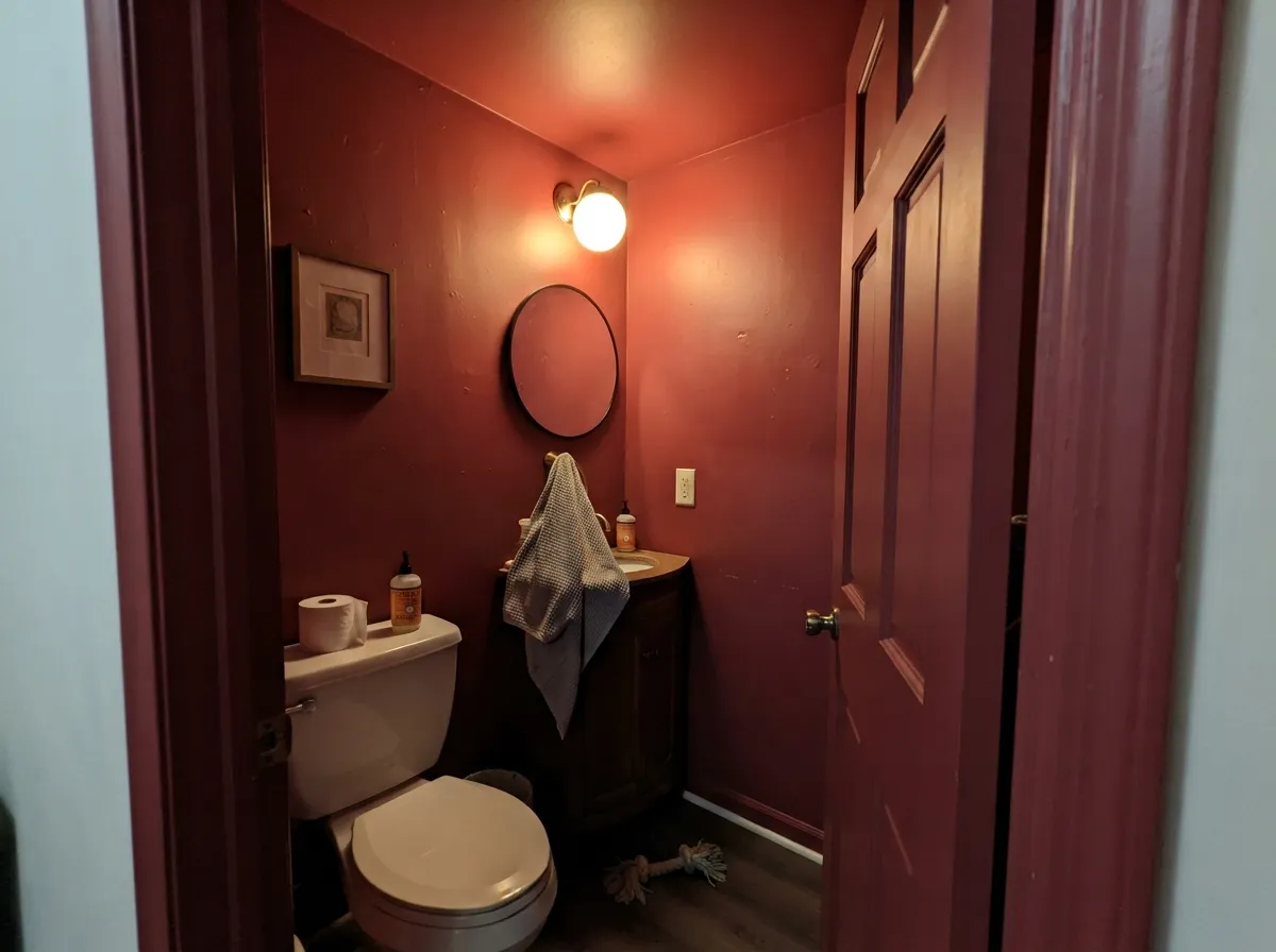
This color is built for small rooms and low light. Drenched on all four walls of a powder room — walls, ceiling, and the back of the door — it stops reading as a dark room and starts reading as a lined box, which is exactly the effect people pay decorators for. Its second home is the dining room that only gets used after dark: candles, warm bulbs, and a red wall are an old combination for a reason. Give it brass, cream linen, walnut, leather and gold-framed art and it looks like it cost far more than a gallon of paint.
Where It Fails
Regret stories about deep reds follow the same three scripts, and all three are predictable before you open the can. Two of them are about light, one is about labor — and none of them get better with more coats.
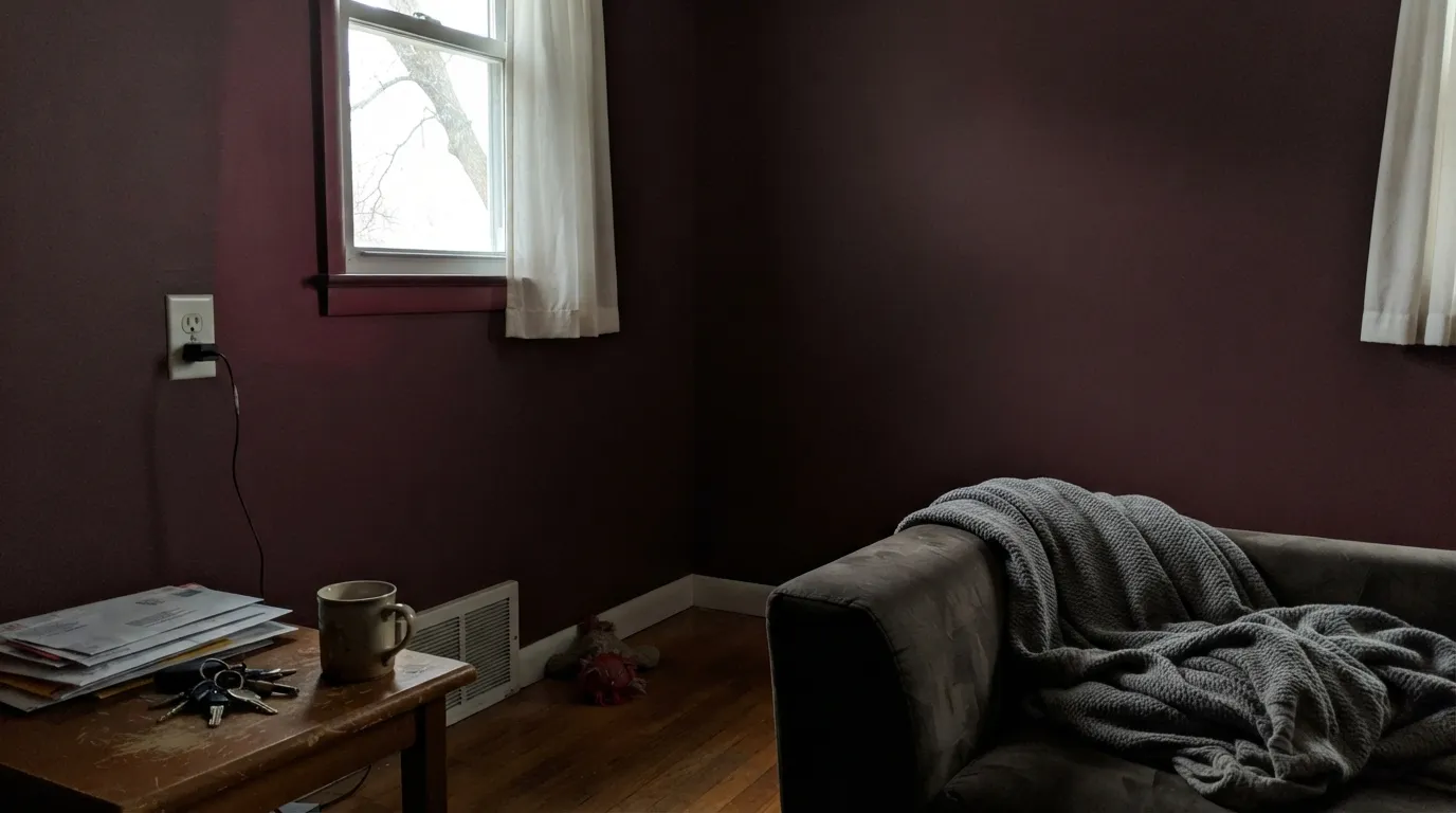
This is not that red. At LRV 9 it reflects almost nothing, so in a room with one small window and no lamps it reads as a dark brown-black wall with a red flicker in the corners — the shade people describe as dried blood. If you want red to feel cheerful rather than formal, you want something lighter and hotter like Rosy Apple at LRV 15, not this.
Deep red is the most expensive color in the store to apply badly. The deep base carries very little hiding pigment, so straight over a light wall it goes on streaky pink and needs four or five coats to look solid. A mid-gray tinted primer plus two finish coats gets you there instead. Roll wall by wall and keep a wet edge — dark reds show lap marks and flashing that a beige would forgive.
Red plus orange-toned oak floors, oak trim and shiny gold-tone fixtures is the 2003 Tuscan kitchen, and no amount of styling talks it out of that. This color needs walnut, painted trim, matte black or unlacquered brass — and a door it can close. In an open plan a wall this saturated bounces red light into every adjoining room and tints your white ceiling faintly pink.
Room by Room
Drench it: walls, ceiling, door, even the trim if you are brave. Small windowless rooms are the one place where LRV 9 is an advantage, because there is no bright wall left to compare it against. Eggshell so it wipes clean, brass fixtures, and a warm bulb over the mirror.
The classic use, and still the right one. Under 2700K bulbs and candles the walls go velvet and skin tones look better than they do under any neutral. Cream linen, walnut table, gold-framed art. If your dining room is really a daytime homework table in an open plan, skip it.
A deep red bedroom is a jewel box or a cave, and lamps are what decide which. Two bedside lamps at 2700K and a Cloud White ceiling keep it enveloping; one dim overhead fixture makes it oppressive. Matte finish, cream bedding rather than bright white.
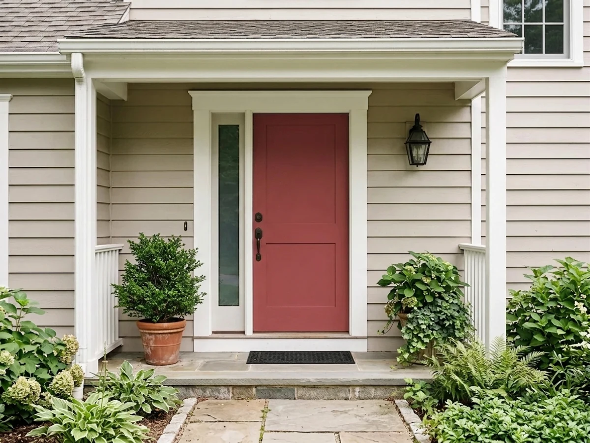
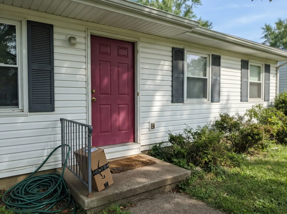
A red front door on a white or pale house is a hundred-year-old move, and this one is deep enough to look considered rather than loud. Inside, a small entry drenched in it makes the rooms beyond feel brighter by contrast. Satin exterior acrylic on the door — and see the exterior notes below about fade.
Rooms that live under lamplight are this color's natural habitat. Books, leather, walnut shelves and a green desk lamp against deep red is the old club-library formula and it still works. Eggshell on walls, semi-gloss on built-ins.
A whole kitchen in this is a hard sell: it fights every warm wood tone, eats the light task areas need, and shows every splash of grease at eggshell sheen. Open-plan main floors have the sightline problem — the red will be visible from three other rooms whether you wanted it there or not. If you want the color in a kitchen, put it on a pantry door or an island and stop there.
Your Light Is the Risk
Warm 2700K bulbs and candles are what this color was mixed for. The red comes fully forward, the walls go velvet, and the room feels lined rather than painted.
Cool, weak daylight has nothing for a dark red to reflect. The wall drops to a heavy brown-black and the color you paid for only shows near the window. Add lamps or pick something lighter.
Direct midday sun is the only time it looks bright — clearly, chromatically red, almost a berry. Through the afternoon it deepens, and at golden hour a west window puts a warm flare on one wall while the rest of the room has already gone plum.
Bulb quality matters more here than with any neutral. Warm 2700K bulbs with good color rendering keep it rich; cheap cool-white LEDs render deep reds badly and leave the walls looking flat, dull and faintly purple. Swap the bulbs before you blame the paint.
Most complaints about Raspberry Truffle are a light mismatch. Upload a photo of your actual room and see it on your walls — then ask for the same wall in north light or evening lamps before you buy a single sample.
Need It From Another Brand?
Any paint counter can custom-tint Benjamin Moore 2080-10 directly. If you would rather stay in one brand's own deck, these are the closest stock matches, measured as ΔE2000. Under 2 is a difference you will not see on the wall.
| Brand | Closest color | ΔE | LRV | |
|---|---|---|---|---|
| Sherwin-Williams | Red BaySW 6321 · Sherwin-Williams | 0.9 | 9 | Color page → |
| Behr | Cherry TreeECC-32-3 · Behr | 1.1 | 9 | Color page → |
| Valspar | Thai Chili8002-8F · Valspar | 1.6 | 10 | Color page → |
| PPG / Glidden | Apple-A-DayPPG1051-7 · PPG / Glidden | 3.6 | 10 | Color page → |
| Glidden | Red Delicious00YR 08/409 · Glidden | 2.0 | 8 | Color page → |
| Dutch Boy | Rosebud Red203-7DB · Dutch Boy | 2.0 | 9 | Color page → |
Similar Benjamin Moore Colors
The nearest shades to Raspberry Truffle within Benjamin Moore's own range, ranked by perceptual color distance — useful when you want the same look a touch lighter, darker, or warmer.
WCAG 2.1: AA is 4.5 : 1 for normal text, 3 : 1 for large text, AAA is 7 : 1.
Raspberry Truffle vs the Colors You're Also Considering
Every Raspberry Truffle sample board has the same rivals on it. The numbers show the real lightness gap — then it comes down to which risk you would rather live with.
Pick this for the same depth with a berry-plum shade instead of a straight red, in a room you want calm rather than loud.
Benjamin Moore AF-290 · LRV 8CalientePick this for the pure, unmissable red — Caliente is the benchmark, and it clamors where this one broods.
Pick this when you want a jewel tone rather than a barn, and no brown in the daylight read.
Benjamin Moore HC-184 · LRV 11Cottage RedPick this for the rustic barn version — browner, earthier, at home on a farmhouse exterior.
Raspberry Truffle Coordinating Colors
The rule for coordinating with a red this deep: one warm white, one quiet neutral for the next room, and one near-black — then stop. Benjamin Moore's own coordinate list points the same way, naming Cloud White, Ballet White and Gray Owl. What you want to avoid is a second saturated color in the same sightline; a red at LRV 9 is already the loudest thing in the house. These are the partners that keep showing up in rooms that work:
Why Deep Red Came Back — and Where This One Sits
Red spent the entire gray decade in exile, then came back sideways. The viral unexpected red theory — coined by designer Taylor Migliazzo Simon in 2024 — gave people permission to put a small deliberate red into an otherwise quiet room, and by 2026 designers had stopped treating it as a trend at all. What did change is the shade: the reds people actually paint now are the earthy ones, oxblood and merlot and currant, not cherry. Raspberry Truffle lands squarely in that lane, and it got there without a marketing campaign — it has sat in the Color Preview deck for decades.
Outside, it behaves like the front-door classic it is, with one honest asterisk. Red pigments are the least UV-stable family in any exterior line, which is why red is the color painters warn will lose depth first on a sun-blasted south elevation. On a shaded or north-facing door it holds for years; in full sun, plan to refresh it before you repaint anything else on the house. The trade is worth it on a door — it is not worth it on an entire facade.
Raspberry Truffle With Wood Tones, Floors and Metals
Walnut, mahogany and dark-stained oak are its best company: the red-brown in those woods answers the plum in the paint and the whole room reads deliberate. Pale white oak and painted floors are safe too, mostly because they stay out of the argument. Cream and jute rugs give the eye somewhere to rest, which a room this saturated needs.
The genuine clash is golden honey oak — orange-toned floors, orange-stained trim, yellow builder carpet. Red and orange sit close enough on the wheel to look like the same idea done twice, and the result is the heavy Tuscan look people spent fifteen years painting over. Cool gray-washed floors are the other awkward one: gray drains the warmth out and the walls start reading closer to brown than red. A large warm rug fixes the gray floor; nothing really fixes honey oak except a different wall color.
Metals are easy. Unlacquered brass, antique brass and matte black all belong here, and warm brass is the pairing that makes small red rooms look expensive. Polished chrome and cool nickel are the two to sample first — they read icy against a wall this warm-blooded.
Three Ready Palettes Built on Raspberry Truffle
A color is never alone on the wall. These are complete combinations in the 60-30-10 pattern, with the reason each one holds together. Every one opens in the visualizer.
Benjamin Moore lists Cloud White as a coordinate for this red and it is the right call — a warm trim white keeps the edges soft where a bright white would cut the room in half. Wrought Iron on the vanity gives one soft near-black note so the scheme reads deliberate; brass fixtures and a warm bulb finish it.
Try this palette in your roomThe handoff is the hard part with a color this saturated, and a light gray next door does it better than another warm color, which would compete. White Dove trim ties both rooms together; keep the dining room ceiling white so the red stays a wall color rather than a box.
Try this palette in your roomA warm white house with a charcoal frame gives the red one job and one place to do it. This deep a red also survives the street better than a bright one — bright reds read orange and cheap from the curb, while the plum shade here keeps looking intentional.
Try this palette in your roomRaspberry Truffle FAQ
Is Raspberry Truffle red or burgundy?
Red — but a dark one with a plum shade, so in low light it drifts toward burgundy. On the wall in daylight nobody calls it purple or brown; after sunset, with the lamps off, plenty of people would call it burgundy. The name is honest in both directions: berry for the color, truffle for the depth.
How many coats does it need, and do I need primer?
Prime with a mid-gray tinted primer, then two finish coats. Deep reds are mixed in a base with almost no white pigment, so straight over a light wall they go on streaky pink and can need four or five coats to look even. The primer is cheaper than the extra gallons and the extra day.
What trim white goes with Raspberry Truffle?
A warm white — Cloud White and White Dove are both safe, and Benjamin Moore lists Cloud White as a coordinate. Avoid a stark bright white next to it: the contrast gets brittle, and deep red walls bounce enough color to make a cold white look faintly pink anyway. Semi-gloss on trim, eggshell on the walls.
Is it too dark for a small powder room?
Small and windowless is where it works best. Dark colors only look oppressive when there is a bright surface nearby to compare them to — in a drenched powder room there is not, so the room reads as an intentional jewel box. Keep the fixture warm and the mirror large.
Does it work on a front door or exterior?
Yes — it is one of the better door reds in the deck, and Benjamin Moore sells it in exterior lines. The honest caveat is fade: red pigments are the least UV-stable of any color family, so a south-facing door in full sun will lose some depth in a few years where a charcoal door would not. Use a quality exterior acrylic, and expect a refresh coat sooner than you would on the siding.
Will a deep red date my house?
The color itself has been in the Color Preview deck for decades and deep earthy reds — oxblood, merlot, currant — are exactly where the current red revival landed, so it is not a fad shade. The real risk is practical, not stylistic: red is the hardest color to paint over, so budget a tinted primer plus two coats whenever you undo it, and keep it in rooms you would enjoy repainting.
Have you painted with Raspberry Truffle?
Rate it — one tap helps the next reader decide.
Ask a Question