Classic Burgundy
The Historical Collection burgundy Benjamin Moore counts among its bestsellers, reviewed honestly: the rooms where it turns wine-dark and rich, the pairing that dates it, and what to pick instead.

Jessica has spec'd whites and neutrals for more than 300 rooms and keeps a sample wall of painted drawdowns in her studio. Every color review is checked against real reader rooms in the comments and re-tested when a formula changes. About the testing process →
- 1Redwood0
- 2Classic Burgundy7
- 3Million Dollar Red13
- 4Cinnamon Slate19
The Fast Verdict
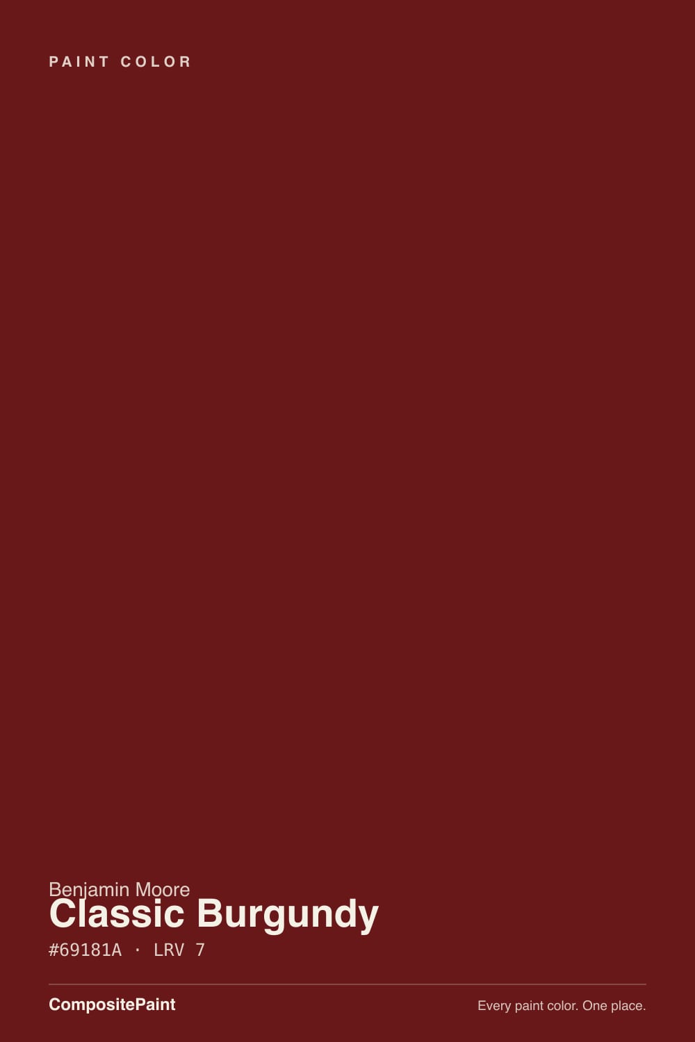
Classic Burgundy is what a front door or dining room looks like when "red" means wine, not fire engine. At LRV 7 it is nearly as dark as a black, but the color underneath stays a true, purple-leaning burgundy — closer to a good Cabernet than to brick or rust. It has sat quietly in Benjamin Moore's Historical Collection for decades and keeps showing up on the same short list of front doors and dining rooms designers reach for when a client wants drama without chasing a trend.
Front doors and shutters · dining rooms with a chair rail or paneling to break up the depth · dens and libraries with leather and walnut · kitchen islands wanting old-world warmth · anyone who wants red without going orange-brick or pink
You want a true brick-orange red — Heritage Red is warmer · your room has no separate light source and needs the color on all four walls with nothing to break it up · your existing trim and cabinets are honey oak (the 90s maroon-and-oak combination is exactly what dates this color) · you're chasing this year's trend color, not a decades-old classic
- True, purple-leaning burgundy — reads wine, not brick or pink
- Front-door classic that works with white, black, or brick exteriors
- Historical Collection pedigree means it won't chase a trend and expire
- Small rooms (powder rooms, islands) take it as a genuine jewel-box color
- Pairs beautifully with walnut, brass, and matte black
- Reads dated fast next to honey oak and shiny brass — the exact 90s combination
- LRV 7 needs a trim break, chair rail, or real light source or the room feels closed-in
- Cool LEDs and north light flatten it toward muddy brown-black
- A hard color to sell a whole room in — most buyers want it in doses, not on every wall
What Color Is Classic Burgundy, Really?
A deep, purple-leaning wine red — not the brown-orange lean of Benjamin Moore's own Dinner Party, and not the true brick-red of Heritage Red. Classic Burgundy sits in the Historical Collection, the 191-color line Benjamin Moore unveiled for the 1976 bicentennial and built around America's historic landmarks. That pedigree shows: this is a color designed to read as timeless and formal, not of-the-moment.
At LRV 7 it belongs in the same near-black bracket as a true charcoal or navy — it absorbs almost all the light that hits it. That depth is the whole appeal on a front door or a paneled dining room: the color reads as a real, saturated wine, not a washed-out red-brown, in almost any daylight. The tradeoff is the same one every LRV-7 color makes — on four bare walls with no trim break, no chair rail, and no second light source, the room can feel closed-in rather than dramatic.
Undertone in one line: red with a whisper of purple, not orange — the wine-toned member of Benjamin Moore's own dark-red trio, cooler than Heritage Red's true barn-red and less brown than Dinner Party's toned-down brick. If your sample looks flat and muddy-brown, that is cool artificial light draining the red out, not a defect in the paint.
Where It Shines
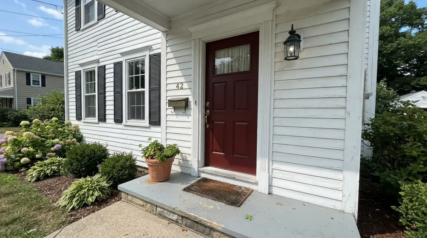
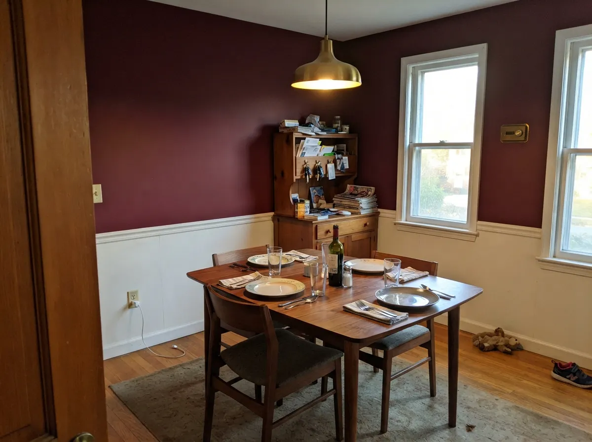
Give it a frame — a white door surround, a chair rail, cabinetry against a lighter perimeter — and it is one of the most dependable dark colors in the deck. Front doors are its signature role: against a white or cream house it reads as a confident classic, not a dare. Dining rooms are its second home, especially with a chair rail or wainscoting splitting the wall, because the color needs a light-colored partner nearby to keep from reading as one flat dark block.
Where It Fails
The complaints about Classic Burgundy follow two very predictable scripts, and a third that has nothing to do with the paint. None of them mean the color is bad — they mean it landed in the wrong room.
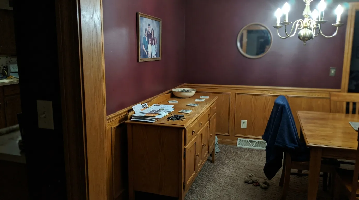
Warm oak trim, oak cabinets and polished brass with a deep burgundy wall is the exact palette a lot of dining rooms wore in the 1990s, and readers who grew up around that look see it instantly and call it dated. The paint hasn't changed — the fix is walnut or painted trim and unlacquered or matte black hardware instead of the shiny brass-and-oak set.
At LRV 7 the color needs help: a window, a chair rail, white trim, something to keep the eye moving. Paint all four walls of a windowless powder room or a dim den with no trim contrast and it reads as a cave rather than a jewel box. Add a chair rail, paint the ceiling and trim lighter, or save it for a room that already gets real daylight.
Cold artificial light and north-facing daylight both drain the red out and leave a flat, muddy near-black-brown — readers describe it as "just looks brown, not burgundy." Warm 2700K bulbs and any real daylight bring the wine color back; this is not a color to judge under a cool overhead LED.
Room by Room
Against a white, cream or brick house it reads confident and formal in almost any daylight. Semi-gloss or satin, brass or matte black hardware, and a near-black on the shutters if you want a second dark note. Exterior daylight is rarely as cool as a dim north-facing interior, so it's a more forgiving light situation than most rooms on this list.
With a chair rail or wainscoting and White Dove or Cloud White trim, it reads rich and formal instead of closed-in. Matte or eggshell on the walls, a walnut table, and brass or candlelight bring the wine tone forward at night.
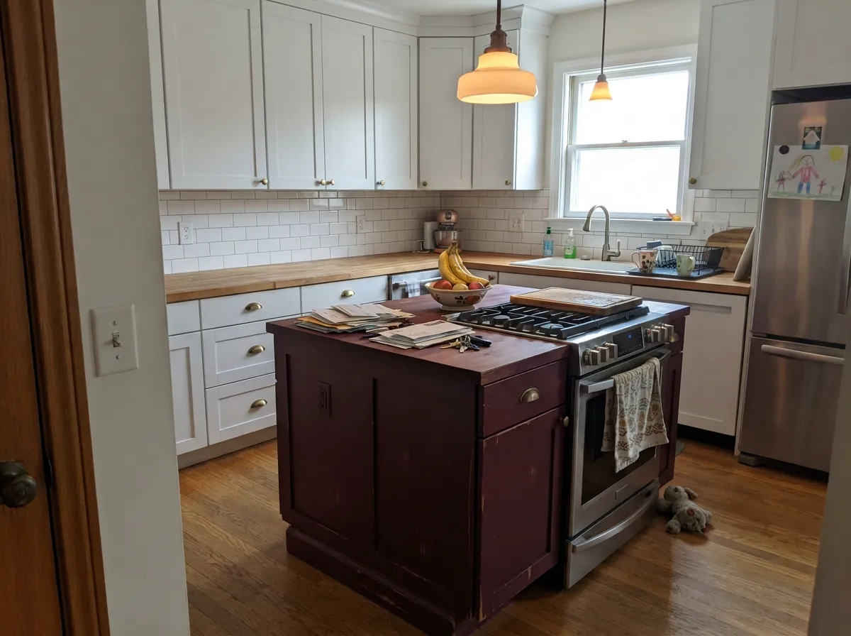
A burgundy island under white perimeter cabinets is confident, not overwhelming. Satin cabinet enamel, brass or matte black pulls. A full kitchen of Classic Burgundy cabinets needs strong, consistent light or it reads dark and heavy.
Low light flatters it here the same way it flatters a dining room. Leather furniture, walnut shelving and a warm desk lamp are its natural company; a north-facing office with only cool overhead light is the one setup to avoid.
All four walls works in a small room, but only with a window or a real light fixture doing the work — a vanity sconce or a bright mirror light. Without one, the room goes flat and cave-like fast.
Too dark and saturated for a primary bedroom at full-room scale; it reads intense rather than restful. If you love it, use it as a single headboard accent wall with a lighter neutral on the rest — it is not a whole-house color.
Your Light Is the Risk
Real daylight — even flat overcast — keeps the color genuinely red. It reads more consistently across exposures than most dark neutrals, because there's little undertone left to shift.
Cold artificial light with zero daylight assist drains the color toward a flat, muddy brown-black. If a room only gets overhead LED light, sample it under that light before committing.
Slightly cooler and more purple-red at midday, warmer and more wine-toned as the light goes gold in late afternoon. The shift is gentle — this is not a color that swings wildly.
2700K bulbs bring the wine tone forward and make it glow rather than go flat. Cool white LEDs do the opposite — swap the bulbs before you blame the paint.
Most complaints about Classic Burgundy are a light mismatch. Upload a photo of your actual room and see it on your walls — then ask for the same wall in north light or evening lamps before you buy a single sample.
Need It From Another Brand?
Any paint counter can custom-tint Benjamin Moore HC-182 directly. If you would rather stay in one brand's own deck, these are the closest stock matches, measured as ΔE2000. Under 2 is a difference you will not see on the wall.
| Brand | Closest color | ΔE | LRV | |
|---|---|---|---|---|
| Sherwin-Williams | Crimson RedSW 2906 · Sherwin-Williams | 2.8 | 4 | Color page → |
| Valspar | Spanish Tile1010-5 · Valspar | 2.8 | 3.6 | Color page → |
Similar Benjamin Moore Colors
The nearest shades to Classic Burgundy within Benjamin Moore's own range, ranked by perceptual color distance — useful when you want the same look a touch lighter, darker, or warmer.
WCAG 2.1: AA is 4.5 : 1 for normal text, 3 : 1 for large text, AAA is 7 : 1.
Classic Burgundy vs the Colors You're Also Considering
Every Classic Burgundy sample board has the same rivals on it. The numbers show the real lightness gap — then it comes down to which risk you would rather live with.
Pick this when you want the color to read unmistakably wine-red, not brown — Classic Burgundy stays cooler and more saturated where Dinner Party can slide toward black.
Benjamin Moore AF-300 · LRV 7Dinner PartyPick this for the toned-down, brown-orange version — Dinner Party reads more like aged brick or leather, less purple, less formal.
Pick this for the formal, indoor version — Classic Burgundy's wine-purple lean reads dining room and evening, not barn door.
Benjamin Moore HC-181 · LRV 7Heritage RedPick this for a true barn-and-door red with no purple lean — Heritage Red is Americana, built for exteriors and decades of sun.
Pick this for real saturated color and drama, not a dusty neutral in red's clothing.
Benjamin Moore 2113-40 · LRV 19Cinnamon SlatePick this if LRV 7 feels like too much commitment — Cinnamon Slate is the same red-brown family at a livable mid-depth that can cover four walls without a chair rail to break it up.
Pick this when red is the whole point — Wrought Iron won't give you any.
Benjamin Moore 2124-10 · LRV 6Wrought IronPick this if you want the drama of a dark, saturated color without committing to red — Wrought Iron is a soft near-black with a green whisper, not a color-family decision.
Classic Burgundy Coordinating Colors
The rule for coordinating with Classic Burgundy is simple: keep the whites warm-neutral rather than stark, keep the metals brass or matte black rather than chrome, and give it a genuine near-black or charcoal partner if the room wants a second dark note. These are the partners that show up again and again:
Classic Burgundy's Historical Collection Roots — and Its Front Door Life
Classic Burgundy is one of the 191 colors in Benjamin Moore's Historical Collection, unveiled for the U.S. bicentennial in 1976 and built around the palettes of America's historic landmarks. That is why it reads more formal and old-world than a paint-store trend red — it was never designed to chase a color-of-the-year cycle, and it hasn't.
Outdoors, it is a front-door and shutter staple rather than a whole-house color, and for good reason: at LRV 7 it holds its color well in full sun without washing out, but like any deep, saturated exterior color a south- or west-facing door in constant direct sun will fade and lighten faster over the years than a lighter color would. A covered porch overhang protects it well and is the standard setup for this color on a door.
Classic Burgundy With Wood Tones and Metals
Walnut, dark-stained oak, and painted white trim are this color's best partners — the depth of the wood matches the depth of the paint instead of fighting it. The one wood tone to watch is honey or golden oak: paired with polished brass, it pulls Classic Burgundy straight into 1990s dining-room territory, the single most common complaint about this color. Swap in matte black or unlacquered brass hardware and the same room reads current.
Metals follow the same logic: brass, whether polished or unlacquered, and matte black both work well; bright chrome or nickel reads cold against the warmth of the wood grain underneath the red, even though the red itself leans cool.
Three Ready Palettes Built on Classic Burgundy
A color is never alone on the wall. These are complete combinations in the 60-30-10 pattern, with the reason each one holds together. Every one opens in the visualizer.
White keeps the house body classic and lets the door carry all the color; Wrought Iron's soft near-black shutters frame the red without competing with it — the same three-color logic behind almost every front-door roundup.
Try this palette in your roomChelsea Gray's charcoal-greige wainscoting is the trim break this color needs — it keeps the room from reading as one flat dark block, while Cloud White overhead keeps the ceiling from disappearing into the depth.
Try this palette in your roomSwiss Coffee's warmth keeps the perimeter from feeling stark against the burgundy island, and Kendall Charcoal on open shelving adds one more dark note so the island doesn't stand alone in the room.
Try this palette in your roomClassic Burgundy FAQ
Is Classic Burgundy red or brown?
Red, and a purple-leaning one — closer to wine than brick. Compared to Benjamin Moore's own Heritage Red (warmer, more orange, no purple) and Dinner Party (muted toward brown-black), Classic Burgundy is the coolest, truest burgundy of the three. In cool light it can look flat and brownish; that's the light, not the undertone.
Does it work on a front door?
It's one of the classic choices — against a white, cream, or brick house it reads confident and traditional, not loud. Pair with brass or matte black hardware and a semi-gloss or satin finish for the door itself; a near-black like Wrought Iron on the shutters frames it well.
Is it too dark for a whole room?
At LRV 7, yes, on four bare walls with no break. It works best with a chair rail, white trim, or a strong light source — a dining room with wainscoting, a well-lit powder room, or an accent wall, not a windowless room painted floor to ceiling.
Does it look dated?
Only in one specific combination: honey oak trim and shiny brass, which reads straight out of the 1990s. Paired with walnut, painted white trim, and matte black or unlacquered brass hardware, it reads current and formal, not dated.
What goes with Classic Burgundy walls?
White Dove or Cloud White for trim and ceiling, walnut or dark-stained wood, brass or matte black metals, and a charcoal-greige like Chelsea Gray if you want a second dark note in the room.
How many coats does it take?
Plan on two full coats over a light existing color. Going over anything darker or more saturated, a standard gray or deep-base primer is usually enough — you don't need a specialty red-hiding primer, but skipping primer on drywall patches can cause visible flashing.
Have you painted with Classic Burgundy?
Rate it — one tap helps the next reader decide.
Ask a Question