Dinner Party
The deep brick-red Benjamin Moore built for dining rooms, reviewed honestly: where it glows like wine, the light that turns it black, and what to pick instead.

Jessica has spec'd whites and neutrals for more than 300 rooms and keeps a sample wall of painted drawdowns in her studio. Every color review is checked against real reader rooms in the comments and re-tested when a formula changes. About the testing process →
- 1Rookwood Dark Red3
- 2Dinner Party8
- 3Million Dollar Red13
- 4Cinnamon Slate19
The Fast Verdict
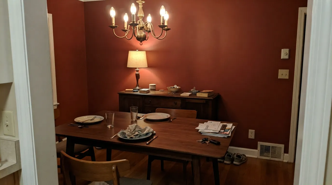
Dinner Party is Benjamin Moore's toned-down deep red — not the fire-engine primary of Caliente, but a brick-brown oxblood built to live in one confident room without setting the whole house on fire. At LRV 7 it is genuinely dark: with candlelight, a chandelier or warm wood it glows like good wine; without a real light source it slides toward black and just reads as a very dark neutral. It earns its name — a color for one dinner-party-worthy room, not a whole floor plan.
Dining rooms with a light fixture overhead · powder rooms · front doors · a den or library that wants drama · anyone who wants red without committing to Caliente's brightness
Your room has no overhead light and stays dim all day · the room runs on cool white LEDs · you're painting more than one connected room · you actually want a bright, true red
- A genuinely toned-down deep red — no fire-engine brightness
- Glows warm and wine-like under real light: chandeliers, sconces, candles
- Small-room and accent jobs (front door, powder room, island) look custom
- Pairs easily with warm wood, brass and leather without a fight
- Reads as sophisticated brick-red, not a primary-color statement
- LRV 7 means it goes nearly black without a real light source
- Cool LED bulbs and north light drain the warmth into a muddy near-black
- Too dark and too committal for open floor plans or whole-house use
- Dark colors need a tinted primer and often three coats over light walls
What Color Is Dinner Party, Really?
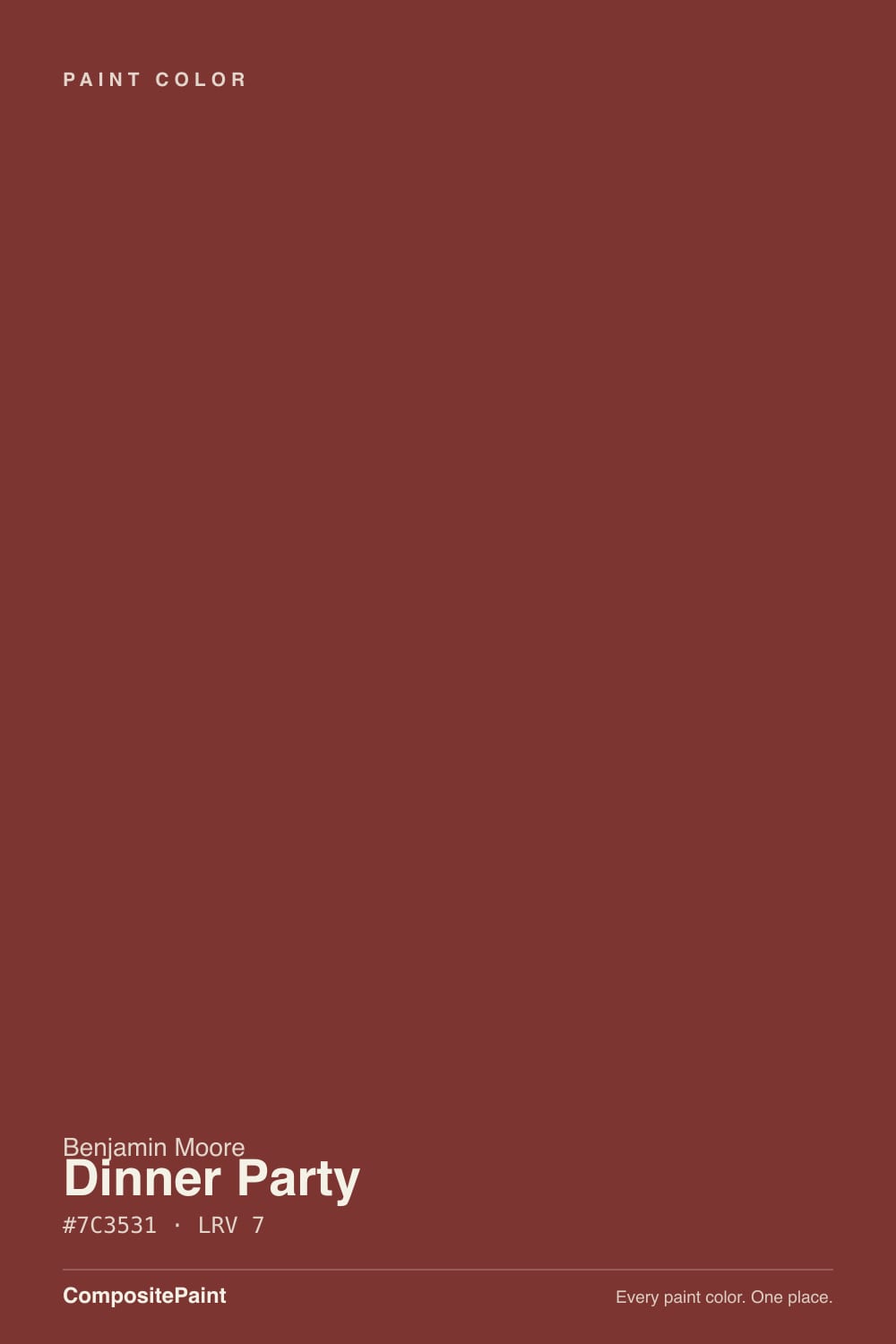
A deep brick-red with a brown-orange undertone, not the purple-leaning wine of Classic Burgundy or the near-black plum of Bewitched. Benjamin Moore built it as part of the Affinity Collection, a line curated so every color in it sits at a matched saturation and plays well with its neighbors — Dinner Party is that collection's answer to "I want red, but not loud red." It reads less like a paint-chip primary and more like aged brick or good leather.
At LRV 7 it reflects almost none of the light that hits it, which is the whole story of how this color behaves. In a room with a chandelier, sconces or a big window it holds its brick-red identity and looks rich, warm and finished. In a room without a real light source, LRV 7 does what any color that dark does: it goes flat and reads close to black. This is not a subtle color shift like a pale greige losing its warmth — it's the difference between "red dining room" and "black dining room," and it surprises people who only saw the paint chip.
Undertone in one line: warm, brown-orange — never purple, never true crimson. If your sample looks brownish and dull, that's correct; if it looks purple or wine-toned, that's your light or your camera, not the paint. Compare it side by side with a genuinely purple-leaning red like Classic Burgundy before you commit if the distinction matters to you.
Where It Shines
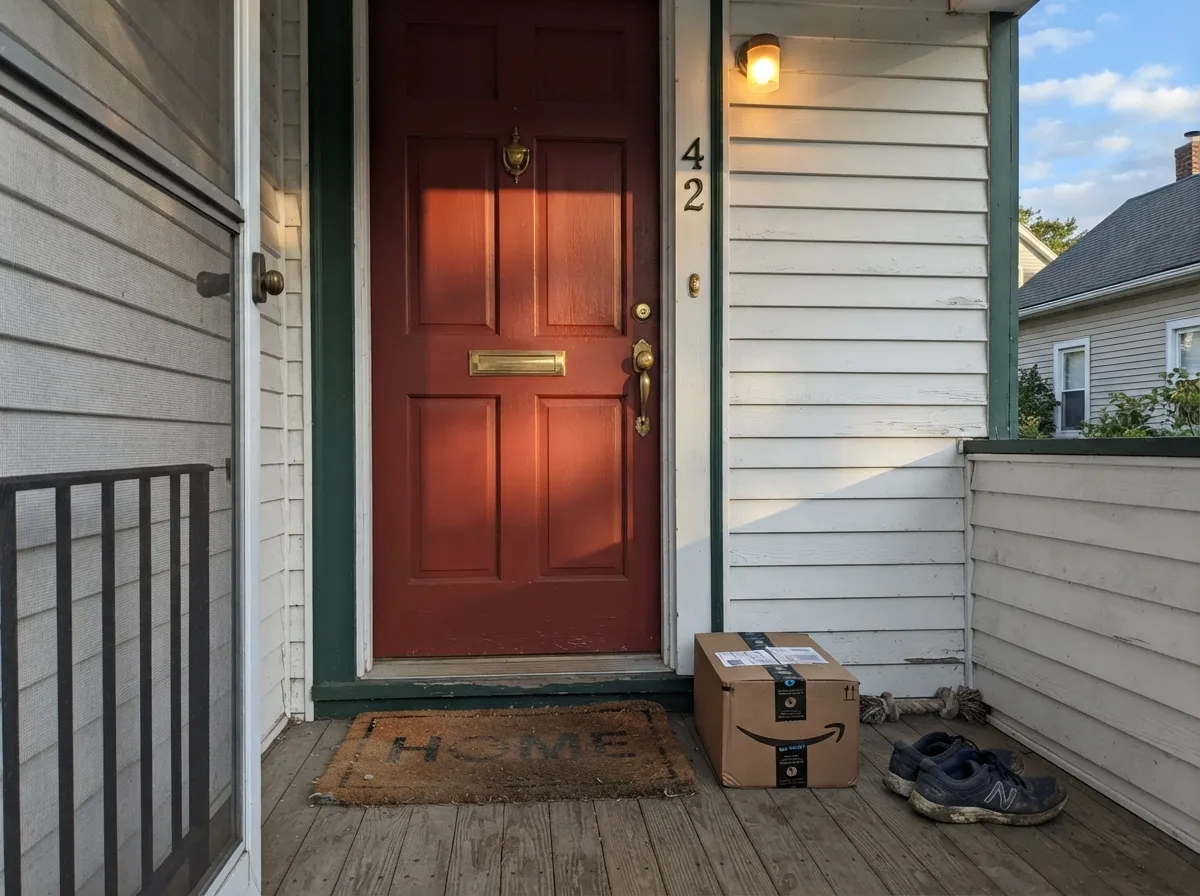
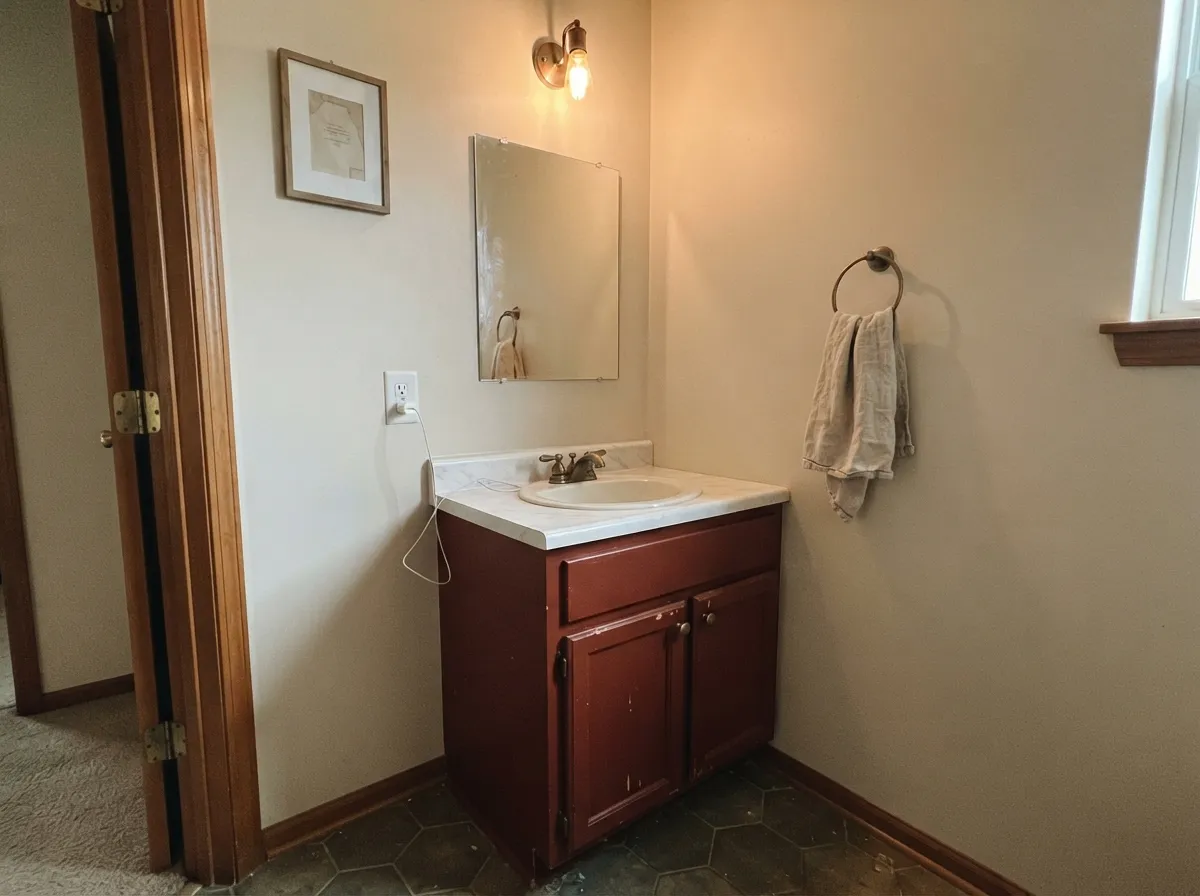
Give it a real light source and it does exactly what the name promises. Under a dining room chandelier or a run of sconces, the brown-orange undertone comes forward and the walls read like a good glass of wine — warm, saturated, flattering to candlelight and to the people sitting at the table. It's equally happy in small, doses-not-walls jobs: a front door, a powder room, an island, a hutch — places where a deep color is a decision, not a commitment.
Where It Fails
Almost every disappointed review of Dinner Party comes down to one of three predictable mismatches, and all three show up before the first coat if you're honest about the room. None of them are the paint's fault — but if your room matches one, this isn't your red.
LRV 7 means the color needs help to read as red at all. Without a chandelier, sconces or strong daylight, Dinner Party just goes dark and flat — readers describe it as "basically black" in a room they expected to feel warm. Add overhead light before you add paint, or pick a lighter red like Rosy Apple instead.
Cool light strips the brown-orange warmth out and leaves a muddy, almost bruised near-black with none of the wine glow this color is known for. Swap to warm 2700K bulbs before you blame the paint — it's the cheaper fix.
This is a one-room red. In an open floor plan it overwhelms the sightline from the kitchen or living room and fights whatever color is next door. Keep it to a closed dining room, a powder room, or trim work like a front door — not a flowing main floor.
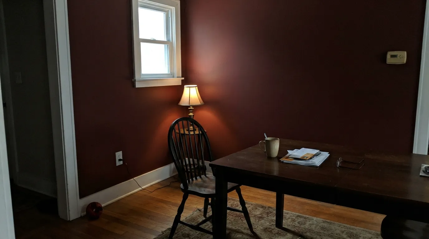
Room by Room
This is the color's entire reason for being. With a chandelier or dimmable sconces it turns candlelit and rich; White Dove trim keeps the room from feeling like a cave. Eggshell on the walls, semi-gloss on the trim.
Small, closed rooms take deep color well, and a powder room usually has a vanity light doing the work a dining room needs a chandelier for. Satin on the walls wipes clean; brass hardware is its best friend.
A shaded, north-facing door can read nearly black; a door that gets afternoon sun shows the brick-red clearly. Look at the door at the actual time of day people will see it before committing. Exterior-grade satin or semi-gloss.
Low light flatters it here the same way it flatters a dining room, and a desk lamp or reading light does the job a chandelier does elsewhere. Walnut shelves and leather furniture are its natural company.
Four walls of Dinner Party in a room that sees all-day traffic and connects to other spaces is a hard color to live with long-term. If you love it, use it as one accent wall with the rest of the room in a supporting neutral.
On an island or a coffee hutch under a lighter wall color it reads confident, not overwhelming. A full kitchen of Dinner Party cabinets needs strong task lighting or it just reads dark. Satin cabinet enamel either way.
Your Light Is the Risk
A real overhead fixture is what wakes the brown-red up. This is the light the color is built for — a dining room after dark, doing exactly what the name promises.
Daylight alone, in a dim or north-facing room, is not enough at LRV 7. The color reads flat and nearly black. Test with the lights on, not just by the window.
By day it's a dark, quiet brick-red in the background. As the sun drops and lamps come on, the orange-brown undertone comes forward and the room warms up.
Warm bulbs bring out the wine-red glow this color is known for. Cool white LEDs flatten it toward a muddy near-black — the single most common fix for a disappointing room.
Most complaints about Dinner Party are a light mismatch. Upload a photo of your actual room and see it on your walls — then ask for the same wall in north light or evening lamps before you buy a single sample.
Need It From Another Brand?
Any paint counter can custom-tint Benjamin Moore AF-300 directly. If you would rather stay in one brand's own deck, these are the closest stock matches, measured as ΔE2000. Under 2 is a difference you will not see on the wall.
| Brand | Closest color | ΔE | LRV | |
|---|---|---|---|---|
| Sherwin-Williams | Crabby AppleSW 7592 · Sherwin-Williams | 2.2 | 7 | Color page → |
| Behr | Tuscan RussetUL110-1 · Behr | 2.0 | 7 | Color page → |
| Valspar | Fire AgateT503 · Valspar | 2.0 | 7 | Color page → |
| PPG / Glidden | BordeauxPPG1055-7 · PPG / Glidden | 3.0 | 8 | Color page → |
| Glidden | Classic Burgundy09YR 05/305 · Glidden | 2.2 | 5 | Color page → |
| Dutch Boy | Red Farmhouse305-7DB · Dutch Boy | 3.7 | 7 | Color page → |
Similar Benjamin Moore Colors
The nearest shades to Dinner Party within Benjamin Moore's own range, ranked by perceptual color distance — useful when you want the same look a touch lighter, darker, or warmer.
WCAG 2.1: AA is 4.5 : 1 for normal text, 3 : 1 for large text, AAA is 7 : 1.
Dinner Party vs the Colors You're Also Considering
Every Dinner Party sample board has the same rivals on it. The numbers show the real lightness gap — then it comes down to which risk you would rather live with.
Pick this for the toned-down brick-red version that reads calmer across a whole dining room.
Benjamin Moore AF-290 · LRV 8CalientePick this if you want a true, bright red statement — Caliente is the benchmark, louder and more saturated.
Pick this for the warmer, browner oxblood that still reads clearly red under light.
Benjamin Moore CSP-450 · LRV 6BewitchedPick this if you want it even darker and cooler — Bewitched leans purple-black, pure drama with less orange.
Dinner Party Coordinating Colors
The rule for coordinating with Dinner Party: warm whites, warm woods, brass and near-blacks — keep cool grays and stark bright whites away from it, since they make the red look muddier by contrast instead of crisper. These are the partners that keep the color reading warm instead of flat:
Where Dinner Party Fits in BM's Red Lineup
Benjamin Moore sells several reds at very similar depth, and it's easy to grab the wrong one from a fan deck. Caliente is the brand's benchmark true red — brighter, more saturated, and built for a door or an accent, not a room you sit in for hours. Classic Burgundy sits at almost the same LRV as Dinner Party but leans purple and wine-toned rather than brown. Dinner Party's own lane is the toned-down middle ground: dark enough to feel serious, warm and brown enough to feel like a room you'd actually want to eat dinner in.
It comes from Benjamin Moore's Affinity Collection, a palette built so its colors sit at matched saturation levels and hand off to each other cleanly — which is part of why Dinner Party pairs so easily with warm neutrals instead of fighting them the way a louder red might.
Dinner Party With Wood Tones and Floors
Warm wood is this color's best friend. Walnut, mahogany, cherry and other red-brown woods deepen the mood instead of competing with it, and aged or antique brass hardware picks up the orange in the undertone beautifully. A dining table or built-in in any of these tones will look like it was chosen for this wall, not just placed against it.
Pale, cool-toned floors — gray-washed wood, light oak with a gray cast, cool LVP — are the one combination worth sampling first. Against a cool floor the wall's brown-orange warmth can look slightly disconnected rather than grounded. A warm rug closes that gap in most rooms without needing to change the floor.
Three Ready Palettes Built on Dinner Party
A color is never alone on the wall. These are complete combinations in the 60-30-10 pattern, with the reason each one holds together. Every one opens in the visualizer.
White Dove trim keeps a Dinner Party dining room from feeling like a cave, and its warm base doesn't fight the red's brown undertone the way a stark white would. Wrought Iron on a chair rail or door adds one near-black note without competing for attention.
Try this palette in your roomA crisp white body lets the brick-red door do all the talking, and charcoal shutters ground the palette without pulling toward the door's warmth or fighting it. Check the door at the actual hour it gets used before committing — shade reads darker than sun.
Try this palette in your roomCinnamon Slate is a lighter, browner cousin in the same warm family, so a built-in bookcase or single accent wall in it reads as depth, not a clash. Pale Oak in the hallway outside gives the eye a light, calm handoff before the room goes dark and dramatic.
Try this palette in your roomDinner Party FAQ
Is Dinner Party a true red or a brown?
Somewhere between the two, which is the point. It's built on a brown-orange base, so it reads as a deep brick-red under real light and as a very dark neutral-brown when the light is weak. If you want a true, saturated red, Caliente is the color to look at instead.
Will it look black in my room?
At LRV 7, yes, if there's no real light source. This is the single most common surprise with this color — it needs a chandelier, sconces or strong daylight to read as red rather than as a dark neutral. Test it with the lights on, not just next to a window.
Can I use it as a whole-house color?
No — this is a one-room or one-surface color. It's too dark and too committal for a connected floor plan, and in an open-concept home it overwhelms the sightline into whatever's next door. Dining rooms, powder rooms, front doors and doses on cabinetry are where it belongs.
How does it compare to Classic Burgundy?
Classic Burgundy leans purple and wine-toned; Dinner Party leans brown and orange. Side by side the difference is clear, but from a paint chip alone the two can look similar — sample both if you're choosing between them.
What trim white goes with Dinner Party?
A warm white like White Dove keeps the room from feeling stark against such a dark wall. A cool, bright white makes the red look muddier by contrast rather than crisper.
How many coats does it take?
Plan on a tinted (gray or deep-base) primer and two finish coats over an existing light color. Going the other direction — covering Dinner Party with a light color later — is the harder job and usually needs a stain-blocking primer first.
Have you painted with Dinner Party?
Rate it — one tap helps the next reader decide.
Ask a Question