Swiss Coffee
America's default creamy white, reviewed honestly: the rooms where it glows, the two lighting situations that turn it butter, and what to buy instead.

Jessica has spec'd whites and neutrals for more than 300 rooms and keeps a sample wall of painted drawdowns in her studio. Every color review is checked against real reader rooms in the comments and re-tested when a formula changes. About the testing process →
- 1First Star69
- 2Classic Gray74
- 3Swiss Coffee82
- 4Chantilly Lace91
- 5Ultra Pure White97
The Fast Verdict
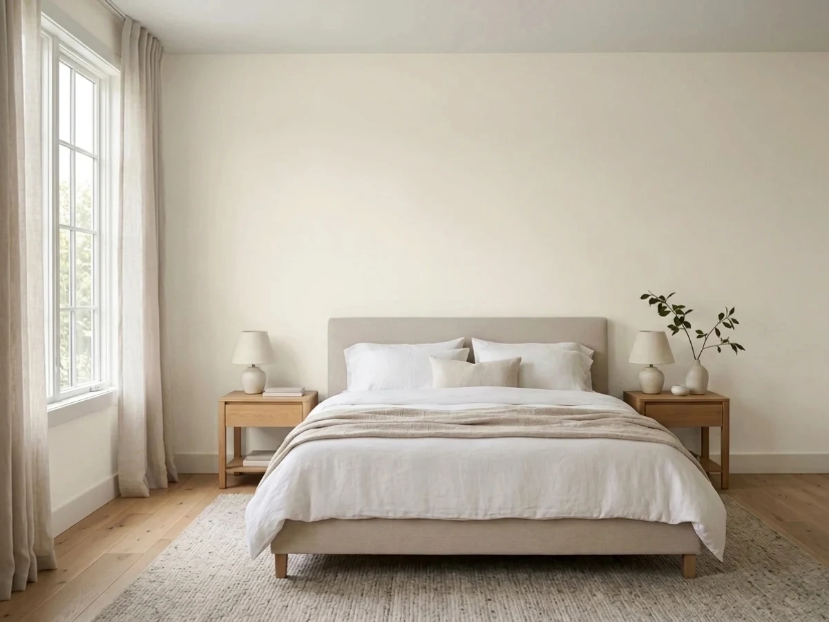
Swiss Coffee is the white people pick when plain white feels cold and hospital-like. At LRV 82 it stays genuinely bright, but there is real cream in it, and that cream is both the reason it sells and the reason it gets one-star reviews. Give it north light, cooler bulbs, and warm wood and it is one of the most forgiving whites you can buy. Give it a windowless basement, 2700K lamps, or a bright white ceiling to sit under, and it turns butter.
Whole-house walls and trim in one soft color · dim hallways, stairwells and windowless baths · kitchen cabinets with wood counters and brass · older homes with heavy millwork and warm floors
Your ceiling or trim stays a bright builder white · a south-facing room blazes all afternoon · your floors, tile or counters are cool gray · you want a crisp modern gallery white
- Bright at LRV 82 while still reading soft, not stark
- Fixes dim halls, stairwells and windowless baths
- Whole-house consistent — walls, trim and ceiling in one color
- Flatters oak, walnut, rattan, brass and aged bronze
- Hides caulk lines, dents and handprints better than a crisp white
- Turns plainly yellow under 2700K bulbs and in low light
- Looks dirty next to a bright white ceiling or trim
- Shows a green-gray cast against cool gray floors and tile
- Saturates warm on big sunny exterior walls by mid-afternoon
What Color Is Swiss Coffee, Really?
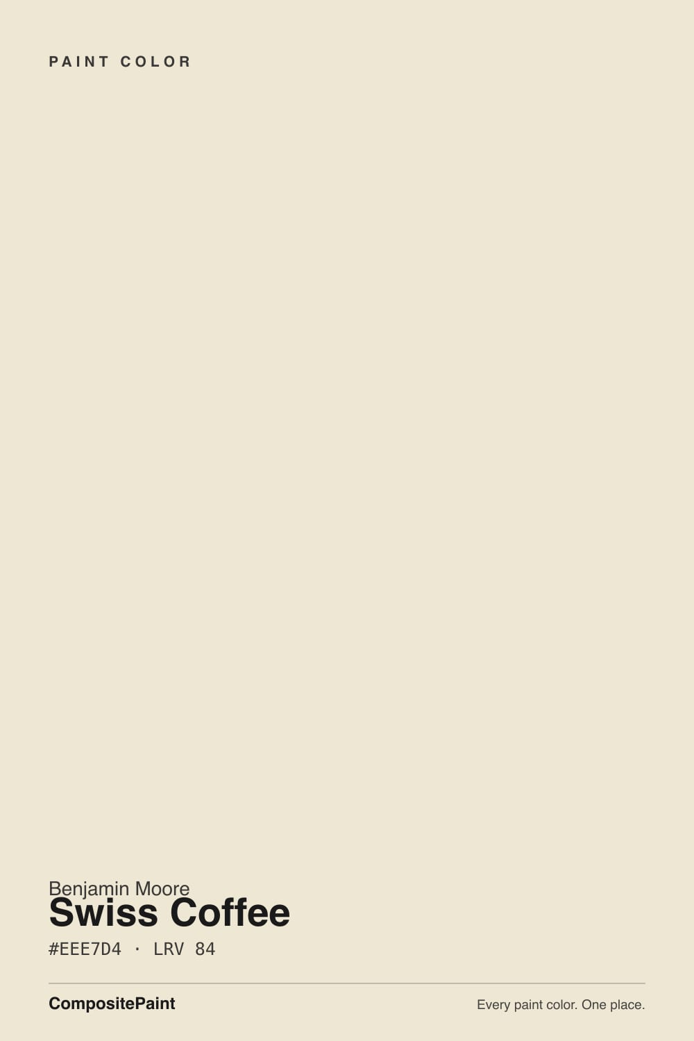
A creamy off-white with real pigment in it — the cream is not a rumor. The hue sits at 44 degrees, squarely in the yellow-gold part of the wheel, and there is a faint green-gray drag on top of it that keeps the yellow from going candy-sweet. That drag is why designers describe Swiss Coffee as "soft" rather than "buttery," and it is also why a few people swear their walls flashed green next to a cool gray floor. Both reactions are the same paint doing the same thing under different neighbors.
At LRV 82 it reflects almost as much light as the brightest whites, and that is the part most people get wrong. Next to White Dove OC-17 at LRV 85, Swiss Coffee is not darker in any meaningful way — it is warmer. Compare it to Alabaster SW 7008 at LRV 82 and Swiss Coffee is actually the lighter of the two, just more golden. So the choice is never about brightness. It is about how much cream you want to see, and how warm your light already is before the paint goes on.
Undertone in one line: warm yellow-gold with a quiet green-gray edge — never pink, never blue. If it looks green on your wall, look at your floor; if it looks yellow, look at your bulbs.
Where It Shines
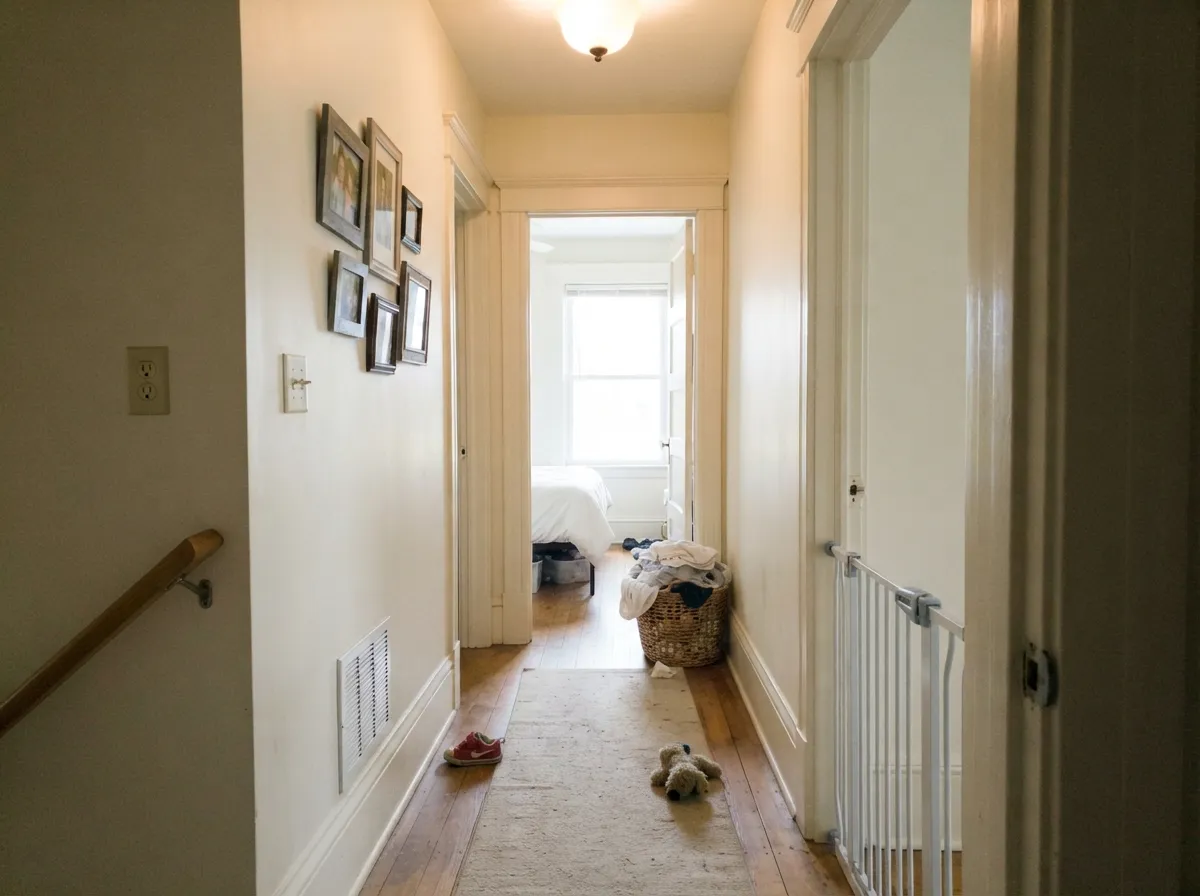
Its home turf is a house full of soft light and warm materials — oak floors, painted millwork, brass, unglazed tile. The one-color trick works beautifully here: Swiss Coffee on walls, trim and ceiling with only sheen changing, which is exactly how old houses with heavy molding look right instead of chopped up.
Where It Fails
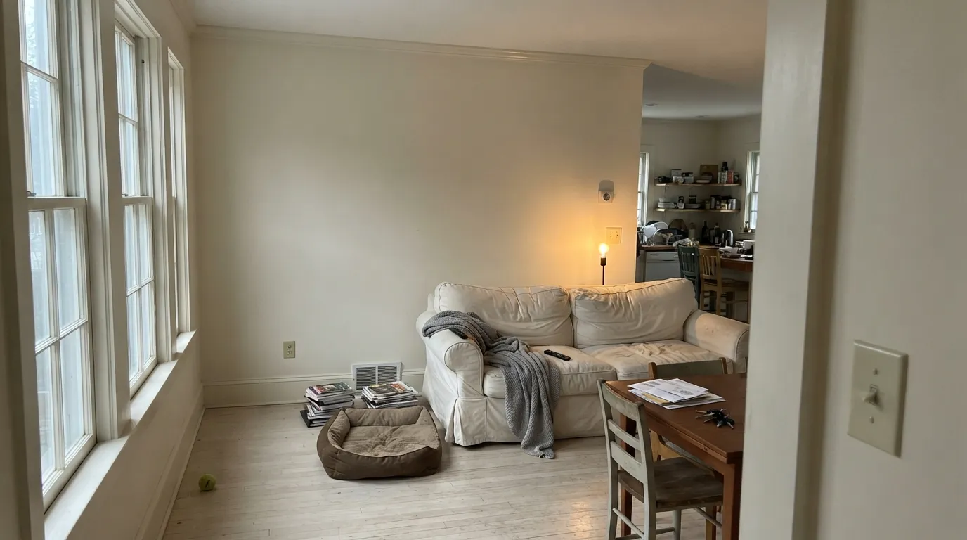
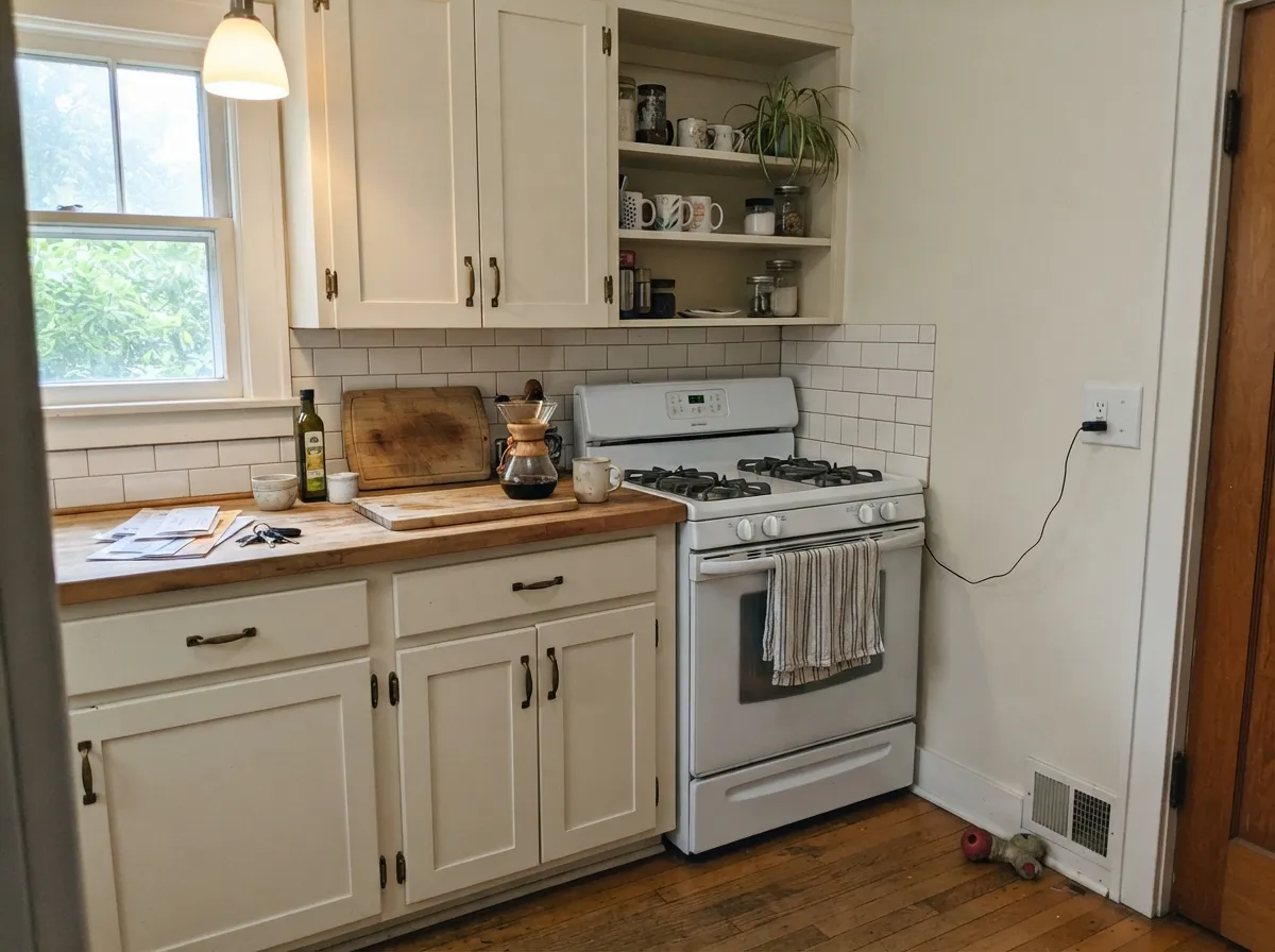
The complaints about Swiss Coffee are unusually consistent. Three situations produce almost every one of them, and none are fixed by another coat — they are decided before the lid comes off.
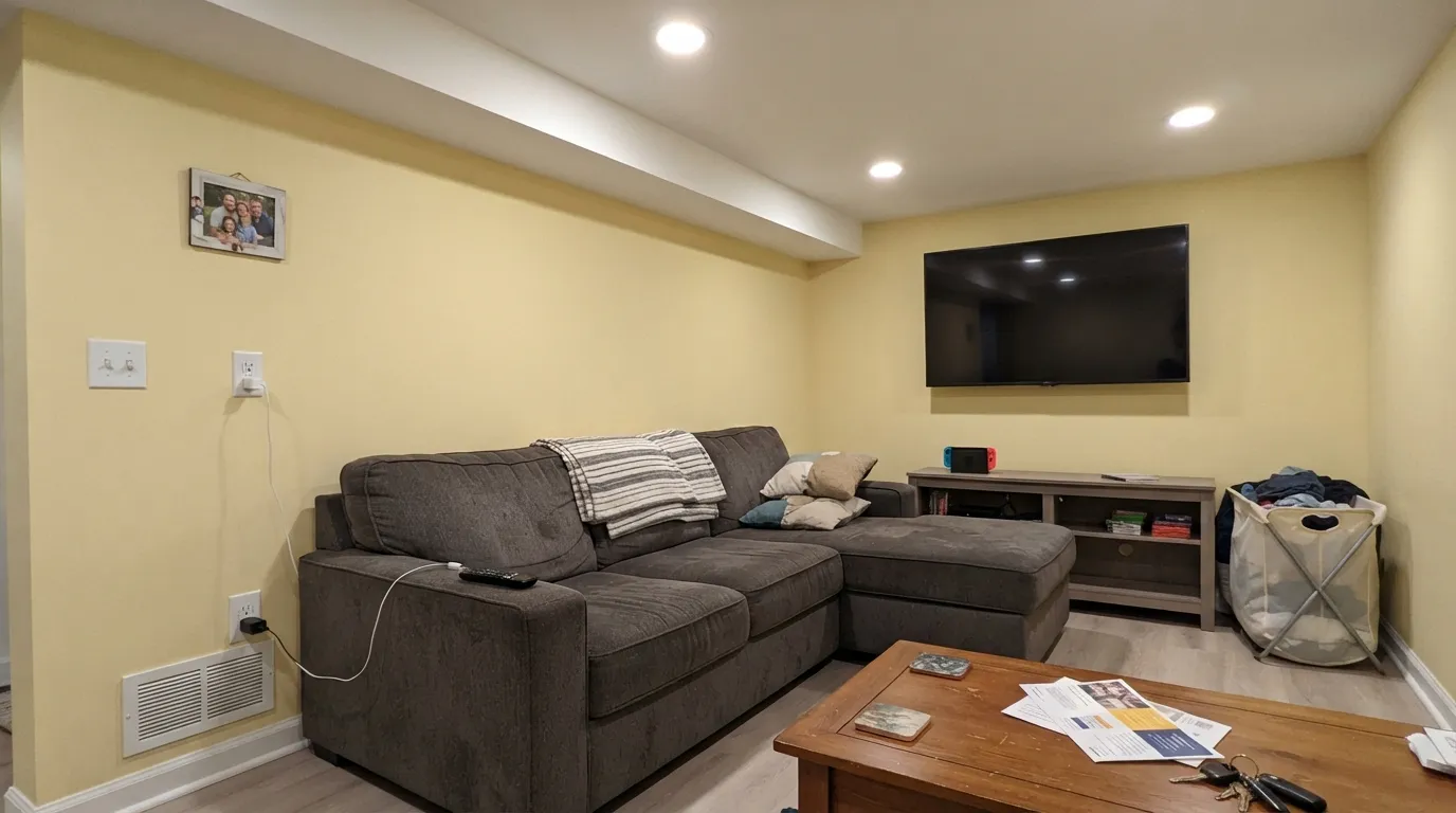
This is the classic bad story: a finished basement or an interior bath, plenty of recessed cans, and the walls read plainly yellow anyway. Warm 2700K light adds gold to a color that is already gold. Swap to 3500K–4000K bulbs first — that alone rescues most of these rooms. If the bulbs have to stay warm, use White Dove OC-17 instead.
Swiss Coffee walls with a stock flat-white ceiling is the single most common regret. The brighter white wins the comparison and the walls suddenly look dirty rather than creamy. The fix is not a different wall color — it is bringing the ceiling and trim into the same family, either Swiss Coffee itself or Cloud White OC-130 one small step up.
Gray LVP, blue-gray subway tile and cool quartz all sit at the opposite temperature, and they pull Swiss Coffee's green-gray edge to the surface. People describe it as "muddy" or "slightly green." With cool fixed surfaces, go to a cleaner white — Simply White 2143-70 or Chantilly Lace 2121-70.
Room by Room
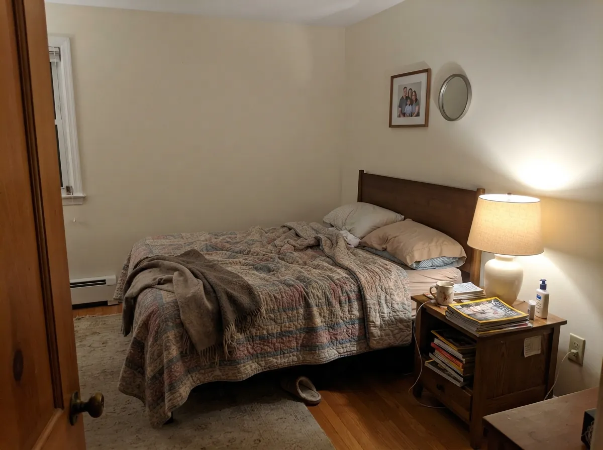
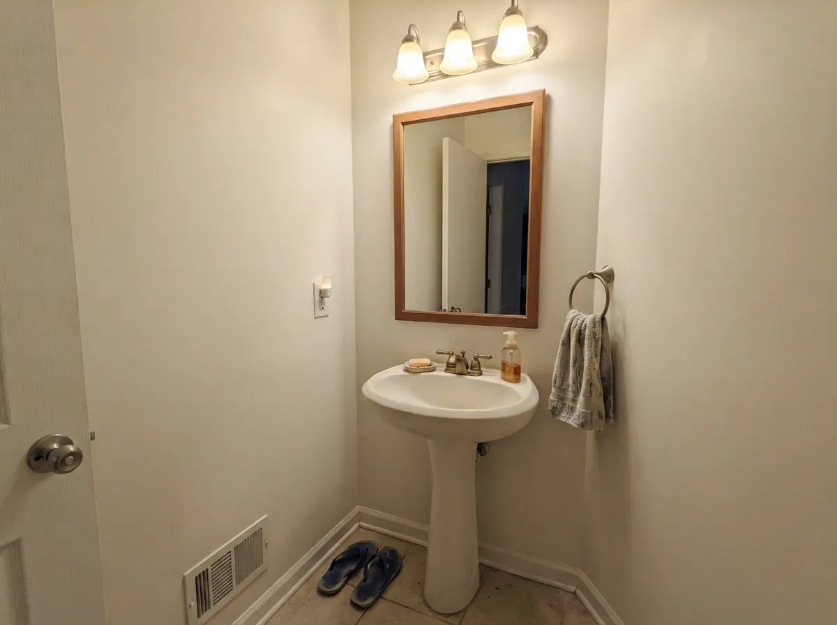
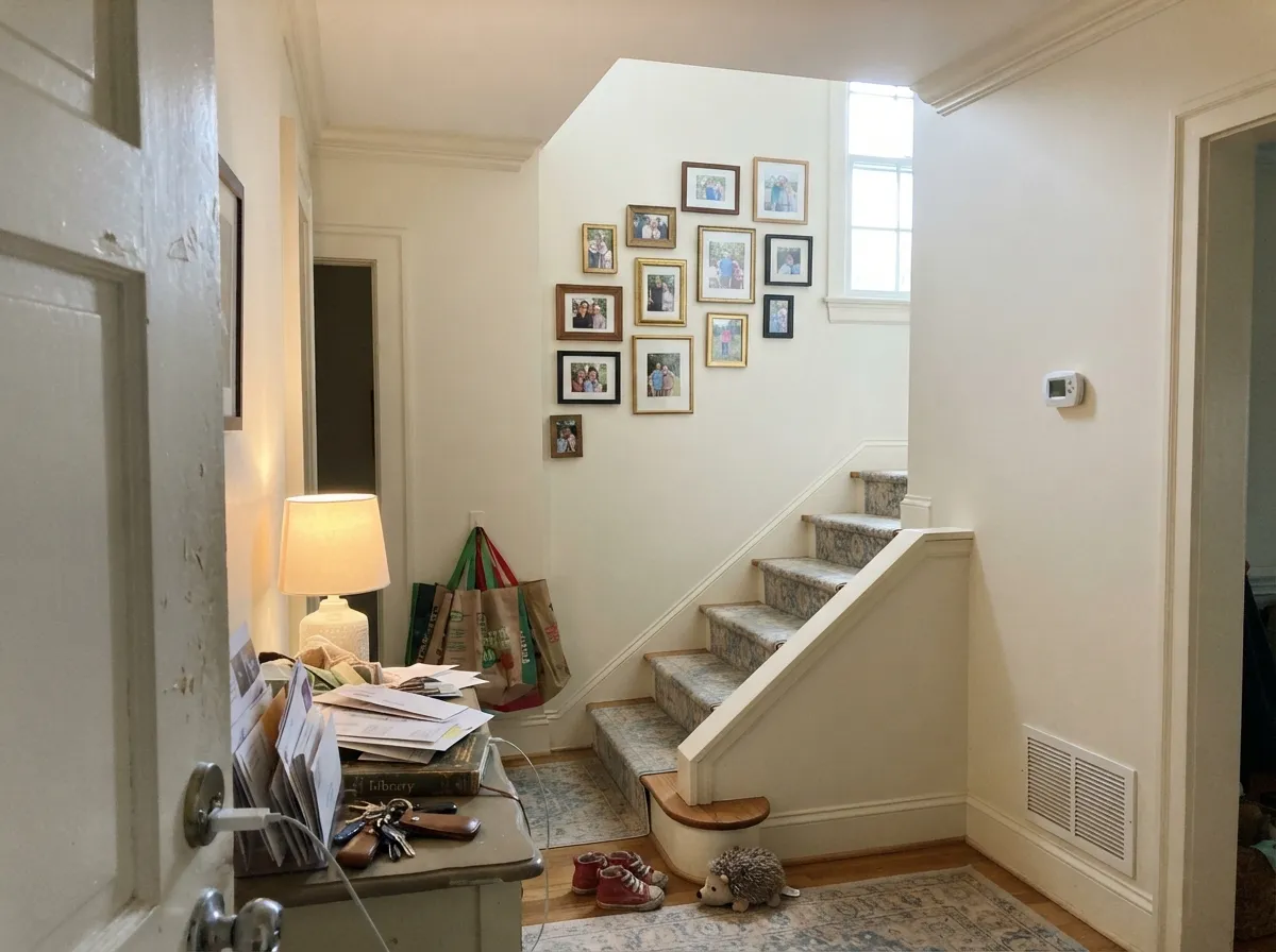
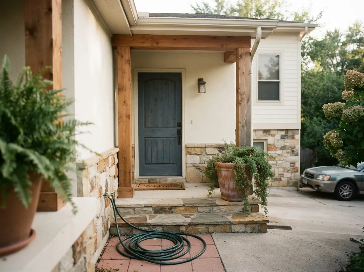
Your Light Is the Risk
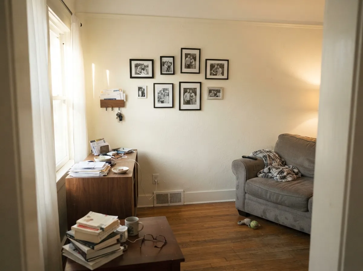
Cool daylight cancels the gold. Reads as a plain, easy soft white — its safest room.
Direct sun pushes the cream forward. By late afternoon the walls can glow yellow.
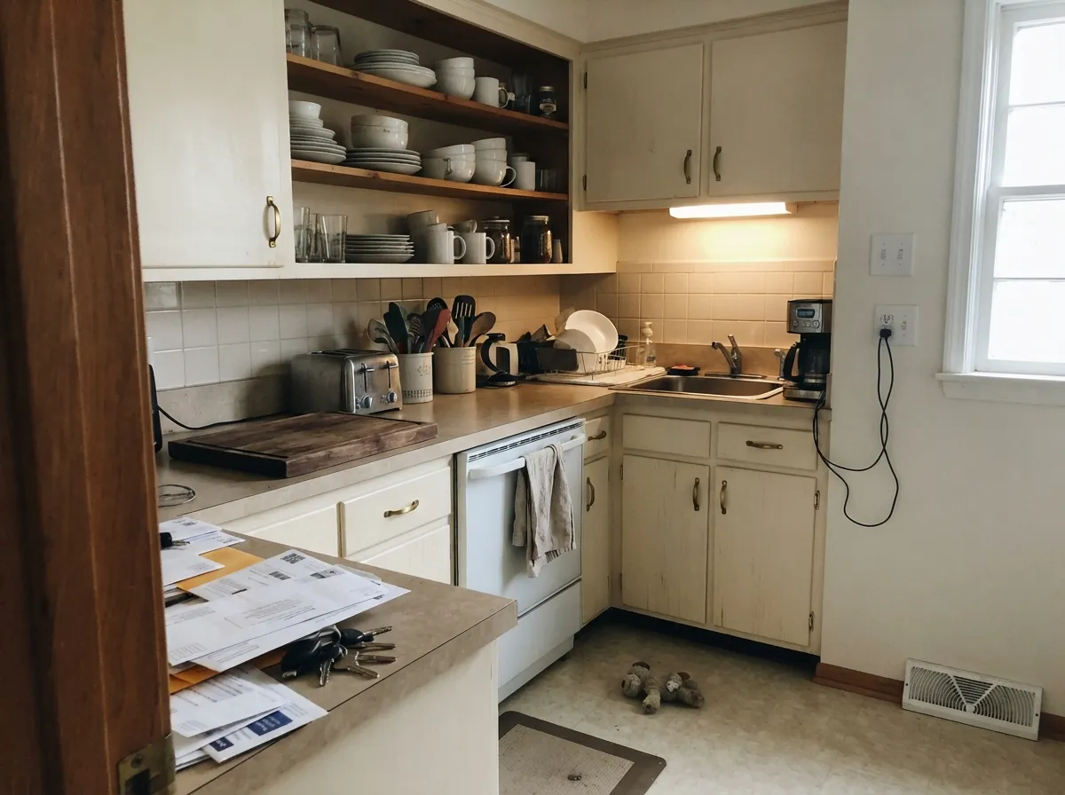
2700K lamps deepen it toward butter. 3500K–4000K bulbs pull it back to white.
At LRV 82 it lifts a dark room beautifully — as long as the bulbs are not warm.
Most complaints about Swiss Coffee are a light mismatch. Upload a photo of your actual room and see it on your walls — then ask for the same wall in north light or evening lamps before you buy a single sample.
Need It From Another Brand?
Any paint counter can custom-tint Benjamin Moore OC-45 directly. If you would rather stay in one brand's own deck, these are the closest stock matches, measured as ΔE2000. Under 2 is a difference you will not see on the wall.
| Brand | Closest color | ΔE | LRV | |
|---|---|---|---|---|
| Sherwin-Williams | CottonSW 9581 · Sherwin-Williams | 0.8 | 83 | Color page → |
| Behr | Salt CrystalQE-25 · Behr | 1.0 | 83 | Color page → |
| Valspar | Polar White7003-16 · Valspar | 1.1 | 83.7 | Color page → |
| PPG / Glidden | Winter MoodPPG14-16 · PPG / Glidden | 0.8 | 83 | Color page → |
| Glidden | Winter MoodPPG14-16 · Glidden | 0.8 | 84 | Color page → |
| Dutch Boy | Whispered White019W · Dutch Boy | 1.0 | 83 | Color page → |
Similar Benjamin Moore Colors
The nearest shades to Swiss Coffee within Benjamin Moore's own range, ranked by perceptual color distance — useful when you want the same look a touch lighter, darker, or warmer.
WCAG 2.1: AA is 4.5 : 1 for normal text, 3 : 1 for large text, AAA is 7 : 1.
Swiss Coffee vs the Colors You're Also Considering
Every Swiss Coffee sample board has the same rivals on it. The numbers show the real lightness gap — then it comes down to which risk you would rather live with.
Pick this when you want the cream to actually show and soften the room.
Benjamin Moore OC-17 · LRV 85White DovePick this for a quieter white that holds up in strong sun and warm bulbs.
Side-by-side comparison →Pick this for the lighter, more golden read — it reflects a touch more light.
Sherwin-Williams SW 7008 · LRV 82AlabasterPick this if your painter buys Sherwin-Williams and you want more gray in it.
Side-by-side comparison →Alabaster SW 7008, at LRV 82 with hex #EDEAE0, is the closest well-known rival. It is slightly darker and clearly less yellow, sitting on a gray-cream base, so Swiss Coffee looks creamier when the two are side by side.
White Dove OC-17, hex #F0EFE2 and LRV 85, is brighter and much less golden, with warmth that leans soft gray. Pick White Dove when you want a color that still reads as white in strong sun, and Swiss Coffee when you want visible softness.
Navajo White 947, hex #EEE7D5 and LRV 78, shares almost the same hex but reflects less light, so on a wall it reads deeper and more clearly beige.
Watch the name trap. Behr sells its own Swiss Coffee, number 12, at LRV 80 with hex #EBE4D2. It is darker and a little duller than this one, so asking for the name at another counter does not get you this color. Benjamin Moore sells through independent dealers, so match by the OC-45 code.
Swiss Coffee Coordinating Colors
The rule with Swiss Coffee is to stay on the warm side and keep the contrast intentional. It partners easily with warm greiges, muted greens, deep navies and true charcoals, and it fights with anything blue-based — icy grays, cool blues, and stark builder white. These are the colors that keep showing up next to it in real houses:
Swiss Coffee on Exteriors
Outside is where Swiss Coffee behaves least like it does on the chip. A wall of siding or stucco is enormous compared to a sample board, and hours of direct sun saturate the warmth across all of it at once. Homes that look softly creamy at nine in the morning can read plainly yellow by four in the afternoon, especially on a south or west elevation. The shaded north side, meanwhile, stays quiet and almost neutral — so the same house can show two different colors on the same day.
That is not a reason to avoid it. It is one of the most-used warm exterior whites in the country for good reason: it suits stucco, shingle, stone and cedar, and it makes new construction look settled instead of raw. But the pairing decides everything. Dark trim reads it as crisp — Wrought Iron 2124-10 or Kendall Charcoal HC-166 for shutters and doors. Warm greige trim like Revere Pewter HC-172 goes soft and traditional. What to avoid is a cool gray or blue-gray accent, which makes the siding look yellowed by comparison. Paint two large boards, put one on the sunny side and one on the shaded side, and look at both at four in the afternoon.
Swiss Coffee With Wood Tones and Floors
Warm wood is where this color earns its reputation. Red oak, honey oak, white oak, walnut, butcher block and rattan all sit comfortably against it, because the cream meets their warmth instead of fighting it. If you have orange-leaning builder oak floors and every white you sample looks like it is amplifying the orange, Swiss Coffee is one of the few that quietly absorbs it — the two warms cancel rather than compete.
Cool gray floors are the opposite story, and this is the pairing that produces the "my walls look green" messages. Gray LVP, gray-washed engineered wood and cool gray tile all sit at the far side of the temperature line, and against them Swiss Coffee's green-gray edge stops being subtle. Warm rugs, wood furniture and brass fix it in some rooms, but not in a dim one. If your floor is cool gray and you cannot change it, sample the wall color directly on the floor, in the evening, before you buy five gallons.
Three Ready Palettes Built on Swiss Coffee
A color is never alone on the wall. These are complete combinations in the 60-30-10 pattern, with the reason each one holds together. Every one opens in the visualizer.
One color at two sheens removes the bright-white ceiling problem entirely, which is where most Swiss Coffee regret starts. The navy door gives the scheme its single dark note so the cream never has to carry contrast it cannot.
Try this palette in your roomEdgecomb Gray sits on the same warm base, so the cabinet-to-wall handoff reads deliberate instead of dirty. Kendall Charcoal grounds the room and gives brass hardware something dark to sit against.
Try this palette in your roomRevere Pewter trim keeps the contrast low so full sun has nothing bright to make the siding look yellow against. Wrought Iron supplies the hard dark edge that reads the cream as crisp rather than aged.
Try this palette in your roomSwiss Coffee FAQ
Does Swiss Coffee look yellow?
It can, and the bulbs decide it more than the paint does. Under 2700K lamps or in a windowless room with warm cans, it reads clearly buttery. Switch to 3500K or 4000K bulbs and the same wall goes back to soft white. In north light it barely shows any yellow at all.
Does Swiss Coffee really have a green undertone?
There is a faint green-gray edge sitting under the yellow, and it is what keeps the color from going sweet. You will never see it on the chip. You may see it on a wall that sits against cool gray flooring, blue-gray tile, or a gray quartz counter, where the contrast pulls it forward.
Swiss Coffee or White Dove for cabinets?
Swiss Coffee if the kitchen has wood counters, brass, or warm tile — it looks like painted furniture. White Dove if the counters are quartz, the tile is cool, or the room gets hard afternoon sun. On cabinets the two are close in brightness, so pick on warmth, not on LRV.
Can I paint the ceiling Swiss Coffee too?
Yes, in flat, and it solves the biggest complaint about this color. A stock bright-white ceiling over Swiss Coffee walls makes the walls look dingy by comparison. Same color overhead keeps the whole envelope soft and reads far more expensive in rooms with molding.
Will it look dirty next to my white kitchen cabinets?
If the cabinets are a bright, blue-based white, yes — that is the pairing to avoid. Swiss Coffee walls need cabinets in the same warm family, or a deliberate step like Cloud White OC-130. Against factory bright-white cabinets, use a cleaner wall white instead.
Does it work with gray floors?
Cool gray LVP and gray-washed wood are the hardest test for it. The floor makes the wall look slightly green or muddy, especially in low light. Warm gray or greige floors are fine. Tape a large sample right down onto the actual floor before you commit.
How many coats does it need?
Two over an existing light color, and three if you are going over a mid-tone beige or a saturated wall without priming. Cream whites like this one have poor hide over strong colors. Use a gray-tinted primer over anything dark and you will stay at two finish coats.
Have you painted with Swiss Coffee?
Rate it — one tap helps the next reader decide.
Ask a Question