Vanilla Milkshake
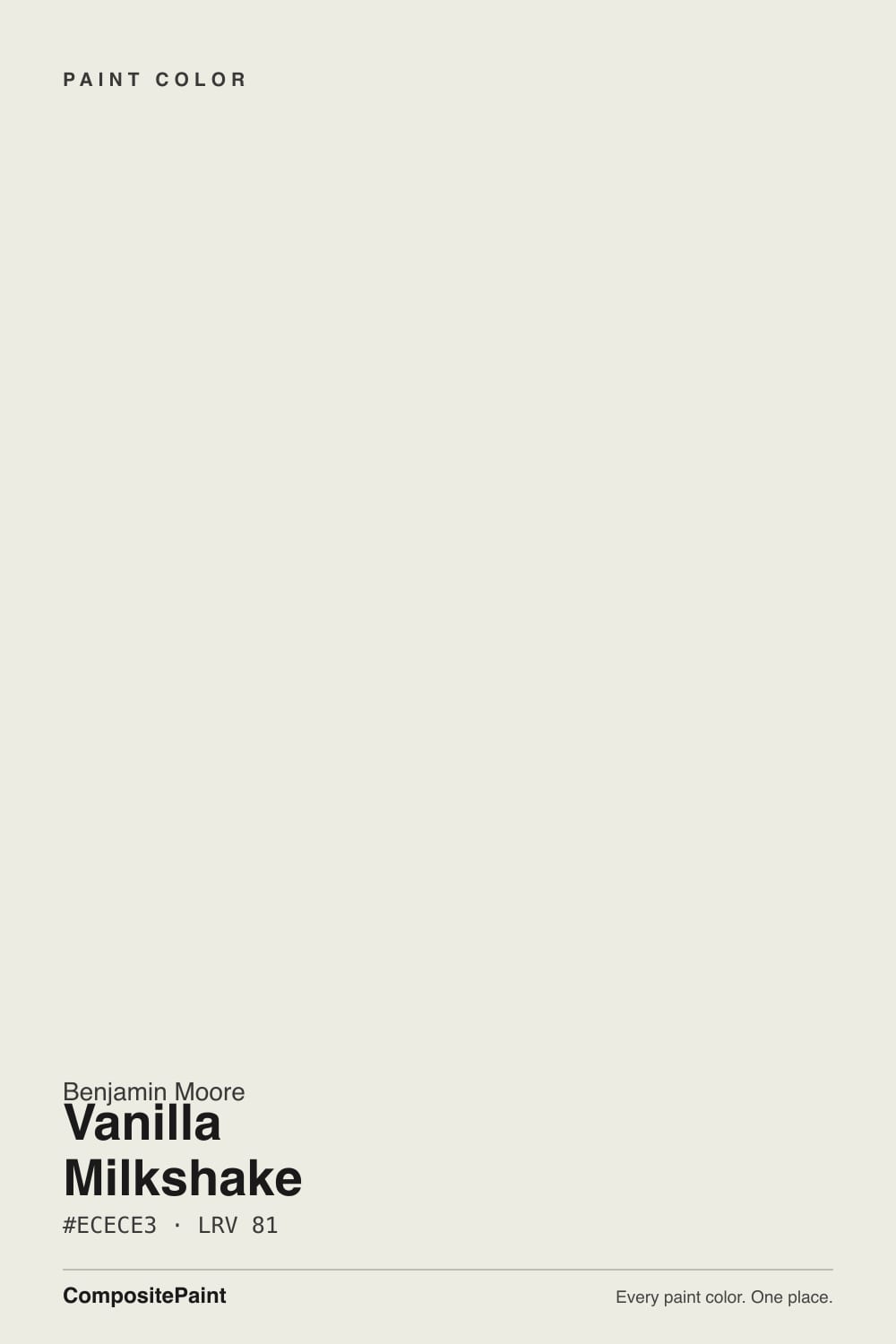
2141-70 · #ECECE3 · LRV 81 — warm yellow tone, very light — near-white, broadens small spaces.
- 1First Star69
- 2Classic Gray74
- 3Vanilla Milkshake81
- 4Extra White86
- 5Chantilly Lace91
What Color Is Vanilla Milkshake, Really?
Vanilla Milkshake 2141-70 is a soft warm white. Its LRV is 81, which puts it near the top of the white range, so it bounces plenty of light and reads bright on a wall without the hard glare of a pure white. The hex is #ECECE3, a yellow-based tone at roughly 19 percent saturation, so the warmth is there but held back. In most rooms people simply call it white.
Whites at this level get chosen for the same reason: they warm a space without making it look yellow. Vanilla Milkshake gives walls a quiet cream cast that keeps rooms from feeling cold, and it is light enough to use everywhere in a house without any one room looking different from the next. It suits trim, ceilings, cabinets, and full walls equally well.
The thing to check is which way the warmth tips in your light. In the hex, red and green sit at the same value and blue drops below both, so under certain bulbs and against pink-based whites the color can look faintly green rather than creamy. It is a small shift, but on a large wall it is visible. Benjamin Moore sells through independent dealers, so pick up a sample pot and paint a board before you buy gallons.
Vanilla Milkshake is built on a yellow hue at 60 degrees with about 19 percent saturation, so the warmth is real but quiet. Look at the hex, #ECECE3, and the red and green values are identical while blue sits lower. That balance is what makes it read as soft cream in most rooms and as faint celery in a few. The green side tends to appear next to pink-based or red-leaning whites, where Vanilla Milkshake suddenly looks cooler than you expected. Next to a stark blue-white it goes the other direction and looks clearly creamy. Against oak floors, natural linen, and brass it settles down and stops announcing any undertone at all. Sample it beside one crisp white and one pink-based white on the same board. That comparison tells you within a minute whether the yellow reads as warm cream in your room or drifts slightly green.
Best Rooms and Uses for Vanilla Milkshake
With an LRV of 81 this is a whole-home white. It brightens hallways, stairwells, and small rooms without the glare a near-100 white throws, and it is soft enough to carry every wall in an open plan. Bedrooms and living rooms take it easily. It is also a practical trim and ceiling color. Painting walls, trim, and doors all in Vanilla Milkshake gives a seamless low-contrast look that suits millwork-heavy rooms and older houses. On cabinets the gentle warmth reads custom rather than clinical, and it forgives small surface flaws better than a bright white does. Outdoors it works as a warm body or trim color and sits comfortably with stone, brick, and wood. What it will not do is create contrast. Treat it as the calm background and let a dark door, a deep island, or the floors carry the weight.
How Lighting Changes Vanilla Milkshake
At LRV 81 Vanilla Milkshake reflects a lot of light, so it stays bright almost anywhere. The real question is which way the warmth tips. North-facing rooms get cool, indirect daylight that cancels most of the yellow, and the color lands as a clean soft white with only a trace of cream. That makes it dependable in rooms where a true white would feel cold. South and west rooms do the opposite. Direct sun pulls the yellow forward, and by late afternoon the walls look distinctly creamy. East rooms warm in the morning and quiet down after noon. Bulbs matter as much as windows. Warm 2700K lamps push it further into cream and can bring the faint green lean into view on a big wall. Neutral 3500K to 4000K bulbs keep it crisp. Look at your sample at night under your own fixtures, not only in daylight.
Most complaints about Vanilla Milkshake are a light mismatch. Upload a photo of your actual room and see it on your walls — then ask for the same wall in north light or evening lamps before you buy a single sample.
Need It From Another Brand?
Any paint counter can custom-tint Benjamin Moore 2141-70 directly. If you would rather stay in one brand's own deck, these are the closest stock matches, measured as ΔE2000. Under 2 is a difference you will not see on the wall.
| Brand | Closest color | ΔE | LRV | |
|---|---|---|---|---|
| Sherwin-Williams | CottonSW 9581 · Sherwin-Williams | 1.4 | 83 | Color page → |
| Behr | Smoky WhiteBWC-13 · Behr | 0.5 | 83 | Color page → |
| Valspar | Cool Gray7006-10 · Valspar | 1.4 | 83.2 | Color page → |
| PPG / Glidden | GypsumPPG1006-1 · PPG / Glidden | 0.2 | 84 | Color page → |
| Glidden | Mountain Mist10GY 83/050 · Glidden | 0.0 | 83 | Color page → |
| Dutch Boy | Pristine Pearl021W · Dutch Boy | 1.5 | 84 | Color page → |
Similar Benjamin Moore Colors
The nearest shades to Vanilla Milkshake within Benjamin Moore's own range, ranked by perceptual color distance — useful when you want the same look a touch lighter, darker, or warmer.
WCAG 2.1: AA is 4.5 : 1 for normal text, 3 : 1 for large text, AAA is 7 : 1.
Vanilla Milkshake vs Similar Colors
Icicle 2142-70 at LRV 82 is the closest neighbor in the line, and at #EDEDE3 against #ECECE3 the two behave like the same paint on a wall. Swiss Coffee OC-45, #EEECE1 at LRV 82, carries a little more red and yellow, so it looks creamier and softer. Dune White 968 at #ECEAE0 and LRV 80 is the beigest of the group and the one most likely to read as an off-white rather than a white. Across brands, Glidden Mountain Mist 10GY 83/050 shares the same hex at a deltaE of 0, while PPG Gypsum PPG1006-1 at 0.21 and Behr Shoelace OR-W13 at 0.44 are matches for practical purposes. Sherwin-Williams Cotton SW 9581 at deltaE 1.43 is visually identical in normal room light. Clare Classic at 3.4 is very close but worth sampling first, and Farrow & Ball Wevet No. 273 at 3.56 is close but visibly different side by side, reading cooler and grayer.
Colors That Go With Vanilla Milkshake
Because it sits so high on the light scale, the most useful partners are its own neighbors. Icicle 2142-70 at LRV 82 is a hair brighter and can serve as trim if you want the faintest step up. Swiss Coffee OC-45 at LRV 82 is slightly creamier and works on a connected ceiling or in an adjacent room without breaking the flow. Dune White 968, also listed as CC-70, at LRV 80 is a touch deeper and beiger, which makes it a quiet step-down for trim in the other direction or for a hallway that meets the room. For contrast, look outside the white family entirely. A deep green, a navy, or a near-black on a door, island, or built-in gives the eye somewhere to land. Warm oak, walnut, and rattan all flatter the yellow lean. Brass and matte black hardware read well against it, while polished chrome can look a little cold.
Coordinated palette
Generated by hue-rotating #ECECE3 in HSL space. Pair Vanilla Milkshake with one accent and one neutral — the swatches below are starting points, not final picks.
Vanilla Milkshake FAQ
Is Vanilla Milkshake warm or cool?
It is a warm white. The hue sits at 60 degrees, which is straight yellow, at about 19 percent saturation. That gives it a soft cream cast rather than a blue or gray one. Because the LRV is 81 the warmth stays gentle, so in cool north light it can read almost like a plain clean white.
What LRV is Vanilla Milkshake?
Vanilla Milkshake has an LRV of 81. Light reflectance value runs from 0 for black to 100 for pure white, so 81 means the color returns a lot of light and clearly reads as a light white. It opens up small or dim rooms without the harsh bounce a near-100 white can create.
Does Vanilla Milkshake look green?
It can, in specific conditions. In the hex #ECECE3 the red and green values are equal, so under warm bulbs or next to a pink-based white the yellow can tip toward a faint celery green. In most daylight it simply reads as a soft cream white. Paint a board and check it against a pink-based white before you decide.
What trim white goes with Vanilla Milkshake?
Icicle 2142-70 at LRV 82 gives the smallest possible step up if you want trim slightly brighter than the walls. Many people also run Vanilla Milkshake on walls and trim together for a seamless look, which suits rooms with a lot of millwork. For a warmer trim direction, Swiss Coffee OC-45 at LRV 82 is a creamier option.
Is Vanilla Milkshake good for cabinets and trim?
Yes. At LRV 81 it is bright enough to look like a white cabinet but warm enough to avoid the clinical edge of a stark white, and the soft yellow base hides minor surface flaws better than a pure white does. It works the same way on doors, baseboards, and crown molding, and holds up outdoors as trim or a warm body color.
What is the difference between Vanilla Milkshake 2141-70 and OC-59?
There is no color difference. The same Vanilla Milkshake appears under both 2141-70 and OC-59, with the same hex #ECECE3 and the same LRV 81. The two codes come from different Benjamin Moore collections. Order by either number and you get the same paint.
Have you painted with Vanilla Milkshake?
Rate it — one tap helps the next reader decide.
Ask a Question