Sand Dollar
A soft beige-pink near-white Benjamin Moore quietly recommends for almost every room, reviewed honestly: where the warmth glows, the light where it goes flat, and the naming mix-up that trips up online shoppers.

Jessica has spec'd whites and neutrals for more than 300 rooms and keeps a sample wall of painted drawdowns in her studio. Every color review is checked against real reader rooms in the comments and re-tested when a formula changes. About the testing process →
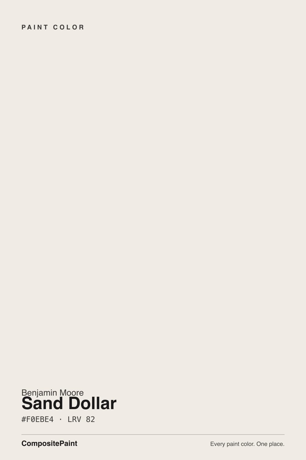
- 1First Star69
- 2Classic Gray74
- 3Sand Dollar82
- 4Chantilly Lace91
- 5Ultra Pure White97
The Fast Verdict
Sand Dollar is a pale, warm off-white built from beige with a whisper of pink and a touch of gray — close enough to White Dove and Swiss Coffee to sit on the same shelf, different enough that you can tell them apart on the wall. At LRV 82 it reflects most of the light it gets, so rooms stay bright, but the beige body keeps it from reading stark or cold. It has no Color of the Year moment and no viral design-blog thread behind it — it is a workhorse near-white that Benjamin Moore itself lists for nearly every room in the house, and it earns that list honestly.
Bedrooms and living rooms that want warmth without going yellow · kitchen walls and cabinets with brass or warm wood · bathroom vanities · exteriors in real sun · anyone who wants White Dove's calm with a touch more beige-pink body
Your room stays dim and north-facing most of the day · your counters, tile, or fixtures lean cool blue-gray · you are ordering a sample online and haven't confirmed the number 877 · you want a color with an internet reputation to point to, not a quiet background
- Soft, warm beige-white with a pink-gray whisper — never yellow-heavy
- LRV 82 keeps rooms bright without going stark
- Officially recommended by Benjamin Moore for nearly every room, including cabinets and exteriors
- Flatters brass, warm wood, and warm stone
- A safe whole-house or trim-adjacent neutral that won't fight a busy room
- Goes flat and dull in dim, north-facing rooms without lamps
- Clashes with cool blue-gray counters, tile, or fixtures
- Shares its name with a completely different, peachier Sherwin-Williams color (SW 6099) — easy to order the wrong sample
- Very little independent design coverage; you're mostly on your own for real-room examples
What Color Is Sand Dollar, Really?
A pale warm neutral built on beige, with research and independent color-matching sources describing a subtle pink and gray blend layered on top — enough to keep it from reading as a plain builder beige, not enough to make it read as pink. Benjamin Moore's own site lists Sand Dollar as a recommended color for bedroom walls, living areas, hallways, bathroom vanities, kitchen cabinets and walls, and even exterior walls and ceilings — a genuinely wide official endorsement for a color that has almost no independent buzz beyond paint-matching databases and a handful of SEO color-review sites.
At LRV 82 it sits in the same light-reflectance neighborhood as some of Benjamin Moore's best-known near-whites: close to White Dove (LRV 85) and BM Alabaster (LRV 85), and essentially tied with Sherwin-Williams Alabaster (LRV 82). Put it next to White Dove and the difference is subtle but real — Sand Dollar carries a touch more visible beige-pink body, where White Dove leans quieter and greyer. It is not a color that announces itself; it is a color that makes a room feel finished without asking anyone to notice the paint.
Undertone in one line: warm beige first, a whisper of pink and gray underneath — never yellow-heavy, never icy. If your wall reads flat and gray, that's a dim-room problem, not the paint; if it reads noticeably peachy-pink, you may be looking at a different color entirely (more on that below).
Where It Shines
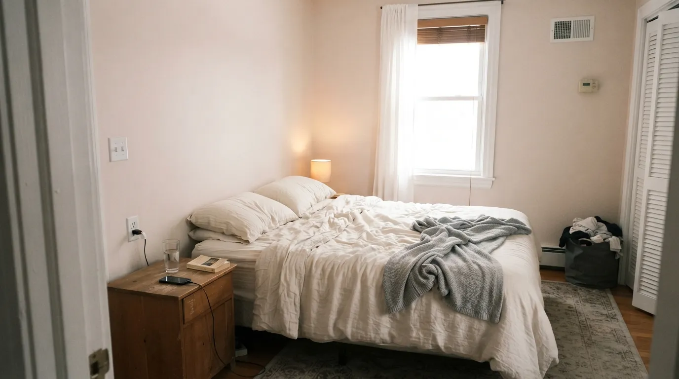
Give it real daylight and it does exactly what Benjamin Moore's own room list promises: it works almost anywhere. Because the pink and gray are both muted, it doesn't fight warm wood, brass, or the cooler edges of a kitchen the way a stronger beige can — and at LRV 82 it keeps rooms bright instead of dense. Its best moments are ordinary ones: a bedroom that reads calm and warm all day, a kitchen wall or cabinet run that lets wood tones and hardware do the talking, an exterior wall in full sun that reads crisp rather than dingy.
Where It Fails
Sand Dollar doesn't have a famous complaint thread the way some big-name colors do — the reviews are thin. What research does turn up follows three predictable patterns, and one of them is unique to a low-profile color like this: shoppers grab the wrong swatch entirely.
Like almost every pale warm neutral, Sand Dollar depends on real light to hold its beige-pink balance. Reviewers describe it going flat and dull without daylight. The color isn't broken — add warm 2700K lamps or pick a color with more built-in depth if the room stays gray all day.
Blue-gray quartz, cool marble, and brushed-chrome fixtures sit at the opposite temperature and can make Sand Dollar's warmth look muddy by comparison. Pair it with warm stone, brass, or matte black instead.
Sherwin-Williams sells a completely different paint also called Sand Dollar (SW 6099) — a noticeably deeper, more peach-leaning color that looks nothing like Benjamin Moore's version once it's on a wall. Some third-party paint-matching sites also list conflicting LRV and undertone numbers for Benjamin Moore's own Sand Dollar. Confirm you're getting Benjamin Moore code 877 before you order a sample.
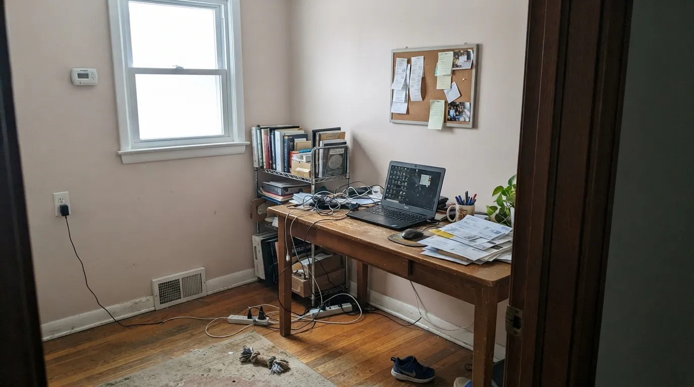
Room by Room
Warm without tipping yellow, bright enough at LRV 82 to keep the room from feeling closed in. Eggshell on the walls, White Dove trim in semi-gloss keeps the edges clean.
A quiet backdrop for wood furniture and art. In a bright room it disappears in the best way; in a dim one, add lamps or lean on a deeper color instead.
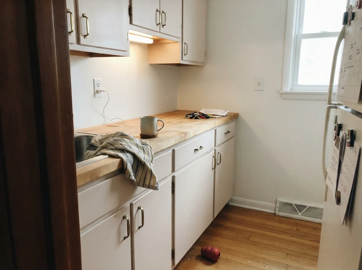
BM lists it for both kitchen walls and cabinets. Satin cabinet enamel wipes clean and flatters brass hardware and butcher block; avoid pairing with cool blue-gray countertops.
Benjamin Moore recommends it for bathroom vanities specifically. With warm stone and brass it looks intentional; with cool grey tile it can read a little flat.
Carries a whole-house scheme without clashing room to room, the same job White Dove and Swiss Coffee do — just with a touch more beige-pink warmth underneath.
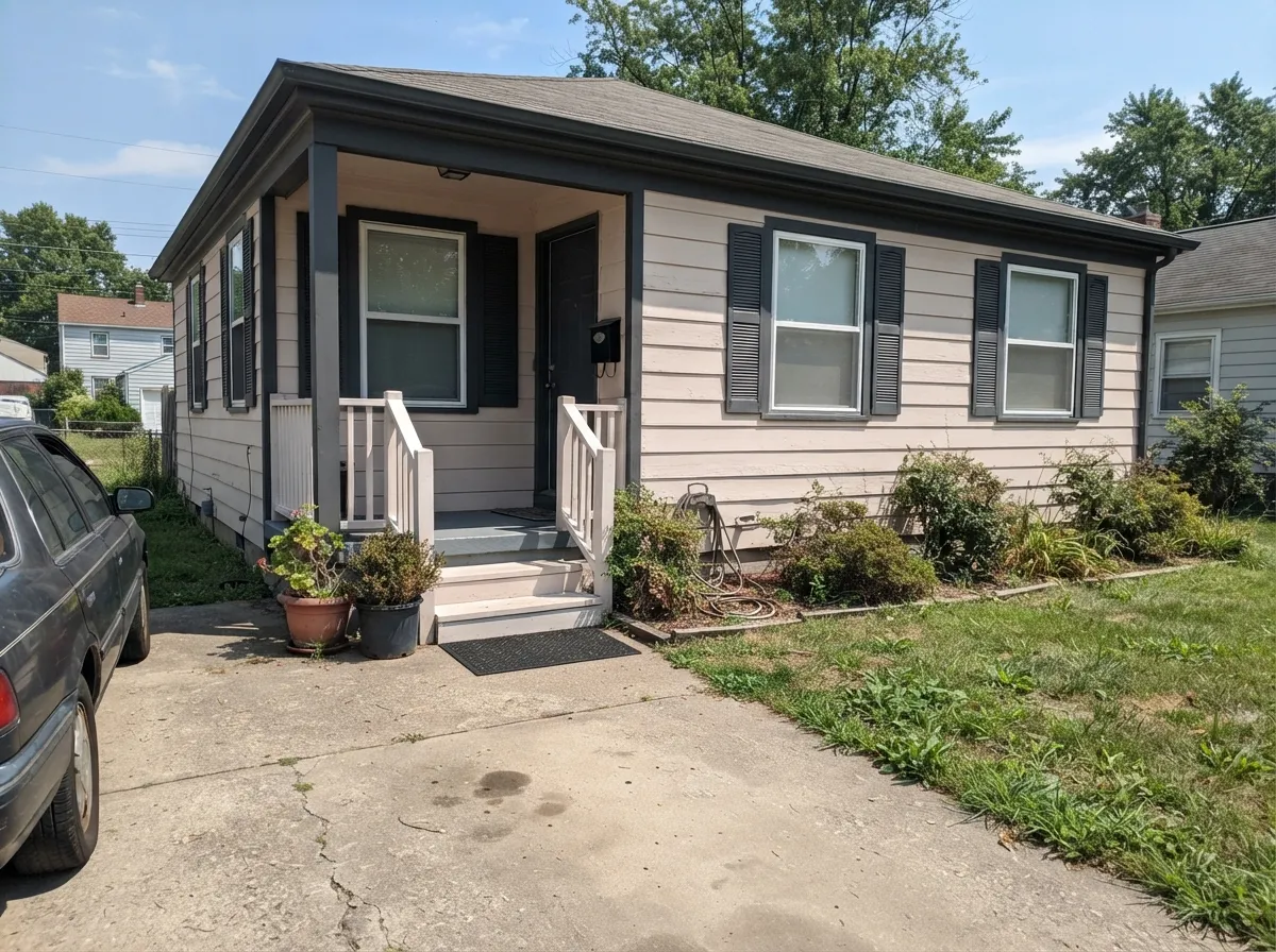
Benjamin Moore lists it as an outdoor-wall color. Full sun reads it brighter and cleaner than indoors; pair with dark trim (Wrought Iron, Kendall Charcoal) for contrast, and expect a shaded north elevation to look flatter than the sunny side.
Your Light Is the Risk
The beige-pink warmth reads clean and even, and LRV 82 keeps the room feeling open rather than washed out.
Without real daylight the warmth flattens out and the color can read dull or slightly gray. Add warm lamps or sample a deeper color.
Warmer and pinker at the sun hours, quieter beige the rest of the day — a gentle shift, not a different color.
2700K bulbs bring the pink-beige warmth forward and make it feel cozy. Cool white LEDs flatten it toward gray — swap the bulbs before you blame the paint.
Most complaints about Sand Dollar are a light mismatch. Upload a photo of your actual room and see it on your walls — then ask for the same wall in north light or evening lamps before you buy a single sample.
Need It From Another Brand?
Any paint counter can custom-tint Benjamin Moore 877 directly. If you would rather stay in one brand's own deck, these are the closest stock matches, measured as ΔE2000. Under 2 is a difference you will not see on the wall.
| Brand | Closest color | ΔE | LRV | |
|---|---|---|---|---|
| Sherwin-Williams | Cold FoamSW 9504 · Sherwin-Williams | 1.6 | 84 | Color page → |
| Behr | Jet WhiteQE-01 · Behr | 0.9 | 84 | Color page → |
| Valspar | Soft WoolV155 · Valspar | 1.6 | 84.7 | Color page → |
| PPG / Glidden | Fresh DoughPPG1055-1 · PPG / Glidden | 1.6 | 83 | Color page → |
| Glidden | Egret White39YY 85/046 · Glidden | 0.5 | 85 | Color page → |
| Dutch Boy | Pristine Pearl021W · Dutch Boy | 1.6 | 84 | Color page → |
Similar Benjamin Moore Colors
The nearest shades to Sand Dollar within Benjamin Moore's own range, ranked by perceptual color distance — useful when you want the same look a touch lighter, darker, or warmer.
WCAG 2.1: AA is 4.5 : 1 for normal text, 3 : 1 for large text, AAA is 7 : 1.
Sand Dollar vs the Colors You're Also Considering
Every Sand Dollar sample board has the same rivals on it. The numbers show the real lightness gap — then it comes down to which risk you would rather live with.
Pick this if you want more beige-pink body than White Dove's quieter grey-cream balance.
Benjamin Moore OC-17 · LRV 85White DovePick this if you want the deck's safest, most dependable warm white — a touch cooler and creamier, with none of the visible pink.
Pick this when yellow cream feels like too much and you want the calmer pink-gray version instead.
Benjamin Moore OC-45 · LRV 84Swiss CoffeePick this for a more yellow-forward, buttery cream — Swiss Coffee leans warmer and sweeter.
Vanilla Milkshake, listed as both 2141-70 and OC-59 at #ECECE3 and LRV 81, is the near twin that goes the other way. Its red and green channels match, so it reads cooler and slightly yellow-green while Sand Dollar reads sandy. On a north wall Vanilla Milkshake can look faintly gray-green.
Swiss Coffee OC-45 at #EEECE1 and LRV 82 holds more yellow and less blue, so it is the creamier of the two. Icicle 2142-70 at #EDEDE3 and LRV 82 is the most neutral of the group, close to a plain soft white. Pink Essence 881 at #F1EBE8 and LRV 83 carries openly the pink that Sand Dollar only hints at.
Across brands, Glidden Egret White 39YY 85/046 at #F1EBE4 is a deltaE of 0.5, effectively the same color, and Behr Jet White QE-01 is 0.91. Sherwin-Williams Cold Foam SW 9504 at 1.59 and Valspar Soft Wool V155 at 1.62 are visually identical in normal room light. Farrow & Ball Wevet No. 273 at 2.69 is very close but sample it first, since it drops most of the warmth.
Sand Dollar Coordinating Colors
Stay warm and Sand Dollar is easy to please: it sits comfortably next to creams, warm wood, brass, and dusty blues, and it argues with anything icy or high-chroma cool gray. These are the partners that keep it looking intentional rather than accidental:
Sand Dollar on Exteriors
Benjamin Moore lists Sand Dollar among its recommended outdoor-wall colors, and the pattern that holds for every pale warm neutral holds here too: full sun reads it brighter and crisper than it looks indoors, while a shaded, north-facing elevation will look noticeably flatter and cooler by comparison — walk the whole house with a sample before committing.
Dark trim gives it the most contrast and the cleanest read: Wrought Iron or Kendall Charcoal shutters and trim, or a Hale Navy front door, all supply the one saturated note the facade needs. Avoid pairing it with cool blue-gray stone or roofing, which will pull the warmth out of the walls by comparison.
Don't Confuse It With The Other "Sand Dollar"
This is a low-profile color, and the biggest real risk isn't the paint — it's ordering the wrong sample. Sherwin-Williams sells a completely different paint that also happens to be called Sand Dollar (SW 6099), and it is noticeably deeper and more peach-toned than Benjamin Moore's version; the two don't read as the same color once they're on a wall.
Even inside Benjamin Moore's own catalog, some third-party color-matching and swatch-reselling sites list conflicting numbers for a paint called 'Sand Dollar' — different LRVs and a stronger pink cast than what Benjamin Moore's own product listings show for code 877. This review is grounded in Benjamin Moore's official code 877, hex #F0EBE4, LRV 82. If you're buying by name rather than by number, confirm the code before you order.
Three Ready Palettes Built on Sand Dollar
A color is never alone on the wall. These are complete combinations in the 60-30-10 pattern, with the reason each one holds together. Every one opens in the visualizer.
Sand Dollar's beige-pink warmth stays calm against a crisp White Dove trim, and the dusty Van Deusen Blue door supplies the one saturated note — a quiet nod to the color's beach-toned name without going full nautical navy.
Try this palette in your roomBenjamin Moore lists Sand Dollar specifically for kitchen cabinets — its beige-pink warmth flatters brass hardware and butcher block without the starkness of a bright white. White Dove walls keep the room light; Wrought Iron on the island supplies the one dark anchor.
Try this palette in your roomCinnamon Slate is Sand Dollar's deeper, browner cousin in the same warm-neutral family, so a single accent wall reads intentional instead of mismatched. White Dove trim keeps the room bright while the two warm neutrals do the quiet work.
Try this palette in your roomSand Dollar FAQ
Is Sand Dollar warm or cool?
Warm — a beige base with a whisper of pink and gray underneath. It never reads yellow-heavy and never reads icy; in dim light it can flatten toward gray, which is the most common surprise reported.
Is Benjamin Moore Sand Dollar the same color as Sherwin-Williams Sand Dollar?
No. The two companies happen to use the same name for different paints — Sherwin-Williams' Sand Dollar (SW 6099) is deeper and more peach-toned. If you're shopping by name instead of by code, confirm you're getting Benjamin Moore 877.
Is it good for kitchen cabinets?
Yes — Benjamin Moore lists it as a recommended cabinet color. It flatters brass hardware and warm wood; use a satin, urethane-fortified cabinet enamel and avoid pairing it with cool blue-gray countertops.
Does Sand Dollar work on exteriors?
Benjamin Moore lists it for outdoor walls, and full sun reads it brighter and cleaner than indoors. Pair with dark trim like Wrought Iron or Kendall Charcoal for contrast, and expect a shaded elevation to look noticeably flatter than the sunny side.
What trim white goes with Sand Dollar walls?
White Dove in semi-gloss is the safe default — close enough in temperature that the trim doesn't fight the walls. For more contrast, go darker rather than brighter; a stark white trim can make Sand Dollar look muddy by comparison.
How is Sand Dollar different from White Dove or Swiss Coffee?
All three are pale warm near-whites in the same Benjamin Moore neighborhood. White Dove leans quieter and greyer; Swiss Coffee leans more yellow and buttery; Sand Dollar sits between them with more visible beige-pink body than White Dove and less yellow than Swiss Coffee.
Have you painted with Sand Dollar?
Rate it — one tap helps the next reader decide.
Ask a Question