Alabaster
Benjamin Moore's Alabaster is not the Alabaster you saw on Instagram — here is what 876 really does on a wall, where the pink shows up, and who should buy Cloud White instead.

Jessica has spec'd whites and neutrals for more than 300 rooms and keeps a sample wall of painted drawdowns in her studio. Every color review is checked against real reader rooms in the comments and re-tested when a formula changes. About the testing process →
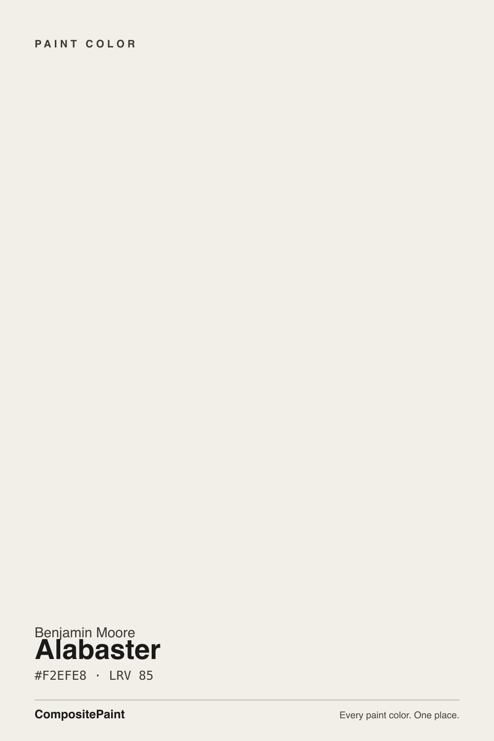
- 1First Star69
- 2Classic Gray74
- 3Alabaster85
- 4Chantilly Lace91
- 5Ultra Pure White97
The Fast Verdict
Alabaster 876 is a bright, soft white that Benjamin Moore itself describes as having a touch of pink. On a paint chip it just looks white; on a twelve-foot wall in afternoon sun the blush shows up, and that is either the prettiest thing about it or the reason you repaint. Settle two things before you buy a gallon: check the code on the can, because Sherwin-Williams sells a completely different color under the same name, and tape a big sample to the wall you are actually worried about. Get those right and it is one of the most flattering whites in the deck.
Bedrooms and bathrooms that want a soft, flattering white · north-facing rooms that always feel cold · trim, doors and millwork under warm walls · anyone who likes a blush-warm white on purpose
You actually meant Sherwin-Williams Alabaster · your ceiling or trim stays a brighter white · you have cool gray floors or blue-gray tile · you want a crisp, no-undertone gallery white
- LRV 85 — bright enough to open small, dark rooms without glare
- The soft pink warmth is genuinely flattering in bedrooms and bathrooms
- Kills the cold in north-facing rooms better than a neutral white
- Forgiving on cabinets and millwork — hides small flaws and finger marks
- Walls, trim and ceiling in one color works without looking flat
- Goes visibly blush on large walls in strong south or west sun
- Constantly confused with Sherwin-Williams Alabaster, which is a different color
- Reads dull and dirty beside any brighter or cooler white
- Fights cool gray floors, blue-gray tile and gray quartz
What Color Is Alabaster, Really?
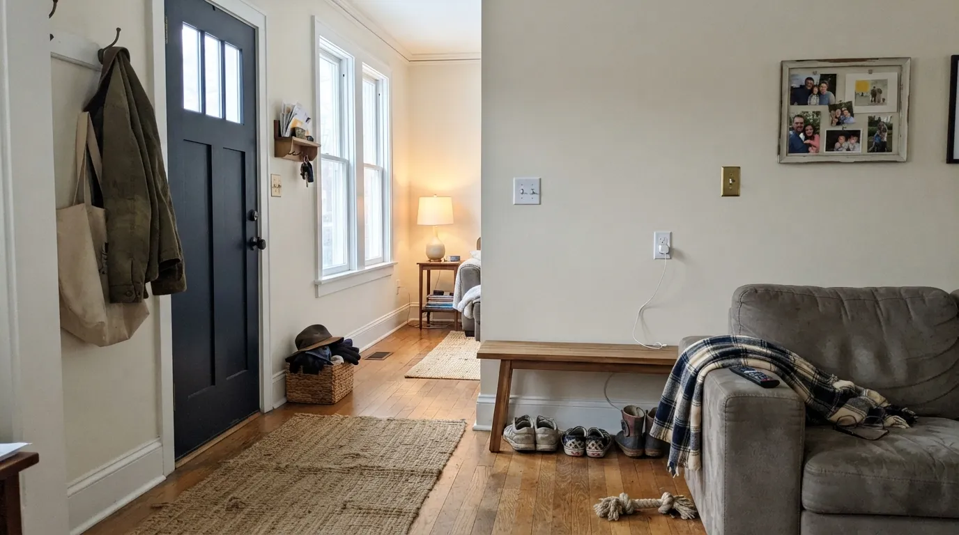
Benjamin Moore's own description of Alabaster is "a fresh, youthful white with a flattering touch of pink," and that is the honest place to start. The measured numbers read warm and creamy — hex #F2EFE8, sitting in the soft-butter direction — but the colors that live next to it in the deck give the game away. Its closest neighbors are Sand Dollar 877 ("a delicate pink cast"), Gardenia AF-10 ("soft pink undertones") and Pink Damask 890. This is a white built on the blush side of warm, not the yellow side. On a two-inch chip you will never see it. On a full wall you will.
At LRV 85 it is genuinely bright. It throws back most of the light that hits it, so small rooms open up and dark hallways stop feeling like tunnels. But it is not a bright white. Put it beside Chantilly Lace OC-65 at LRV 90 and Alabaster suddenly shows its body and looks tinted. The more useful comparison is Cloud White OC-130, which sits at the same LRV 85 — identical brightness, but Cloud White's warmth is creamy where Alabaster's is rosy. Most people who say they want "a warm white" turn out to want Cloud White. Sample both, side by side, on the same wall.
Undertone in one line: warm with a quiet pink lean — never yellow, never gray. If your wall looks faintly peachy at five in the afternoon, that is the pink meeting the sun, and the paint is doing exactly what it was designed to do.
Where It Shines
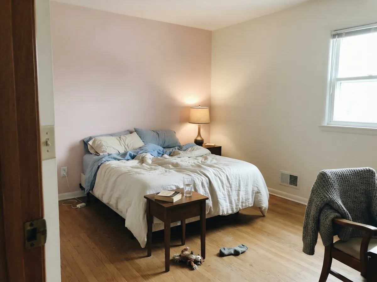
It is best in the rooms where you want people to look good — bedrooms and bathrooms. The soft pink is flattering on skin, it takes the chill out of a north-facing room that always feels cold, and at LRV 85 nothing ever goes dim. These are real rooms in real light.
Where It Fails
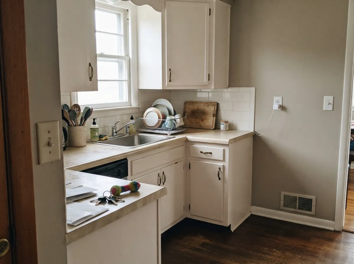
Alabaster's bad reviews come from three places, and two of them are not really the paint's fault. Read all three before you buy a gallon, because none of them can be fixed with another coat.
South and west light pull the pink forward. On a large flat wall it stops reading as white and starts reading faintly blush or peachy, and that is the complaint people post with a photo attached. Some people love it. If you do not, Cloud White OC-130 gives you the same LRV 85 brightness with creamy warmth instead of rose, and White Dove OC-17 gives you warmth muted by a drop of gray.
Sherwin-Williams Alabaster SW 7008 is the famous one — warmer, slightly deeper, more of a greige-white, at LRV 82. Benjamin Moore's Alabaster 876 is lighter, cleaner and pinker. They are not the same paint and no store can match them by name. If your inspiration photo came out of a Sherwin-Williams house, buy SW 7008. Always order by the code.
A builder-white ceiling, stock white cabinet doors, cool white quartz — anything crisper wins the argument, and Alabaster beside it reads dull and slightly dirty. This is the most common self-inflicted mistake with soft whites. Either put Alabaster on everything in the room, or choose a white that can stand next to cool stone, like Chantilly Lace OC-65.
Room by Room
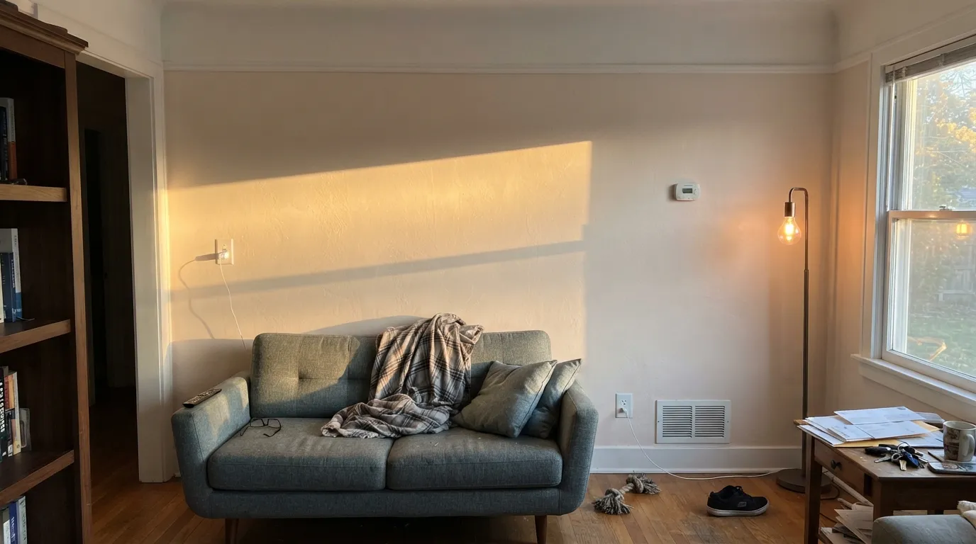
The blush warmth is quiet under lamps and flattering in the morning, and at LRV 85 the room still feels light on a gray day. Eggshell on the walls, flat overhead. For soft contrast, an accent wall in First Light 2102-70 leans into the pink instead of fighting it.
It is lovely with white subway tile, warm marble, brass and a wood vanity. It argues with blue-gray floor tile, which pushes the walls visibly pink. Use eggshell or satin so it wipes clean around the sink.
North-facing living rooms are where it does its best work: the cool daylight cancels the pink and leaves a clean, calm white. South and west rooms need a large sample taped up for a whole afternoon before you commit to five gallons.
Satin Alabaster doors look custom rather than builder-basic, and the warmth hides knuckle marks better than a stark white. Pair it with Edgecomb Gray HC-173 walls and a Kendall Charcoal HC-166 island. Hold a sample against your countertop first — cool gray quartz makes the doors look pink.
Semi-gloss on trim, flat on the ceiling, and use Alabaster for all of it if the walls are Alabaster too. Under mid-tone warm walls like Revere Pewter HC-172 it is a soft, traditional trim white. Never mix it with a second, brighter white in the same room.
Full sun reads it brighter and crisper than any indoor test, and at that scale the pink mostly disappears. It sits naturally against brick, stone and wood siding. Let a dark door or shutter in Hale Navy HC-154 or Wrought Iron 2124-10 carry the contrast.
Your Light Is the Risk
Cool daylight cancels the pink. You get a clean, quiet white with none of the chill.
Warm sun brings the blush forward on big walls. Sample it for a full afternoon.
Clean and bright at the cool hours, softly rosy when the sun swings around. It moves.
2700K lamps read creamier and cozier. 3500-4000K bulbs keep it crisp and mute the pink.
Most complaints about Alabaster are a light mismatch. Upload a photo of your actual room and see it on your walls — then ask for the same wall in north light or evening lamps before you buy a single sample.
Need It From Another Brand?
Any paint counter can custom-tint Benjamin Moore 876 directly. If you would rather stay in one brand's own deck, these are the closest stock matches, measured as ΔE2000. Under 2 is a difference you will not see on the wall.
| Brand | Closest color | ΔE | LRV | |
|---|---|---|---|---|
| Sherwin-Williams | Arcade WhiteSW 7100 · Sherwin-Williams | 1.0 | 86 | Color page → |
| Behr | Fuji SnowT11-13 · Behr | 0.5 | 86 | Color page → |
| Valspar | Du Jour7002-6 · Valspar | 0.6 | 86 | Color page → |
| PPG / Glidden | Cotton TailPPG0998-1 · PPG / Glidden | 1.2 | 87 | Color page → |
| Glidden | Muslin White82YY 85/038 · Glidden | 0.8 | 85 | Color page → |
| Dutch Boy | Simplified White020W · Dutch Boy | 0.5 | 86 | Color page → |
Similar Benjamin Moore Colors
The nearest shades to Alabaster within Benjamin Moore's own range, ranked by perceptual color distance — useful when you want the same look a touch lighter, darker, or warmer.
WCAG 2.1: AA is 4.5 : 1 for normal text, 3 : 1 for large text, AAA is 7 : 1.
Alabaster vs the Colors You're Also Considering
Every Alabaster sample board has the same rivals on it. The numbers show the real lightness gap — then it comes down to which risk you would rather live with.
Pick this for the softer, rosier version of exactly the same brightness.
Benjamin Moore OC-130 · LRV 85Cloud WhitePick this for the same LRV 85 with creamy warmth instead of pink.
Pick this for the lighter, cleaner white on Benjamin Moore's deck.
Sherwin-Williams SW 7008 · LRV 82AlabasterPick this if your inspiration photo is the famous Alabaster — warmer, deeper.
Inside Benjamin Moore, Gardenia AF-10 at #F3F0E9 and LRV 85 is essentially the same brightness with a hair more warmth. Steam AF-15 at #F0EFE6 and LRV 84 is a shade lower and reads slightly quieter. White Zinfandel 880 and Atrium White PM-13 both sit at LRV 87, so they look marginally brighter on the wall and make sensible trim partners over Alabaster walls.
Across brands, Behr Fuji Snow T11-13 and Magnolia Home Silos White JG-107 both land at deltaE 0.5, and Dutch Boy Simplified White 020W and HGTV Home Bohemian Lace HGSW 4052 at 0.53, so all four are the same color in practice. Sherwin-Williams Arcade White SW 7100 at deltaE 1.01 and Backdrop Jane BD-JA at 1.68 are visually identical in normal room light. Farrow and Ball Pointing No. 2003 at deltaE 2.17 and Clare Wing It PNT100-LT-24 at 2.5 are very close, so sample first. Rust-Oleum Linen White 285140 at LRV 93 and deltaE 4.84 is much brighter and cooler, and the difference is easy to see side by side.
Alabaster Coordinating Colors
The rule with Alabaster is to keep its partners warm and keep them clearly darker. It has a pink lean, so it flatters warm greiges, soft blush tones, deep navies and near-blacks — and it looks worn out beside cool gray, icy blue and anything brighter than itself. These are the partners that behave:
The Two Alabasters: Benjamin Moore 876 vs Sherwin-Williams 7008
Almost every question that starts with "is Alabaster too yellow" or "is Alabaster good for trim" is about Sherwin-Williams Alabaster SW 7008, not this color. SW 7008 is one of the best-selling whites in America. It sits at LRV 82, carries a soft greige warmth, and is the color in most of the white-kitchen photos people save. Benjamin Moore's Alabaster 876 is a different animal: three points brighter at LRV 85, cleaner, and tipped toward pink rather than beige.
This matters at the counter. A Benjamin Moore store cannot sell you SW 7008 by name, and a Sherwin-Williams store cannot sell you 876 by name — you will simply get their own Alabaster and find out on the wall. Say the code out loud when you order. If you want the Benjamin Moore product but the Sherwin-Williams look, Cloud White OC-130 and White Dove OC-17 are the two closest honest substitutes.
Alabaster With Wood Tones and Floors
Warm wood is where it is easy. Walnut, cherry, white oak and rattan all sit comfortably against Alabaster, and the shared warmth makes the room feel finished rather than assembled. Red-toned oak floors are the one warm case to sample: orange floor plus pink wall can tip a small room toward peach, especially in the afternoon. A neutral rug usually solves it.
Cool floors are the harder job. Gray LVP, gray-washed oak and blue-gray tile all sit at the opposite temperature, and they pull Alabaster's pink into full view — this is the situation people photograph and post asking why their white walls look like the inside of a seashell. It is not always a dealbreaker, but test a large sample standing on the actual floor before you paint the room. If it fails, Decorator's White OC-149 has a touch of cool gray and settles down over gray floors immediately.
Three Ready Palettes Built on Alabaster
A color is never alone on the wall. These are complete combinations in the 60-30-10 pattern, with the reason each one holds together. Every one opens in the visualizer.
One white at two sheens is the only safe way to run Alabaster, because a second, brighter white in the same room makes it look dirty. The navy door supplies the single dark note the whole scheme needs.
Try this palette in your roomEdgecomb Gray is warm enough that the wall-to-cabinet handoff never turns pink, which is the trap with cooler greiges. The charcoal island grounds the room and gives the eye somewhere dark to land.
Try this palette in your roomInstead of hiding Alabaster's pink, this scheme admits it: First Light is the same story turned up, so the accent wall reads deliberate rather than accidental. The near-black doors keep the room from going sweet.
Try this palette in your roomAlabaster FAQ
Is Benjamin Moore Alabaster the same as Sherwin-Williams Alabaster?
No, and this is the single biggest mistake people make with it. Benjamin Moore Alabaster is 876, also listed as OC-129, at LRV 85. Sherwin-Williams Alabaster is SW 7008 at LRV 82 — warmer, a little deeper, and much more widely used. Order by the code on the can, not the name.
Does Alabaster really look pink on the wall?
Sometimes, yes. Benjamin Moore describes it as a white with a touch of pink, and its deck neighbors Sand Dollar 877 and Gardenia AF-10 are both pink-cast whites. In north light you will not notice it. On a large south or west wall in late-afternoon sun, most people can see a faint blush.
Alabaster or Cloud White?
Both sit at LRV 85, so they are equally bright — the difference is only the direction of the warmth. Cloud White OC-130 leans creamy and is the safer whole-house pick. Alabaster leans rosy and is the better bedroom and bathroom white. Paint both on the same wall before deciding.
What trim white goes with Alabaster walls?
Alabaster itself, in semi-gloss. Any brighter white next to it — builder white, Chantilly Lace, Extra White — wins and makes the walls look dingy. If you want visible contrast, go darker instead: greige or charcoal trim works, brighter trim does not.
Is it good for kitchen cabinets?
Yes, with one check first. Satin Alabaster doors look soft and custom, and the warmth hides handprints better than a stark white. But hold a big sample against your countertop before you spray anything — against cool gray quartz or blue-gray marble the doors will read pink.
Can I paint the ceiling Alabaster too?
Yes, in flat, and if the walls are Alabaster you should. A standard bright ceiling white above Alabaster walls creates the exact brighter-white problem that makes it look dull. Over a mid-tone wall color, Alabaster is a warmer, gentler ceiling than stock ceiling white.
Have you painted with Alabaster?
Rate it — one tap helps the next reader decide.
Ask a Question