Heartthrob
Sherwin-Williams' go-to front-door red, reviewed honestly: the door it was built for, the rooms it swallows, and why red is the first color the sun takes back.

Jessica has spec'd whites and neutrals for more than 300 rooms and keeps a sample wall of painted drawdowns in her studio. Every color review is checked against real reader rooms in the comments and re-tested when a formula changes. About the testing process →

- 1Redwood0
- 2Bewitched6
- 3Heartthrob11
- 4Cinnamon Slate19
- 5Rejuvenate30
The Fast Verdict
Heartthrob is a saturated true red with just enough warmth to stay out of pink and purple territory, and at LRV 11 it is deep enough that it never reads fire-engine. On a front door in daylight it is exactly what people picture when they say red door. Inside, it is a one-room color: it eats light, it needs a gray-tinted primer and three coats, and it turns brown-black in a dim room. Buy it for a door, a dining room or an island — not for a house.
Front doors on white, gray or brick houses · shutters and exterior accents · a dining room that should feel like a supper club · kitchen islands and cabinet doses · powder rooms that can afford drama
Your door faces full south or west and you hate touch-ups · the room is dim and lamp-free · you want the room to feel bigger · your floors and trim are honey oak or orange-stained red oak · you repaint rarely and want a color nobody argues about
- The clean, unambiguous red people picture when they say red door
- Deep enough (LRV 11) to look expensive instead of fire-engine bright
- Warm enough to sit next to brick and wood without clashing
- Small doses do a lot: one door, one island, one powder room
- Reads current on a modern white house and correct on a colonial
- Fades and chalks faster than neutrals on sunny exposures — red always does
- Needs gray-tinted primer and two to three coats or it looks blotchy pink
- Swallows light indoors: brown-black in dim rooms, hard on big spaces
- Fights honey oak and orange-stained red oak trim and floors
What Color Is Heartthrob, Really?
A saturated true red that sits almost exactly on the red axis with a hair of warmth — not brick, not burgundy, not cherry-pink. That placement is the whole reason designers keep it on the front-door shortlist: it reads as the red people mean when they say red door, without the orange of a barn red or the plum of an oxblood. The mass tone underneath is a red-brown, which is what keeps it from going fire-engine bright the way a pure primary red would.
At LRV 11 it is one of the darkest reds Sherwin-Williams sells at this level of saturation, and that number explains almost everything the color does. On a small sunlit surface — a door slab, a shutter, an island — the light bouncing off it makes the pigment sing and it reads vivid and lipstick-clean. On four interior walls the same paint reflects almost nothing back and settles into wine and brick territory. Plan on getting two different colors out of one can depending on how much surface you give it.
Undertone in one line: red first, a whisper of orange second — never pink, never purple. If your sample board looks brown, the light in that spot is low, not the paint. If it flares scarlet, that is direct sun. Both are the same paint being honest about where you taped it.
Where It Shines
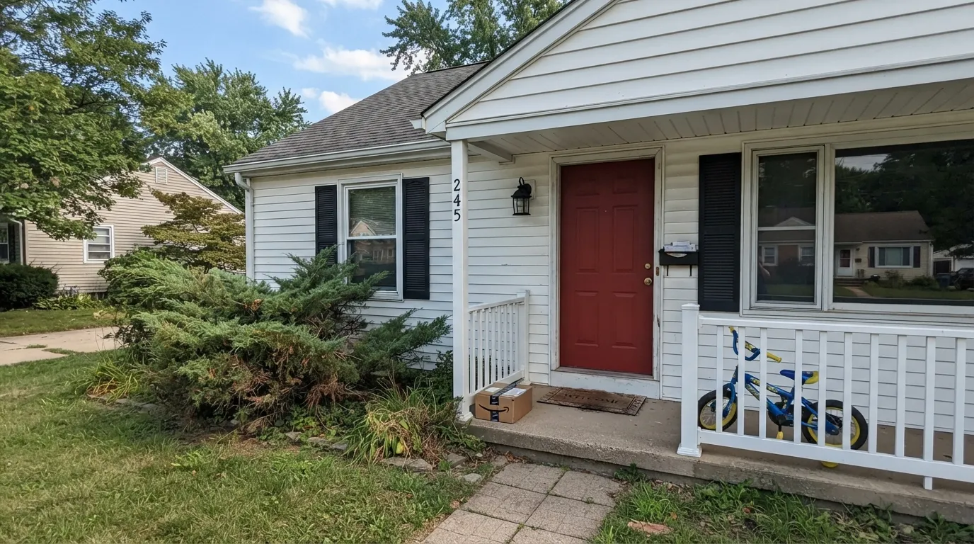
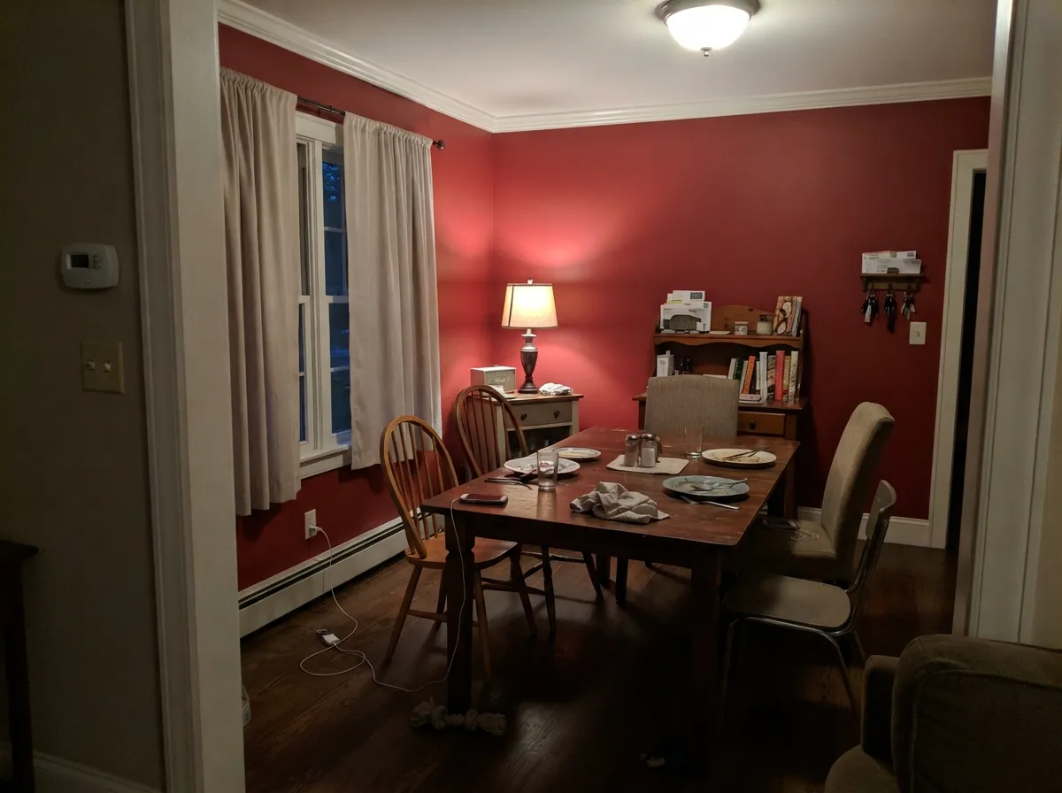
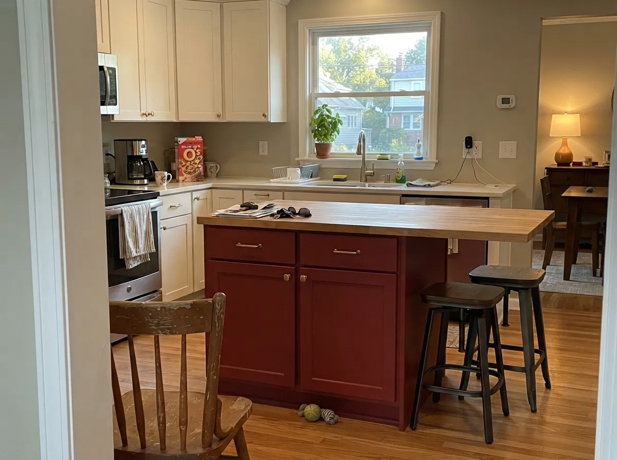
This color has one job it does better than almost anything else in the deck, and it is a front door. A deep saturated red on a door slab is the oldest curb-appeal move there is, and Heartthrob is the version that stays a real red instead of drifting orange like a barn red or muddy like a burgundy. Its second home is the small interior commitment: a dining room you only use after dark, a kitchen island under warm white cabinets, a powder room where the whole point is that it feels like a jewelry box. Give it clean white trim, black hardware, warm brass or unlacquered bronze, and the color reads confident rather than loud.
Where It Fails
Complaints about Heartthrob come in three flavors, and none of them are surprises — you can predict all three from the exposure, the room and the primer before you open a can. If your project matches one, sampling harder will only confirm it.
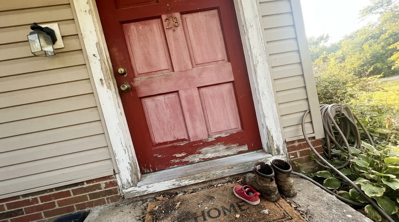
Saturated reds lean on organic pigments, which are the least UV-stable pigments in the tray. On a south- or west-facing door with no porch roof over it, a red door chalks and shifts toward a dusty pink-red faster than the beige siding around it — often visible in two to four years. It is not a defect in this color; it is what red does outdoors. Buy the best exterior enamel your store sells, and treat a sunny door as a repaint every few years rather than a lifetime decision.
This is a color that gives back almost no light. In a living room with one window it stops looking red and starts looking brown-black in the corners, and every piece of dark furniture disappears into the wall. Deep red works when the room is small enough to feel deliberate — a dining room, a powder room, a den with lamps — or when the color has an escape route in the form of a big white ceiling and white trim. Four walls in a big dim room is where the regret posts come from.
Deep saturated reds are mixed in a deep or ultra-deep base with very little white in them, so they hide badly. Rolled straight over white primer you get a patchy, sunburned pink that panics people halfway through the job. The fix is boring and non-negotiable: a gray or deep-tinted primer first, then two to three finish coats, keeping a wet edge — lap marks show on red more than on any other color family.
Room by Room
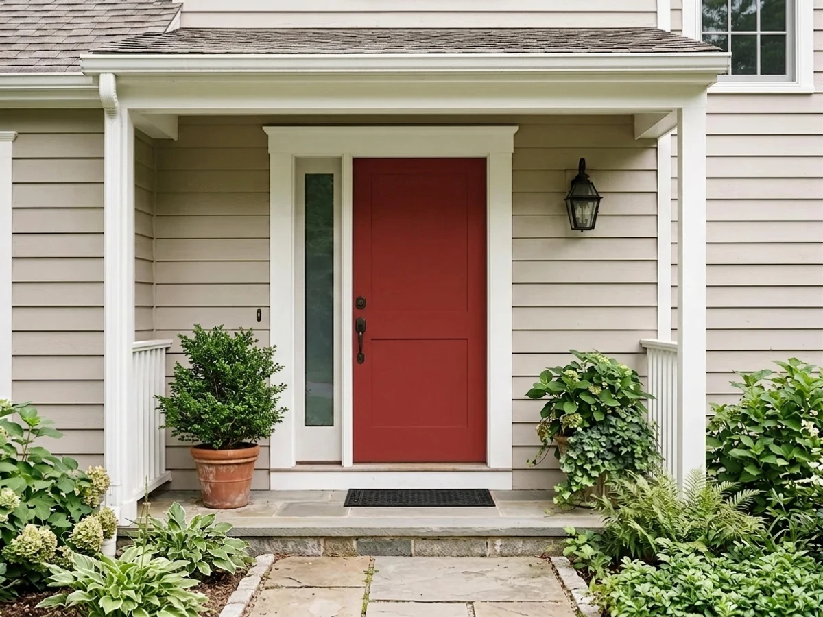
This is why the color exists. Deep enough to look intentional against white, gray or brick siding, saturated enough to be visible from the street, warm enough that it never reads cranberry. Use an exterior door and trim enamel in satin or gloss — gloss reads more expensive on a paneled slab and sheds dirt — and paint the door off its hinges if you can. One note before you buy: a dark door absorbs a lot of heat, and several fiberglass door makers restrict dark colors or set warp limits in their warranty, especially behind a storm door. Check the paperwork before you paint a new fiberglass slab.
Shutters, a porch ceiling border, a garden gate, a mailbox post — small red notes tie a white or gray house together the way the door does. The same UV caveat applies, and it applies hardest to south and west elevations. On brick houses, hold the sample against the actual brick first: red on red-orange brick can either look built-in or look like a mismatch, and brick varies too much to guess.
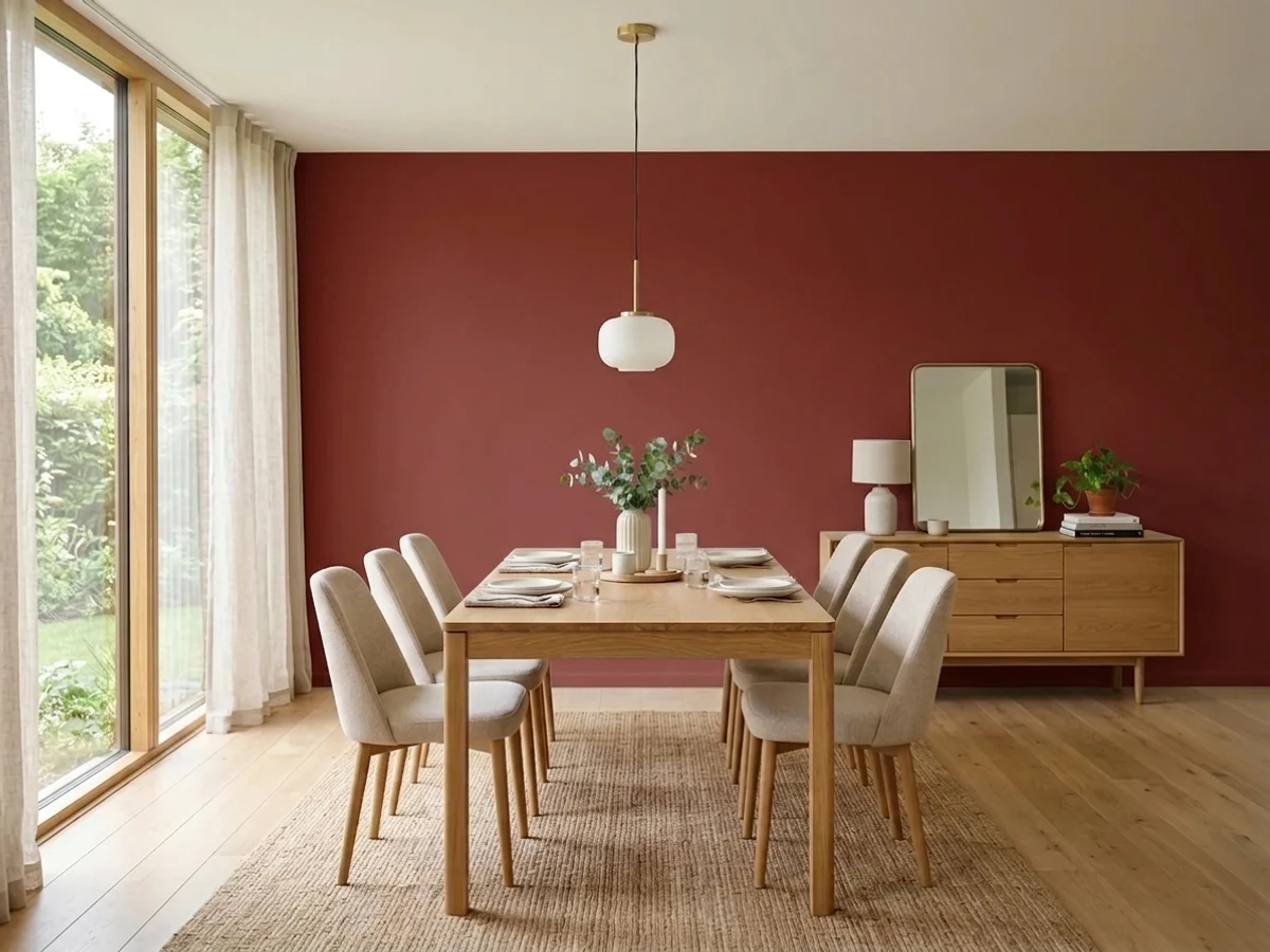
Red dining rooms are a cliche because they work. The room is used at night, under lamps and candles, which is exactly the light this color wants, and there is a real argument that a warm saturated room makes a table feel like an occasion. Matte or eggshell on the walls, a bright white ceiling to keep the box from closing in, and warm wood on the table. Keep the trim crisp — Pure White or Alabaster — so the red has an edge to end at.
An island or a run of lower cabinets in Heartthrob under warm white uppers is a genuinely good look, and it is the version of red that has not dated. A full red kitchen is a much larger bet and a hard one to undo. Satin urethane-fortified cabinet enamel either way, and expect the same primer-and-three-coats routine on doors as on walls.
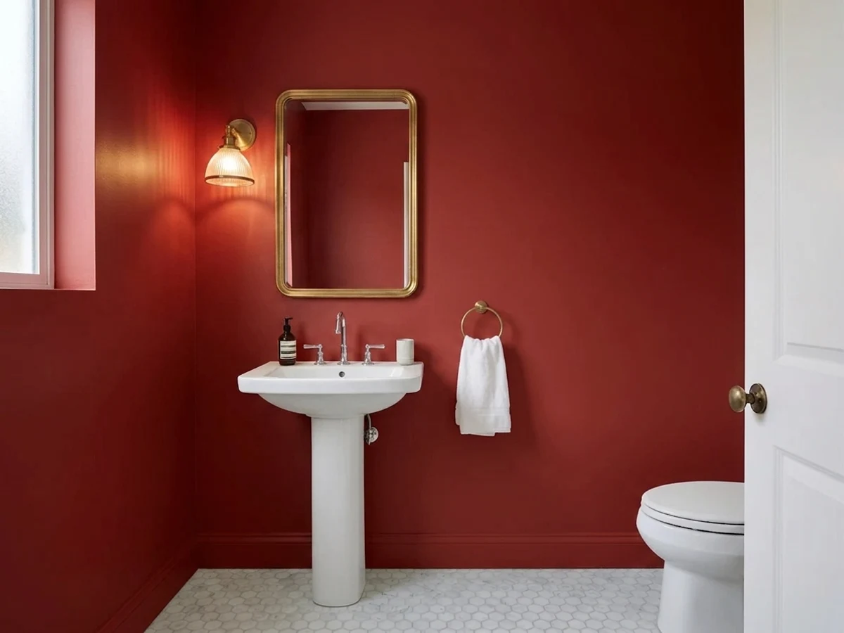
Small dark rooms are the one place LRV 11 is an asset rather than a problem. Drench all four walls, keep the ceiling white or paint it too if you are feeling brave, add a brass or black faucet and one good mirror. Guests are only in there for two minutes, which is exactly the right amount of time for a color this loud.
Saturated red is a stimulating color in a room meant for sleep, and in a big living space it turns every corner brown and makes furniture vanish. If you want the drama in a big room, put it on one wall behind a fireplace or on a built-in bookcase back and leave the rest neutral. Bedrooms are a straightforward no from us — pick an oxblood like Behr Rumors if you want depth without the shout.
Your Light Is the Risk
Full sun on a door slab or a shutter is where this color earns its money — the saturation comes forward and it reads as a clean, vivid red from the curb. The same light on a big interior wall is just as flattering, which is why sunny dining rooms photograph so well.
With little light to reflect, LRV 11 collapses. Cool north daylight and shadowed corners drain the red out and leave a brown-black that reads closer to dried blood than to the chip. If the room has one small window and no lamps, this is the wrong color.
East morning light is cool and slightly blue, so the red looks crisper and a touch more crimson before noon. By late afternoon a west-facing door or wall picks up the warm low sun and flares toward scarlet for an hour. It is a real swing — look at your sample at both ends of the day, not just at lunchtime.
At 2700K the red deepens and warms toward wine and brick, which is the flattering, supper-club version and the reason evening dining rooms are its best interior use. Cool 4000K and higher LEDs strip the warmth and leave a flat, slightly harsh cherry. On a porch, a warm-white bulb over the door matters more than most people expect — cool porch LEDs make a red door look plastic at night.
Most complaints about Heartthrob are a light mismatch. Upload a photo of your actual room and see it on your walls — then ask for the same wall in north light or evening lamps before you buy a single sample.
Need It From Another Brand?
Any paint counter can custom-tint Sherwin-Williams SW 6866 directly. If you would rather stay in one brand's own deck, these are the closest stock matches, measured as ΔE2000. Under 2 is a difference you will not see on the wall.
| Brand | Closest color | ΔE | LRV | |
|---|---|---|---|---|
| Behr | IndiscreetUL110-6 · Behr | 1.8 | 12 | Color page → |
| Benjamin Moore | Hot TamaleCSP-1155 · Benjamin Moore | 1.4 | 13 | Color page → |
| Valspar | Très Bien8001-9G · Valspar | 0.0 | 10 | Color page → |
| PPG / Glidden | Red GumballPPG1187-7 · PPG / Glidden | 2.7 | 12 | Color page → |
| Glidden | Rapture Red07YR 10/489 · Glidden | 2.6 | 10 | Color page → |
| Dutch Boy | Sugared Maple104-7DB · Dutch Boy | 0.0 | 11 | Color page → |
Similar Sherwin-Williams Colors
The nearest shades to Heartthrob within Sherwin-Williams's own range, ranked by perceptual color distance — useful when you want the same look a touch lighter, darker, or warmer.
WCAG 2.1: AA is 4.5 : 1 for normal text, 3 : 1 for large text, AAA is 7 : 1.
Heartthrob vs the Colors You're Also Considering
Every Heartthrob sample board has the same rivals on it. The numbers show the real lightness gap — then it comes down to which risk you would rather live with.
Pick this for the marginally deeper, marginally warmer read, or simply because your store is Sherwin-Williams.
Benjamin Moore AF-290 · LRV 8CalientePick this if you are already in the Benjamin Moore deck — it is the same idea, a hair cooler and more crimson, and it was a Color of the Year.
Pick this when you want the saturated, unmistakable red rather than the softened one.
Sherwin-Williams SW 6607 · LRV 14Red TomatoPick this when Heartthrob is too dark for the room — at LRV 14 it is lighter and softer, and it holds its color in low light better.
Heartthrob Coordinating Colors
The rule with a color this saturated is that everything around it should be quiet. Red does not want a second opinion — it wants clean whites to stop against, a black or near-black for hardware and shutters, and one earthy neutral if the scheme needs a third note. These are the partners that keep showing up in schemes that work:
Why Red Doors Fade First — and What to Ask For at the Counter
Nothing about Heartthrob is unusual here, but it is the single most common disappointment with any red door, so it is worth understanding before you buy. The pigments that make a red this saturated are largely organic, and organic pigments break down under ultraviolet light far sooner than the iron-oxide and titanium pigments that carry beiges, grays and off-whites. That is why the red door on a sunny elevation looks tired while the siding around it still looks new.
Exposure decides how much this matters. A door under a deep porch, or on a north-facing entry, can hold its color for a very long time. A south- or west-facing door in open sun is the hard case: expect chalking and a shift toward a dusty pink-red, and plan on a refresh coat every few years rather than treating it as done forever. Two things genuinely help — the highest-grade exterior door and trim enamel your store carries, and washing the door once or twice a year so chalk and grime do not get read as fading when they are not.
The other exterior question is heat, not color. A dark slab in direct sun runs hot, and several fiberglass door manufacturers set warp limits or restrict dark finishes in their warranties, particularly when a glass storm door traps heat against the slab. If the door is new, read the warranty before you commit. Wood and steel doors have their own version of this — wood moves, steel telegraphs heat — so on any full-sun entry, a storm door plus a very dark color is the combination to avoid.
Heartthrob With Wood Tones, Brick and Floors
Warm reds like company that is either clearly darker or clearly neutral, and the mistakes happen in the middle. Walnut, espresso and dark-stained oak are excellent with it — the brown depth reads as the same family and lets the red be the brightest thing in the room. Pale white oak and gray-washed floors are also safe, because they simply step out of the way.
The real clash is orange. Honey oak floors, orange-stained trim and pinkish red oak all sit close enough to this red in hue to compete without matching, which is the worst possible relationship between two colors: the floor looks more orange, the wall looks more brick, and neither looks chosen. A large neutral rug is the practical fix in a dining room; on trim there is no fix short of repainting the trim white.
Brick deserves its own sentence, because it is the most common front-door question. Red on red-orange brick can look built-in or can look like two reds that missed each other, and brick varies far too much to predict from a chip. Tape a large sample to the door in daylight and look at it from the sidewalk, not from arm's length. If it fights, the black-shutter route or a deeper oxblood usually resolves it. Metals are easy: unlacquered brass, oil-rubbed bronze and matte black all work; polished chrome is the only one that looks cold next to it.
Three Ready Palettes Built on Heartthrob
A color is never alone on the wall. These are complete combinations in the 60-30-10 pattern, with the reason each one holds together. Every one opens in the visualizer.
The safest possible frame for a loud door: a clean white body so nothing competes, and a true black on the shutters and light fixture so the red is clearly the accent and not one of two arguing colors. This is the combination that reads correct on a colonial and modern on a new build, and it is why you see it on every third house with a red door.
Try this palette in your roomRed needs a soft white to stop against, not a bright one — Alabaster keeps the edges warm so the walls do not look like a fire truck against a refrigerator. Rookwood Brown reads like stained wood, which lets you add a third element without introducing a fourth color; it is also the reason this scheme works in an old house with real trim.
Try this palette in your roomThe two-tone kitchen with the color kept to the island is the low-risk way to own a red kitchen — one piece of cabinetry is a weekend to repaint, a whole kitchen is not. Agreeable Gray on the walls is warm enough to sit with the red and quiet enough to stay out of the argument; brass or matte black pulls both finish it.
Try this palette in your roomHeartthrob FAQ
Is Heartthrob a good front door color?
It is one of the best in the Sherwin-Williams deck for the job. It is a clean, saturated true red rather than a barn red or an oxblood, and at LRV 11 it has enough depth to look deliberate against white, gray or brick. Use exterior door and trim enamel in satin or gloss, and if the door is new fiberglass, check the manufacturer's warranty for dark-color restrictions first.
What white goes with Heartthrob?
A soft warm white rather than a stark one. Alabaster is the default for interior trim and cabinets, Pure White is the cleaner choice for exterior siding and trim where you want maximum contrast with the door. Ibis White also works on warm or brick houses, though it carries a blush tell that some people see next to red. Avoid the brightest blue-whites — they make the red look harsh instead of rich.
How many coats of Heartthrob do I need?
Plan on primer plus two to three coats. Deep reds are mixed in a deep or ultra-deep base with very little white pigment, so they hide poorly and look patchy pink over white primer. A gray or deep-tinted primer under them is what turns a five-coat job into a three-coat one. Keep a wet edge — lap marks and roller stops show on red more than on any other family.
Will Heartthrob fade on an exterior door?
Faster than a neutral would, yes — that is true of every saturated red, because red pigments are the least UV-stable ones in the tray. A north-facing or covered door holds its color for years. A south- or west-facing door in full sun with no porch roof will chalk and drift toward dusty pink, sometimes noticeably within a few years. Use the best exterior enamel your store sells and treat a sunny door as a periodic refresh, not a permanent finish.
Heartthrob or Caliente?
They are close enough that most people cannot tell them apart on a door. Caliente is a hair cooler and more crimson at LRV 8, Heartthrob a hair warmer and deeper at LRV 11. The honest tiebreaker is which store you are standing in and which paint line you want — this is not a decision worth losing sleep over.
Can I paint a whole room in Heartthrob?
You can, but be selective about which room. A dining room, a powder room or a small den that gets used after dark under warm lamps will look intentional and rich. A big living room with one window will look brown and closed in, and a bedroom in saturated red is a fight with the reason you are in there. If in doubt, put it on one wall or on cabinetry and keep the rest neutral.
Have you painted with Heartthrob?
Rate it — one tap helps the next reader decide.
Ask a Question