Ibis White
The Sherwin-Williams white built to frame warm rooms, reviewed honestly: where the blush is the whole point, the finishes that turn it pink, and what to pick instead.

Jessica has spec'd whites and neutrals for more than 300 rooms and keeps a sample wall of painted drawdowns in her studio. Every color review is checked against real reader rooms in the comments and re-tested when a formula changes. About the testing process →
- 1First Star69
- 2Classic Gray74
- 3Ibis White84
- 4Chantilly Lace91
- 5Ultra Pure White97
The Fast Verdict
Ibis White is the white you reach for when everything around it is already warm. It is bright — LRV 84, no gray body dragging it down — but its warmth leans red rather than yellow, so it frames beige, terracotta and warm greige walls without the yellow argument you get from a creamier white. That red lean is also its one real risk: in late-day sun, under warm bulbs, or beside cool gray stone, people see pink. If blush-warm is what you wanted, this is a quietly excellent white. If you wanted plain, it will surprise you.
Entries and hallways that open onto warm-colored rooms · trim and ceilings over beige or greige walls · living and dining rooms with warm wood and brass · anyone who finds cream whites too yellow
Your counters are cool gray quartz or Carrara-type marble · you want a plain, undecided white · the room is dim and north-facing · your other trim stays a cooler, brighter white
- Bright at LRV 84 with no gray body weighing it down
- The right white to frame beige, greige and terracotta walls
- Warm without any of the yellow that creamy whites show in sun
- Excellent connector color for entries and hallways in open plans
- Trim, doors and ceilings all work in one color, sheen doing the separating
- The red lean reads as pink to people expecting a neutral white
- Turns visibly dirty-pink beside cool gray quartz or marble
- Looks tinted and grubby next to any cooler, brighter white
- Goes flat and beige in a dim north-facing room
What Color Is Ibis White, Really?
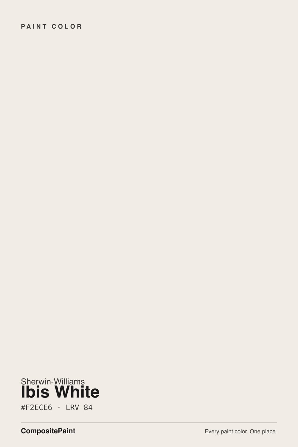
A bright off-white whose warmth sits on the red side of the fence. Most warm whites are built on a yellow oxide base, which is why they tip cream or butter in sun. Ibis White carries a more balanced red-and-yellow warmth — hue-wise it sits right at the orange midpoint rather than up in the yellows — and the practical result is a white that reads soft and blush-warm instead of creamy. Sherwin-Williams itself positions it in the white family as the trim-side white for framing red- and yellow-hued walls, and that is genuinely the job it does best.
At LRV 84 it is bright, and unlike a lot of warm whites it has no gray body holding it back. Put it beside Snowbound (LRV 83) and the difference is obvious: Snowbound has a soft greige weight to it, Ibis White does not. Put it beside Pure White (also LRV 84) and the brightness matches exactly while the temperature does not — Pure White stays on the fence, Ibis White commits to warm. That combination, bright but warm, is why it works as a whole-house trim and ceiling white in warm-toned houses where a cleaner white would look like a mistake.
Undertone in one line: warm, with red and yellow in near-equal parts — which reads as a faint blush, never as cream and never as gray. If your sample looks distinctly pink, that is west sun, a 2700K bulb, or a cool gray countertop doing it. If it looks beige and dull, that is dim north light. Both are the paint telling the truth about the room.
Where It Shines
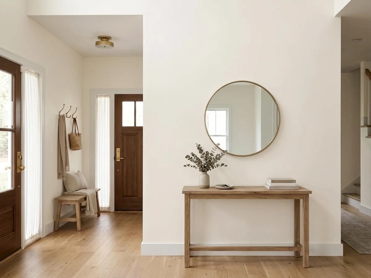
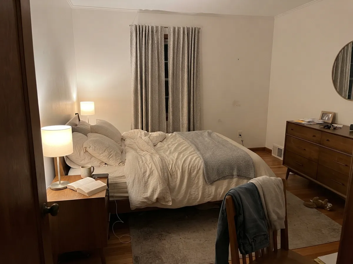
This color earns its keep at the seams of a house. In an entry that opens onto beige or greige rooms, Ibis White is the connector: bright enough to make the entry feel like the light part of the floor plan, warm enough that walking from it into an Accessible Beige living room feels like one house rather than two decisions. Its second job is trim and ceilings over warm walls, where a cooler white would cut a hard blue-ish line around every casing. Give it oak, brass, cream linen and warm lamps and it looks quietly expensive.
Where It Fails
Almost every complaint about Ibis White comes down to one of three situations, and all three are visible before you buy the gallon. None of them are defects — but if your room matches one, this is the wrong white, and a second coat will only make it more so.
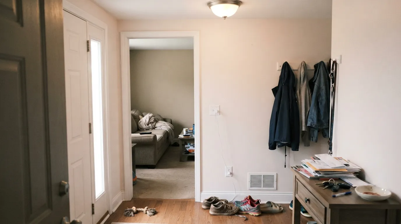
The most common regret. On the chip it looks like a safe neutral; on four walls the red side shows and people call it pink. That blush is the color working as designed, not a mistint — but if your brief was "just white, no undertone," Pure White is the same brightness with none of the commitment.
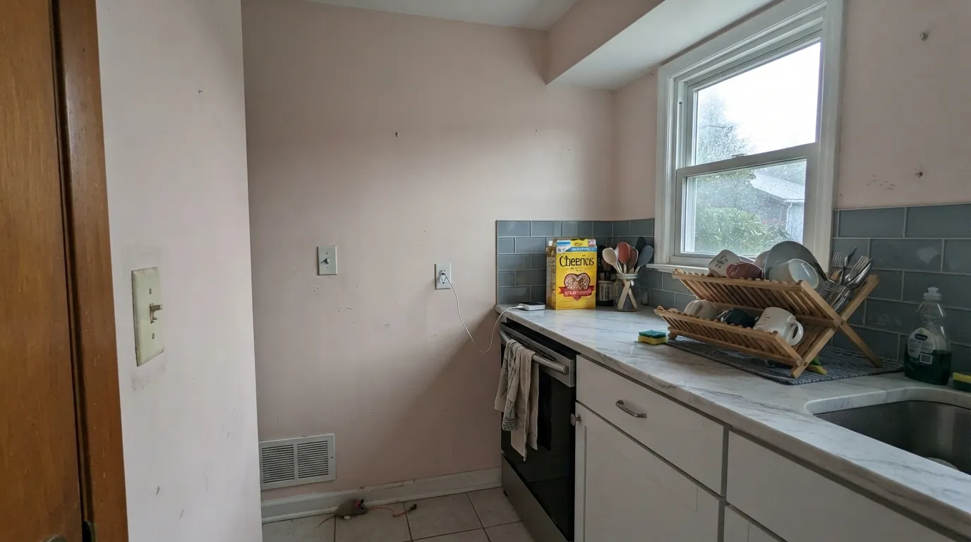
Cool stone sits at the opposite temperature and pushes Ibis White straight into pink. In a kitchen with gray-veined quartz or a bath with blue-gray tile, the wall stops reading as white and starts reading as dirty-pink. This is the one pairing to rule out on sight; Snowbound or Pure White handles cool stone without the fight.
Ibis White walls with builder-white ceilings, or Extra White (LRV 86) trim, is a pairing mistake that gets blamed on the paint. The cleaner white wins the comparison and Ibis White looks tinted and slightly grubby. The fix is the one-color rule: same color on walls, trim and ceiling, separated only by sheen.
Room by Room
This is where it beats the more famous whites. An entry painted Ibis White reads bright and welcoming while still handing off cleanly to warm rooms on either side — no cold pause between the front door and the living room. Eggshell on walls, same color semi-gloss on the trim and doors.
With oak floors, cream upholstery, brass and warm lamps it is a calm, finished backdrop that never goes yellow at 4pm the way a cream white does. Dining rooms in particular benefit: under evening bulbs the blush comes forward and the room reads flattering rather than flat.
Warm bulbs bring the soft blush up and the walls turn gently cozy at night, without the yellow cast a creamier white would show. Pair with cream or white bedding rather than gray, which pulls the pink into relief.
Over beige, greige or terracotta walls this is a better trim white than any cool one: it frames warm color instead of cutting it. On ceilings, flat Ibis White keeps the plane soft instead of clinical. Just do not mix it with a second, cooler white elsewhere in the same sightline.
With butcher block, warm quartz or a creamy granite it is lovely on cabinets in satin. With cool gray quartz or Carrara-type marble it turns pink and the kitchen looks off — that is the situation where Alabaster (LRV 82) or Pure White is the safer cabinet answer.
Full sun bleaches most of the warmth out and it reads as a fairly ordinary bright white from the street, which is fine but not a reason to pick it. It works best on a shaded porch ceiling or on trim against a warm-toned body color; for a whole facade there are whites with more staying power in sun.
Your Light Is the Risk
Bright, even daylight gives the cleanest read: clearly white, softly warm, with the blush staying a hint rather than a statement.
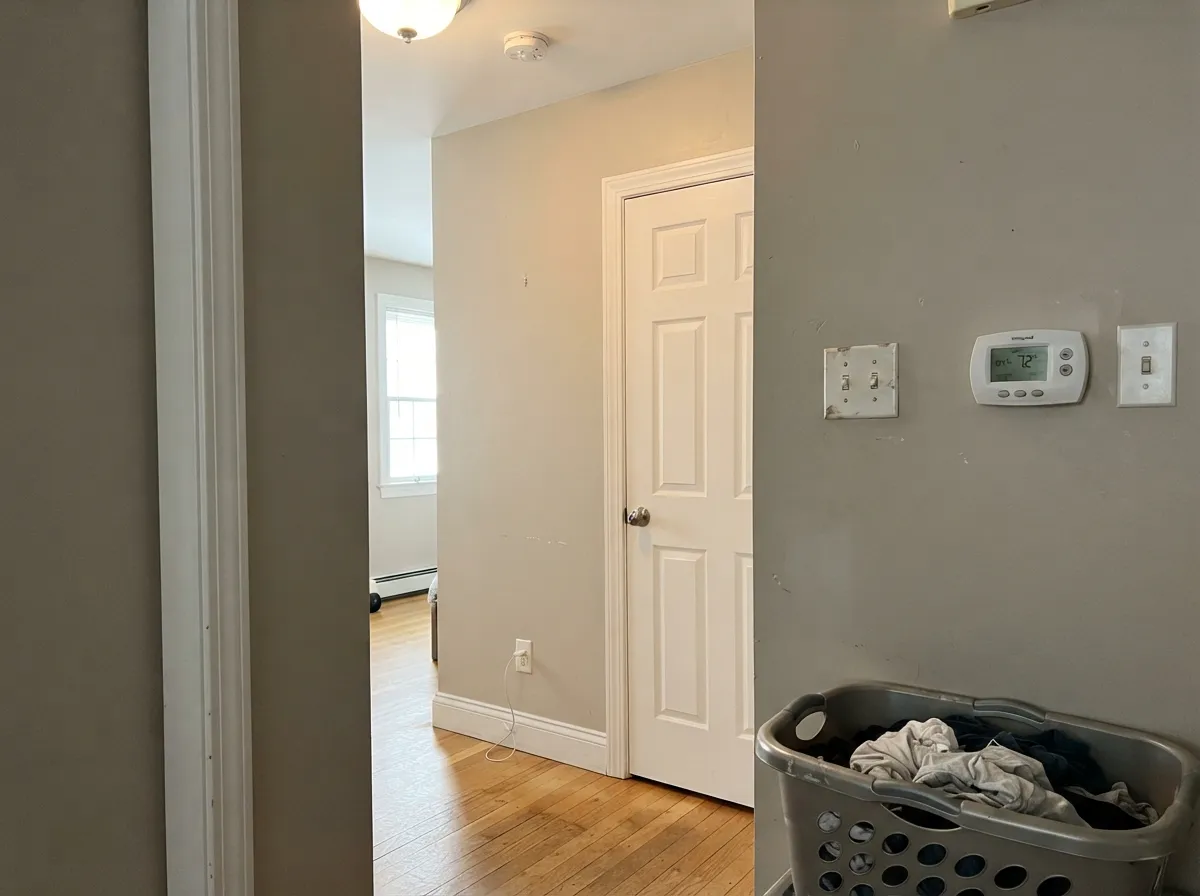
Cool, weak daylight drains the brightness and leaves the beige body exposed — the wall reads dull and slightly dingy. Test here before anywhere else.
Soft and creamy in morning east light; late-day west sun flushes it distinctly blush for an hour. Look at it at 6pm before you commit.
2700K bulbs push the warmth and the pink comes forward. Cool 4000K LEDs flatten it into a plain, slightly gray white — the color loses its whole personality.
Most complaints about Ibis White are a light mismatch. Upload a photo of your actual room and see it on your walls — then ask for the same wall in north light or evening lamps before you buy a single sample.
Need It From Another Brand?
Any paint counter can custom-tint Sherwin-Williams SW 7000 directly. If you would rather stay in one brand's own deck, these are the closest stock matches, measured as ΔE2000. Under 2 is a difference you will not see on the wall.
| Brand | Closest color | ΔE | LRV | |
|---|---|---|---|---|
| Behr | New House WhiteRD-W10 · Behr | 1.0 | 85 | Color page → |
| Benjamin Moore | Vintage Taupe2110-70 · Benjamin Moore | 0.6 | 82 | Color page → |
| Valspar | Bistro White7006-4 · Valspar | 1.5 | 84.8 | Color page → |
| PPG / Glidden | Summer LilyPPG1191-1 · PPG / Glidden | 1.6 | 84 | Color page → |
| Glidden | Summer LilyPPG1191-1 · Glidden | 0.8 | 85 | Color page → |
| Dutch Boy | Simplified White020W · Dutch Boy | 2.1 | 86 | Color page → |
Similar Sherwin-Williams Colors
The nearest shades to Ibis White within Sherwin-Williams's own range, ranked by perceptual color distance — useful when you want the same look a touch lighter, darker, or warmer.
WCAG 2.1: AA is 4.5 : 1 for normal text, 3 : 1 for large text, AAA is 7 : 1.
Ibis White vs the Colors You're Also Considering
Every Ibis White sample board has the same rivals on it. The numbers show the real lightness gap — then it comes down to which risk you would rather live with.
Pick this when you want the brighter, cleaner version of warm, with no creamy weight to it.
Sherwin-Williams SW 7008 · LRV 82AlabasterPick this for cabinets and for warmth that leans yellow-soft rather than blush — it is the cabinet default for a reason.
Pick this when the rooms around it are warm and a neutral white would read cold at the doorway.
Sherwin-Williams SW 7005 · LRV 84Pure WhitePick this when you need a white that does not take a side — same brightness, no blush, safe next to cool stone.
Pick this for brightness. Snowbound has weight to it; Ibis White stays clean and light. Note that Snowbound is not the escape hatch from pink — it has its own rosy flash in some light.
Sherwin-Williams SW 7004 · LRV 83SnowboundPick this for a softer white with real greige body — it hides wall imperfections better and sits calmly beside cool finishes.
Pick this if you are buying Sherwin-Williams and your warmth needs to lean blush rather than cream. They are not twins: White Dove is quieter, Ibis White is brighter and pinker.
Benjamin Moore OC-17 · LRV 85White DovePick this if your painter works in Benjamin Moore — it is the safest warm white there is, warm on the grayed-yellow side.
Ibis White Coordinating Colors
The rule with Ibis White is simple: keep its company warm and keep the other whites away. It sits beautifully with warm beiges and greiges, with soft blush neutrals, and with warm darks — and it argues with anything cool, including a second white. These are the partners that keep showing up in rooms that work:
Why This Is the White for Framing Warm Rooms
Ibis White holds the first number in the modern Sherwin-Williams deck — SW 7000 — and it has never been a hype color. It does not show up in trend palettes and it will never out-sell Alabaster. What it has instead is a specific, useful job, and Sherwin-Williams' own white-family guidance points straight at it: this is the warmer-toned white to use when the walls it borders already carry warm color.
That matters most in entries and hallways, where paint decisions collide. A cool white in the entry of a warm house creates a cold seam at every doorway — you feel it even if you cannot name it. Ibis White solves that without going creamy, which is the other failure mode: a cream white in an entry makes the adjacent beige rooms look yellow and tired. Bright, warm, no yellow, no gray. That narrow slot is the whole reason to buy it, and inside that slot it beats every more famous white in the deck.
Outside that slot, honestly, it is not the pick. If your house runs cool, or your finishes are gray, the same qualities that make it a good connector make it look pink and out of place.
Ibis White With Wood Tones, Floors and Stone
Wood is the easy part. Red oak, honey oak, walnut, cherry and butcher block all sit comfortably against Ibis White because its warmth meets theirs on the same side. Red oak in particular — the floor most whites make look orange — is flattered here, since the wall already carries a little red of its own and stops competing with the floor.
Stone is where the decision gets made. Warm quartz, creamy granite, travertine and terracotta tile all work. Cool gray quartz, Carrara-type marble and blue-gray porcelain are the genuine problem: cool stone sits opposite this color on the temperature wheel and each side exaggerates the other, so the counter looks bluer and the wall looks pink. Sample against the actual slab, in the actual room, before the kitchen or bath gets painted.
Floors follow the same logic. Warm-toned wood and cream carpet are safe. Gray-washed floors and cool LVP put the blush into relief — not always a dealbreaker in a bright room with warm rugs, but always worth a large sample taped above the floor before you buy paint. Metals are simple: brass, bronze and matte black all belong; polished chrome is the one that reads cold next to it.
Three Ready Palettes Built on Ibis White
A color is never alone on the wall. These are complete combinations in the 60-30-10 pattern, with the reason each one holds together. Every one opens in the visualizer.
The entry is the one room everybody sees twice a day and nobody decorates. Ibis White makes it the bright spot on the floor plan while sharing enough warmth with Accessible Beige that the doorway stops being a color change. Urbane Bronze on the door and rail gives the eye one dark anchor so the whole thing does not float.
Try this palette in your roomShoji White walls at LRV 74 under Ibis White trim at 84 gives about ten points of separation — enough for the casings to read as trim, not enough to look striped. Both are warm, so no line goes cold, and the muted green of Evergreen Fog is the one color note that keeps an all-neutral floor from feeling like a rental.
Try this palette in your roomMalted Milk is the color most often paired with Ibis White in coordinating suggestions, and it works because both share the same blush warmth — the accent wall reads as the same color turned up, not as a second decision. Iron Ore on doors and frames supplies the contrast the scheme otherwise lacks, and stops a soft room from going saccharine.
Try this palette in your roomIbis White FAQ
Is Ibis White warm or cool?
Warm, clearly — but warm on the red side rather than the yellow side. That is the difference between it and a cream white like Dover White: Ibis White never goes buttery in sun, it goes faintly blush instead. It has no gray in it, so it does not go cold; the worst it does in weak light is flatten toward beige.
Does Ibis White look pink?
Sometimes, and honestly — yes, that is its one real tell. Late-day west sun, warm 2700K bulbs, and any cool gray stone nearby will all bring the blush forward. In bright south daylight with warm wood and cream fabrics it just reads as a soft warm white. If the merest hint of pink would bother you, buy Pure White instead; it is the same brightness with no lean.
Ibis White or Alabaster — which should I pick?
Alabaster (LRV 82) is warmer in the yellow-cream direction and slightly softer; it is the better cabinet white and the more forgiving one next to mixed finishes. Ibis White is brighter and cleaner with a blush lean. For trim and ceilings over warm walls, and for entries, Ibis White is the sharper choice. For cabinets, take Alabaster.
Is Ibis White a good trim color?
It is one of the better ones in the Sherwin-Williams deck for warm houses — that is the role Sherwin-Williams itself gives it, framing red- and yellow-hued walls. Semi-gloss over beige, greige or terracotta walls looks intentional in a way a cool white never does. The one rule: do not use a different, cooler white anywhere in the same sightline, or Ibis White will look tinted by comparison.
Can I use it on the ceiling?
Yes, in flat, and it is a good ceiling white for a warm room. At LRV 84 it keeps the plane bright, and the warmth stops the ceiling from reading as a cold lid over warm walls. If the walls are also Ibis White, ceiling included, you get the one-color room that hides every uneven corner.
Will it work in a north-facing entry?
Only with help. North light strips the warmth and leaves a dull beige-white that readers describe as dingy. If the entry is north-facing and has no real window, either commit to warm 2700K bulbs in the fixture or step to a white with more body, like Snowbound, which handles low light with less disappointment.
Have you painted with Ibis White?
Rate it — one tap helps the next reader decide.
Ask a Question