White Sand
The sand-toned Sherwin-Williams white, reviewed honestly: the daylight where it glows warm, the flat light where it turns plain, and why it's nearly the same paint as Pure White in the can.

Jessica has spec'd whites and neutrals for more than 300 rooms and keeps a sample wall of painted drawdowns in her studio. Every color review is checked against real reader rooms in the comments and re-tested when a formula changes. About the testing process →

- 1First Star69
- 2Classic Gray74
- 3White Sand84
- 4Chantilly Lace91
- 5Ultra Pure White97
The Fast Verdict
White Sand is Sherwin-Williams' answer to "I want white, but a little sandy" — and at LRV 84 it is bright enough to argue it's barely a color at all. In real daylight, against warm wood or sisal, the sand comes through: soft, pale, gently beige. Take the daylight away and it drifts toward plain pale gray-white with no fixed personality of its own. That's the whole story: this is less a color than a very light mirror, and it reflects whatever room you put it in.
Whole-house walls with real daylight · farmhouse and coastal exteriors · kitchen and bath cabinets that want warmth without full commitment · anyone who likes the word "sand" more than the word "pure" on a paint chip
Your room faces north and stays dim most of the day · your trim is already Sherwin-Williams Pure White · you want a guaranteed warm beige and not a chameleon · you're chasing the exact showroom chip indoors under cool LEDs
- Genuinely soft, sandy warmth in real daylight — without going full beige
- LRV 84 brightens a room fast, and flatters wood, wicker, jute and brass
- Easy one-color wall-and-trim scheme since it holds up at any sheen
- Reads at home in farmhouse, coastal and transitional styles alike
- One of the brighter exterior whites that still avoids a blue-white glare
- No fixed undertone of its own — it borrows color from whatever's around it
- Goes flat, pale gray-white in overcast or north-facing light
- Nearly identical to Pure White in hex and LRV, so it offers little visual personality next to it
- Not a reliable pick if you want a guaranteed-warm beige rather than a mood ring
What Color Is White Sand, Really?
White Sand is filed as a white, but the name is doing real work: this is a barely-there sandy beige, not a crisp neutral. At LRV 84 it sits at the very bright end of the deck — the same tier as Pure White, Snowbound and Extra White — which means it reflects almost all the light that hits it and, in the process, reflects the color of everything around it too. Sherwin-Williams' own masstone reads closer to a pale gray than a beige; it's the warm daylight and warm materials in the room that pull the sand forward. That high-LRV, low-pigment mix is exactly why paint bloggers describe it two completely different ways in the same breath — "soft sandy beige" in one line, "muted, grayish white" in the next. Both are true; they're just describing different rooms.
Here's the fact worth knowing before you buy a sample: in our own color library, White Sand's hex value is #EDECE7 and Pure White's is #EDECE6 — one digit apart, both LRV 84. On a screen and very nearly on a wall, they are the same paint. The difference SW is selling you is the name and the story: Pure White is marketed as the crisp, do-no-wrong neutral default; White Sand is marketed as the softer, sandier, more coastal cousin. In practice, most people cannot tell them apart once they're both rolled onto drywall under the same light — which matters if you're choosing between them, and matters a lot if your trim is already one and you're eyeing the other for contrast.
Undertone in one line: it doesn't have a strong one of its own. Loosely warm and sandy in full daylight and next to warm wood; loosely cool and gray under overcast skies or cool LEDs. If your sample looks like a different color from one wall to the next, that isn't a bad batch — that's the paint doing exactly what a near-neutral white at LRV 84 does.
Where It Shines
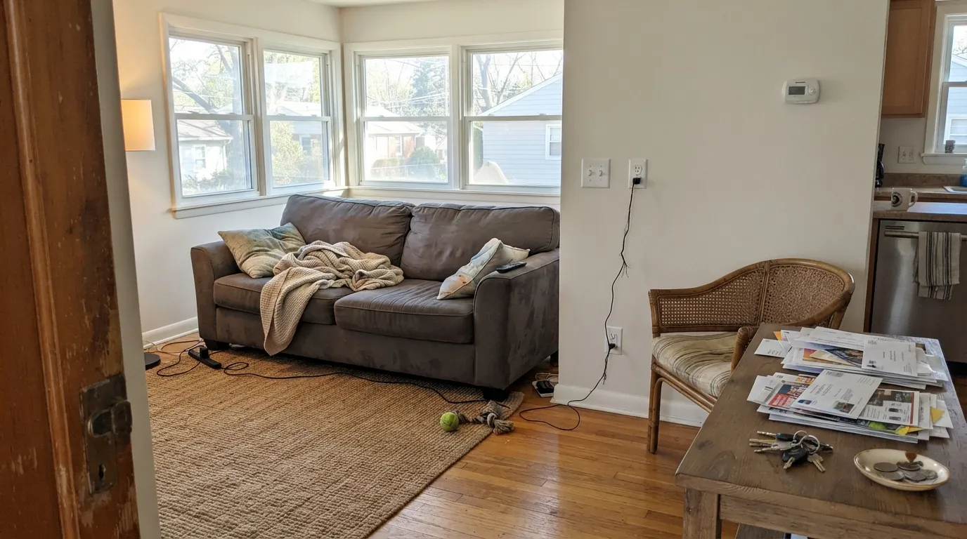
Give White Sand strong daylight and warm materials and the sand comes forward on its own — no extra work required. It's genuinely good on farmhouse and coastal exteriors, where full sun keeps it bright without the blue-white glare of a starker white, and it's a natural for rooms built around wicker, jute, rattan, unfinished wood and brass, where its warmth has something to agree with. Because it sits so close to Pure White, it also makes an easy one-color wall-and-trim scheme: same paint, two sheens, zero contrast lines to worry about.
Where It Fails
Almost every disappointed review of White Sand comes down to one of three mismatches, and all three are predictable before the first coat goes on. The paint isn't inconsistent — it's a near-neutral doing exactly what a near-neutral at LRV 84 always does.
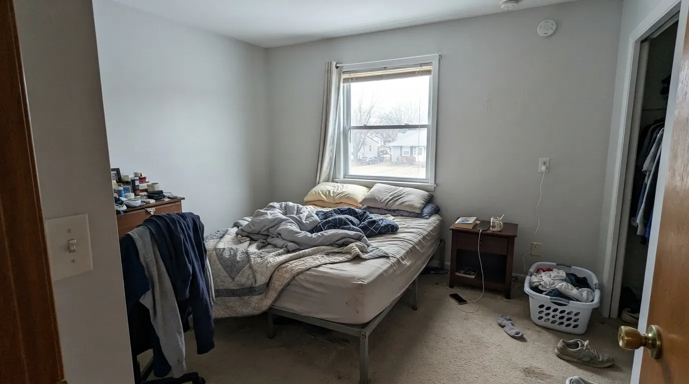
Cool, diffuse daylight is the one condition where White Sand has nothing warm to reflect. The sand drains out and the wall reads plain, pale, slightly cold gray-white — readers who bought it expecting "sandy beige" describe this exact room as looking like builder-grade white. Test the sample on the actual wall on a cloudy day before committing a whole house.
White Sand's high LRV means it takes on the color of its neighbors more than it asserts its own. If you want a wall that reads reliably warm and sandy no matter the weather, this is the wrong pick — go a full step deeper to Shoji White or Natural Linen, which hold their warmth on their own.
Because the two colors are nearly identical in our own swatch data, painting White Sand walls next to existing Pure White trim erases the wall-trim distinction almost entirely — the room reads as one flat plane instead of a defined wall-and-trim look. Either keep both the same paint on purpose (sheen does the separating) or pick a genuinely different trim white like Alabaster or White Dove.
Room by Room
With honest daylight and some warm wood or rattan furniture, it's a calm, bright backdrop that doesn't compete with anything. In a shadier room, sample first — this is the room most likely to disappoint if the light is thin.
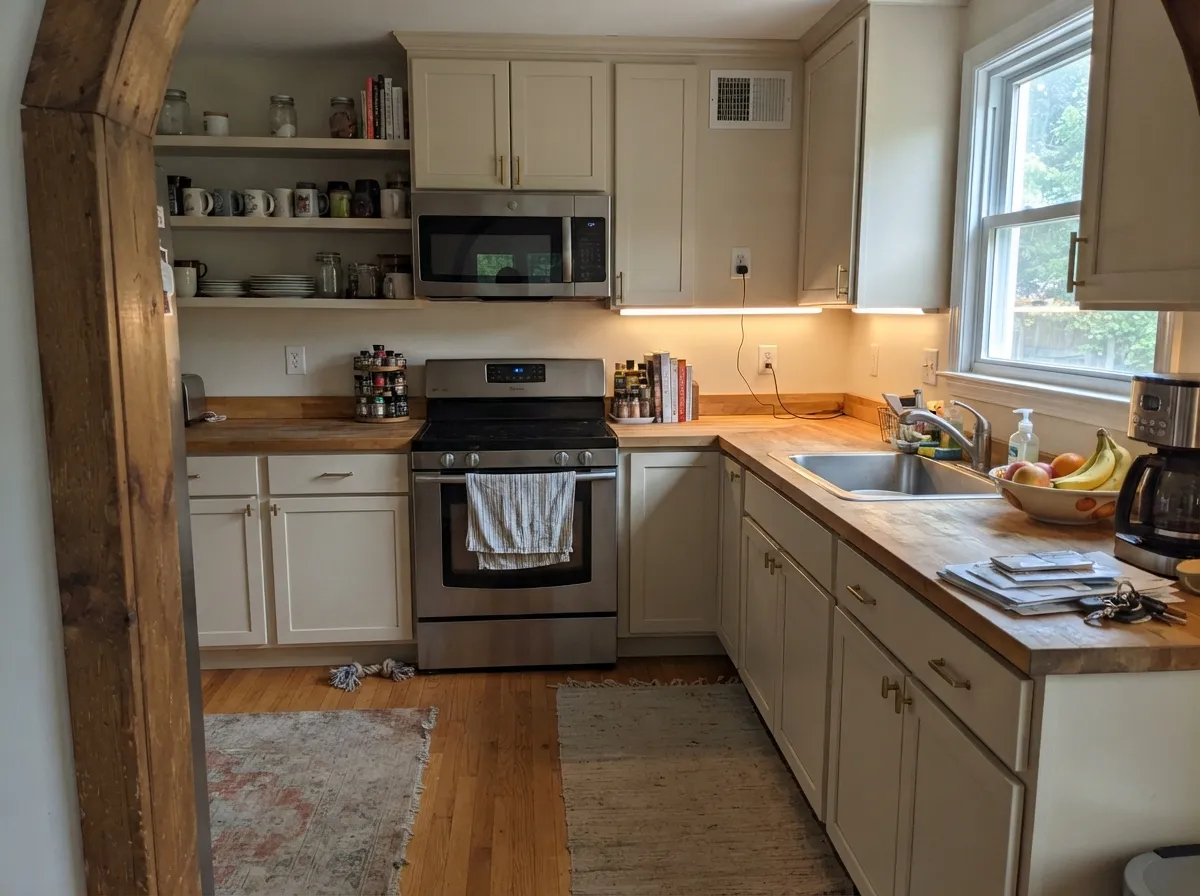
On cabinets against butcher block, brass hardware or warm stone it reads soft and sandy without going full cream. Satin holds up to daily wiping and doesn't amplify the grayness the way a flatter sheen can in dim corners.
Warm marble, wood vanities and brass fixtures bring the sand forward. Cool gray or blue-toned tile pulls it the other way, toward plain gray-white — the same rule that governs every white in a bathroom, just more visible here because the paint has so little undertone to fight back with.
Daytime reads gentle and airy. After dark, swap to 2700K bulbs — cool LEDs will flatten it toward plain white and cancel the whole reason to pick a "sand" color over a stock white.
A one-color house (walls and trim both White Sand, separated only by sheen) is an easy, safe move. Do not pair White Sand walls with existing Pure White trim expecting contrast — the two are close enough that the room will read flat. Pick one lane.
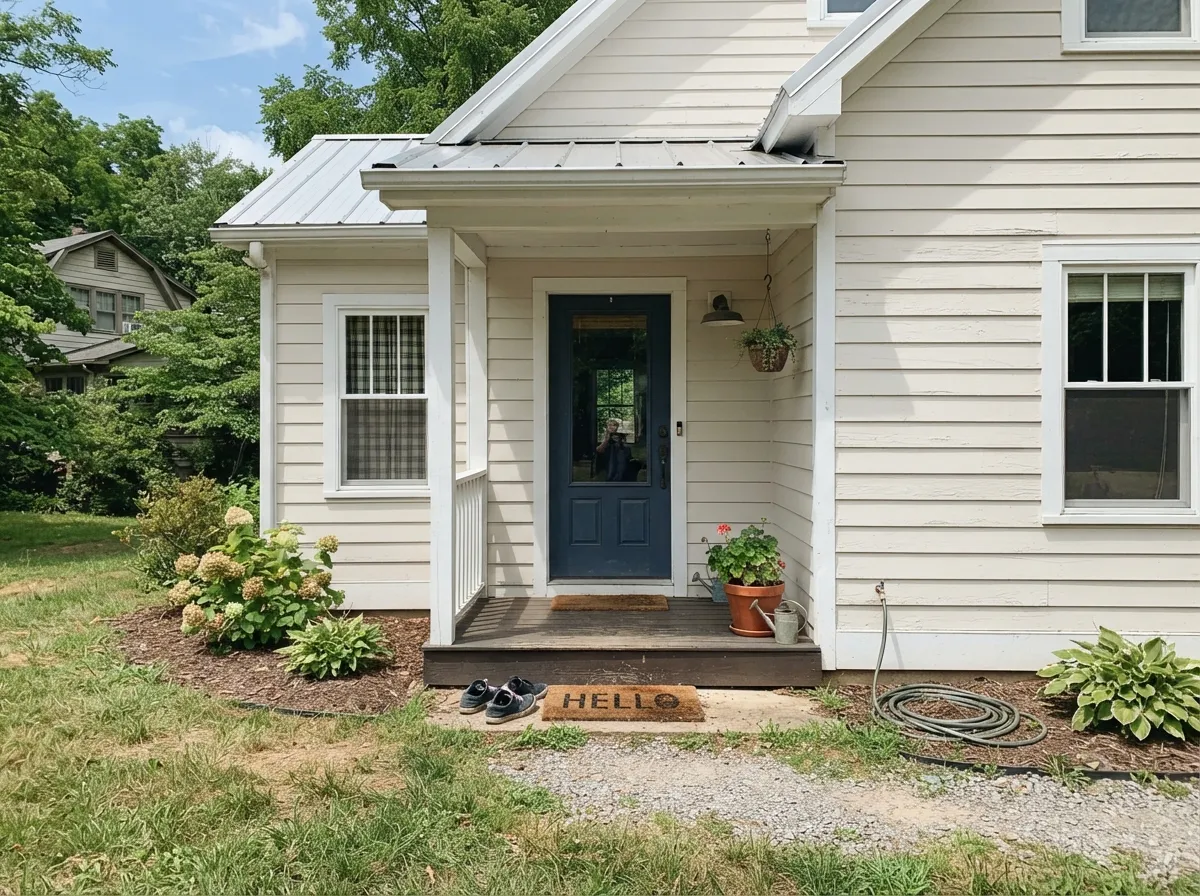
Full sun keeps it bright and clean without the cold glare of a starker white, and it holds up well against warm-toned trim, wood doors and stone. On a shaded elevation or a persistently overcast climate, expect it to read closer to plain white than to sand — walk the whole house with a sample before ordering gallons.
Your Light Is the Risk
South-facing sun and bright rooms pull the sand tone forward and keep it looking bright, not stark. Its best and most honest light.
With nothing warm to reflect, the color drains toward plain pale gray-white. Sample here first if this is your room's usual light.
Warmest and sandiest at the sun hours, quieter and more neutral the rest of the day. A normal, gentle shift for a color this light.
2700K lamps keep the sand alive after dark. Cool white LEDs flatten it toward plain white — swap the bulbs before you blame the paint.
Most complaints about White Sand are a light mismatch. Upload a photo of your actual room and see it on your walls — then ask for the same wall in north light or evening lamps before you buy a single sample.
Need It From Another Brand?
Any paint counter can custom-tint Sherwin-Williams SW 9582 directly. If you would rather stay in one brand's own deck, these are the closest stock matches, measured as ΔE2000. Under 2 is a difference you will not see on the wall.
| Brand | Closest color | ΔE | LRV | |
|---|---|---|---|---|
| Behr | Floral ScentPPL-34 · Behr | 0.6 | 85 | Color page → |
| Benjamin Moore | Baby's Breath873 · Benjamin Moore | 1.4 | 82 | Color page → |
| Valspar | High Hide White7007-2 · Valspar | 0.6 | 85 | Color page → |
| PPG / Glidden | Commercial WhitePPG1025-1 · PPG / Glidden | 0.6 | 83 | Color page → |
| Glidden | Commercial WhitePPG1025-1 · Glidden | 0.5 | 84 | Color page → |
| Dutch Boy | Pristine Pearl021W · Dutch Boy | 1.9 | 84 | Color page → |
Similar Sherwin-Williams Colors
The nearest shades to White Sand within Sherwin-Williams's own range, ranked by perceptual color distance — useful when you want the same look a touch lighter, darker, or warmer.
WCAG 2.1: AA is 4.5 : 1 for normal text, 3 : 1 for large text, AAA is 7 : 1.
White Sand vs the Colors You're Also Considering
Every White Sand sample board has the same rivals on it. The numbers show the real lightness gap — then it comes down to which risk you would rather live with.
Pick this if "sand" sounds friendlier than "pure" on the chip — on the wall the two read as the same paint.
Sherwin-Williams SW 7005 · LRV 84Pure WhitePick this if you want the reassurance of the deck's default — same brightness, sold and used as the safe neutral choice.
Pick this for a slightly brighter, more neutral read that won't tip visibly yellow on cabinets.
Sherwin-Williams SW 7008 · LRV 82AlabasterPick this for a warm white that commits — Alabaster holds its cream color more predictably across changing light.
Pick this for the warmer sand note that Snowbound simply doesn't carry.
Sherwin-Williams SW 7004 · LRV 83SnowboundPick this for a cooler, more classic "white" instead of a beige-leaning near-neutral.
Pick this for the paler, higher-LRV version that stays closer to white in a small or dim room.
Sherwin-Williams SW 7042 · LRV 74Shoji WhitePick this if White Sand felt too faint and washed-out — Shoji White is a full step deeper and stays unmistakably warm sand, in any light.
Pure White SW 7005 is the nearest match in the line, with the same published LRV of 84 and a hex of #EDECE6 against White Sand's #EDECE7. On paper the difference is a single point of blue, so expect them to look the same on a wall and choose on availability rather than character.
Natural White SW 9542 and Dashing SW 9544, both LRV 83, hold marginally more blue, so they read a touch cooler. Snowbound SW 7004 at LRV 83 goes the other way at #EDEAE5, slightly warmer than White Sand. Gypsum SW 9543 at LRV 82 is the dimmest of the group.
Across brands, Behr Floral Scent PPL-34 at LRV 85 is a deltaE of 0.55 away, effectively the same color. Benjamin Moore Baby's Breath 873 at LRV 82 is 1.44 away and Farrow and Ball Wevet No. 273 at LRV 83 is 1.54 away, both visually identical in normal room light. Rust-Oleum Linen White 285140 at LRV 93 is 4.26 away, close but visibly different side by side.
White Sand Coordinating Colors
Because White Sand carries so little pigment of its own, it takes its cues from whatever sits next to it — which makes the choice of partner colors more important than usual. Warm woods, brass, and mid-depth warm neutrals give it something to lean into; cool grays and stark whites tend to cancel its sand note entirely. These are the partners that keep it reading warm rather than blank:
White Sand on Exteriors
Outside is where White Sand's high LRV works most in its favor. Full sun keeps it bright without tipping into the slightly blue-white glare that some starker exterior whites get, and against warm-toned trim, a wood front door or stone accents it holds a soft, sandy warmth that reads intentional rather than generic builder-white. That's why it shows up so often in farmhouse and coastal exterior photos.
The trade-off is the same one that shows up indoors: a shaded elevation, an overcast climate, or the north side of the house will read noticeably plainer and grayer than the sunny south wall. Walk the entire house with a sample panel — under one roofline, a color this reflective can genuinely look like two different paints.
White Sand vs. Pure White: The Same Paint, Two Names
This is the question worth asking before you buy either sample: in Sherwin-Williams' own numbers, White Sand and Pure White sit at the identical LRV of 84, and in our color library their hex values are one digit apart — #EDECE7 against #EDECE6. That is not a rounding coincidence you'll spot on the wall; it's close enough that most people cannot tell the two apart once they're both rolled onto drywall under the same light.
What actually differs is the story each name tells. Pure White is marketed and used as the deck's safe, do-no-wrong neutral default — the color a builder reaches for without thinking twice. White Sand is marketed as the softer, sandier, more coastal alternative, aimed at buyers who want "warm" without committing to a real beige. If you like the sound of "sand" better than "pure," buy White Sand — you're not getting a meaningfully different color, but you are getting a name that won't make you second-guess the choice. Where it matters is trim: if one of them is already on your walls or doors, don't reach for the other expecting contrast.
Three Ready Palettes Built on White Sand
A color is never alone on the wall. These are complete combinations in the 60-30-10 pattern, with the reason each one holds together. Every one opens in the visualizer.
One paint at two sheens avoids the flat-plane problem White Sand runs into next to a different white trim, and it keeps a small coastal house feeling continuous room to room. The navy door supplies the single dark note the scheme needs.
Try this palette in your roomWhite Sand cabinets read soft and sandy against Agreeable Gray's warm greige without fighting it, and the navy island gives the room the one deep anchor it needs. Brass hardware finishes the pairing.
Try this palette in your roomShoji White is White Sand's own family a full step deeper, so a headboard-wall accent reads intentional instead of accidental. Alabaster trim stays close enough in temperature that nothing looks stapled on.
Try this palette in your roomWhite Sand FAQ
Is White Sand warm or cool?
Neither, reliably. It leans warm and sandy in strong daylight and next to warm materials, and leans cool, flat gray-white under overcast skies or cool LEDs. At LRV 84 it has very little pigment of its own to hold a fixed temperature — it mostly reflects the room around it.
What's the difference between White Sand and Pure White?
Almost nothing on the wall. In our color library, White Sand's hex is #EDECE7 and Pure White's is #EDECE6 — both LRV 84. The real difference is marketing: Pure White is sold as the crisp neutral default, White Sand as the softer sandy cousin. If you already have one of them on trim, don't expect visible contrast from the other.
Does it work on exteriors?
Yes — it's a genuine farmhouse and coastal option, bright without the cold glare some starker whites get in full sun. Shaded or persistently overcast elevations will read closer to plain white than sand, so sample all sides of the house before ordering gallons.
Is it good for kitchen cabinets?
Yes. Against butcher block, brass and warm stone it reads soft and sandy rather than sterile. Satin cabinet enamel wipes clean and handles daily use better than a flatter sheen, which can look grayer in shadowed corners.
What trim color goes with White Sand walls?
White Sand itself, in semi-gloss, is the safe default. If you want visible contrast, go with a genuinely different white like Alabaster or White Dove — pairing it with Pure White trim will read as almost no contrast at all, since the two colors are nearly identical.
Will it look gray in my north-facing room?
Likely, at least some of the day. North light is cool and diffuse, and White Sand has little pigment to resist that pull — expect a plainer, paler read than the "sand" name promises. If your room stays dim most of the day, a color with more built-in warmth, like Shoji White or Natural Linen, will be more predictable.
Have you painted with White Sand?
Rate it — one tap helps the next reader decide.
Ask a Question