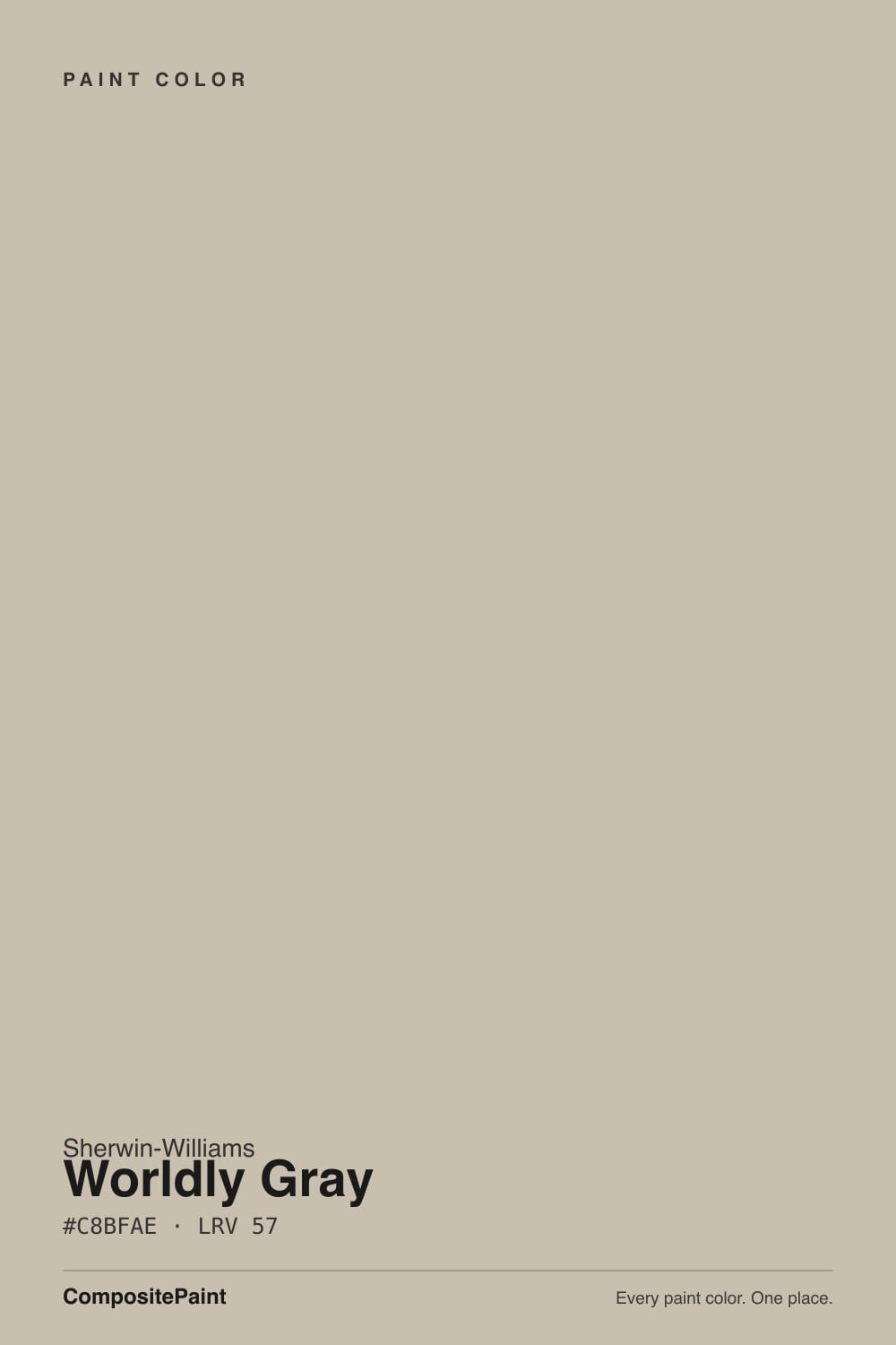
Worldly Gray
Sherwin-Williams' warmer answer to Agreeable Gray, reviewed honestly: the quiet green cast nobody warns you about, the rooms where it goes dingy, and what to pick instead.

Jessica has spec'd whites and neutrals for more than 300 rooms and keeps a sample wall of painted drawdowns in her studio. Every color review is checked against real reader rooms in the comments and re-tested when a formula changes. About the testing process →
- 1Dorian Gray39
- 2Mindful Gray48
- 3Worldly Gray57
- 4Pale Oak69
- 5Shoji White74
The Fast Verdict
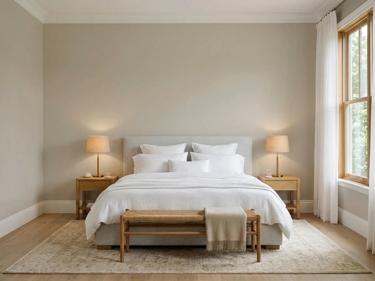
Worldly Gray is the greige people choose when true gray felt cold and beige felt dated. It carries real warmth with a soft, earthy green cast underneath, which is what keeps it from looking chalky or pink like a lot of light greiges do. It behaves beautifully in rooms with daylight and warm wood. In a dim room, or beside anything violet-taupe, it is a different color than the chip promised.
Open main floors with real daylight · warm oak and walnut floors · kitchen cabinets and built-ins · anyone who found gray too cold and beige too yellow
The room is a basement or has one small north window · your carpet or stone is violet-taupe · you run 4000K daylight bulbs · you want a color that never shifts
- Warm without ever going yellow or mustard
- The green thread keeps it looking earthy instead of chalky
- Flows across an open floor plan as one calm backdrop
- Flatters oak, walnut, brass, and warm stone
- Deep enough to hold its color in a bright, sunny room
- Goes drab and dingy in basements and dim rooms
- The green cast surfaces under cool north light and 4000K bulbs
- Flashes violet next to mauve or taupe-purple flooring and stone
- Shifts more between morning and evening than most people expect
What Color Is Worldly Gray, Really?
A light warm greige with a quiet green thread running through it. That green is the part chips and paint-store lighting hide, and it is the single most useful thing to know about this color. It is not sage and it is not obvious — most people never name it — but it is why Worldly Gray looks earthy and grounded on a wall instead of chalky, and it is also why it argues with anything mauve. Sherwin-Williams sells it as the warmer sibling to Agreeable Gray, which is accurate: same job, more soil in it.
At LRV 57 it sounds light, and on paper it is only three points below Agreeable Gray (LRV 60). Three points does not sound like anything. On a wall it is: Worldly Gray sits at the heavy end of light, so it holds its color in a bright room where Agreeable Gray can wash out, and it drops noticeably faster than Agreeable Gray when the light goes away. Put both up in a sunny living room and they are near twins. Put both in a hallway with no window and Worldly Gray is the one that reads dull first.
Undertone in one line: warm tan-gray with a soft green underneath — occasionally a violet wink in cold light, never yellow.
Where It Shines
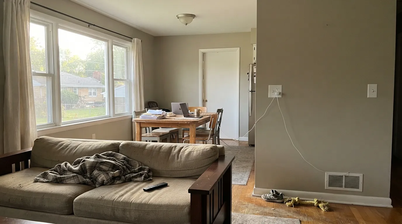
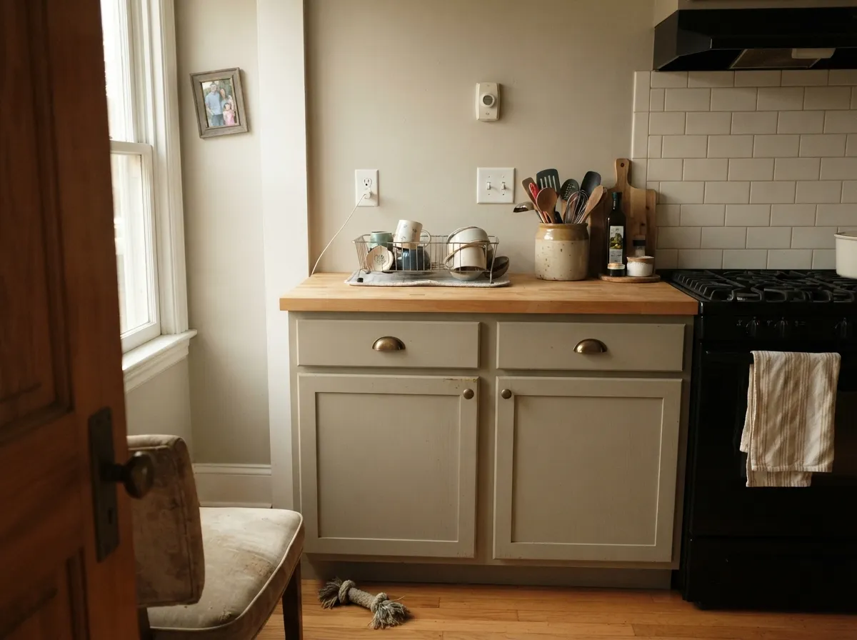
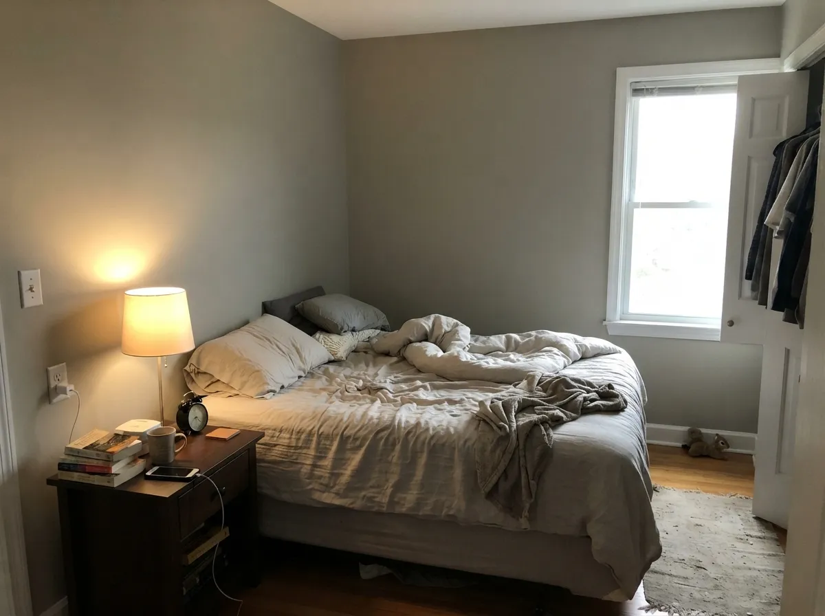
Give it daylight and warm wood and this is one of the easiest whole-house colors Sherwin-Williams makes. It flows across an open main floor without going flat in the corners, and on cabinets it reads like an intentional soft neutral rather than a cheap off-white.
Where It Fails
The bad reviews for Worldly Gray are remarkably consistent, and they are all about context, not quality. Three situations account for nearly every one of them — and if your room is one of them, no primer, sheen, or extra coat will save it.
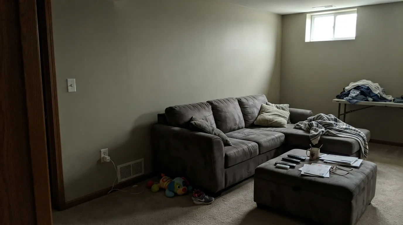
LRV 57 reads light on a chip and heavy on a wall. With no real daylight the warmth drains out and what is left is a drab gray-brown that homeowners describe as dingy or muddy. If the room is dark, go up the same strip to Shoji White (SW 7042, LRV 74) — same family, far more forgiving.
North light is already cool, and daylight LEDs strip out the last of the warmth. That leaves the green cast standing alone, and the wall reads faintly sage and tired instead of neutral. Either swap to 2700K bulbs, or use Accessible Beige (SW 7036) which has no green to expose.
This is the source of the "my gray looks purple" complaints. The green in Worldly Gray sits directly opposite mauve on the color wheel, so a violet-taupe floor or a mauve-gray granite pushes the wall visibly violet-blue. With that flooring, pick Sandbar (SW 7547) — a sandier greige with no green to fight.
Room by Room
One warm backdrop carrying the whole main floor is exactly the job it was made for. Eggshell on walls, Alabaster (SW 7008) semi-gloss on trim. Needs at least one good window per zone.
On cabinets it reads as a deliberate soft neutral against butcher block, brass, and warm quartz. Pair with Alabaster (SW 7008) uppers or an Urbane Bronze (SW 7048) island. Use a urethane-fortified cabinet enamel, not wall paint.
Under 2700K bulbs it turns quietly cozy and the green disappears entirely. If the bedroom is north-facing and you sleep with the blinds down, add Sea Salt (SW 6204) on one wall so the room has something to lean on.
Warm travertine, wood vanities, and cream tile: excellent. Mauve-gray porcelain or violet-veined marble: it will flash purple. Hold a large sample flat against the tile before you buy a gallon.
This is where it either flows or dies. A hallway that catches daylight from an open room reads warm and continuous. A closed interior hallway with one ceiling can turns it drab — Shoji White (SW 7042) is the safer hall color.
Full sun bleaches out the green and leaves a clean warm gray body color. Pure White (SW 7005) trim and a Naval (SW 6244) or Urbane Bronze (SW 7048) door. Details in the palette section below.
Your Light Is the Risk
Warm sun brings the tan forward and the room reads cozy and finished. Safest exposure for it.
Cool steady light thins the warmth and lets the green cast show. Warm bulbs fix most of it.
Warm and sandy at the sun hours, quieter gray the rest of the day. Expect the swing.
With no daylight the LRV 57 works against you and the wall reads muddy. Go lighter.
Most complaints about Worldly Gray are a light mismatch. Upload a photo of your actual room and see it on your walls — then ask for the same wall in north light or evening lamps before you buy a single sample.
Need It From Another Brand?
Any paint counter can custom-tint Sherwin-Williams SW 7043 directly. If you would rather stay in one brand's own deck, these are the closest stock matches, measured as ΔE2000. Under 2 is a difference you will not see on the wall.
| Brand | Closest color | ΔE | LRV | |
|---|---|---|---|---|
| Behr | Smoked UmberPWN-71 · Behr | 1.6 | 57 | Color page → |
| Benjamin Moore | London Fog1541 · Benjamin Moore | 1.4 | 57 | Color page → |
| Valspar | Perfect Backdrop8005-8B · Valspar | 2.3 | 56 | Color page → |
| PPG / Glidden | IntuitivePPG1022-2 · PPG / Glidden | 1.3 | 57 | Color page → |
| Glidden | IntuitivePPG1022-2 · Glidden | 0.8 | 57 | Color page → |
| Dutch Boy | Silvered447-1DB · Dutch Boy | 1.5 | 57 | Color page → |
Similar Sherwin-Williams Colors
The nearest shades to Worldly Gray within Sherwin-Williams's own range, ranked by perceptual color distance — useful when you want the same look a touch lighter, darker, or warmer.
WCAG 2.1: AA is 4.5 : 1 for normal text, 3 : 1 for large text, AAA is 7 : 1.
Worldly Gray vs the Colors You're Also Considering
Every Worldly Gray sample board has the same rivals on it. The numbers show the real lightness gap — then it comes down to which risk you would rather live with.
Pick this for more warmth and earthiness — it is the less washed-out of the two.
Sherwin-Williams SW 7029 · LRV 60Agreeable GrayPick this for the safest, most neutral greige — slightly lighter and no green to manage.
Side-by-side comparison →Pick this when you want the wall to stay gray-leaning rather than clearly beige.
Sherwin-Williams SW 7036 · LRV 58Accessible BeigePick this when the room is dim or the floors are mauve — beige with no green to expose.
The closest comparison is Agreeable Gray (SW 7029), LRV 60. Agreeable Gray is a hair lighter and reads more evenly gray, while Worldly Gray is a touch warmer and slightly deeper. If your room already feels cool, Worldly Gray adds welcome warmth; if you want the safest, most balanced greige, Agreeable Gray is the pick.
Anew Gray (SW 7030), LRV 47, is the deeper cousin. It has clearly more color and reads as a proper mid-tone greige. Choose Anew Gray when you want the walls to carry more presence, and Worldly Gray when you want the room to stay light.
Sandbar (SW 7547), LRV 53, sits between the two in depth and leans a bit sandier. It is a good alternative if Worldly Gray looks slightly too gray in your light and you want a touch more tan warmth.
Worldly Gray Coordinating Colors
The rule with Worldly Gray is to follow the green, not fight it. Muted greens, warm whites, and grounded browns all sit naturally beside it because they share its earthy base. What it dislikes is anything violet-taupe or mauve-gray, which turns the walls purple, and any bright cool white on trim, which makes the walls look dirty by comparison.
These are the partners that come up over and over in real Worldly Gray houses:
The Worldly Gray Ladder: Lighter and Darker
Worldly Gray is the middle rung of one of the most useful strips in the Sherwin-Williams deck. Directly above it is Shoji White (SW 7042) at LRV 74, and directly below it is Amazing Gray (SW 7044) at LRV 42. Same family, same warm base, three very different amounts of light — which means when Worldly Gray is almost right, you rarely have to leave the strip.
Use the ladder like this. If your sample looks dingy on the wall, the room is darker than you thought: go up to Shoji White. If it looks washed out and weak in a very sunny room, go down to Amazing Gray, or step to Anew Gray (SW 7030, LRV 47) for a mid-tone with a touch more gray. For the dark anchor at the bottom — doors, an island, a built-in wall — Dovetail (SW 7018) keeps the same warm gray character at LRV 26.
Worldly Gray on Cabinets and Built-Ins
Cabinets are where this color quietly outperforms its reputation. At LRV 57 it hides fingerprints and knuckle marks around handles far better than a white cabinet does, and the warm base flatters brass, unlacquered brass, and aged bronze hardware instead of going gray-blue next to them. Against butcher block, walnut, and warm quartz it looks like a decision rather than a compromise.
Two things decide whether it works. First, contrast: Worldly Gray cabinets under Alabaster or Pure White walls can end up too close in value to read as separate — you want either real distance in the values or a clear sheen change. Second, product: use a urethane-fortified cabinet enamel in satin. Wall paint on cabinet doors stays soft, prints under fingernails, and blocks together at the hinges within a season.
Three Ready Palettes Built on Worldly Gray
A color is never alone on the wall. These are complete combinations in the 60-30-10 pattern, with the reason each one holds together. Every one opens in the visualizer.
Alabaster is a warm white, so the trim frames the walls without the cold edge a bright builder white would cut. Urbane Bronze supplies the single dark note the scheme needs, and its warm gray-brown base sits in the same family instead of fighting it.
Try this palette in your roomWorldly Gray's quiet green is what makes Evergreen Fog look inevitable here rather than decorated — the island is simply the wall color turned up. Alabaster cabinets keep the light half bright so the 60-30-10 split stays readable in a busy room.
Try this palette in your roomFull sun burns off the green, so outdoors you can use the crisper Pure White that would look too cold inside. Naval gives the facade one saturated note and reads classic against a warm gray body without pulling the siding blue.
Try this palette in your roomWorldly Gray FAQ
Does Worldly Gray look green?
There is a soft green cast in it, yes, but most people never name it as green. It shows up in cool north light, on overcast days, and under 4000K bulbs. In warm light or full sun it disappears completely and the wall just reads warm gray. The green is a feature in rooms with sage, olive, or wood tones and a problem in rooms with mauve.
Why does my Worldly Gray sample look purple?
Almost always the floor. Violet-taupe carpet, mauve-gray tile, or purple-veined stone sits opposite the green in Worldly Gray, and the contrast pushes the wall visibly violet. Move the sample board away from the floor and hold it against a white card — if the purple vanishes, it is reflection, not paint. If the flooring stays, switch to Sandbar (SW 7547).
Is Worldly Gray too dark for a small or dim room?
For a small room with a decent window, no — it is fine. For a dim room, yes. LRV 57 sits at the heavy end of light, so without daylight it reads dull and slightly muddy instead of soft. Basements, windowless halls, and single-small-window rooms should use Shoji White (SW 7042, LRV 74) instead.
Worldly Gray or Accessible Beige?
They are nearly the same depth — LRV 57 versus 58 — so the choice is temperature, not lightness. Worldly Gray stays gray-leaning with a green thread; Accessible Beige is clearly the beige of the two and has no green to manage. If your finishes are warm and yellow-leaning, Accessible Beige blends better. If you want the wall to stay quietly neutral, take Worldly Gray.
Can I paint cabinets and walls both Worldly Gray?
You can, and in a small kitchen it looks intentional and calm — but change the sheen so the planes separate: eggshell walls, satin cabinets. In a larger kitchen it flattens out. Break it up with Alabaster (SW 7008) uppers or an Urbane Bronze (SW 7048) island so the room has a second value.
Does Worldly Gray work with orange oak floors?
It is one of the better choices for them. The warmth in the wall meets the orange halfway instead of amplifying it the way a cool gray does, and the faint green quietly cancels some of the orange. Honey oak, red oak, and builder-grade oak all calm down against it. Cool gray-washed LVP is the flooring that needs a sample first.
Have you painted with Worldly Gray?
Rate it — one tap helps the next reader decide.
Ask a Question