Sherwin-Williams Worldly GrayvsSherwin-Williams Agreeable Gray
Two warm grays that look like twins on a chip and behave like cousins on a wall. Worldly Gray has a quiet green thread in it; Agreeable Gray sits on a taupe base that can turn violet when the light goes cool.

Built from our full reviews of both colors — same measured data, same real-room photos. About the testing process →
The Numbers
Agreeable Gray is slightly lighter (LRV 60 vs 57, 3-point delta).
The Real Difference on a Wall
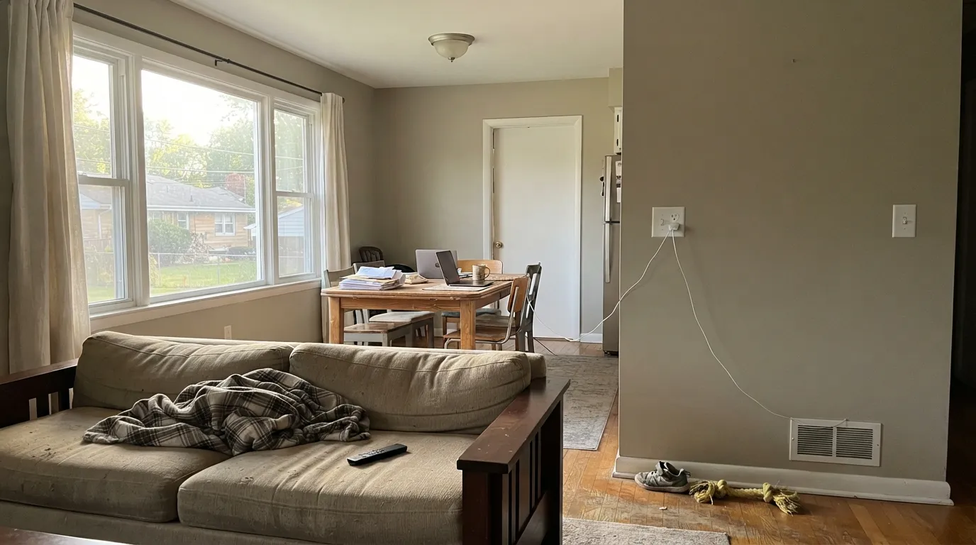
In a sunny room at noon you would struggle to tell these two apart. The split is in what sits underneath the warmth. Agreeable Gray is built over a taupe base with a whisper of violet in it, which is why it reads gray first and warm second, and why the warmth can switch off. Worldly Gray is built over the same kind of soft tan but with a green thread running through it. That green is the part nobody warns you about, and it is also the reason Worldly Gray looks earthy and grounded on a wall instead of chalky.
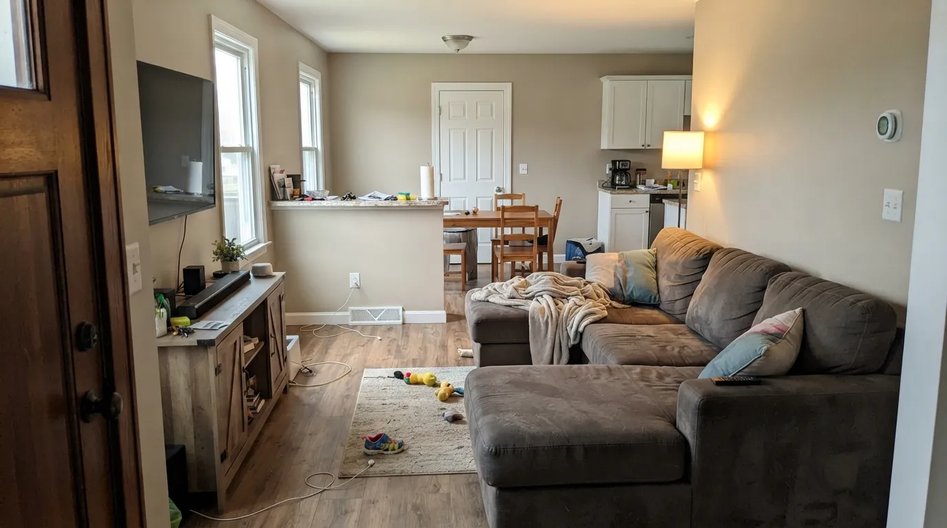
They also fade in opposite ways. Agreeable Gray is a chameleon by design: warm and almost beige by a south window, then plainly gray, drab, sometimes faintly violet in the shaded corner of the same open room. Worldly Gray is a touch deeper, so it holds its color better in a bright room where Agreeable Gray can wash out at midday. Take the daylight away and the order flips. In a closed hallway or a basement, Worldly Gray is the one that goes dull and muddy first, because there is less light coming back to carry the warmth.
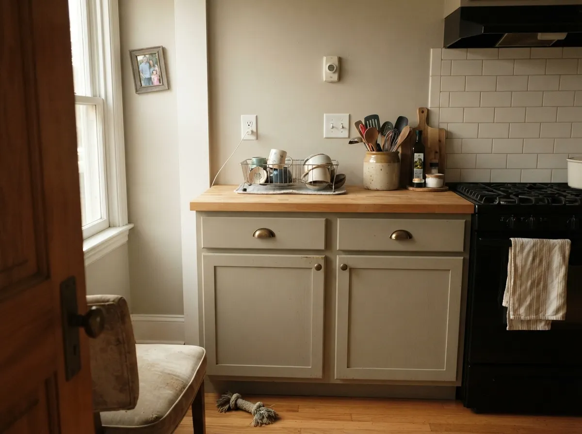
Next to the fixed things in a house they land differently too. Worldly Gray flatters oak, walnut, brass, butcher block and warm stone with no effort, and it is the better of the two on cabinets because it has enough body to look chosen rather than beige. Agreeable Gray is the more agreeable roommate almost everywhere except one place: cream. Beside cream trim or antique-white cabinets it gets pushed cool and reads dirty blue-gray, and the cream looks yellowed. Both want a clean or warm white on the trim, never a cream one.
They flash in opposite directions. Worldly Gray shows its green under north light and 4000K bulbs, and flips visibly violet beside mauve or taupe-purple flooring and stone. Agreeable Gray does the reverse: it loses its warmth in cool north light and comes up faintly violet on its own, then flashes green next to cool violet-gray tile and quartz.
What Each Color Really Is
A light warm greige with a quiet green thread running through it. That green is the part chips and paint-store lighting hide, and it is the single most useful thing to know about this color. It is not sage and it is not obvious — most people never name it — but it is why Worldly Gray looks earthy and grounded on a wall instead of chalky, and it is also why it argues with anything mauve. Sherwin-Williams sells it as the warmer sibling to Agreeable Gray, which is accurate: same job, more soil in it.
At LRV 57 it sounds light, and on paper it is only three points below Agreeable Gray (LRV 60). Three points does not sound like anything. On a wall it is: Worldly Gray sits at the heavy end of light, so it holds its color in a bright room where Agreeable Gray can wash out, and it drops noticeably faster than Agreeable Gray when the light goes away. Put both up in a sunny living room and they are near twins. Put both in a hallway with no window and Worldly Gray is the one that reads dull first.
A warm gray built on a taupe base, not a beige one — and that distinction explains almost everything about how it behaves. Beige-based neutrals carry yellow, so they stay warm no matter what the light does. Agreeable Gray carries a soft brown-violet instead, which is why it reads gray first and warm second, and why the warmth can switch off when the light turns cool. Sherwin-Williams sells it as the agreeable one because it refuses to commit to an undertone, and that refusal is both the reason it goes on more American walls than almost any other color and the reason a small share of people hate it.
At LRV 60 it reflects a bit more than half the light that lands on it, which puts it in the mid-light band — light enough to open a room, not light enough to act as a bright neutral. The number looks close to Revere Pewter (HC-172) at 56, but on a wall the gap feels bigger than four points because Revere Pewter also carries green and reads a full step heavier and more traditional. Put Agreeable Gray beside a real off-white like Alabaster (SW 7008) at LRV 82 and the comparison is honest: this is a color, not a pale wash, and it will hold visible shadow in corners and behind furniture.
Specs Side by Side
| Spec | Worldly Gray | Agreeable Gray |
|---|---|---|
| Brand | Sherwin-Williams | Sherwin-Williams |
| SKU | SW 7043 | SW 7029 |
| Hex | #CEC6BB | #D1CBC1 |
| RGB | 206, 198, 187 | 209, 203, 193 |
| LRV | 57 | 60 |
| Undertone | red-orange / warm | red-orange / warm |
| Family | Neutral | Neutral |
How Light Changes Them
Warm sun brings the tan forward and the room reads cozy and finished. Safest exposure for it.
Cool steady light thins the warmth and lets the green cast show. Warm bulbs fix most of it.
Warm and sandy at the sun hours, quieter gray the rest of the day. Expect the swing.
With no daylight the LRV 57 works against you and the wall reads muddy. Go lighter.
Warms up and looks its softest and lightest. Can wash toward a pale beige at midday — most people love it anyway.
The warmth drains out. Gray, sometimes violet, often just dingy. Sample this room first — or go warmer.
2700K lamps push it cozy and beige. 4000K daylight bulbs pull the gray out and can trigger the violet. Swap bulbs before you repaint.
One color, two rooms, two looks: warm and beige by the south windows, gray and cool in the shaded corner. Fine if you expect it, jarring if you don't.
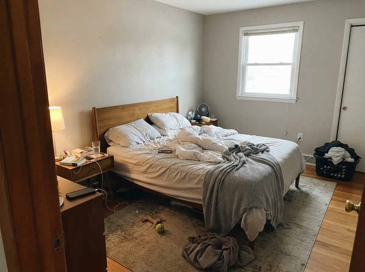
Both Colors in Real Rooms
Photos from our full reviews — the same rooms and captions, so you can judge each color where it actually lives, not on a chip.
When to Pick Which
Choose Worldly Gray if the room has real daylight and warm wood in it, and you want a greige with some soil in it rather than a pale wash. It is the better cabinet color of the two and the better choice over oak or walnut floors. Skip it if your floors, carpet or stone lean mauve.
Choose Agreeable Gray if you want the lighter, safer, more neutral one and you are painting a lot of rooms at once. It brightens more, it commits to less, and every painter in the country already knows it. Skip it if your trim or cabinets are cream, because that pairing makes both colors look wrong.
No comparison page can see your light. Upload one photo of your room and try both colors on the same walls, seconds apart.
Worldly Gray vs Agreeable Gray FAQ
Which one is safer in a north-facing room?
Neither is a slam dunk, and that is the honest answer. Agreeable Gray drains to a drab gray and can show violet; Worldly Gray drops its warmth and shows sage. If the room is north-facing but bright, Worldly Gray with 2700K bulbs is the better bet. If it is north-facing and dim, go lighter instead with Shoji White SW 7042 or warmer with Accessible Beige SW 7036.
Which is better for kitchen cabinets?
Worldly Gray. It has enough depth to read as a deliberate soft neutral against warm quartz, butcher block and brass, while Agreeable Gray on cabinets often washes out next to a white counter and looks like a dirty off-white. Either way, use a urethane-fortified cabinet enamel in satin, not wall paint.
What trim white goes with each?
Alabaster SW 7008 with Worldly Gray, because a warm white frames the earthiness instead of cutting it. Pure White SW 7005 with Agreeable Gray, because a clean white keeps the taupe base from going dingy. Do not put a cream white with Agreeable Gray under any circumstances.
Which one works better as a whole-house color?
Agreeable Gray, in most houses. It is lighter, so it survives the closed hallways and small bathrooms that every whole-house scheme runs into, and it has no green to expose. Worldly Gray does whole-house beautifully but only when the floor plan is open and every zone has a real window.
How do they look at night under lamps?
Under 2700K bulbs both go warm and cozy, and Worldly Gray's green disappears completely, which is why it is a good bedroom color. Under 4000K daylight LEDs the picture reverses: Agreeable Gray goes gray and can pull violet, and Worldly Gray goes faintly sage. If you hate your walls at night, change the bulbs before you change the paint.
Ask a Question