Balanced Beige
The beige people buy when the light beige disappeared — reviewed honestly, including the rooms where it turns heavy and the light that makes it flash pink.

Jessica has spec'd whites and neutrals for more than 300 rooms and keeps a sample wall of painted drawdowns in her studio. Every color review is checked against real reader rooms in the comments and re-tested when a formula changes. About the testing process →
- 1Anonymous20
- 2Dorian Gray39
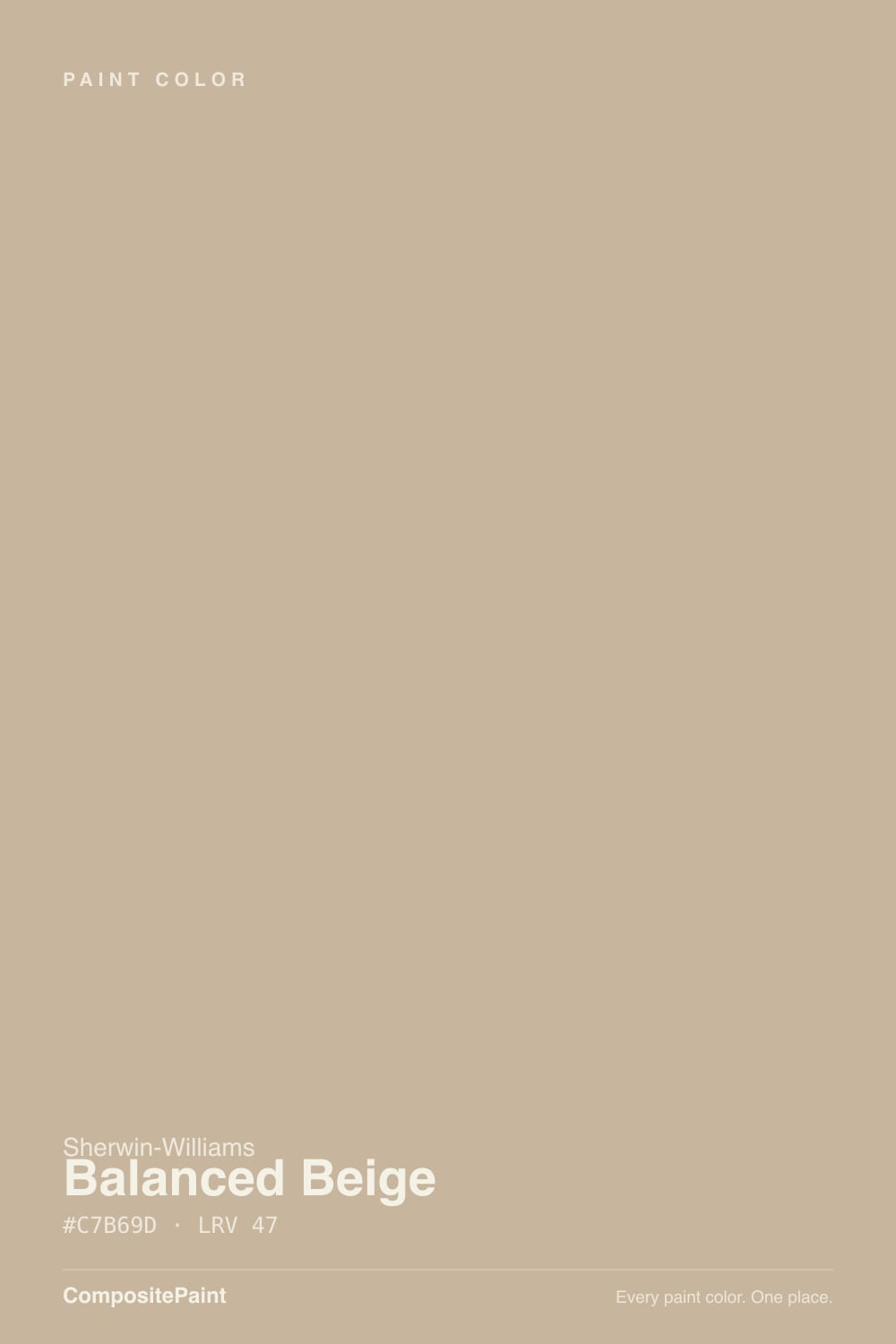
- 3Balanced Beige46
- 4Agreeable Gray60
- 5Pale Oak69
The Fast Verdict
Balanced Beige is what you reach for when a pale beige washed out and the room still looked unfinished. At LRV 47 it has enough pigment to hold its color in full sun and give walls actual weight, and it is genuinely lovely with oak, leather, tan stone and brass.
The catch is the red side of its undertone: in cool light or against gray surfaces it can read pinkish, and in a dim room it drops into heavy khaki. Great color, narrow window — sample it on two walls before you commit.
Sunny rooms where a light beige washed out · warm wood, leather and tan stone · dining rooms and studies that want weight · exterior siding with white trim
The room faces north with one window · your floors are orange honey oak · you actually want something that reads gray · your counters and tile are cool gray
- Holds its color in bright sun where pale beiges bleach out
- Reads clearly as beige, not as another cautious greige
- Flatters oak, walnut, leather, rattan and tan stone
- Mid-tone depth hides scuffs and wall imperfections well
- Strong exterior siding color with white trim and a dark door
- Flashes pink-mauve next to cool gray stone or gray flooring
- Turns heavy and khaki in north-facing or single-window rooms
- Amplifies orange honey oak into a dated 1990s look
- Much darker on four walls than the chip suggests
What Color Is Balanced Beige, Really?
A mid-tone beige that is honestly beige — not a greige pretending. The undertone sits on the warm red-orange side, and the pigment load is high for a neutral, so the tan shows plainly on a wall instead of hiding behind gray. That red lean is the part nobody warns you about. Most beiges in this depth are built on yellow, which fails by going gold. Balanced Beige fails the other direction: put it beside a cool gray quartz top or gray-washed flooring and the red comes forward as a soft pink-mauve haze. Warm surroundings pull it back to tan immediately, which is why the same paint gets described as "perfect warm beige" in one house and "weirdly pink" in the next.
LRV 47 is the number that decides everything. Set it next to Accessible Beige SW 7036 at LRV 58 and the gap is obvious: eleven points is roughly the difference between a neutral that reads like a soft background and a neutral that reads like a color you chose. Balanced Beige reflects only about half the light that lands on it, so it stays visible in strong sun where lighter beiges bleach out, and it gets noticeably heavier the moment daylight is limited. It is a wall color, never a trim or ceiling color.
Undertone in one line: warm tan with a red edge — never yellow-gold, never gray. If yours looks pink, that is your floor, tile or countertop pushing the red forward, not a bad batch of paint.
Where It Shines
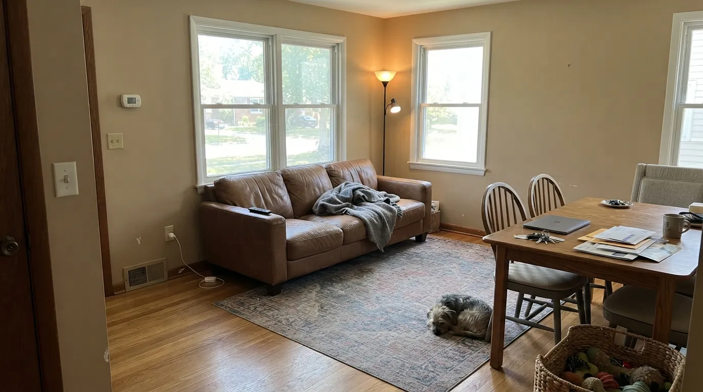
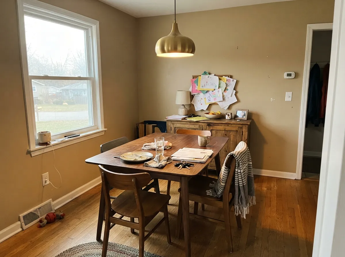
Give it windows and warm materials and it does exactly what people hoped for: the walls finally have color in them and the wood in the room stops looking accidental. Dining rooms, studies, main floors with south or west glass, and siding under white trim are where the extra depth earns its keep.
Where It Fails
The unhappy stories about this color are remarkably consistent, and all three are predictable before you open the can. If your room matches one of them, a second coat will not save it — the color is simply wrong for that room.
Cool north light drains the gold out and leaves the red base exposed, so the wall goes heavy and slightly mauve instead of warm and soft. At LRV 47 there is not enough reflectance left to rescue it. Step up in light with Accessible Beige SW 7036, eleven points brighter in the same family.
The red-orange base and orange wood amplify each other, and the room lands squarely in dated builder-beige territory. This is the single most common regret with this color in older houses. Use a mid-tone with more gray in it, like Anew Gray SW 7030, which sits at the same LRV 47 but refuses to echo the orange.
Cool gray is the opposite temperature, and it pushes the red forward until the wall reads pink at certain hours. It is subtle in photos and obvious in person. If the hard surfaces are staying cool, match them with Amazing Gray SW 7044 — same depth, no pink.
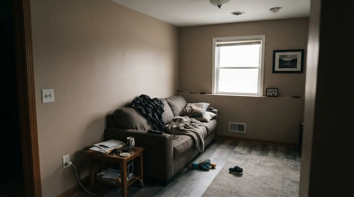
Room by Room
The depth reads intentional here in a way it does not in a bright hallway, and it flatters a wood table better than any pale neutral. Eggshell walls with Alabaster SW 7008 trim in semi-gloss. Brass or aged bronze lighting; avoid chrome.
In a room with two or more windows it holds its warmth all day and gives the sofa and art something to sit against. Eggshell. Add one darker note — Urbane Bronze SW 7048 on a built-in or the fireplace surround — so the beige is not carrying the room alone.
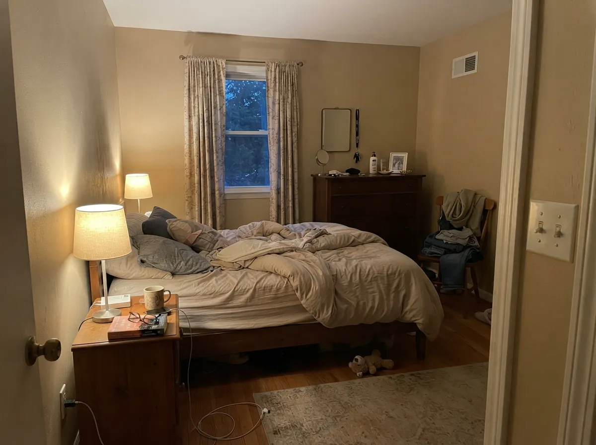
It goes genuinely cozy under 2700K lamps, almost honey. Under cool 4000K LEDs it flattens out and looks dull. Matte or eggshell, with Natural Choice SW 7011 on the trim if you want the softest possible edge.
A full run of Balanced Beige cabinets looks tired fast at this depth. On an island under lighter perimeter doors it works, in satin urethane cabinet enamel, with butcher block or a warm quartz. Skip it entirely if your counters are cool gray.
One window and four walls at LRV 47 is where people discover how much darker it is than the chip. If the hallway has borrowed light from a bright room it can work; if it does not, go to Accessible Beige SW 7036 instead.
Outdoor light is far stronger than indoor light, so the depth that feels heavy inside reads as a warm, settled body color outside. Satin siding, Pure White SW 7005 trim, and a dark door. Full pairings in the exterior section below.
Your Light Is the Risk
Steady warm tan all day, and the depth keeps it from washing out. Its ideal room.
Cool light strips the gold and exposes the red — heavy, faintly mauve. Test before buying.
Late sun pushes it distinctly golden, so the sunlit wall outruns the wall opposite.
2700K lamps make it honeyed and cozy. Cool 4000K LEDs flatten it — change bulbs, not paint.
Most complaints about Balanced Beige are a light mismatch. Upload a photo of your actual room and see it on your walls — then ask for the same wall in north light or evening lamps before you buy a single sample.
Need It From Another Brand?
Any paint counter can custom-tint Sherwin-Williams SW 7037 directly. If you would rather stay in one brand's own deck, these are the closest stock matches, measured as ΔE2000. Under 2 is a difference you will not see on the wall.
| Brand | Closest color | ΔE | LRV | |
|---|---|---|---|---|
| Behr | SmokestackN220-3 · Behr | 1.3 | 46 | Color page → |
| Benjamin Moore | PashminaAF-100 · Benjamin Moore | 2.7 | 44 | Color page → |
| Valspar | Clean Sweep2007-10B · Valspar | 1.7 | 46.5 | Color page → |
| PPG / Glidden | DiscoverPPG1021-3 · PPG / Glidden | 1.2 | 44 | Color page → |
| Glidden | Dry Goods Neutral40YY 44/095 · Glidden | 2.5 | 44 | Color page → |
| Dutch Boy | Grayed Pebble441-3DB · Dutch Boy | 0.5 | 46 | Color page → |
Similar Sherwin-Williams Colors
The nearest shades to Balanced Beige within Sherwin-Williams's own range, ranked by perceptual color distance — useful when you want the same look a touch lighter, darker, or warmer.
WCAG 2.1: AA is 4.5 : 1 for normal text, 3 : 1 for large text, AAA is 7 : 1.
Balanced Beige vs the Colors You're Also Considering
Every Balanced Beige sample board has the same rivals on it. The numbers show the real lightness gap — then it comes down to which risk you would rather live with.
Pick this when Accessible Beige washed out in a bright, sun-filled room.
Sherwin-Williams SW 7036 · LRV 58Accessible BeigePick this for whole-house use, hallways, and rooms short on daylight.
Side-by-side comparison →Pick this for a deeper beige with more gray holding the warmth down.
Sherwin-Williams SW 6106 · LRV 49Kilim BeigePick this for a lighter, sunnier beige that suits honey oak better.
The comparison people ask about most is Accessible Beige SW 7036 at #D1C7B4 and LRV 58. It is eleven LRV points lighter and visibly grayer, which is why it works as an all-over neutral in average light. Balanced Beige at #C7B69D and LRV 47 is deeper and more clearly beige, so it is the better answer when Accessible Beige has washed out in a sunny room.
Within the brand, Windsor Greige SW 7528 at #C4B49C and LRV 47 is the same depth with a slightly cooler cast, and Macadamia SW 6142 at #CCB79B and LRV 49 is lighter and more golden.
Across brands, Behr Elemental Tan MQ2-21 at deltaE 0.94 and Glidden Jefferson House Tan 30YY 47/145 at deltaE 0.96 are effectively the same color, and Valspar Sandy Trail V134-3 at deltaE 1.17 is visually identical in normal room light. Benjamin Moore Glacial Till AF-390 at deltaE 2.55 is very close, so sample first. Farrow and Ball Wall White No. 58 at deltaE 4.15 is close but visibly different side by side.
Balanced Beige Coordinating Colors
The rule with this color is simple: keep its neighbors warm or keep them clearly muted. Anything cool and gray pulls the red undertone out and gives you the pink problem, while warm whites, deeper browns, muted greens and true navies all sit comfortably with it.
These are the partners that come up again and again, whether you need a trim white, a lighter neutral for the next room, or a dark note to anchor the scheme:
Balanced Beige on Exteriors
Outside is where this color is easiest to get right. Exterior daylight is several times stronger than anything indoors, so the depth that feels heavy in a hallway simply reads as a settled, warm siding color, and it does not bleach out at midday the way a pale beige body color does. It also sits naturally with the materials most houses already have — tan brick, warm stone, cedar, terracotta roof tile.
Pairing decides the result, same as inside. Pure White SW 7005 trim gives crisp modern separation; a warmer trim white softens it toward traditional. For the dark note, Naval SW 6244 on the door or Kendall Charcoal HC-166 on shutters both work, and the cool depth is what keeps the facade from looking uniformly beige. One warning: the shaded north elevation will read a full step darker and grayer than the sunny south side, so paint a sample board and walk it around the whole house before you order.
Balanced Beige With Wood Tones and Floors
Flooring covers more square footage than trim does, and with a mid-tone beige it decides the outcome. Walnut, medium-brown engineered oak, natural white oak and rattan all pair beautifully — they share the warmth without competing, and the wall stops looking like a color and starts looking like a background. Leather furniture and tan stone do the same job.
Two floors need caution. Orange-toned honey oak is the known failure: both surfaces are pushing the same red-orange note and the room tips dated. Cool gray LVP is the other one, because it forces the red forward and that is where the pink complaints come from. If you have either floor and still want a warm neutral, sample Anew Gray SW 7030 at the same depth, or move lighter to Accessible Beige SW 7036 before you paint a whole room.
Three Ready Palettes Built on Balanced Beige
A color is never alone on the wall. These are complete combinations in the 60-30-10 pattern, with the reason each one holds together. Every one opens in the visualizer.
Alabaster is warm enough that it never makes the beige look dingy the way a bright white would, and the 35-point LRV gap keeps the trim clearly separate. Urbane Bronze supplies the one dark note that stops a warm room from reading soft all the way through.
Try this palette in your roomNatural Choice is the softest landing for this beige — barely there, no cold edge, so the walls stay the story. Evergreen Fog is a muted green sitting opposite the red undertone, which is exactly why it calms the warmth instead of competing with it.
Try this palette in your roomOutside you want maximum separation, so a clean white at LRV 84 against siding at 47 draws every edge sharply. Naval is deep enough to anchor the front of the house and its cool blue keeps the whole scheme from going all-warm and flat.
Try this palette in your roomBalanced Beige FAQ
Is Balanced Beige too dark for walls?
In a room with two or more windows, no — it is a normal mid-tone wall color and the depth is the point. In a single-window room or a north-facing one, yes, most people find it heavier than they wanted. The rule of thumb: if a pale beige looked washed out in that room, this one will look right; if a pale beige looked fine, this one will look dark.
Does Balanced Beige look pink?
It can, and this is its most-reported surprise. The undertone leans red-orange, so cool gray surfaces — gray quartz, gray-washed floors, blue-gray tile — pull the red forward until the wall reads faintly pink or mauve. Surround it with warm wood, tan stone or cream and the pink disappears completely.
Balanced Beige or Accessible Beige?
Accessible Beige SW 7036 is eleven LRV points lighter and visibly grayer, which makes it the safer whole-house neutral. Balanced Beige is the fix for rooms where Accessible Beige looked pale and unfinished, usually south or west facing spaces with a lot of glass. Buy samples of both and paint them side by side on the sunniest wall.
What white trim goes with Balanced Beige?
Alabaster SW 7008 is the standard answer — warm enough to belong with the beige, bright enough to keep the trim reading as trim. Pure White SW 7005 is the sharper, more current option and works better if the room has black hardware or modern lighting. Natural Choice SW 7011 is the softest, near-invisible edge if you want almost no contrast.
Does it work with honey oak floors and trim?
This is the pairing to avoid. The red-orange base echoes the orange in honey oak and the whole room tips dated. If the oak is staying, go grayer at the same depth with Anew Gray SW 7030, or lighter and grayer with Accessible Beige SW 7036.
Can I use it on kitchen cabinets or an island?
On an island, yes — in satin, under lighter perimeter cabinets, with warm wood or a warm quartz top. A full kitchen of Balanced Beige cabinets is too much of it and looks tired within a few years. And skip it entirely if your countertops are cool gray, or the doors will pick up that pink cast.
Is Balanced Beige outdated?
Not on its own. It looks dated when it is combined with the things it was originally sold with — honey oak, golden granite, tuscan bronze. With white trim, black hardware, and one muted green or deep navy in the room, it reads current and warm. Beige came back; the 1998 package around it did not.
Have you painted with Balanced Beige?
Rate it — one tap helps the next reader decide.
Ask a Question