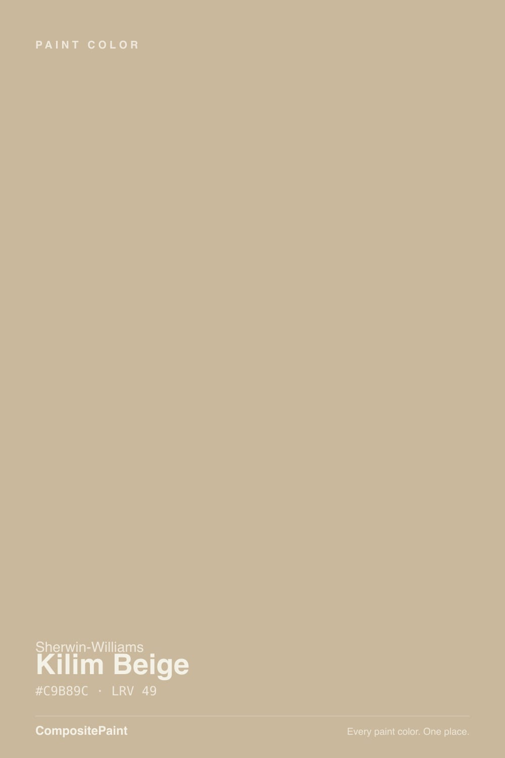
Kilim Beige
The warm beige that never goes gray, reviewed honestly: the oak and travertine it rescues, the afternoon light that turns it peach, and what to pick instead.

Jessica has spec'd whites and neutrals for more than 300 rooms and keeps a sample wall of painted drawdowns in her studio. Every color review is checked against real reader rooms in the comments and re-tested when a formula changes. About the testing process →
- 1Dorian Gray39
- 2Mindful Gray48
- 3Kilim Beige57
- 4Pale Oak69
- 5Shoji White74
The Fast Verdict
Kilim Beige is a real beige, not a greige in disguise. Sherwin-Williams files it in the orange family and that is exactly what you get: a warm tan built on orange, with a pink-gold flush that comes forward in strong afternoon light. It is the color that makes honey oak, travertine and orange-toned brick look intentional instead of dated, and it is one of the few warm neutrals that does not collapse into drab gray in a cool north room.
The catch is that the warmth is not optional — cross-shop it against a greige and you will be surprised on day one.
Living and family rooms in houses with oak, brick or travertine · dining rooms and open main floors · hallways, entries and closets · anyone whose greige sample looked cold and lifeless
You actually want greige · your trim and cabinets are yellow-based cream · your floors are cool gray LVP · the room takes hard west afternoon sun on tall walls
- A true warm beige — no gray in it to go drab in cool light
- Rescues honey oak, travertine and 2000s beige tile instead of fighting them
- Deep enough at LRV 57 to give white trim real contrast
- Carries an open main floor: living, dining and hall in one color
- Hides scuffs and handprints better than any pale greige
- The orange base is real and non-negotiable — peach flashes in afternoon sun
- Argues with yellow-cream trim, yellow-stained oak and cool gray floors
- Photographs grayer and flatter than it lives — the chips and Pinterest both lie
- Firmly beige, so it narrows what you can put next to it later
What Color Is Kilim Beige, Really?
A true warm beige with an orange base — and Sherwin-Williams says so itself, filing SW 6106 in the orange color family rather than with the neutrals. That single fact explains most of what the color does on a wall. There is no gray in it to mute the warmth, so it never turns drab; it reads tan, with a soft pink-gold flush that most people describe as cozy and a minority describe as peachy. Reviewers who love it and reviewers who returned it are usually looking at the same wall and disagreeing about how much orange they can live with.
At LRV 57 it sits at the deeper end of the light range — noticeably more body than the pale beiges people usually roll across a whole floor. That depth is useful: white trim gets real contrast instead of a mushy edge, scuffs and handprints disappear in a hallway, and the color still holds its identity in a dim room where a lighter beige would wash out. It is also the reason it looks stronger on the wall than on the chip. Every reviewer warns about the same surprise: it photographs grayer and flatter than it lives, so the real wall lands warmer, pinker and a touch deeper than the photo that sold it to you.
Undertone in one line: orange first, pink-gold second, with a faint green-gray that only surfaces in cool indirect light — never a cool gray, never a modern greige.
Where It Shines
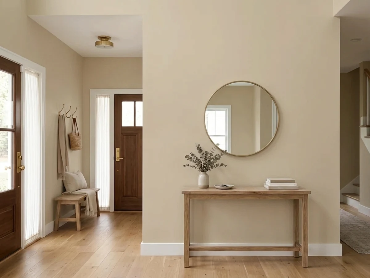
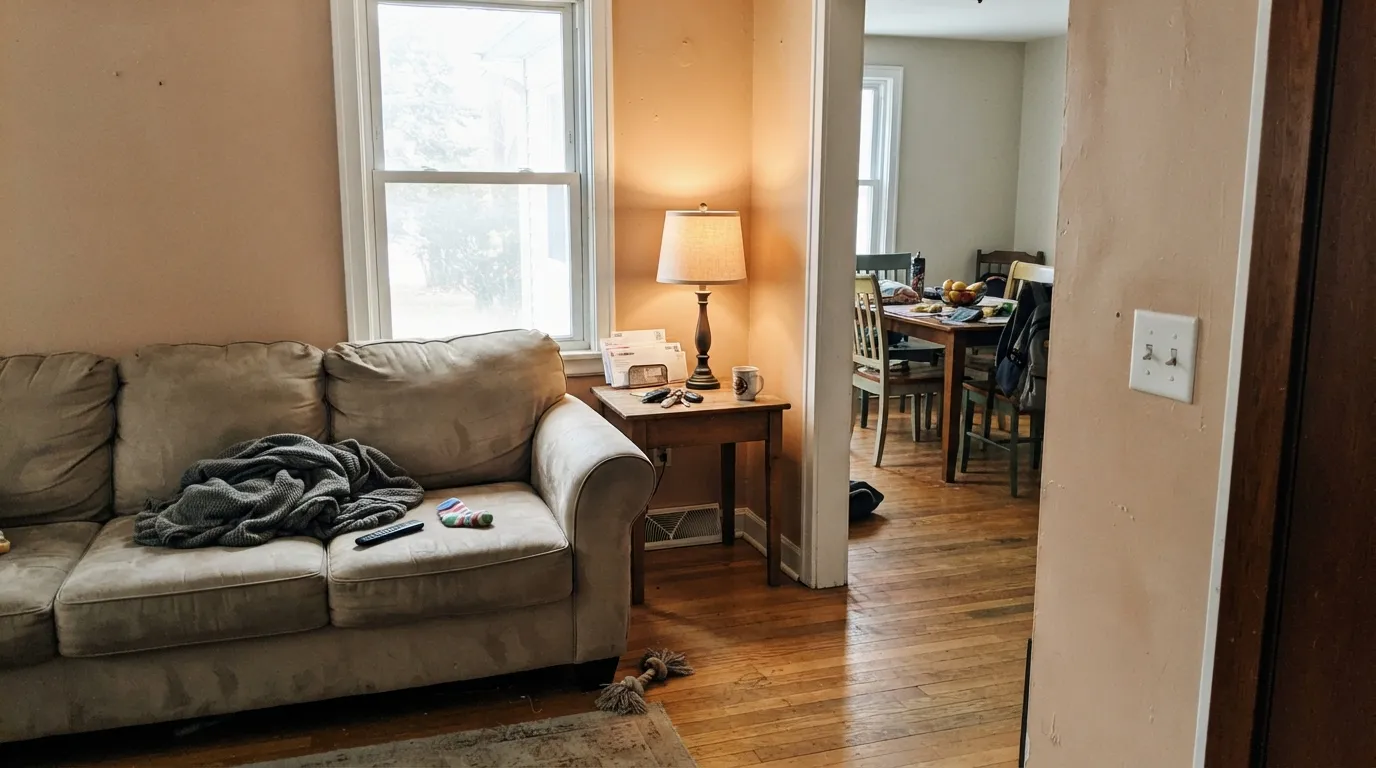
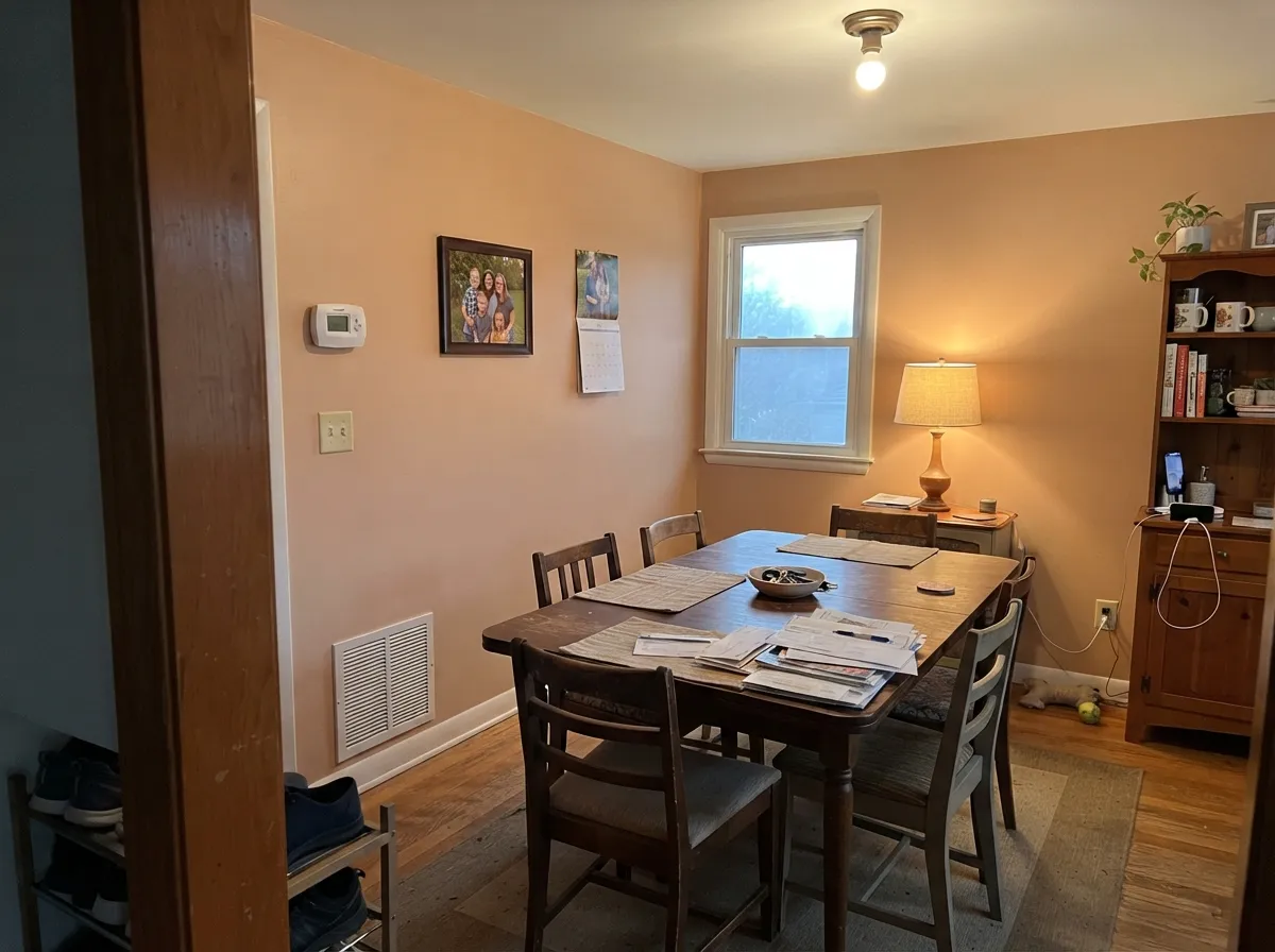
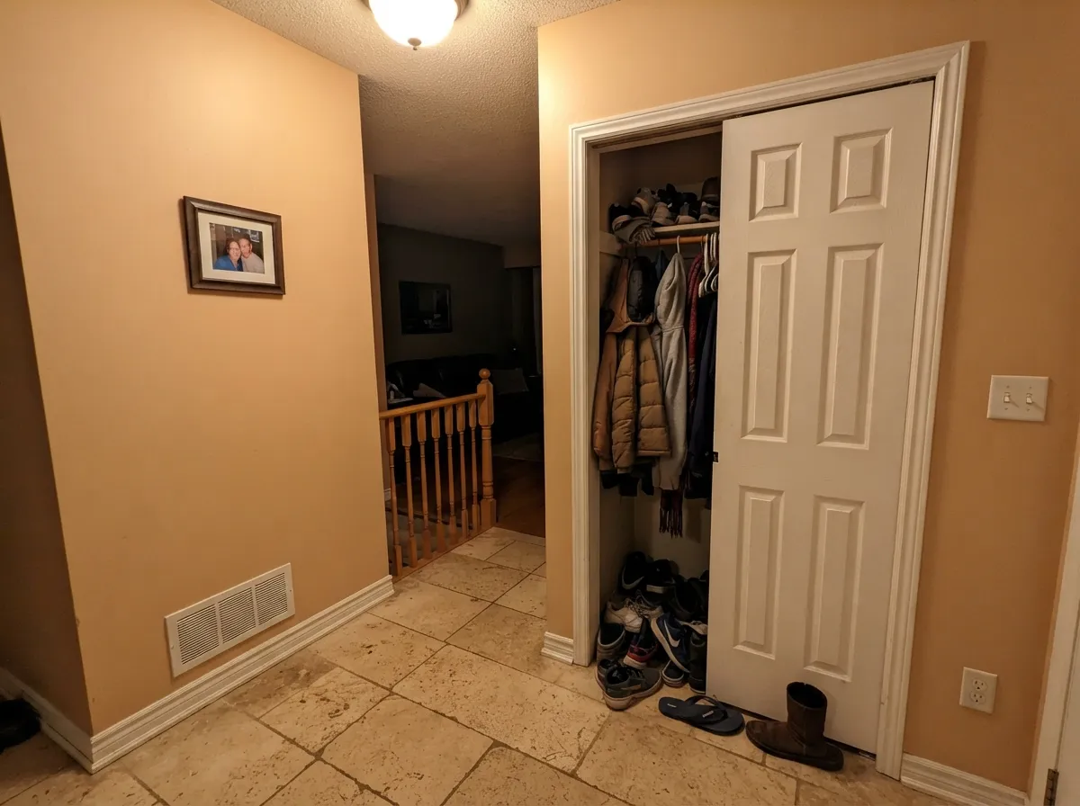
This color earns its keep in houses that already own their warmth. Honey oak floors and trim, red-oak stair rails, travertine tile, orange-toned brick, the beige stone from every 2000s builder — Kilim Beige meets all of it halfway instead of fighting it, which is why it is still specified constantly in homes where replacing the floors is not on the table. Its second strength is the one nobody advertises: because there is no gray in the mix, it stays a warm tan in cool north light, exactly where the popular greiges go flat and lifeless. On an open main floor it does the whole social side of the house — living, family, dining, hall — in one color.
Where It Fails
Nearly every bad review of Kilim Beige comes from one of three situations, and all three are predictable before the lid comes off. The paint is not misbehaving in any of them — but if your room matches one, this is the wrong beige and a second coat will only make it more so.
Most people find this color while cross-shopping Accessible Beige and the other greiges, and it does not belong in that group — there is no gray in it to cut the warmth. On four walls the orange is unmistakable, and it will read warmer, pinker and deeper than the photos you saved. If you want beige with the warmth turned down, go to Accessible Beige and accept that it goes gray when the light goes cool.
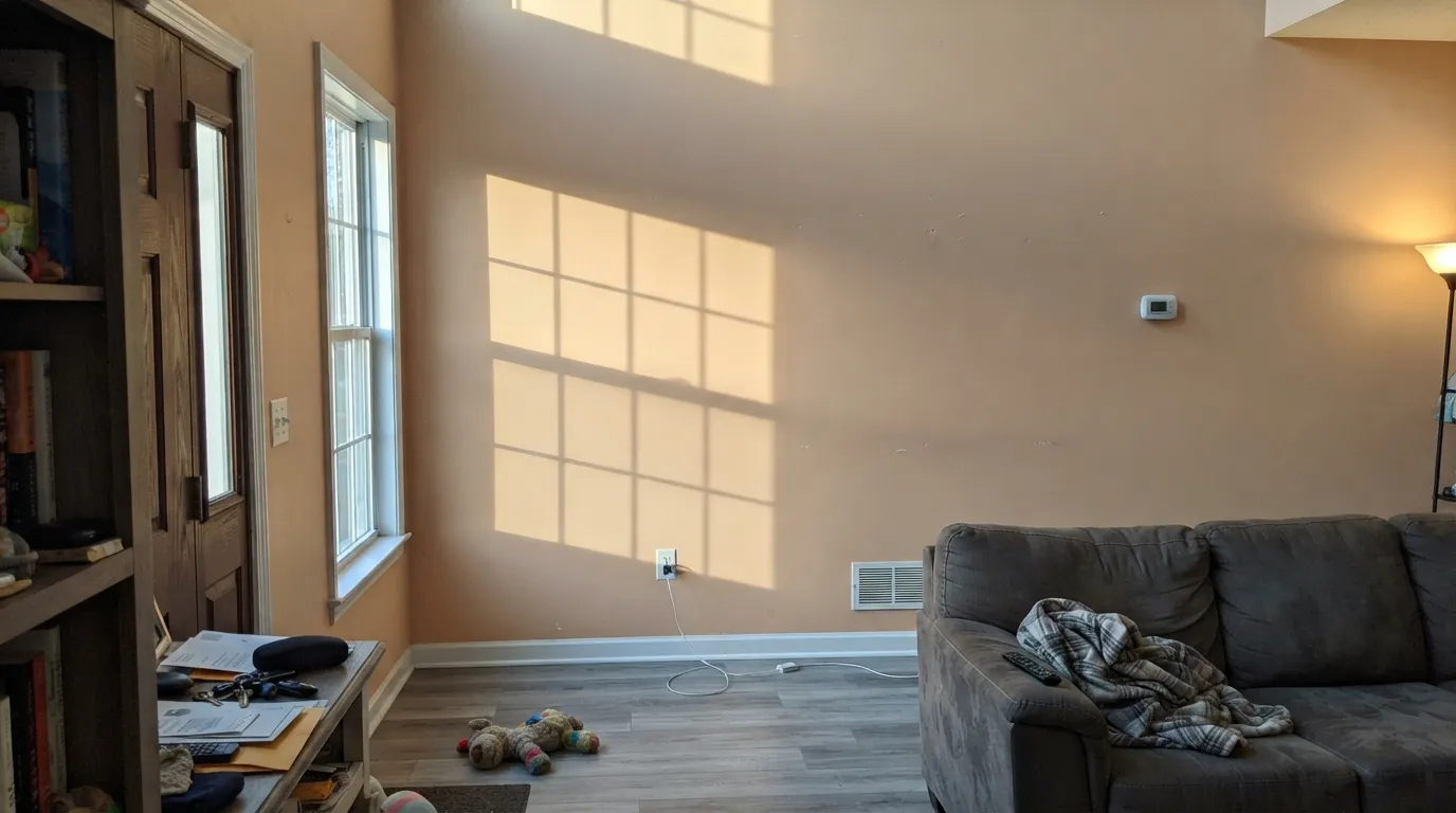
Low warm sun stacks on top of an already-warm color and the wall flashes peach — sometimes close to salmon on a tall, bright, two-story wall. Owners in bright south-facing rooms describe it as toasty, which is a compliment or a complaint depending on you. Sample the actual wall at 5pm, not at noon, and be extra careful above eight feet where nothing shades it.
Orange and yellow-based cream sit close enough to argue: yellow-cream cabinets and yellow-toned white trim make Kilim Beige look muddy, and it makes them look sour. On the other side, cool gray LVP and gray quartz throw the orange into relief and the walls read dirty. It wants warm-but-grayed whites, warm woods, and stone with a peach or sand cast in it.
Room by Room
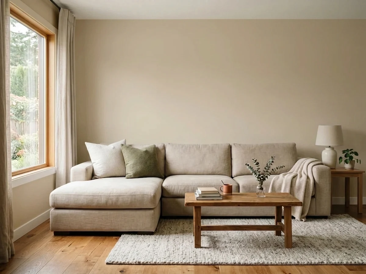
The room this color is chosen for most often, and rightly. It gives a family room the warmth that greige keeps promising and not delivering, and it flatters leather, oak and brass fireplaces without anybody having to redecorate. Eggshell on walls, and keep one lamp on in the evening — that is when it looks most expensive.
Warm neutrals flatter skin and food, which is the whole job in a room that runs on candles and lamplight after dark. Kilim Beige at LRV 57 has enough depth to feel like a decision rather than a builder default. Pairs naturally with walnut, brass and a navy accent.
Calm and enveloping rather than crisp; it reads like a hotel room in a warm climate. Eggshell or matte, 2700K bulbs, cream bedding rather than bright white — bright white next to it looks clinical and makes the wall look yellowed.
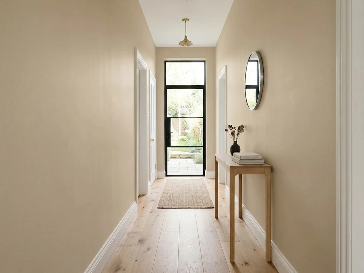
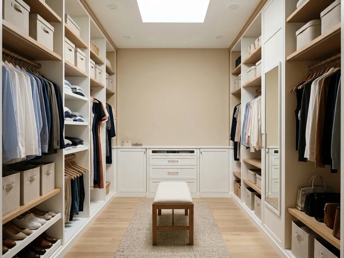
Windowless halls and dressing rooms are where a warm mid-tone beats a pale one: it hides scuffs, takes artificial light gracefully, and never goes gray under a single ceiling fixture. In a closet or dressing room, know that warm walls tint the light — a white shirt will look a shade creamier than it is, so judge clothes at the window if that matters to you.
On kitchen and bath walls it is genuinely good, especially with travertine, tumbled stone or beige tile from the 1990s and 2000s that you are not replacing. On cabinets it is a harder sell — a mid-tone orange-beige cabinet reads dated faster than the same color on a wall. Satin if you do it anyway.
It is a long-standing stucco and siding beige, and full sun washes it noticeably lighter and softer outside than it looks indoors. It is at its best next to sandstone, clay tile or peach-toned brick; it fights gray-toned stone. Details and trim pairings are in the exterior section below.
Your Light Is the Risk
Its quiet superpower: with no gray in the mix, cool daylight cannot drain it. It stays a warm tan where popular greiges go flat.
Low afternoon sun pushes it to peach, sometimes salmon on tall bright walls. Test at 5pm before you commit.
A clean warm tan in the morning, steadily warmer and deeper toward evening. The swing is bigger than most beiges.
2700K bulbs deepen it and bring the orange forward. Cool 4000K LEDs flatten it and can expose a faint green-gray.
Most complaints about Kilim Beige are a light mismatch. Upload a photo of your actual room and see it on your walls — then ask for the same wall in north light or evening lamps before you buy a single sample.
Need It From Another Brand?
Any paint counter can custom-tint Sherwin-Williams SW 6106 directly. If you would rather stay in one brand's own deck, these are the closest stock matches, measured as ΔE2000. Under 2 is a difference you will not see on the wall.
| Brand | Closest color | ΔE | LRV | |
|---|---|---|---|---|
| Behr | Riviera RetreatBXC-77 · Behr | 1.2 | 57 | Color page → |
| Benjamin Moore | Adobe Beige1128 · Benjamin Moore | 0.9 | 55 | Color page → |
| Valspar | Beach Dune8005-7C · Valspar | 0.7 | 56 | Color page → |
| PPG / Glidden | ArmadilloPPG14-17 · PPG / Glidden | 1.7 | 59 | Color page → |
| Glidden | Mushroom Cap20YY 55/151 · Glidden | 0.8 | 55 | Color page → |
| Dutch Boy | Westwood414-2DB · Dutch Boy | 0.0 | 57 | Color page → |
Similar Sherwin-Williams Colors
The nearest shades to Kilim Beige within Sherwin-Williams's own range, ranked by perceptual color distance — useful when you want the same look a touch lighter, darker, or warmer.
WCAG 2.1: AA is 4.5 : 1 for normal text, 3 : 1 for large text, AAA is 7 : 1.
Kilim Beige vs the Colors You're Also Considering
Every Kilim Beige sample board has the same rivals on it. The numbers show the real lightness gap — then it comes down to which risk you would rather live with.
Pick this if your Accessible Beige sample looked cold or drab on the wall; that same gray is what drains it in cool light.
Sherwin-Williams SW 7036 · LRV 58Accessible BeigePick this if you want the warmth dialed down — the gray in it keeps beige from ever reading orange.
Side-by-side comparison →Pick this when the room has orange-red brick, terracotta or red oak; the pink-gold side sits better against them than gold does.
Benjamin Moore HC-44 · LRV 49Lenox TanPick this if your painter works in Benjamin Moore — same depth exactly, with the warmth tipped toward gold instead of pink.
Kilim Beige (LRV 49) is often compared with Accessible Beige (SW 7036), LRV 58. Accessible Beige is lighter and carries more gray, making it a true greige that reads calmer and more current. Kilim Beige is warmer and a touch deeper, so it feels cozier and more traditional. Choose Accessible Beige if you want a modern, understated neutral, and Kilim Beige if you want visible warmth.
Macadamia (SW 6142), at LRV 51, sits very close in depth but leans a bit more golden-yellow rather than red-orange. In warm south light Macadamia can look sunnier, while Kilim Beige stays sandier.
Crewel Tan (SW 11), LRV 50, is nearly identical in lightness and family, so the practical difference is minor; it is a fine alternative if Kilim Beige is unavailable. When in doubt, sample the two side by side, since these small warm-beige shifts are easiest to see on the wall.
Kilim Beige Coordinating Colors
The rule for coordinating with Kilim Beige is to stay warm but avoid yellow. It pairs beautifully with grayed warm whites, deeper warm greiges from the same temperature family, navy, muted green and true browns — and it argues with yellow-cream, cool gray stone and anything icy. These are the partners that keep showing up in rooms that work:
Kilim Beige With Honey Oak, Travertine and Brick
This is the reason to choose it over any greige, and the decision gets made at the floor. Honey oak, red oak, orange-stained rails, travertine tile, tumbled stone backsplashes and the beige speckled tile every 2000s builder installed all sit on the same warm side of the wheel as Kilim Beige. A gray-based neutral puts those finishes on trial; this one takes their side, and the room stops looking like a house waiting for a renovation. Orange-toned and peach-toned brick get the same treatment, indoors on a fireplace or outdoors on a facade.
Two honest exceptions. Yellow-stained oak trim — the flat, greenish-yellow 1980s stain rather than true honey — is close enough to the orange base to argue with it instead of matching, and the wall ends up looking dirty; test a large sample directly against the trim before you buy a gallon. And cool gray LVP or gray-washed wood does the opposite job of warm oak: it throws the orange into relief and the walls can read peachy or muddy against it. Warm rugs help, but if the whole floor is cool gray, pick a neutral with some gray of its own.
Metals are easy: brass, oil-rubbed bronze, aged copper and matte black all belong. Polished chrome and brushed nickel are the only ones that read slightly cold beside it, which is worth knowing before you re-do the lighting.
Kilim Beige Outside: Stucco, Brick and Sun
Outside it behaves like a different, gentler color. Full sun washes it noticeably lighter and less saturated than it looks on an interior wall, so the peachy risk that worries people indoors mostly evaporates on a facade — expect it to land closer to a soft sand than to a tan. That makes it a long-running stucco and siding choice, particularly on Southwestern, Mediterranean and warm-climate houses, and it is still turning up on best-of lists for stucco in 2026.
Pair it by masonry. Sandstone, clay roof tile and peach or orange-toned brick are its natural company, and it is one of the few body colors that makes an existing brick base look coordinated rather than tolerated. Gray-toned stone and cool gray roofing are the mismatch — the body color reads yellow-orange next to them. For trim and contrast, a deeper khaki keeps things tonal, a near-black gray gives modern definition, and navy is the door color that does the most work for the least money. Walk a sample around the house: the shaded north elevation will read a full step deeper and warmer than the sunny side.
Three Ready Palettes Built on Kilim Beige
A color is never alone on the wall. These are complete combinations in the 60-30-10 pattern, with the reason each one holds together. Every one opens in the visualizer.
Alabaster is the safe trim white here because its warmth is soft rather than yellow — a yellow-cream trim is the one white that makes Kilim Beige look muddy. Navy sits opposite orange on the wheel, so the door reads crisp and deliberate instead of matchy.
Try this palette in your roomThe scheme for a house with golden oak floors you are keeping. White Dove is warm but its yellow is grayed out, so it separates without going sour next to the walls, and a muted green on the island is the classic counterweight to an orange-based beige — it makes the oak look chosen rather than inherited.
Try this palette in your roomKaffee is two steps down the same Sherwin-Williams strip, so the dark note is literally the same color family and the room reads layered rather than decorated. Pure White keeps the trim crisp enough that the walls do not swallow the woodwork at this depth.
Try this palette in your roomKilim Beige FAQ
Is Kilim Beige a beige or a greige?
A beige, and firmly. Sherwin-Williams files SW 6106 in the orange color family, and there is no gray in it to cool the warmth down. That is the single biggest reason it disappoints people — most of them arrived from a greige shortlist. If you want the gray version of this idea, Accessible Beige is the color you actually meant.
Does Kilim Beige look orange or pink on the wall?
Both, mildly, depending on the hour. The base is orange; a pink-gold flush shows up in warm afternoon light and can go briefly peachy in hard west sun. In flat or north light it settles into a clean warm tan. However sensitive you are to orange is the whole review — plenty of owners never see it, and the ones who do never stop seeing it.
What trim white goes with Kilim Beige?
A warm white whose yellow is muted: Alabaster is the default, White Dove if you are in Benjamin Moore, Pure White for a crisper edge. Avoid true yellow-based creams — they sit close enough to the orange base to argue, and the wall ends up looking muddy while the trim looks sour. Semi-gloss on trim, eggshell on walls.
Does Kilim Beige work with honey oak floors and trim?
This is its best trick. Golden and orange-toned oak, travertine, tumbled stone and 1990s-2000s beige tile all share its warmth, so instead of the wall fighting the floor the two read as one deliberate scheme. The exception is yellow-stained oak trim, which is close enough to argue rather than agree — test a large sample against the trim itself, not just the floor.
Is Kilim Beige good for a closet or dressing room?
Yes, and it is underrated there. Closets run on artificial light where pale beiges go flat, and at LRV 57 this one keeps its warmth under a single fixture while hiding the scuffs a hallway of shelving collects. One honest caveat: warm walls tint the light, so a white shirt reads a shade creamier than it is. If you judge fabric colors seriously, do it at a window.
Is Kilim Beige dated in 2026?
Less than it was five years ago. Warm neutrals came back hard after the gray decade, and a true beige now looks intentional again rather than left over. What dates a room is not the beige — it is the beige plus yellow-cream trim plus builder oak plus gold fixtures, all untouched. Give it a crisp trim white, one dark note and modern hardware and it reads current.
Have you painted with Kilim Beige?
Rate it — one tap helps the next reader decide.
Ask a Question