Lenox Tan
The gathering-room beige from the Historical deck, reviewed honestly: where it turns golden and warm, the light that turns it olive, and what to pick instead.

Jessica has spec'd whites and neutrals for more than 300 rooms and keeps a sample wall of painted drawdowns in her studio. Every color review is checked against real reader rooms in the comments and re-tested when a formula changes. About the testing process →
- 1Anonymous20
- 2Fawn Brindle36
- 3Lenox Tan43
- 4Agreeable Gray60
- 5Pale Oak69
The Fast Verdict
Lenox Tan is a real tan, not a greige pretending. It has actual color in it — golden, faintly yellow-green — and at LRV 49 it has enough depth to make a big room feel held together instead of empty. That is exactly why it works in family rooms and exactly why it fails people who wanted a modern neutral: it never once reads gray, and in the wrong light it flashes olive.
Family rooms, dens and living rooms that should feel occupied · traditional dining rooms and entries · north-facing rooms that need warming up · houses with oak, maple or cherry staying put · anyone who wants beige with actual color in it
You want a modern gray or greige · your room takes hard west or south afternoon sun · your fixed finishes are pink-beige rather than yellow-tan · you are staging to sell to a young buyer · the room runs on 4000K LEDs
- Deep enough (LRV 49) to make a big family room feel finished
- Hides scuffs, handprints and traffic marks that pale beiges show
- Warms a cold north-facing room without going pastel
- Flatters oak, maple, cherry and brass — the finishes most houses already have
- A Historical Collection color that never depended on a trend to be good
- Flashes olive-khaki in cool light, overcast weather and 4000K bulbs
- Goes honey-gold and reads dated in hard west or south sun
- Fights pink-beige tile, travertine and rosy carpet
- Reads early-2000s to buyers who grew up on gray — real resale risk
What Color Is Lenox Tan, Really?
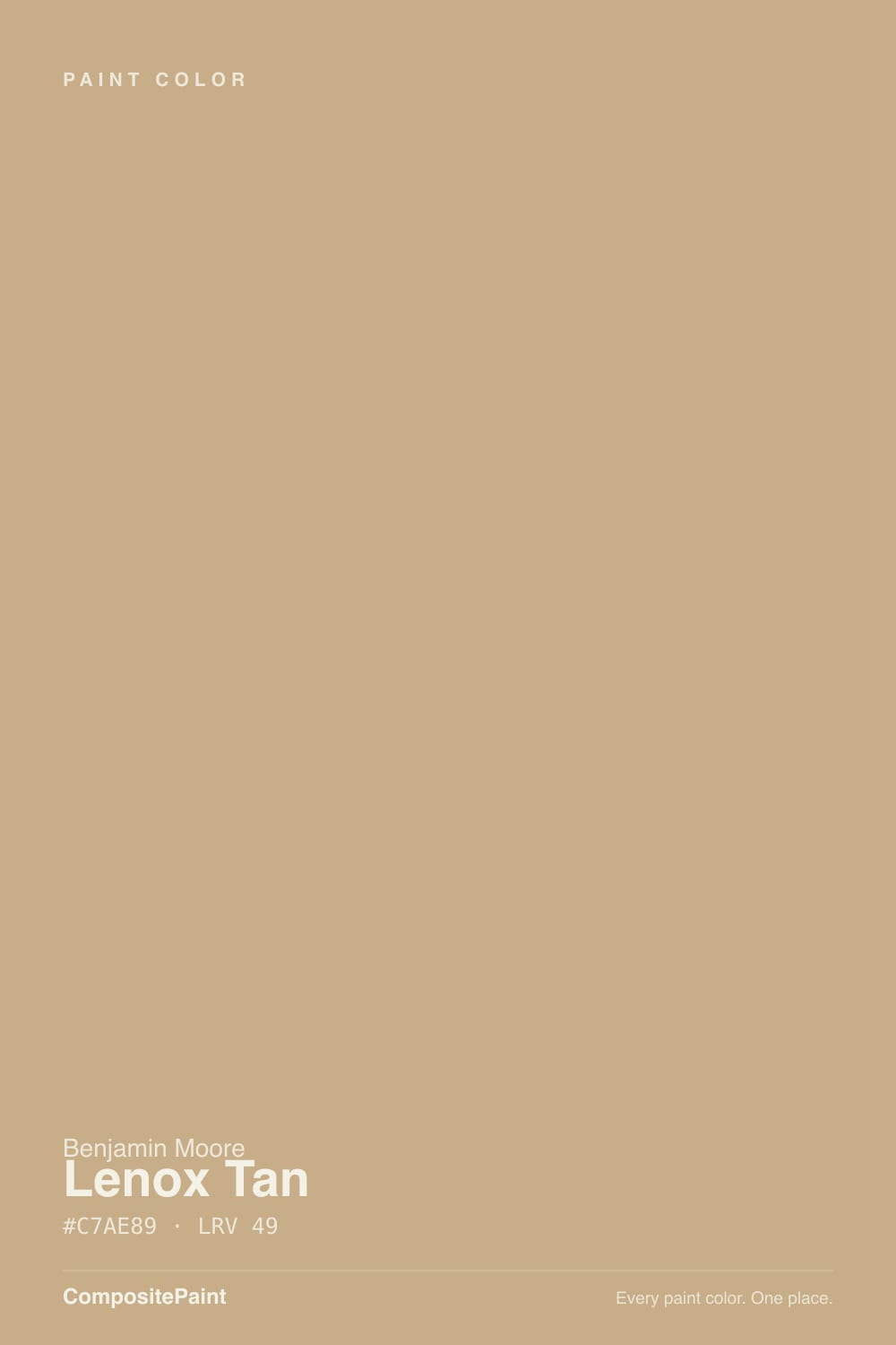
A medium tan built on yellow, with green and a little orange moving around underneath. That mixed undertone is the whole story of this color. Straight yellow beiges go buttery and sweet; straight gray-beiges go flat. Lenox Tan sits between them — warm enough to read golden in daylight, muddied enough by the green to stay grown-up. Benjamin Moore files it in the Historical Collection, the 191-color deck drawn from early American architecture, and it behaves like what it is: a color that predates the gray decade and did not change to accommodate it.
At LRV 49 it is genuinely mid-depth — the point on the beige strip where a wall stops being background and starts being a color. Put it next to Shaker Beige (LRV 58) from the same strip and Lenox Tan looks like the evening version: same family, one real step darker and more saturated. That depth is why it works in rooms with tall ceilings and a lot of wall, and why it can feel heavy in a small dim room with one window.
Undertone in one line: yellow first, green second, a trace of orange third — never pink, never gray. If your sample reads khaki-olive, that is cool light pulling the green forward. If it reads honey-gold, that is afternoon sun pulling the orange forward. Same paint, two honest answers, and you should see both before you buy five gallons.
Where It Shines
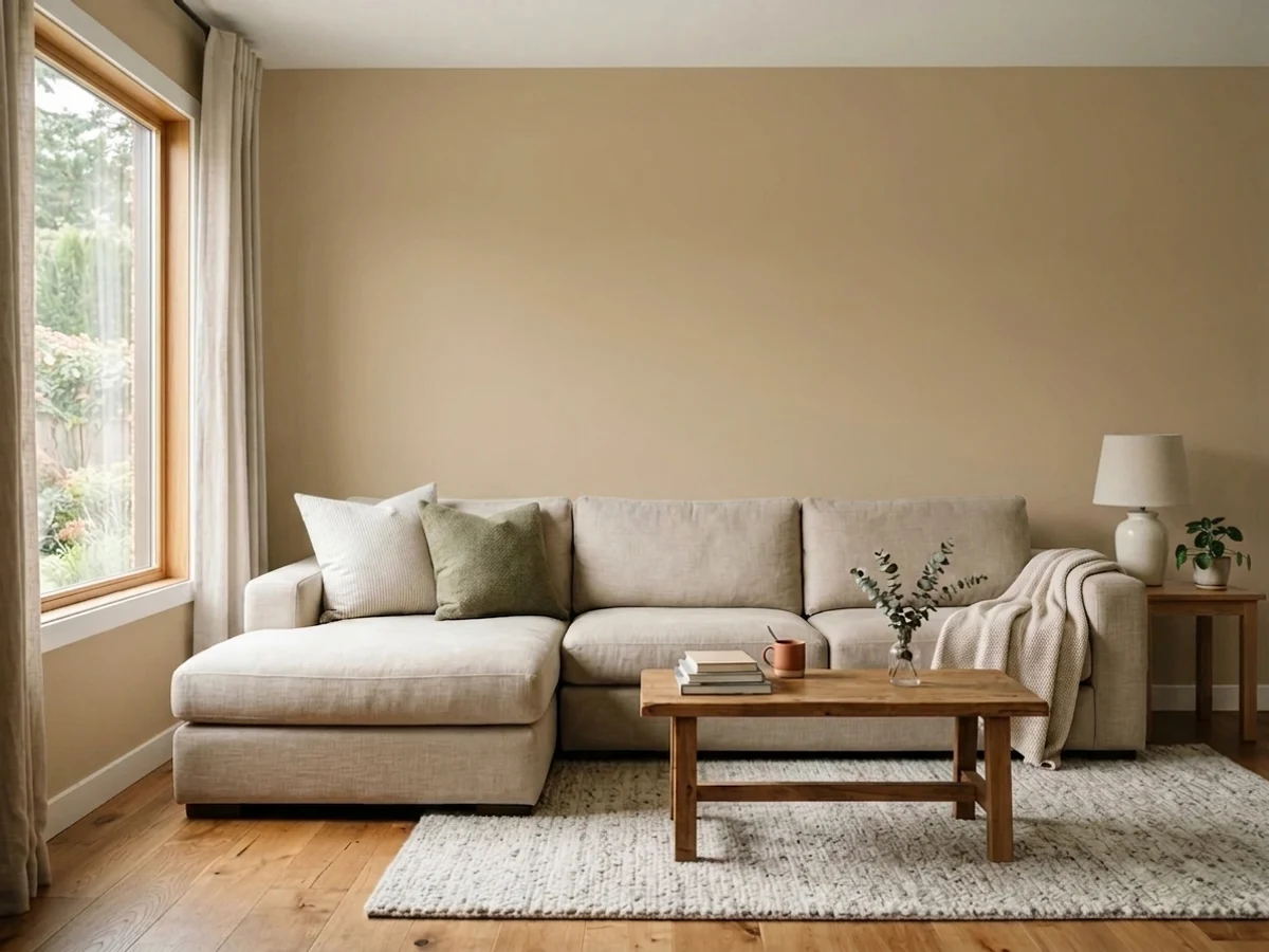
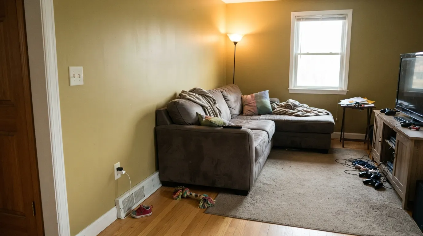
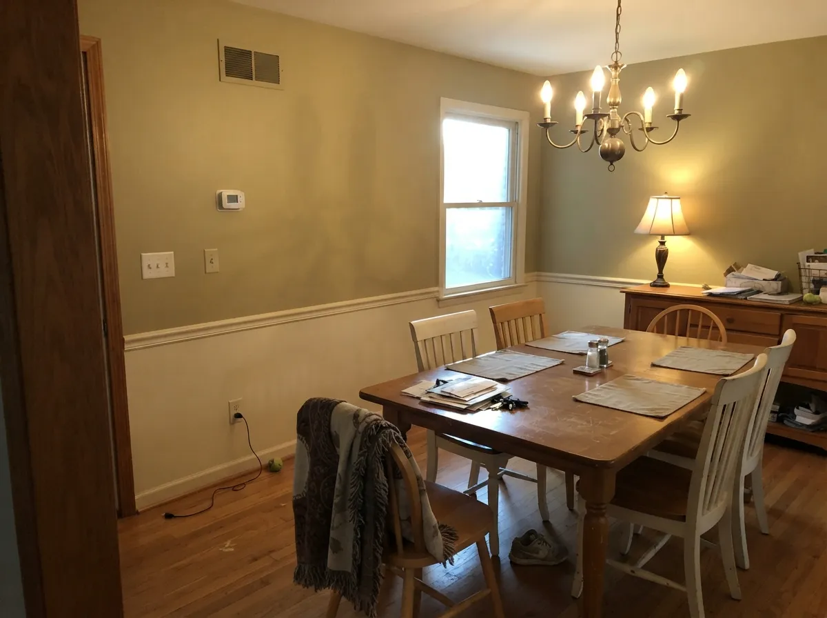
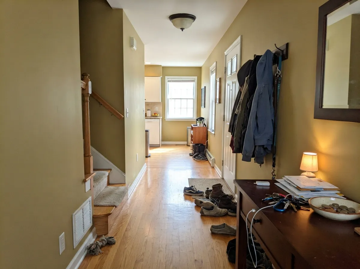
This color earns its keep in the rooms where people actually sit. A family room with a sectional, a TV, kid clutter and one warm lamp is unflattering territory for a pale neutral — white walls make the mess look louder and the room look unfinished. Lenox Tan absorbs all of that. At LRV 49 it puts a warm, low-glare surface behind everything, hides the scuffs a light beige broadcasts, and makes oak furniture and leather look intentional rather than inherited. Its second home is the traditional main floor: dining room, entry, stair hall, wood trim, brass, a house built before 1995 that never wanted to be gray.
Where It Fails
The bad reviews of Lenox Tan are unusually consistent, and all three are predictable from your own room before you open a can. Two are about light, one is about the stuff you already own — and that third one is the reason most people who hate this color hate it.
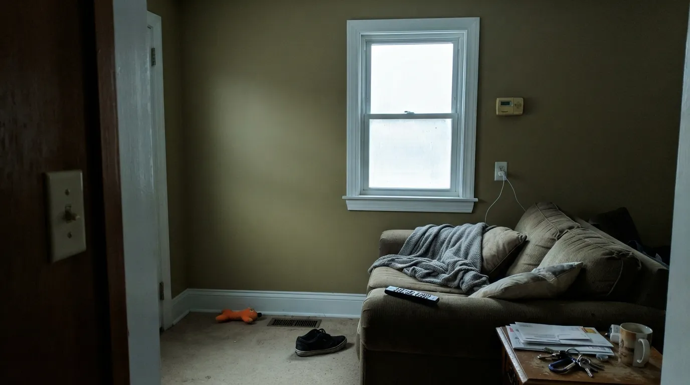
The single most common complaint, and it is real: put a sample up in cool north light, on an overcast day, or under 4000K LEDs, and the green under the yellow steps forward. Owners describe the wall drying to olive or khaki with “no tan at all.” It is worst next to a bright cool white trim, which cancels the warmth and leaves the green exposed. If you love the color, this is fixable — warm trim white, 2700K bulbs — but if the room is dim, cold and lampless, believe the sample.
The flip side. In a room that takes direct afternoon sun the orange comes up and Lenox Tan goes from tan to honey-gold, which is the exact read that gets called “Tuscan” and “dated.” Nothing has gone wrong with the paint; the color simply has more pigment in it than a greige and the sun finds all of it. In a west-facing family room, look one step lighter and grayer, or accept a very warm four-to-six-thirty.
The quiet failure nobody predicts. A lot of 1990s and 2000s finishes — travertine, builder tile, pinkish carpet, rosy-toned oak — lean orange-pink, while Lenox Tan leans yellow-green. Those two beiges do not agree, and the wall ends up looking dirty next to the floor. Hold the chip flat against your tile and your carpet, not against the trim, before you decide.
Room by Room
The depth is the point. A gathering room takes abuse and holds a lot of visual noise, and a mid-tone warm wall quiets both. Scuffs from the sectional and handprints near the switch disappear here in a way they never do on a pale beige. Eggshell or a scrubbable matte, warm lamps, White Dove or Cloud White on the trim.
It needs company. Against leather, walnut, oak, wool and cream upholstery it reads rich; against a room of gray-and-white furniture it reads like a mistake from a different decade. Decide by what is staying, not by the chip.
Warm mid-tone walls are still the best backdrop for candlelight, brass and a wood table — the color deepens after dark instead of going flat. If your dining room has a chair rail, Lenox Tan above and a warm white below is the classic Historical-deck arrangement.
Halls have little natural light and lots of wall, which is where a color with real body beats a pale neutral. It also makes the handoff into any beige or cream room seamless. Use eggshell so you can wipe the traffic line at shoulder height.
Under 2700K lamps it is genuinely cozy and reads a little deeper at night. It is not a light, airy bedroom color — if you want the room to feel bigger and quieter, go up the strip to Shaker Beige (LRV 58) and keep the same family.
On kitchen walls above cream or maple cabinets it is a proven combination and a big part of why the color sold so well. On the cabinets themselves it is a harder sell: at this depth a full run of tan doors reads heavy and distinctly early-2000s. An island or a mudroom bench is the safer dose, in satin cabinet enamel.
Your Light Is the Risk
Its warmth fills in what cool northern daylight takes out, so the color lands as a true tan instead of tipping gold. The one exposure where its saturation is an asset rather than a gamble.
Direct sun pulls the orange up and the walls flare honey-gold for hours. If you dislike golden rooms, this is where you will regret it — sample against the sunny wall, at four in the afternoon.
Bright and clearly tan in the morning, settling to a quieter khaki by afternoon. On gray days the green under the yellow comes forward everywhere in the house — that read is normal, not a bad batch.
2700K bulbs are the right choice and make it deeper, golden and calm after dark. Cool 4000K LEDs do the opposite: they drain the warmth and leave the olive. Swap the bulbs before you blame the paint.
Most complaints about Lenox Tan are a light mismatch. Upload a photo of your actual room and see it on your walls — then ask for the same wall in north light or evening lamps before you buy a single sample.
Need It From Another Brand?
Any paint counter can custom-tint Benjamin Moore HC-44 directly. If you would rather stay in one brand's own deck, these are the closest stock matches, measured as ΔE2000. Under 2 is a difference you will not see on the wall.
| Brand | Closest color | ΔE | LRV | |
|---|---|---|---|---|
| Sherwin-Williams | Favorite TanSW 6157 · Sherwin-Williams | 0.9 | 44 | Color page → |
| Behr | Woven StrawPPU7-21 · Behr | 1.3 | 42 | Color page → |
| Valspar | Withered Moss6007-3C · Valspar | 3.6 | 45.3 | Color page → |
| PPG / Glidden | Desert CamelPPG12-16 · PPG / Glidden | 1.2 | 43 | Color page → |
| Glidden | Rock CliffsPPG1101-4 · Glidden | 1.3 | 44 | Color page → |
| Dutch Boy | Woolen Sweater418-3DB · Dutch Boy | 0.9 | 44 | Color page → |
Similar Benjamin Moore Colors
The nearest shades to Lenox Tan within Benjamin Moore's own range, ranked by perceptual color distance — useful when you want the same look a touch lighter, darker, or warmer.
WCAG 2.1: AA is 4.5 : 1 for normal text, 3 : 1 for large text, AAA is 7 : 1.
Lenox Tan vs the Colors You're Also Considering
Every Lenox Tan sample board has the same rivals on it. The numbers show the real lightness gap — then it comes down to which risk you would rather live with.
Pick this when the room is big, bright or busy and a lighter beige just looks unfinished.
Benjamin Moore HC-45 · LRV 58Shaker BeigePick this if you want the same colonial warmth with more light in the room — it is the lighter neighbor on the same strip and far more forgiving in a small space.
Pick this when Manchester Tan tests too pale and washes out against your floors.
Benjamin Moore HC-81 · LRV 53Manchester TanPick this for a lighter, more restrained tan that still shares the green-flash risk — the safer whole-house version of this idea.
Lenox Tan Coordinating Colors
The rule for coordinating with Lenox Tan: keep the whites warm, take the accents either deep-green or near-charcoal, and never park a cool bright white right beside it. It layers easily with the rest of the Historical deck because they were drawn from the same source, and it needs at least one dark note in the room to keep the warmth from becoming the only idea. These are the partners that keep showing up in rooms that work:
The Tuscan Hangover: Why a Good Color Got Blamed for a Bad Decade
Lenox Tan sold enormously in the 2000s, and it sold into a very specific room: cherry or maple cabinets, dark speckled granite, oil-rubbed bronze, a sponged or glazed finish on the walls, and heavy furniture in the same temperature as everything else. When that look fell out of favor, the paint took the blame for the decor. Read the old complaints closely and almost none of them are about the color itself — they are about a room where nothing ever cooled off.
The color underneath is older and better than its reputation. It comes out of Benjamin Moore's Historical Collection, the 191-color deck pulled from early American architecture, which is also where Shaker Beige and Manchester Tan live. Those colors are meant to sit against wood, brass and daylight, and they still do that better than most current neutrals. What changed is the company they keep: one charcoal or deep-green element, crisp warm-white trim, and furniture that is not all the same temperature, and the same tan reads simply warm.
Outside, the Historical colors are rated for exteriors too, and Lenox Tan is a credible siding color on a traditional house — colonial, shingle, craftsman — with white or cream trim and a dark door. Full sun pushes it a step lighter and more golden than it looks indoors, so sample it on the actual south wall. On a modern or farmhouse-style facade it tends to read like it belongs to the previous owner.
Lenox Tan With Wood Tones and Floors
This is where the color quietly wins. Honey oak, red oak, maple and cherry all share its yellow-orange direction, so instead of amplifying each other into a fight, they merge — the floor stops shouting and the room starts looking coordinated. If you have 1990s golden oak floors and trim that are not going anywhere, Lenox Tan is one of the few current-deck warm neutrals that makes the situation look chosen rather than tolerated. Walnut and espresso are just as safe, with more contrast.
Two floors need a real sample first. Gray-washed wood and cool gray LVP sit at the opposite temperature and throw the yellow-green in the walls into relief — the wall can read olive against them. And pinkish-beige carpet or travertine is the genuine mismatch: those finishes lean orange-pink while the paint leans yellow-green, and the two beiges make each other look dirty. Hold a large sample flat on the floor, not on the wall, before deciding.
Metals are easy: brass, antique bronze and matte black all belong here. Polished chrome and brushed nickel are not wrong, but they read cool against the wall, which is one more reason to keep a charcoal or deep-green note somewhere in the room to explain them.
Three Ready Palettes Built on Lenox Tan
A color is never alone on the wall. These are complete combinations in the 60-30-10 pattern, with the reason each one holds together. Every one opens in the visualizer.
All three come out of the Historical deck, so they agree without effort. Cloud White is the important choice: a warm trim white keeps the green in Lenox Tan asleep, where a bright cool white would wake it up. Tate Olive on the shelving takes the green the wall is already hinting at and makes it deliberate instead of accidental.
Try this palette in your roomThe thing that dated Lenox Tan was never the tan — it was warm-on-warm with nothing to interrupt it. One dark, cool-leaning gray somewhere in the room resets the whole scheme: charcoal doors or a charcoal island give the eye a modern edge to land on, and White Dove keeps the trim crisp without going cold enough to trigger the green.
Try this palette in your roomTwo colors off the same strip, nine LRV points apart: bright rooms get the lighter one, the gathering room gets the deeper one, and the change reads as the house getting cozier rather than as a color switch. One trim white everywhere is what holds it together.
Try this palette in your roomLenox Tan FAQ
Is Lenox Tan yellow or green?
Both, depending on the hour. The base is yellow with green sitting under it and a trace of orange on top. Warm light and afternoon sun bring the yellow-gold forward; cool north light, overcast days and 4000K bulbs bring the green forward. Neither read is a bad batch — they are the same paint answering two different rooms.
What trim white goes with Lenox Tan?
A warm one. Cloud White is the safest partner and White Dove is the close second — both keep the wall reading as a warm tan. A bright cool white next to it does two bad things at once: it makes the tan look muddy and it pulls the green out of hiding. Semi-gloss on the trim, eggshell on the walls.
Is Lenox Tan good for a family room?
It is the room it is best at. At LRV 49 it has enough depth to hold a busy room together, it hides the scuffs and handprints a pale beige advertises, and it makes wood furniture and leather look chosen. Give it warm bulbs and a warm trim white and it does the job better than any greige at the same depth.
Is Lenox Tan dated?
Honestly — it can read that way, and pretending otherwise would be useless. It was everywhere in the 2000s alongside cherry cabinets, dark speckled granite and faux-finished walls, so plenty of buyers see it as a period color. What dates a room is the whole warm-on-warm package, not the paint: with one cool dark note, white trim and current furniture, it just reads warm. If you are staging to sell to a young buyer, pick something lighter and grayer anyway.
Lenox Tan or Shaker Beige?
Same strip, one step apart. Shaker Beige (LRV 58) is lighter and easier — the better whole-house choice and the better pick for small or dim rooms. Lenox Tan is the one to use when a room is large, bright or visually busy and the lighter beige tests as washed-out. Many houses use both: the lighter one for the main floor, the deeper one for the family room.
Does Lenox Tan work with honey oak floors and trim?
Better than almost anything else you could pick. Golden oak sits in the same warm family, so instead of fighting it the way a violet-based gray does, Lenox Tan meets it and the floor stops being the loudest thing in the room. The floors to test carefully are the cool ones — gray-washed wood and gray LVP make the walls look distinctly yellow-green by contrast.
Have you painted with Lenox Tan?
Rate it — one tap helps the next reader decide.
Ask a Question