Natural Linen
The warm beige people pick when greige feels cold, reviewed honestly: the rooms where it glows, the afternoon it turns yellow, and what to buy instead.

Jessica has spec'd whites and neutrals for more than 300 rooms and keeps a sample wall of painted drawdowns in her studio. Every color review is checked against real reader rooms in the comments and re-tested when a formula changes. About the testing process →
- 1Revere Pewter55
- 2Agreeable Gray60
- 3Natural Linen66
- 4Shoji White74
- 5Dover White83
The Fast Verdict
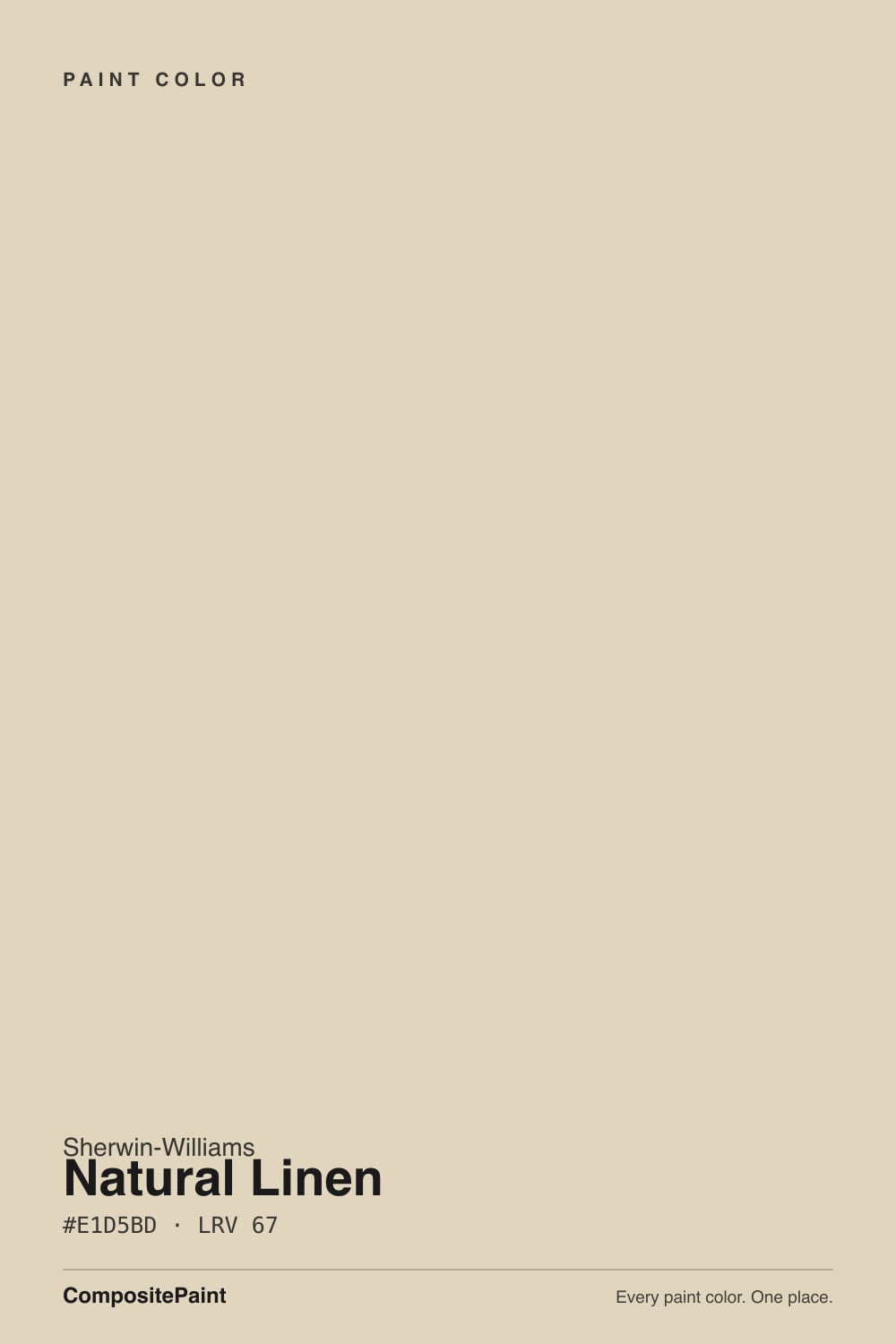
Natural Linen is a real beige, not a greige wearing a beige name. At LRV 67 it keeps a room open while still reading as a color from across the floor, and in north-facing rooms it puts back the warmth the light takes away.
The catch is honest sunlight: for two hours in a west-facing room it goes sandy-yellow, and it argues with cream cabinets and cool gray tile. Get those two checks right and it is one of the easiest warm neutrals Sherwin-Williams sells.
North-facing rooms that feel cold in gray · honey oak floors and 2000s tan tile · whole-house warmth without going tan · bedrooms and dining rooms under lamplight
Your cabinets or trim are already cream · your floors are cool gray LVP · you want a modern gray-neutral look · your room takes hard west sun all afternoon
- Real warmth with no gray hiding in it — beige that stays beige
- Fixes cold north-facing rooms without going full tan
- One of the few light neutrals that flatters honey oak floors and 2000s tan tile
- LRV 67 keeps small rooms and hallways open while staying visible as a color
- Reads soft and expensive next to brass, rattan, and unlacquered hardware
- Goes sandy-yellow and washed out in hard west afternoon sun
- Fights cream cabinets and creamy trim whites — the pairing looks dingy
- Reads dated next to cool gray flooring or blue-based whites
- Not a substitute for a greige; it will never look modern-neutral
What Color Is Natural Linen, Really?
A light warm beige with an orange-gold direction, and it does not hide it. The hue sits at 40 degrees with roughly 37 percent saturation, which is the tan side of warm rather than the yellow side, and the hex #E1D5BD shows blue dropping well behind red and green. There is almost no gray in it. That matters, because most of the popular "warm neutrals" of the last ten years are greiges with a little beige stirred in; Natural Linen is the opposite. It is beige first, and the warmth is the point rather than an undertone you have to hunt for.
At LRV 67 it reflects a good share of the light in the room but never pretends to be a white. Put it next to Accessible Beige SW 7036 at LRV 58 and Natural Linen is clearly the lighter, cleaner, warmer one; put it next to Shoji White SW 7042 at LRV 74 and it suddenly has body and color. That middle position is the useful part. It brightens a dim room without going pale, and it stays visible on a big open wall that would look blank in white.
Undertone in one line: warm gold-tan, no gray, no pink, no green. If it looks yellow on your wall, look at what is next to it — cream cabinets, a blue-based ceiling white, or three o'clock sun coming through a west window.
Where It Shines
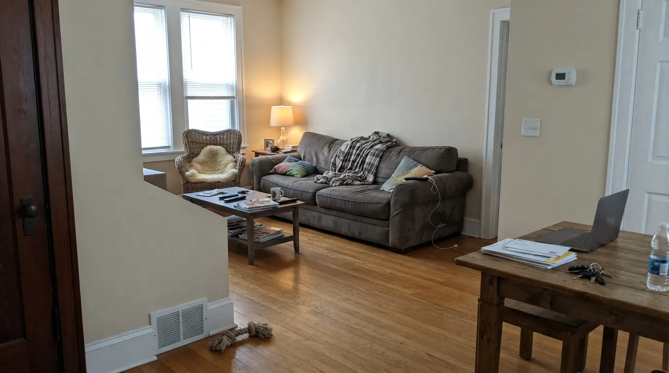
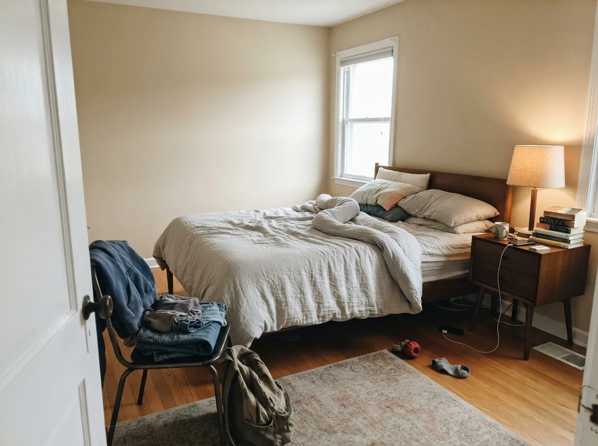
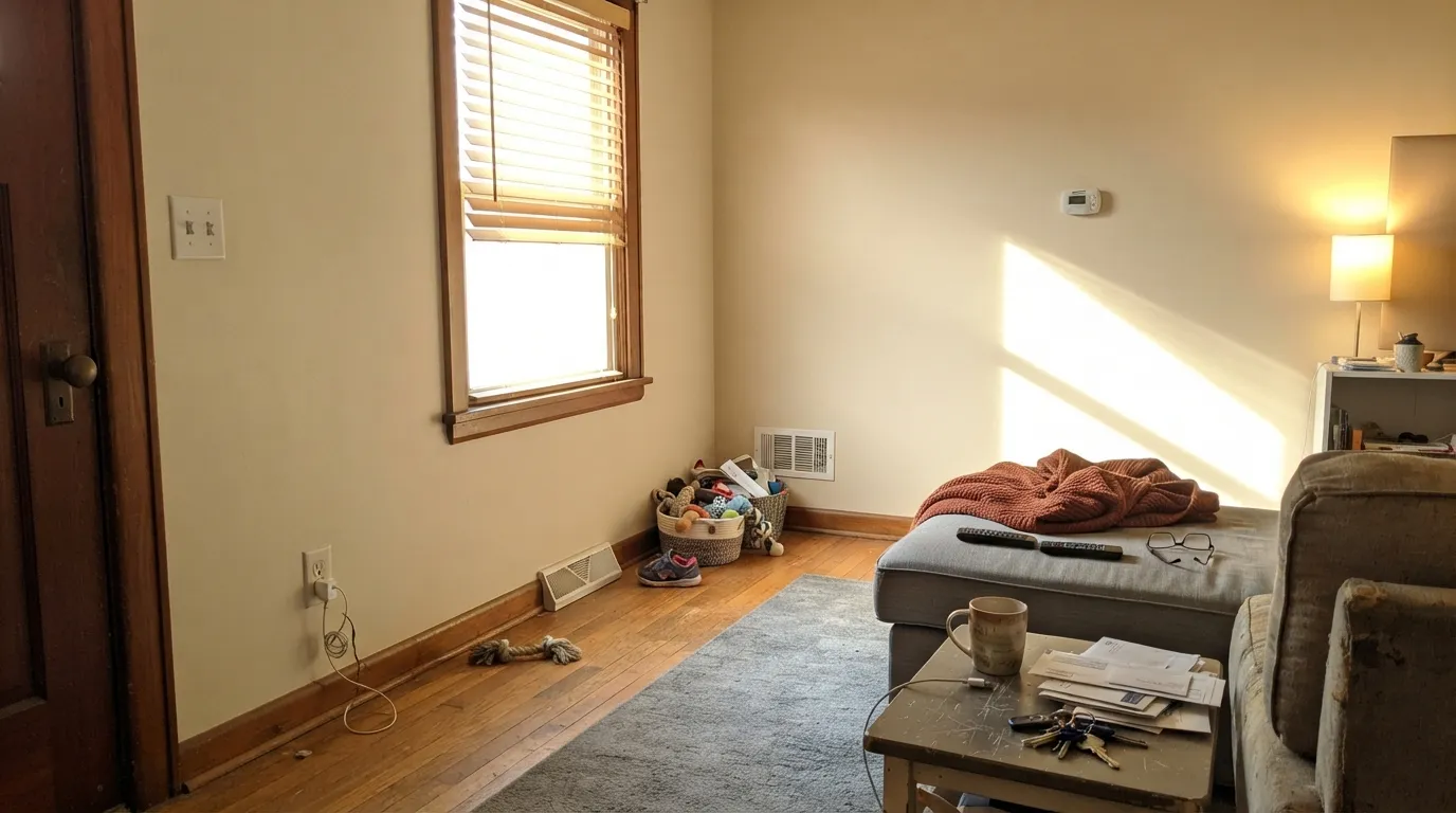
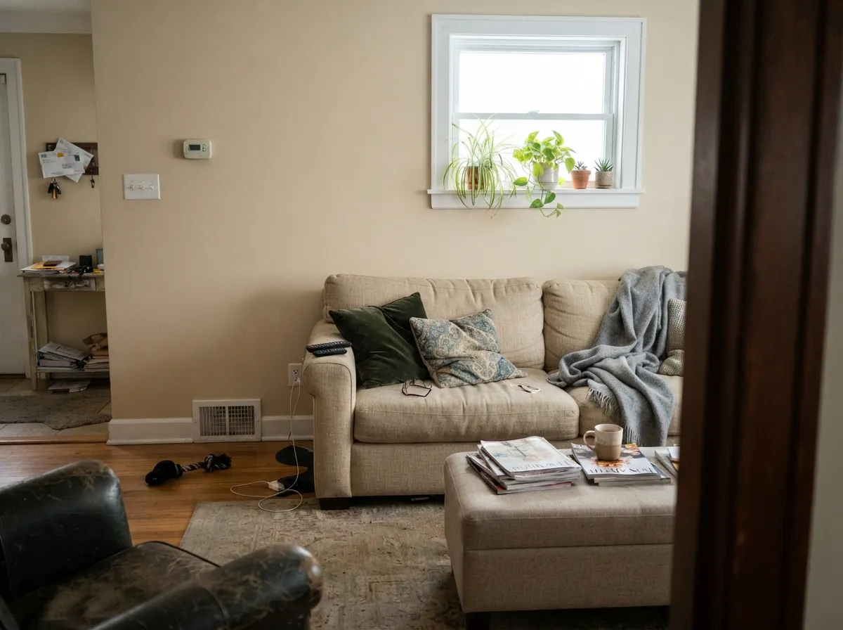
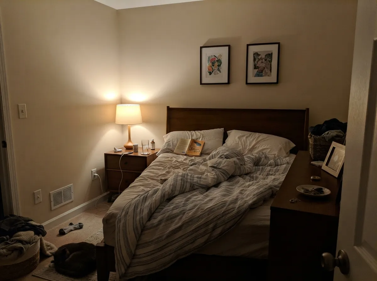
It earns its money in the rooms other neutrals go cold: north-facing living rooms, bedrooms with honey oak floors, hallways lit only by borrowed daylight. These are the situations where the warmth reads as intentional instead of dated.
Where It Fails
The complaints about Natural Linen are consistent and easy to predict. All three come from something else in the room, not from the can — but if your room matches one, no number of coats will fix it.
Hard low sun drives that 37 percent saturation straight forward and the walls read sandy-yellow, almost washed out, for a couple of hours a day. It settles back by evening, but people who hate it hate it at exactly that hour. If your main room takes full west sun, Accessible Beige SW 7036 carries enough gray to hold its color through the glare.
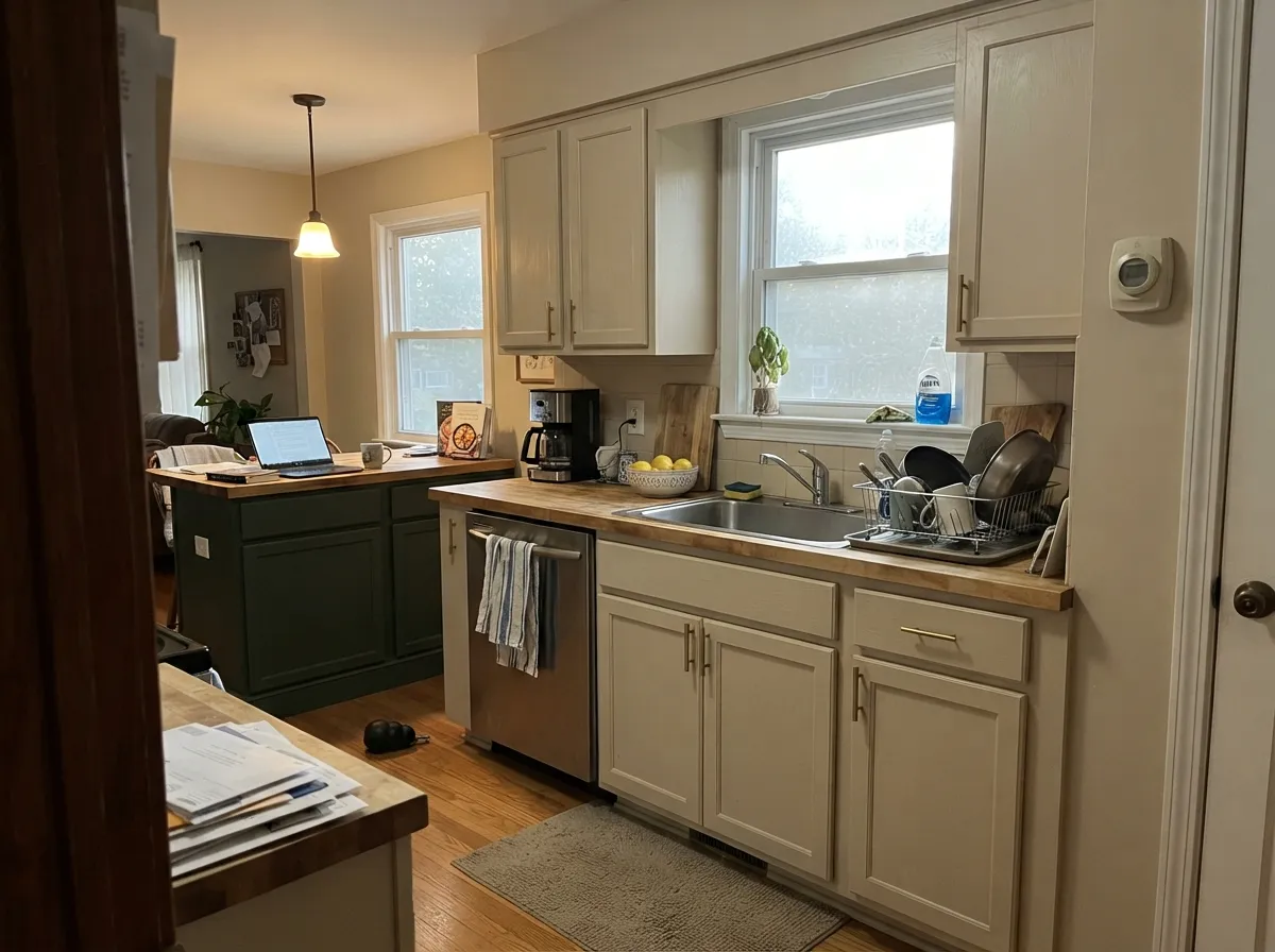
This is the pairing designers call a hard no. Cream has its own yellow, Natural Linen has orange-tan, and side by side neither looks clean — the walls go dingy and the cabinets go dirty. Trim it with Pure White SW 7005 instead. If the cream cabinets are staying, pick a deeper, quieter beige like Kilim Beige SW 6106 for the walls.
Gray LVP, blue-gray tile, or a builder ceiling white all sit at the opposite temperature, and by contrast Natural Linen reads yellow and dated instead of soft. Nothing about the paint changed — the room is telling you it wants a neutral with gray in it. Agreeable Gray SW 7029 is the color most people actually want in that room.
Room by Room
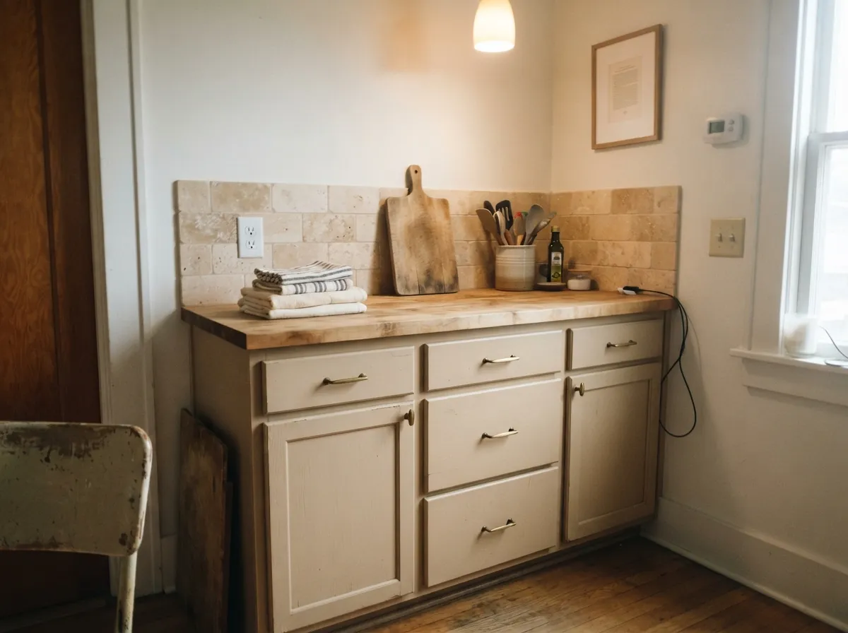
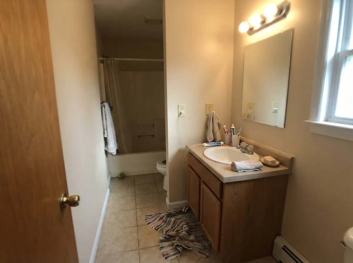
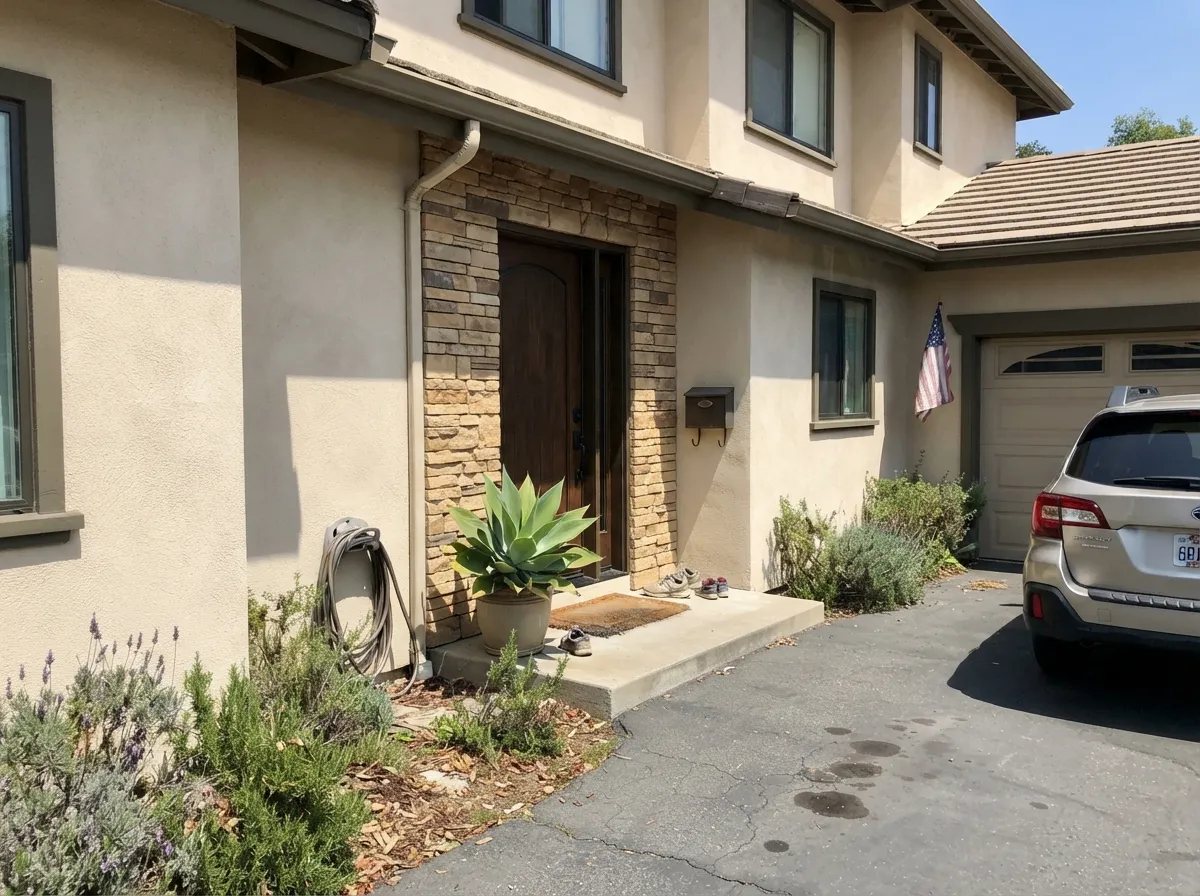
Your Light Is the Risk
Cool daylight mutes the gold and the wall reads soft warm sand. Its best room.
Strong afternoon sun pushes it yellow-tan and slightly washed out for a couple of hours.
2700K lamps deepen the sand and it turns cozy. Cool 4000K LEDs flatten it to putty.
Gray LVP or blue-gray tile throws the warmth into relief and it reads yellow. Sample big.
Most complaints about Natural Linen are a light mismatch. Upload a photo of your actual room and see it on your walls — then ask for the same wall in north light or evening lamps before you buy a single sample.
Need It From Another Brand?
Any paint counter can custom-tint Sherwin-Williams SW 9109 directly. If you would rather stay in one brand's own deck, these are the closest stock matches, measured as ΔE2000. Under 2 is a difference you will not see on the wall.
| Brand | Closest color | ΔE | LRV | |
|---|---|---|---|---|
| Behr | Parisian TaupePWN-42 · Behr | 0.5 | 67 | Color page → |
| Benjamin Moore | Tucson Winds1024 · Benjamin Moore | 1.2 | 65 | Color page → |
| Valspar | Honey Locust8007-10G · Valspar | 1.4 | 67 | Color page → |
| PPG / Glidden | Wheat SheafPPG14-21 · PPG / Glidden | 1.0 | 67 | Color page → |
| Glidden | Wheat SheafPPG14-21 · Glidden | 0.5 | 67 | Color page → |
| Dutch Boy | Candle Flame311-1DB · Dutch Boy | 2.9 | 67 | Color page → |
Similar Sherwin-Williams Colors
The nearest shades to Natural Linen within Sherwin-Williams's own range, ranked by perceptual color distance — useful when you want the same look a touch lighter, darker, or warmer.
WCAG 2.1: AA is 4.5 : 1 for normal text, 3 : 1 for large text, AAA is 7 : 1.
Natural Linen vs the Colors You're Also Considering
Every Natural Linen sample board has the same rivals on it. The numbers show the real lightness gap — then it comes down to which risk you would rather live with.
Pick this when you want the warmth to actually show, and a lighter wall.
Sherwin-Williams SW 7036 · LRV 58Accessible BeigePick this for a grayer, safer neutral that holds its color in strong sun.
Side-by-side comparison →Pick this when Shoji reads too close to a white on your walls.
Sherwin-Williams SW 7042 · LRV 74Shoji WhitePick this for a lighter, softer version that works as an almost-white.
Accessible Beige SW 7036 (#D1C7B4, LRV 58) is the common comparison. It is nine points darker and carries visible gray, so it reads as a greige where Natural Linen reads as a clean beige. Pick Accessible Beige when you want the color to sit closer to neutral, and Natural Linen when you want the warmth to show. Shiitake SW 9173 (#C8BCAB, LRV 51) goes further again, a mid-tone taupe that works better as a contrast to Natural Linen than as a substitute.
Across brands the near matches are unusually tight. Dunn-Edwards Sand Dollar DE6171 at 0.42, Diamond Vogel Barberry Sand 0278 (LRV 68) at 0.45, and Farrow and Ball Matchstick No. 2013 (LRV 67) at 0.47 all count as matches. Behr Wax Sculpture PPU7-17 (LRV 68) at 1.05 and Benjamin Moore Cayman Islands 952 (LRV 66) at 1.16 are visually identical in normal room light. Annie Sloan Old Ochre at 4.87 is close but visibly different side by side.
Natural Linen Coordinating Colors
The rule for coordinating with Natural Linen is to stay warm or go muted-green. It pairs happily with deeper beiges and taupes, with green-grays, and with warm-based whites — and it argues with anything cream and anything blue-based. These are the partners that actually work in real rooms:
Natural Linen on Cabinets and Trim
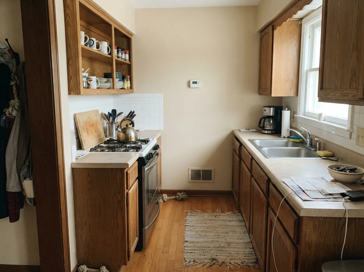
As a cabinet color it is underrated. Sprayed in a satin urethane enamel it gives a low, sandy finish that looks like old painted furniture rather than new millwork, and it flatters butcher block, soapstone, travertine, and every shade of brass. It also forgives daily life better than a white does — the scuff marks around handles simply do not show the same way.
The trim decision is the one that ruins rooms. Natural Linen walls with cream or antique-white woodwork is the single most common regret with this color: the two warmths sit right on top of each other and both surfaces read dirty. Use Pure White SW 7005 for a clean line, Greek Villa SW 7551 for a softer one, and keep the ceiling in the same white rather than a blue-based builder flat, which will make the walls look yellow from below.
Natural Linen With Wood Floors and Older Finishes
If you have golden or honey oak floors, this is one of the very few light neutrals that helps them. Gray and greige walls read as the opposite temperature, which makes oak look orange by contrast; Natural Linen meets the wood halfway, so the floor stops shouting and starts looking like a warm wood floor. The same trick works on tan travertine, beige granite with brown flecks, and the golden-toned tile that came with a lot of houses built between 1998 and 2010.
Walnut and darker stained woods are also fine — they simply become the contrast in the room instead of a match. The floor to test carefully is cool gray LVP or gray-washed engineered wood. Against those, Natural Linen has nothing to hold on to and the wall tips yellow. Tape a two-foot sample right down onto the floor before you commit; if the two look like they came from different houses, you want a greige, not this.
Three Ready Palettes Built on Natural Linen
A color is never alone on the wall. These are complete combinations in the 60-30-10 pattern, with the reason each one holds together. Every one opens in the visualizer.
Pure White is clean without being blue, so it gives Natural Linen a crisp trim line instead of the dingy handoff a cream white creates. Urbane Bronze supplies the one dark warm note the scheme needs at the door.
Try this palette in your roomGreek Villa is warm enough to sit with Natural Linen but far enough above it in lightness that the cabinets still read as cabinets. Pewter Green is the 10 percent note that keeps the room from becoming one long beige.
Try this palette in your roomMuted green-grays are Natural Linen's most reliable partner because they answer the warmth without competing with it. Keeping trim and ceiling in Greek Villa lets the accent wall be the only thing the eye stops on.
Try this palette in your roomNatural Linen FAQ
Is Natural Linen too yellow?
It is warm gold-tan, not yellow, in most light. It does read yellow in two situations: hard afternoon sun from a west window, and anywhere it sits beside cream trim or cool gray flooring. Sample a large board on the wall that gets the worst sun and look at it at 3 p.m., not at noon.
Natural Linen or Accessible Beige?
Accessible Beige SW 7036 has gray in it and is nine LRV points darker, so it reads as a modern greige. Natural Linen is a true beige, lighter and clearly warmer. Choose Natural Linen if gray-toned neutrals look cold in your room; choose Accessible Beige if you want the safer, more current look and your room gets strong sun.
What white trim goes with Natural Linen?
Pure White SW 7005 is the standard answer — clean, soft, and warm enough not to look blue. Greek Villa SW 7551 works if you want the trim quieter. Skip Alabaster SW 7008 and any antique or cream white; the two warmths cancel out and both surfaces look dirty.
Does it work with honey oak floors and older tan tile?
This is one of its best uses. Golden oak, travertine, and the tan tile and countertops from early 2000s builds all sit in the same warm family, so Natural Linen makes them look chosen rather than left over. A cool gray on those floors is what makes an oak room look orange.
Can I paint kitchen cabinets Natural Linen?
Yes, in a satin urethane cabinet enamel. It gives a soft sand finish that flatters wood counters, stone, and brass hardware, and it hides fingerprints better than a bright white. Just do not pair it with a cream or antique-white island — use Pewter Green SW 6208 or a stained wood island instead.
Will it work in a west-facing room?
It works for most of the day and then goes sandy-yellow for the two hours before sunset. Some people love that hour; the one-star reviews come from people who did not expect it. If that worries you, Accessible Beige SW 7036 handles west sun with less shift.
Is Natural Linen good for a whole house?
Yes, as long as the fixed finishes lean warm. At LRV 67 it carries from room to room without any wall feeling dark, and hallways with no windows still look open. Run the same trim white everywhere and let one or two rooms take a deeper accent so the beige does not become the only story.
Have you painted with Natural Linen?
Rate it — one tap helps the next reader decide.
Ask a Question