Sherwin-Williams Accessible BeigevsSherwin-Williams Natural Linen
Why this comparison: Natural Linen is lighter and creamier; Accessible Beige holds more gray. Accessible Beige and Natural Linen are very close (ΔE 3.1). The difference shows up most in side-by-side comparison and under specific light.

Built from our full reviews of both colors — same measured data, same real-room photos. About the testing process →
The Numbers
Natural Linen is slightly lighter (LRV 66 vs 58, 8-point delta).
What Each Color Really Is
A tan built on a real gray backbone — which is exactly why people argue about whether it is beige or greige. It sits on the line. The useful way to see it is by how it is put together compared to its rival: Agreeable Gray is a gray that has been warmed up with beige, and Accessible Beige is a beige that has been steadied with gray. The gray is doing a specific job. Old builder beige was mixed with yellow-orange pigment, which is what made it go gold under lamplight and eventually look dated; the gray in Accessible Beige cancels that gold before it can show up. Take the gray out and you have 1998 back.
LRV 58 means it bounces back a little under 60% of the light that lands on it — mid-light, not pale. That number is worth sitting with, because Agreeable Gray is LRV 60, which is effectively the same lightness. If Accessible Beige looks darker to you on the chip, you are reading the extra brown in it, not less light. Against a clean trim white like Pure White at LRV 84 there is a clear step, so trim reads as trim. In a room with real windows it behaves like a light neutral. In a room without them, it stops being light and starts being a mid-tone — same paint, different job.
A light warm beige with an orange-gold direction, and it does not hide it. The hue sits at 40 degrees with roughly 37 percent saturation, which is the tan side of warm rather than the yellow side, and the hex #E1D5BD shows blue dropping well behind red and green. There is almost no gray in it. That matters, because most of the popular "warm neutrals" of the last ten years are greiges with a little beige stirred in; Natural Linen is the opposite. It is beige first, and the warmth is the point rather than an undertone you have to hunt for.
At LRV 67 it reflects a good share of the light in the room but never pretends to be a white. Put it next to Accessible Beige SW 7036 at LRV 58 and Natural Linen is clearly the lighter, cleaner, warmer one; put it next to Shoji White SW 7042 at LRV 74 and it suddenly has body and color. That middle position is the useful part. It brightens a dim room without going pale, and it stays visible on a big open wall that would look blank in white.
Specs Side by Side
| Spec | Accessible Beige | Natural Linen |
|---|---|---|
| Brand | Sherwin-Williams | Sherwin-Williams |
| SKU | SW 7036 | SW 9109 |
| Hex | #D1C7B8 | #DFD3C3 |
| RGB | 209, 199, 184 | 223, 211, 195 |
| LRV | 58 | 66 |
| Undertone | red-orange / warm | red-orange / warm |
| Family | Neutral | Neutral |
How Light Changes Them
Strong warm sun all day pushes the tan forward. Soft, creamy, and never orange.
Cool daylight kills the warmth and the gray takes over. Reads taupe, sometimes drab. Sample first.
2700K bulbs make it warm and cozy. Cool LEDs above 3500K flatten it to gray — change bulbs, not paint.
With no daylight it loses its lift and can read dingy or faintly pink-taupe. Go lighter or warmer here.
Cool daylight mutes the gold and the wall reads soft warm sand. Its best room.
Strong afternoon sun pushes it yellow-tan and slightly washed out for a couple of hours.
2700K lamps deepen the sand and it turns cozy. Cool 4000K LEDs flatten it to putty.
Gray LVP or blue-gray tile throws the warmth into relief and it reads yellow. Sample big.
Both Colors in Real Rooms
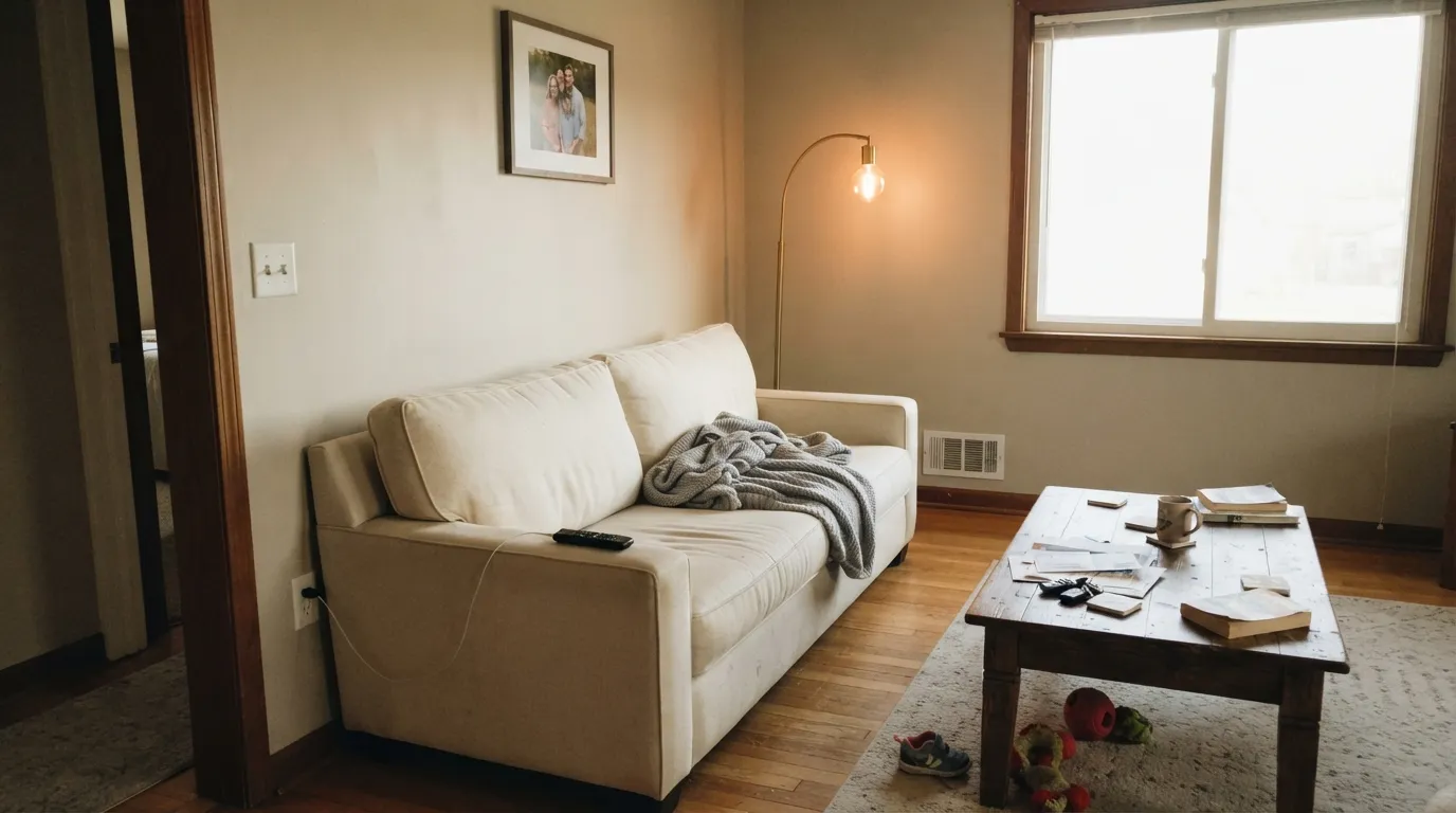
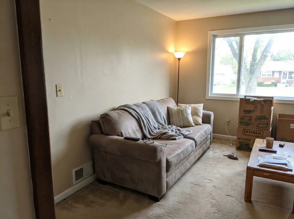
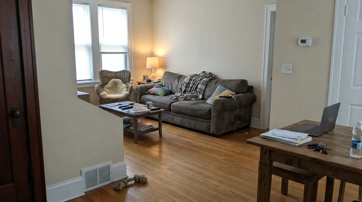
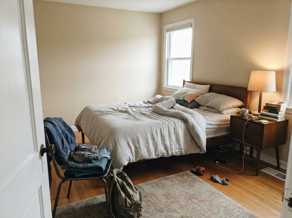
Photos from our full reviews — the same rooms and captions, so you can judge each color where it actually lives, not on a chip.
When to Pick Which
Open-plan main floors that need one color everywhere · south and west rooms with real daylight · resale prep and rentals · warm wood, brass, and cream furnishings
Your room faces north and stays dim · your floors are red-toned cherry or red oak · your trim is a warm white like Alabaster · you want a beige that reads clearly beige, not taupe
North-facing rooms that feel cold in gray · honey oak floors and 2000s tan tile · whole-house warmth without going tan · bedrooms and dining rooms under lamplight
Your cabinets or trim are already cream · your floors are cool gray LVP · you want a modern gray-neutral look · your room takes hard west sun all afternoon
No comparison page can see your light. Upload one photo of your room and try both colors on the same walls, seconds apart.
Accessible Beige vs Natural Linen FAQ
Which is lighter, Accessible Beige or Natural Linen?
Natural Linen is lighter: LRV 66 vs 58. Natural Linen is slightly lighter (LRV 66 vs 58, 8-point delta).
Which is warmer, Accessible Beige or Natural Linen?
They share the same undertone family — both read red-orange / warm. The difference between them is lightness and depth, not temperature.
How similar are Accessible Beige and Natural Linen?
Accessible Beige and Natural Linen are very close (ΔE 3.1). The difference shows up most in side-by-side comparison and under specific light. The only reliable test is seeing both in your own room and light — a side-by-side on a screen or chip flattens the difference.
Can I use Accessible Beige and Natural Linen together in one house?
Not in the same room, and be careful in the same house. At ΔE 3.1 they are so close that two walls in each will read as a tinting mistake, not a design choice. Pick one, or keep them on different floors where they are never seen together.
Ask a Question