Muslin
A quiet warm beige with a real pink lean, reviewed honestly: the light where it settles into a soft neutral, the light where it turns pink, and what to pick instead.

Jessica has spec'd whites and neutrals for more than 300 rooms and keeps a sample wall of painted drawdowns in her studio. Every color review is checked against real reader rooms in the comments and re-tested when a formula changes. About the testing process →
- 1Revere Pewter55
- 2Agreeable Gray60
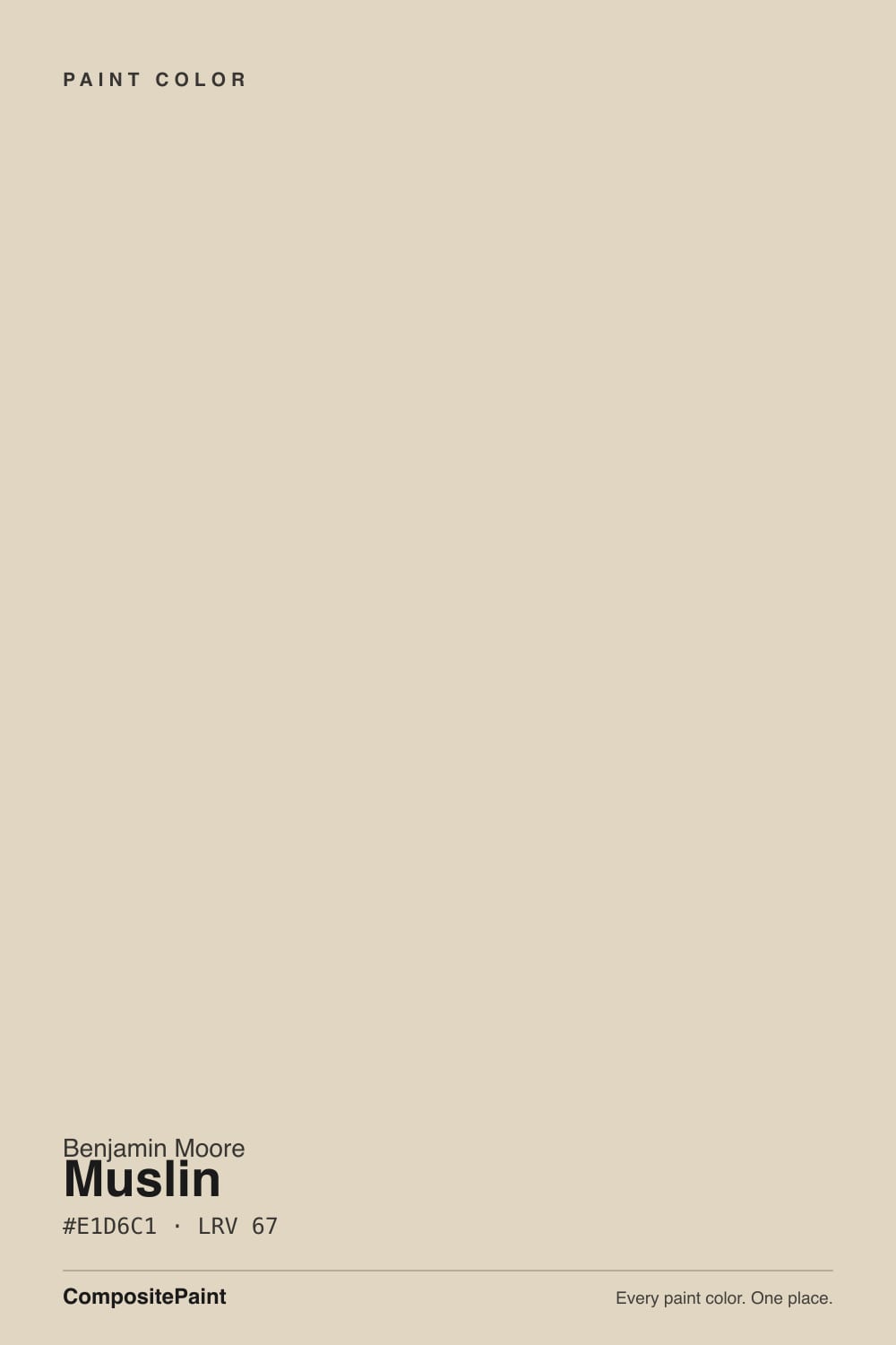
- 3Muslin67
- 4Shoji White74
- 5Dover White83
The Fast Verdict
Muslin is Benjamin Moore's quiet warm beige — the color you reach for when you want a wall that feels lived-in rather than decorated. Its whole personality sits on one fact: a genuine pink-peach undertone under the tan, not a rumor, not a trick of the light. In diffuse daylight and against warm wood it settles into a soft, welcoming neutral; in full south sun or under warm bulbs, the peach steps forward and some rooms read distinctly blush. Neither reading is wrong — know which one you're buying before the first coat goes on.
Whole-house walls in homes with warm wood and brass · hallways, entryways, and living rooms that want cozy over crisp · bedrooms under warm lamps · anyone who genuinely likes a hint of blush in their beige
You want a true gray-beige with zero pink · your room gets full south sun and the chip already looks pink · your fixtures and stone are cool-toned (chrome, gray quartz) · you're pairing it with a stark white trim
- A genuinely warm, welcoming neutral — not a cold imitation of one
- Mid LRV (67) holds real color without going washed-out
- Whole-house workhorse: living rooms, hallways, and bedrooms all take it well
- Flatters warm wood, brass, and layered textiles
- Enough personality to feel finished without committing to a bold color
- Genuine pink-peach undertone — not everyone wants that in a "beige"
- Strong south sun and warm bulbs push the pink forward hard
- Clashes with cool stone, chrome, and stark white trim
- Reads flat in bare, minimalist, cool-lit rooms
What Color Is Muslin, Really?
Muslin belongs to Benjamin Moore's Classics collection, filed by the brand itself as a warm neutral that "captures the effortless charm of organic materials" — corporate language for the plainest compliment a beige can get. What that description leaves out is the part every owner discovers on the wall: Muslin carries a genuine pink-peach undertone under its tan, not just warmth in the abstract. Independent hue analysis puts it near 39°, which lands it in the red-pink family rather than a straight orange-tan — the same family as Baby Fawn and Natural Linen, its closest cousins in the deck.
At LRV 67 it sits mid-light — brighter and airier than a true greige like Revere Pewter (LRV 56), essentially matched in depth by Sherwin-Williams's Natural Linen (LRV 67), and noticeably deeper than a soft white like Natural Cream (LRV 65) or White Dove (LRV 85). That mid-light band is exactly why it reads as a workhorse rather than a statement: enough color to feel finished, not so deep that it demands a whole design plan built around it.
Undertone in one line: warm beige with a genuine pink-peach lean — not gray, not straight yellow-tan. Houzz and Facebook paint threads argue about this color constantly, and both sides are right: in diffuse or cool light it settles down toward a plain, quiet beige; in bright warm light or under incandescent bulbs, the pink comes forward and is hard to miss. If your sample looks pink, that isn't a fluke — that's Muslin being itself in strong warm light.
Where It Shines
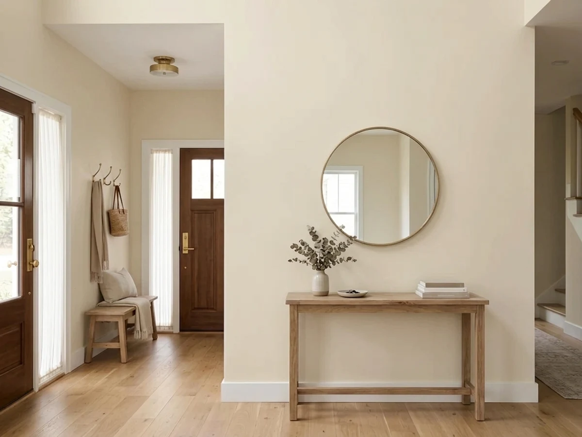
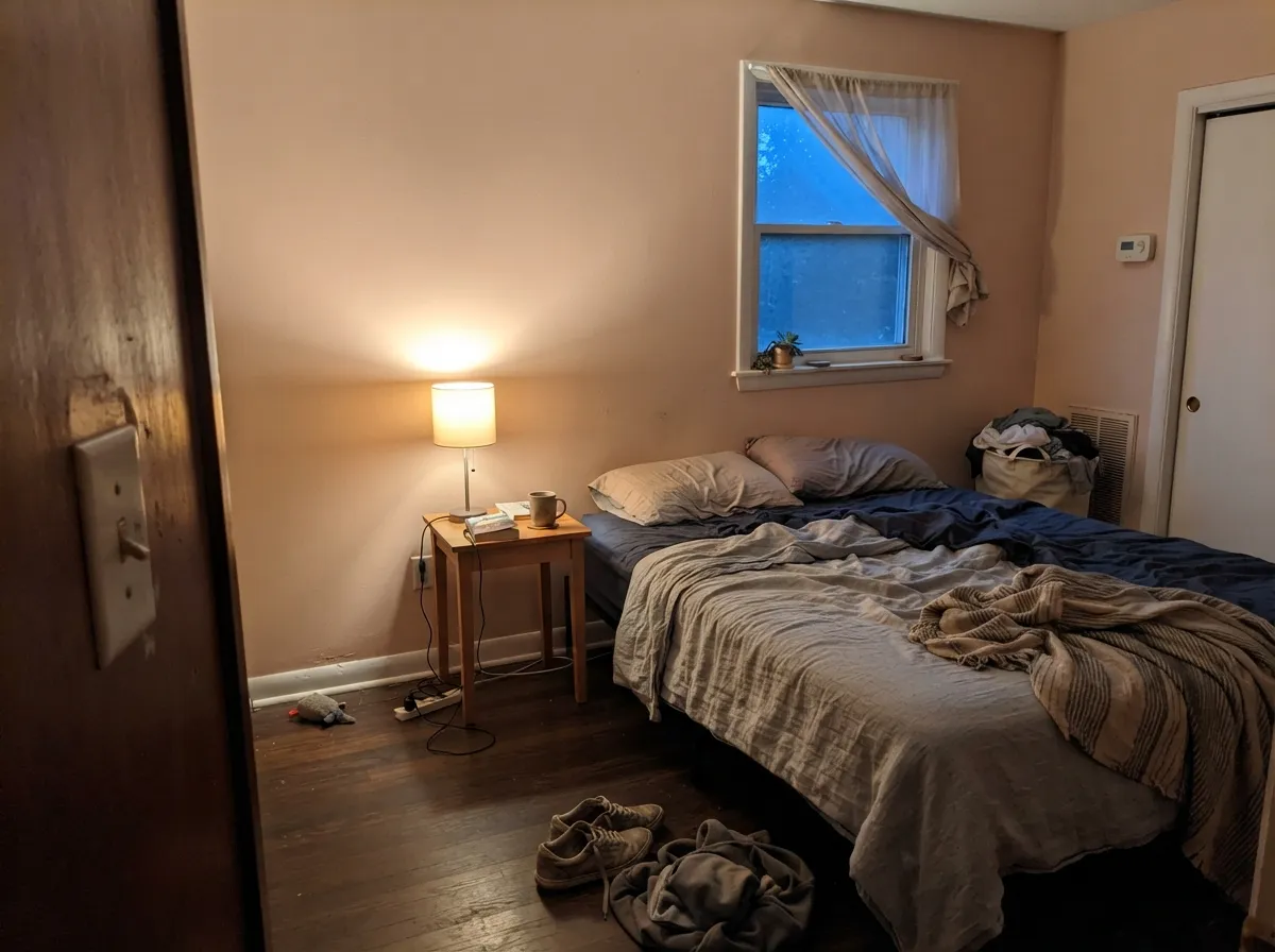
Give it a room with real but not blasting light — north exposure, an interior hallway, diffuse daylight — plus warm wood and a little brass, and Muslin turns into exactly what its name promises: a soft, woven-looking neutral that makes a room feel settled rather than staged. It's a genuine whole-house color, equally at home in living rooms, hallways, entryways, and bedrooms, and it pairs easily with both traditional and more modern furniture because the color itself does the work of softening a room without asking for a theme.
Where It Fails
Nearly every complaint about Muslin traces back to the same fact readers wish someone had told them up front: this color has real pink in it, and light decides how loud that pink gets. None of the three scripts below are the paint failing — they are the paint being honest in conditions that don't suit it.
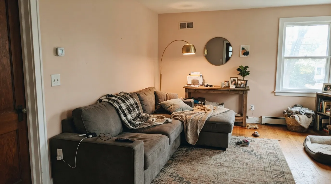
This is the single most common regret: someone asks a Houzz or Facebook paint group for "a warm neutral, not pink," gets pointed to Muslin, and in a bright south-facing room the peach steps forward hard enough that guests call it pink on sight. The paint didn't change — strong warm daylight is simply the light that shows Muslin's true undertone. Sample a real board in your actual south window before committing to four walls.
Muslin's warmth needs warm company. Set it against cool gray quartz, chrome fixtures, or a bright blue-white trim, and the pairing reads like a mistake rather than a palette — the cool materials make the wall look dingy, and the wall makes the stone look flat. Keep the metals warm (brass, unlacquered bronze) and the trim soft (White Dove, Swiss Coffee), never stark.
This color earns its keep through company — wood, linen, layered rugs, a little brass. Strip that out and paint it in a sparse, all-hard-surface room lit by cool LEDs, and Muslin reads flat and slightly washed-out rather than warm. It rewards a lived-in room; it doesn't carry a stark, empty one.
Room by Room
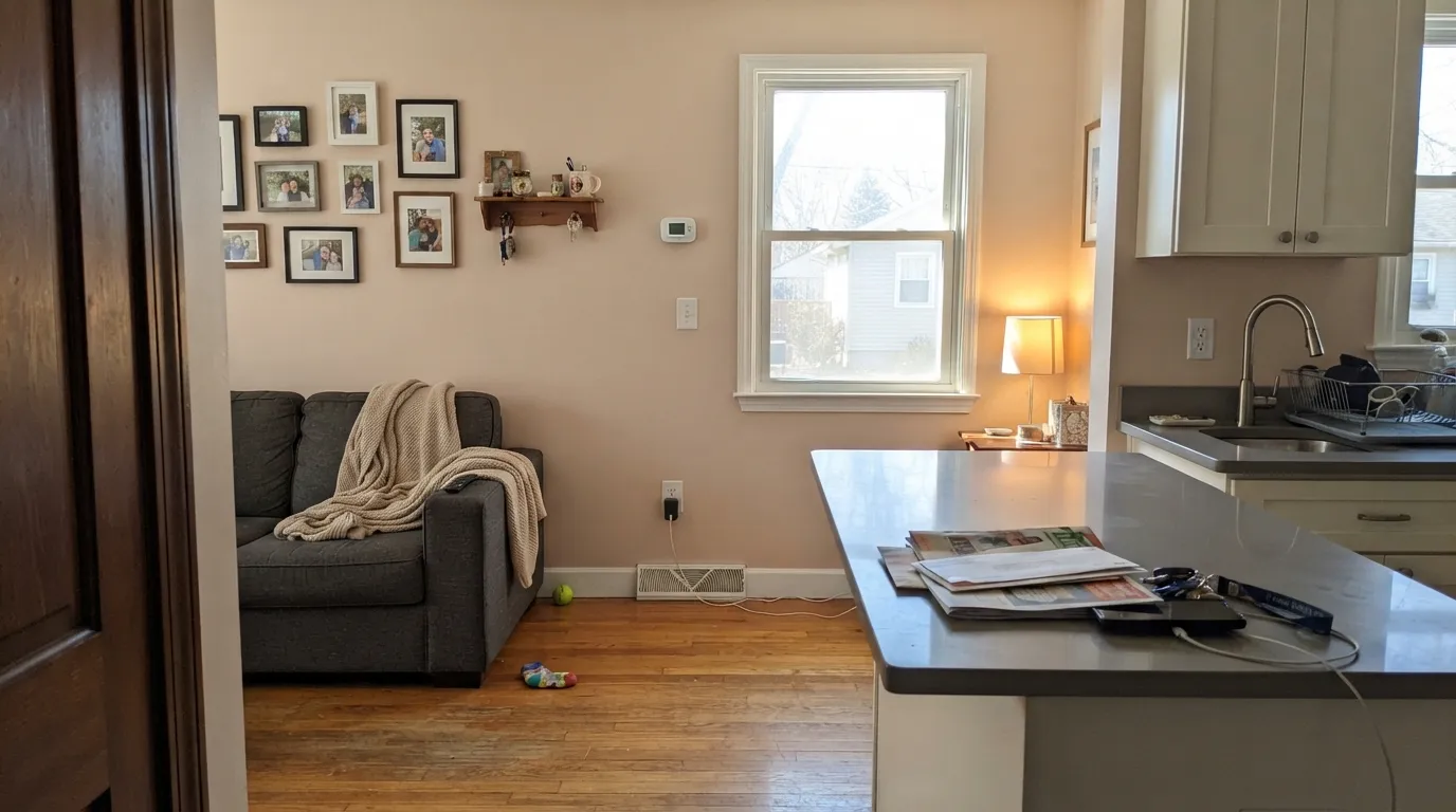
The color's whole reputation is built here: with wood furniture, a rug, and warm lamps it reads settled and welcoming rather than decorated. Eggshell finish; keep trim soft, not stark white.
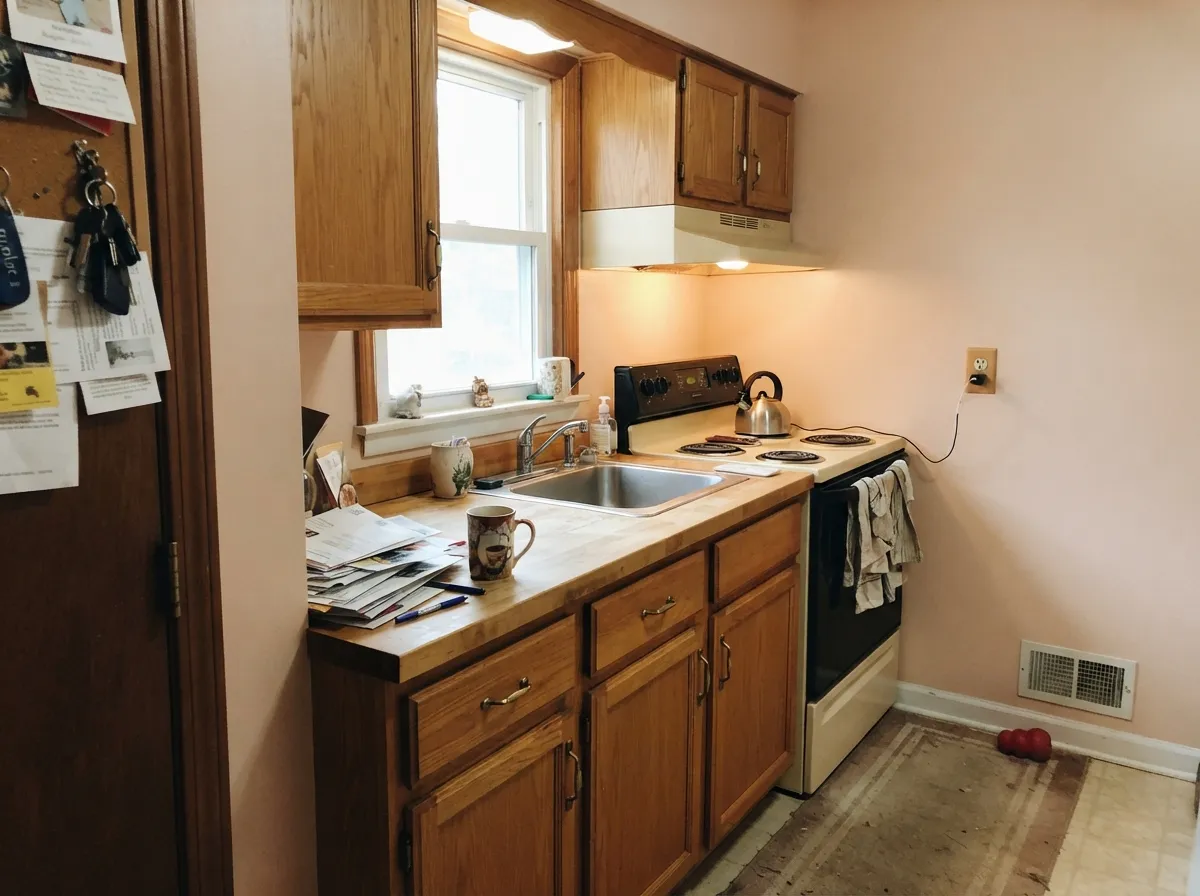
Against oak cabinets, butcher block, and brass hardware it's genuinely lovely. Against cool gray quartz or a stainless-heavy kitchen, the pink can read as a clash rather than a complement — check your counter sample before the walls.
Under 2700K lamps it turns gently blush and calm, a good match for anyone drawn to the mauve-adjacent bedroom trend without committing to an actual purple. Skip it if you specifically want the room to read gray.
With warm marble, wood vanities, and brass it's a soft, spa-like neutral. With cool gray or blue-veined stone and chrome, the undertones argue — pick a cooler neutral instead, or test a large sample above the actual counter.
This is where a lot of the positive reviews come from: Muslin carries from room to room without a hard stop, softening the transition better than a plain white would.
Muslin doesn't show up often in exterior galleries, and there's a reason: full outdoor sun is exactly the strong warm light that brings its pink forward hardest, on a scale you can't fix by repainting one wall. If you're set on it, sample a real swatch on the actual siding, in the actual sun, before committing a whole house.
Your Light Is the Risk
Softer, cooler daylight balances the warmth into a settled, quiet beige — this is Muslin at its most "just a nice neutral."
Strong warm daylight is exactly what brings the pink-peach forward. If you wanted plain beige, this is the light where Muslin argues back.
Warmest and pinkest at golden hour, quieter through the rest of the day — most owners like the movement, but test at both ends before deciding.
2700K incandescent amplifies the pink into a cozy blush; cool LEDs calm it back toward plain beige — pick your bulbs on purpose, not by accident.
Most complaints about Muslin are a light mismatch. Upload a photo of your actual room and see it on your walls — then ask for the same wall in north light or evening lamps before you buy a single sample.
Need It From Another Brand?
Any paint counter can custom-tint Benjamin Moore 1037 directly. If you would rather stay in one brand's own deck, these are the closest stock matches, measured as ΔE2000. Under 2 is a difference you will not see on the wall.
| Brand | Closest color | ΔE | LRV | |
|---|---|---|---|---|
| Sherwin-Williams | Steamed ChaiSW 9509 · Sherwin-Williams | 0.9 | 67 | Color page → |
| Behr | Rococo BeigeHDC-NT-15 · Behr | 0.7 | 68 | Color page → |
| Valspar | Lion of Hadrian8007-9G · Valspar | 0.7 | 68 | Color page → |
| PPG / Glidden | Alpaca WoolPPG14-19 · PPG / Glidden | 2.2 | 67 | Color page → |
| Glidden | Autumn Haze45YY 67/120 · Glidden | 0.7 | 67 | Color page → |
| Dutch Boy | Sheridan White415-1DB · Dutch Boy | 1.3 | 70 | Color page → |
Similar Benjamin Moore Colors
The nearest shades to Muslin within Benjamin Moore's own range, ranked by perceptual color distance — useful when you want the same look a touch lighter, darker, or warmer.
WCAG 2.1: AA is 4.5 : 1 for normal text, 3 : 1 for large text, AAA is 7 : 1.
Muslin vs the Colors You're Also Considering
Every Muslin sample board has the same rivals on it. The numbers show the real lightness gap — then it comes down to which risk you would rather live with.
Pick this if you're already committed to the Benjamin Moore deck and want the Classics-collection version.
Sherwin-Williams SW 9109 · LRV 67Natural LinenPick this if your painter works in Sherwin-Williams — nearly the same hex, the same warm-beige undertone, just a different brand name on the can.
Pick this for the lighter, more distinctly beige version of the same warm family.
Benjamin Moore OC-15 · LRV 63Baby FawnPick this for a shade deeper and grayer — the pink is there too, but with more gray to settle it down.
Pick this if you want the pink lean on purpose, not by accident.
Sherwin-Williams SW 7036 · LRV 58Accessible BeigePick this if pink specifically is your dealbreaker — its warmth leans gold, not pink, though it has its own cool-light risk.
Pick this for more color and depth — Natural Cream is quieter and closer to a true off-white.
Benjamin Moore OC-14 · LRV 65Natural CreamPick this for a cooler-lit room — Natural Cream is the warm off-white built to survive rooms that feel cold; Muslin needs more warmth to begin with.
Inside the Benjamin Moore line, Hidden Cove CSP-1030 at #DED6BF and LRV 67 is the slightly greener, duller neighbor. Brandy Cream, sold as 1030, CC-60, and OC-4 at #E2D4C2 and LRV 66 to 67, leans a shade pinker. The gaps are small. On a paint chip you may not see them at all, but across a full wall Brandy Cream reads warmer and Hidden Cove reads quieter.
Across brands the matches are unusually tight. Farrow and Ball Light Sand No. CC2 at LRV 69 is only 0.44 away in color difference, which is the same color for practical purposes. Behr Rococo Beige HDC-NT-15 at LRV 68 and Sherwin-Williams Steamed Chai SW 9509 at LRV 67 both land under 1.0 as well.
Further out, Backdrop Cookies and Cream at LRV 73 is 2.11 away, so it is very close but worth sampling first. Portola Paints Figueroa at LRV 63 is 4.1 away: close, but visibly different side by side.
Muslin Coordinating Colors
The rule for coordinating with Muslin is simple: stay warm everywhere else. It wants warm whites on trim, warm metals, and warm or neutral wood — and it argues with cool grays, chrome, and stark blue-white. These are the partners that keep showing up in rooms that work:
Muslin's Real Story: A Quiet Classic, Not a Trend Chaser
Muslin doesn't have a Color of the Year moment or a viral renovation behind it — it's a working member of Benjamin Moore's Classics collection, the same catalog that holds decades-old dependable neutrals rather than this year's headline color. Benjamin Moore's own description calls it a neutral that "captures the effortless charm of organic materials," language that undersells the one thing that actually defines it: hue analysis places it in the red-pink family, not the plain tan-orange most "warm beige" searches expect.
That's the real story here, and it's why paint forums keep circling back to the same question — "is this beige or is this pink?" Both answers are correct, and which one you get depends entirely on your light. It's an honest, dependable color rather than a famous one: no hype to live up to, no trend clock ticking on it, just a warm neutral that's been quietly doing the same job for years.
Muslin With Wood Tones and Floors
Warm wood is this color's best friend. Oak, walnut, and butcher block all sit comfortably against Muslin because the wood's warmth meets the paint's pink-peach lean halfway rather than fighting it — the same logic that makes it a natural in kitchens with wood cabinetry and brass hardware.
Cool-toned flooring is the one pairing that needs a real sample first: gray LVP, a gray-washed oak, or polished cool-toned tile all pull Muslin's pink into relief, and the wall can start to look more blush than beige against them. It isn't automatically a dealbreaker — warm rugs and brass accents can bridge the gap in most rooms — but test a large sample above the actual floor before committing to the whole room.
Three Ready Palettes Built on Muslin
A color is never alone on the wall. These are complete combinations in the 60-30-10 pattern, with the reason each one holds together. Every one opens in the visualizer.
Muslin's pink-peach warmth needs a soft, not stark, white to keep it from reading dirty — White Dove's own warmth doesn't fight it the way a bright white would. The navy door supplies the one dark note the scheme needs.
Try this palette in your roomManchester Tan grounds the island a shade deeper in the same warm family, so the two-tone kitchen reads intentional rather than mismatched; all three love oak floors and brass hardware.
Try this palette in your roomPashmina is Muslin's own deeper cousin — same warm base, more weight — so the accent wall reads like a shadow of the main color instead of a new one. Wrought Iron's soft near-black keeps the built-ins from going stark.
Try this palette in your roomMuslin FAQ
Is Muslin warm or cool?
Warm, unambiguously — and warmer than a typical "greige" in one specific way: it carries a genuine pink-peach undertone under the tan, not just yellow warmth. In diffuse light that undertone settles down to a soft neutral; in bright warm light it steps forward and reads distinctly blush.
Is Muslin pink?
It leans that way more than most colors marketed as "beige." Hue analysis places it in the red-pink family, and Houzz and Facebook paint threads argue about this constantly. On the chip it reads as a quiet tan; on four walls in strong light, real pink can show up. If you want zero pink, test a large sample in your actual light before buying gallons.
What trim white goes with Muslin?
A soft warm white — White Dove or Swiss Coffee — not a stark, blue-white trim. A cool bright white fights the pink undertone and makes the walls look dingy by contrast; a warm white lets the two colors agree.
Does Muslin work with gray or cool-toned floors and counters?
Not easily. Muslin's warmth wants warm company — oak, walnut, brass, cream stone. Against cool gray LVP, blue-veined marble, or chrome, the undertones argue and the wall can start to look pink by comparison. Test a large sample above the actual floor or counter first.
How does Muslin compare to Natural Linen or Baby Fawn?
Natural Linen (Sherwin-Williams) is close enough to be a twin — same LRV, nearly the same hex, the same warm-pink risk, different brand. Baby Fawn (also Benjamin Moore) sits a step deeper and grayer, so the pink shows a bit less. All three come from the same warm-beige family; picking between them mostly comes down to which brand's paint your painter already stocks.
Is Muslin a popular or trending color?
It isn't a Color of the Year and it doesn't show up in viral before-and-afters — it's a quiet member of Benjamin Moore's Classics collection that gets picked steadily rather than dramatically. That's actually a point in its favor: no trend clock ticking on it, just a dependable warm neutral for people who know they want pink-adjacent beige rather than gray.
Have you painted with Muslin?
Rate it — one tap helps the next reader decide.
Ask a Question