White Sand
The Benjamin Moore off-white that is actually a beige, reviewed honestly: the rooms it warms up, the light that flattens it, and what to pick instead.

Jessica has spec'd whites and neutrals for more than 300 rooms and keeps a sample wall of painted drawdowns in her studio. Every color review is checked against real reader rooms in the comments and re-tested when a formula changes. About the testing process →
- 1Revere Pewter55
- 2Agreeable Gray60
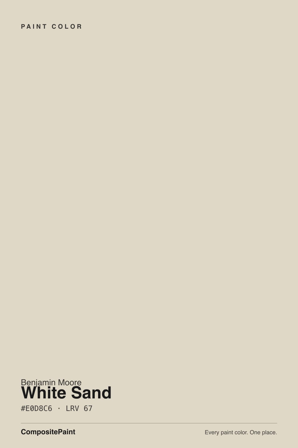
- 3White Sand67
- 4Shoji White74
- 5Dover White83
The Fast Verdict
White Sand is a beige wearing an off-white's name. At LRV 67 it carries real body — enough to warm an entire floor, soften a bright room and hide a family's worth of scuffs — but the chroma is held so low that it never behaves like a color. That is exactly why it works as a whole-house neutral, and exactly why it disappoints anyone who sampled it hoping for a warm white.
Family rooms and open main floors that need warmth without glare · whole-house neutral over warm wood floors · kitchen walls and cabinets with brass and butcher block · anyone whose bright white felt cold at night
You actually want a white · your room is dim and north-facing · your trim is a golden antique white · your floors, counters and tile are all cool gray
- Warm and calm without ever tipping into a strong yellow beige
- Genuine whole-house color — no green or violet flip room to room
- LRV 67 hides scuffs and handprints far better than an off-white
- Flatters honey oak, walnut and brass instead of fighting them
- Reads custom on cabinets while still counting as a neutral
- The name promises a white; the wall delivers a beige
- Too little pigment to hold up in dim north light or cool LEDs
- Flattens into a yellow haze next to creamy antique-white trim
- Plain by design — it will not carry a room on its own
What Color Is White Sand, Really?
A muted sandy beige with the yellow deliberately held down. Benjamin Moore files it in the Off-White Collection — it carries two numbers, OC-10 and 964, for the same paint — and that filing is the source of most confusion about it. On the chip, surrounded by white cards in a fan deck, it passes for a warm white. On four walls it is unmistakably beige: a soft, low-chroma sand that most people describe as greige-adjacent, with a faint taupe steadiness underneath the warmth.
At LRV 67 it sits in the useful middle of the deck — light enough to keep a room open, deep enough to actually read as a color choice rather than as primer. The company it keeps at that exact number tells you what it is: Pale Oak (LRV 67) is the cooler, violet-taupe version of the same lightness, and Muslin (LRV 67) is the warmer one that keeps almost being pink. White Sand is the plain yellow-beige between them, and it is the least likely of the three to surprise you with an undertone you did not order.
Undertone in one line: yellow-beige softened with gray — a faint peach flash in strong sun, never green, never pink. Its chroma is low enough that a color consultant on Houzz described it as sitting right on the cusp of cool, and homeowners regularly report a sample that looks cooler than the marketing promised. That is not a gray base showing through; it is a warm color with very little pigment in it, doing whatever the room's light and furniture tell it to do.
Where It Shines
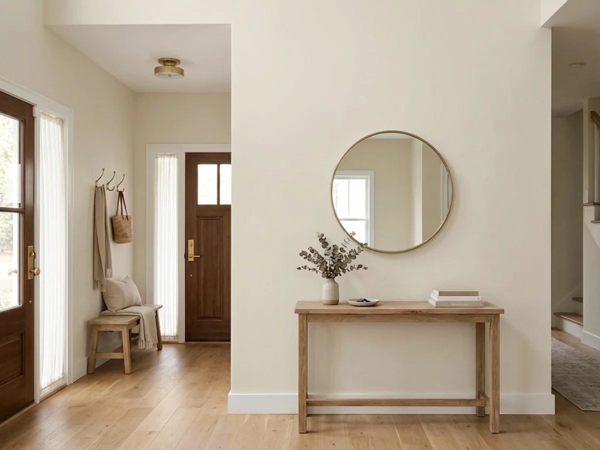
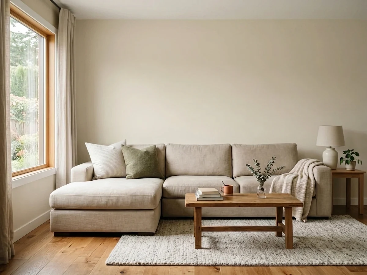
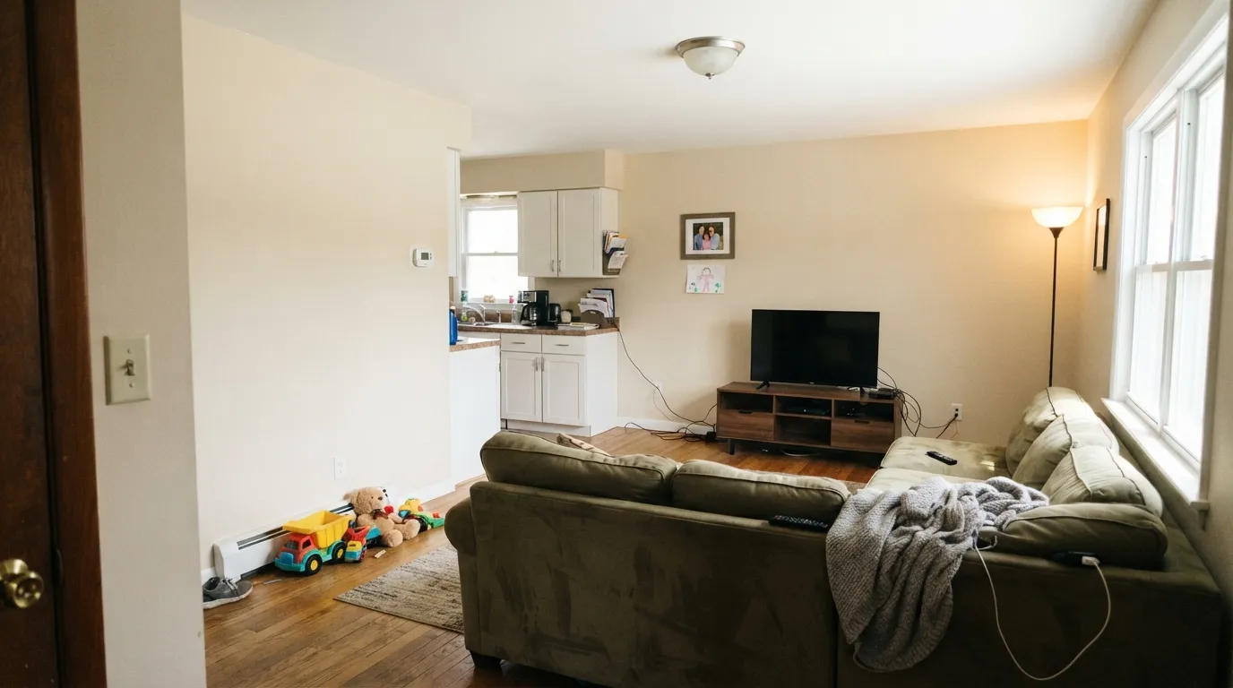
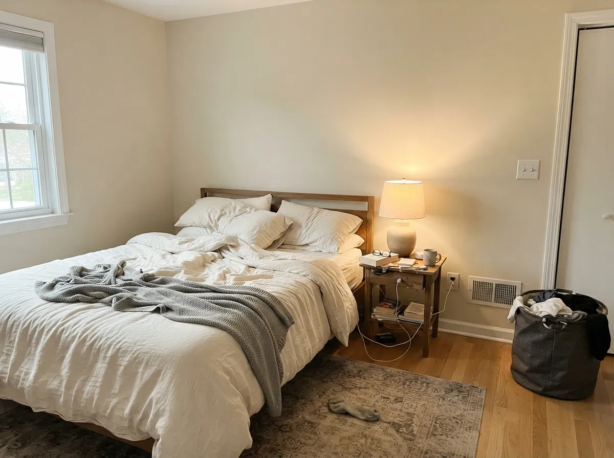
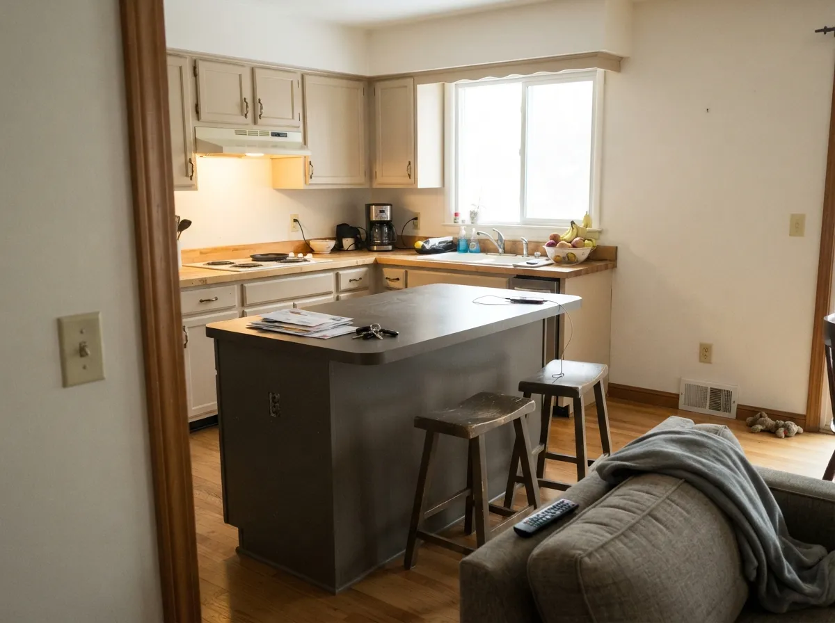
Its best room is the one people actually live in. A family room asks a paint color to do three unglamorous things — stay warm under mixed lamp-and-daylight, not glare off the TV wall, and forgive fingerprints, sofa scuffs and a decade of mismatched furniture — and White Sand does all three without asking for anything back. One blogger lived with it in every room of a large house for eight years, which is the honest test no chip can pass. Its second home is the kitchen, where it reads custom rather than builder-grade both on walls and on cabinet doors.
Where It Fails
Nearly every disappointed review of White Sand comes down to one of three situations, and all three are predictable from your floor plan and your light bulbs. None are the paint's fault — but if your room matches one, sampling a bigger square will only confirm it.
This is the number-one complaint and it is baked into the name. White Sand is a beige at LRV 67, roughly eighteen points below White Dove (LRV 85). Put it under a bright white ceiling and beside crisp white trim and there is no argument left — the walls read tan. If you want warm white walls, buy a warm white; use White Sand when you want the room to look soft and lived-in, not painted white.
Pairing it with a creamy yellow-based trim like Linen White or Navajo White removes the only cool reference in the room, and the whole space flattens into one yellow haze. White Sand needs a cleaner white beside it — White Dove for a soft handoff, Simply White or Chantilly Lace when you want the walls to read crisply as the warm color and the trim as the white.
There is not enough pigment here to fight cold light. In a north-facing room with 4000K bulbs the warmth drains out and what is left is a flat putty-gray that owners call dull or dirty. Warm 2700K bulbs are part of this paint job, not an upgrade. If the room is dim and the bulbs are staying cool, step warmer to Muslin or deeper to Accessible Beige.
Room by Room
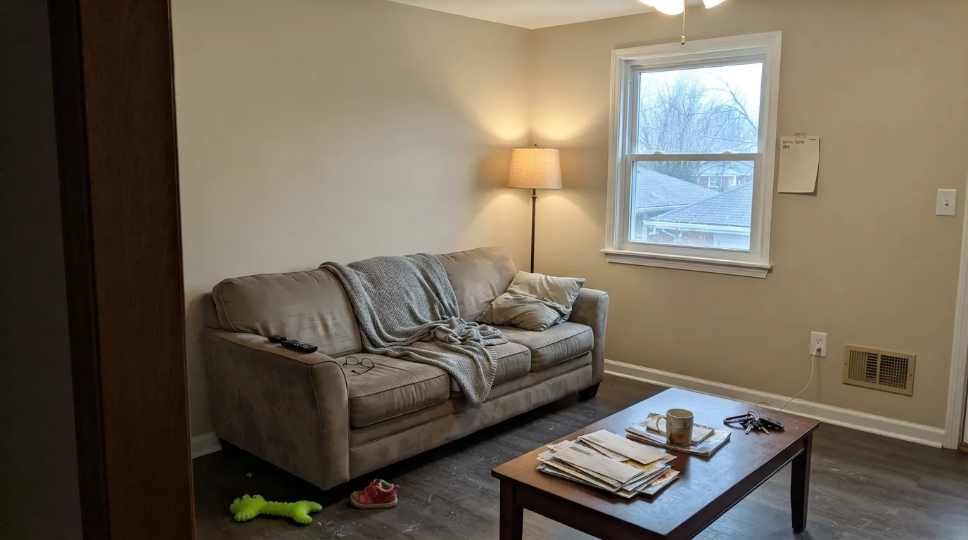
Warm enough to feel like evening at 4pm, quiet enough that the TV wall never glares, light enough at LRV 67 that a room with one window still feels open. Eggshell hides the roller marks and wipes clean where the sectional meets the wall. This is the color you pick when the room has to work for kids, guests and a Tuesday night, not for photos.
It carries across sightlines better than most beiges because it has almost no undertone to argue with the next room. Over oak floors with cream upholstery and brass it reads warm and settled; with one deeper color — a navy built-in, a sage cabinet run — it stops being plain.
Under 2700K bulbs it turns genuinely creamy and restful. Skip it in a dim north-facing bedroom that only ever sees overcast daylight, where it goes putty. Eggshell or matte; cream bedding rather than bright white, which will make the walls look dingier than they are.
On walls it warms a white kitchen without competing with the backsplash. On cabinet doors, in satin, it is the more interesting choice than another white — sandy enough to read custom, neutral enough to live with brass, butcher block or honed stone. Pair the cabinets with a deeper island rather than another mid-tone.
Transitional spaces are where whole-house neutrals earn their keep, and this one has no green or violet flip to embarrass it as the light changes down a hallway. In a dining room it is a flattering, low-drama backdrop for a dark table and warm metal.
Full sun bleaches the little chroma it has and the siding can read chalky and washed from the street. It can work on a facade, but only framed by real contrast — charcoal or near-black trim, a dark door — and only after you look at a large sample on both the sunny and the shaded side of the house.
Your Light Is the Risk
Bright, generous daylight is where it looks its best — light and sandy, warm with no glare. Whole-house safe here.
Cool overcast light drains the warmth and leaves a flat putty-gray. Sample it for three days before committing.
Warmest in morning sun, more neutral by midday; late west light pulls the taupe forward for an hour.
2700K lamps make it creamy and cozy. Cool 4000K LEDs flatten it to gray-tan — change bulbs, not paint.
Most complaints about White Sand are a light mismatch. Upload a photo of your actual room and see it on your walls — then ask for the same wall in north light or evening lamps before you buy a single sample.
Need It From Another Brand?
Any paint counter can custom-tint Benjamin Moore 964 directly. If you would rather stay in one brand's own deck, these are the closest stock matches, measured as ΔE2000. Under 2 is a difference you will not see on the wall.
| Brand | Closest color | ΔE | LRV | |
|---|---|---|---|---|
| Sherwin-Williams | Warm WinterSW 9506 · Sherwin-Williams | 0.5 | 70 | Color page → |
| Behr | Sentimental BeigeYL-W13 · Behr | 0.4 | 69 | Color page → |
| Valspar | Light Raffia3008-10B · Valspar | 1.5 | 68.4 | Color page → |
| PPG / Glidden | Cozy CreamPPG1112-2 · PPG / Glidden | 1.5 | 70 | Color page → |
| Glidden | Natural Wicker30YY 67/084 · Glidden | 1.9 | 67 | Color page → |
| Dutch Boy | Sheridan White415-1DB · Dutch Boy | 2.6 | 70 | Color page → |
Similar Benjamin Moore Colors
The nearest shades to White Sand within Benjamin Moore's own range, ranked by perceptual color distance — useful when you want the same look a touch lighter, darker, or warmer.
WCAG 2.1: AA is 4.5 : 1 for normal text, 3 : 1 for large text, AAA is 7 : 1.
White Sand vs the Colors You're Also Considering
Every White Sand sample board has the same rivals on it. The numbers show the real lightness gap — then it comes down to which risk you would rather live with.
Pick this when you want zero risk of a pink flash and a flatter, sandier read.
Benjamin Moore 1037 · LRV 67MuslinPick this if you want the same lightness with more warmth — it is the beige that keeps almost being pink, and it holds up better in dim rooms.
Pick this when the room is already cool and needs the warmth, or when you cannot risk a moody violet cast.
Benjamin Moore OC-20 · LRV 67Pale OakPick this for the cooler version of the same lightness — a violet-taupe lean that suits gray floors and cool stone.
Pick this when you want the beige to be obvious and stable rather than nearly-white.
Benjamin Moore OC-9 · LRV 72Ballet WhitePick this if White Sand samples a shade too beige and you want a lighter warm off-white — just watch its green risk.
Pick this for the lighter, airier version — Accessible Beige at LRV 58 will darken a small family room that White Sand keeps open.
Sherwin-Williams SW 7036 · LRV 58Accessible BeigePick this if your painter works in Sherwin-Williams, or the room is bright enough to take a deeper, more definite greige.
White Sand OC-10 is the same hex, #E0D8C6, listed at LRV 69, so the two codes mix to the same paint. Muslin 1037, CC-110, and OC-12 at #E1D6C1 and LRV 67 to 68 are a shade warmer and slightly more golden. Early Morning Mist 1528 and Ashwood OC-47 at #DBD8C9 and LRV 67 drop most of the red and read cooler and greener, which is the better route if White Sand tests too warm.
Across brands, Sherwin-Williams Warm Winter SW 9506 at LRV 70 with a deltaE of 0.45 is a true match, as are Diamond Vogel Illusive Dream 0335 at deltaE 0.91 and HGTV Home by Sherwin-Williams Neutral White HGSW 4017 at deltaE 0.96. Farrow and Ball Blanc de Treillage No. G1 at LRV 69 and Valspar Light Raffia 3008-10B at LRV 68.4 fall between deltaE 1.24 and 1.5, so they are visually identical in normal room light. Behr Spanish Sand OR-W7, deltaE 2.13, is very close but worth sampling first.
White Sand Coordinating Colors
The rule with White Sand is that it needs one thing brighter and one thing darker. On its own across a whole house it can read undecided; give it a clean trim white above and a real dark note somewhere below, and it stops being plain and starts being the calm background it is good at. Everything warm sits well next to it — the colors to keep away are icy blues and cool gray-blue stone, which turn its low chroma into something that looks tired.
Two Numbers, One Paint: OC-10 and 964
Search this color and you will find it written both ways, and the two listings can look like different products — different chip photos, different LRV printed to two decimal places, sometimes different prices at different retailers. They are the same paint. Benjamin Moore lists many colors twice, once inside a named collection and once in the plain numbered deck, and White Sand happens to be one of them: OC-10 in the Off-White Collection, 964 in the numbers. Whichever code your store keys into the tinting machine, the formula that comes out is identical.
The other name trap is across brands. Several manufacturers sell a color called White Sand, and they are not close relatives — some are near-white, some are distinctly gray. If someone recommends White Sand in a comment thread or a Facebook group, get the brand and the code before you buy a gallon. On this page, White Sand always means Benjamin Moore 964 / OC-10.
White Sand With Wood Tones and Floors
This is the pairing that decides whether the color looks right, and it is unusually forgiving. Honey oak, red oak and golden builder floors — the exact floors that make gray and greige walls look sour — sit comfortably against White Sand because both sides are on the warm half of the wheel. Instead of highlighting the orange, the walls meet it and the floor stops shouting. Walnut, hickory and pale white oak are all easy too, and cane, rattan and jute read as if they were chosen for it.
The two floors to sample against before committing are cool gray LVP and gray-washed hardwood. Against a genuinely cool floor, the walls' warmth is thrown into relief and can read distinctly yellow-tan from across the room. A large warm rug usually settles it, but paint a big sample board and stand it on the actual floor first — photos of this pairing lie more than most.
Metals are simple: brass, unlacquered brass, bronze and matte black all belong here. Polished chrome and brushed nickel are fine but neutral — they will not do anything for the color the way warm metal does.
Three Ready Palettes Built on White Sand
A color is never alone on the wall. These are complete combinations in the 60-30-10 pattern, with the reason each one holds together. Every one opens in the visualizer.
The bright trim is the point: a clean white edge lets the walls read as a deliberate warm color instead of a dirty white. Navy built-ins give the TV wall somewhere to disappear into, and the whole scheme still forgives kids and a well-used sofa.
Try this palette in your roomWhite Dove trim gives the softer, seamless version of the scheme — warm on warm, no hard edges. Saybrook Sage is a green that specifically wants warm company, so it settles against the sand instead of turning cold, and the two stay friendly across an open plan.
Try this palette in your roomSandy cabinets under lighter cream walls is the quiet alternative to another white kitchen — warmer than white, calmer than a color. Chelsea Gray on the island supplies the dark note the scheme needs so the perimeter does not read washed out, and both flatter brass.
Try this palette in your roomWhite Sand FAQ
Is White Sand a white or a beige?
A beige. Benjamin Moore keeps it in the Off-White Collection and the name says white, but at LRV 67 it is nearly twenty points below a real warm white like White Dove (LRV 85). On four walls it reads as a soft sand-beige, and that mismatch is behind most of its bad reviews.
What trim white goes with White Sand walls?
Two good answers. White Dove is the soft one — warm on warm, almost no visible edge, best when you want the room seamless. Simply White or Chantilly Lace is the crisper move, giving the walls a clean white to be a warm color against. The one to avoid is a golden antique white like Linen White, which leaves the whole room yellow with no cool reference.
Is White Sand 964 the same color as OC-10?
Yes. Benjamin Moore carries this one paint under two identifiers — OC-10 in the Off-White Collection and 964 in the numbered listing. Chips, samples and gallons made from either code are the same formula, so order with whichever number your store uses.
Will White Sand look yellow?
Rarely bright yellow, but it can lean that way in two situations: strong afternoon sun, which brings out a faint peach-gold flash, and a room where everything else is already cream. Keep one clean white in the room — trim, ceiling or both — and the yellow stays in check.
Is it a good whole-house color?
One of the safer ones. It has no green or violet flip to embarrass it as it travels from a bright living room to a dim hallway, and its warmth reads friendly under lamps. The condition is light: rooms that are both dim and north-facing will show a flat putty version of it, so plan warm 2700K bulbs throughout or give those rooms their own color.
Does it work with honey oak floors?
Yes — this is one of its quiet advantages over gray-leaning neutrals. The sand and the orange-gold in the oak sit on the same side of the wheel, so the floor looks intentional instead of dated. Walnut and pale white oak are equally easy. The one to sample carefully is cool gray LVP, which pulls the walls yellow by contrast.
Have you painted with White Sand?
Rate it — one tap helps the next reader decide.
Ask a Question