Maison Blanche
The warm honey-beige HGTV kitchens keep choosing, reviewed honestly: the light that turns it flat gray-lavender, the light that flashes it pink, and what to pick instead.

Jessica has spec'd whites and neutrals for more than 300 rooms and keeps a sample wall of painted drawdowns in her studio. Every color review is checked against real reader rooms in the comments and re-tested when a formula changes. About the testing process →
- 1Revere Pewter55
- 2Agreeable Gray60
- 3Maison Blanche66
- 4Shoji White74
- 5Dover White83
The Fast Verdict
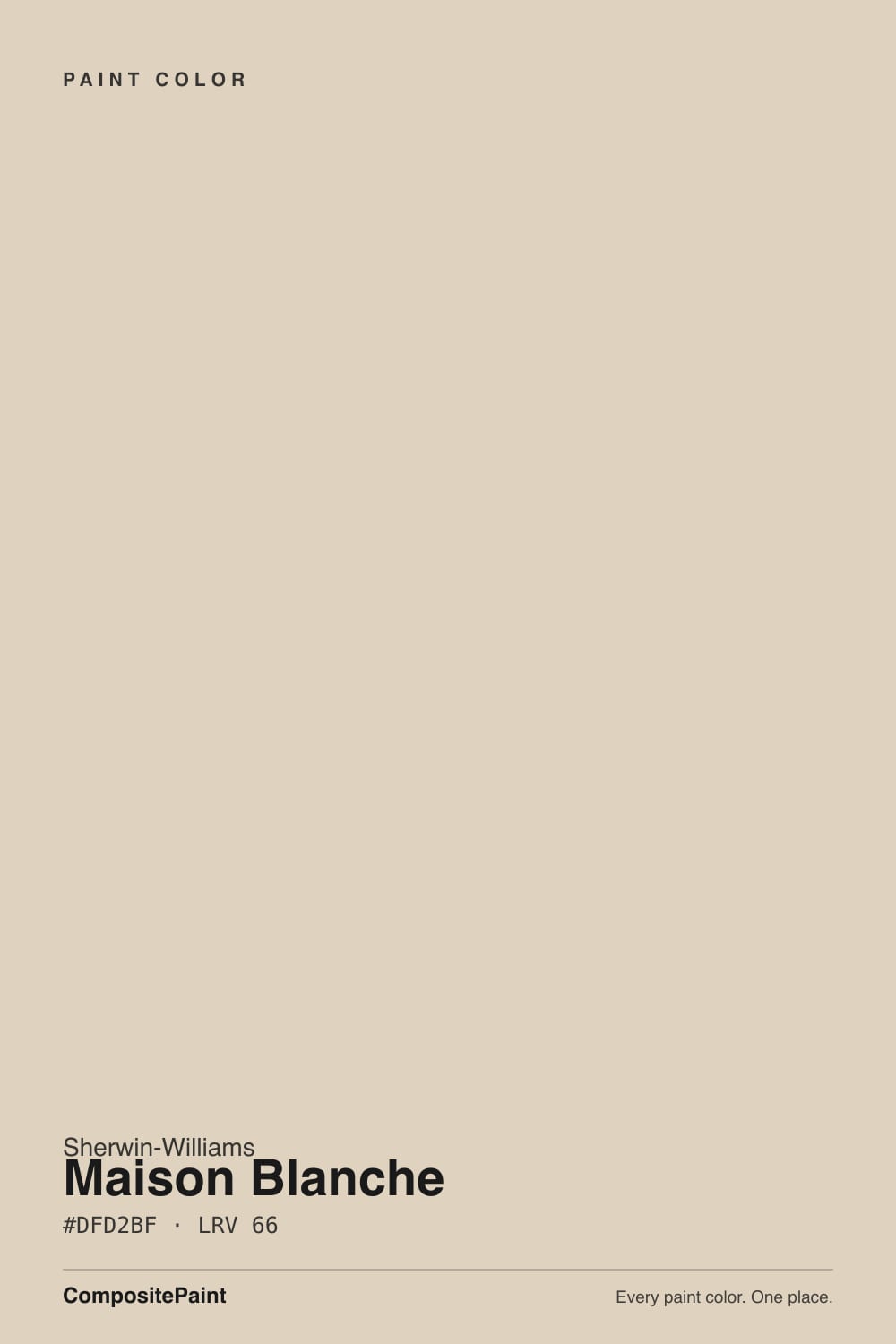
Maison Blanche is a warm, honey-khaki beige-white that Sherwin-Williams itself calls a "lighthearted, warm khaki yellow" — and that description is more honest than most brand copy. It is not a Color of the Year and it has no viral before-and-after story; it is the color HGTV's Timeless Beauty collection quietly leans on for kitchens, and thousands of cabinet jobs have proven it out. At LRV 66 it sits in the gap between a true white and a real beige, which is exactly why it flatters warm wood and brass — and exactly why weak or cool light exposes the gray underneath it.
Kitchen cabinets and islands with dark stone or brass · sunny living rooms and open-plan main floors · anyone who wants warm without committing to visible beige · pairing with oak, walnut, and butcher block
Your room is north-facing and dim · you get strong unfiltered west sun and hate pink flashes · you want a true white, not a warm off-white · your countertops and trim are cool gray
- Warm without reading as heavy, dated beige
- A genuine kitchen-cabinet favorite — flatters brass, dark stone, warm wood
- Sits between white and beige, so it opens a room without going stark
- Dependable, not trendy — an HGTV Timeless Beauty collection pick, not a fad color
- Pairs cleanly with oak, walnut, and butcher block without clashing
- Goes flat, gray-lavender in dim or north-facing light
- Can flash pink-violet in strong, unfiltered west afternoon sun
- Reads dingy next to a brighter, cooler trim white
- No strong exterior track record — sample big before using it on siding
What Color Is Maison Blanche, Really?
A warm off-white built on a khaki-yellow base with gray mixed in to keep it from reading as straight beige — Sherwin-Williams' own file describes it as a "lighthearted, warm khaki yellow," and that is a fair summary of what happens on the wall: enough yellow to feel warm and inviting, enough gray to keep it from tipping into visible tan. It lives in the Timeless Beauty collection (an HGTV HOME by Sherwin-Williams line), which is a telling detail — this was never positioned as a trend color, it was positioned as the dependable one.
At LRV 66 it is meaningfully deeper than a true white (Alabaster sits at 82, White Dove at 85) but noticeably lighter than a full greige like Accessible Beige (58). That middle position is the whole appeal: on cabinets it reads as a soft, expensive off-white rather than a stark white, and next to dark countertops or brass hardware it photographs the way a lot of kitchen renovation posts want it to. Its closest deck relative is Natural Linen (SW 9109, LRV 67) — nearly the same depth, but Natural Linen runs the same warm base a shade louder, especially in strong afternoon sun. Maison Blanche is the quieter version of that same idea.
Undertone in one line: warm khaki-yellow first, with gray keeping it in check — not pink, not green in good light. Owners who report a pink or lavender cast are almost always describing what happens to this color in the wrong light, not a defect in the paint itself; the sections below cover exactly which light does that.
Where It Shines
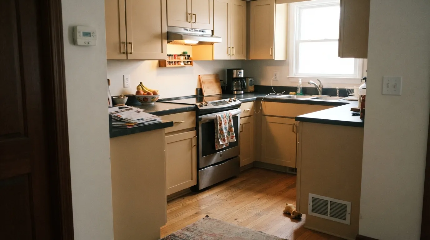
Give it real daylight, warm wood, and a dark counter or a black hardware accent, and it does the job it was built for. Kitchens are genuinely its best room — the reason this color shows up in so many renovation photos is that it splits the difference between "safe white" and "builder beige," opening up a small kitchen without going stark, and letting dark stone or soapstone counters do the visual heavy lifting. In any sunny main-floor room with oak or walnut furniture it reads calm and finished rather than dated.
Where It Fails
The complaints about Maison Blanche cluster around two very specific lighting situations, plus one common pairing mistake — and all three show up independently across paint-color review sites and homeowner forums, which is a good sign they are real and not a fluke.
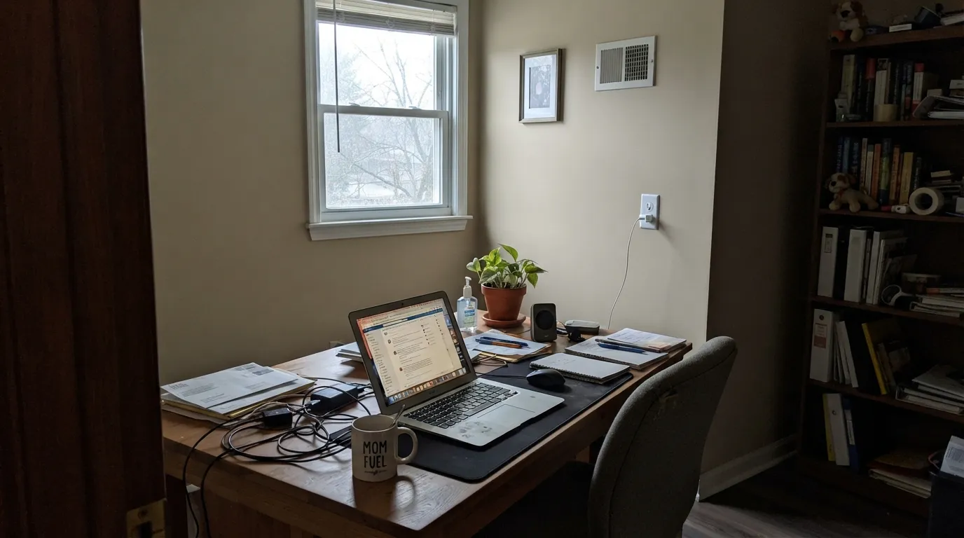
Cool, indirect light strips out the yellow and leaves the gray base exposed — several independent reviews describe the color going flat, muted, or slightly lavender-gray in this exact situation. It is not a defect; it is what every gray-warmed beige does in cold light. Sample it on your actual north wall before committing, or add warm lamps and accept it will read quieter than it does on the chip.
Multiple sources flag the same thing: in intense late-day light, very light warm neutrals like this one can flash pinkish-violet for an hour or two. Most people barely notice it in passing; if you are sensitive to pink undertones, test a large sample on the actual west wall and look at it specifically between 4 and 6pm before buying gallons.
At LRV 66, Maison Blanche is meaningfully deeper than a typical trim white. Pair it with a stark, cool white (bright builder trim, cool-toned ceiling paint) and the wall can start to look dingy by comparison — the same mismatch that sinks every warm off-white. Use a warm trim white like Alabaster instead of whatever bright white happens to be on hand.
Room by Room
This is the job Sherwin-Williams built the color for and where it shows up most in real renovation photos. It opens up a kitchen without going stark, flatters brass and black hardware, and pairs especially well with dark stone or soapstone counters. Satin or semi-gloss on cabinets for cleanability.
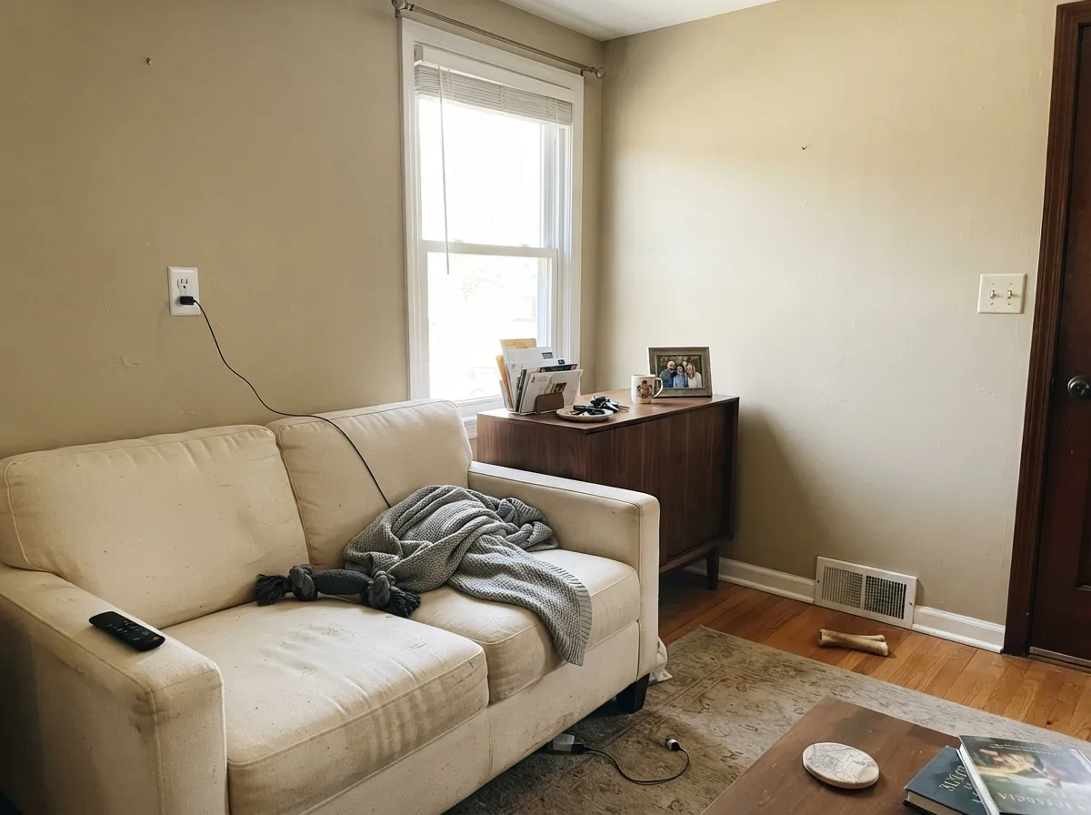
In a bright room it is a calm, warm neutral that carries well across an open floor plan. Skip it if the room only gets indirect north light — see the fails section.
Under 2700K lamps at night it reads cozy and warm. If the room is north-facing and dim during the day, it will read flatter than expected until the lamps come on.
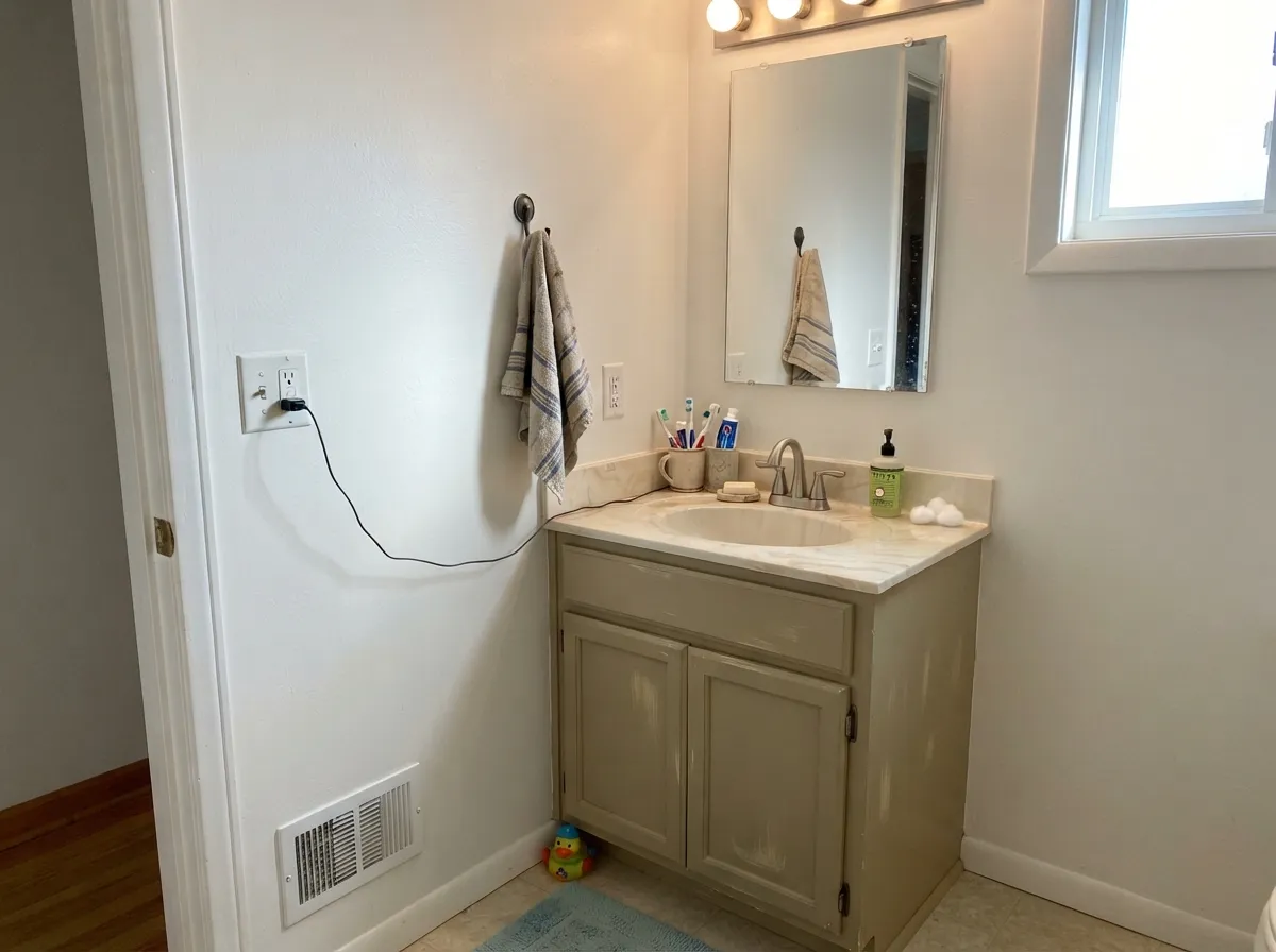
With warm-veined marble, wood vanities, and brass fixtures it is a natural match. Against cool gray tile or blue-white quartz it can look muddy and tan by comparison — sample against your actual counter and tile before painting.
At LRV 66 it reads more like a wall color than a trim white; using it as trim under a lighter wall can look chalky. It is at its best as the wall or cabinet color, framed by a lighter, warmer trim white like Alabaster.
Sherwin-Williams lists it for exterior use and it will read as a pale warm beige on siding, but there is no strong documented before-and-after pattern the way there is for dedicated exterior farmhouse colors. If you want it outside, sample a large board in the actual sun exposure — the same west-sun flash risk applies outdoors, magnified by scale.
Your Light Is the Risk
The khaki-yellow warmth comes through clean and even — this is the light every kitchen-cabinet photo of this color was taken in.
Cool, indirect light strips the yellow and exposes the gray base underneath — readers describe it going flat or faintly lavender. Test on the actual wall first.
Strong late-day sun can flash it pinkish-violet for an hour or two, then it settles back to warm beige as the light fades. Most people don't mind; test if you're pink-sensitive.
2700K warm bulbs deepen the khaki warmth nicely. Cool white LEDs flatten it toward the gray side — swap the bulbs before you blame the paint.
Most complaints about Maison Blanche are a light mismatch. Upload a photo of your actual room and see it on your walls — then ask for the same wall in north light or evening lamps before you buy a single sample.
Need It From Another Brand?
Any paint counter can custom-tint Sherwin-Williams SW 7526 directly. If you would rather stay in one brand's own deck, these are the closest stock matches, measured as ΔE2000. Under 2 is a difference you will not see on the wall.
| Brand | Closest color | ΔE | LRV | |
|---|---|---|---|---|
| Behr | Natural AlmondPPU4-12 · Behr | 1.5 | 65 | Color page → |
| Benjamin Moore | Dulce de LecheCSP-250 · Benjamin Moore | 1.5 | 66 | Color page → |
| Valspar | Vanderbilt BeachV134-1 · Valspar | 0.8 | 64.9 | Color page → |
| PPG / Glidden | Wheat SheafPPG14-21 · PPG / Glidden | 1.5 | 67 | Color page → |
| Glidden | Wheat SheafPPG14-21 · Glidden | 1.3 | 67 | Color page → |
| Dutch Boy | Homespun Beige409-1DB · Dutch Boy | 4.1 | 66 | Color page → |
Similar Sherwin-Williams Colors
The nearest shades to Maison Blanche within Sherwin-Williams's own range, ranked by perceptual color distance — useful when you want the same look a touch lighter, darker, or warmer.
WCAG 2.1: AA is 4.5 : 1 for normal text, 3 : 1 for large text, AAA is 7 : 1.
Maison Blanche vs the Colors You're Also Considering
Every Maison Blanche sample board has the same rivals on it. The numbers show the real lightness gap — then it comes down to which risk you would rather live with.
Pick this when you want visible warmth and depth on the wall, not just a hint of it.
Sherwin-Williams SW 7008 · LRV 82AlabasterPick this if you want a genuine soft white instead of a beige-white — it is the classic warm trim and cabinet partner for this exact color.
Pick this for the quieter, more restrained version of nearly the same depth and undertone.
Sherwin-Williams SW 9109 · LRV 67Natural LinenPick this if you want the same warm base pushed louder — Natural Linen runs hotter, especially in west afternoon sun.
Within Sherwin-Williams, the differences are small enough that they only appear on a wall. Natural Linen SW 9109 shares the LRV of 66 and differs mainly by being a touch less orange. Canvas Tan SW 7531 at LRV 64 is the deeper, sandier option. Patience SW 7555 at LRV 67 and Steamed Chai SW 9509 at LRV 67 read very slightly lighter and creamier.
Across brands there are several matches close enough to treat as the same color. The HGTV Home by Sherwin-Williams line carries Maison Blanche HGSW 3457 at a deltaE of 0. Kompozit and Hirshfield's Mineral Water 0272, Rodda Warm Grey CA091, Valspar Vanderbilt Beach V134-1, Clare Turbinado PNT100-LT-21, and Diamond Vogel Mineral Water 0272 all fall under a deltaE of 1.
Benjamin Moore Dulce de Leche CSP-250 and Behr Natural Almond PPU4-12 both sit at 1.47, visually identical in normal room light. Farrow and Ball Off-White No. 3 at 3.31 is very close but worth sampling, and Dutch Boy Homespun Beige 409-1DB at 4.08 is close but visibly different side by side.
Maison Blanche Coordinating Colors
The rule for coordinating with Maison Blanche: keep trim and ceiling warmer and lighter, not cooler and brighter, and let dark stone or matte-black metal carry the contrast. It flatters warm woods and brass, and it argues with cool gray stone and stark cool whites. These are the partners that keep showing up in kitchens and open-plan rooms that work:
A Quiet Workhorse, Not a Headline Color
Maison Blanche has no Color of the Year title and no famous viral room behind it — and that is worth saying plainly, because most of what gets written about it online reads like marketing copy without checking. What it actually has is a place in Sherwin-Williams' Timeless Beauty collection (part of the HGTV HOME by Sherwin-Williams line) and a long, unglamorous track record as a go-to kitchen cabinet color, the kind of pick a designer reaches for when the brief is "warm, not white, not beige, and definitely not a trend I'll regret."
That honesty is the point of this review: if you came here expecting a dramatic before-and-after story, there isn't one. What there is instead is a dependable warm neutral with two well-documented light traps — cool rooms and hard west sun — that are easy to plan around once you know they exist.
Maison Blanche With Wood Tones and Floors
This color's warm khaki base means it naturally sides with warm wood: oak, walnut, and butcher block all read comfortably against it, and it is one of the more forgiving warm beiges for orange-leaning builder oak, since its own undertone leans the same warm direction rather than fighting it.
The floor that needs a sample first is cool gray LVP or gray-washed wood. Cool flooring pulls the same way north light does — it exposes the gray under the warmth and can make the wall look slightly dingy by contrast. Warm rugs and brass hardware close that gap in most rooms, but test a large sample above the actual floor before committing to the whole space.
Three Ready Palettes Built on Maison Blanche
A color is never alone on the wall. These are complete combinations in the 60-30-10 pattern, with the reason each one holds together. Every one opens in the visualizer.
This is the pairing behind most of the kitchen photos this color shows up in: cabinets a shade deeper than the walls, a near-black island for contrast, and brass or matte-black hardware to finish it. Alabaster keeps the walls from competing with the cabinets.
Try this palette in your roomA warmer trim white keeps Maison Blanche from looking dingy by comparison, which is the single most common pairing mistake with this color. The near-black door supplies the one dark note the palette needs without touching the walls.
Try this palette in your roomWhite Dove, Maison Blanche, and Natural Linen sit on nearly the same warm khaki base at three different depths, so a house layered this way reads as one calm palette getting quietly warmer room to room instead of three unrelated colors.
Try this palette in your roomMaison Blanche FAQ
Is Maison Blanche a white or a beige?
Technically a warm beige-white — Sherwin-Williams describes it as a "warm khaki yellow." At LRV 66 it is too deep to read as a true white next to something like Alabaster (LRV 85), but light enough that most people call it an off-white rather than a beige. It sits in the gap on purpose.
Does Maison Blanche look pink?
It can, briefly — several independent reviews report a pinkish-violet flash in strong, unfiltered west afternoon sun. In normal daylight it reads as warm beige, not pink. If you're sensitive to this, sample the actual west wall between 4 and 6pm before buying gallons.
Is it good for kitchen cabinets?
Yes — this is its strongest use case. It splits the difference between stark white and full beige, which flatters dark stone counters, brass hardware, and warm wood without going heavy. Use a satin or semi-gloss cabinet-rated enamel.
What trim color goes with Maison Blanche walls?
A warm white like Alabaster, not a stark cool white. A bright, cool trim white will make Maison Blanche walls look dingy by comparison — the most common complaint about this pairing.
How does it look in a north-facing room?
Flatter and more muted than the chip suggests — cool, indirect light strips out the yellow warmth and leaves the underlying gray more visible. It is not a bad color for a north room, but expect it to read quieter and cooler than it does in a sunny south-facing space. Sample first.
Can I use Maison Blanche outside?
Sherwin-Williams lists it for exterior use, and it will read as a soft warm beige on siding, but there isn't a strong documented track record for it outdoors the way there is for dedicated exterior colors. If you're considering it for a facade, paint a large test board and view it in your actual sun exposure before committing to the full house.
Have you painted with Maison Blanche?
Rate it — one tap helps the next reader decide.
Ask a Question