Universal Khaki
The exterior workhorse everyone's roofer or realtor has recommended at least once, reviewed honestly: the light it needs, the shade that turns it green, and what to pick instead.

Jessica has spec'd whites and neutrals for more than 300 rooms and keeps a sample wall of painted drawdowns in her studio. Every color review is checked against real reader rooms in the comments and re-tested when a formula changes. About the testing process →
- 1Anonymous20
- 2Felted Wool28
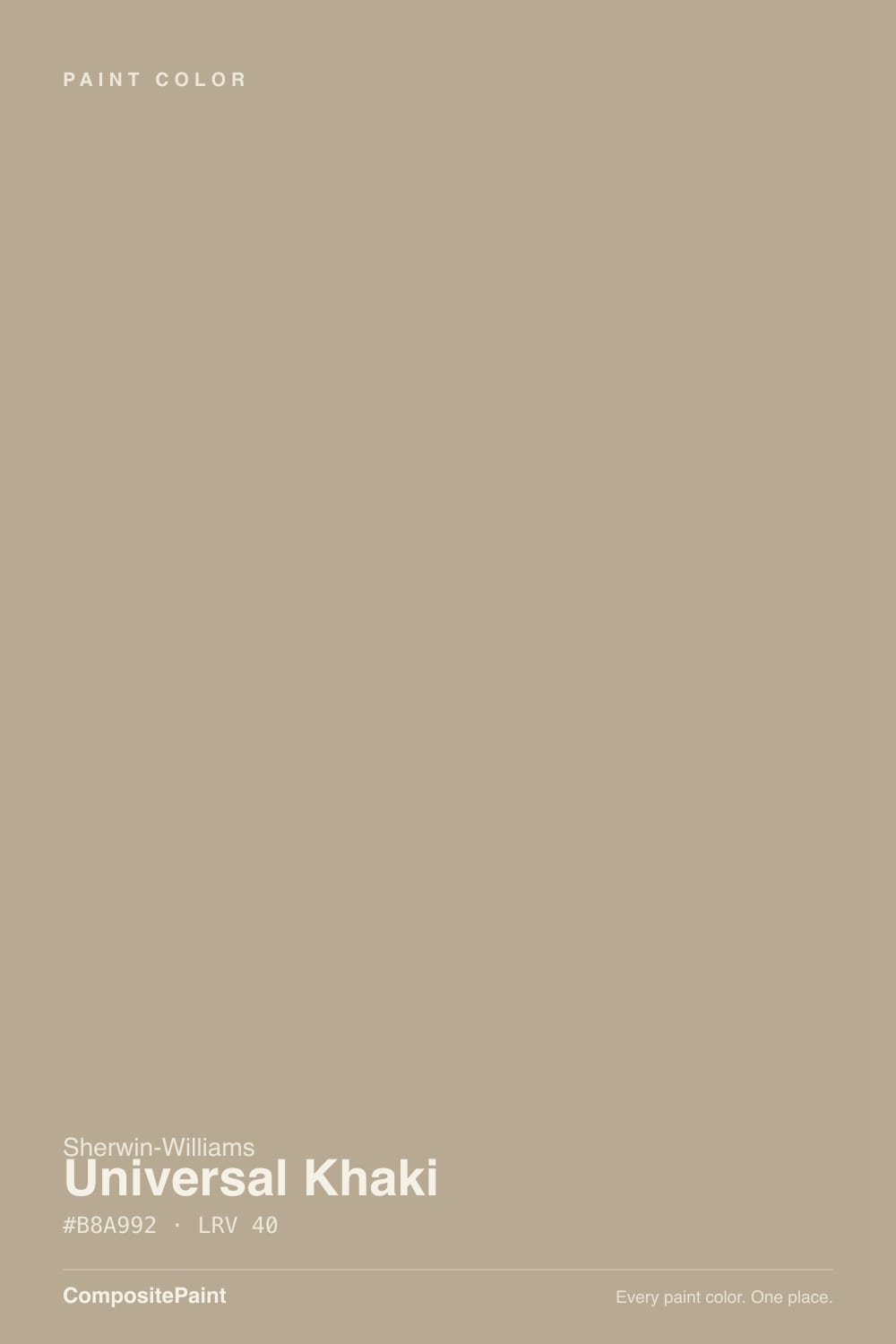
- 3Universal Khaki40
- 4Agreeable Gray60
- 5Pale Oak69
The Fast Verdict
Universal Khaki is the color contractors reach for when a homeowner says "something tan, something that won't look dated in ten years." It is not a designer darling and it never had a Color of the Year moment — it is a working neutral, a warm khaki-taupe that sits between beige and gray-green and holds its color on a full elevation in direct sun. Give it real light and stone or brick nearby and it looks expensive and calm. Put it in shade and the olive undercurrent takes over and it stops looking khaki at all.
Craftsman, ranch, and farmhouse exteriors · homes with stone or brick accents · full-sun elevations · anyone who wants tan without going full beige
You want a color that reads the same in sun and shade · your exterior stays mostly shaded or north-facing · you're pairing with cool gray stone or slate · you're painting a small, dim interior room and expected it light
- Holds true khaki-tan color on a full exterior wall in direct sun
- Flatters brick, stone, and warm wood without a fight
- Deep enough (LRV 40) to hide dirt and years of weather on siding
- Reads as tan without the sweetness of a straight beige
- A dependable, unfussy choice — not trend-dated, never was trend-chasing
- Turns visibly gray-green in shade or on a north-facing wall
- Deeper and more colorful on a whole wall than the chip suggests
- Argues with cool gray stone, slate, or stark-white modern facades
- Too dark and olive for a small, dim interior room used on all four walls
What Color Is Universal Khaki, Really?
A warm khaki-taupe at LRV 40, and the name is not marketing — it really does sit in the middle ground where tan and gray-green meet. Sherwin-Williams built it as a general-purpose neutral, and it earned that job: it is one of the brand's most recommended exterior body colors for craftsman bungalows, ranch houses, and farmhouse remodels, because it reads as "tan" without the sweetness of a true beige and "neutral" without the coolness of a pure gray. It has never been a Color of the Year and has no viral-room moment attached to it — it is a quiet workhorse, and it has earned that reputation the boring way, one exterior job at a time.
The defining trait is the olive undercurrent underneath the tan. In strong, direct sun the khaki wins and the wall reads warm and sandy. In shade, overcast light, or on a north-facing elevation, the green-gray base comes forward and the same paint reads more like a muted sage-gray than a khaki. At LRV 40 it is a genuine mid-depth color — deep enough to hide dirt and hold its saturation on a big wall, which is exactly why it works as exterior siding, but also why it looks noticeably darker and more colorful on a whole house than it does on a 2-inch chip. Plan for that jump before you order five gallons.
Undertone in one line: warm khaki-tan over an olive-green base — never pink, and only reads gray-neutral when the light itself goes flat and cool. If your sample looks straightforwardly gray, that is the shade talking, not a different can of paint.
Where It Shines
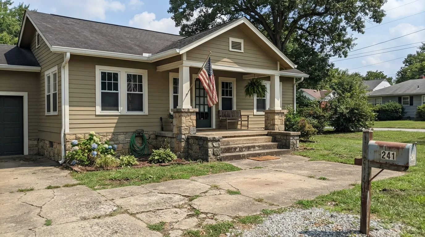
Full sun is where this color does its actual job. On a craftsman or ranch exterior with real daylight hitting the wall all day, Universal Khaki settles into a warm, sandy tan that flatters stone foundations, brick chimneys, and cedar-toned garage doors without competing with any of them. It is a color built to be seen from the street, not up close on an accent wall, and that is exactly where it earns its keep — most of the good reviews are exterior jobs, not interior ones.
Where It Fails
Almost every disappointed review of Universal Khaki traces back to one of three situations, and all three are predictable before the first coat goes on. None of them are the paint's fault — but if your project matches one, this is not your color, and a bigger sample will only confirm the problem, not fix it.
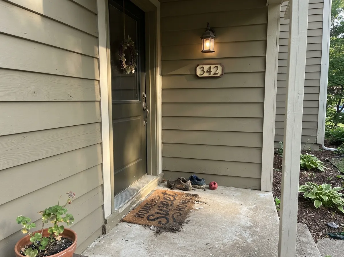
Take the tan out of direct sun and the olive-green base underneath takes over. Owners who fell in love with the color on a sunny side of the house are often startled by how gray-green the same paint reads on the shaded side. It is one paint doing two honest jobs in two different lights — walk the whole house with a sample board before committing, not just the sunniest wall.
Universal Khaki's warmth wants warm partners — brick, tan stone, wood, cream trim. Set it against cool blue-gray stone or a crisp white-and-black modern build and the khaki starts to look muddy and out of place rather than earthy. If your fixed materials are cool-toned, a true greige like Perfect Greige reads calmer next to them.
This color was built to cover a whole exterior in bright light, and at LRV 40 it is genuinely mid-depth — deeper than most people expect from a word like "khaki." Painted on all four walls of a small room with limited daylight, it can feel heavy and olive rather than warm. It works far better indoors in doses — an island, a den, a home office — than as a whole-room wall color in a dim space.
Room by Room
This is what the color was built for. Flat or satin exterior finish, real daylight, and it settles into a warm, dependable khaki that holds up over years without chalking obviously. The single most common — and most successful — use of this color.
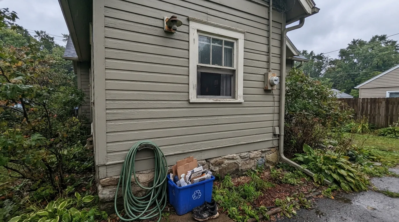
The same paint, no direct sun, reads noticeably greener and cooler. Not a defect, just a different light doing a different thing to the same undertone. Sample both the sunny and shaded sides of the house before ordering.
Red brick, tan stone, and fieldstone all sit comfortably next to Universal Khaki because its warmth meets theirs halfway. This is the pairing that shows up in nearly every successful project photo.
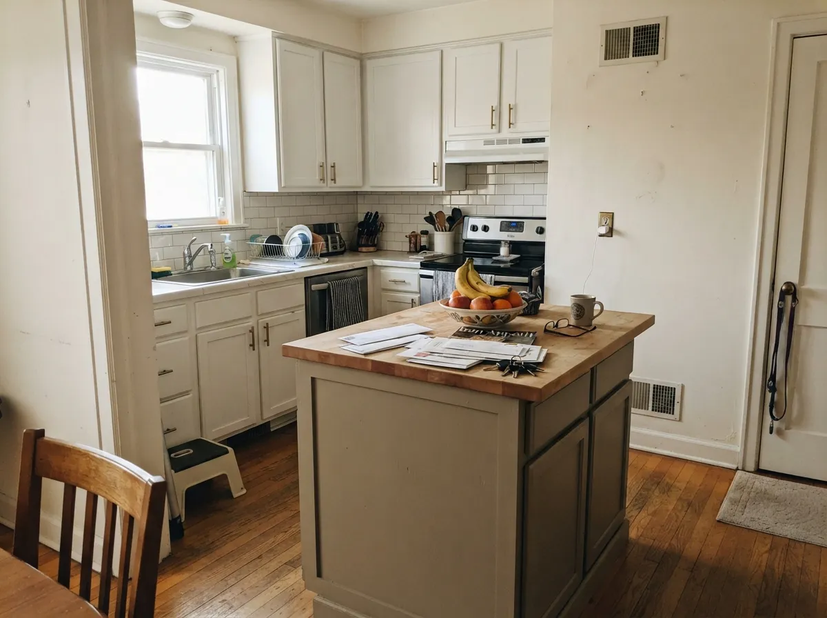
In satin cabinet enamel, an island or set of lower cabinets in this khaki reads warm and grounded under white or cream upper cabinets and walls. Keep the surrounding walls light so the depth has somewhere to land.
A moody, masculine choice for a small study with a window that gets actual sun. In a north-facing or windowless room, skip it — the olive base needs light to read as khaki rather than as a dull green-brown.
This is not a whole-house interior neutral the way Agreeable Gray or White Dove is. It is deep, warm, and light-dependent — better as an exterior body color or a single interior surface than as walls-and-trim throughout a house.
Your Light Is the Risk
Full daylight brings the tan forward and settles the color into a warm, sandy khaki. This is the light the color is made for.
No direct sun lets the olive-green base take over; the same paint reads more sage-gray than khaki. Sample the shaded side separately.
East walls warm up fast and fade toward neutral by afternoon; west walls stay cool most of the day, then flush warm and golden at sunset.
2700K warm bulbs pull the tan forward on an island or den wall. Cool LEDs push it toward flat olive-gray — swap the bulb before you swap the paint.
Most complaints about Universal Khaki are a light mismatch. Upload a photo of your actual room and see it on your walls — then ask for the same wall in north light or evening lamps before you buy a single sample.
Need It From Another Brand?
Any paint counter can custom-tint Sherwin-Williams SW 6150 directly. If you would rather stay in one brand's own deck, these are the closest stock matches, measured as ΔE2000. Under 2 is a difference you will not see on the wall.
| Brand | Closest color | ΔE | LRV | |
|---|---|---|---|---|
| Behr | Canyon OuvertN300-4 · Behr | 1.3 | 41 | Color page → |
| Benjamin Moore | PensiveAF-140 · Benjamin Moore | 2.5 | 42 | Color page → |
| Valspar | Earthy BeigeM351 · Valspar | 1.0 | 40.1 | Color page → |
| PPG / Glidden | Prairie DustPPG1102-4 · PPG / Glidden | 1.2 | 41 | Color page → |
| Glidden | Prairie DustPPG1102-4 · Glidden | 2.1 | 41 | Color page → |
| Dutch Boy | Khaki-ed419-4DB · Dutch Boy | 0.0 | 40 | Color page → |
Similar Sherwin-Williams Colors
The nearest shades to Universal Khaki within Sherwin-Williams's own range, ranked by perceptual color distance — useful when you want the same look a touch lighter, darker, or warmer.
WCAG 2.1: AA is 4.5 : 1 for normal text, 3 : 1 for large text, AAA is 7 : 1.
Universal Khaki vs the Colors You're Also Considering
Every Universal Khaki sample board has the same rivals on it. The numbers show the real lightness gap — then it comes down to which risk you would rather live with.
Pick this for genuine tan warmth and a color built to hold up on a full exterior wall.
Sherwin-Williams SW 7030 · LRV 47Anew GrayPick this if you want a true warm gray-taupe instead of khaki — lighter, with its own light-dependent streak.
Pick this when the job is exterior siding and you need real depth and coverage in full sun.
Sherwin-Williams SW 7043 · LRV 57Worldly GrayPick this for a lighter, softer interior greige that still needs decent light to look its best.
Portico SW 7548, at #BBAB95 and LRV 42, is a slightly lighter and marginally cooler version, useful when a room needs a little more light back. Sleepy Owlet SW 9513, at #B5A78D and LRV 39, is a shade deeper with more yellow-green in it. Smoky Beige SW 9087, at #B9A796 and LRV 40, matches the depth but leans pinker. Svelte Sage SW 6164, at #B2AC96 and LRV 41, is clearly greener and reads as a sage-tan. Sand Trap SW 6066, at #BBA595 and LRV 40, is the rosiest of the group.
Across brands, Dutch Boy Khaki-ed 419-4DB and HGTV Home by Sherwin-Williams Universal Khaki HGSW 3185 carry the identical hex. Valspar Earthy Beige M351 and PPG Prairie Dust PPG1102-4 are visually identical in normal room light. Behr British Khaki MQ2-25 and Benjamin Moore Pensive AF-140 are very close, so sample first. Farrow and Ball Smoked Trout No. 60 at LRV 41 is close but visibly different side by side.
Universal Khaki Coordinating Colors
The rule for coordinating with Universal Khaki: stay warm, stay earthy, and give it real light. It pairs naturally with warm whites, deep near-blacks, and brick or stone tones, and it argues with anything stark-cool. These are the partners that keep showing up in projects that work:
Universal Khaki on Exteriors
This is the color's actual job, and where nearly every strong review comes from. On craftsman bungalows, ranch houses, and farmhouse remodels, Universal Khaki delivers exactly what its name promises: a tan that isn't sweet, a neutral that isn't cold, and enough depth at LRV 40 to hold its color through years of weather without looking washed out or dated.
The result depends entirely on exposure. The sunny side of the house reads warm and sandy; the shaded or north side of the same house reads noticeably cooler and greener — the identical paint doing two different jobs in two different lights. This is not a flaw unique to this color, but it is more pronounced here than in a straightforward beige, because of the olive undercurrent underneath the tan. Walk the whole exterior with a large sample board, in the morning and again in the afternoon, before ordering.
Universal Khaki With Stone, Brick, and Wood
This is where the color earns its reputation. Tan or gray-brown fieldstone foundations, red or tan brick, and cedar-toned garage doors all sit comfortably next to Universal Khaki because its warmth meets theirs halfway — it is one of the more forgiving body colors for a house that already has one or two fixed warm materials on it.
The one material that argues with it is cool gray stone or slate. Blue-gray masonry pulls the khaki toward muddy rather than earthy, and the two fight instead of settling. If your foundation or accent stone runs cool, a true greige with less olive in it — Perfect Greige is the closer match — will sit more calmly next to it than Universal Khaki will.
Three Ready Palettes Built on Universal Khaki
A color is never alone on the wall. These are complete combinations in the 60-30-10 pattern, with the reason each one holds together. Every one opens in the visualizer.
Warm khaki siding with a soft white trim is the classic craftsman formula, and it needs real contrast at the door — Wrought Iron supplies one dark, near-black note without going flat modern-black.
Try this palette in your roomWhite Dove keeps the room bright enough for the khaki island to read warm rather than heavy; the charcoal hood adds one deep note so the kitchen doesn't flatten into two neutrals.
Try this palette in your roomRed or tan brick already carries warmth, so the khaki body settles rather than competes; a warm trim white keeps the porch bright, and the navy door is the one confident color note the scheme needs.
Try this palette in your roomUniversal Khaki FAQ
Is Universal Khaki more tan or more gray?
Both, depending on the light. In direct sun it reads as a warm, sandy khaki-tan. In shade or on a north-facing wall the olive-green base takes over and it reads closer to a muted gray-green. It is not a color that looks the same all day — sample both the sunny and shaded sides of your house before ordering.
Does it look green?
It can, and that surprises people who bought it expecting a straightforward tan. The green comes from an olive undercurrent that only shows up when direct sun is absent — overcast days, shaded elevations, north walls. In full sun it stays khaki. This is the single most common complaint about the color, and it is a light problem, not a defect.
What trim color goes with a Universal Khaki exterior?
A warm white — Alabaster or Sherwin-Williams's own Pure White both work — softens the transition without fighting the khaki's warmth. A stark cool white or bright builder white can make the body color look dingy by comparison. Semi-gloss on the trim, flat or satin on the body.
Does it work with red brick?
Yes, it is one of the more forgiving neutrals for brick because it shares the warm side of the color wheel. It also gets along with tan and fieldstone. It is cool gray stone or slate that fights it, not brick.
Can I use it indoors?
In doses — a kitchen island, a den with real daylight, a front door — yes. As a whole-room wall color in a small or dim interior it can feel heavy and olive rather than warm, because it was built and proven as an exterior body color, not a light-filled living-room neutral.
Why does it look darker on the house than on the chip?
At LRV 40 it is a genuine mid-depth color, and depth compounds on a large surface — the same effect that makes any mid-tone paint look more saturated on a whole wall than on a small sample. Order a large sample board and view it outdoors at different times of day before committing to five gallons.
Have you painted with Universal Khaki?
Rate it — one tap helps the next reader decide.
Ask a Question