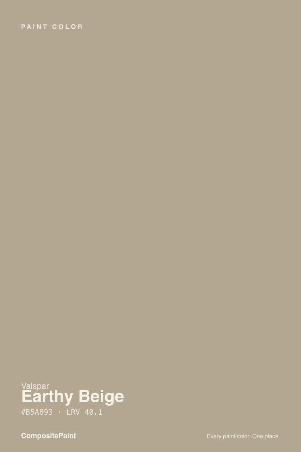
Earthy Beige
The warm greige-beige with almost no paper trail online, reviewed on its own data: where it earns its keep, the light that flattens it, and the more famous colors it quietly stands in for.

Jessica has spec'd whites and neutrals for more than 300 rooms and keeps a sample wall of painted drawdowns in her studio. Every color review is checked against real reader rooms in the comments and re-tested when a formula changes. About the testing process →
- 1Anonymous20
- 2Felted Wool28
- 3Earthy Beige40.1
- 4Agreeable Gray60
- 5Pale Oak69
The Fast Verdict
Earthy Beige is the color a paint counter hands you when you say "warm greige, not too tan, not too gray" and don't have a specific chip in mind. It is a genuinely useful mid-depth neutral — warm without tipping orange, muted without going flat gray — and it happens to be nearly interchangeable with two colors people fight over online, Sherwin-Williams Universal Khaki and Perfect Greige. It just carries none of their name recognition, because it lives on Valspar's independent-dealer shelf, not in a design blog.
Living rooms and open-plan main floors that want warm, not gray · kitchens with wood cabinets or butcher block · anyone who wants the Universal Khaki look without hunting a specific SW code · whole-house neutrals that need to work in more than one room
You want a true pale beige — LRV 40 is a real mid-tone, not a light neutral · the room is small, north-facing and lamp-free · you need a documented, famous color for a client who wants provenance · you're trying to match an existing warm-yellow builder beige exactly
- Genuinely balanced warm-gray undertone — avoids both the "too tan" and "too gray" complaints
- Reads consistently near-identical to pricier, better-known greiges (Universal Khaki, Perfect Greige)
- Sold through independent dealers and Ace Hardware, not locked to one big-box retailer
- Mid-depth LRV holds its color without going murky in ordinary daylight
- Genuinely flexible — works in main living spaces, kitchens and bedrooms alike
- Almost no independent reviews, forum threads or design-press coverage to check your expectations against
- LRV 40.1 reads deeper and more present on the wall than "beige" suggests from the chip
- Goes flat and muddy in cool, dim, north-facing rooms — same as every greige at this depth
- Clashes visibly with older yellow-warm builder beige if the two sit side by side
What Color Is Earthy Beige, Really?
A warm, muted greige-beige — the color-science numbers back up what the eye sees. Its hue angle sits at roughly 87 degrees (solidly in beige-tan territory, not yellow and not pink) and its chroma is low, around 11 on a 0-100 scale, which is why it never reads as a saturated "beige" the way a builder-grade tan does. It is quiet by design: enough warmth to keep a room from feeling cold, enough gray to keep it from feeling dated.
It also sits in an unusual spot in Valspar's lineup. The SKU format — M351, not a Lowe's-style numeric-dash code — puts it in Valspar's independent-retailer and dealer colors, the ones sold through Ace Hardware and small paint stores rather than exclusively through Lowe's big-box mixing counter. That distribution explains the near-total silence around it: no design-blog features, no Color of the Year run, no Houzz thread with a hundred replies. This review is built from the color's own numbers and its closest, well-documented relatives, and says so plainly rather than inventing a backstory it doesn't have.
Undertone in one line: warm beige leaning gray, never pink, never green. At LRV 40.1 it reflects a bit less than half the light that hits it — a genuine mid-tone, not a pale neutral, so it will read more present on a wall than the number "beige" implies to most people.
Where It Shines
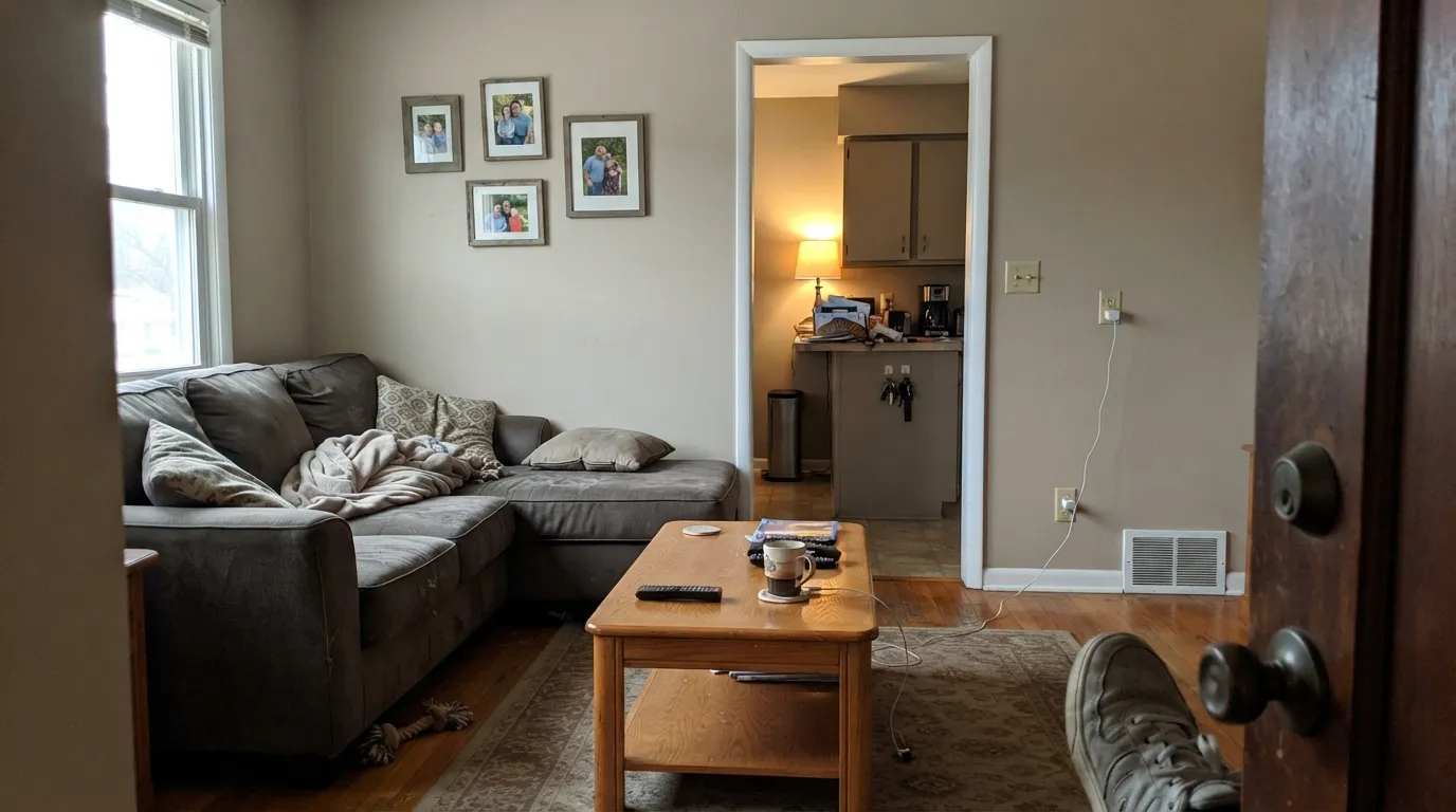
It does its best work as the neutral nobody has to think about twice: a main-floor wall color that sits comfortably behind wood furniture, warm metals and everyday clutter without competing for attention. Because the undertone is genuinely balanced — warm enough to avoid the cold-gray complaint, muted enough to avoid the orange-tan complaint — it survives daylight, lamp light and mixed rooms better than most true beiges or true grays manage on their own.
Where It Fails
There is no viral complaint thread for this color, so the failure modes below come from how every warm greige at this depth and undertone behaves, cross-checked against its closest documented relatives (Universal Khaki, Perfect Greige, Smoked Tan). None of them are exotic — they are the same three things that trip up every mid-tone greige-beige.
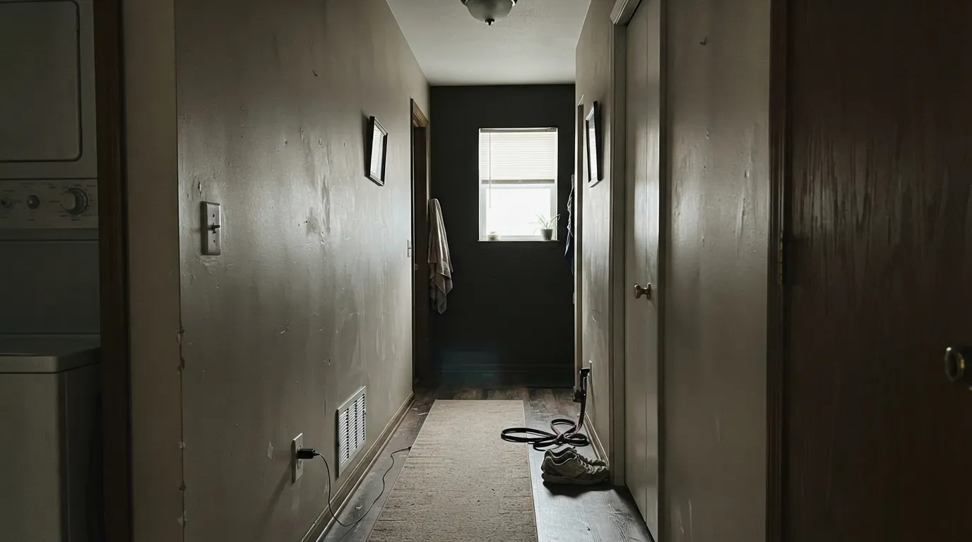
Cool daylight and cool LEDs pull the warmth out of any greige at this chroma level, leaving a flat, slightly muddy gray-tan. This is the single most common greige complaint across every brand's version of this color, and Earthy Beige has no special immunity to it. Add a warm 2700K lamp or two before you decide the color is wrong.
LRV 40.1 is a genuine mid-tone — roughly the same depth as Sherwin-Williams Universal Khaki and Perfect Greige, both of which people also mistake for a paler color on the chip. On four walls it reads more solid and more present than a small paint chip suggests. If you want the light, barely-there beige feeling, this is a full step too deep; look at something closer to LRV 65-70.
Earthy Beige's undertone is grayed-down beige, not the straight yellow-tan of a lot of 2000s-era builder paint. Put it directly next to that older color — say, touching up one wall — and the mismatch is obvious: the older beige looks more orange, Earthy Beige looks more gray. Repaint the whole room rather than patching next to legacy trim color.
Room by Room
A calm, warm backdrop for wood furniture, brass and everyday life. Eggshell finish; it holds up next to both warm and cool-toned upholstery without arguing with either.
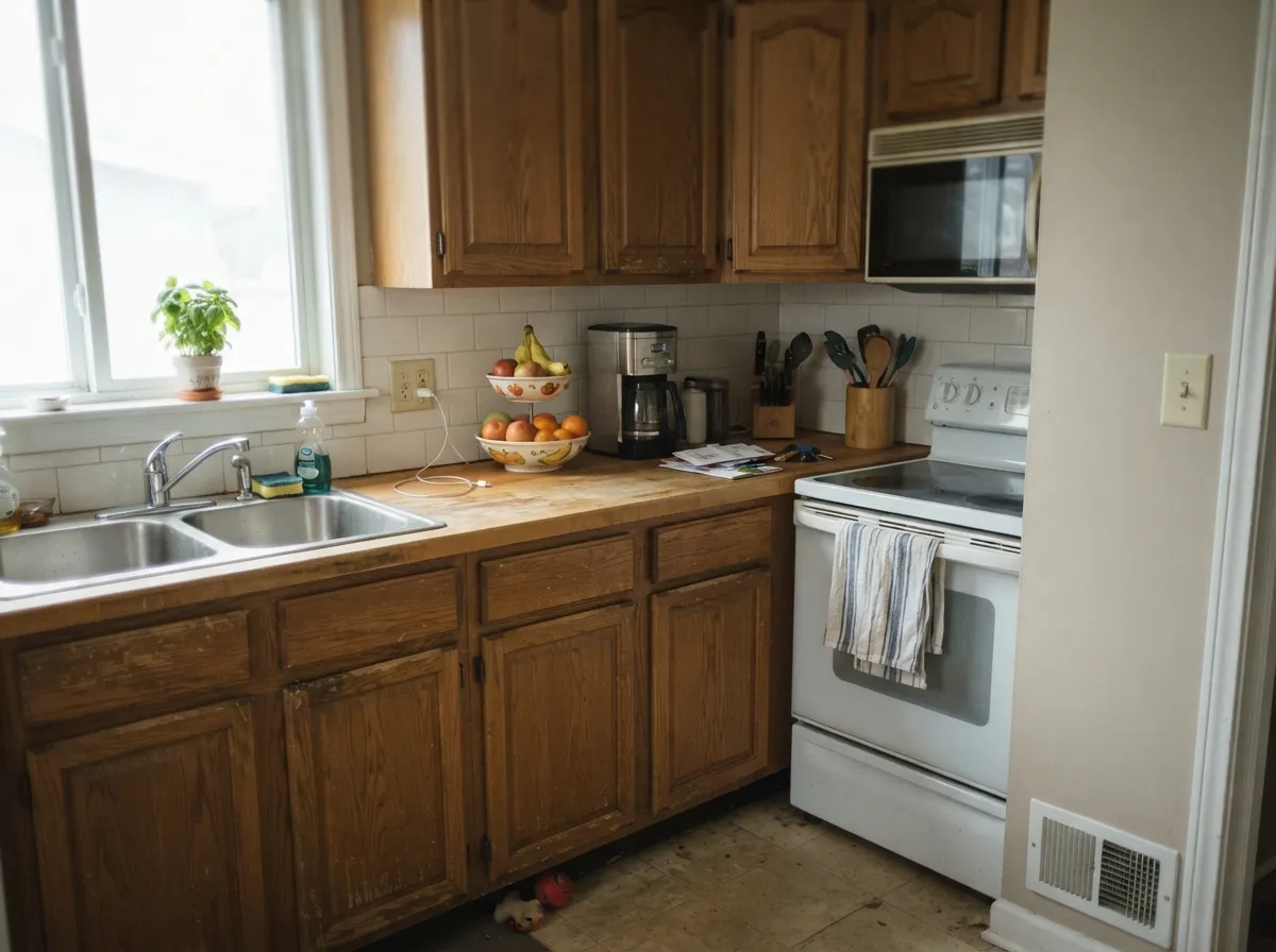
Reads well against wood cabinetry and butcher block, and quiet enough behind white uppers that it won't fight the room. On an island, satin cabinet paint; it will not compete with brass or black hardware.
The warm-but-muted undertone suits a room lit mostly by a chandelier or sconces rather than harsh overhead light. Pairs comfortably with a walnut or oak table.
A restful mid-tone neutral rather than a mood color. Keep bulbs at 2700K; on cool LEDs it can read closer to plain gray than the warm greige it actually is.
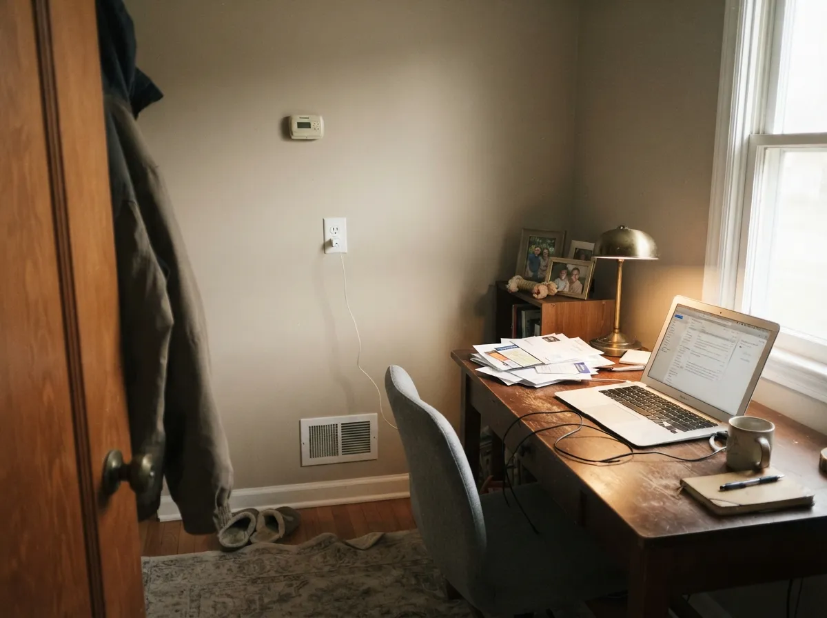
Enough color to feel deliberate, not so much that it's distracting on a video call. Works well as the one-color wall-and-trim room the templates above describe for other neutrals.
A dependable whole-house connector color. In a windowless interior hallway with only overhead cans, it needs warm-temperature bulbs to avoid going flat — see the fails section above.
Your Light Is the Risk
Direct warm sun brings the beige forward and keeps the gray from taking over. The most flattering, most honest reading of the color.
Cool, flat daylight drains the warmth and leaves a muddier gray-tan. Same failure every greige at this chroma has — test before committing a whole room.
Warmer and more beige at the sun-facing hours, quieter and grayer the rest of the day. A normal, moderate shift for a color this muted.
2700K bulbs keep it reading warm and gray-beige after dark. Cool white LEDs push it toward plain gray — swap the bulbs before you swap the paint.
Most complaints about Earthy Beige are a light mismatch. Upload a photo of your actual room and see it on your walls — then ask for the same wall in north light or evening lamps before you buy a single sample.
Need It From Another Brand?
Any paint counter can custom-tint Valspar M351 directly. If you would rather stay in one brand's own deck, these are the closest stock matches, measured as ΔE2000. Under 2 is a difference you will not see on the wall.
| Brand | Closest color | ΔE | LRV | |
|---|---|---|---|---|
| Sherwin-Williams | Universal KhakiSW 6150 · Sherwin-Williams | 1.0 | 40 | Color page → |
| Behr | Safari ChicMQ2-20 · Behr | 1.7 | 40 | Color page → |
| Benjamin Moore | CotswoldAF-150 · Benjamin Moore | 2.4 | 39 | Color page → |
| PPG / Glidden | El CapitanPPG1020-4 · PPG / Glidden | 3.1 | 39 | Color page → |
| Glidden | Palm Springs Tan20YY 39/130 · Glidden | 2.0 | 39 | Color page → |
| Dutch Boy | Khaki-ed419-4DB · Dutch Boy | 1.0 | 40 | Color page → |
Similar Valspar Colors
The nearest shades to Earthy Beige within Valspar's own range, ranked by perceptual color distance — useful when you want the same look a touch lighter, darker, or warmer.
WCAG 2.1: AA is 4.5 : 1 for normal text, 3 : 1 for large text, AAA is 7 : 1.
Earthy Beige vs the Colors You're Also Considering
Every Earthy Beige sample board has the same rivals on it. The numbers show the real lightness gap — then it comes down to which risk you would rather live with.
Pick this for the same warm-greige tone without chasing a specific SW code — and it stays neutral rather than green.
Sherwin-Williams SW 6150 · LRV 40Universal KhakiPick this if your painter only stocks Sherwin-Williams — nearly the same tan-greige at the same LRV, though our review flags it turning green in shade.
Pick this for a lighter, more beige-leaning read at nearly the same depth.
Sherwin-Williams SW 6073 · LRV 42Perfect GreigePick this for the original, deeper and slightly warmer greige the whole trend is built on.
Earthy Beige Coordinating Colors
The rule for coordinating with Earthy Beige is the same as with any balanced warm greige: warm whites stop it from looking dingy, true darks give it one strong anchor, and its own close relatives layer well when you want depth without contrast. These are the partners that make the most sense with it:
Why This Color Has No Story
Most colors in this deck arrive with a history: a Color of the Year run, a design-blog feature, a viral TV-show room. Earthy Beige has none of that, and it is worth being honest about why. Its SKU, M351, belongs to Valspar's independent-retailer and dealer color pages rather than the numbered Lowe's-exclusive line — it is sold through Ace Hardware and small local paint stores, the kind of retail channel that rarely gets covered by national design press or racks up a Houzz thread.
That does not make it a worse color. Its numbers — a warm hue angle near 87 degrees, low chroma around 11, LRV just above 40 — put it in the same well-tested neighborhood as Universal Khaki and Perfect Greige, colors that are genuinely popular precisely because that balance works. Earthy Beige is best understood as the version of that balance you can walk into a neighborhood hardware store and ask for by name, sample first, and decide for yourself — because almost nobody else has written the review for you.
Earthy Beige With Wood Tones and Floors
Its muted, grayed-down warmth is genuinely forgiving of wood. Oak, walnut and butcher block all sit comfortably against it because the paint doesn't compete with the wood's own undertone the way a stronger yellow-beige or a colder gray would. It is particularly useful over honey-toned oak floors that a true gray would fight and a bright tan would amplify — Earthy Beige splits the difference.
The floor combination that needs a real sample first is very pale, whitewashed or gray-washed wood. Against a light cool floor, the beige side of Earthy Beige becomes more noticeable, and some readers may find that contrast reads more "tan wall, gray floor" than intended. A cream or warm-toned area rug closes that gap in most rooms.
Three Ready Palettes Built on Earthy Beige
A color is never alone on the wall. These are complete combinations in the 60-30-10 pattern, with the reason each one holds together. Every one opens in the visualizer.
A one-brand palette that keeps the mixing simple: Dove White trim stops the greige from reading dingy, and one true-black accent gives the room the single dark note it needs without a second neutral to negotiate with.
Try this palette in your roomWhite cabinets keep the kitchen bright, the navy island supplies contrast and a focal point, and Earthy Beige on the surrounding walls ties both back to the warm wood tones most kitchens already have.
Try this palette in your roomTwo close cousins in the same greige family, layered instead of contrasted, keep the room restful rather than themed. Dove White trim separates them cleanly so the accent wall reads as a choice, not a mismatch.
Try this palette in your roomEarthy Beige FAQ
Is Valspar Earthy Beige warm or cool?
Warm, but muted — a low-saturation warm greige-beige rather than a straight tan. It leans gray more than a builder beige and warmer than a true gray. It never tests pink or green; if your sample looks off, check the light before blaming the paint.
Where can I actually buy Valspar Earthy Beige?
It is listed on Valspar's independent-retailer color pages rather than exclusively at Lowe's, so look for it at Ace Hardware or a local independent paint dealer that carries Valspar. Confirm the exact code, M351, when you order — Valspar runs several overlapping color lines.
How does it compare to Sherwin-Williams Universal Khaki?
Very close on paper — nearly the same hex and the same LRV around 40 — which makes it a reasonable substitute if your painter or store only carries one brand. The one documented difference: our review of Universal Khaki notes it can shift green in shaded light, a trait Earthy Beige's numbers don't show.
Is LRV 40.1 light or dark?
Mid-tone. It reflects a little under half the light that hits it, which reads as a real, present color on the wall rather than a pale, barely-there neutral. Expect it to look deeper in a room than a small chip suggests.
Will it work in a room with little natural light?
Only with warm 2700K bulbs doing real work. Like every muted warm greige, cool or dim light drains its warmth and leaves a flatter gray-tan. If the room stays dark all day and you won't add lamps, pick something with a higher LRV instead.
How many coats does it need?
Two coats over most existing light-to-mid colors is standard for a mid-depth neutral like this. Going over a bold or dark existing wall, use a tinted primer first to avoid a third finish coat.
Have you painted with Earthy Beige?
Rate it — one tap helps the next reader decide.
Ask a Question