Perfect Greige
The color that made "greige" a household word, reviewed honestly: how much deeper it really is than its lighter cousins, the light that flattens it, and what to pick instead.

Jessica has spec'd whites and neutrals for more than 300 rooms and keeps a sample wall of painted drawdowns in her studio. Every color review is checked against real reader rooms in the comments and re-tested when a formula changes. About the testing process →
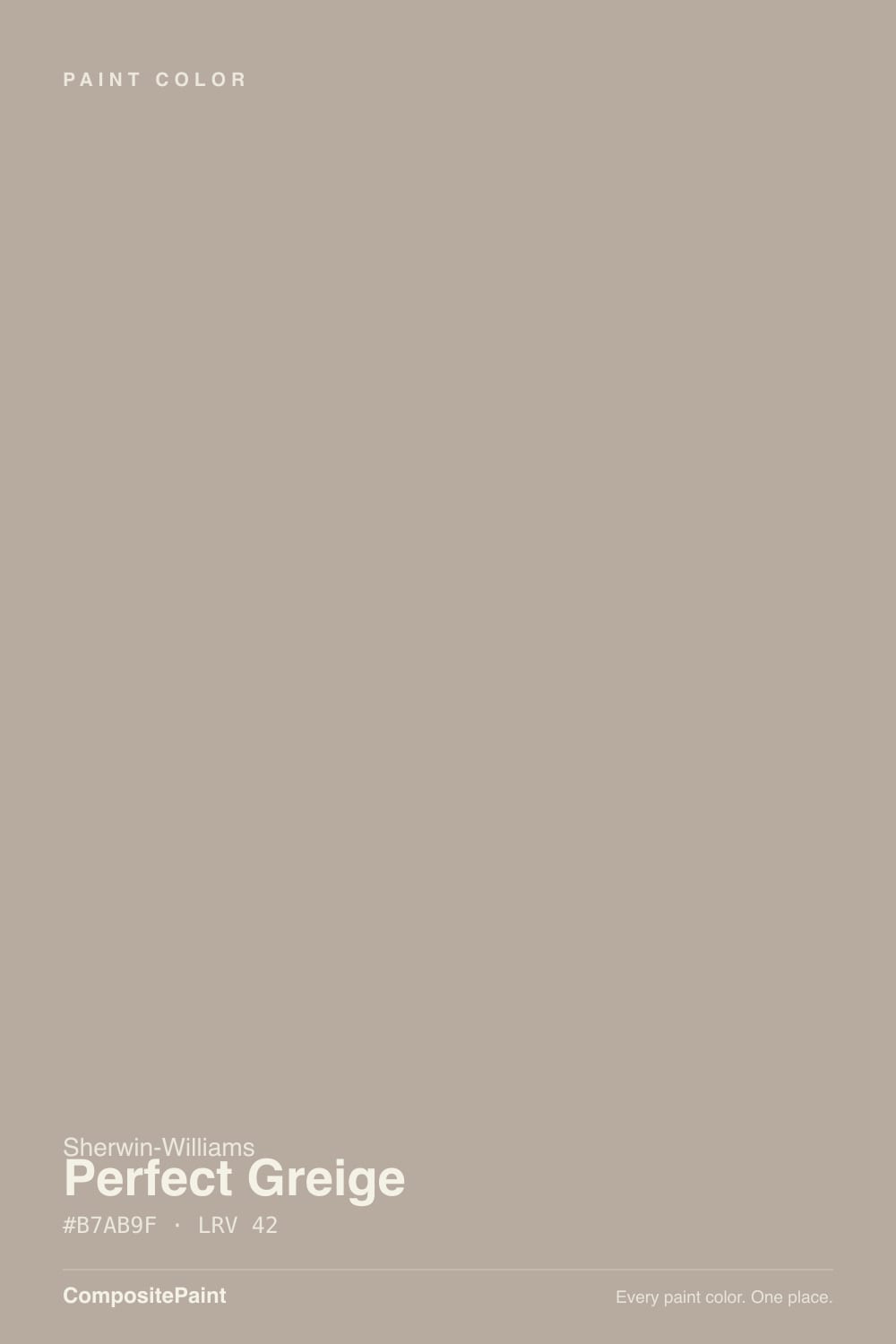
- 1Anonymous20
- 2Fawn Brindle36
- 3Perfect Greige42
- 4Agreeable Gray60
- 5Pale Oak69
The Fast Verdict
Perfect Greige is the color the whole "greige" trend gets named after — a genuine, unhedged 50/50 blend of warm beige and cool gray, built deep enough (LRV 42) to actually read as a color instead of a whisper of one. It was everywhere in builder spec homes for most of a decade, and it earned that ubiquity: with real daylight, warm wood, and one dark accent it still looks deliberate, not dated. Buy it knowing it is markedly darker than the "safe" greiges search engines keep lumping it in with.
Open floor plans that want real depth · exteriors that need to read as a color from the street · warm oak and walnut floors · anyone who tried Agreeable Gray or Repose Gray and found them too pale
You want a light, breezy neutral · your room is small, north-facing, and lamp-free · you're specifically avoiding a 2010s builder-spec look · your fixed finishes are cool gray
- A genuinely warm, balanced greige — the name is not marketing
- Deep enough (LRV 42) to read as a real color, not a washed-out gray
- One of the most-used exterior siding greiges in the Sherwin-Williams deck
- Flatters oak, walnut, and brass without going green or pink
- A decade-proven color, not a trend guess
- Noticeably darker than the "safe" greiges it's often lumped in with
- Goes flat and slightly mauve-grey under cool artificial light
- Reads dated builder-spec to buyers chasing a fresher look
- Too much commitment for small, dim rooms without real daylight
What Color Is Perfect Greige, Really?
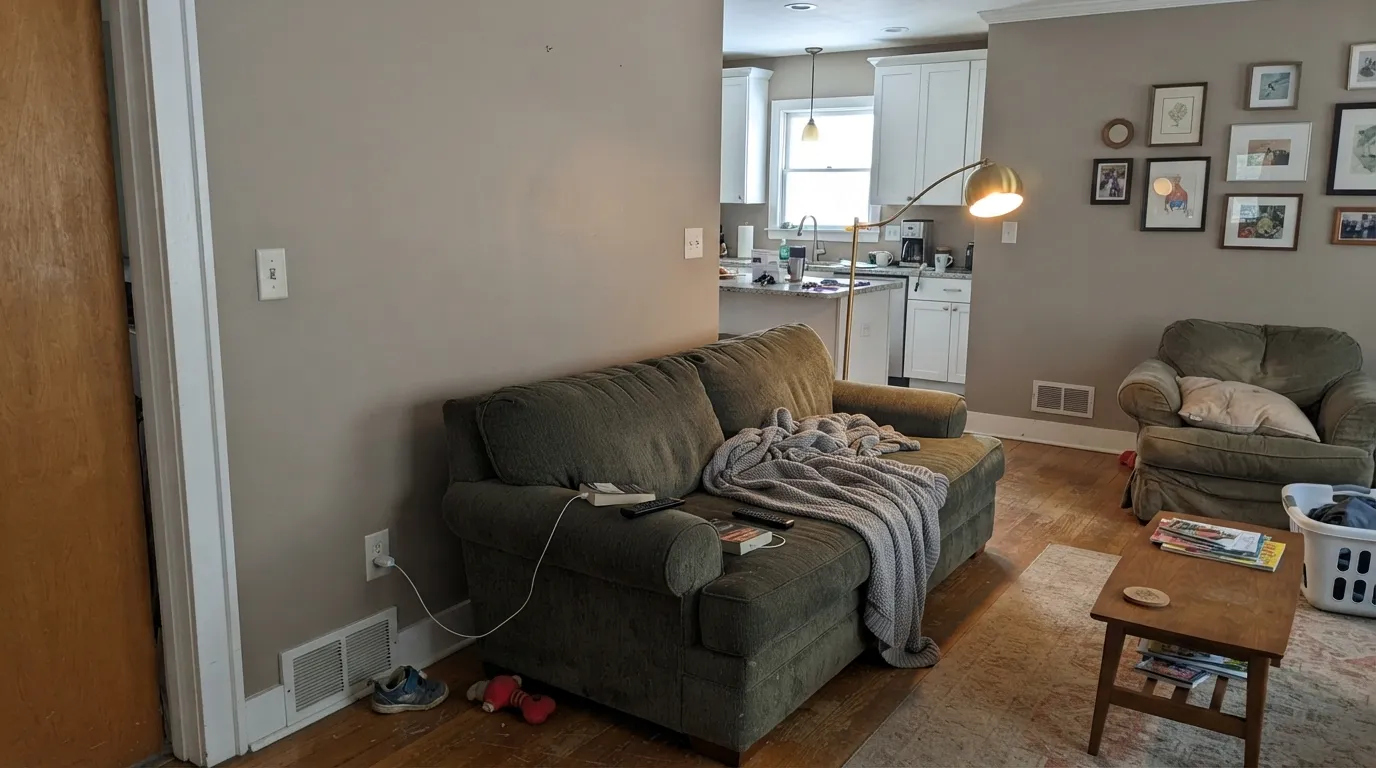
Perfect Greige is exactly what the name promises: a genuine 50/50 blend of warm beige and cool gray, with neither side winning. It launched into the middle of the 2010s greige boom — the years when America decided flat beige was dated and flat gray felt cold, and "greige" became the compromise everyone reached for. Revere Pewter (Benjamin Moore) and Perfect Greige (Sherwin-Williams) were the two colors that defined that moment; both are still bestsellers a decade later, which says more about how well they were built than any trend cycle usually allows.
At LRV 42 it is meaningfully deeper than the greiges most people picture when they hear the word — Agreeable Gray and Repose Gray both sit in the high 50s to 60, nearly 20 points brighter. That gap matters on the wall: Perfect Greige commits to being a real, visible color rather than a whisper of one. It holds its warmth in daylight, grounds a room instead of just brightening it, and is dark enough to actually read as "a color" from across a street when used on siding — which is exactly why builders reached for it so often.
Undertone in one line: warm greige with a brown-taupe base, never green, occasionally flashing a little mauve-grey when the light turns cold. If your sample looks flat and purplish-gray, that is cool daylight or an overhead fluorescent doing it — put a warm lamp on it before you decide.
Where It Shines
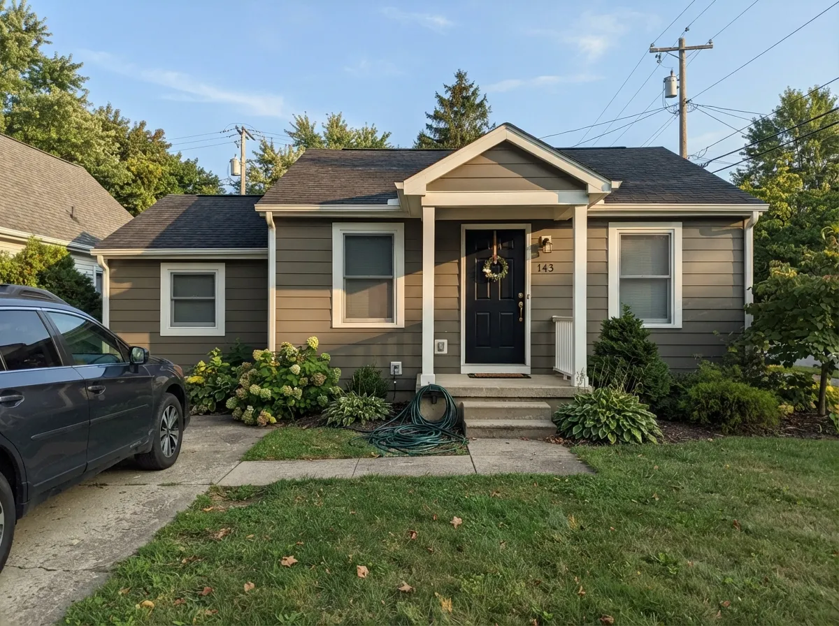
Give it real daylight, warm wood, and brass, and Perfect Greige is the color that made "greige" a household word. It carries an open floor plan without flattening it the way a paler neutral can, and outdoors it is one of the most-used siding colors in the Sherwin-Williams deck — full sun brings the taupe forward without washing it out, and it holds its own next to real materials: stone, cedar, oak.
Where It Fails
Almost every complaint about Perfect Greige comes from one of three scripts, and all three are predictable before the first gallon is opened. None of them are the paint's fault — but if your room or your expectations match one of these, this is not your color.
Searches for "greige" throw Perfect Greige into the same list as Agreeable Gray and Repose Gray, but those sit at LRV 58–60 and Perfect Greige sits at LRV 42 — a real, visible gap. On the wall it reads as a genuine mid-depth color, not a barely-there neutral, and in a small or dim room that depth can feel closed-in fast. If you actually want light and airy, this is the wrong number — go lighter, not just "a different greige."
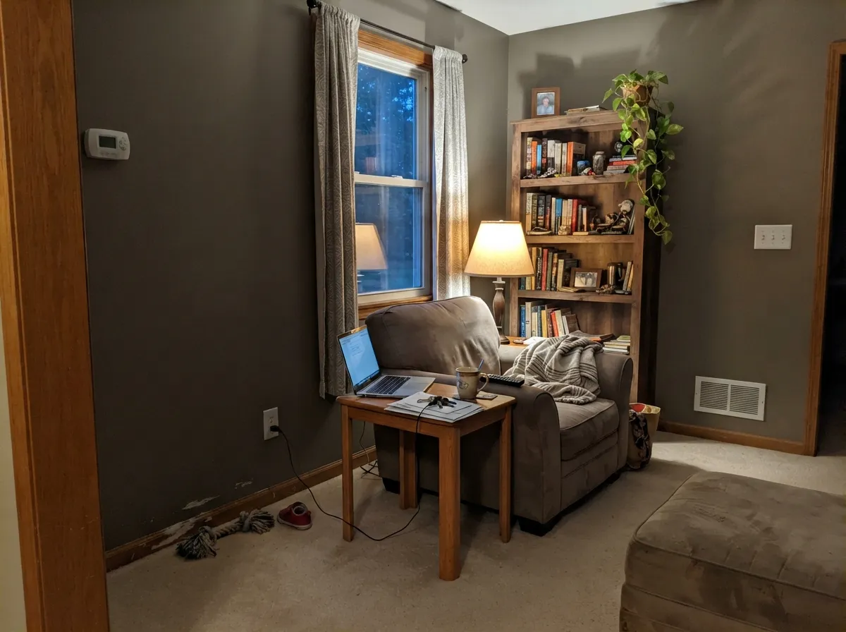
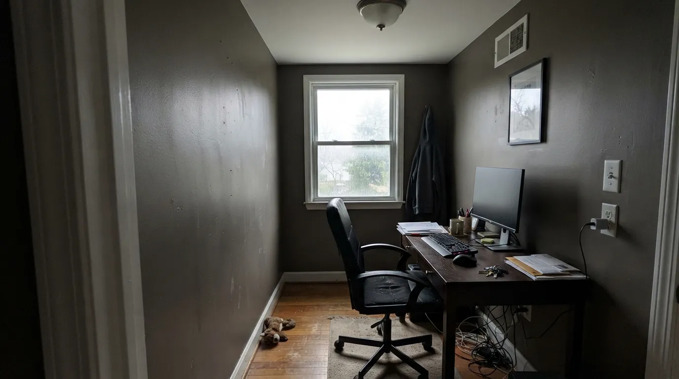
Fluorescent overheads, north-facing daylight, or cool LED bulbs strip the brown out of Perfect Greige and leave a flat, slightly mauve-grey that reads dull instead of rich. It is still a warm color underneath — swap to 2700K bulbs before you blame the paint.
Perfect Greige was one of the defining colors of the 2012–2018 greige boom, and that ubiquity is now its own reputation: some buyers and agents read it as dated spec-home beige-gray. It is a genuinely well-built color used on purpose — with real wood, brass, and one dark accent — but if you're renovating specifically to escape that decade's look, this is not the color to reach for out of habit.
Room by Room
This is the pairing it built its reputation on: with warm wood floors and real daylight it carries a big open space without flattening out. Eggshell finish; match trim to Pure White or White Dove, not a stark cool white.
It is genuinely handsome on an island or lower run of cabinets under lighter upper cabinets — full-height on every door can feel heavy in an average-size kitchen. Satin cabinet enamel; brass or aged-bronze hardware, not chrome.
Under 2700K lamps it turns genuinely chocolate-warm at night. If the room is north-facing and lamp-light-only isn't happening, expect it to read flatter and cooler than the chip promised.
One of the most-used greige siding colors Sherwin-Williams sells. Full sun opens the taupe-brown warmth instead of washing it out, and it pairs cleanly with white trim and a dark door or shutters.
A room that runs on task lamps rather than daylight is an easy win — the warmth needs the warm bulb, not the sun. A north-facing office lit only by cool overhead light will look dull and grey; fix the bulbs before you repaint.
With warm stone, wood vanities, and brass it is quietly expensive-looking. With cool grey or blue-leaning tile it argues with the room; test a large sample against the actual tile first.
Your Light Is the Risk
South or west daylight opens the full taupe-brown warmth — the richest, most "perfect greige" the color gets.
Cool daylight and office-style overheads strip the brown out and leave a dull, slightly mauve-grey. Fine if you wanted it quieter; disappointing if you wanted the warmth.
Golden in the morning or evening sun hours, more neutral gray-brown at midday. The shift is gentle but real — most owners like it.
2700K lamps push it toward a cozy chocolate-brown. Cool white LEDs flatten it to plain grey — the bulb matters as much as the paint.
Most complaints about Perfect Greige are a light mismatch. Upload a photo of your actual room and see it on your walls — then ask for the same wall in north light or evening lamps before you buy a single sample.
Need It From Another Brand?
Any paint counter can custom-tint Sherwin-Williams SW 6073 directly. If you would rather stay in one brand's own deck, these are the closest stock matches, measured as ΔE2000. Under 2 is a difference you will not see on the wall.
| Brand | Closest color | ΔE | LRV | |
|---|---|---|---|---|
| Behr | Perfect TaupePPU18-13 · Behr | 1.4 | 42 | Color page → |
| Benjamin Moore | Grége Avenue991 · Benjamin Moore | 1.0 | 41 | Color page → |
| Valspar | Ivory Brown6006-1C · Valspar | 2.5 | 42.2 | Color page → |
| PPG / Glidden | Desert DunePPG1023-4 · PPG / Glidden | 1.3 | 41 | Color page → |
| Glidden | Desert DunePPG1023-4 · Glidden | 2.1 | 41 | Color page → |
| Dutch Boy | Shale Ridge421-3DB · Dutch Boy | 4.2 | 41 | Color page → |
Similar Sherwin-Williams Colors
The nearest shades to Perfect Greige within Sherwin-Williams's own range, ranked by perceptual color distance — useful when you want the same look a touch lighter, darker, or warmer.
WCAG 2.1: AA is 4.5 : 1 for normal text, 3 : 1 for large text, AAA is 7 : 1.
Perfect Greige vs the Colors You're Also Considering
Every Perfect Greige sample board has the same rivals on it. The numbers show the real lightness gap — then it comes down to which risk you would rather live with.
Pick this if Agreeable Gray already read too pale and washed-out in your room — Perfect Greige gives you the depth it's missing.
Sherwin-Williams SW 7029 · LRV 60Agreeable GrayPick this if you want the same greige family lighter and safer — Agreeable Gray is the color the trend moved to once buyers wanted less commitment.
Pick this when Accessible Beige feels too pale and flat and you want real gray weight underneath the warmth.
Sherwin-Williams SW 7036 · LRV 58Accessible BeigePick this for the same warm neutral family in a lighter, beige-leaning version that opens up a small or dim room.
Pick this for more depth and a more overtly brown cast than Revere Pewter's lighter greige.
Benjamin Moore HC-172 · LRV 56Revere PewterPick this if you're not locked into Sherwin-Williams — Revere Pewter is the other half of the original greige duo, a shade lighter and just as famous.
Pick this if you want the color the newer greiges are still chasing — same weight, more warmth, the original.
Sherwin-Williams SW 7017 · LRV 39Dorian GrayPick this for a similar mid-depth greige from the newer side of the trend, without Perfect Greige's decade of builder-home history.
Within the same deck, Pussywillow (SW 7643) at LRV 42 has hex #B2ADA4 against Perfect Greige's #B7AB9F, which means less red and more gray, so it is the cooler, more neutral option. Warm Pewter (SW 9572) at LRV 42 sits between them. Chelsea Mauve (SW 2) at LRV 43 goes further into pink with #BEAC9F, and Gateway Gray (SW 7644) at LRV 41 swaps the red-orange for a greener cast.
Across brands the field is crowded. HGTV Home by Sherwin-Williams lists Perfect Greige (HGSW 2475) at deltaE 0, the same color. Benjamin Moore Grege Avenue (991), LRV 41, at 1.0, PPG and Glidden Desert Dune (PPG1023-4), LRV 41, at 1.31, and Behr Perfect Taupe (PPU18-13), LRV 42, at 1.39 are all visually identical in normal room light. Valspar Ivory Brown (6006-1C), LRV 42.2, at 2.5 is very close, so sample first. Farrow and Ball Hardwick White (No. 5), LRV 42, at 3.83 is close but visibly different side by side.
Perfect Greige Coordinating Colors
The rule for coordinating with Perfect Greige: keep everything else warm, and let one confident dark carry the contrast. It needs a genuinely warm white on trim — a stark blue-white makes the walls look muddy by comparison — and it pairs best with real wood, brass, and a near-black rather than a cool accent color. These are the partners that keep showing up in rooms that work:
The Original Greige: Where Perfect Greige Came From
Perfect Greige is not a recent trend color — it is one of the two colors that started the trend. Alongside Benjamin Moore's Revere Pewter, it defined the 2012–2018 shift away from the flat honey-beige and cool blue-gray of the decade before it, and both are still among their brands' best-selling colors today. The name is unusually honest for a paint chip: it really is built as a near-even split between warm and cool, which is exactly why it worked on almost every fixed finish a builder threw at a neutral wall.
What changed is the rest of the greige family. Agreeable Gray, Repose Gray, and Accessible Beige all arrived later and settled higher on the LRV scale — lighter, softer, more forgiving of a dim room — and became the defaults recommended to anyone unsure about committing to color. Perfect Greige never moved. It stayed the deep, original version, which means it now reads as the more decisive choice of the family: pick it because you want the depth, not because a list told you "greige" was safe.
Perfect Greige With Wood Tones and Floors
Warm wood is this color's best company. Oak, walnut, and butcher block all sit comfortably against Perfect Greige because the wood's warmth and the paint's brown-taupe base are speaking the same language — this is the pairing behind most of the open-plan kitchens and living rooms it shows up in.
Cool gray or gray-washed flooring is the one combination that needs a sample first: two cool-leaning grays sitting at different depths can read muddy rather than intentional, and Perfect Greige's warmth gets pulled toward mauve in the contrast. It is not automatically a bad pairing — a warm rug or brass hardware usually settles the argument — but test a large sample against the actual floor before committing a whole room.
Three Ready Palettes Built on Perfect Greige
A color is never alone on the wall. These are complete combinations in the 60-30-10 pattern, with the reason each one holds together. Every one opens in the visualizer.
This is the combination behind a decade of open floor plans: Perfect Greige carries the walls with real depth, Pure White keeps the trim crisp instead of creamy, and Kendall Charcoal gives the room one grounded dark note without going full black.
Try this palette in your roomAt LRV 42, Perfect Greige is dark enough to read as an actual color from the curb instead of washing out to white in full sun — the reason it became a builder favorite for siding. Extra White keeps the trim sharp; Tricorn Black shutters give the facade the contrast a lighter greige can't.
Try this palette in your roomA den or study rarely gets bright daylight, and that's exactly where Perfect Greige stops being risky and starts being cozy — the brown in it comes forward under lamp light. White Dove trim keeps the room from feeling like a cave; Urbane Bronze on a door or shelving adds one more warm-dark note instead of fighting the greige with a cooler color.
Try this palette in your roomPerfect Greige FAQ
Is Perfect Greige more gray or more brown/beige?
Dead even — that is the whole point of the name. It is a true 50/50 blend, warm from the brown-taupe base but grayed enough to never read as tan. Most people call it "gray" in conversation and "warm" the moment they stand next to it.
Why does Perfect Greige look so much darker than Agreeable Gray?
Because it is. Agreeable Gray sits at LRV 60 and Repose Gray at LRV 58; Perfect Greige is LRV 42 — nearly 20 points deeper. Search engines file all three under "popular greige" as if they're interchangeable, but on the wall that gap is the difference between a light neutral and a genuine mid-depth color. If you sampled the wrong one, this is why.
Is Perfect Greige good for an open floor plan?
Yes, with real daylight somewhere in the plan. Its depth is what makes it carry a big space without flattening out the way a paler neutral can — but every room in the plan should get at least some direct light, or the darkest corners will feel closed-in rather than cozy.
Does Perfect Greige work as an exterior color?
It's one of the most-used greige siding colors Sherwin-Williams sells. Full sun brings out the taupe-brown warmth without washing it out the way it does to paler exterior neutrals, and it pairs cleanly with white trim and a dark door or shutters.
Is Perfect Greige outdated?
It was one of the defining colors of the 2012–2018 greige boom, so some buyers and agents do read it as dated spec-home beige-gray on sight. That reputation is about overuse, not the paint — used deliberately, with real wood and one confident dark accent, it still looks considered rather than default.
What trim white goes with Perfect Greige?
A genuinely warm white — Pure White or White Dove — not a stark, blue-leaning trim white, which will make the walls look muddy by comparison. Semi-gloss on trim, eggshell or flat on the walls.
Have you painted with Perfect Greige?
Rate it — one tap helps the next reader decide.
Ask a Question