Baja Dunes
A warm sandy taupe most homeowners have never heard of, reviewed honestly: where it reads sun-baked and expensive, the light that turns it muddy, and what to pick instead.

Jessica has spec'd whites and neutrals for more than 300 rooms and keeps a sample wall of painted drawdowns in her studio. Every color review is checked against real reader rooms in the comments and re-tested when a formula changes. About the testing process →
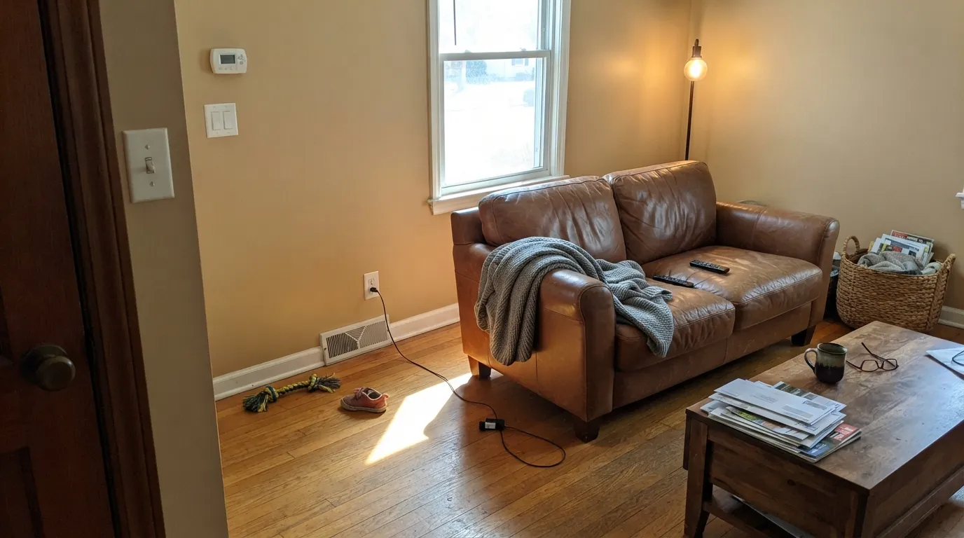
- 1Anonymous20
- 2Fawn Brindle36
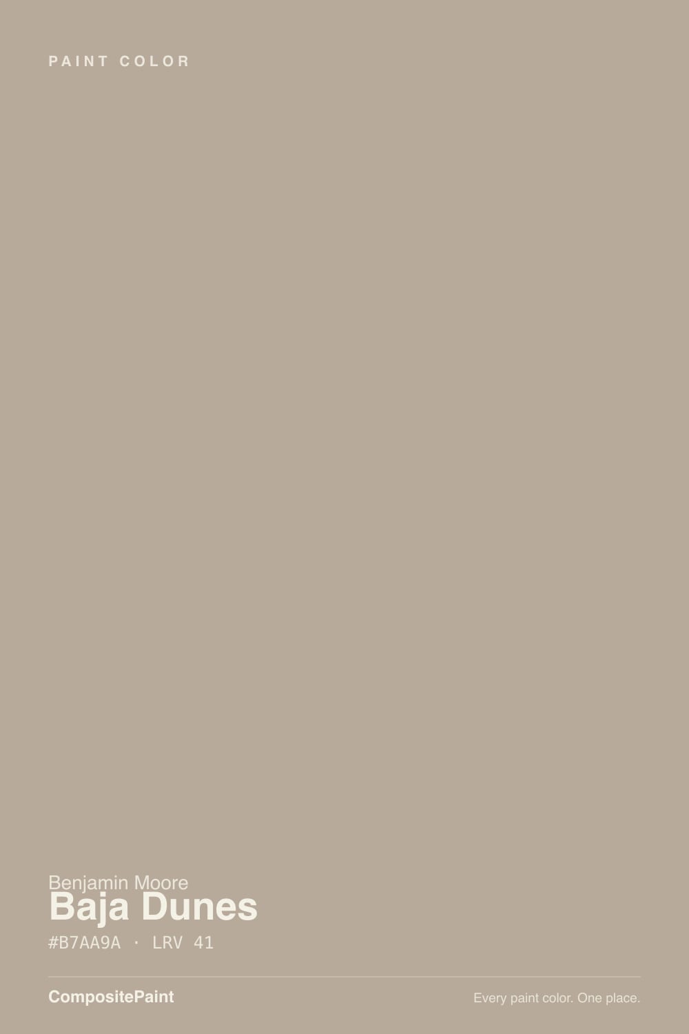
- 3Baja Dunes41
- 4Agreeable Gray60
- 5Pale Oak69
The Fast Verdict
Baja Dunes is what a greige looks like when nobody puts it on a trend board. It is a genuine mid-depth warm taupe — sand more than gray, LRV 41 — with none of the marketing behind Revere Pewter or Agreeable Gray and, honestly, none of their fan-club risk either. It is the color a colorist reaches for when a client wants a warm neutral with real weight on the wall, not a pale wash that needs three coats to look like anything.
Exteriors, stucco, and Spanish- or southwestern-style homes · whole-house neutrals in rooms with real daylight · anyone who wants Revere Pewter's warmth a shade deeper · living rooms and dens with warm wood and leather
Your room stays dim or faces north · you actually want a true gray, not a taupe · your trim, tile, or floors already lean cool · you want a color your painter has already sampled a hundred times
- Genuine mid-depth warm neutral that reads as a real color, not a pale wash
- One of the stronger warm choices for stucco, siding, and Spanish-style exteriors
- Flatters terracotta, rattan, walnut, and warm stone
- Deep enough (LRV 41) to hide scuffs and hold its warmth in ordinary daylight
- A genuine workhorse color your neighbors almost certainly haven't already painted
- Goes flat, muddy, and distinctly brown in dim or north-facing rooms
- Reads dingy next to a cool, bright white trim
- Not a true gray — buyers hoping for gray will see taupe or tan
- Little public track record online; you're testing a professional's color, not a viral one
What Color Is Baja Dunes, Really?
A warm sand-taupe with a soft, grayed-down base — the kind of color that reads exactly like its name. Baja Dunes carries no OC or HC prefix; it is a numbered color from Benjamin Moore's older Classic Colours deck, the wide back catalog of chips that never got a lifestyle campaign or a Color-of-the-Year push. That is not a knock. It means the color's reputation, such as it is, comes entirely from colorists and painters who kept specifying it rather than from a marketing team who kept naming it. Honestly: this is not a famous color, and this review will not pretend otherwise.
At LRV 41 it sits noticeably deeper than the famous safe greiges — Revere Pewter runs LRV 56, Agreeable Gray LRV 60. That gap is the whole point of picking Baja Dunes over them: a wall painted in a color this deep reads as an actual decision from across the room, not a hint of warmth on an off-white. It holds its sandy color under ordinary daylight instead of needing direct sun to show up, which is exactly what a mid-depth neutral should do and exactly why the paler, more famous greiges sometimes disappoint people who wanted more presence.
Undertone in one line: warm and sandy, brown before gray. There is no pink in it and no green flip to watch for — the only real undertone risk is that in low light it reads more brown than the "gray" a lot of buyers are quietly hoping for.
Where It Shines
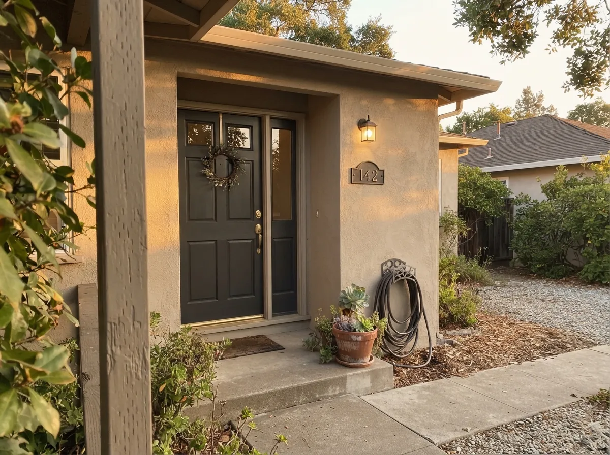
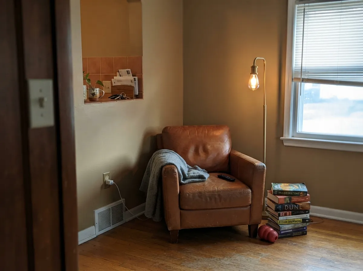
Give it real daylight, warm wood, stone, or stucco, and it looks like a color someone paid a designer for. It is genuinely strong on exteriors — the depth reads as sun-baked plaster rather than flat paint, which is why it turns up on stucco ranch houses and Spanish Revival remodels more than on Pinterest boards. Indoors, it does its best work in living rooms and dens that get honest daylight, next to leather, rattan, walnut, and terracotta — anywhere the room is already leaning warm and just needs a wall color with enough depth to anchor it.
Where It Fails
The regret stories with a color this quiet come in three predictable shapes, and none of them are the paint's fault. If your room matches one of these, sample it big before you commit a whole exterior or a whole living room to it.
Baja Dunes is taupe first, gray a distant second. On the chip in bright store light it can look neutral; on four walls in ordinary daylight the brown steps forward. If "gray with a little warmth" is the actual goal, look at Stonington Gray or Light French Gray instead and let this one go.
Cool, low daylight drains the sand out of it and leaves a flat, muddy taupe-gray that photographs worse than it looks in person, and looks pretty flat in person too. This is a color that needs light to do its job — in a dark room, size up to a lighter warm greige like Edgecomb Gray.
Pair it with a stark, blue-white trim and Baja Dunes reads dingy and brown instead of warm and deep — the same mistake that sinks every warm color paired with the wrong white. Keep the trim warm (White Dove, Alabaster) or go deep and confident (Chelsea Gray, Wrought Iron) instead of bright and cool.
Room by Room
This is the room the color was quietly built for. On stucco or fiber-cement siding in real sun it reads sun-baked and substantial, not chalky the way a paler greige can. Flat or low-sheen finish; pair with a warm white or a genuinely dark trim, not a cool bright one.
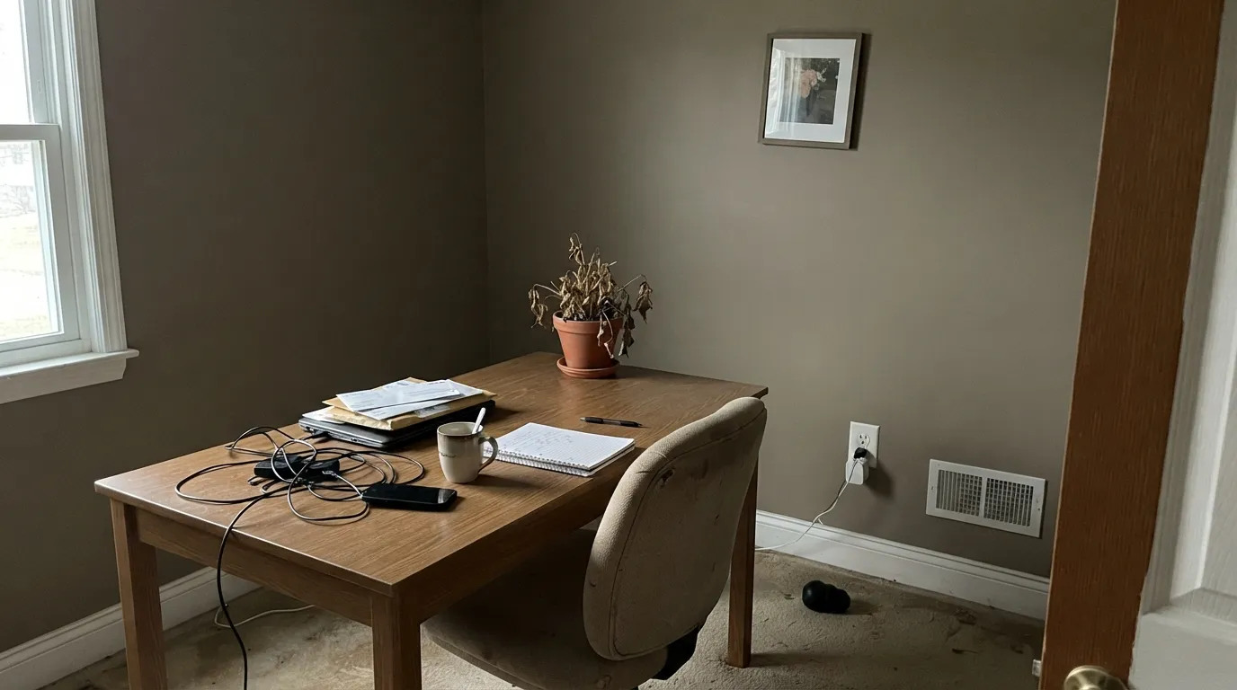
With any real window light it anchors a room full of leather, walnut, and warm textiles without going dark. In a dim living room it goes flat and brown; check the light before committing all four walls.
On an island or full cabinet run under a warm white ceiling, it flatters butcher block, brass, and terracotta tile. Against cool grey stone or stainless-everything, it looks muddy rather than moody.
Under warm 2700K lamps it turns genuinely cozy and enveloping. In a north-facing bedroom with no lamps, it can read like a flat brown-gray; add warm light before you paint, not after.
Low-key daylight and warm materials are exactly its comfort zone. Leather chairs, wood shelving, and a brass lamp make it look intentional rather than dated.
With warm stone, wood vanities, and brass fixtures it works well. Against cool gray or blue-gray tile it fights the room the same way it fights a cool white trim — sample against your actual tile first.
Your Light Is the Risk
Direct warm daylight brings out the sand and keeps the color reading deep and deliberate, indoors and out.
Cool, flat daylight drains the warmth and leaves a muddy, faintly brownish gray. Test on the actual wall before painting a whole exterior or room.
Cooler and quieter in the morning, noticeably warmer and sandier by afternoon — a bigger daily swing than the paler famous greiges show.
2700K bulbs push it toward cozy sand-brown; cool white LEDs flatten it toward plain gray-brown. Warm bulbs are doing real work here, not just a nice-to-have.
Most complaints about Baja Dunes are a light mismatch. Upload a photo of your actual room and see it on your walls — then ask for the same wall in north light or evening lamps before you buy a single sample.
Need It From Another Brand?
Any paint counter can custom-tint Benjamin Moore 997 directly. If you would rather stay in one brand's own deck, these are the closest stock matches, measured as ΔE2000. Under 2 is a difference you will not see on the wall.
| Brand | Closest color | ΔE | LRV | |
|---|---|---|---|---|
| Sherwin-Williams | Perfect GreigeSW 6073 · Sherwin-Williams | 1.7 | 42 | Color page → |
| Behr | Mesa TaupePPU5-14 · Behr | 2.1 | 41 | Color page → |
| Valspar | Oyster Shoal8005-5D · Valspar | 1.4 | 40 | Color page → |
| PPG / Glidden | Desert DunePPG1023-4 · PPG / Glidden | 1.0 | 41 | Color page → |
| Glidden | Desert DunePPG1023-4 · Glidden | 1.4 | 41 | Color page → |
| Dutch Boy | Shale Ridge421-3DB · Dutch Boy | 3.6 | 41 | Color page → |
Similar Benjamin Moore Colors
The nearest shades to Baja Dunes within Benjamin Moore's own range, ranked by perceptual color distance — useful when you want the same look a touch lighter, darker, or warmer.
WCAG 2.1: AA is 4.5 : 1 for normal text, 3 : 1 for large text, AAA is 7 : 1.
Baja Dunes vs the Colors You're Also Considering
Every Baja Dunes sample board has the same rivals on it. The numbers show the real lightness gap — then it comes down to which risk you would rather live with.
Pick this for real depth on the wall — Baja Dunes reads as an actual color instead of a pale wash, and it holds its warmth where Revere Pewter can look chalky in flat light.
Benjamin Moore HC-172 · LRV 56Revere PewterPick this for the lighter, far more famous greige — brighter rooms, and a color your painter has already done a dozen times.
Pick this for the warmer, more desert-leaning version at nearly the same depth — Baja Dunes leans dunes, Pashmina leans city loft.
Benjamin Moore AF-100 · LRV 44PashminaPick this for almost identical depth with the dial turned toward gray instead of sand.
Pick this when you want a wall that reads as a real color from across the room, not a whisper of one.
Benjamin Moore HC-173 · LRV 63Edgecomb GrayPick this for a much lighter, easier warm greige that behaves in almost any room, including dim ones.
Pick this for a color you can live with on all four walls of a used room without it swallowing the light the way a true charcoal would.
Benjamin Moore HC-168 · LRV 22Chelsea GrayPick this for a genuinely dark charcoal-greige — islands, exteriors, and accent walls that need more weight than Baja Dunes carries.
The closest comparisons inside the line are near-duplicates. Rocky Road CC-470 shares the identical hex #B7AA9A and LRV 41. Grege Avenue 991 and Cobblestone CC-454 both sit at #B7A99C with LRV 41, a hair cooler and grayer. Evening Gown CSP-375 (#B5A99D, LRV 41) is the same idea again, while Finnie Gray CW-55 (#B4AC99, LRV 42) and Kid Gloves CSP-175 (#B2AB99, LRV 41) trade a little of the red-orange for a green-yellow lean.
Across brands, C2 Intrigue C2-812 at a deltaE of 0.99 is a true match. PPG Desert Dune PPG1023-4 at 1.02, Magnolia Home Rustic Oak JG-110 at 1.06, Valspar Oyster Shoal 8005-5D at 1.35, and Sherwin-Williams Perfect Greige SW 6073 (#B7AB9F, LRV 42) at 1.74 are all visually identical in normal room light. Behr Mesa Taupe PPU5-14 at 2.08 is very close, so sample first. Dutch Boy Shale Ridge 421-3DB at 3.6 and Farrow and Ball Hardwick White No. 5 at 3.84 are close but visibly different side by side.
Baja Dunes Coordinating Colors
The rule with Baja Dunes is the same as with any deep warm neutral: stay warm or go genuinely dark, and skip anything cool and bright in between. It pairs cleanly with warm whites, terracotta, and confident near-blacks — these are the partners that keep it looking deliberate instead of muddy:
A Numbered Color, Not a Marketing Campaign
Benjamin Moore's most famous colors — White Dove, Chantilly Lace, Hale Navy — carry OC or HC prefixes and get their own lifestyle photography, their own trend-list slots, their own designer interviews. Baja Dunes is a plain numbered color, 997, from the much larger Classic Colours back catalog that most homeowners never scroll past on the in-store fan deck.
That is worth saying plainly rather than dressing up: this is not a Color of the Year, and there is no viral room built around it. What it has instead is the quieter kind of reputation — the one colorists build by specifying a color again on the next stucco house or the next warm-toned living room because it keeps doing the job. An honestly obscure, dependable neutral is not a lesser review; it is a different, useful kind of answer than the famous chips get.
Baja Dunes With Wood Tones and Floors
Walnut, leather-brown, and aged wood are the easiest pairing — two warm tones at different depths read as a considered palette rather than a clash. Pale white oak and light gray-washed floors also work, and actually help in a dim room by giving the eye a lighter surface to land on.
The one combination to test carefully is deep honey-oak or golden floors with a dim or north-facing room: two warm mid-tones with no lighter break between them can flatten into a single muddy mass when the daylight is weak. In a bright room the same pairing looks rich and cohesive. Sample a large board above the actual floor before committing a whole room, and lean on a lighter rug or trim if the light is in doubt.
Three Ready Palettes Built on Baja Dunes
A color is never alone on the wall. These are complete combinations in the 60-30-10 pattern, with the reason each one holds together. Every one opens in the visualizer.
Warm sand siding with a soft near-black door and shutters reads Spanish-Revival-meets-modern-farmhouse instead of flat and beige. White Dove trim keeps the warmth from turning dingy the way a stark cool white would.
Try this palette in your roomA deep, sandy neutral needs a genuinely warm trim to stay friendly rather than dingy — White Dove does that job. The navy door supplies the one dark, confident note the scheme is missing.
Try this palette in your roomTwo warm earth tones at different depths, both dependent on real daylight, layer instead of fight — sample both together before committing, since a dim room will flatten this pairing fast. White Dove trim keeps the room from feeling like an all-brown box.
Try this palette in your roomBaja Dunes FAQ
Is Baja Dunes warm or cool?
Warm — it is a sandy taupe with brown well ahead of gray in the mix. There is no pink or green undertone to worry about, but in dim or north-facing light it can look more brown-gray than the "warm gray" a lot of buyers expect from a greige this deep.
Is Baja Dunes a good exterior color?
Yes — it is one of its strongest uses. On stucco, siding, or fiber cement in real sun it reads deep and sun-baked instead of chalky, and it pairs well with both a soft near-black (Wrought Iron) and a warm white (White Dove) for trim.
How is it different from Revere Pewter?
Depth. Revere Pewter sits at LRV 56, a lighter, more famous, more forgiving greige. Baja Dunes runs LRV 41 — a genuine mid-tone that reads as a real color rather than a hint of warmth on an off-white, but with a bit less margin for error in dim rooms.
What white trim goes with Baja Dunes?
A warm white, not a cool bright one. White Dove or a similarly warm off-white keeps the wall reading sandy and deliberate; a stark blue-white trim makes the walls look dingy and brown by comparison.
Does it work with honey oak or golden floors?
Reasonably well, since both are warm — but two warm tones together with no light-colored break can look flat and heavy in a dim room. In a bright room they read cohesive; in a dark one, add a lighter rug or trim to keep the room from going monochrome-muddy.
Why haven't I heard of this color?
Because it never got a marketing push. Baja Dunes is a numbered color from Benjamin Moore's back catalog, not one of the handful of chips that get a lifestyle campaign. That is not a mark against it — it is exactly why colorists keep specifying it while the trend lists stay full of the same half-dozen famous names.
Have you painted with Baja Dunes?
Rate it — one tap helps the next reader decide.
Ask a Question