Cocoa Dust
Valspar's dusty rose-beige, reviewed honestly: the light that turns it pink, the light that turns it flat, and why its numbers are nearly identical to a Farrow & Ball color that costs three times as much.

Jessica has spec'd whites and neutrals for more than 300 rooms and keeps a sample wall of painted drawdowns in her studio. Every color review is checked against real reader rooms in the comments and re-tested when a formula changes. About the testing process →
- 1Dorian Gray39
- 2Mindful Gray48
- 3Cocoa Dust56
- 4Pale Oak69
- 5Shoji White74
The Fast Verdict
Cocoa Dust is a warm, dusty rose-beige that refuses to settle on one identity — some days it reads tan, some days it reads faintly pink, and both are honest. At LRV 56 it holds its color without going dark, which is what makes it work on more than an accent wall. It is not a household name the way Revere Pewter or Agreeable Gray are, and it is not sold on every paint aisle in the country — but the color itself does something those safer greiges do not: it flirts with pink instead of hiding from it.
Living rooms and bedrooms with real daylight and warm wood · powder-room vanities and small jewel-box rooms · anyone chasing a dusty pink-beige look without a designer-paint price tag · brass, walnut and terracotta over anything
Your room stays cool and north-facing all day with no lamps · your counters or fixtures are cool gray stone or brushed steel · you want a neutral with zero pink, full stop · your local store can't tint Valspar's independent-retailer deck
- A warm dusty rose-beige that reads sophisticated, not dated
- LRV 56 holds its color in daylight instead of washing out
- Flatters brass, walnut, cognac leather and terracotta
- A jewel-box color for powder rooms and vanities that punches above its size
- Landed almost on top of Farrow & Ball Setting Plaster's numbers, at a fraction of the price
- Cool light and cool LEDs push it toward dull, muddy mauve-gray
- Fights cool gray stone, steel and brushed nickel
- Harder to buy than mainline Valspar — independent dealer or Ace territory
- Less brand recognition than the safe greiges it gets compared to, so fewer real-world sample photos to check against
What Color Is Cocoa Dust, Really?
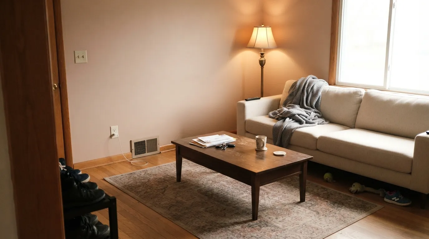
A warm neutral filed in Valspar's Classic Collection, sold through independent paint dealers and Ace Hardware rather than the mainline Lowe's-facing deck — which already tells you something: this is not a color built for mass marketing, it is one you have to go looking for. On the wall it reads as a dusty, muted rose-beige: warm enough to sit comfortably next to tan and taupe, pink enough that calling it "just beige" undersells it.
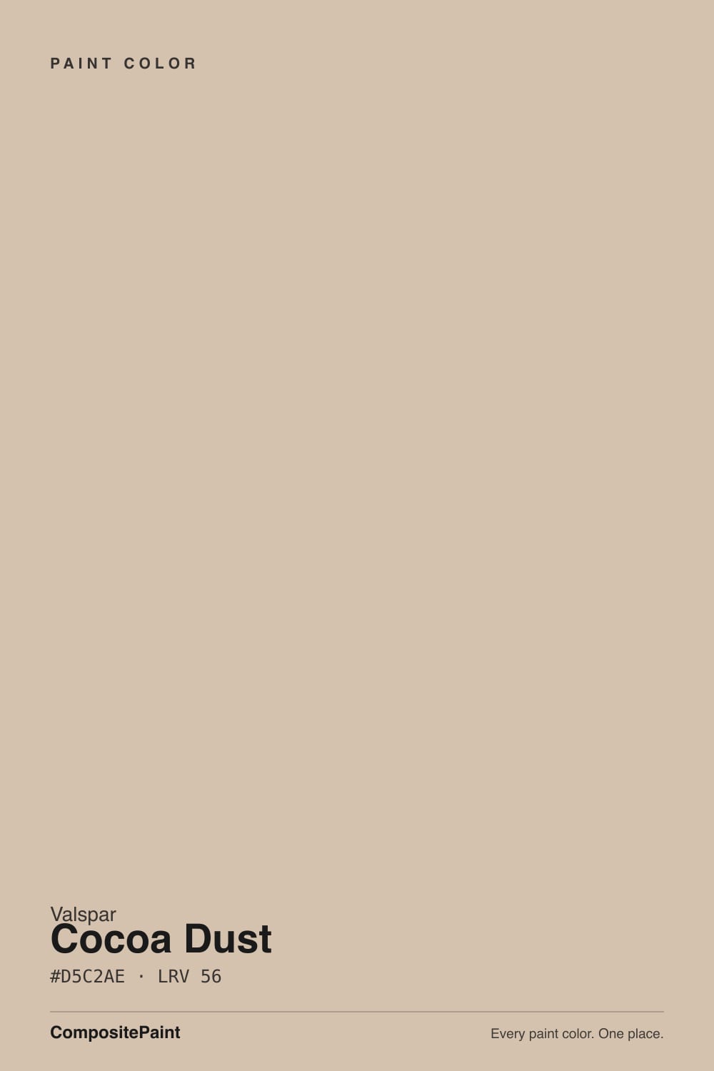
At LRV 56 it is a genuine mid-tone, not a pale wash. That depth is the useful part: it holds its dusty color in full daylight instead of washing out to a whisper the way lighter blush neutrals do, and it settles toward a warm taupe-brown once the sun drops. Run the numbers against Farrow & Ball's famous Setting Plaster — LRV 56, hex #D6BFA8, the not-quite-pink-not-quite-beige color that launched a thousand renovation posts — and Cocoa Dust's own LRV 56 and hex #D5C2AE land within a few points of it. Nobody markets Cocoa Dust as a dupe, but the numbers do the marketing for us.
Undertone in one line: warm beige with a whisper of rose — never orange, never gray on its own. If your sample reads flatly gray, the light in the room is cold; if it reads more pink than you expected, that is warm afternoon sun or a 2700K bulb doing exactly what this color does under warm light.
Where It Shines
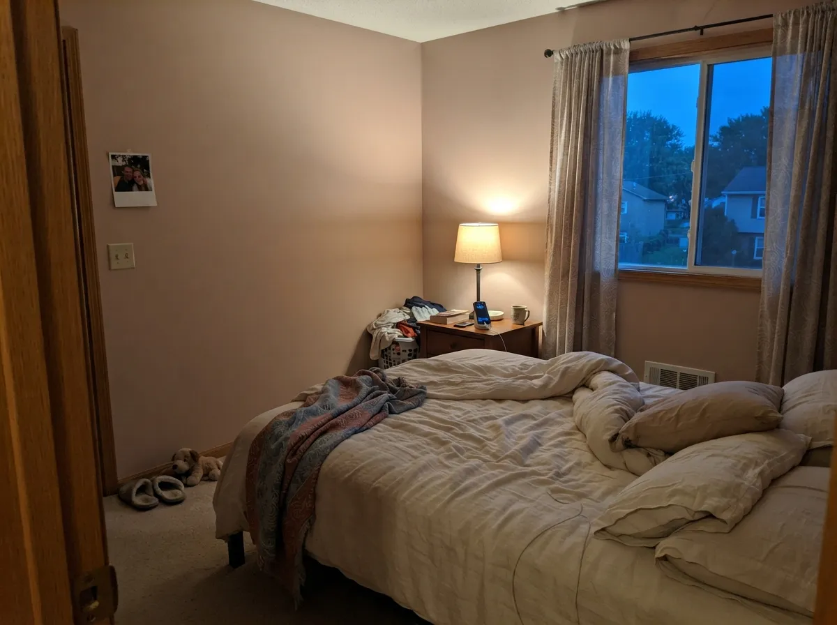
Give it real daylight and warm materials and Cocoa Dust looks expensive rather than indecisive. It is at its best in rooms people actually use in the evening — living rooms, bedrooms, dens — where lamp light pulls the rose forward and the color goes soft and layered instead of flat. Its other natural home is the small commitment: a powder-room vanity or an accent wall, where the dusty color reads custom without betting an entire open floor plan on it. Walnut, brass, cognac leather and terracotta all sit easily next to it — unlike a cooler mauve or violet, its warmth means honey-toned wood does not fight it the way it fights most pinks.
Where It Fails
Most of the disappointment with Cocoa Dust traces back to one of three predictable situations, and none of them are really the paint's fault.
On the chip it can pass for a soft tan. On four walls, especially under warm light, the rose comes forward and some readers feel ambushed by it. If your goal is a neutral nobody notices, this color has too much personality — look at a true warm beige like Manchester Tan instead.
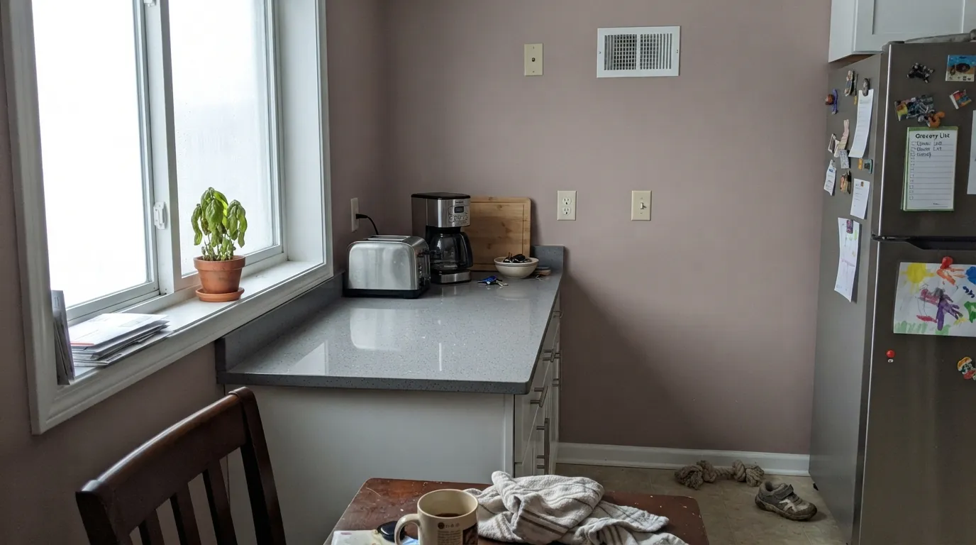
Cool gray quartz, stainless appliances and brushed nickel sit at the opposite temperature and pull Cocoa Dust toward muddy and dull instead of warm and dusty. Both sides lose the argument. Keep this color with warm metals and warm stone, or skip it in that kitchen.
Cocoa Dust lives in Valspar's independent-retailer Classic Collection, not the everyday Lowe's paint wall most Valspar shoppers know. Plenty of big-box stores cannot pull up the formula. Call ahead to an Ace Hardware or independent Valspar dealer, or ask for a custom color match — do not assume any Valspar counter can mix it on the spot.
Room by Room
With real daylight and any warm wood furniture, this is a calm, layered backdrop that reads more expensive than its price. Eggshell finish; keep trim on the warm side of white.
Under evening lamps the rose comes forward and the room goes soft and cocooning. Pair with cream or white bedding, not stark gray, which fights the warmth.
A closed, lamplit dining room is exactly the kind of room this color was built for — warm wood table, brass fixture, candlelight all flatter it. Riskier in an open-plan kitchen-dining combo with cool cabinetry.
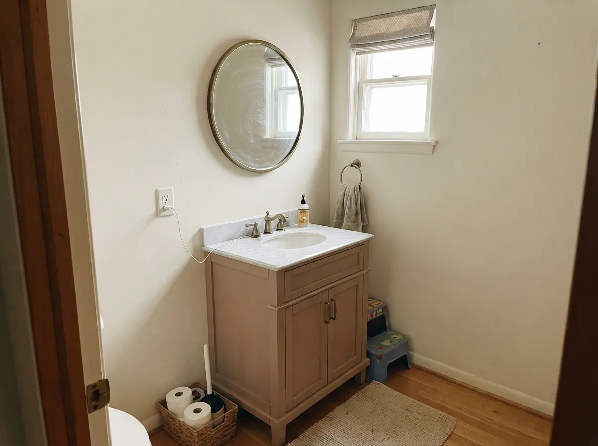
A Cocoa Dust vanity under cream walls and a brass mirror is a weekend project that reads like a design fee. Small rooms take a color this specific far better than a whole open floor plan does.
Genuinely charming on an island or coffee hutch against warm wood and brass. Against cool gray quartz or stainless, it reads dingy rather than dusty — sample it against your actual counters first.
We could not verify real exterior installations of this color in the U.S. market, and interior behavior does not automatically carry over to full sun and weathering. If you're set on it outside, sample a large board in real daylight before committing rather than trusting the interior read.
Your Light Is the Risk
The rose comes forward and the color reads dusty, layered and warm all day. The most reliable read on this paint.
Cool gray daylight cancels the warmth and leaves a flat, slightly muddy mauve-gray. Test a large sample before trusting it in a dim room.
Clearly warm-beige at midday, then a distinct rose flush for an hour around golden hour. Most owners like the shift; test at both times if you're unsure.
2700K lamps push it rosier and cozier. Cool white LEDs flatten it toward gray — swap the bulbs before you second-guess the paint.
Most complaints about Cocoa Dust are a light mismatch. Upload a photo of your actual room and see it on your walls — then ask for the same wall in north light or evening lamps before you buy a single sample.
Need It From Another Brand?
Any paint counter can custom-tint Valspar T576 directly. If you would rather stay in one brand's own deck, these are the closest stock matches, measured as ΔE2000. Under 2 is a difference you will not see on the wall.
| Brand | Closest color | ΔE | LRV | |
|---|---|---|---|---|
| Sherwin-Williams | Fresco CreamSW 7719 · Sherwin-Williams | 0.9 | 57 | Color page → |
| Behr | ComfortingICC-42 · Behr | 1.2 | 55 | Color page → |
| Benjamin Moore | King Arthur's Court1081 · Benjamin Moore | 0.8 | 56 | Color page → |
| PPG / Glidden | Gotta Have ItPPG1076-3 · PPG / Glidden | 2.6 | 55 | Color page → |
| Glidden | Mushroom Cap20YY 55/151 · Glidden | 2.0 | 55 | Color page → |
| Dutch Boy | Westwood414-2DB · Dutch Boy | 1.6 | 57 | Color page → |
Similar Valspar Colors
The nearest shades to Cocoa Dust within Valspar's own range, ranked by perceptual color distance — useful when you want the same look a touch lighter, darker, or warmer.
WCAG 2.1: AA is 4.5 : 1 for normal text, 3 : 1 for large text, AAA is 7 : 1.
Cocoa Dust vs the Colors You're Also Considering
Every Cocoa Dust sample board has the same rivals on it. The numbers show the real lightness gap — then it comes down to which risk you would rather live with.
Pick this if plain gray-beige feels boring and you actually want the rose to show.
Benjamin Moore HC-172 · LRV 56Revere PewterPick this if you want the safer, more brown-gray greige with almost none of the pink risk.
Pick this for the dustier, slightly more rose-leaning version of the same idea.
Sherwin-Williams SW 7511 · LRV 53Bungalow BeigePick this for the same warm-beige-with-a-pink-tell character at a store you can walk into almost anywhere.
Cocoa Dust Coordinating Colors
The rule for coordinating with Cocoa Dust is the one that works for any dusty rose-beige: warm whites, walnut brown, and one true dark for contrast. Stay away from cool grays and steel tones — next to them the pink looks like an accident instead of a choice. These are the partners that keep it reading deliberate:
The Farrow & Ball Look-Alike
Cocoa Dust isn't marketed as a designer dupe, but the numbers make the case for us. Farrow & Ball's famous Setting Plaster (No. 231) — the not-quite-pink, not-quite-beige color behind countless renovation posts — sits at LRV 56 with a hex of #D6BFA8. Cocoa Dust is LRV 56 at #D5C2AE. That is about as close as two paints from unrelated companies get without being a literal formula match.
The real difference is price and access, not color. Farrow & Ball runs well over $100 a gallon; Cocoa Dust is a Valspar Classic Collection color tinted at an independent dealer for a fraction of that. It won't reproduce Farrow & Ball's chalky, high-pigment finish — no ordinary acrylic fully does — but on the wall, in real daylight, the color itself is doing the same job.
Cocoa Dust With Wood Tones and Floors
Because Cocoa Dust is warm rather than cool or violet, it is far more forgiving with wood than a true mauve or purple would be. Walnut, white oak and even honey-toned oak sit reasonably well against it — the warmth in the paint meets the warmth in the floor instead of fighting it, which is not something you can say for the dusty-violet colors it sometimes gets grouped with.
The one floor that argues with it is cool gray-washed wood or gray LVP. Gray floors pull the color's warmth into contrast and can make the walls read more pink than intended. It's not a dealbreaker in every room, but test a large sample above the actual floor before committing to walls throughout an open plan.
Three Ready Palettes Built on Cocoa Dust
A color is never alone on the wall. These are complete combinations in the 60-30-10 pattern, with the reason each one holds together. Every one opens in the visualizer.
White Dove keeps the trim warm enough that it never fights the dusty rose in the walls, and Wrought Iron gives the room one true dark note — a fireplace surround or a built-in bookcase — so the color reads curated instead of accidental pink.
Try this palette in your roomCream walls keep the small room airy while the vanity carries the color; Kendall Charcoal on the door and mirror frame gives one grounding dark note so the dusty pink reads sophisticated instead of sugary. Brass hardware finishes the room.
Try this palette in your roomPale Oak is light enough to run through hallways and living areas without committing to pink, and Cocoa Dust in one deeper room — a den or dining room — reads like the same house going warmer, not a different color entirely. White Dove trim carries through both.
Try this palette in your roomCocoa Dust FAQ
Is Cocoa Dust more pink or more beige?
Both, depending on the light — and that is the honest answer, not a dodge. In warm daylight and lamp light it leans tan-beige with a rosy warmth; in cool north light or under cool LEDs the pink drains out and it can read flat and slightly gray. If you need a color that behaves the same way in every light, this is not it.
Is Cocoa Dust similar to Farrow & Ball Setting Plaster?
By the numbers, yes — both sit at LRV 56, and their hex codes are only a few points apart. Valspar does not market it as a match, and the paint formulas themselves are different (Farrow & Ball's chalky, high-pigment finish is hard for any acrylic to fully copy), but the color you see on the wall lands in the same family for a fraction of the price.
Where can I buy Valspar Cocoa Dust?
It's part of Valspar's independent-retailer Classic Collection rather than the everyday Lowe's-facing deck. Look for an Ace Hardware or independent paint dealer that carries Valspar, or ask for a custom color match using the T576 formula — don't assume every Valspar counter can pull it up automatically.
What trim color goes with Cocoa Dust walls?
A warm white — White Dove or Swiss Coffee — in semi-gloss. A stark, cool-leaning white will make the walls look dingy by comparison, the same mistake that trips up warmer neutrals across every brand.
Does Cocoa Dust work with gray floors or countertops?
Cool gray stone, steel and brushed nickel are the one combination to test carefully — they pull the color toward muddy instead of dusty. Warm wood floors, brass and walnut are a much safer bet.
Is it good for a bedroom?
Yes, arguably its best room. It calms down under warm evening lamps, which is exactly when most people use a bedroom. Pair it with cream or white bedding and keep the bulbs at 2700K rather than cool white.
Have you painted with Cocoa Dust?
Rate it — one tap helps the next reader decide.
Ask a Question