Setting Plaster
Farrow & Ball's most famous blush, reviewed honestly: the rooms where it turns rosy and grown-up, the light that pushes it toward brown or orange, and what to pick instead.

Jessica has spec'd whites and neutrals for more than 300 rooms and keeps a sample wall of painted drawdowns in her studio. Every color review is checked against real reader rooms in the comments and re-tested when a formula changes. About the testing process →
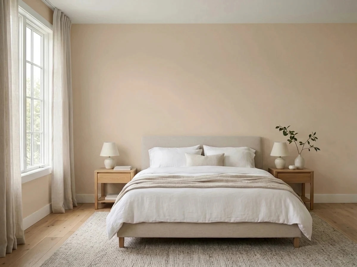
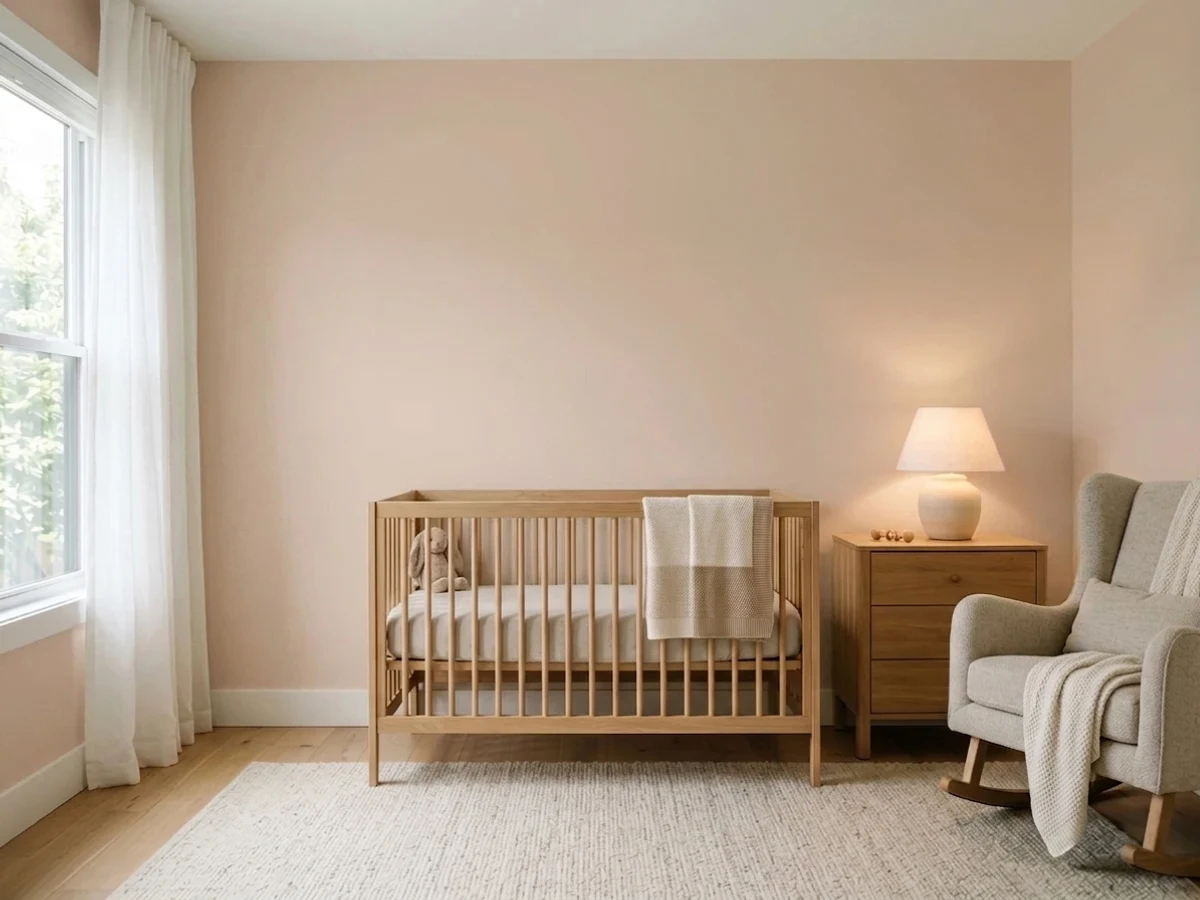
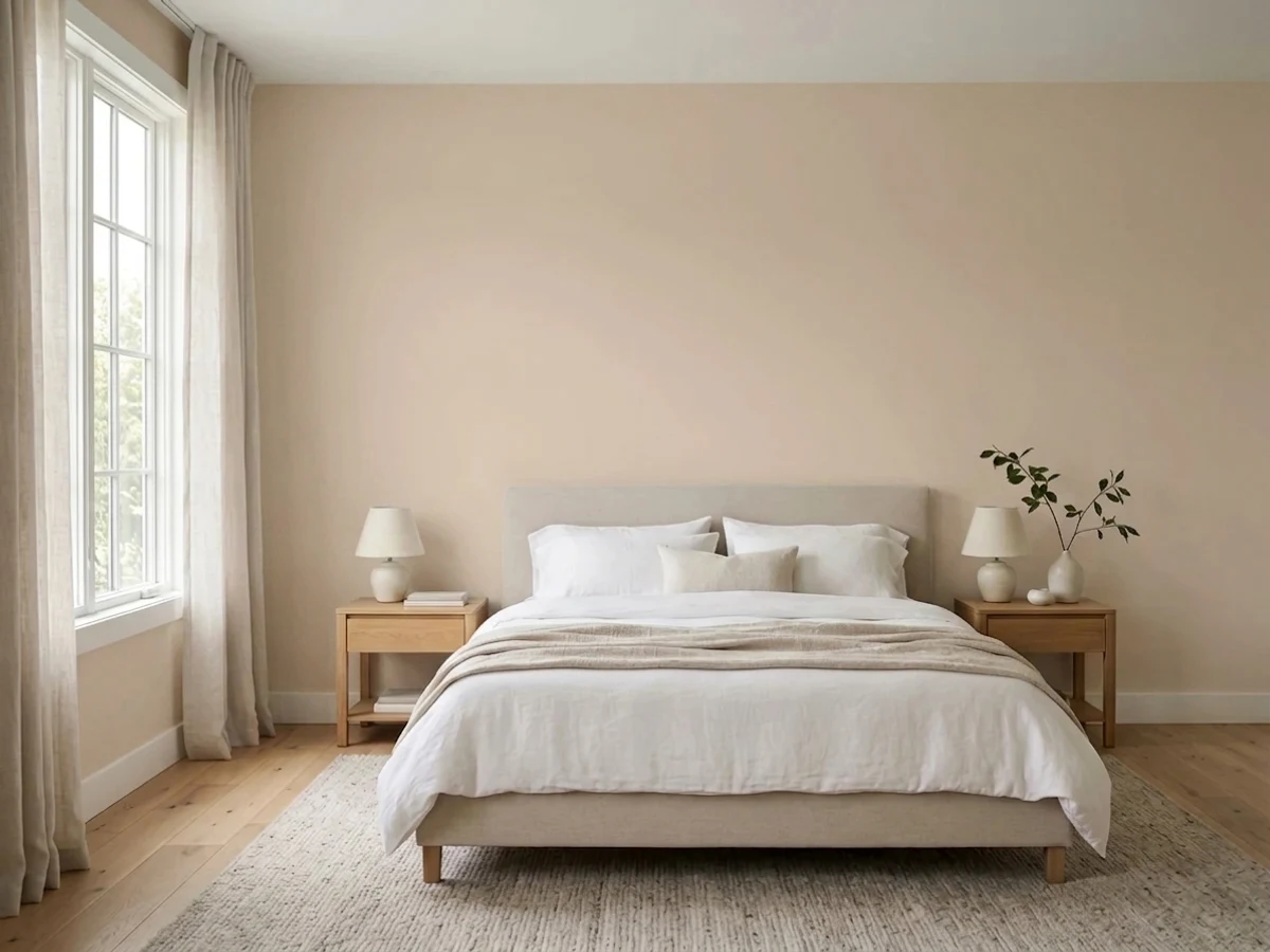
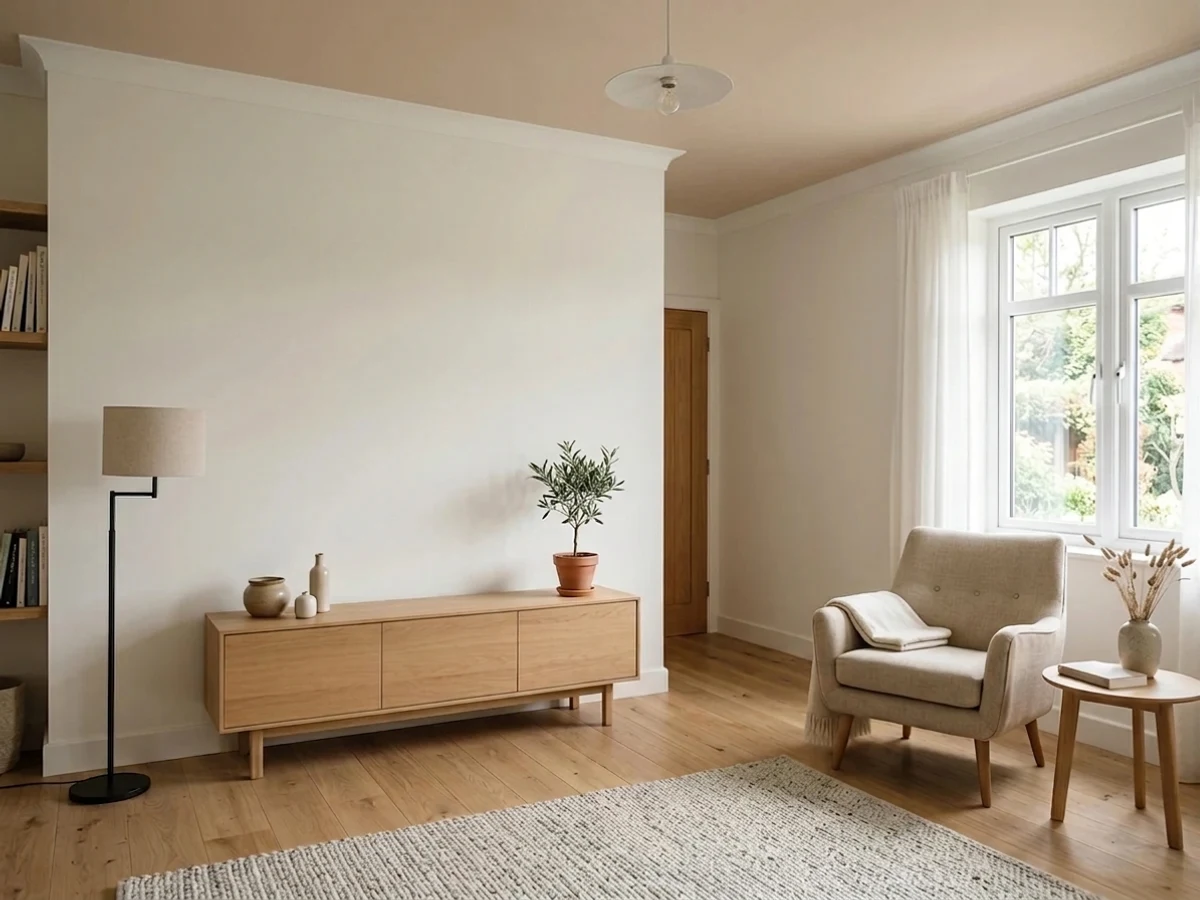

- 1Retro Pink38
- 2Vintage Tea Rose47
- 3Setting Plaster56
- 4Pale Cherry Blossom61
- 5First Light76
The Fast Verdict
Setting Plaster is what a genuinely dusty, grown-up pink looks like: a warm putty color built to mimic real plaster, not candy. Farrow & Ball's own color curator invented it chasing the look of freshly re-plastered walls, and that honesty is the whole appeal — it never reads sugary, but it never fully disguises itself as a plain neutral either. Under warm light it glows soft and rosy; without it, the color can turn heavy and muddy fast.
Bedrooms and calm, lamplit rooms · powder rooms and vanities · kitchen islands and cabinets · anyone who wants pink without it reading as pink
You actually want a true neutral · your room is dim, north-facing, and lamp-free · your floors are strongly orange honey oak · you're painting a bright, south-facing exterior wall
- A genuinely sophisticated pink — reads grown-up, not sugary
- Deep enough (LRV 56) to hold real color instead of washing to baby pink
- Turns rosy and flattering under warm lamplight — built for evening rooms
- Pairs beautifully with olive green and warm wood tones
- A decades-old Farrow & Ball bestseller that sparked its own design trend, not a fad
- Reads more pink than buyers expecting a neutral or greige realize
- Goes heavy and muddy-brown in a dim, north-facing room without lamps
- Turns peachy-orange, even terracotta, in strong direct sun
- No exact US-brand dupe — the closest matches are still noticeably different
What Color Is Setting Plaster, Really?
A dusty, putty-toned pink built from a warm red pigment softened with yellow ochre — and the yellow is what makes it wearable. Farrow & Ball's color curator Joa Studholme created it after falling for the look of her own home's freshly re-plastered walls, and named it for exactly that raw, warm-toned surface. It mimics a material rather than a mood, which is part of why it reads as sophisticated instead of sugary: Farrow & Ball itself is upfront that this is 'definitely a pink,' just a grayed, softened one.
At LRV 56 it sits at a genuine mid-depth. That matters: a much paler pink like First Light (LRV 76) almost disappears into an off-white, while Setting Plaster is dense enough to read as a real, three-dimensional wall color rather than a tint. It also means the color visibly shifts across a normal day — warm lamplight brings out a rosy putty glow, flat daylight settles it into a beige-putty neutral, and direct sun pushes the yellow-ochre base hard enough to read peachy, almost terracotta.
Undertone in one line: warm, yellow-based pink — never blue, never cool. If your sample looks heavy or muddy brown, that is dim light starving the yellow base; if it looks bright orange, that is strong sun pushing it too hard. Both are the same paint being honest about the room, not a flaw in the can.
Where It Shines
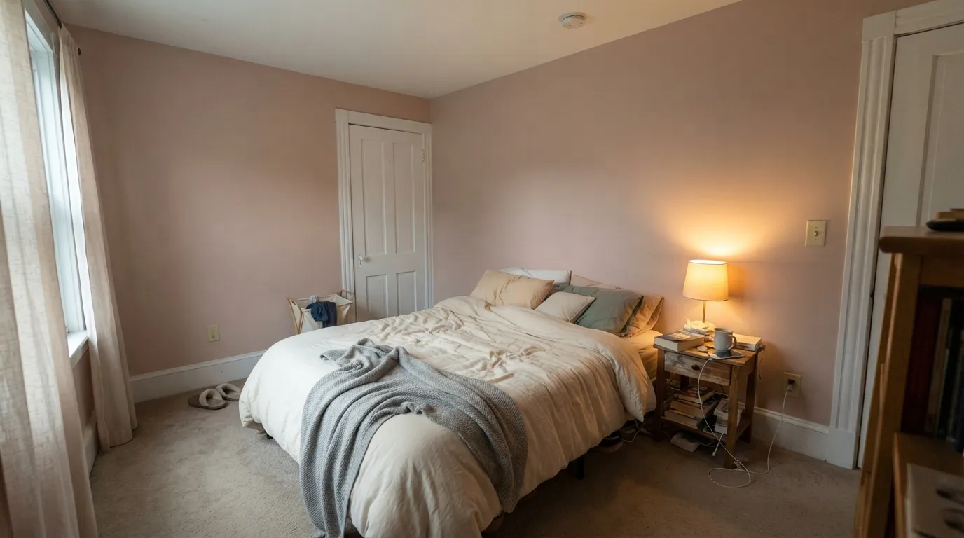
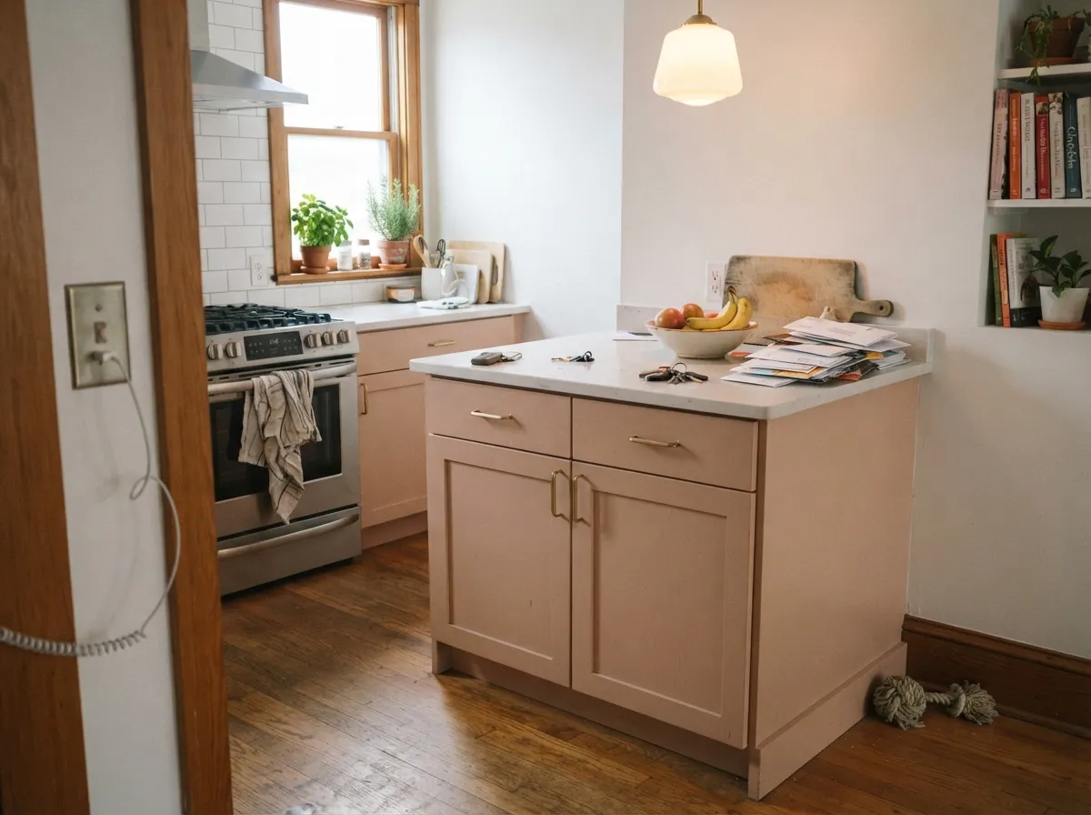
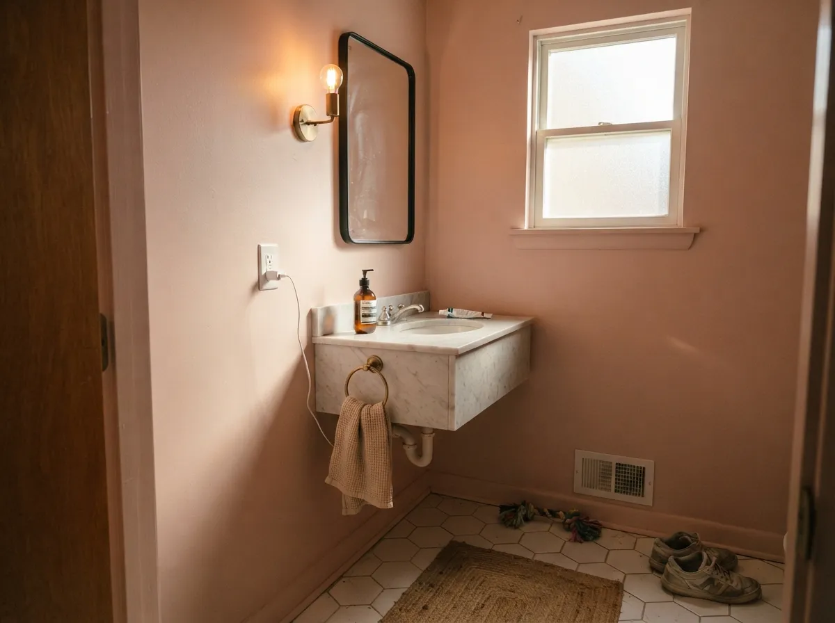
This color is built for rooms with real warmth in them, whether that's daylight or a lamp. Under 2700K light it turns genuinely rosy and flattering — a large part of why designers reach for it in bedrooms and powder rooms, where warm skin tones and warm light are a proven pairing. Its other favorite job is the small commitment: an island, a vanity, a run of cabinets under white walls, where it reads custom and considered without betting a whole room on pink. Give it olive green — its classic complement — and warm wood, and it looks deliberate rather than accidental.
Where It Fails
Almost every regret story about Setting Plaster follows one of three scripts, and all three are predictable before the first coat. None of them are the paint's fault — but if your room matches one, this is not your color, and a bigger sample will only confirm it.
Without real daylight the yellow base can't do its job, and the pink sinks into a heavy, muddy brown that readers describe as dingy rather than dusty. Farrow & Ball's own paler pink, Pink Ground, holds its warmth better in a truly dim room — Setting Plaster wants either daylight or reliable warm lamps to stay itself.
Strong sunlight pushes the yellow-ochre base hard, and the color reads distinctly peachy-orange, close to terracotta, rather than the softer putty-pink on the chip. It can be a beautiful shift on the right wall, but it surprises people expecting the same dusty pink they saw indoors.
Farrow & Ball is upfront that this is a pink, just a grayed, yellow-softened one — and on four walls in daylight, nobody mistakes it for taupe. If you want the same warm depth with none of the blush, Pashmina gets you there instead.
Room by Room
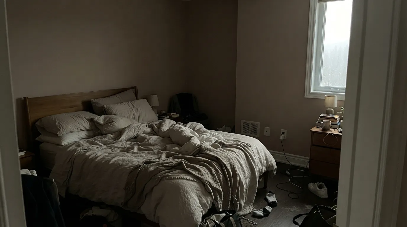
The color Farrow & Ball itself leans on for a calm, grown-up bedroom — it was designed to feel like the raw plaster underneath the paint. Matte finish, warm 2700K lamps, and cream or blush linens keep it restful rather than sweet.
In a closed, lamplit living room with brass and warm wood it reads like a considered neutral rather than 'the pink room.' Pair it with olive green — the color's classic complement — for definition instead of leaving it to float alone.
Warm skin tones and warm light are a proven combination, and a small powder room can carry all four walls in the deep color without feeling cramped. Eggshell or satin for moisture, brass fittings for the full effect.
On an island or a run of cabinets under white walls it looks custom and vintage without committing the whole kitchen to pink. A full kitchen washed in it under strong daylight risks tipping toward peachy-orange, especially near south-facing windows.
Candlelight and warm pendant fixtures are this color's natural habitat, and a dinner-party room gets exactly the rosy, flattering glow it was built for. In a bright breakfast nook with harsh morning sun, expect more peach than pink.
Full outdoor sun intensifies the yellow-ochre base into something closer to terracotta than the indoor putty-pink — a bold, deliberate choice on the right house, an unpleasant surprise on the wrong one. Test a large sample outdoors across a full day before committing a facade.
Your Light Is the Risk
2700K lamps push it into a full rosy putty-pink — the read Farrow & Ball built the color around. Best after sunset or in a lamplit bedroom.
Without real daylight, the pink drains and the yellow base goes heavy and brownish. Fine with warm lamps on; dull and muddy without them.
Direct sun pushes the yellow undertone hard, and the color reads distinctly peachy-terracotta rather than pink. Test on the actual wall before committing.
2700K bulbs: romantic, rosy, exactly the point. Cool white LEDs flatten it to a dull mauve-taupe — swap the bulbs, not the paint.
Most complaints about Setting Plaster are a light mismatch. Upload a photo of your actual room and see it on your walls — then ask for the same wall in north light or evening lamps before you buy a single sample.
Need It From Another Brand?
Any paint counter can custom-tint Farrow & Ball No. 231 directly. If you would rather stay in one brand's own deck, these are the closest stock matches, measured as ΔE2000. Under 2 is a difference you will not see on the wall.
| Brand | Closest color | ΔE | LRV | |
|---|---|---|---|---|
| Sherwin-Williams | Fresco CreamSW 7719 · Sherwin-Williams | 3.4 | 57 | Color page → |
| Behr | Artisan TeaS220-2 · Behr | 0.8 | 57 | Color page → |
| Benjamin Moore | Milk Shake1165 · Benjamin Moore | 1.4 | 56 | Color page → |
| Valspar | Alpaca MittensT534 · Valspar | 1.1 | 55.7 | Color page → |
| PPG / Glidden | Wild RicePPG1072-3 · PPG / Glidden | 2.5 | 55 | Color page → |
| Glidden | Castaway Shore Beige00YY 54/146 · Glidden | 1.3 | 54 | Color page → |
Similar Farrow & Ball Colors
The nearest shades to Setting Plaster within Farrow & Ball's own range, ranked by perceptual color distance — useful when you want the same look a touch lighter, darker, or warmer.
WCAG 2.1: AA is 4.5 : 1 for normal text, 3 : 1 for large text, AAA is 7 : 1.
Setting Plaster vs the Colors You're Also Considering
Every Setting Plaster sample board has the same rivals on it. The numbers show the real lightness gap — then it comes down to which risk you would rather live with.
Pick this for the color that actually reads pink in every light; Odessa Pink is more willing to disappear.
Benjamin Moore HC-59 · LRV 59Odessa PinkPick this for a more beige-forward version at nearly the same depth — Odessa Pink can pass for taupe in the right light.
Pick this when you want real depth — First Light is two LRV steps lighter and washes out in bright rooms.
Benjamin Moore 2102-70 · LRV 76First LightPick this for a paler, safer blush that behaves almost like a warm off-white.
Oxford Stone No. 264 at LRV 54 is the close neutral cousin. It shares the warmth but drops most of the pink, reading as a soft stone-beige. Choose Oxford Stone when you want the same cozy feel without any risk of the walls looking pink; choose Setting Plaster when you actually want that rosy character to show.
Potted Shrimp No. 9906 at LRV 53 sits very near Setting Plaster but is a touch deeper and more clearly pink-brown, so it feels a little more saturated on a big wall. It suits a smaller or cozier room where you want the color to register more firmly.
Dead Salmon No. 28 at LRV 47 is darker and more muted, a dustier heritage pink with brown in it. It reads as a proper period color and grounds a room, while Setting Plaster stays lighter, fresher, and more contemporary.
Setting Plaster Coordinating Colors
The color's own maker gives the clearest rule: pair it with olive green for definition, and keep the rest of the room warm — warm whites, warm wood, brass, never anything icy or blue-gray. These are the partners that keep showing up in rooms that work:
The Plaster-Pink Story: How One Color Started a Design Trend
Setting Plaster wasn't invented to be a pink — Farrow & Ball's color curator Joa Studholme created it after falling for the look of her own home's freshly re-plastered walls, and named it for exactly that raw, warm-toned surface. The paint mimics a material, not a mood, which is part of why it reads as sophisticated rather than sugary.
That honesty is also what made it spread: years after launch, content creators — a widely shared TikTok pink-bedroom transformation among them — turned it into one of Farrow & Ball's best-selling colors and helped kick off a broader 'bare plaster' color trend that other paint brands have been chasing ever since.
Setting Plaster With Wood Tones and Floors
Warm, mid-to-dark wood is this color's best company: cherry, walnut and mahogany all deepen the pink into something that reads as a considered neutral rather than a statement color. Pale, cool-toned wood — ash, whitewashed oak — is safe too, giving the pink room to read clearly without a warmth pileup.
The one floor that needs a sample first is orange-leaning honey oak. Two warm undertones stacked on top of each other push the whole room toward peach rather than the dustier pink the paint is known for. A large rug, or a run of paler white oak between the two, is the easy fix if the floor is staying.
Three Ready Palettes Built on Setting Plaster
A color is never alone on the wall. These are complete combinations in the 60-30-10 pattern, with the reason each one holds together. Every one opens in the visualizer.
A warm cream trim keeps the blush soft instead of making it look dirty, and a deep, genuinely brown accent grounds the room the way walnut furniture would — the same warm family, just three depths of it.
Try this palette in your roomOlive is Setting Plaster's classic complement, and it gives the pink the definition it needs instead of leaving it to float alone in the room. A warm white trim keeps the whole scheme from tipping too sweet.
Try this palette in your roomPashmina's warm greige sits close enough in temperature that the powder room doesn't feel like a jump from the hallway. Wrought Iron adds one near-black note so the pink reads deliberate, not accidental.
Try this palette in your roomSetting Plaster FAQ
Is Setting Plaster pink or beige?
Pink — Farrow & Ball itself calls it "definitely a pink," just one softened with yellow ochre so it never reads bright or candy-colored. In flattering light it can look beige-putty, but on four walls in daylight the pink is unmistakable. If you want beige with zero pink risk, look at Pashmina instead.
Does it work in a north-facing room?
It can — the yellow undertone genuinely warms up a north room that would otherwise feel cold. But if the room gets very little daylight and you won't add warm lamps, the color can sink into a heavy, muddy brown instead of staying dusty pink. Sample it on the actual wall before committing.
What trim white goes with Setting Plaster?
A warm white, not a stark one — Cloud White or White Dove keep the blush soft instead of making it look dirty next to a bright white. Semi-gloss on trim and doors, matte or eggshell on the walls.
Is there a Sherwin-Williams or Benjamin Moore dupe?
Nothing matches exactly, but the closest colors we carry are Sherwin-Williams Pink Shadow (a touch more peach, less rose) and Benjamin Moore Odessa Pink (more beige-forward at a nearly identical depth). Order real samples of both if you're deciding between an F&B order and a domestic can.
Can I use it on kitchen cabinets?
Yes — it's one of its most popular jobs, especially on an island or a hutch under white walls. A full kitchen in Setting Plaster is a bigger commitment and risks reading peachy-orange in strong daylight; most kitchens use it in doses rather than on every wall.
Does it work with honey oak or golden wood floors?
Carefully. Warm woods like cherry, walnut and mahogany are the color's best friends, but very orange honey-oak floors stack warmth on warmth and can push the whole room toward peach. Cooler or pale wood — white oak, ash — gives the pink more room to read as pink rather than orange.
Have you painted with Setting Plaster?
Rate it — one tap helps the next reader decide.
Ask a Question