Retro Pink
The dusty clay-pink built for a 1950s tile bathroom, reviewed honestly: the light that makes it glow, the light that turns it muddy, and what to pick instead.

Jessica has spec'd whites and neutrals for more than 300 rooms and keeps a sample wall of painted drawdowns in her studio. Every color review is checked against real reader rooms in the comments and re-tested when a formula changes. About the testing process →
- 1Razzle Dazzle20
- 2Coming up Roses30
- 3Retro Pink38
- 4Pale Cherry Blossom61
- 5Romance66
The Fast Verdict
Retro Pink is not the pink you reach for by accident — you buy it knowing exactly what you're getting: a clay-warm, muted rose that nods straight at 1950s tile bathrooms without going full bubblegum. It reads sophisticated in the right light and slightly bruised-taupe in the wrong one. There is no in-between with this color, which is exactly why it works when it works.
Bathrooms and powder rooms with white subway tile and brass · a mid-century-modern accent wall · bedrooms lit by warm lamps · anyone chasing the pink-tile revival look without buying actual tile
You want a true, candy-bright pink · your room runs on cool white LEDs with no warm lamps · your fixtures are chrome or brushed nickel · you want a color that doesn't move with the light
- A pink that reads sophisticated, not sweet — a real design choice
- Grounded, clay-warm undertone that flatters brass and warm wood
- Deep enough (LRV 38) to hold its color in bright rooms
- Genuinely nails the 1950s pink-tile bathroom look on purpose
- Works as a confident single accent wall without overwhelming a room
- Not a true or bright pink — disappoints anyone picturing candy-color
- Cool LEDs and dim north light drain it toward flat, muddy taupe
- Fights chrome fixtures and cool gray tile
- A committed, opinionated color — hard to make it read as a safe neutral
What Color Is Retro Pink, Really?
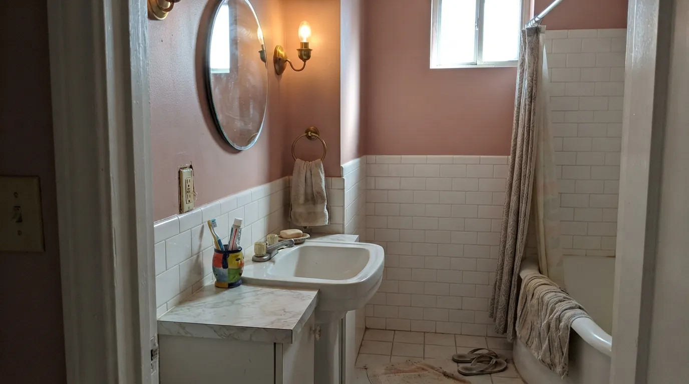
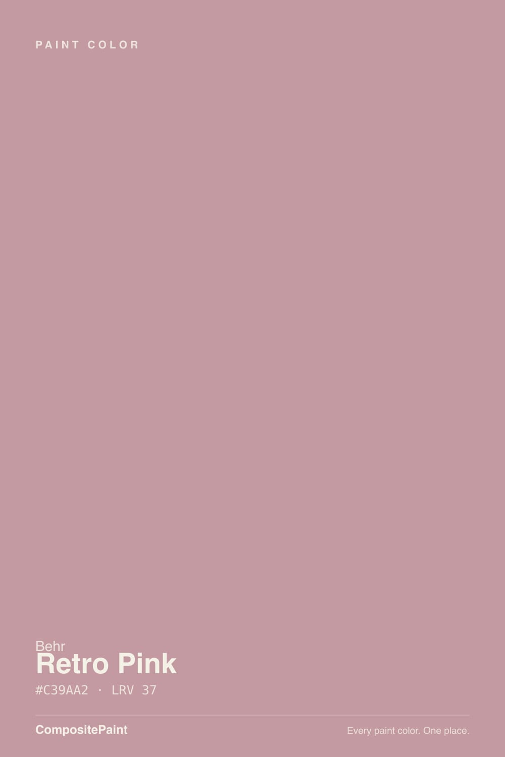
A muted, warm pink with a real clay-brown undertone — not the cool, chalky millennial pink of the last decade, and not the sugary pink of a nursery. Behr's own color story ties it to 1950s tile: the dusty rose of vintage bathroom fixtures and countertops, the color you find under wallpaper in a mid-century house that never got renovated. That reference point tells you what kind of pink this is — earthy and a little nostalgic, built to look intentional rather than sweet.
At LRV 38 it sits at genuine mid-depth, not a pastel wash. That matters because a paler blush pink can read almost white in a bright room, but Retro Pink holds its color at midday and then drops a full register toward warm mauve-taupe as the light fades — the same behavior every clay-based color shows, just more visible here because the base color is already this saturated. Expect the sample chip to look distinctly pinker on the wall in good light than it does propped against a store's fluorescent tubes.
Undertone in one line: warm clay-pink with brown underneath — never cool, never violet. If your sample reads brown or taupe, that is shadow or cool light doing it, not the paint changing formula; if it flashes orange, that is strong direct afternoon sun.
Where It Shines
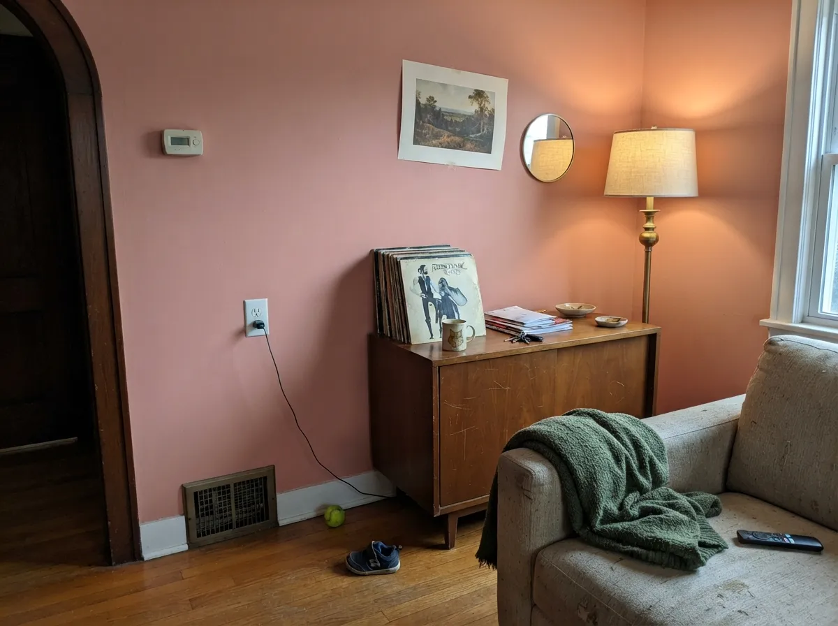
This color wants warm light and warm metal. Under an incandescent or 2700K bathroom sconce, next to white subway tile and unlacquered brass, it looks like a paint chip pulled straight from a well-preserved 1955 bathroom — the exact effect people search Pinterest for. It is just as comfortable as a single mid-century-modern accent wall behind walnut furniture, where the clay undertone reads as a deliberate, grown-up color choice instead of a trend chase. Give it wood, brass, and lamp light, and it earns its name.
Where It Fails
Almost every disappointed review of Retro Pink comes from one of three mismatches, and all three are predictable before the first coat goes on. None of them are the paint failing — they are the paint being honestly clay-based in a room built for a different kind of pink.
This is not a nursery pink or a bubblegum accent wall — it is muted and brown-based by design. If you're picturing something bright and sweet, Retro Pink will look disappointingly dull next to it. Look at a genuinely saturated rose like SW Coming up Roses instead, and let this one stay in the vintage-tile lane.
Cold light strips the warmth straight out and leaves a flat, slightly muddy mauve-taupe that reads more 'dated bathroom' than 'retro-chic bathroom.' The fix is cheap: swap to 2700K bulbs before you blame the paint. In a genuinely dim north room with no warm fixtures planned, this is the wrong color.
Chrome fixtures and cool gray tile fight the clay undertone and make the wall look pink-going-brown instead of pink-going-rosy. Brass, unlacquered bronze, and warm woods are non-negotiable partners here — swap the hardware before you repaint.
Room by Room
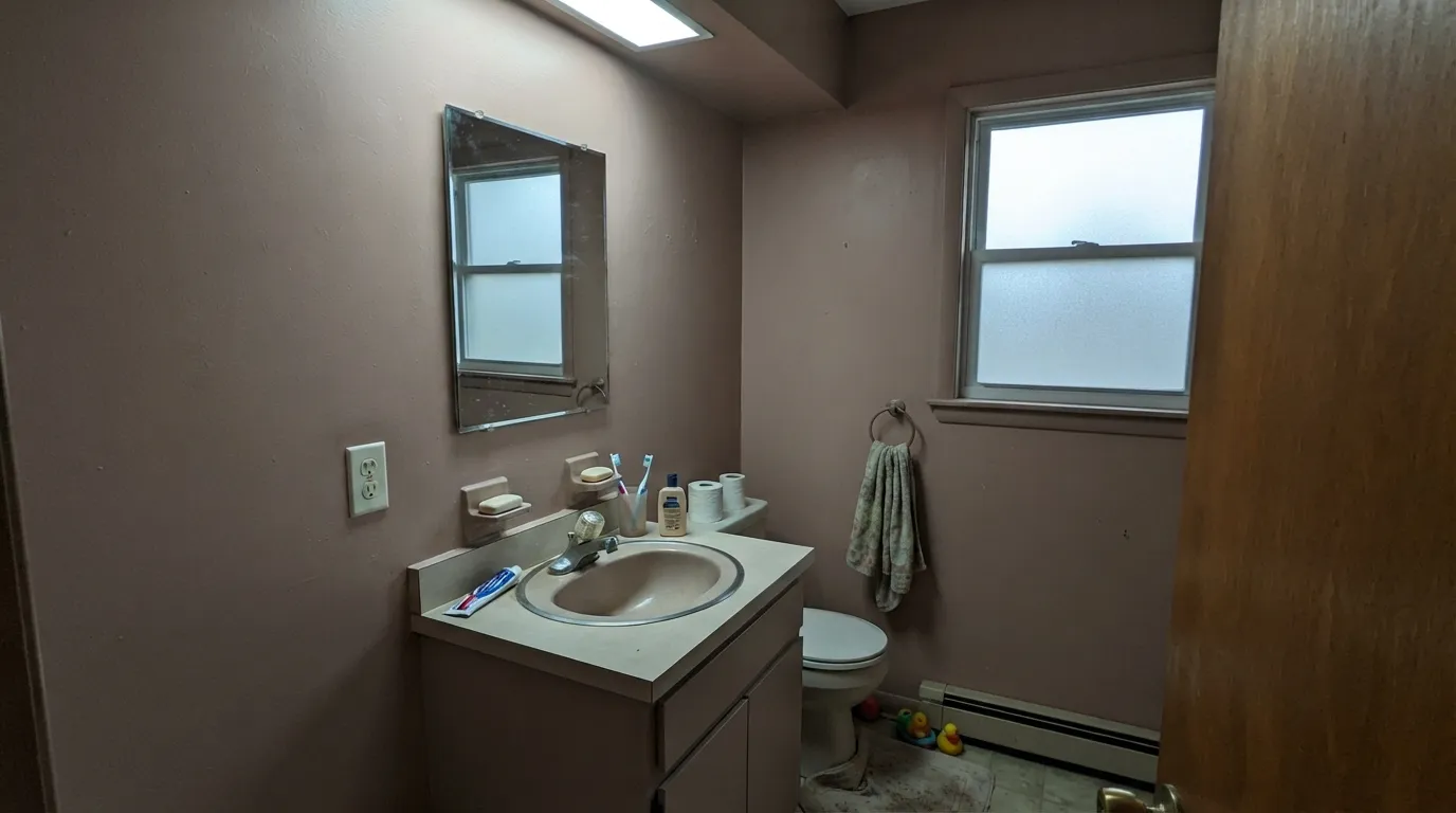
White subway tile, brass fixtures, and a warm sconce turn this into the pink-tile bathroom people are trying to recreate on purpose. Satin sheen for the moisture; keep bulbs at 2700K or the whole effect goes flat.
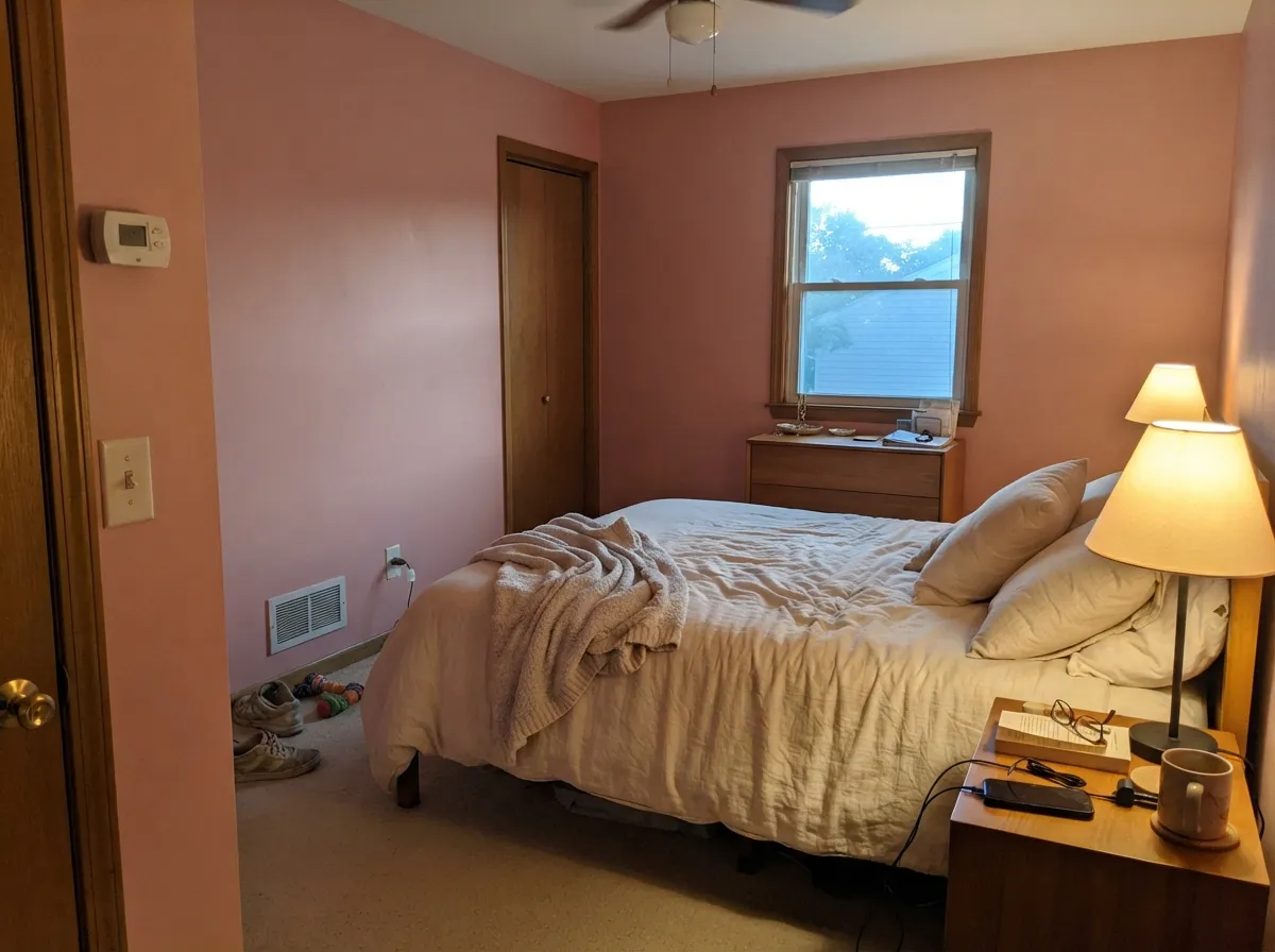
Warm evening lamplight is where it looks most expensive: cozy, clay-rose, never sweet. If the room is north-facing and dim during the day, expect it to read taupe-brown until the lamps come on.
One wall, walnut or teak furniture, brass floor lamp: it reads as a confident, mid-century color decision rather than a pink phase. Four walls of it in a bright open-plan room is a bigger commitment than most people want.
On a single island or a run of lower cabinets under warm white uppers, it is genuinely charming and vintage without being cute. A full kitchen of it fights most stone countertops; keep it to one element.
It reads more 'design magazine' than 'nursery pink' — sophisticated, not sugary. If you actually want a sweet, playful pink for a child's room, this reads too muted and adult for that job.
Full outdoor sun and shifting daylight are hard on a color that already depends on warm, controlled light indoors. It can work on a shaded porch ceiling or a single door on a genuinely mid-century house, but it is not a confident whole-exterior pick.
Your Light Is the Risk
2700K bulbs bring the clay-rose forward and the color turns genuinely warm and expensive-looking. This is the light the whole review rests on.
Cold light cancels the pink and leaves a flat, slightly muddy taupe-brown. Fine if you were half-hoping for a neutral; disappointing if you wanted pink.
Brightest and most honestly pink at midday, then it warms and deepens through the afternoon as the sun angle drops. Sample here first.
Warm 2700K: velvety clay-rose, the color's best self. Cool white LED: dull and slightly gray — swap the bulb before you swap the paint.
Most complaints about Retro Pink are a light mismatch. Upload a photo of your actual room and see it on your walls — then ask for the same wall in north light or evening lamps before you buy a single sample.
Need It From Another Brand?
Any paint counter can custom-tint Behr S170-4 directly. If you would rather stay in one brand's own deck, these are the closest stock matches, measured as ΔE2000. Under 2 is a difference you will not see on the wall.
| Brand | Closest color | ΔE | LRV | |
|---|---|---|---|---|
| Sherwin-Williams | Cabbage RoseSW 3 · Sherwin-Williams | 1.9 | 39 | Color page → |
| Benjamin Moore | Palmetto Pink1188 · Benjamin Moore | 2.3 | 38 | Color page → |
| Valspar | Naked Clay1008-10A · Valspar | 2.5 | 38.6 | Color page → |
| PPG / Glidden | Just RoseyPPG1061-4 · PPG / Glidden | 2.3 | 40 | Color page → |
| Glidden | PepperberryPPG1055-4 · Glidden | 3.8 | 39 | Color page → |
| Dutch Boy | Hennepin Stone407-3DB · Dutch Boy | 3.2 | 38 | Color page → |
Similar Behr Colors
The nearest shades to Retro Pink within Behr's own range, ranked by perceptual color distance — useful when you want the same look a touch lighter, darker, or warmer.
WCAG 2.1: AA is 4.5 : 1 for normal text, 3 : 1 for large text, AAA is 7 : 1.
Retro Pink vs the Colors You're Also Considering
Every Retro Pink sample board has the same rivals on it. The numbers show the real lightness gap — then it comes down to which risk you would rather live with.
Pick this when you actually want the pink to read as pink, not as a beige with a memory of pink.
Behr HDC-CT-07A · LRV 47Vintage Tea RosePick this for a lighter, quieter dusty rose that reads closer to taupe than pink in most rooms.
Pick this for real presence — Odessa Pink is nearly a whisper by comparison.
Benjamin Moore HC-59 · LRV 59Odessa PinkPick this for a much softer, paler beige-pink that behaves like a warm neutral.
Within Behr, Dusty Rose S140-4A at LRV 36 is the closest sibling and reads slightly redder, while Shiny Kettle S180-4 at LRV 39 is lighter and a touch cleaner. Dutchess Dawn MQ1-4 at LRV 41 gives you the same character with more light back and more mauve.
Across brands, Hirshfield's Harvest Blessing 0105 at LRV 39 is the nearest at deltaE 1, which means the two are visually identical in normal room light. Dunn-Edwards Rose Meadow DE6025 at LRV 34 sits at deltaE 1.24, also visually identical in practice though it is a step darker. Sherwin-Williams Rose Embroidery SW 6297 at LRV 39 comes in at deltaE 1.92, close enough that most people will not separate the two on a wall. Benjamin Moore Mauve Mist 1264 at LRV 36 and Farrow and Ball Cinder Rose No. 246 at LRV 40, at deltaE 3.12 and 3.33, are very close but worth sampling first. Valspar Bedroom Plum 1004-8A at deltaE 4.62 is close but visibly different side by side, reading more purple.
Retro Pink Coordinating Colors
The rule for coordinating with Retro Pink: warm whites, warm metals, and one muted green or near-black accent. It leans on brass and walnut the way a true neutral leans on nothing, and it goes quiet — even flattering — next to a soft sage. Cool grays and chrome are the pairings to avoid; they pull the clay undertone toward muddy instead of rosy.
The 1950s Pink Tile Story Behind This Color
Retro Pink is not chasing a current color trend — it is referencing an older one that never fully went away. Millions of mid-century American homes were built with pink bathroom fixtures and tile, a genuinely popular postwar choice, and a real preservation movement has kept those original bathrooms alive online rather than letting them get gutted for a white remodel. Retro Pink is Behr's paint answer to that same warm, clay-based pink glaze, aimed at anyone who loves the look but is starting from drywall instead of 1955 ceramic.
That history is also why the color reads best paired the way the original tile was: with white fixtures, warm metal, and a fair amount of natural light — not as a saturated statement color competing for attention, but as a warm neutral with a strong personality underneath.
Retro Pink With Wood Tones and Metals
Warm woods are the easy win: walnut, teak, and honey oak all sit comfortably against Retro Pink because their warmth meets the color's clay base halfway — this is the rare pink that actually likes honey-toned oak floors instead of fighting them. Cool gray-washed or ash-toned wood is the one flooring that needs a sample first; it can push the pink toward a muddier, more brownish read.
Metals matter more with this color than with most neutrals. Unlacquered brass, aged bronze, and matte black all read as intentional and vintage; polished chrome and brushed nickel read cold and slightly clash, flattening the warmth the color depends on.
Three Ready Palettes Built on Retro Pink
A color is never alone on the wall. These are complete combinations in the 60-30-10 pattern, with the reason each one holds together. Every one opens in the visualizer.
White tile trim keeps the small room from feeling closed in, and one near-black note on the mirror frame reads deliberate instead of dated. Brass hardware over both does the rest of the work.
Try this palette in your roomA warm off-white keeps the rest of the room quiet so the pink wall can be the whole statement; the muted sage echoes the mint-and-pink pairing the color was practically built for, without turning the room into a theme.
Try this palette in your roomTwo depths of the same clay-rose family read as tonal layering, not a matchy theme, and White Dove trim keeps the edges soft instead of cutting hard against the pink.
Try this palette in your roomRetro Pink FAQ
Is Retro Pink actually pink, or more of a beige-mauve?
It is genuinely pink in good light — the clay undertone is what keeps it from reading candy-sweet, not what erases the pink. In cool light or shade it does drift toward taupe-brown, which is the most common surprise buyers report. Sample it in the room's actual evening light before committing.
What's the best light for this color?
Warm — either direct daylight or 2700K lamps. Cold north light and cool white LEDs both drain the warmth and leave a flatter, muddier version of the same paint. It is not a color to trust on a paint chip under store fluorescents.
What trim white goes with Retro Pink?
A clean, slightly warm white works best — Behr White or Swiss Coffee. A stark, blue-white trim fights the clay undertone and makes the wall look dingier by contrast rather than crisper.
Does it work in a bathroom with tile?
It is one of the strongest use cases for this color — white subway tile, brass fixtures, and a warm sconce recreate the 1950s pink-tile look almost exactly. Satin sheen is the right call for moisture resistance.
Will a pink like this look dated in a few years?
Less than a bright millennial pink would. Because it leans on a clay-brown base rather than a cool pastel base, it reads closer to a warm neutral with personality than to a pure trend color — closer in spirit to a terracotta than to a candy pink, and terracottas tend to age more like earth tones than like fads.
Can I use it on kitchen cabinets?
Yes, in doses — an island or a run of lower cabinets under warm white uppers is charming and vintage without taking over the room. A full kitchen of it is a bigger bet, and it tends to argue with cool stone countertops.
Have you painted with Retro Pink?
Rate it — one tap helps the next reader decide.
Ask a Question