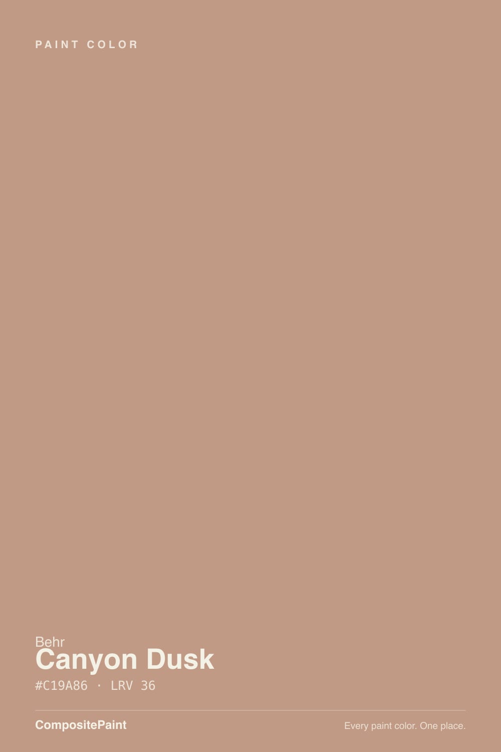
Canyon Dusk
Behr's terracotta Color of the Year, reviewed honestly: where the clay-warmth glows, the light that turns it muddy, and what to pair it with.

Jessica has spec'd whites and neutrals for more than 300 rooms and keeps a sample wall of painted drawdowns in her studio. Every color review is checked against real reader rooms in the comments and re-tested when a formula changes. About the testing process →
- 1Determined Orange22
- 2Tart Orange31
- 3Canyon Dusk36
- 4Venetian Plaster42
- 5Colonial Yellow59
The Fast Verdict
Canyon Dusk is Behr's answer to gray fatigue — a dusty, orange-red terracotta grayed down just enough to read as "earthy" instead of "orange." It won Behr's Color of the Year for 2021 for exactly that reason: comfort without commitment. Give it real daylight, stucco, or warm wood and it glows like sun-baked clay. Take the light away and it slumps into a flat, muddy brown that looks nothing like the chip.
Stucco and masonry exteriors · living rooms and dens with real daylight · entryways and front doors as an accent · anyone who wants warmth without picking orange
Your room is north-facing and dim · you actually want a neutral taupe or greige · your trim and floors are already deep orange-toned oak · you're pairing it with cool white quartz or gray stone
- Genuine, wearable terracotta — warm without being loud
- Built for stucco and masonry; holds color outdoors for years
- Grounds a room next to natural wood, brick, and stone
- Medium LRV (36) reads as a real color choice without swallowing a small room
- A Color of the Year that outlasted its year — still a go-to earth tone
- Reads flat, muddy brown in cool north light or blue-white LEDs
- Clashes with cool white trim and gray-veined stone
- Surprises buyers expecting a neutral taupe, not a true terracotta
- A whole room of it is a bigger commitment than the small chip suggests
What Color Is Canyon Dusk, Really?
Canyon Dusk is a grayed-down terracotta — Behr's own color-family classification puts it in Orange, and the undertone confirms it: a warm, high-strength orange-red base muted down until it reads as "earthy clay" instead of "orange paint." Behr named it Color of the Year for 2021, framing it as a comforting, sun-warmed antidote during a year everyone stayed home — and the description has held up better than most Colors of the Year do, because the color itself is genuinely wearable: dusty enough to sit next to neutrals, saturated enough that it never disappears into beige.
At LRV 36 it's a true medium color — noticeably deeper than a beige or greige (most of the site's warm neutrals sit at LRV 50 and up), but nowhere near as saturated as a true terracotta like Sherwin-Williams Cavern Clay (LRV 24) or Redend Point (LRV 27). That middle position is the whole appeal: strong enough to read as a genuine color choice, light enough that it doesn't demand the whole-room commitment a deeper clay would. In bright, direct sun it leans distinctly orange-red — this is the light the Color-of-the-Year photos were shot in. In flat or artificial light it sinks toward a plainer brown, losing the glow that made it famous.
Undertone in one line: orange-red first, nothing cool about it. If your sample looks dull brown or grayish, your light is cold — north exposure or blue-white LEDs. If it looks almost pink-orange, that's direct sun or warm 2700K bulbs doing exactly what the color is built to do.
Where It Shines
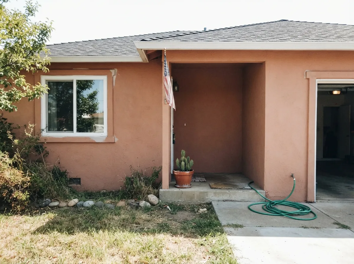
Its real home is outside. Canyon Dusk built its reputation on stucco and masonry — Behr sells it in an elastomeric masonry formula made for exactly this job — and full sun is the light that made it Color of the Year: the clay warmth reads sun-baked and expensive against natural stone, brick, and warm wood trim. Indoors, give it a living room or den with real daylight and it does the same job at a smaller scale: a grounding, comforting color that photographs like it belongs in the Southwest without forcing the rest of the house to follow.
Where It Fails
Almost every disappointed review of Canyon Dusk comes from one of three situations, and all three are avoidable if you sample honestly first. None of them are the paint's fault — the color is exactly what Behr says it is — but if your room or your expectations match one of these, this is not your color.
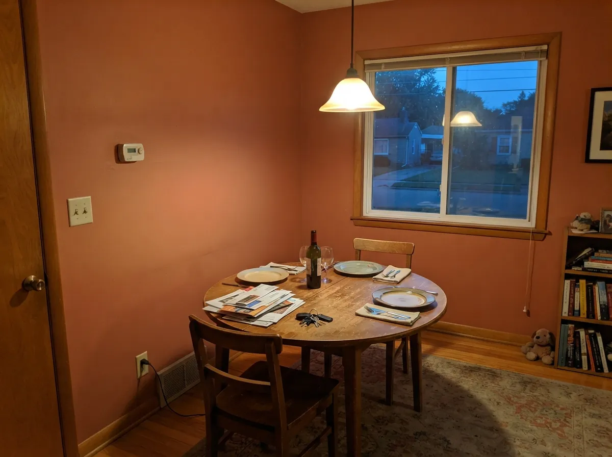
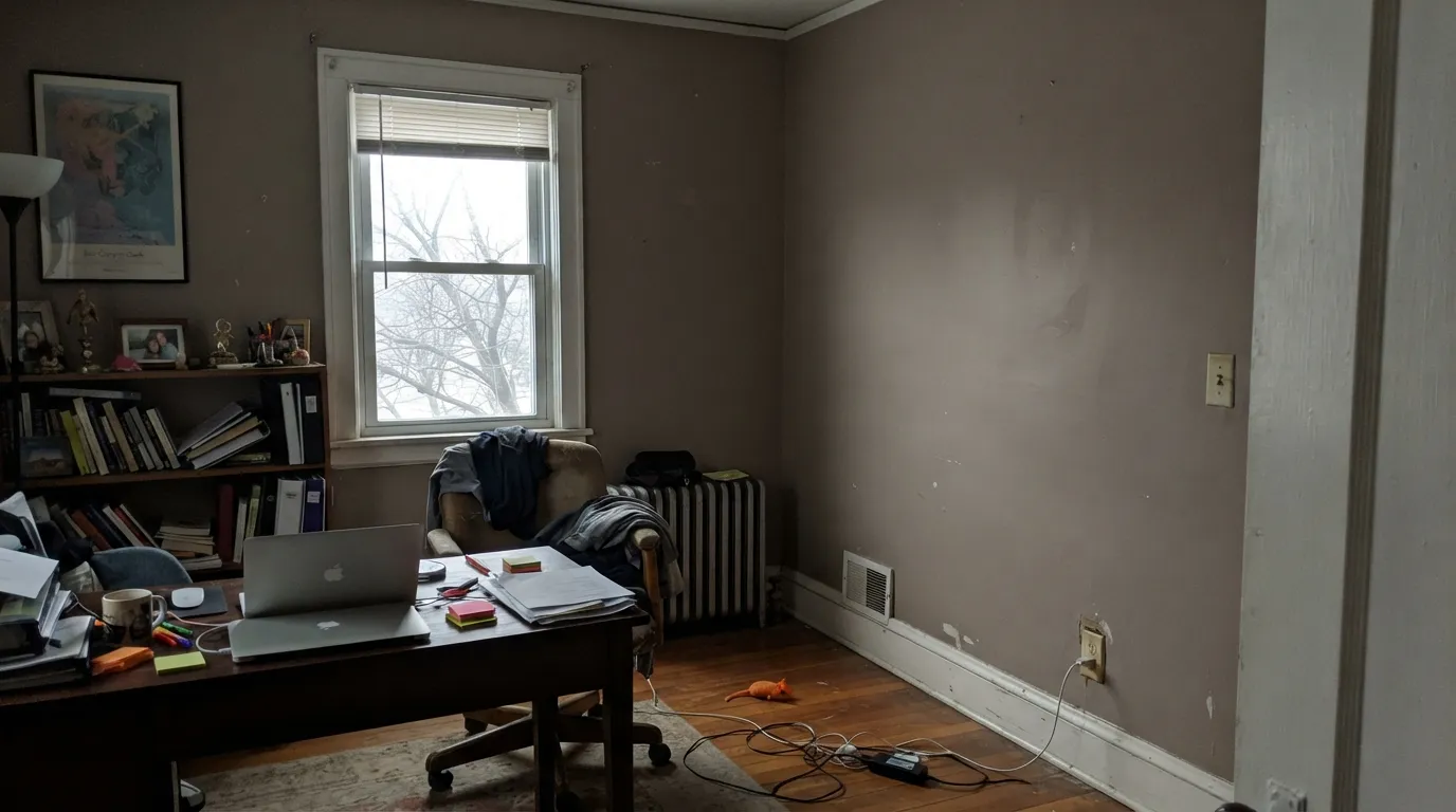
Take the warm light away and Canyon Dusk goes flat and slightly muddy — readers describe it as looking "dirty brown" instead of "dusty terracotta." It's one of the more light-dependent colors in the deck because the whole appeal is the orange coming forward; cool light cancels the trick. Warm 2700K bulbs are close to mandatory in a north-facing room.
Canyon Dusk photographs muted on a small chip, which fools people into buying it as a neutral. On four walls, or a full stucco exterior, in real sun, the orange-red comes forward and it reads unmistakably like clay — not gray, not tan. If you wanted "greige with a little warmth," look at Behr Creamy Mushroom instead and let this one stay in the earth-tone lane.
Stark, blue-based white trim or gray-veined quartz sits at the opposite temperature and makes the orange undertone look dated instead of warm — the classic orange-wall, icy-trim mismatch. Pair it with a warm white (Behr Swiss Coffee, Blank Canvas) and warm-toned stone instead.
Room by Room
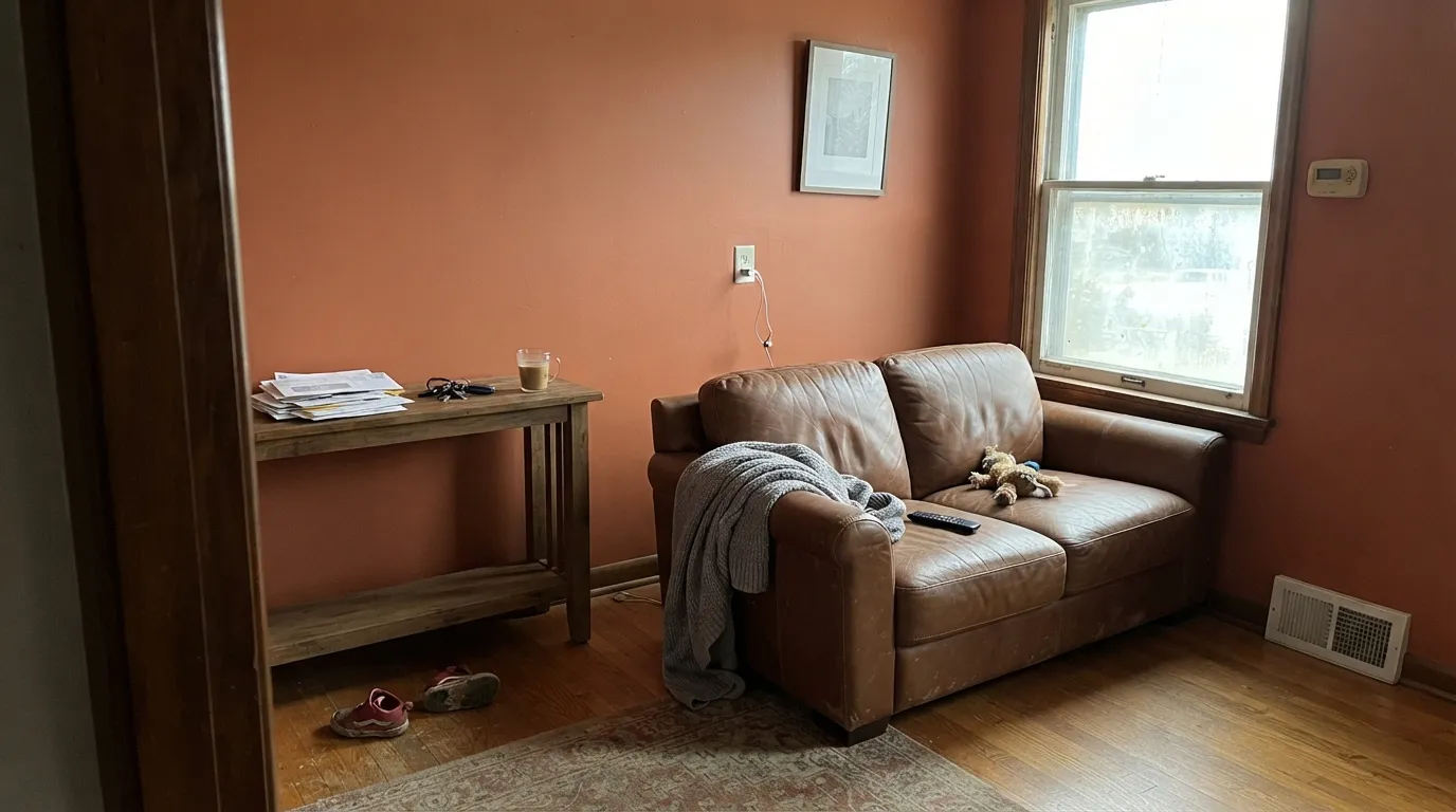
With real daylight and natural materials — leather, walnut, brick, wool — it turns into a grounding backdrop that photographs like a magazine feature. Eggshell finish, warm white trim, and it needs almost nothing else to feel finished.
This is the job Canyon Dusk was built for. Behr sells it in an elastomeric masonry formula specifically for stucco, and reviewers report it holding color for years on Southwest-style homes. Full sun brings out the clay-orange the chip only hints at.
Under evening lamplight it turns warm and enveloping, which is exactly what a dining room wants. Pair with a warm white ceiling and a wood table; skip it if the room is only used for bright weekday breakfasts in cool light.
A small dose — a front door, a covered-porch wall — carries the whole personality without committing a house to it. It reads as a deliberate, welcoming choice rather than "the orange house."
On an island or a coffee nook it's genuinely charming against warm wood and brass. A full kitchen of Canyon Dusk cabinets is a bold, harder-to-resell bet, especially over anything already orange-toned like honey oak.
In a south- or west-facing bedroom with warm lamps, it's cozy and enveloping. In a north-facing bedroom it goes muddy and can feel heavy rather than restful — test a large sample before committing a room you sleep in.
Your Light Is the Risk
Full, direct sunlight is the light Behr photographed it in — the orange-red comes forward and it reads exactly like sun-baked clay. This is its Color-of-the-Year light.
Cool, indirect daylight drains the warmth and leaves a flatter, slightly muddy brown. Readers in north-facing rooms report it looking "dirty" rather than "earthy."
Glows distinctly orange-pink at the sun hours, settles into a calmer clay tone the rest of the day. Expect real movement, not a static color.
2700K lamps: warmer, cozier, closer to the chip. Cool LEDs: flat and slightly gray — swap the bulbs before you consider repainting.
Most complaints about Canyon Dusk are a light mismatch. Upload a photo of your actual room and see it on your walls — then ask for the same wall in north light or evening lamps before you buy a single sample.
Need It From Another Brand?
Any paint counter can custom-tint Behr S210-4 directly. If you would rather stay in one brand's own deck, these are the closest stock matches, measured as ΔE2000. Under 2 is a difference you will not see on the wall.
| Brand | Closest color | ΔE | LRV | |
|---|---|---|---|---|
| Sherwin-Williams | WickerworkSW 10 · Sherwin-Williams | 4.8 | 37 | Color page → |
| Benjamin Moore | Nutmeg1227 · Benjamin Moore | 1.3 | 37 | Color page → |
| Valspar | Adobe Glow1007-10A · Valspar | 2.5 | 35 | Color page → |
| PPG / Glidden | Salmon EggsPPG18-16 · PPG / Glidden | 3.7 | 35 | Color page → |
| Glidden | Brownington Court90YR 36/203 · Glidden | 4.2 | 36 | Color page → |
| Dutch Boy | Ginger Nut410-4DB · Dutch Boy | 3.0 | 34 | Color page → |
Similar Behr Colors
The nearest shades to Canyon Dusk within Behr's own range, ranked by perceptual color distance — useful when you want the same look a touch lighter, darker, or warmer.
WCAG 2.1: AA is 4.5 : 1 for normal text, 3 : 1 for large text, AAA is 7 : 1.
Canyon Dusk vs the Colors You're Also Considering
Every Canyon Dusk sample board has the same rivals on it. The numbers show the real lightness gap — then it comes down to which risk you would rather live with.
Pick this for the lighter, easier-to-live-with version of the same clay family.
Sherwin-Williams SW 7701 · LRV 24Cavern ClayPick this for a deeper, more saturated terracotta — it only glows in the right light, same as this one, just louder.
Pick this for more orange, less pink, and a genuine Color-of-the-Year pedigree.
Sherwin-Williams SW 9081 · LRV 27Redend PointPick this if you want the pinker, more controversial clay that split the internet — Canyon Dusk is the calmer version.
The nearest Behr neighbor is Chestnut Bisque S200-4 at #BE9A89 and LRV 36. Same depth, slightly more pink, and hard to separate until both are on a wall. Egyptian Pyramid PPU3-12 at #C19A7E and Copper Moon HDC-AC-02 at #C4997A, both LRV 36, pull yellow instead and read as a safer tan.
Across brands, Benjamin Moore Nutmeg 1227 at #C39D87 and LRV 37 has a deltaE of 1.29, which makes it visually identical in normal room light. Valspar Adobe Glow 1007-10A at LRV 35 is deltaE 2.47 and Dunn-Edwards Clouds in My Coffee DEBN08 at LRV 35 is 2.64, so both are very close and worth sampling first.
Farrow and Ball Ointment Pink No. 21 at LRV 36 is deltaE 2.85 and lives up to its name by leaning pinker. Sherwin-Williams Wickerwork SW 10 at LRV 37 is deltaE 4.8 and clearly more yellow, so it is close but visibly different side by side.
Canyon Dusk Coordinating Colors
The rule for coordinating with Canyon Dusk: warm whites and warm-toned neutrals, not cool ones — and don't be afraid of a genuine dark or a cool accent in small doses, since the color is strong enough to carry contrast. These are the partners that keep showing up in rooms and exteriors that work:
Canyon Dusk's Story: Behr's 2021 Color of the Year
Behr named Canyon Dusk its Color of the Year for 2021, describing it as a comforting, sun-warmed hue meant to bring calm during a year most people spent almost entirely at home. The marketing framing was of-the-moment, but the color itself wasn't invented for it — a muted terracotta this wearable is really just Behr's take on a clay-earth tone that has cycled through American homes for decades, from mid-century adobe ranch houses to today's Southwest-revival exteriors.
That history is why it outlasted its year on the calendar. Behr still sells it in an elastomeric masonry formula built for stucco and brick specifically, which tells you where the color actually earns its keep — not on a single accent wall, but on whole exteriors in the Southwest and California, where full sun and natural stone are exactly the conditions Canyon Dusk was built to answer.
Canyon Dusk With Wood Tones and Floors
Dark wood is the easy, safe pairing: walnut, espresso, and dark-stained oak all give Canyon Dusk something to contrast against, so the wall or exterior reads as a deliberate color choice rather than one big orange note. Pale, white-oak floors work well too, keeping the room feeling current rather than heavy.
Honey oak is the pairing to think through first. It isn't a true clash — orange and orange-brown don't fight the way complementary colors do — but two warm-orange surfaces in the same room can read matchy and dense rather than intentional. A large rug, a cooler accent piece, or simply testing a big sample against the actual floor before committing is worth the extra step.
Three Ready Palettes Built on Canyon Dusk
A color is never alone on the wall. These are complete combinations in the 60-30-10 pattern, with the reason each one holds together. Every one opens in the visualizer.
Warm terracotta siding needs a warm-white trim, not a stark cool one — Swiss Coffee keeps the whole exterior in the same warm family. Sable anchors the entry with a near-black brown door instead of a jarring true black.
Try this palette in your roomBlank Canvas carries the room in a warm neutral so Canyon Dusk can work as one grounding accent wall instead of four; Stone Hearth echoes the same earth-tone family a shade cooler, so the room reads intentional rather than random.
Try this palette in your roomBlue is Canyon Dusk's true complement — a small dose on a sideboard or interior door gives the warm walls one cool anchor without fighting them, and under evening lamps both colors deepen together.
Try this palette in your roomCanyon Dusk FAQ
Is Canyon Dusk orange or brown?
Both, depending on the light. Behr classifies it in the Orange family, and in direct sun it reads unmistakably orange-red — the clay glow that made it Color of the Year. In flatter or cooler light it settles into a plainer warm brown. Neither read is wrong; it's the same paint responding honestly to different light.
Is it good for a stucco exterior?
It's arguably the color's best job. Behr sells it in an elastomeric masonry formula built specifically for stucco and brick, and it's one of the more common earth-tone exteriors on Southwest-style homes. Full sun brings out the warmth the chip only suggests.
What trim color goes with Canyon Dusk?
A warm white — Behr Swiss Coffee or Blank Canvas — not a stark, blue-based white. A cool trim white makes the orange undertone look dated instead of warm, which is the single most common styling mistake with this color.
Does it work with honey oak floors or trim?
It's not a clash the way a violet color would fight orange wood, but two warm-orange tones in the same room can feel heavy and matchy rather than intentional. Darker or paler wood — walnut, espresso, or pale white oak — gives the color more contrast to work with.
Is Canyon Dusk still worth using, or did it date itself as a 2021 trend color?
It's held up better than most Colors of the Year. Because it's a grayed-down terracotta rather than a saturated trend orange, it reads as an earth tone rather than a timestamp — the same reason clay colors keep cycling back into favor instead of aging out.
What rooms should I avoid it in?
Skip it in a dim, north-facing room you're not willing to light with warm lamps, and think twice before painting an entire kitchen or bathroom in it — as an island, vanity, or accent it's charming; as the only color in a small, functional room, the medium-dark warmth can feel heavy fast.
Have you painted with Canyon Dusk?
Rate it — one tap helps the next reader decide.
Ask a Question