Venetian Plaster
Valspar's terracotta blush at LRV 42, reviewed honestly: the sun that makes it plaster, the light that turns it peach, and why it belongs on one wall more than four.

Jessica has spec'd whites and neutrals for more than 300 rooms and keeps a sample wall of painted drawdowns in her studio. Every color review is checked against real reader rooms in the comments and re-tested when a formula changes. About the testing process →
- 1Determined Orange22
- 2Caramelized35
- 3Venetian Plaster42
- 4Beehive51
- 5Colonial Yellow59
The Fast Verdict
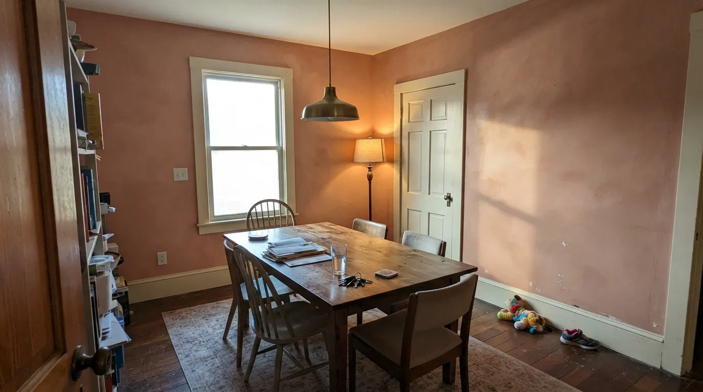
Venetian Plaster is the Lowe's-shelf terracotta blush people pull when they want Mediterranean clay without going as deep as Cavern Clay. On a sunlit accent wall it reads like warm plaster — muted copper with a clay-pink cast. Wrap four walls, or put it under cool LEDs, and the same paint goes peach-salmon. It is a color, not a neutral. Sample it on the actual wall at noon and at 7pm before you buy the gallon.
South- or west-facing accent walls · Mediterranean dining rooms with real daylight · powder rooms · bedrooms that should feel like warm plaster · anyone who wants terracotta without the adobe depth of Cavern Clay
You actually wanted beige · your floors and counters are cool gray · the room faces north and stays dim · you planned four walls of a whole house · peach or salmon is a dealbreaker
- Terracotta blush at a livable mid-tone (LRV 42) — lighter than adobe, richer than beige
- West and south sun makes it read like warm plaster, not craft-paint orange
- Excellent single-commitment use: accent wall, powder room, dining drench
- Lowe's-easy color for the Mediterranean / clay-pink look without a designer deck
- Pairs cleanly with cream whites, walnut, brass and olive sage
- Reads peach, salmon or flesh in cool light and on four walls
- Fights cool gray floors, chrome, gray marble and crisp gallery whites
- Cool LEDs and dim north rooms kill the copper and leave dingy salmon
- Not a whole-house color — too much chroma to run room to room
What Color Is Venetian Plaster, Really?
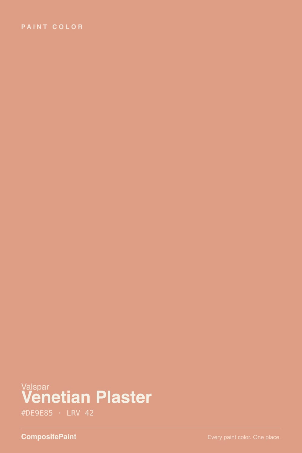
A muted copper-peach sitting in Valspar's orange family, on a strip that runs Pink Soap and Pretty in Peach above it and Rosy Pashmina, Autumn Ivy, and Red Maple below. That neighborhood is the honest read: this is not a yellow ochre and not a brown clay. The formula is warm copper with both yellow and red in it — the yellow keeps it from candy-coral, the red is what you actually see on a wall. Lowe's files 8002-12C as a warm orange; on drywall it behaves like terracotta blush, a clay-pink plaster tone a step lighter and peachier than the famous clay-pinks it gets searched against.
At LRV 42 it is a genuine mid-tone, not a tinted beige you can talk yourself into as a whole-house color. That depth is the useful part and the trap. Light enough to keep a dining room or powder room from cave-dark, saturated enough that four walls wrap you in peach the moment the light goes cool or flat. It is 22 points lighter than Cavern Clay (LRV 20) and a full step airier than Redend Point (LRV 30), which is why it photographs as plaster in west sun and as 1990s peach in a north room with the lamps off.
Undertone in one line: red-orange clay first, yellow-copper second — never beige, never a clean citrus orange. If your sample reads salmon or flesh, the light is cool or you are looking at four walls instead of one. If it reads sun-baked plaster, that is south or west daylight doing the job the chip promised.
Where It Shines
Give it real warm daylight and a limited job and it earns the name. A west-facing dining wall, a plaster-colored powder room, a headboard wall with 2700K lamps — those are the rooms where Venetian Plaster looks like aged clay instead of peach paint. It loves walnut, unlacquered brass, olive linen, terracotta tile and creamy whites. Pair it with a sage-gray like Evergreen Fog or Sprig of Sage and the scheme reads Mediterranean on purpose, not leftover from a coral decade.
Where It Fails
Almost every regret about Venetian Plaster is the same surprise: the chip looked like clay, the room looked like peach. That gap is predictable. None of it is a bad batch — but if your room matches one of these three, this is not your color, and a bigger sample will only confirm it.
On the strip it sits next to Pretty in Peach for a reason. In cool daylight, under overcast sky, or on all four walls, the red-pink comes forward and readers get salmon, flesh, or 1990s guest-room peach — not sunbaked clay. If your mental picture is Cavern Clay adobe, this is too light and too pink. One accent wall in west sun is the version that keeps the plaster promise.
This is a genuinely warm red-orange. Next to cool gray LVP, blue-gray quartz, chrome taps and builder-gray sofa fabric it looks like a leftover from a different house. The temperature clash is geometry, not a coat-count problem. Warm wood, cream, brass and olive are the company it needs; Repose Gray and Chantilly Lace next door are not.
Cool white bulbs strip the copper and leave a dingy salmon that makes the room feel smaller and slightly unwell. North sky already leans gray; add 4000K cans and Venetian Plaster loses the plaster and keeps the peach. Warm 2700K lamps are part of this paint job. If you refuse lamps and the room stays dim, pick a color that does not depend on warmth.
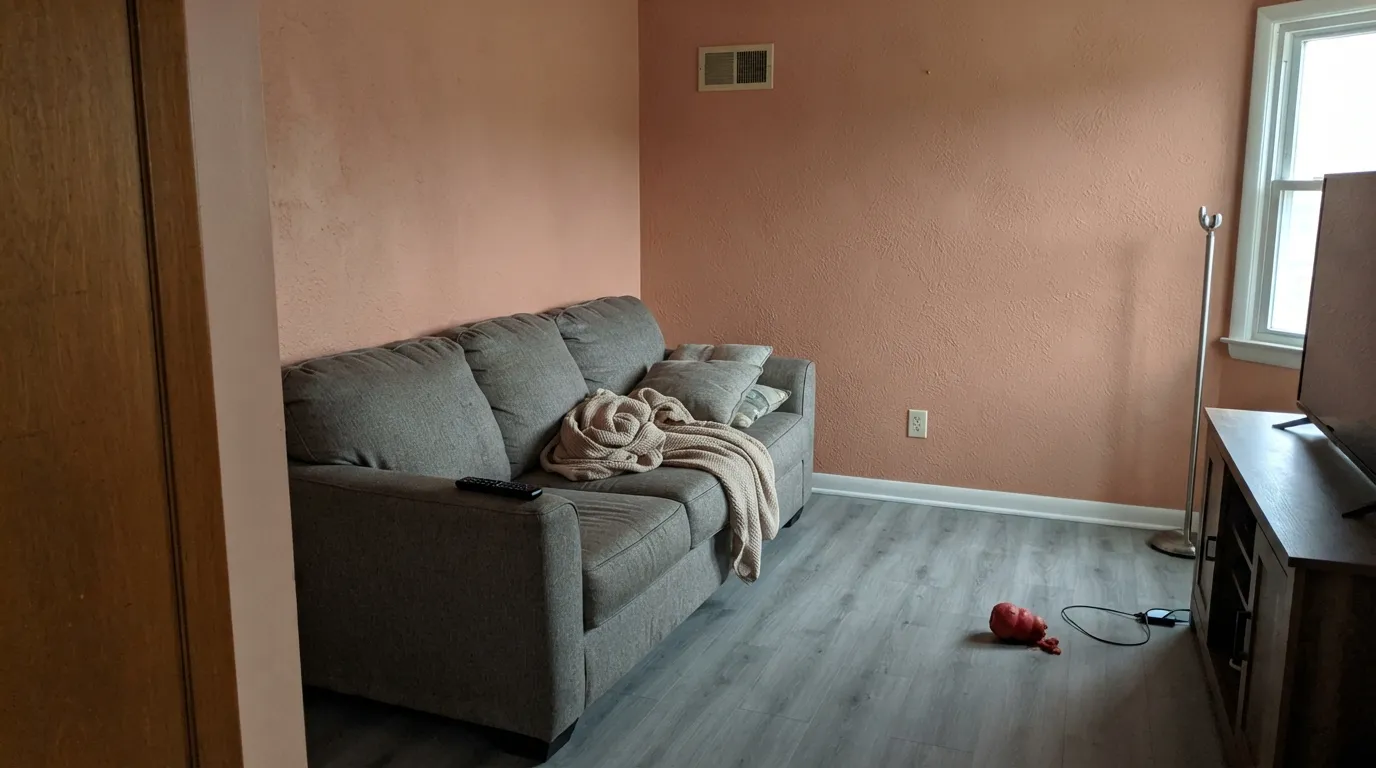
Room by Room
This is the use the search traffic is for. One west- or south-facing wall, White Dove or Alabaster on the rest, eggshell or matte. The clay-pink reads as plaster instead of a peach wrap, and you can still live with the sofa you already own.
A closed dining room with afternoon sun is the four-wall exception. Walnut table, brass or black iron, cream linen, warm bulbs at night — it goes terracotta-clay for dinner and stays interesting in the morning. Skip it in an open plan that has to shake hands with a gray kitchen.
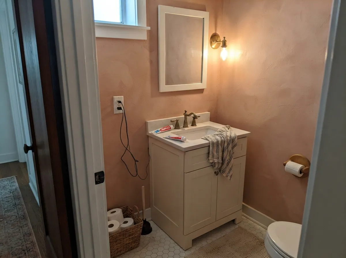
Small rooms take mid-chroma color well. All four walls in eggshell, a cream vanity, brass taps: jewel-box plaster without betting the house. Satin on the door. This is the cheapest way to live with 8002-12C before an accent wall in the living room.
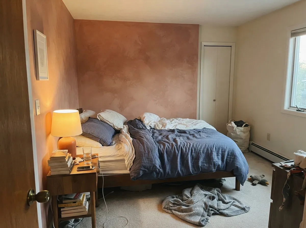
A headboard wall in a west bedroom, cream bedding, 2700K bulbs: the plaster read at night is the reason to buy it. Four walls in a north bedroom is the peach-cave version. Matte hides texture; keep gray sheets out of the room.
As a fireplace or sofa wall in south or west light, with Accessible Beige or White Dove on the other planes, it anchors an organic-modern room. Painted on every wall it can feel like living inside a terracotta pot that went pink. Sample the largest wall at 2pm and after dark.
A full kitchen of peach-clay cabinets fights stainless, cool quartz and food stains, and the color is louder next to white subway tile than the chip suggests. An island or pantry door under cream walls can work. Outside, full sun pushes the peach and it reads more coral stucco than plaster — leave exteriors to deeper terracottas.
Your Light Is the Risk
Warm sun keeps the copper-clay in charge and the wall reads plaster. Late afternoon is the color the chip promised — this is the light to buy it for.
Cool gray sky strips the copper and leaves peach-salmon, often a step dingier than the chip. Fine as a tiny powder room with lamps; disappointing on a living-room wrap.
East light shows more peach at breakfast; west sun and golden hour pull it toward terracotta-clay. It is an active color across the day — sample at 8am and 6pm on the same wall.
2700K bulbs hold the clay-copper and it goes cozy. Cool white LEDs (3500K and up) push salmon-flesh — swap the bulbs before you repaint.
Most complaints about Venetian Plaster are a light mismatch. Upload a photo of your actual room and see it on your walls — then ask for the same wall in north light or evening lamps before you buy a single sample.
Need It From Another Brand?
Any paint counter can custom-tint Valspar 8002-12C directly. If you would rather stay in one brand's own deck, these are the closest stock matches, measured as ΔE2000. Under 2 is a difference you will not see on the wall.
| Brand | Closest color | ΔE | LRV | |
|---|---|---|---|---|
| Sherwin-Williams | Fame OrangeSW 6346 · Sherwin-Williams | 3.0 | 40 | Color page → |
| Behr | ApricottaHDC-CT-13 · Behr | 3.2 | 43 | Color page → |
| Benjamin Moore | Farmer's Market054 · Benjamin Moore | 1.4 | 41 | Color page → |
| PPG / Glidden | Opal FirePPG1192-5 · PPG / Glidden | 2.5 | 42 | Color page → |
| Glidden | Buttered Salmon60YR 40/297 · Glidden | 0.6 | 40 | Color page → |
| Dutch Boy | Native Copper208-4DB · Dutch Boy | 2.5 | 40 | Color page → |
Similar Valspar Colors
The nearest shades to Venetian Plaster within Valspar's own range, ranked by perceptual color distance — useful when you want the same look a touch lighter, darker, or warmer.
WCAG 2.1: AA is 4.5 : 1 for normal text, 3 : 1 for large text, AAA is 7 : 1.
Venetian Plaster vs the Colors You're Also Considering
Every Venetian Plaster sample board has the same rivals on it. The numbers show the real lightness gap — then it comes down to which risk you would rather live with.
Pick this for a lighter, peachier plaster read that stays clearly terracotta-blush instead of beige-mauve.
Sherwin-Williams SW 9081 · LRV 30Redend PointPick this if you want the famous clay-pink — deeper, browner, more chameleon, and more likely to read mauve in cool light.
Pick this when you want the same warm-clay idea at a lighter, airier value that will not cave a dining room.
Sherwin-Williams SW 7701 · LRV 20Cavern ClayPick this if you want real adobe depth — sunbaked terracotta that only glows in the right light, not a blush.
Venetian Plaster Coordinating Colors
The rule for coordinating with Venetian Plaster: stay warm, add one olive or navy, and keep cool gray at arm's length. Creamy whites, walnut, brass and sage-gray make the clay-pink look like plaster; chrome, gallery white and greige make it look like peach paint. These are the partners that keep showing up in rooms that work:
Not the Plaster in a Bucket — and Not a Color of the Year
Two naming traps sit on this chip. First: Valspar sells a tintable acrylic Venetian Plaster finish at Lowe's, a specialty coating people trowel for a concrete or lime look. 8002-12C is unrelated — it is a standard orange-family wall color on the Pretty in Peach to Red Maple strip. Clerks, TikToks and Reddit threads blend the two, which is why someone will tell you this color only comes in seven tints. That is the finish product.
Second: it is not a famous Color of the Year. Cavern Clay (2019) and Redend Point (2023) did that work for terracotta and clay-pink; Venetian Plaster is the Lowe's-aisle answer people search when they want that plaster-clay mood at a lighter, peachier value. Honest obscurity is useful here — you are not buying a viral color, you are buying a mid-tone blush that behaves like terracotta only in the right light. Sample it like a color, not like a safe beige.
Venetian Plaster With Wood Tones and Floors
Warm wood is the easy yes. Walnut, chestnut, medium oak and espresso make the clay-pink look grounded; the red in the paint meets the red-brown in the floor and both sides settle. Unlacquered brass, antique bronze and matte black iron all sit well; polished chrome is the metal that turns it salmon.
Pale white oak and light maple are workable if the rest of the palette stays cream and olive rather than gray. Orange honey-oak builder floors are the maybe: some Mediterranean rooms lean into the double warmth, others look overcooked. A large rug in ivory or olive is cheaper than refinishing.
The honest no is cool gray — gray LVP, gray-washed wood, blue-gray tile. Cool floors pull the peach forward and the wall looks fleshy. If the gray floor is staying, this is the wrong paint; look at Accessible Beige or a true greige and keep the terracotta for pottery.
Three Ready Palettes Built on Venetian Plaster
A color is never alone on the wall. These are complete combinations in the 60-30-10 pattern, with the reason each one holds together. Every one opens in the visualizer.
Creamy Alabaster keeps the plaster as a single clay plane instead of a peach wrap; Evergreen Fog is the sage note terracotta needs so the room reads Mediterranean rather than coral. Brass hardware and walnut finish the argument.
Try this palette in your roomWhite Dove is the soft warm white that will not ice the clay-pink the way a crisp gallery white would. Hale Navy gives one dark note so the dining room feels decided; it needs real light, which this room already has if Venetian Plaster is on four walls.
Try this palette in your roomOne Lowe's trip: Valspar Swiss Coffee is the cleaner house white next to this blush, not a yellow cream that would double the peach. Sprig of Sage is the sage-gray that keeps the bedroom from going coral-and-cream cute. 2700K lamps are non-negotiable.
Try this palette in your roomVenetian Plaster FAQ
Is Venetian Plaster pink, peach, or terracotta?
Terracotta blush — clay-pink with copper in it. On a sunlit accent wall it reads plaster; in cool light or on four walls it reads peach-salmon. It is not beige. If pink-peach is a dealbreaker in any form, skip it. If you want adobe, go deeper to Cavern Clay.
What trim white goes with Venetian Plaster?
A soft warm white. White Dove is the default; Valspar Swiss Coffee if you are staying in the Lowe's aisle. A stark bright white like Chantilly Lace makes the walls look peachier and a little dirty at the cut line. Semi-gloss on the trim, eggshell or matte on the walls.
Can I paint a whole room, or just an accent wall?
Accent wall is the safe and usual job. A closed dining room or powder room with real daylight can take all four walls. A whole house, an open living-kitchen, or a north bedroom should not. LRV 42 with this much red-orange is a wrap, not a backdrop.
Does it work with oak floors?
Walnut, espresso, and medium brown oak are excellent — the wood and the clay share warmth. Pale white oak is fine if the rest of the room stays cream and olive. Orange honey oak plus this paint is a lot of red-orange in one room; it can work in a Mediterranean scheme, or it can look like two peaches arguing. Sample over the actual floor. Cool gray LVP is the honest no.
Is this the Valspar Venetian Plaster textured finish?
No. 8002-12C is a regular paint color in the orange family. Valspar also sells a tintable acrylic Venetian Plaster finish — a specialty coating with a short tint list — and Lowe's clerks and Reddit threads mix the two constantly. Ask for the color chip 8002-12C, not the plaster product, unless you actually want the textured finish.
Will it look salmon in a north-facing room?
Often, yes — especially with cool bulbs and no lamps. North light is the peach version of this color. A tiny powder room with 2700K sconces can still work; a north living room on four walls is the regret photo. Test a big sample on the dimmest wall for two cloudy days before committing.
Have you painted with Venetian Plaster?
Rate it — one tap helps the next reader decide.
Ask a Question