Beehive
The honey-gold Behr's own experts pick, reviewed honestly: where it glows on a front door, the light that turns it to mustard, and what to pick instead.

Jessica has spec'd whites and neutrals for more than 300 rooms and keeps a sample wall of painted drawdowns in her studio. Every color review is checked against real reader rooms in the comments and re-tested when a formula changes. About the testing process →
- 1Caramelized35
- 2Venetian Plaster42
- 3Beehive51
- 4Colonial Yellow59
- 5Belvedere Cream65
The Fast Verdict
Beehive is a real, unapologetic gold — amber and honey rather than the pastel butter-yellow most "gold" paints turn into on a wall. It reads warm without reading like a nursery, and it holds its color in real daylight instead of washing out. Best used with intent: a front door, a kitchen island, one confident wall — not four walls of a dim room, where the same amber that glows in the sun goes muddy fast.
Front doors and entryways · kitchen islands and cabinet accents · dining rooms with real daylight · one committed accent wall · anyone who wants an actual gold, not a beige with a suggestion of one
The room runs on cool LEDs and gets little daylight · you want it on all four walls of a big, dim living space · your counters or floor are stark white or cool blue-gray · you're chasing a quiet, safe neutral
- A genuine gold — amber and honey, not a pale butter-yellow imitation
- Holds its color in real daylight instead of washing out
- A proven front-door and exterior-trim color with real curb appeal
- Flatters brass, walnut, and warm whites
- Mid-tone LRV (52) keeps it legible without reading brown
- Turns muddy or mustard-toned in a dim, weak-light room
- Cool LED bulbs cancel its warmth after dark
- Argues with stark white or cool blue-gray stone and quartz
- Too much presence for anyone who actually wants a quiet neutral
What Color Is Beehive, Really?
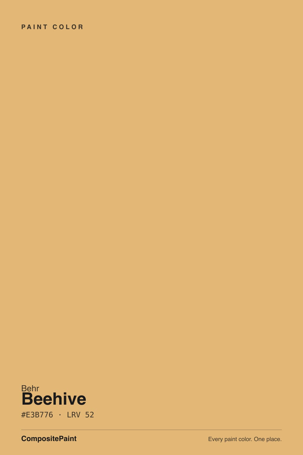
Beehive is a golden-yellow built on amber and ochre rather than lemon — the orange undertone is what keeps it from reading like a pale butter yellow or a cool, flat gold. It behaves less like a pastel accent color and more like a genuine hue: strong enough to notice, warm enough to never feel clinical. Behr counts it among its own expert color picks, which tracks — this is a color chosen by people who work with paint all day, not a trend-chase.
At LRV 52 it sits at a true mid-tone: reflective enough to stay legible instead of reading as brown, saturated enough to hold its gold instead of washing pale. For scale, it lands 17 points lighter than SW Caramelized (LRV 35, a deeper caramel-brown) and 7 points darker than SW Colonial Yellow (LRV 59, a brighter, more purely yellow historic color). Beehive sits between those two — more amber than Colonial Yellow, more light than Caramelized.
Undertone in one line: warm, golden-orange — never a cool lemon-yellow, never pink, never green. If your sample looks flat and slightly brownish, that is dim or artificial cool light doing it, not the paint changing character.
Where It Shines
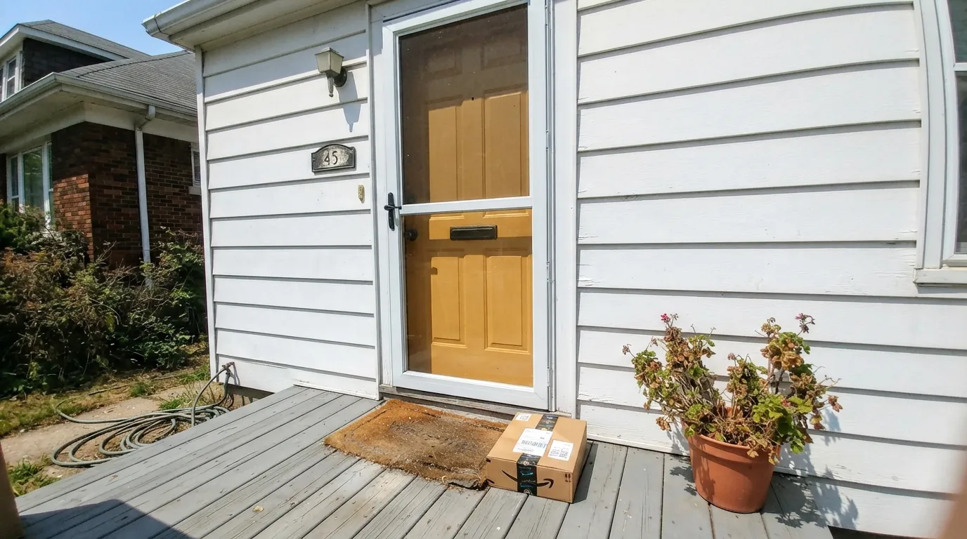
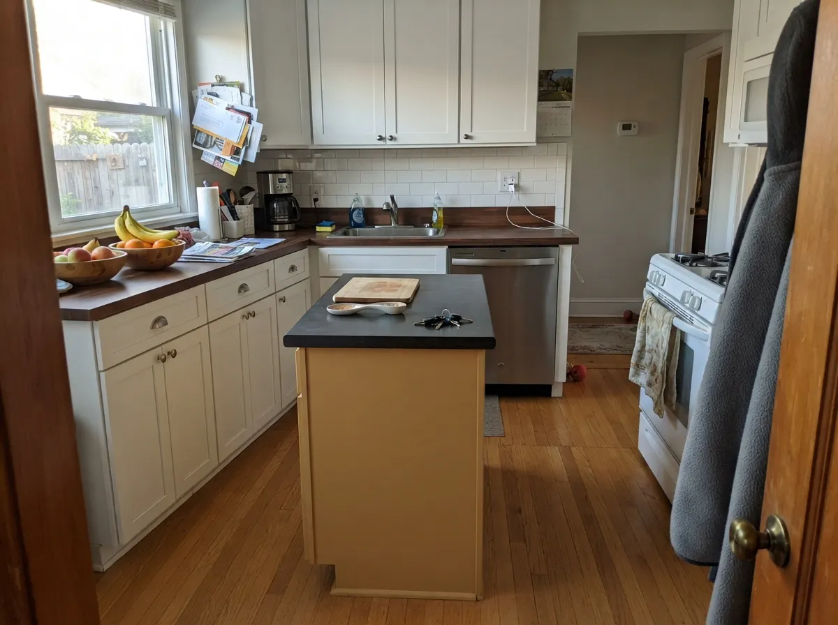
Give it real daylight — south sun especially — and Beehive earns its reputation as one of Behr's most-searched golds. It is a proven front-door and exterior-trim color for a reason: from the street, in full sun, it reads confident and welcoming without tipping into orange. Indoors its best job is the same instinct in smaller doses — a kitchen island, a dining-room accent wall, a set of interior doors — anywhere it gets to be the one loud decision in an otherwise calm room. With brass hardware, walnut or butcher block, and a warm white trim, it looks intentional rather than trendy.
Where It Fails
Almost every disappointed review of a bold gold like this comes from one of three situations, and Beehive is no exception. None of them are the paint's fault — but if your room matches one, sample big before you commit to four walls.
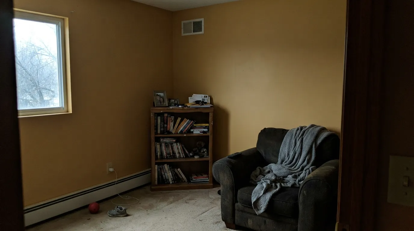
In a large room with north exposure, small windows, or no real daylight, the amber that glows in the sun turns muddy — reviewers of golds like this describe it as "mustard" or "dingy." Beehive was built to be a door, an island, or one wall, not a whole dim living room. Where a whole room is the goal, test a big sample on the darkest wall first.
Cool white or daylight-temperature LEDs cancel the warmth that makes this color work, leaving a flat, slightly gray-mustard cast after dark. The fix costs a few dollars: swap to 2700K warm bulbs wherever this color lives. Don't repaint before you've changed the bulbs.
Icy white quartz, blue-gray marble, or a bright cool-white trim pulls against Beehive's orange undertone and makes both sides look slightly off — the counters read dingy, the paint reads too orange. Warm woods, brass, and a soft warm white trim are its natural company instead.
Room by Room
Golden and visible from the curb without reading garish. Semi-gloss for wipeability and shine; it holds up well in full sun and reads warm even against gray or white siding.
On an island or a run of lower cabinets under white or cream upper cabinets, it is genuinely striking with brass hardware and butcher block. A full kitchen of gold cabinets is a much bigger bet — most readers who love this color use it as the one accent, not the whole room.
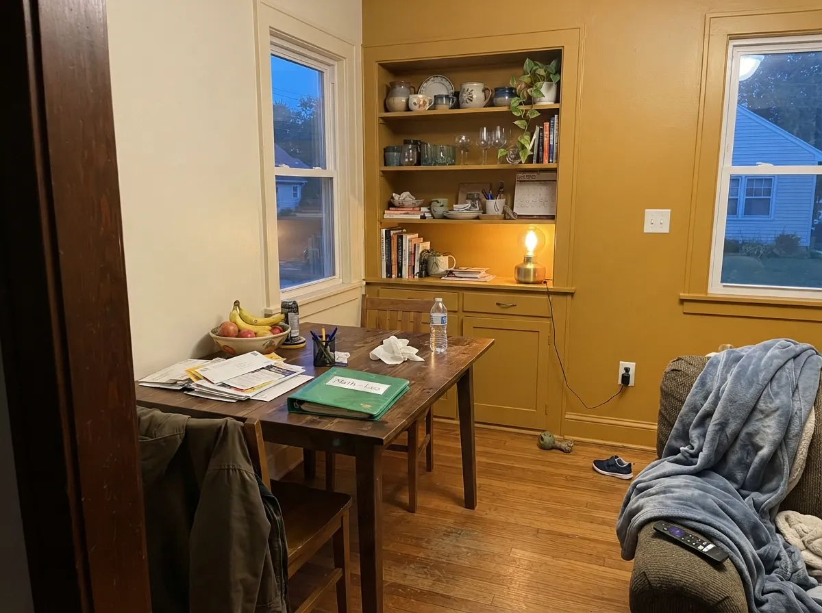
On an accent wall or a built-in hutch under a brass chandelier and a walnut table, it looks custom and warm. Needs actual daylight or evening lamp light to stay gold rather than heavy.
Works beautifully as one accent wall or a set of built-ins in a room with strong daylight. A whole living room in this color, especially a large or dim one, is the situation most likely to disappoint — go smaller if the light is uncertain.
A headboard wall or a set of interior doors carries the warmth without overwhelming a room meant to be restful. Under warm 2700K bulbs it turns cozy at night; under cool LEDs it goes flat, so check the bulbs before you blame the paint.
Beehive is sold in Behr's exterior lines specifically for doors, shutters, sheds, and trim, and it holds its gold well in full outdoor sun. Pair with a white or gray body and a dark accent (navy, charcoal) for the classic contrast.
Your Light Is the Risk
Full, warm daylight is where the amber glows honestly gold, all day, without going orange or dull.
Without direct sun or warm lamps, the color loses its glow and reads muddy, closer to a flat mustard-brown. Test big before committing a whole room.
Low morning or evening sun amplifies the amber into a real glow for an hour or two; midday light is the more honest, even read.
2700K warm bulbs keep it cozy and gold after dark. Cool white or daylight LEDs flatten it toward gray-mustard — swap the bulbs, not the paint.
Most complaints about Beehive are a light mismatch. Upload a photo of your actual room and see it on your walls — then ask for the same wall in north light or evening lamps before you buy a single sample.
Need It From Another Brand?
Any paint counter can custom-tint Behr M270-5 directly. If you would rather stay in one brand's own deck, these are the closest stock matches, measured as ΔE2000. Under 2 is a difference you will not see on the wall.
| Brand | Closest color | ΔE | LRV | |
|---|---|---|---|---|
| Sherwin-Williams | Polvo de OroSW 9012 · Sherwin-Williams | 1.7 | 53 | Color page → |
| Benjamin Moore | Roasted Sesame Seed2160-40 · Benjamin Moore | 1.6 | 51 | Color page → |
| Valspar | Yellow LabT528 · Valspar | 0.8 | 51.7 | Color page → |
| PPG / Glidden | Honey BunnyPPG1090-3 · PPG / Glidden | 2.6 | 51 | Color page → |
| Glidden | Honey BunnyPPG1090-3 · Glidden | 2.3 | 51 | Color page → |
| Dutch Boy | Pineapple Flan214-3DB · Dutch Boy | 1.0 | 52 | Color page → |
Similar Behr Colors
The nearest shades to Beehive within Behr's own range, ranked by perceptual color distance — useful when you want the same look a touch lighter, darker, or warmer.
WCAG 2.1: AA is 4.5 : 1 for normal text, 3 : 1 for large text, AAA is 7 : 1.
Beehive vs the Colors You're Also Considering
Every Beehive sample board has the same rivals on it. The numbers show the real lightness gap — then it comes down to which risk you would rather live with.
Pick this for a door or a single accent instead of a whole room — Beehive is more amber, less purely yellow, and easier to live with in doses.
Sherwin-Williams SW 30 · LRV 59Colonial YellowPick this if you want to commit to gold on all four walls — Colonial Yellow was built for exactly that, brighter and more purely yellow than Beehive's amber.
Pick this for more light and more visible gold — Beehive sits 17 LRV points lighter and keeps its color where Caramelized turns muddy in a dim room.
Sherwin-Williams SW 9186 · LRV 35CaramelizedPick this for a deeper, browner caramel with less shine — Caramelized reads more like leather than honey.
Beehive Coordinating Colors
The rule for coordinating with Beehive: keep trim and walls warm, and reach for cool colors only as deliberate contrast — a navy door frame, a muted green accent — never as the everyday neighbor. Here are the partners that keep showing up in rooms that work:
Beehive on Exteriors
Beehive is one of Behr's more popular exterior colors, sold across its exterior lines for exactly this job — doors, shutters, sheds, trim, garage doors. Full outdoor sun reads it a touch brighter and more saturated than it does indoors, and it holds that gold well through the day rather than flattening out.
The pairing decides the effect. Against a white or light-gray body it reads classic and welcoming — the front-door move it's best known for. Add navy or charcoal shutters and the color wheel does the rest: gold and blue sit opposite each other, so the contrast reads deliberate rather than accidental. Avoid pairing it directly against cool blue-gray siding without a neutral buffer between them; the two undertones fight instead of complementing.
Beehive With Wood Tones and Metals
This color was made for warm company. Walnut, butcher block, and honey oak all sit comfortably with it because they share the same warm base — nothing fights, nothing amplifies an unwanted undertone. Unlacquered brass and aged bronze hardware are its best metal partners; they pick up the same amber warmth instead of competing with it.
The pairing to test first is anything cool: brushed nickel, chrome, or polished steel can look slightly cold and mismatched against Beehive's warmth. It's not a dealbreaker, but if your kitchen or bath hardware runs cool-toned, sample the two together before committing a whole surface to this color.
Three Ready Palettes Built on Beehive
A color is never alone on the wall. These are complete combinations in the 60-30-10 pattern, with the reason each one holds together. Every one opens in the visualizer.
A calm warm-white body lets the door do the work, and navy shutters give the gold its opposite on the color wheel — the classic curb-appeal contrast that makes a gold door read intentional instead of loud.
Try this palette in your roomSwiss Coffee keeps the perimeter cabinets and walls quiet and warm so the island can carry the color; a near-black pantry door gives the kitchen one dark note so the gold doesn't have to do all the work alone.
Try this palette in your roomManchester Tan and Beehive share the same golden-tan family, so the hutch reads like a deliberate deepening of the room's own palette instead of a clashing accent; White Dove trim keeps the whole room from tipping too yellow.
Try this palette in your roomBeehive FAQ
Is Beehive more yellow or orange?
Both, in balance — it's a golden yellow built on an amber-orange undertone, warmer than a lemon or butter yellow but nowhere near a true terracotta orange. Think honey, not lemonade.
Is it too bold for a whole room?
It can be, depending on the room. In a bright, daylight-filled space it can carry all four walls; in a dim or north-facing room it's much safer as one accent wall, a door, or an island rather than the whole box. Sample big before committing a whole room.
What trim goes with Beehive?
A soft warm white — Behr Swiss Coffee or Benjamin Moore White Dove — keeps the transition gentle. For more contrast, a crisp white trim reads clean against it, but test first: a very cool white can make the gold look slightly orange by comparison.
Does it work as a front door or exterior color?
Yes — it's sold in Behr's exterior lines specifically for doors, shutters, and trim, and it's one of the more popular exterior uses for this color. It reads confident and welcoming against white or gray siding, especially in semi-gloss.
What's a good accent color to pair with Beehive?
A deep navy or charcoal gives it the strongest contrast — think a navy front door's opposite, used as shutters or trim. A muted green like Evergreen Fog is a softer, more traditional pairing if you want less contrast.
Will it clash with cool countertops or floors?
Stark white or blue-gray quartz and marble tend to argue with its orange undertone — both sides can end up looking slightly off. It's much happier with warm wood, butcher block, or a warmer stone.
Have you painted with Beehive?
Rate it — one tap helps the next reader decide.
Ask a Question