Caramelized
The caramel-toffee neutral Sherwin-Williams barely markets, reviewed honestly: the rooms where it glows like polished leather, the light that flattens it to mud, and what to pick instead.

Jessica has spec'd whites and neutrals for more than 300 rooms and keeps a sample wall of painted drawdowns in her studio. Every color review is checked against real reader rooms in the comments and re-tested when a formula changes. About the testing process →
- 1Rookwood Terra Cotta14
- 2Determined Orange22
- 3Caramelized35
- 4Venetian Plaster42
- 5Colonial Yellow59
The Fast Verdict
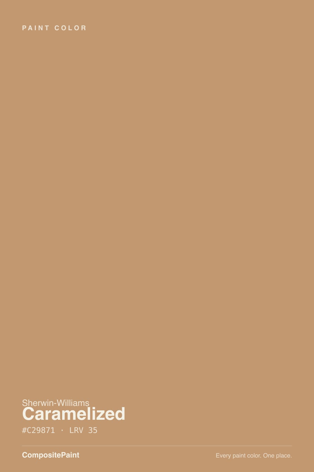
Caramelized is a genuine caramel-tan, not a beige wearing a fun name — a warm gold-brown that reads like polished leather or toffee candy when the light is on its side. It has no Color of the Year moment and no viral kitchen behind it; it is simply a well-built mid-tone warm color that Sherwin-Williams quietly filed a few slots away from its famous terracotta cousins. Give it real sun or a warm lamp and it glows. Leave it in a dim room and it goes muddy fast.
Exteriors with white trim and a black door · kitchen islands under white perimeter cabinets · dens and libraries with leather and walnut · anyone tired of gray who wants real warmth without going full terracotta
Your room is north-facing and gets little direct sun · you actually want a quiet beige or greige, not a color with personality · your stone or quartz runs cool and pink-veined · you need a name people instantly recognize on a paint chip
- A real caramel-gold, not a beige stretching to sound interesting
- Glows against white trim, black hardware and warm wood
- Holds its color at LRV 35 instead of washing out pale
- A strong, current exterior camel-tan for siding and stucco
- Quiet enough not to date the way a hyped trend color does
- Goes muddy and flat fast in dim or north-facing rooms
- Too orange for anyone who actually wants a beige or greige
- Fights cool, pink-veined quartz and marble
- No brand recognition, so it is hard to find real-room photos to compare against
What Color Is Caramelized, Really?
A warm gold-brown with almost no gray in it — the undertone is straightforward orange-gold, the kind of color you'd get by browning sugar past caramel and just short of burnt. There is no pink lurking in it and no green flip when the light changes; what you see on the chip in daylight is close to what you get on the wall. That honesty is Caramelized's whole appeal: it does not require the undertone detective work that trips people up with beiges and greiges.
At LRV 35 it sits at a genuine mid-depth — deeper than any greige in the deck, lighter than a true brown. That number is doing real work: it is dark enough to hold its color instead of washing out pale, but light enough that it still needs bounce light to read caramel rather than dull tan-brown. Compare it to Sherwin-Williams's own Cavern Clay (LRV 24) and Caramelized is the lighter, more golden sibling — less rust, more toffee.
Its brush with fame is real but modest: Sherwin-Williams ran it as a Color of the Month back in November 2019, and it still sits in the brand's curated Timeless Color collection. That is a genuine credential, not a knock-off claim — but it is a world away from a Color of the Year run or a viral kitchen, and this review found no evidence of either. One more oddity worth knowing before you sample it: Sherwin-Williams files Caramelized under "Yellow" in its own color-family menu, even though on the wall it reads as caramel-tan, not yellow — the name is a filing quirk, not a warning about the actual color.
Where It Shines
This is a color built for direct light and warm materials. Full sun on an exterior wall turns it into a genuine camel-tan that photographs beautifully against a white trim and a dark door. Indoors, its best friends are leather, walnut, black iron hardware and brass — put it near any of those under a real window or a warm lamp and it reads expensive, not builder-basic. A single caramel element in an otherwise white or off-white room — an island, a front door, a den wall — does more for the space than four walls of it would.
Where It Fails
Nearly every disappointed review of Caramelized traces back to one of three predictable mismatches, and none of them are the paint's fault.
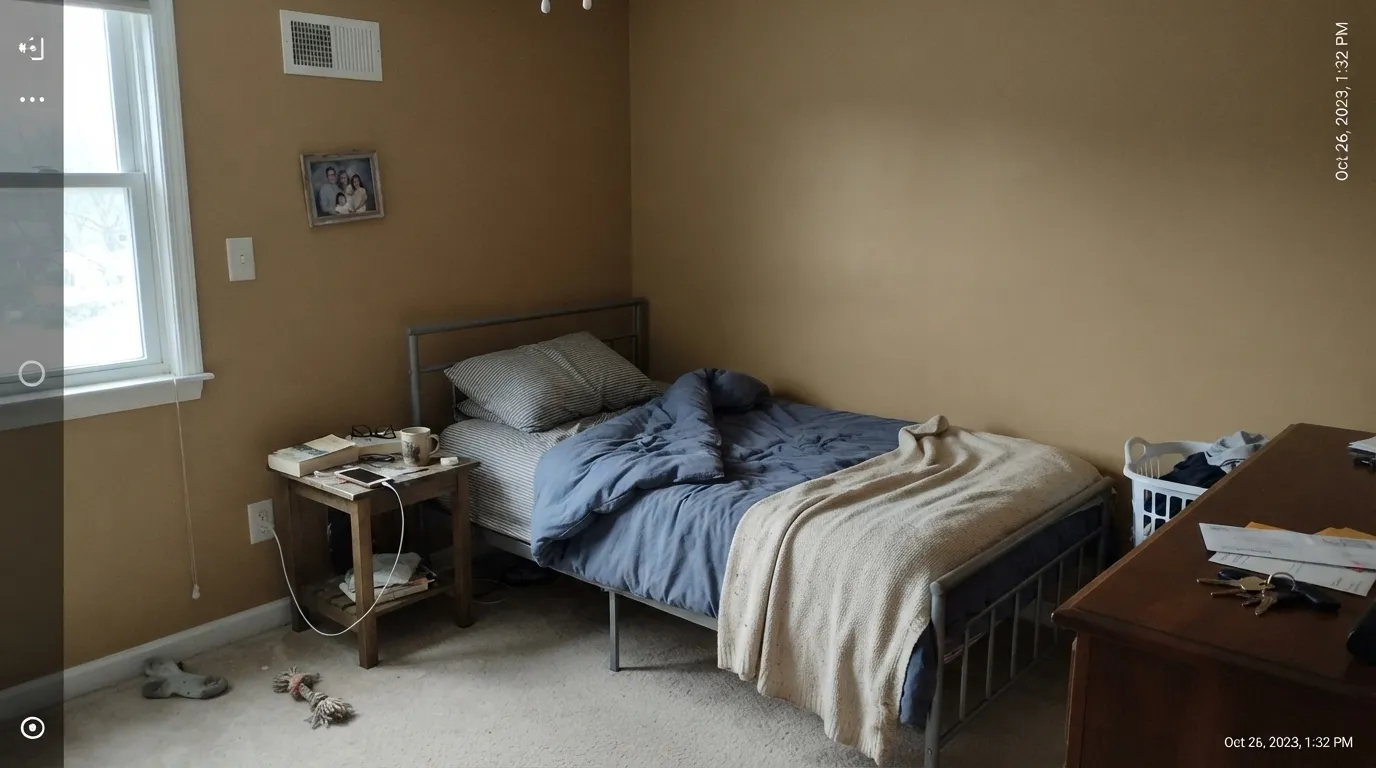
At LRV 35 this color needs light bouncing off it to read caramel-gold. Without real daylight or warm bulbs it slides into a flat, muddy tan-brown that owners describe as "dirty" rather than "warm." A north-facing room with small windows is the classic setup for this complaint — sample it there before committing to four walls.
Bright white stone with grey or pink veining sits at the opposite temperature and makes Caramelized look orange and dated by comparison, while the stone starts to look pink next to it. Pair it with warm-veined stone or solid surfaces, or keep it off the walls entirely in that kitchen.
This is not a quiet neutral — it is a genuine caramel-tan, closer in spirit to Cavern Clay than to anything in the greige family. Buyers expecting "a warm beige, nothing too colorful" are surprised by how much personality it has on four walls. If gray-adjacent is the real goal, Baja Dunes or Fawn Brindle sit in that calmer lane.
Room by Room
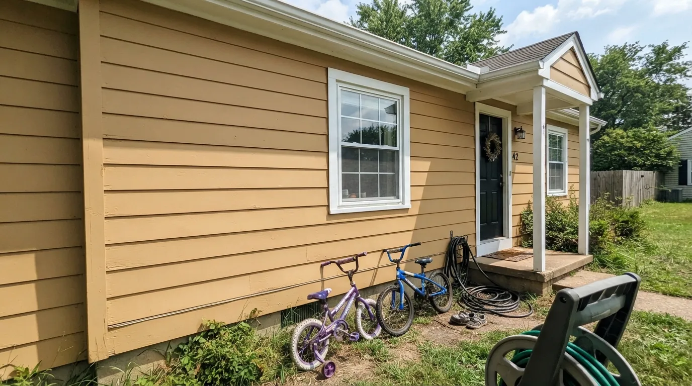
Full sun on siding or stucco is where this color earns its keep: a warm, camel-toned facade that reads current against white trim and a black or charcoal door. Overcast climates should sample a large board outdoors before committing — the same color that glows in Arizona sun can look flat under a gray Pacific Northwest sky.
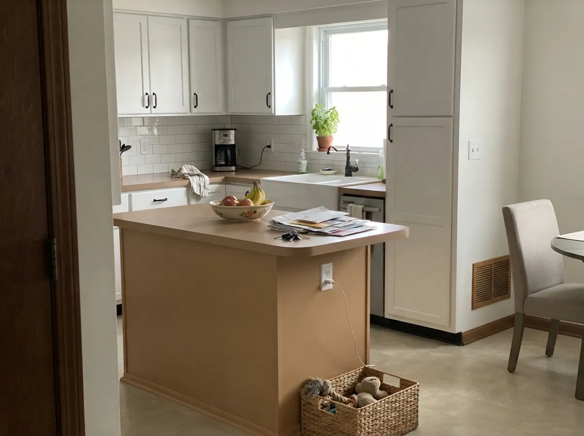
One caramel island against white or off-white surrounding cabinetry is the strongest indoor use: it gives the kitchen a focal point that still reads neutral, and it loves black hardware. A whole kitchen of caramel cabinets is a much bigger commitment and needs warm counters to back it up.
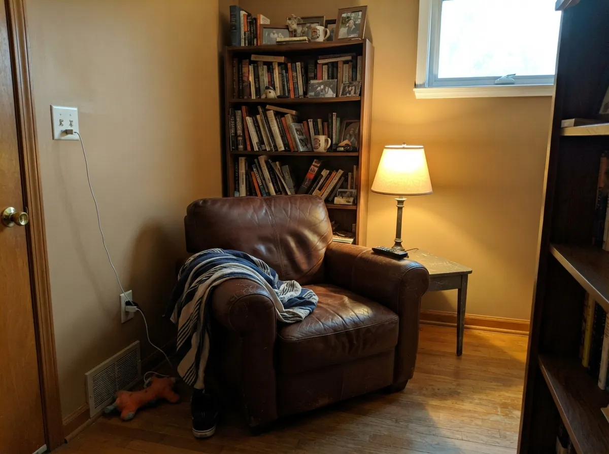
In a room with real daylight and warm furnishings this is one of its best uses — leather chairs, walnut shelving and brass reading lamps all meet it halfway. Skip it in a windowless media room; the color needs light to earn the room.
Under a brass or bronze chandelier at night the walls turn genuinely rich and toffee-warm. Daytime performance depends entirely on window exposure — check the light section below before you commit to a room used mostly after dark.
Cool white or grey tile and chrome fixtures fight this color's warmth, and small bathrooms rarely get enough direct sun to keep it glowing. It can work with warm brass fixtures and wood vanities, but it is not the easy bathroom choice a greige would be.
A north-facing bedroom will read this color as dull tan-brown by day. A room with afternoon sun or warm 2700K lamps turns it genuinely cozy at night — treat it like a mood color, not a safe default.
Your Light Is the Risk
Full, warm sun is where the caramel-gold shows up strongest — this is the light an exterior or a west-facing room gives it, and it is genuinely striking.
Cool, indirect daylight drains the gold and leaves a flat, muddy tan-brown. Test a large sample here before painting a whole room.
Bright and golden through the morning and midday, quieter and more brown-toned by late afternoon. The shift is gentle, not a color change.
2700K warm bulbs deepen it toward genuine toffee-brown, cozy and rich. Cool white LEDs flatten it toward a dull tan — swap the bulb before you blame the paint.
Most complaints about Caramelized are a light mismatch. Upload a photo of your actual room and see it on your walls — then ask for the same wall in north light or evening lamps before you buy a single sample.
Need It From Another Brand?
Any paint counter can custom-tint Sherwin-Williams SW 9186 directly. If you would rather stay in one brand's own deck, these are the closest stock matches, measured as ΔE2000. Under 2 is a difference you will not see on the wall.
| Brand | Closest color | ΔE | LRV | |
|---|---|---|---|---|
| Behr | Antique TreasureN280-5 · Behr | 2.5 | 35 | Color page → |
| Benjamin Moore | Butternut Squash1090 · Benjamin Moore | 1.0 | 35 | Color page → |
| Valspar | Friendly Tan2008-8A · Valspar | 1.3 | 35.1 | Color page → |
| PPG / Glidden | Tudor BeigePPG16-17 · PPG / Glidden | 1.5 | 33 | Color page → |
| Glidden | DoeskinPPG1082-5 · Glidden | 1.6 | 37 | Color page → |
| Dutch Boy | Sahara Sands315-4DB · Dutch Boy | 2.7 | 37 | Color page → |
Similar Sherwin-Williams Colors
The nearest shades to Caramelized within Sherwin-Williams's own range, ranked by perceptual color distance — useful when you want the same look a touch lighter, darker, or warmer.
WCAG 2.1: AA is 4.5 : 1 for normal text, 3 : 1 for large text, AAA is 7 : 1.
Caramelized vs the Colors You're Also Considering
Every Caramelized sample board has the same rivals on it. The numbers show the real lightness gap — then it comes down to which risk you would rather live with.
Pick this for a color that still reads warm brown in average light — Cavern Clay needs more direct sun to avoid going flat.
Sherwin-Williams SW 7701 · LRV 24Cavern ClayPick this if you want the redder, more overtly terracotta version — Cavern Clay leans rust where Caramelized leans gold, and it only really glows in strong light.
Pick this for real depth and a more current camel-leather look — Manchester Tan can flash green in cool light, Caramelized doesn't.
Benjamin Moore HC-81 · LRV 53Manchester TanPick this for the lighter, more classic tan — same warm family, noticeably brighter, and safer in a dim room.
Pick this for the actual caramel color — Fawn Brindle reads more taupe than tan and needs real sun to show any warmth at all.
Sherwin-Williams SW 7640 · LRV 36Fawn BrindlePick this if you want the same weight with the orange dialed back — Fawn Brindle is a grayed brown-greige, calmer and more neutral.
Pick this when you actually want the color to read as caramel, not sand — Baja Dunes stays closer to beige even in good light.
Benjamin Moore 997 · LRV 41Baja DunesPick this for a quieter, sandier neutral that never tips fully into brown — the safe middle ground if Caramelized feels like too much color.
Caramelized Coordinating Colors
The rule for coordinating with Caramelized: crisp or warm whites for contrast, black or near-black iron for grounding, and warm woods everywhere else. It struggles next to cool grays and blue-based whites, which make it look orange rather than warm. These are the partners that keep it looking intentional:
A Quiet Color in a Loud Deck
Caramelized's one real moment in the spotlight was small: Sherwin-Williams featured it as a Color of the Month in November 2019, and it still lives in the brand's curated Timeless Color collection. That is genuine recognition, but it never turned into a Color of the Year run, a viral kitchen, or a design-blog trend piece — this review found no evidence of any of those. It sits several rows below Sherwin-Williams's famous terracottas (Cavern Clay, Redend Point) in search volume and in the pattern of who talks about it online, which is closer to "nobody" than "a small devoted fanbase."
That obscurity is not a defect in the paint. The broader shift away from a decade of cool gray toward warm neutrals, camels and browns is well documented across the industry, and Caramelized is a genuinely well-built color inside that shift — it simply never got the marketing push its cousins did. For a reader willing to sample first, that is arguably an upside: less trend risk, and a color your neighbor almost certainly does not already have on their exterior.
Caramelized With Wood Tones and Floors
Wood is where this color is most forgiving. White oak, natural walnut and butcher block all sit in the same warm family, so the wall and the floor or counter reinforce each other instead of competing. Even mid-tone honey oak — a floor that clashes with cooler colors — reads comfortably alongside Caramelized because both lean the same direction.
The one flooring combination to sample first is a cool, gray-washed or ashy floor. That undertone sits opposite Caramelized on the color wheel, and the contrast can make the wall look orange rather than warm. It is not an automatic dealbreaker — a large warm-toned rug closes the gap in most rooms — but it is worth a sample board before committing to four walls.
Three Ready Palettes Built on Caramelized
A color is never alone on the wall. These are complete combinations in the 60-30-10 pattern, with the reason each one holds together. Every one opens in the visualizer.
Crisp white trim keeps the caramel body from reading like builder beige, and one true near-black door supplies the contrast the facade needs. This is the pairing that turns up in the color's best real-world uses.
Try this palette in your roomOne caramel island against Alabaster perimeter cabinets gives the kitchen a focal point without committing the whole room, and Peppercorn accents keep it from tipping too sweet.
Try this palette in your roomLinen trim keeps the walls from closing the room in, while near-black built-ins nearly disappear into the caramel at night, giving a lamplit den the cocoon feeling it's after.
Try this palette in your roomCaramelized FAQ
Is Caramelized warm or cool?
Warm, plainly — a straightforward orange-gold undertone with no pink and no green flip. What you see on the chip in good light is close to what lands on the wall, which is rarer than it sounds in this part of the deck.
Is it a good exterior color?
Yes, when the house gets real sun. Full daylight turns it into a genuine camel-tan facade color, especially with white trim and a dark door. In consistently overcast climates, sample a large board outdoors before committing — the color needs light to perform.
What trim white goes with Caramelized?
A crisp white like Extra White or a warm off-white like Alabaster both work — the trim's job is to give the caramel body contrast, not to match its warmth. Avoid a cream trim close in value to the wall; it flattens the look.
Does it work with white oak floors?
Yes — the two share the same gold-orange family, so the pairing is harmonious rather than contrasting. Grey-washed or cool-toned floors are the mismatch to watch; they pull Caramelized toward looking dated instead of warm.
Will it look muddy in my room?
Only if the room is dim. In real daylight or under warm 2700K bulbs it reads caramel-gold; in a north-facing room with little sun and no warm light, it can flatten toward a dull tan-brown. Test a large sample in your actual light before deciding.
Is this a trendy color that will date fast?
It's a lower risk than a hyped terracotta, because it never rode a viral wave in the first place — there's no trend cycle to fall out of. The honest risk is the opposite: because so few people have used it, there isn't a large library of real rooms to compare your own against.
Have you painted with Caramelized?
Rate it — one tap helps the next reader decide.
Ask a Question