Van Dyke Brown
The near-black brown named after the Old Masters' shadow pigment, reviewed honestly: where the brown actually shows, the light where it just reads black, and what to pick instead.

Jessica has spec'd whites and neutrals for more than 300 rooms and keeps a sample wall of painted drawdowns in her studio. Every color review is checked against real reader rooms in the comments and re-tested when a formula changes. About the testing process →
- 1Weathervane2
- 2Van Dyke Brown7
- 3Porpoise13
- 4Cavern Clay20
The Fast Verdict
Van Dyke Brown is the color you reach for when you want the drama of a black door or a black island without the flatness of actual black. At LRV 7 it sits in the same near-black band as Iron Ore and Tricorn Black, but it carries a genuine warm, red-brown lean instead of a neutral one — closer to bittersweet chocolate than charcoal.
The catch is right there in the LRV: that warmth only shows up when real light hits it. In a dim room, you have simply bought an expensive black.
Front doors and exterior trim · kitchen islands and cabinetry · home-office and library built-ins · anyone who wants near-black drama with a warm brown soul, not a cold one
Your room gets little or no direct light · you're painting four full walls, not an accent · your palette leans cool grey and white · you actually want true, unambiguous black
- Reads as a rich, warm near-black brown instead of flat black
- One of the deepest colors in the SW deck (LRV 7) for real drama in small doses
- A genuinely warmer, friendlier alternative to a true-black front door or island
- Name borrowed from a real art-history pigment, not an invented trend label
- Pairs beautifully with brass, walnut, and warm cream whites
- At LRV 7 it needs real, direct light to look brown at all — otherwise it is just black
- Needs a proper coat schedule; thin coats over light colors flash and show roller marks
- Clashes with cool greys and stark cool whites, reading muddy instead of rich
- Too dark for most full rooms — works as an accent, not a whole-house color
What Color Is Van Dyke Brown, Really?
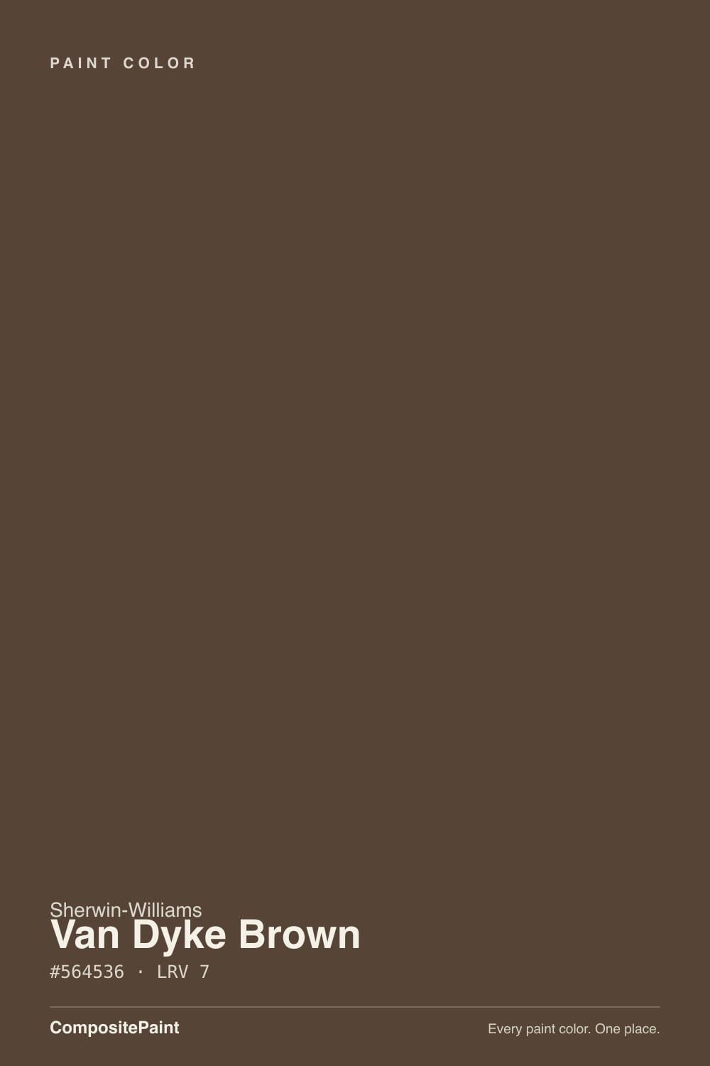
A deep, warm brown at the near-black end of the scale, named for the classic Van Dyke brown pigment — the rich, warm-shadow brown associated with 17th-century portrait painter Sir Anthony van Dyck and used for centuries in oil painting for deep, glowing shadow tones. Sherwin-Williams isn't mixing the old organic pigment (it was famously unstable and largely phased out of artist paints), but the name signals the mood correctly: this is meant to read as a rich, old-world brown, not a flat modern black.
At LRV 7 it belongs to the same near-black family as SW Iron Ore (LRV 6), Black Fox (LRV 6) and Urbane Bronze (LRV 8) — colors so dark that undertone becomes a light-dependent event rather than a fixed fact. What separates Van Dyke Brown from that group is how hard it commits to brown: even next to Urbane Bronze, which is also a warm dark, Van Dyke Brown reads noticeably more chocolate and less grey. Give it strong daylight or a warm lamp and the red-brown comes forward; take the light away and it collapses toward black just like its neighbors.
Undertone in one line: warm red-brown, never grey, never cool — but at this depth, "undertone" mostly means "how much light did you give it." A sample chip on a dim wall will look almost identical to a chip of Tricorn Black; the same chip in a sunlit doorway will not.
Where It Shines
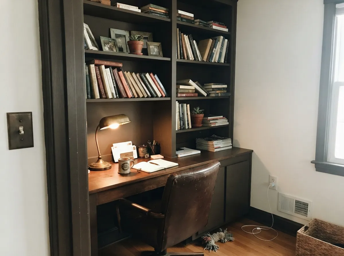
This color earns its keep in small, well-lit doses rather than across four walls. A front door in strong daylight, a kitchen island under can lights, a set of built-ins with a reading lamp nearby — anywhere it gets consistent light, the brown is unmistakable and the effect reads expensive rather than heavy. It is a color people notice and ask about, which is exactly the job an accent color is supposed to do.
Where It Fails
Almost every disappointed review of Van Dyke Brown traces back to one of three predictable situations, and none of them are really about the paint. If your project matches one of these, either fix the situation first or pick a lighter color.
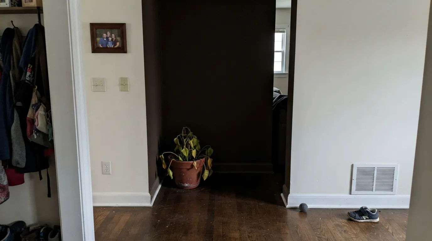
This is the single biggest source of regret. Without a window that gets real sun or a warm lamp nearby, Van Dyke Brown simply reads black — the LRV 7 leaves almost no light to bounce back and reveal the brown. If the space is genuinely dim, step up in LRV to something like BM Chelsea Gray (LRV 22) instead, which still reads as a serious dark but shows its color without direct light.
Near-black colors are unforgiving about coat count. Going straight from a builder white or beige with two thin coats leaves flashing, patchy sheen, and visible roller lines where the old color still shows through in raking light. Use a grey-tinted primer and plan on two full finish coats minimum — three over anything pale.
Pair this warm brown with a cold, blue-leaning white or grey and the two fight instead of contrast — the brown looks muddy and the white looks dingy. Warm creams and off-whites (SW Alabaster, BM White Dove) let the brown read rich; stark cool whites make it look dirty.
Room by Room
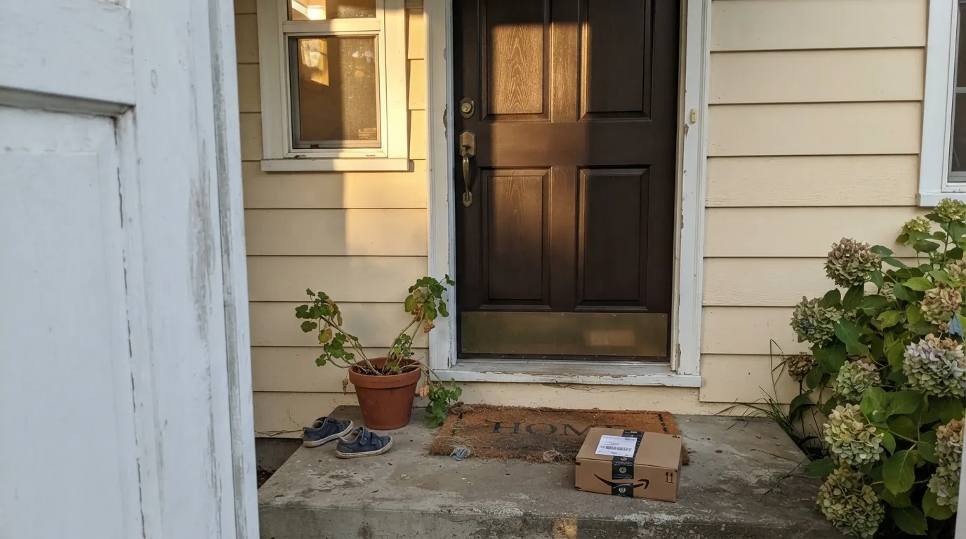
The single most reliable place for this color. Full daylight on a door reads the brown clearly, and against brick, warm siding or wood tones it is softer and friendlier than a true-black door. Semi-gloss exterior enamel, proper prep, and it holds up to weather like any other exterior dark.
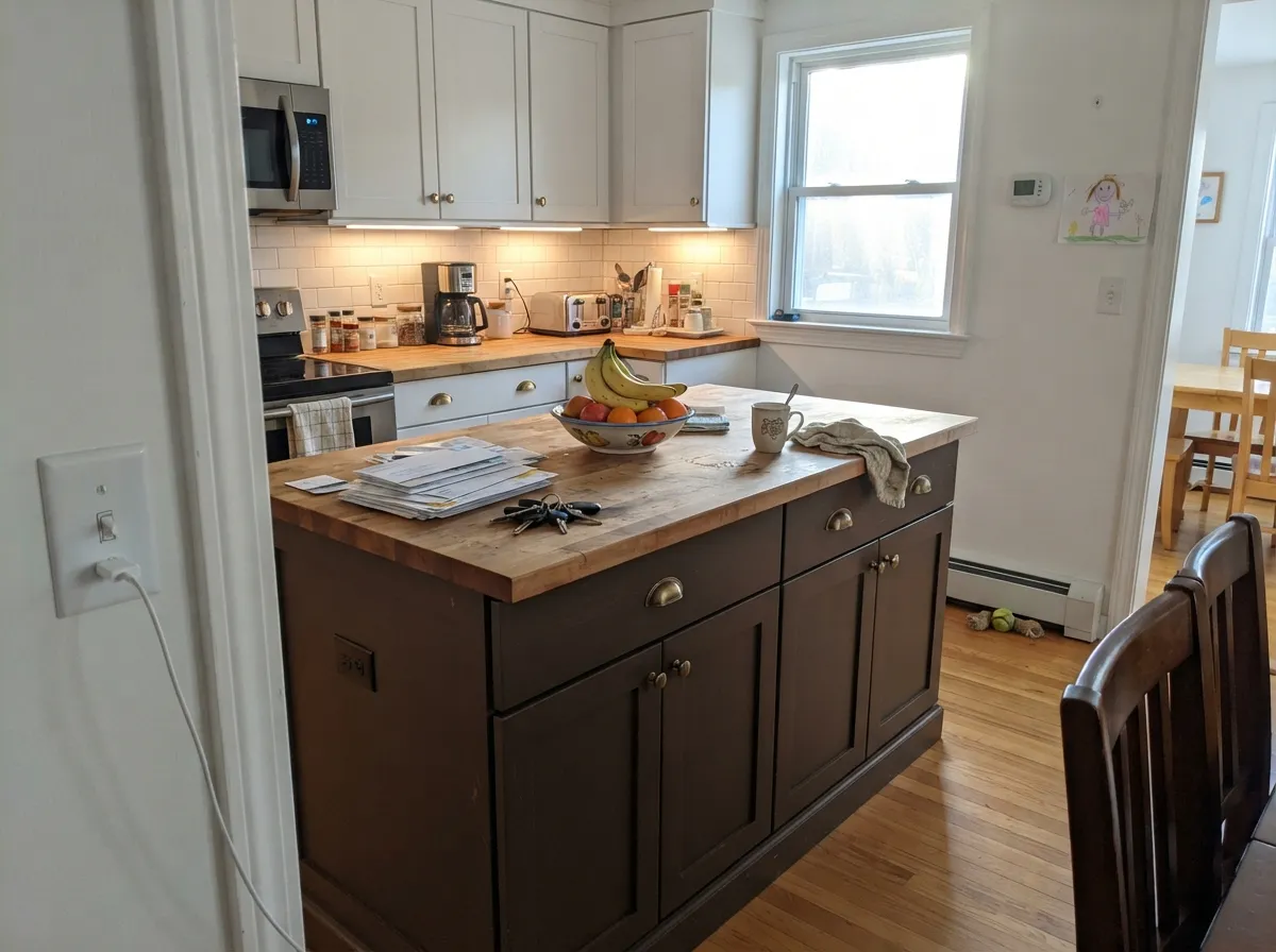
Part of the wider move away from flat-black islands toward warmer near-blacks. Works best with white or cream upper cabinets, warm wood or butcher-block counters, and brass hardware. Cool grey quartz and stainless steel pull it toward looking merely black rather than brown.
Under a reading lamp or task light, built-ins in this color feel deliberately old-world — leather, brass, walnut all read as intentional company. Satin finish for durability on shelves that get handled.
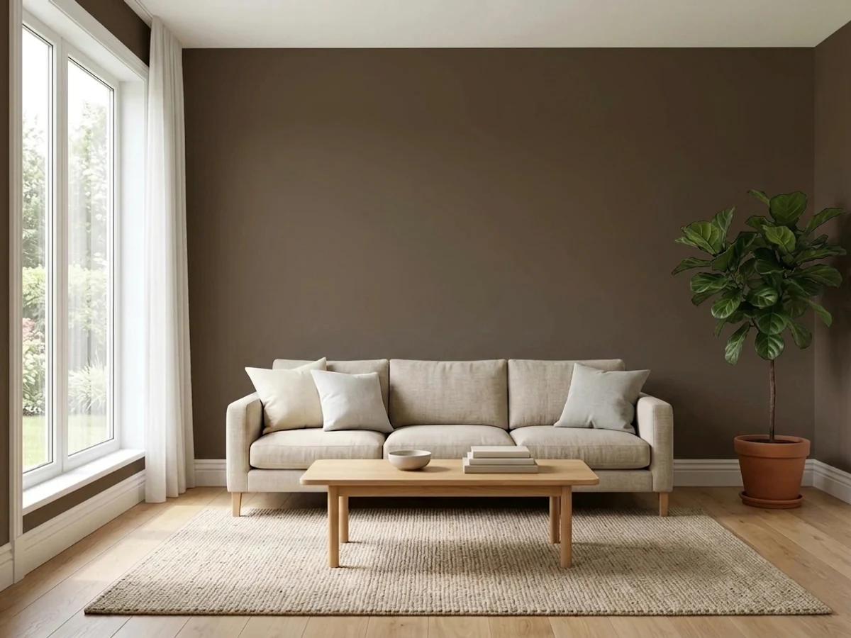
Can be striking behind a bed or in a dining nook, but only if that wall gets meaningful daylight or a dedicated warm fixture. In a corner that never sees direct sun, the accent wall just becomes a dark rectangle with no visible brown in it.
At LRV 7, wrapping an entire room drops the ambient light in the space noticeably and most rooms don't have the window area to compensate. This is an accent-and-trim color, not a whole-room color, for the vast majority of houses.
A warmer alternative to black shutters or trim, especially against brick, stone, or warm-toned siding where true black can look severe. Behaves like any dark exterior color: expect more heat absorption and check your manufacturer's dark-color guidance for the substrate.
Your Light Is the Risk
Strong daylight on a door or under-cabinet lighting on an island pulls the red-brown fully forward. This is the light the color needs to prove it isn't black.
Without sun or a nearby lamp, LRV 7 leaves almost nothing to reflect. The brown disappears and you're left with what reads as plain black.
Flat overcast light reads it charcoal-black; as low-angle sun rakes across the surface, the red-brown warmth appears at the edges and highlights first.
2700K warm bulbs bring the chocolate-brown forward and make it glow slightly. Cool white LEDs flatten it back toward neutral black — pick your bulbs deliberately here.
Most complaints about Van Dyke Brown are a light mismatch. Upload a photo of your actual room and see it on your walls — then ask for the same wall in north light or evening lamps before you buy a single sample.
Need It From Another Brand?
Any paint counter can custom-tint Sherwin-Williams SW 7041 directly. If you would rather stay in one brand's own deck, these are the closest stock matches, measured as ΔE2000. Under 2 is a difference you will not see on the wall.
| Brand | Closest color | ΔE | LRV | |
|---|---|---|---|---|
| Behr | Breakfast Blend280F-7 · Behr | 2.7 | 6 | Color page → |
| Benjamin Moore | Deep Taupe2111-10 · Benjamin Moore | 2.6 | 8 | Color page → |
| Valspar | Momentous Occasion8005-10G · Valspar | 2.2 | 7 | Color page → |
| PPG / Glidden | Dark GranitePPG1005-7 · PPG / Glidden | 5.0 | 6 | Color page → |
| Glidden | Earth Brown00YY 07/093 · Glidden | 2.7 | 7 | Color page → |
| Dutch Boy | Wire Work416-7DB · Dutch Boy | 0.5 | 7 | Color page → |
Similar Sherwin-Williams Colors
The nearest shades to Van Dyke Brown within Sherwin-Williams's own range, ranked by perceptual color distance — useful when you want the same look a touch lighter, darker, or warmer.
WCAG 2.1: AA is 4.5 : 1 for normal text, 3 : 1 for large text, AAA is 7 : 1.
Van Dyke Brown vs the Colors You're Also Considering
Every Van Dyke Brown sample board has the same rivals on it. The numbers show the real lightness gap — then it comes down to which risk you would rather live with.
Pick this if you want the color to commit harder to brown, even in mixed light.
Sherwin-Williams SW 7048 · LRV 8Urbane BronzePick this if you want a slightly softer warm dark that leans more bronze-grey than straight brown.
Pick this for unmistakable brown character, not just a warm flash on a black base.
Sherwin-Williams SW 7020 · LRV 6Black FoxPick this for near-black drama with only a whisper of warmth — closer to black than brown.
Inside Sherwin-Williams, Hickory Smoke SW 7027 at hex #564537 and LRV 7 is one digit away from Van Dyke Brown. On a wall you will not tell them apart. Otter SW 6041, hex #56433B at LRV 6, is a shade darker and pushes slightly cooler. Fairfax Brown SW 2856, hex #61463A at LRV 7, is a little lighter and clearly redder, and Java SW 6090 at #634533 is the warmest and most obviously brown of the group.
Across brands, the HGTV Home by Sherwin-Williams version of Van Dyke Brown, HGSW 2481, is the same formula value at deltaE 0, and Dutch Boy Wire Work 416-7DB at deltaE 0.51 is effectively the same color. Behr Moose Trail N190-7 at deltaE 1.42 is visually identical in normal room light. Valspar Momentous Occasion 8005-10G at 2.18, Benjamin Moore Deep Taupe 2111-10 at 2.58, and Glidden Earth Brown 00YY 07/093 at 2.73 are very close, so sample first. Backdrop It's a Date at 3.47 and Magnolia Home Wooded Acres JG-122 at 4.29 are close but visibly different side by side.
Van Dyke Brown Coordinating Colors
The rule for coordinating with Van Dyke Brown is simple: keep everything else warm, and give it room to catch light. Warm creams and off-whites let the brown stay rich instead of muddy, brass and aged bronze metals sit naturally with it, and a mid-depth warm neutral nearby keeps the transition from near-black to bright wall from feeling abrupt. These are the partners that keep showing up in rooms that work:
The Pigment Behind the Name
Long before it was a paint-deck name, Van Dyke brown was one of the most-used shadow colors in oil painting — a deep, warm, near-black brown associated with the 17th-century Flemish portrait painter Sir Anthony van Dyck, whose rich brown shadows and glazes became a reference point for painters after him. The historic pigment was made from organic material (lignite, peat, or earth rich in humic acid), which gave it a beautiful transparency in glazes but also made it notoriously unstable — paintings that used it heavily are known to have darkened or shifted over the centuries, and it was gradually replaced by more lightfast synthetic browns in artist paints.
Sherwin-Williams isn't using the historic pigment, obviously — this is a modern, stable paint tint. But borrowing the name is an honest signal about the mood: not a flat modern black, but the kind of deep, warm-shadow brown painters reached for when they wanted richness instead of void. It is a quieter, more literary story than most Color-of-the-Year marketing, and it happens to be true.
Van Dyke Brown With Wood Tones and Floors
This color's best friends are darker, cooler-toned woods: walnut and espresso floors create a low-contrast, moody blend where the near-black brown feels like a natural extension of the floor rather than a separate decision. Pale white oak and light, grey-washed floors go the other direction and work just as well — the strong contrast makes the brown pop as a clear accent rather than blending in.
The one wood tone to test carefully first is orange-leaning honey oak. Because Van Dyke Brown carries real red-brown warmth of its own, it can compete with an already-warm orange floor rather than complementing it, and the two can read as slightly mismatched rather than coordinated. A large sample held above the actual floor, in the room's real light, is the cheapest way to settle it before committing to cabinets or a full accent wall.
Metals are the easy part: brass, aged bronze and matte black hardware all sit naturally with this color. Polished chrome or bright nickel is the one finish that reads distinctly cold against it.
Three Ready Palettes Built on Van Dyke Brown
A color is never alone on the wall. These are complete combinations in the 60-30-10 pattern, with the reason each one holds together. Every one opens in the visualizer.
A warm cream siding keeps the whole facade friendly, a genuinely crisp white trim frames the opening, and the door carries the one dramatic dark note — warmer and less severe than true black against warm-toned siding or brick.
Try this palette in your roomWhite Dove uppers and Alabaster walls keep the kitchen bright enough for the island to actually read brown instead of black, and the shared warmth means nothing in the room fights the wood counters or brass hardware.
Try this palette in your roomChelsea Gray gives the room a mid-depth stepping stone so the near-black built-ins don't read as a hole in the wall, while cream Alabaster walls supply enough bounced light for the brown to stay visibly brown, not black.
Try this palette in your roomVan Dyke Brown FAQ
Is Van Dyke Brown actually brown, or is it basically black?
Both, depending on the light. At LRV 7 it sits right at the edge of the near-black band. In strong daylight or under a warm lamp, the red-brown undertone is clearly visible; in a dim room with no direct light, it reads as plain black. Test a large sample at different times of day before committing, especially on an accent wall.
What's the story behind the name?
Van Dyke brown is a genuine art-history term — a deep, warm shadow-brown pigment associated with 17th-century portrait painter Sir Anthony van Dyck and used for centuries in oil painting. The historic pigment was famously unstable and largely phased out of artist paints, but the name still signals "rich old-world brown" rather than a modern trend color, and that's the mood Sherwin-Williams is aiming for here.
Does it work as a front door color?
It's the single best use of this color. Full daylight on a door reveals the brown clearly, and it reads warmer and less severe than a true-black door against brick, stone, or warm siding. Use exterior-grade semi-gloss enamel and proper primer for a dark exterior color.
What trim white goes with Van Dyke Brown?
A warm white — SW Alabaster or BM White Dove — lets the brown read rich rather than muddy. A stark, cool-leaning white or grey fights the warmth and can make the brown look dirty by comparison.
How many coats does it need?
Plan on a grey-tinted primer plus two full finish coats minimum, three if you're covering a pale existing color. Near-black colors like this one are unforgiving about thin coats — under-coating shows as flashing and visible roller marks in raking light.
Does it work with honey oak floors?
It's a mixed match. The warm red-brown undertone can compete with orange-leaning honey oak rather than complementing it. It sits much more comfortably with walnut, espresso, or pale white oak floors — sample it above your actual floor before committing to a full room.
Have you painted with Van Dyke Brown?
Rate it — one tap helps the next reader decide.
Ask a Question