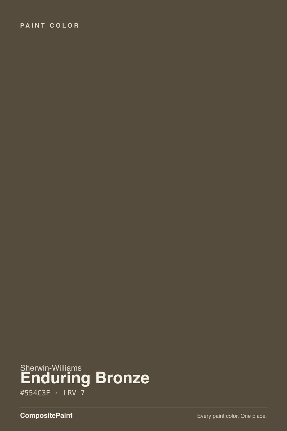
Enduring Bronze
SW 7055 · #554C3E · LRV 7 — warm red-orange tone, very dark — reads black in most rooms.
- 1Weathervane2
- 2Enduring Bronze7
- 3Porpoise13
- 4Cavern Clay20
What Color Is Enduring Bronze, Really?
Enduring Bronze (SW 7055) is a very dark warm brown. Its hex value #554C3E sits at a hue of 37 degrees with roughly 16 percent saturation, which places it in the bronze and dark-earth range rather than a true chocolate or a gray. At an LRV of 7 it is one of the darkest colors in the fan deck, so on a wall it reflects very little light and reads close to black until light lands on it.
People reach for it when black feels too hard. The warm red-orange lean gives the color a soft, metallic quality that suits older houses, wood-heavy rooms, and exteriors where a flat black would look modern in the wrong way. It is used most often on window sashes, front doors, shutters, cabinetry, and trim.
The thing to check is how little of the brown you will actually see. At LRV 7 the undertone only shows in direct light or a shiny finish. In flat paint on a shaded north wall, Enduring Bronze looks like a dark neutral and the bronze quality is close to invisible. Sample a large piece, in the sheen you plan to use, on the side of the house or the wall that gets the least light.
Enduring Bronze leans warm red-orange. The 37 degree hue is the brown and bronze part of the wheel, and the low 16 percent saturation keeps it muted, so it never looks like a saturated chestnut. What you get is a dark brown with a faint metallic warmth rather than an obvious color.
The undertone shows most in strong light and against clean whites, where the brown separates clearly from a black trim or a black window frame. Against warm wood it can look grayer by comparison, since the wood carries more color than the paint does. Against a true gray-brown such as Urbane Bronze (SW 7048), hex #54504A, the red-orange in Enduring Bronze becomes easy to spot.
Test it beside any bronze, oil-rubbed, or black metal in the room. Those finishes tell you quickly whether the paint reads as a match, a near-match, or a slightly warmer neighbor, which is usually the deciding factor.
Best Rooms and Uses for Enduring Bronze
Enduring Bronze is used more on architecture than on open walls. Window sashes, exterior trim, garage doors, front doors, shutters, and metal railings are its natural home, where the warm brown mimics dark bronze hardware and looks softer than a straight black against brick, stone, or stucco.
Inside, it works on cabinetry, islands, built-in bookcases, and interior doors. At LRV 7 it gives cabinets real weight, and the warm lean keeps the kitchen from feeling cold. It also suits a study, a dining room, or a powder room painted out entirely, walls and trim together, for a quiet enclosed effect.
As a general wall color in a bright, open living space it is a harder sell, since the depth eats light rather than reflecting it. If you want it on walls, put it in a small room that already feels intimate, or restrict it to a single accent wall with lighter surfaces around it.
How Lighting Changes Enduring Bronze
At LRV 7 this color absorbs nearly everything that hits it, so lighting decides whether you see brown or black. North-facing rooms give cool, flat light and push Enduring Bronze toward a dark neutral, with very little of the bronze visible. South-facing rooms and direct sun bring out the red-orange warmth and the color starts to look like the metal it is named for.
East light shows the warmth in the morning and lets it go dark through the afternoon. West light keeps it heavy early and warms it late in the day, which is why west-facing exterior doors in this color look best in the evening.
Bulbs push it the same way. Warm 2700K lamps bring the brown forward, while cooler 3500K to 4000K light strips the warmth and leaves a near-black. Sheen matters just as much: satin and semi-gloss catch light and reveal the color, flat holds it back.
Most complaints about Enduring Bronze are a light mismatch. Upload a photo of your actual room and see it on your walls — then ask for the same wall in north light or evening lamps before you buy a single sample.
Need It From Another Brand?
Any paint counter can custom-tint Sherwin-Williams SW 7055 directly. If you would rather stay in one brand's own deck, these are the closest stock matches, measured as ΔE2000. Under 2 is a difference you will not see on the wall.
| Brand | Closest color | ΔE | LRV | |
|---|---|---|---|---|
| Behr | Rare WoodMQ2-39 · Behr | 4.3 | 8 | Color page → |
| Benjamin Moore | Tavern CharcoalCW-90 · Benjamin Moore | 3.6 | 10 | Color page → |
| Valspar | Turkish Coffee6003-2C · Valspar | 1.6 | 7.4 | Color page → |
| PPG / Glidden | Afternoon TeaPPG1023-7 · PPG / Glidden | 1.4 | 8 | Color page → |
| Glidden | Afternoon TeaPPG1023-7 · Glidden | 1.4 | 8 | Color page → |
| Dutch Boy | Deeply Rooted421-7DB · Dutch Boy | 0.0 | 7 | Color page → |
Similar Sherwin-Williams Colors
The nearest shades to Enduring Bronze within Sherwin-Williams's own range, ranked by perceptual color distance — useful when you want the same look a touch lighter, darker, or warmer.
WCAG 2.1: AA is 4.5 : 1 for normal text, 3 : 1 for large text, AAA is 7 : 1.
Enduring Bronze vs Similar Colors
The comparison most people make is with Urbane Bronze (SW 7048), hex #54504A at LRV 8. The two are nearly the same darkness, but Urbane Bronze is a gray-brown while Enduring Bronze at #554C3E is clearly warmer and more red-orange. Choose Urbane Bronze if you want a dark that behaves like a neutral, and Enduring Bronze if you want visible brown. Tungsten (SW 9515), hex #584E41 at LRV 8, and Status Bronze (SW 7034), hex #5C4D3C at LRV 8, are both slightly lighter and warmer again.
Across brands, Dutch Boy Deeply Rooted (421-7DB) shares the exact hex #554C3E and LRV 7. PPG and Glidden Afternoon Tea (PPG1023-7) at a color difference of 1.44, Valspar Turkish Coffee (6003-2C) at 1.57, and Behr Cavalry Brown (N220-7) at 2.14 all land close enough to look the same in normal room light, though the Behr is worth sampling first.
Benjamin Moore Tavern Charcoal (CW-90) is lighter at LRV 10 and sits at 3.61, so it is close but visibly different side by side.
Colors That Go With Enduring Bronze
The pairing that matters most is the white beside it. A warm off-white on trim and ceilings keeps the bronze looking soft and traditional, while a cleaner white makes it look sharper and more modern. With a color this dark, the contrast reads strongly either way, so choose based on the mood you want rather than the amount of contrast.
For a companion dark in the same house, Urbane Bronze (SW 7048), hex #54504A at LRV 8, is the grayer version and reads as a neutral where Enduring Bronze reads as brown. Chateau Brown (SW 7510), hex #5B4B44 at LRV 8, is a touch redder, and Sable (SW 6083), hex #5F4B3F at LRV 8, is a warmer, more obvious brown for a smaller accent.
Materials do the rest. Oak, walnut, and leather share its warmth, aged bronze and antique brass hardware disappear into it in the best way, and cream, tan, and terracotta all sit comfortably against it. Cool blue-grays can look out of place next to the red-orange.
Coordinated palette
Generated by hue-rotating #554C3E in HSL space. Pair Enduring Bronze with one accent and one neutral — the swatches below are starting points, not final picks.
Enduring Bronze FAQ
Is Enduring Bronze warm or cool?
It is warm. The hue sits at 37 degrees with a red-orange lean, which is what makes it read as bronze rather than charcoal. The warmth is subtle because saturation is only about 16 percent and the LRV is 7, so in low light the color can look neutral. In direct sun the brown comes through clearly.
What LRV is Enduring Bronze?
Enduring Bronze has an LRV of 7, on a scale running from 0 for black to 100 for pure white. That makes it one of the darkest colors in the deck. It reflects very little light, so it will not brighten a space, and its warm brown character depends almost entirely on the light falling on it.
Is Enduring Bronze black or brown?
It is a brown that behaves like a black. The hex #554C3E is a genuine warm brown, but at LRV 7 there is so little reflected light that most people read it as near-black on first look. Sunlight, a satin or semi-gloss sheen, and a white surface next to it are what make the brown visible.
Does Enduring Bronze work in a dark room?
It works if the goal is depth rather than light. At LRV 7 it will make a dark room feel smaller and more enclosed, which some people want in a study, dining room, or powder room. If you want to see the bronze undertone, it needs either good daylight or well-placed warm lamps, otherwise it settles into a flat dark neutral.
Is Enduring Bronze good for exteriors and cabinets?
Yes, and exteriors are its most common use. It suits window sashes, doors, shutters, garage doors, and railings, where it looks softer against brick and stone than a straight black. On cabinets and islands the LRV of 7 gives serious weight, and the warm red-orange lean keeps the kitchen from feeling cold.
What white trim goes with Enduring Bronze?
A creamy off-white is the easiest match, because it echoes the warm red-orange undertone and keeps the pairing traditional. A cleaner, brighter white gives a crisper modern edge and makes the brown look slightly deeper by contrast. With the wall or trim at LRV 7, any white will read as high contrast, so pick the temperature rather than the brightness.
Have you painted with Enduring Bronze?
Rate it — one tap helps the next reader decide.
Ask a Question