Sable
The deep warm brown Sherwin-Williams officially files as an orange, reviewed honestly: the light where it glows red-brown and cozy, the light where it goes flat and black, and what to pick instead.

Jessica has spec'd whites and neutrals for more than 300 rooms and keeps a sample wall of painted drawdowns in her studio. Every color review is checked against real reader rooms in the comments and re-tested when a formula changes. About the testing process →
- 1Polished Mahogany3
- 2Sable8
- 3Porpoise13
- 4Cavern Clay20
The Fast Verdict
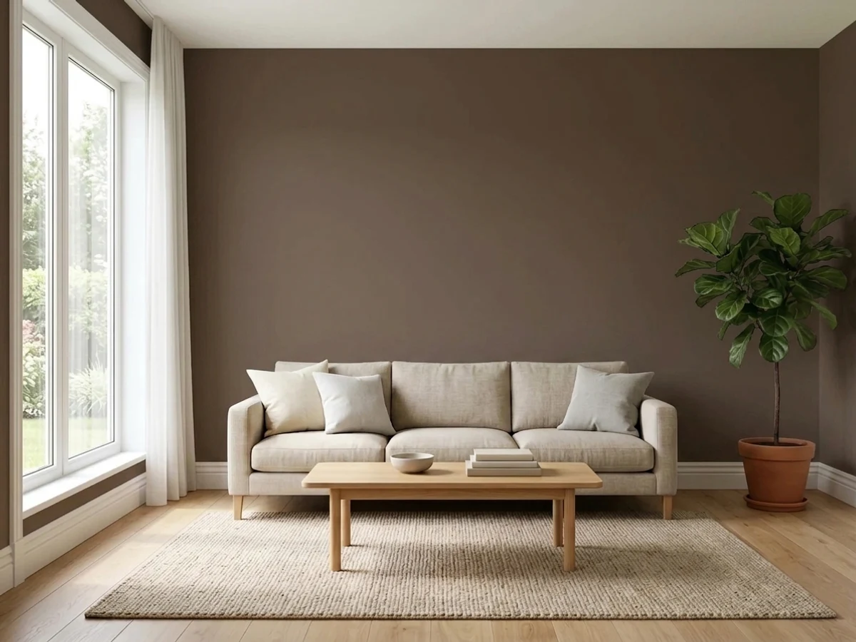
Sable is a near-black brown with a red-orange undertone strong enough that Sherwin-Williams' own website lists it under Orange, not Brown. On a kitchen island, a front door, or one accent wall with real light on it, that undertone reads rich and cozy — like dark leather, not like a hole in the wall. Take the light away and it collapses toward a flat, undefined near-black. It is not a famous color and never tried to be one; it is a dependable deep neutral for people who want warmth instead of true black.
Kitchen islands and cabinetry · front doors and exterior shutters · bedrooms and dens meant to feel cozy, not bright · anyone who wants a warm chocolate-red brown instead of a flat black
Your room runs on dim north light with no lamp plan · you actually want a neutral black or charcoal, not a brown one · you're covering four walls with no natural light to test first · you want a bright, airy result
- A genuine warm brown, not a flat black — reads red and alive next to leather and dark wood
- Outstanding on kitchen islands and cabinetry against brass or matte black hardware
- A natural, proven front-door and exterior-trim color
- Deep enough to anchor a room without needing four walls of commitment
- An honest alternative to true black for anyone who finds neutral near-blacks too cold
- Needs real daylight or a lamp plan — goes flat and undefined in a dim room
- The red-orange undertone surprises buyers who wanted a neutral black
- Not recommended for home offices or other low-light work spaces
- High sheen on walls shows glare and roller texture that eggshell hides
What Color Is Sable, Really?
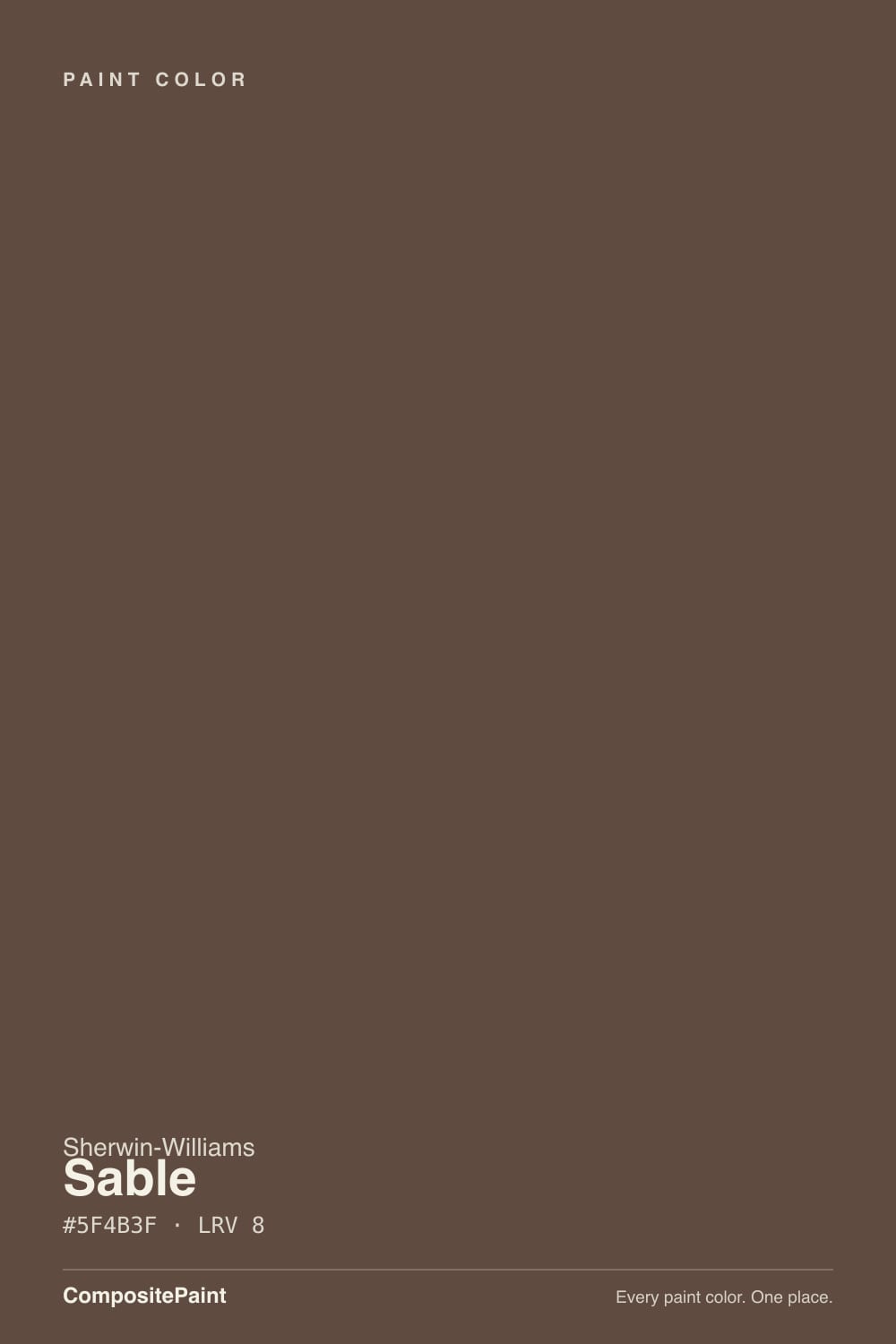
A deep, muted brown with a genuinely warm red-orange undertone — so warm that Sherwin-Williams' own site files Sable under its "Orange Paint Colors" family online, even though every design blog and paint database calls it a brown. That is not a mistake; it is an honest description of the tint base. Sable sits between raw umber and a weathered, reddish walnut, closer to dark leather or aged wood than to the cool near-blacks like Iron Ore or Tricorn Black.
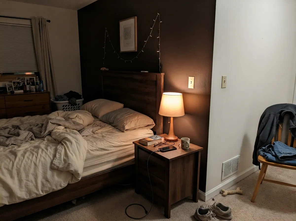
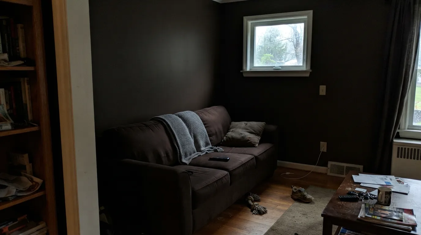
At LRV 8 it is a near-black depth color, and depth is where the undertone lives or dies. In a room with real daylight or warm lamp light, the red-orange comes forward and the color reads rich, cozy, almost glowing against wood and leather. In a dim room with no natural light and no lamps, that same wall goes flat and undefined — dark enough that the brown character disappears and it reads as a plain near-black. The paint did not change; the room stopped giving it anything to work with.
Undertone in one line: warm red-orange, never a cool neutral black-brown and never a true gray-black. If your sample looks flat charcoal instead of chocolate, the room is starving it of light, not showing you the real color.
Where It Shines
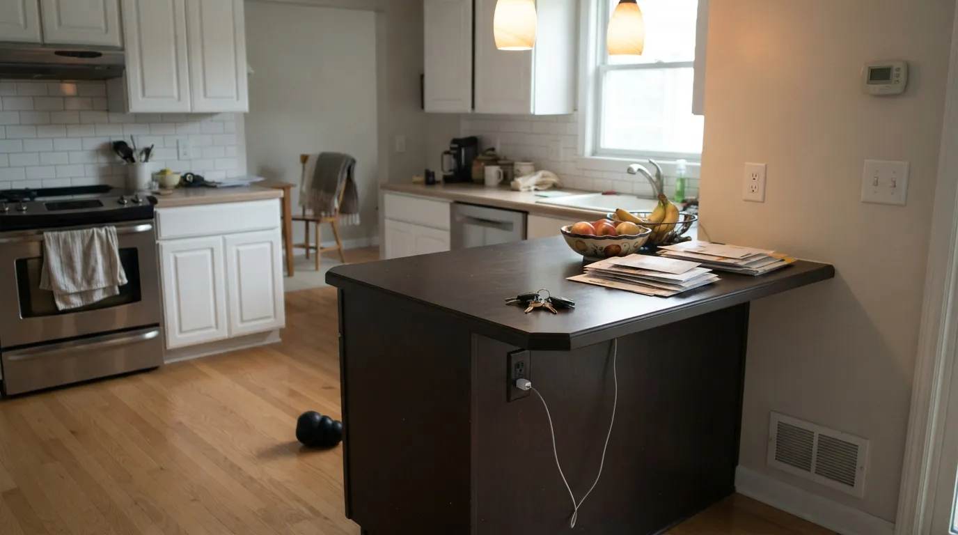
This is a small-dose color built for the pieces that get real light and real materials next to them: a kitchen island under brass or matte black pulls, a front door that catches afternoon sun, one accent or headboard wall in a room with a lamp plan. Houzz owners who chose it for their living rooms describe it doing exactly this — pulling out the red undertones in dark leather furniture rather than sitting there as generic dark brown. Give it warm wood, brass, leather, or a light stone counter to push against, and the color does the rest.
Where It Fails
The regret stories with Sable follow one of three patterns, and all three show up before the first coat if you know to look. None of them are the paint failing — they're the paint being asked to do something it was never built for.
At LRV 8, Sable needs daylight or warm bulbs to hold its brown identity — reviewers note it works best where "ample natural light can balance out the darkness," and that in lower light it goes darker and more dramatic, favoring its gray-black side over its brown one. A north-facing room with no fixtures planned will read flat and heavy, not cozy. This is also why more than one review steers it away from a home office: a productivity space with weak overhead light is the wrong home for it.
Sable gets shopped by people hunting a "near-black" the same way Iron Ore or Tricorn Black get shopped, but its undertone is unmistakably warm red-orange, not neutral. Next to true cool blacks it visibly leans brown-red. If neutral is the goal, this is the wrong pick — go Iron Ore or Tricorn Black instead and let Sable stay a brown.
Dark colors amplify sheen, and reviewers specifically flag Sable for glare above eggshell on walls. Semi-gloss or gloss on a full wall shows every roller stipple and patch of light. Keep walls eggshell or matte; save satin and semi-gloss for cabinets, trim, and the front door where a little shine is the point.
Room by Room
One accent or headboard wall in warm lamp light does exactly what owners describe: cozy, enveloping, "like a big hug." Matte or eggshell, White Dove or another soft warm white on the remaining walls and trim so the room doesn't go cave-like.
Sable on an island against light perimeter cabinets is a real, repeated design move — brass or matte black hardware, a light counter and light floor keep the room balanced instead of heavy. Satin cabinet enamel; don't take it to every cabinet in a small kitchen.
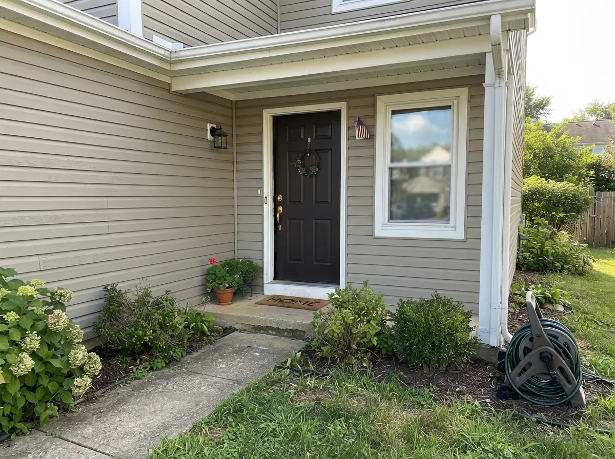
Full daylight is the light this color wants, and a front door gets it all day. Warm-toned against a greige or white body, it reads intentional and expensive rather than dark for dark's sake — semi-gloss for wear and wash.
A closed room used mostly in the evening is easy territory: warm bulbs push the red-brown forward exactly the way the wood-and-leather pairing wants. Skip it for a sunroom or anywhere the main light source is cool daylight only.
More than one review steers Sable away from productivity spaces specifically, and the LRV-8 depth backs that up: a workspace needs bounce light, and this color eats it. If you love it, keep it to a single accent wall behind, not facing, the desk.
One wall works beautifully with dark furniture and leather, echoing red undertones the way the Houzz thread describes. Four walls in an open-plan space with weak daylight is a bigger bet — test a large sample through a full afternoon before committing to the whole room.
Your Light Is the Risk
Real sun or a bright warm room pulls the red-brown forward — cozy and rich, the reason people buy this color in the first place.
Without daylight or warm bulbs the color collapses toward flat, undefined near-black — the brown character disappears entirely.
Cooler morning light keeps it closer to neutral dark brown; afternoon warmth pushes it visibly toward red. Sample at both times before a full wall.
2700K bulbs deepen the red and make it glow; cool white LEDs flatten it back toward gray-black. Warm bulbs are part of the paint job, not optional.
Most complaints about Sable are a light mismatch. Upload a photo of your actual room and see it on your walls — then ask for the same wall in north light or evening lamps before you buy a single sample.
Need It From Another Brand?
Any paint counter can custom-tint Sherwin-Williams SW 6083 directly. If you would rather stay in one brand's own deck, these are the closest stock matches, measured as ΔE2000. Under 2 is a difference you will not see on the wall.
| Brand | Closest color | ΔE | LRV | |
|---|---|---|---|---|
| Behr | Roasted NutsUL130-2 · Behr | 1.2 | 8 | Color page → |
| Benjamin Moore | Grizzly Bear Brown2111-20 · Benjamin Moore | 1.6 | 8 | Color page → |
| Valspar | Boston Legacy2005-9A · Valspar | 1.4 | 8 | Color page → |
| PPG / Glidden | Fudge TrufflePPG1075-7 · PPG / Glidden | 0.9 | 8 | Color page → |
| Glidden | Fudge TrufflePPG1075-7 · Glidden | 1.3 | 8 | Color page → |
| Dutch Boy | Heritage Brown411-7DB · Dutch Boy | 1.5 | 8 | Color page → |
Similar Sherwin-Williams Colors
The nearest shades to Sable within Sherwin-Williams's own range, ranked by perceptual color distance — useful when you want the same look a touch lighter, darker, or warmer.
WCAG 2.1: AA is 4.5 : 1 for normal text, 3 : 1 for large text, AAA is 7 : 1.
Sable vs the Colors You're Also Considering
Every Sable sample board has the same rivals on it. The numbers show the real lightness gap — then it comes down to which risk you would rather live with.
Pick this for a slightly redder, more overtly warm-orange brown, and if your painter works in Sherwin-Williams.
Benjamin Moore 2110-10 · LRV 8TaupePick this if you're already matched into the Benjamin Moore system — Taupe is nearly the same warm dark brown, just a hair less orange.
Pick this when you specifically want the wall to read as brown, not as a color nobody can name.
Sherwin-Williams SW 7048 · LRV 8Urbane BronzePick this if you want the same depth without the orange — Urbane Bronze is a greige-black lean instead of a red-brown one.
Half-Caff SW 9091 shares the same LRV of 8 and a hex of #604C3D, which makes the two effectively interchangeable on a wall. Rookwood Dark Brown SW 2808 at LRV 8 and hex #5F4D43 is fractionally cooler and grayer. Status Bronze SW 7034 at LRV 8 and hex #5C4D3C pulls toward olive, and Fairfax Brown SW 2856 at LRV 7 and hex #61463A is redder and slightly darker.
Across brands, HGTV Home by Sherwin-Williams Sable HGSW 3451 shares the exact hex and LRV, so it is the same color, and PPG Fudge Truffle PPG1075-7 at LRV 8 sits under a deltaE of 1. Behr Roasted Nuts UL130-2, Valspar Boston Legacy 2005-9A, Rodda Leather CA066, Dutch Boy Heritage Brown 411-7DB, and Benjamin Moore Grizzly Bear Brown 2111-20, all at LRV 8, are visually identical in normal room light. Dunn-Edwards Chaps DE6049 at LRV 8 and Backdrop It's a Date BD-IT at LRV 7 are very close, so sample first.
Sable Coordinating Colors
The rule with Sable is simple: give it soft warm neutrals to push against and let it be the only dark note in the room. It pairs cleanly with warm whites and creams, and it can share a room with one other deep neutral as long as that second color is used sparingly, not as a second wall. These are the partners that keep showing up in real rooms:
The Color Sherwin-Williams Filed as Orange
Sable has no Color of the Year moment and no viral TV-show scene behind it — it is a quiet workhorse that has sat in the Sherwin-Williams deck doing steady, unglamorous work on kitchen islands and front doors for years. The one genuinely interesting fact about it is administrative: on Sherwin-Williams' own site, Sable is filed under "Orange Paint Colors," not Brown. Every third-party paint database calls it a brown, and on the wall that's exactly what it looks like — but the tint base is warm and red-orange enough that the brand's own family sorting puts it with the oranges.
That mismatch between the official label and the lived experience is the whole story of this color: it is warmer and redder than a generic "dark brown," which is precisely why it flatters leather and dark wood so well. One Houzz homeowner picking it for a living room put it plainly — it "brings out the red undertones in our leather couches," the kind of specific, grounded praise that generic near-blacks rarely earn.
Sable With Wood Tones and Metals
Because Sable is nearly as dark as the wall gets, the pairing decisions happen at the counter, the floor, and the hardware. Light countertops and light floors are doing real work here — pale oak, white oak, and light stone keep an island or accent wall from making the room feel closed in. Walnut and other reddish-brown woods echo Sable's own undertone and read as a deliberate tonal choice rather than a clash.
Metals split cleanly: brass and matte black both photograph beautifully against Sable and show up again and again in kitchen-island examples, while polished chrome or nickel reads cold and slightly at odds with the warmth. On a front door, aged bronze or matte black hardware carries the same logic outside.
Three Ready Palettes Built on Sable
A color is never alone on the wall. These are complete combinations in the 60-30-10 pattern, with the reason each one holds together. Every one opens in the visualizer.
One deep wall does the work while White Dove keeps the rest of the room warm and bright, not cave-like. Kendall Charcoal on a single door echoes the depth without doubling the darkness.
Try this palette in your roomTwo soft warm neutrals let the island carry all the drama. Keep the counters and floor light so the room stays balanced — brass or matte black hardware finishes the look.
Try this palette in your roomA warm greige body and a crisp white trim keep the house light; the door is the single dark, warm note that reads intentional in full daylight rather than dark for its own sake.
Try this palette in your roomSable FAQ
Is Sable brown or orange?
Both, technically. Sherwin-Williams' own website files Sable under "Orange Paint Colors," but on the wall it reads unmistakably as a deep warm brown — the undertone is just warm and red-orange enough to earn the classification. Every design database and blog calls it brown; the official family tag is the one honest surprise.
Is Sable too dark for a whole room?
At LRV 8 it is a serious commitment on four walls, especially without strong daylight. It works best as an island, a front door, or one accent wall rather than an entire room — if you do go all four walls, do it in a space with real windows and a warm lamp plan.
What wall or trim white goes with Sable cabinets or an accent wall?
A soft warm white, not a stark cool one — White Dove or Alabaster both work, keeping the contrast gentle instead of harsh. A bright cool white next to Sable's warm undertone will make the pairing feel mismatched rather than crisp.
Does Sable work on a front door?
Yes — it's one of its strongest uses. Full daylight is exactly the light this color wants, and a front door gets it all day. Pair it with a warm greige or white body and semi-gloss for durability and wash-ability.
What sheen should I use on Sable?
Eggshell or matte on walls — reviewers specifically flag glare and roller texture at higher sheens on this dark a color. Move up to satin for cabinets and trim, and semi-gloss for a front door that needs to shed weather and fingerprints.
Why does Sable look black in some photos and brown in others?
Light. In real daylight or warm lamp light the red-orange undertone comes forward and it reads as a rich brown; in a dim room with no natural light it collapses toward flat near-black. Same paint, different light — test your actual room before trusting a photo.
Have you painted with Sable?
Rate it — one tap helps the next reader decide.
Ask a Question