Rookwood Dark Brown
Sherwin-Williams' Historic-collection brown, reviewed honestly: the woodwork it was made for, the rooms where LRV 8 turns it black, and the red undertone nobody warns you about.

Jessica has spec'd whites and neutrals for more than 300 rooms and keeps a sample wall of painted drawdowns in her studio. Every color review is checked against real reader rooms in the comments and re-tested when a formula changes. About the testing process →
- 1Polished Mahogany3
- 2Rookwood Dark Brown8
- 3Porpoise13
- 4Cavern Clay20
The Fast Verdict
Rookwood Dark Brown is a genuine chocolate brown with red and orange running under it, pulled straight from Sherwin-Williams' historic archive. On lockers, cabinet doors, built-ins and a front door it looks like stained wood that someone finally got right. On four walls in an average room it stops being brown: at LRV 8 it needs real daylight to hold its color, and without it you get an expensive black. Buy it for woodwork and be happy; buy it for a dim room and you will be repainting.
Mudroom lockers, cubbies and bench fronts · entry built-ins and interior doors · front doors, shutters and exterior trim on Craftsman, Tudor and older brick houses · dens and offices with a real window
The room has no window or only one small north one · your floors are honey oak or orange-stained pine · the room's tile, stone or carpet is a cool gray · you want a brown that stays visibly brown after dark
- A brown that actually reads brown in daylight, not a gray-brown compromise
- Hides shoe scuffs, hand grime and mudroom abuse better than any light cabinet color
- Historic pedigree — period-correct on Craftsman, Tudor and older brick homes
- Excellent outdoors: doors, shutters and trim where black would feel too modern
- Warm red-orange base makes it flattering next to brick, brass and warm wood
- LRV 8 — in dim or windowless rooms it simply reads black
- The red steps forward hard next to cool gray tile, stone or floors
- Fights honey oak and orange-stained trim, which it pushes further orange
- Needs gray-tinted primer plus two to three coats, and touch-ups flash on satin
What Color Is Rookwood Dark Brown, Really?
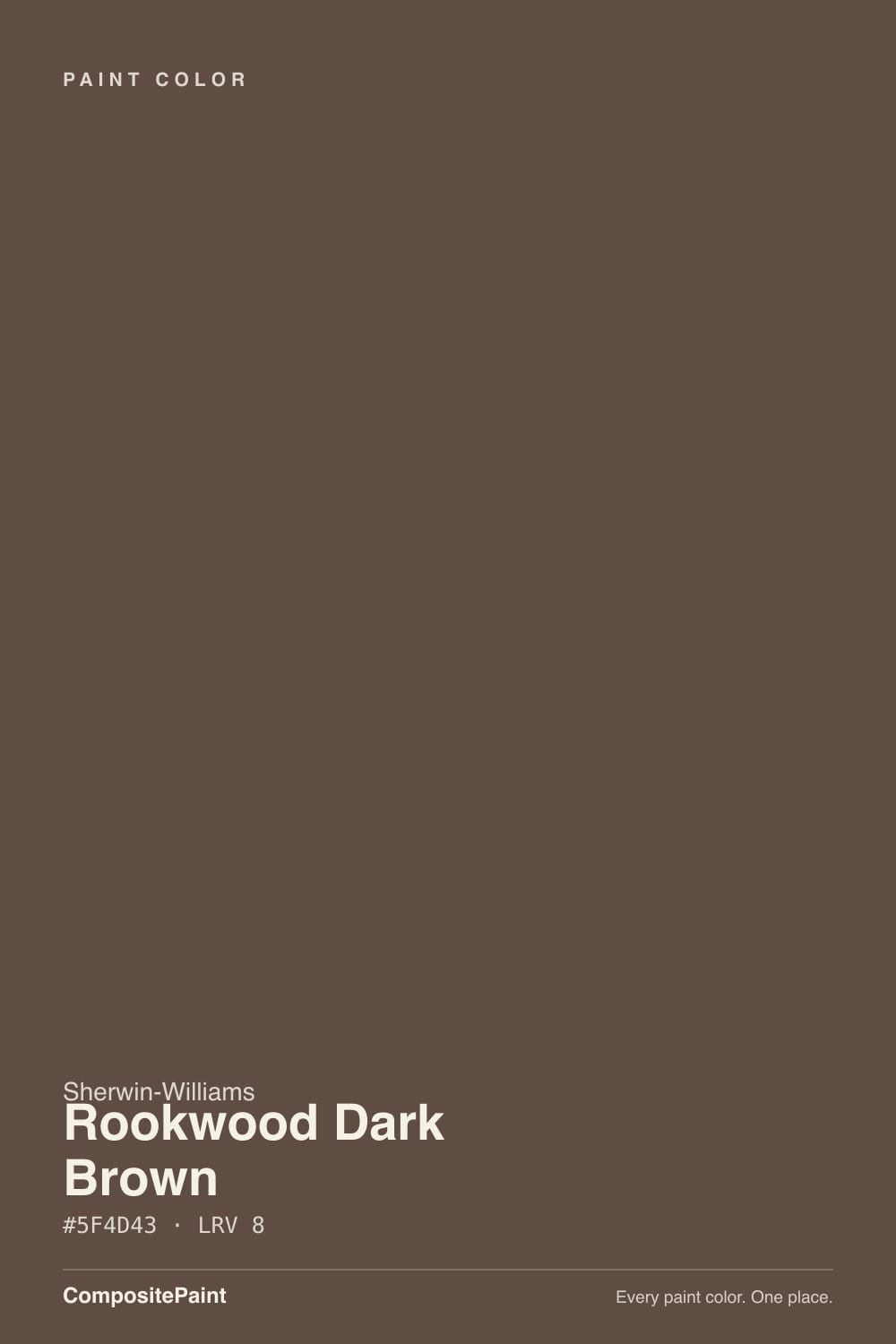
A deep chocolate brown with warm red and orange under it — that red is what separates it from every gray-brown in the deck. Sherwin-Williams pulled it from its own historic archive and files it with the Historic and Exterior Historic collections, alongside Rookwood Brown and Rookwood Dark Red. The Rookwood name comes from the Cincinnati art pottery founded in 1880, and the family reads exactly like the glazes it was named for: earthy, saturated, slightly clay-red rather than cold.
At LRV 8 it is a true dark. That number is the whole review in one figure: this color has almost no light of its own to give back, so everything depends on how much light the room hands it. In daylight it reads unmistakably brown, with the red waking up along a sunlit edge. Step into the same room at night with the overheads off and it looks black-brown. Neither reading is a defect — but people who sample on a small chip under a bright store light and then paint a windowless mudroom are shocked, every time.
Undertone in one line: brown first, red-orange second, no gray to hide behind. Interesting quirk — Sherwin-Williams' own site sorts this one under its orange color family, which sounds absurd until you see it against a cool gray tile and watch the red step forward.
Where It Shines
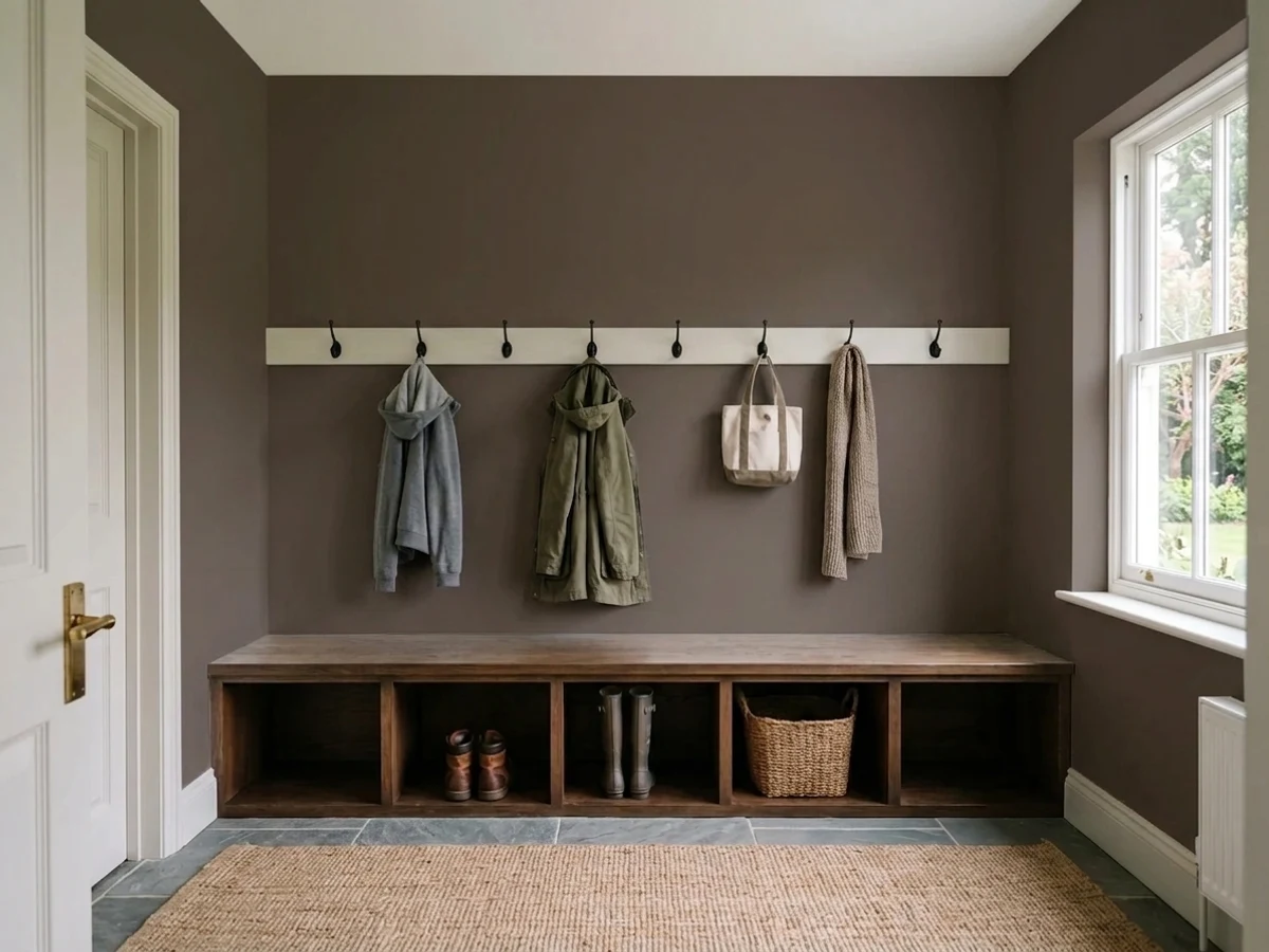
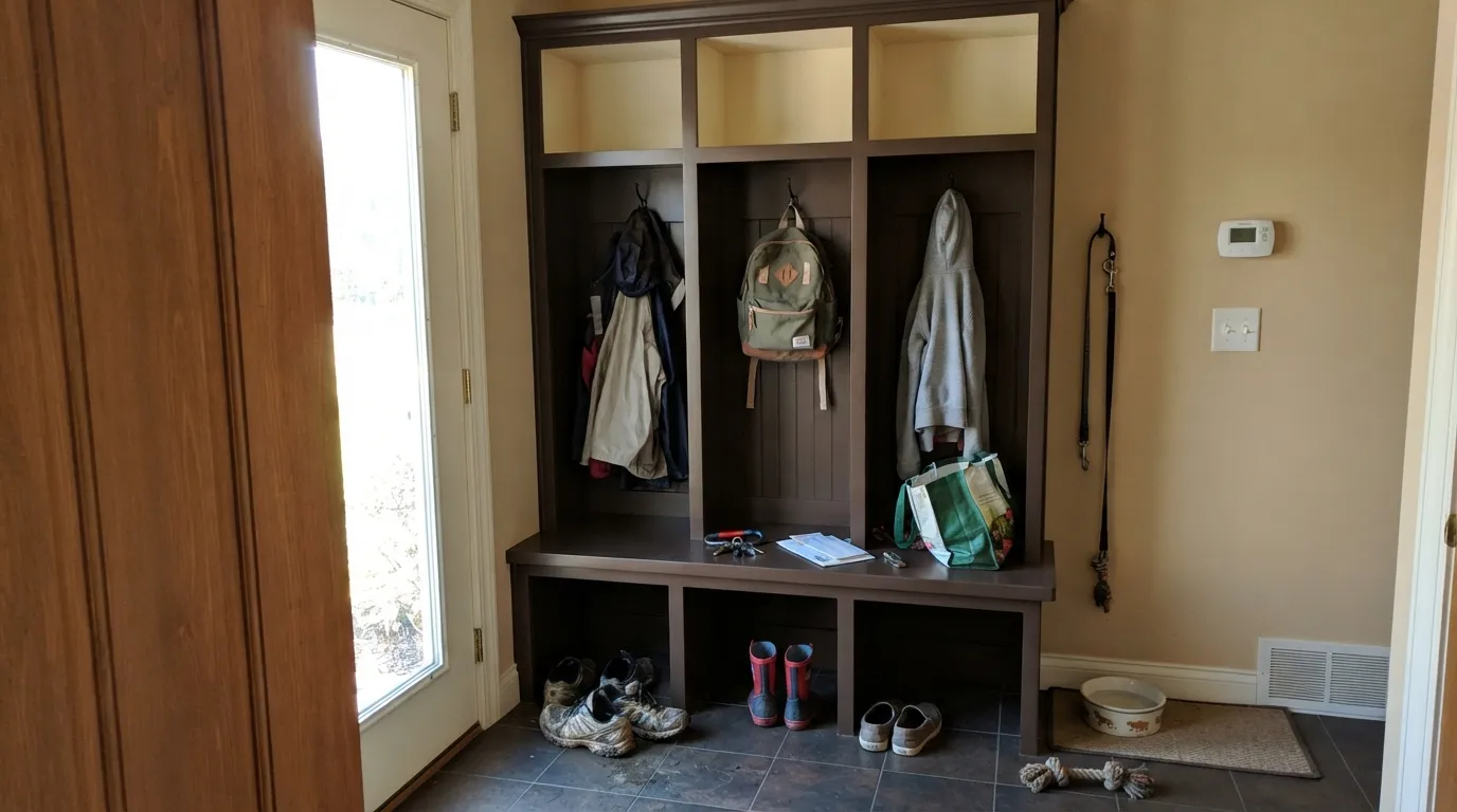
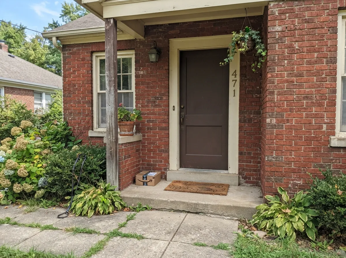
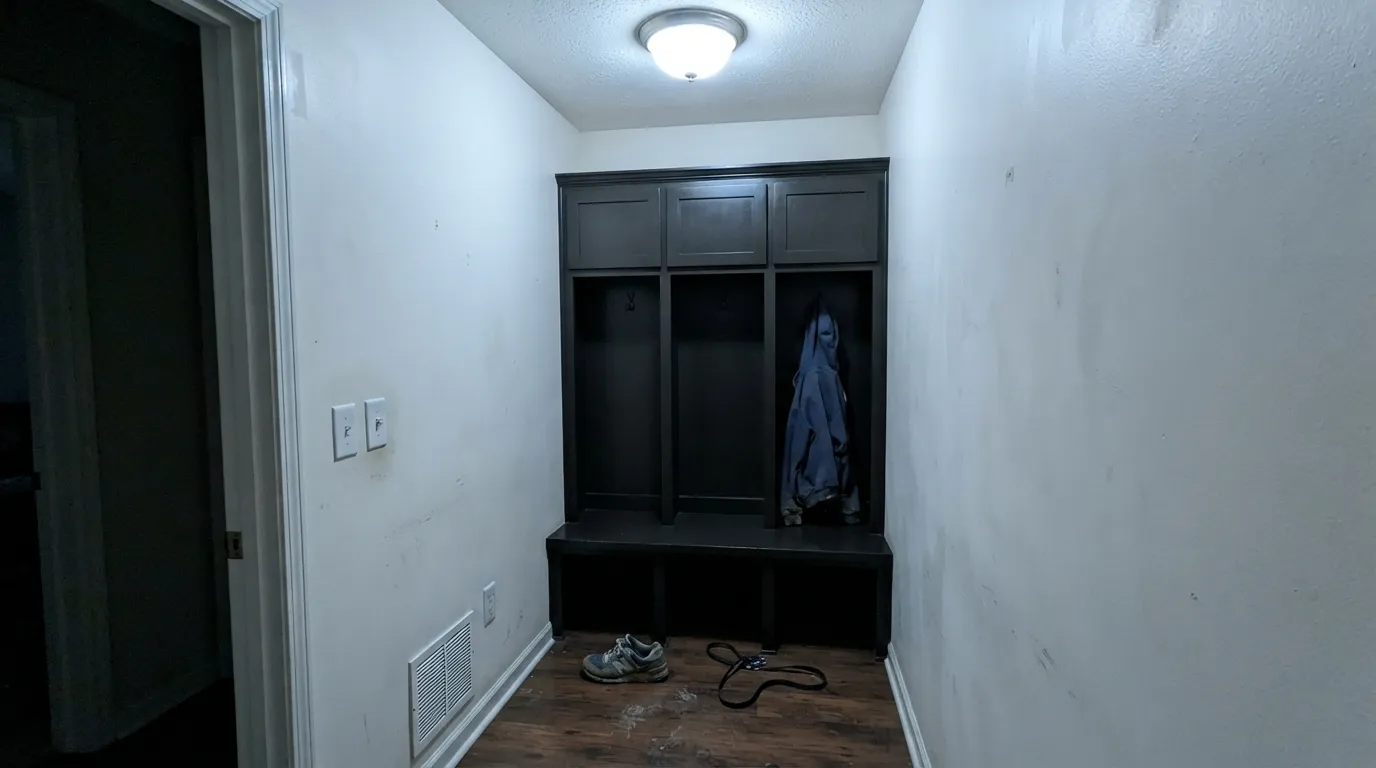
This color is built for things you touch, not walls you look at. Satin Rookwood Dark Brown on mudroom lockers is close to the perfect use of it: dark enough to swallow shoe scuffs, backpack marks and wet-dog splash, warm enough that the room still feels like a house instead of a locker room, and historic enough to sit right in an older home. Its second home is outdoors — a front door, shutters or exterior trim against brick, stone or a warm neutral body, where full sun brings the red out and the color reads like old woodwork rather than paint. Give it cream or warm-white trim, aged brass or oil-rubbed bronze hardware, and one muted green somewhere, and the Arts-and-Crafts logic behind it clicks into place.
Where It Fails
The complaints about this color are boringly consistent, and all three are predictable before you open the can. If your room matches one of them, no amount of extra coats will fix it — the problem is the room, not the paint.
LRV 8 means the color reflects almost nothing. In a windowless mudroom, a north-facing back hall or any room lit only by ceiling cans at night, the brown collapses and the lockers read black. Sample a big board and look at it in the room at 8pm, not in the store. If you need the brown to stay readable in low light, go a step lighter to Rookwood Brown (LRV 14) — same family, still historic, actually brown after dark.
Put this against cool gray porcelain tile, blue-gray stone or a gray-washed floor and the red-orange steps forward hard — owners describe it as suddenly looking rusty or reddish next to the gray. It is doing exactly what warm and cool do to each other. This color wants warm company: cream, tan, slate, brick, warm wood. If the mudroom floor is cool gray tile that is staying, Urbane Bronze or Black Fox will sit on it more quietly.
Going this dark over white primer or old white cabinet paint takes a gray-tinted primer plus two full coats, sometimes three, and any roller lap mark, sanding scratch or drywall patch telegraphs through in raking light. It also flips the dirt equation: dark brown hides shoe scuffs and hand grime beautifully, but shows dust, lint and any light-colored scratch. And spot touch-ups on satin flash — keep enough paint to recoat a whole door, not a dab.
Room by Room
This is the use the color is quietly famous for. Satin on lockers, cubbies, bench fronts and hook boards, with warm-white or beige walls above and around them. It hides the real damage a mudroom takes — scuffed shoes, backpack zippers, wet paws — while keeping the built-ins looking like furniture rather than storage. One rule from people who have lived with it: paint the inside of the cubbies a light color so you can find a glove.
A Rookwood Dark Brown front-hall door or a run of interior doors against cream trim looks like original 1910 woodwork, which is the whole point of a Historic-collection color. Semi-gloss so it wipes clean and the panel profiles catch light. In a dim hall it will read near-black — in an entry that is usually fine, because you want the door to read as a heavy dark element anyway.
Outdoors is where it is easiest to love. Full sun is the only light that shows the whole color, so the red-brown finally reads as brown from the street. It sits naturally against red and buff brick, stone and warm neutral siding, and it is a period-correct choice on Craftsman, Tudor and older Colonial houses where black would look too modern. It can carry a whole body color on a Craftsman, but be aware a dark body absorbs heat and shows chalking sooner than a mid-tone.
Drenching a small study in it — walls, built-ins and trim all Rookwood Dark Brown — is genuinely handsome if the room has one decent window and warm lamps. Matte on walls, satin on shelves. Without that window it becomes a cave, and not the cozy kind: brown at LRV 8 in flat light goes flat and heavy rather than moody.
As a lower-cabinet or island color under warm-white uppers it works well and looks less severe than black, especially with brass. Satin urethane-fortified cabinet enamel, not wall paint. A full kitchen of it is a lot of brown, and it is the one place the honey-oak problem bites hardest — if the floor is golden oak, both the floor and the cabinets go more orange.
It can be beautiful in a bedroom you use at night, with lamps, cream bedding and walnut. But it is a big bet: at this depth the room loses light permanently, and brown does not have navy's or forest green's forgiveness when the light gets dull. If you want the mood without the risk, put the color on the built-ins or an accent wall with a window on it and leave the other three walls warm.
Your Light Is the Risk
Real daylight is the only light that shows you the whole color: warm chocolate with a red-clay edge where the sun hits. This is why it succeeds outdoors and on cabinet doors near a window.
With nothing to reflect, LRV 8 goes black-brown and stays there. The brown disappears first, the warmth second, and you are left with a very dark, slightly muddy neutral.
Cool morning light grays it toward wet bark. Through the afternoon it warms steadily, and low west sun flashes it distinctly rust-red for an hour before it drops away into near-black at dusk.
Warm 2700K bulbs are not optional here — they keep the red alive and the color legible as brown at night. Cool 4000K or daylight LEDs, the kind that come standard in mudroom and garage-entry fixtures, strip the warmth and leave it looking like flat charcoal.
Most complaints about Rookwood Dark Brown are a light mismatch. Upload a photo of your actual room and see it on your walls — then ask for the same wall in north light or evening lamps before you buy a single sample.
Need It From Another Brand?
Any paint counter can custom-tint Sherwin-Williams SW 2808 directly. If you would rather stay in one brand's own deck, these are the closest stock matches, measured as ΔE2000. Under 2 is a difference you will not see on the wall.
| Brand | Closest color | ΔE | LRV | |
|---|---|---|---|---|
| Behr | Roasted NutsUL130-2 · Behr | 0.3 | 8 | Color page → |
| Benjamin Moore | French PressAF-170 · Benjamin Moore | 0.0 | 10 | Color page → |
| Valspar | Boston Legacy2005-9A · Valspar | 2.2 | 8 | Color page → |
| PPG / Glidden | Little BearPPG1074-7 · PPG / Glidden | 2.1 | 8 | Color page → |
| Glidden | Little BearPPG1074-7 · Glidden | 1.8 | 8 | Color page → |
| Dutch Boy | Heritage Brown411-7DB · Dutch Boy | 0.3 | 8 | Color page → |
Similar Sherwin-Williams Colors
The nearest shades to Rookwood Dark Brown within Sherwin-Williams's own range, ranked by perceptual color distance — useful when you want the same look a touch lighter, darker, or warmer.
WCAG 2.1: AA is 4.5 : 1 for normal text, 3 : 1 for large text, AAA is 7 : 1.
Rookwood Dark Brown vs the Colors You're Also Considering
Every Rookwood Dark Brown sample board has the same rivals on it. The numbers show the real lightness gap — then it comes down to which risk you would rather live with.
Pick this when you want real depth and the room has daylight to spend on it.
Sherwin-Williams SW 2806 · LRV 14Rookwood BrownPick this if you want the brown to still look brown in a dim room — the lighter sibling from the same historic family reads like stained wood instead of near-black.
Pick this when you want an unmistakable brown rather than a warm dark neutral that could pass for gray.
Sherwin-Williams SW 7048 · LRV 8Urbane BronzePick this if cool gray tile, stone or floors are staying — same depth, far less chroma, so it never turns red on you.
Pick this for the marginally more grounded, less orange read, and for the historic-collection pedigree if that matters to the house.
Sherwin-Williams SW 6083 · LRV 8SablePick this if your store already has it mixed — these two are near-twins at the same LRV, with Sable a hair more orange.
Rookwood Dark Brown Coordinating Colors
The rule with this brown is to keep everything around it warm. It flatters creams, tans, muted greens and terracottas, and it argues with cool grays, blue-grays and anything with a blue-white edge. These are the partners that keep showing up in rooms and elevations that actually work:
The Rookwood Story: Cincinnati Pottery on a Paint Chip
Rookwood is not a marketing name invented for a trend deck. Rookwood Pottery was founded in Cincinnati in 1880 and became one of the defining American art potteries of the Arts-and-Crafts era, known for earthy glazes in clay reds, browns and sage greens. Sherwin-Williams built a small family of colors around that palette — Rookwood Dark Red, Rookwood Brown and this one, the darkest of the group — and files them in its Historic and Exterior Historic collections.
That heritage explains the color's behavior. Historic browns were mixed to sit next to brick, quarter-sawn oak and stained woodwork, not next to gray porcelain and cool LED strips, which is exactly why it looks so right on an older house and so awkward in a builder-gray mudroom. It also explains the red: Sherwin-Williams' own site sorts this color under its orange family, and once you have seen it beside a cool gray you understand why.
Practical upshot: if your house is Craftsman, Tudor, Victorian or older brick Colonial, this is a color with a genuine reason to be there. If your house is 2015 gray-and-white, it will fight the fixed finishes you already own.
Rookwood Dark Brown With Wood, Floors and Hardware
Wood is where this decision is really made. Walnut, quarter-sawn oak, cherry and warm-stained fir are its natural family — the paint sits a shade deeper than the wood and the whole room reads intentional. Slate, brick and warm-toned tile are excellent underfoot in a mudroom, and they are the reason so many locker schemes with this color photograph well. Pale white oak works too, in a cleaner, more modern way.
The honest no is golden: honey oak floors, orange-stained pine trim, yellow-beige carpet. The red-orange in the paint amplifies the orange in the wood and both sides look cheaper for it. Cool gray tile is the other losing combination — different mechanism, same result, with the brown suddenly reading rusty against it. If either finish is staying and cannot be softened by a large rug or a warm wall color, pick something with less chroma.
Hardware is easy: unlacquered and aged brass, oil-rubbed bronze and matte black all belong on it, and brass in particular is what keeps a dark mudroom from feeling like a locker room. Polished chrome and brushed nickel are the two that read cold and slightly wrong against this much warm brown.
Three Ready Palettes Built on Rookwood Dark Brown
A color is never alone on the wall. These are complete combinations in the 60-30-10 pattern, with the reason each one holds together. Every one opens in the visualizer.
The workhorse version: a warm mid-tone on the walls so the lockers are not doing all the work, and a soft warm white on the trim and, importantly, inside the cubbies so you can see what is in them. Accessible Beige is warm enough that the brown's red never looks out of place, which a cool gray wall would guarantee.
Try this palette in your roomAn earthy body color, a creamy trim and a dark brown door is the period-correct Arts-and-Crafts stack, and it is far softer than the black-door version everyone else on the street has. Sun is what makes this work — outdoors the door reads brown rather than black, which is exactly the reading you cannot get in a dim hallway.
Try this palette in your roomBrown and muted green is the oldest trick in the Arts-and-Crafts book, and it still reads calm rather than costume. Natural Linen keeps the room bright enough that the built-ins stay brown, and Evergreen Fog gives the scheme a second color so the brown does not have to carry the whole room alone.
Try this palette in your roomRookwood Dark Brown FAQ
Is Rookwood Dark Brown too dark for a mudroom?
Not for the lockers and cabinetry — that is its best use, and it hides shoe scuffs and bag marks far better than any light color. It is too dark for all four walls of a mudroom that has no window, because at LRV 8 it reflects almost nothing and the room goes cave-like. The standard move is dark built-ins with a warm beige or off-white on the walls above them.
Does it look black?
In poor light, yes. In daylight it is clearly a warm chocolate brown with a red edge; in a windowless room or under cool LEDs at night it collapses to black-brown. That gap is the number-one surprise people report. Test a large sample in the actual room after dark before you commit, and put 2700K bulbs in the fixtures.
What white goes with Rookwood Dark Brown?
A warm or creamy white, not a bright cool one. Alabaster (LRV 82) is the easy default for trim and cabinet frames; Dover White is the creamier choice on an exterior. A stark blue-white makes the brown look muddy by comparison and turns the pairing into a hard contrast stripe rather than an old-house detail.
Rookwood Dark Brown or Urbane Bronze?
Same depth, different personality. Urbane Bronze is the safer of the two — much less chroma, so it never turns red next to gray tile or stone, and it passes for a warm dark neutral. Rookwood Dark Brown is the one to pick when you specifically want brown to be visible as brown, especially in a warm-toned or historic house.
Is it a good exterior color?
It is one of the better ones in the deck for it. Sherwin-Williams lists it in its Exterior Historic collection, and full sun is the light that makes it look best. It is a natural fit on doors, shutters and trim against brick, stone or warm siding on Craftsman, Tudor and older Colonial houses. As a whole-body color it works but runs hot and will chalk sooner than a mid-tone.
How many coats does it take?
Budget for a gray-tinted primer and two full coats, and plan on a third if you are covering white cabinets or white primer — deep bases like this have little hiding power. Sand and spot-prime patches first, because raking light shows every scratch through a dark satin finish, and keep leftover paint: touch-ups on dark satin flash badly and often need the whole door or panel recoated.
Have you painted with Rookwood Dark Brown?
Rate it — one tap helps the next reader decide.
Ask a Question