Taupe
The dark brown wearing a light color's name, reviewed honestly: where it reads like leather, where it just reads black, and what to buy instead.

Jessica has spec'd whites and neutrals for more than 300 rooms and keeps a sample wall of painted drawdowns in her studio. Every color review is checked against real reader rooms in the comments and re-tested when a formula changes. About the testing process →
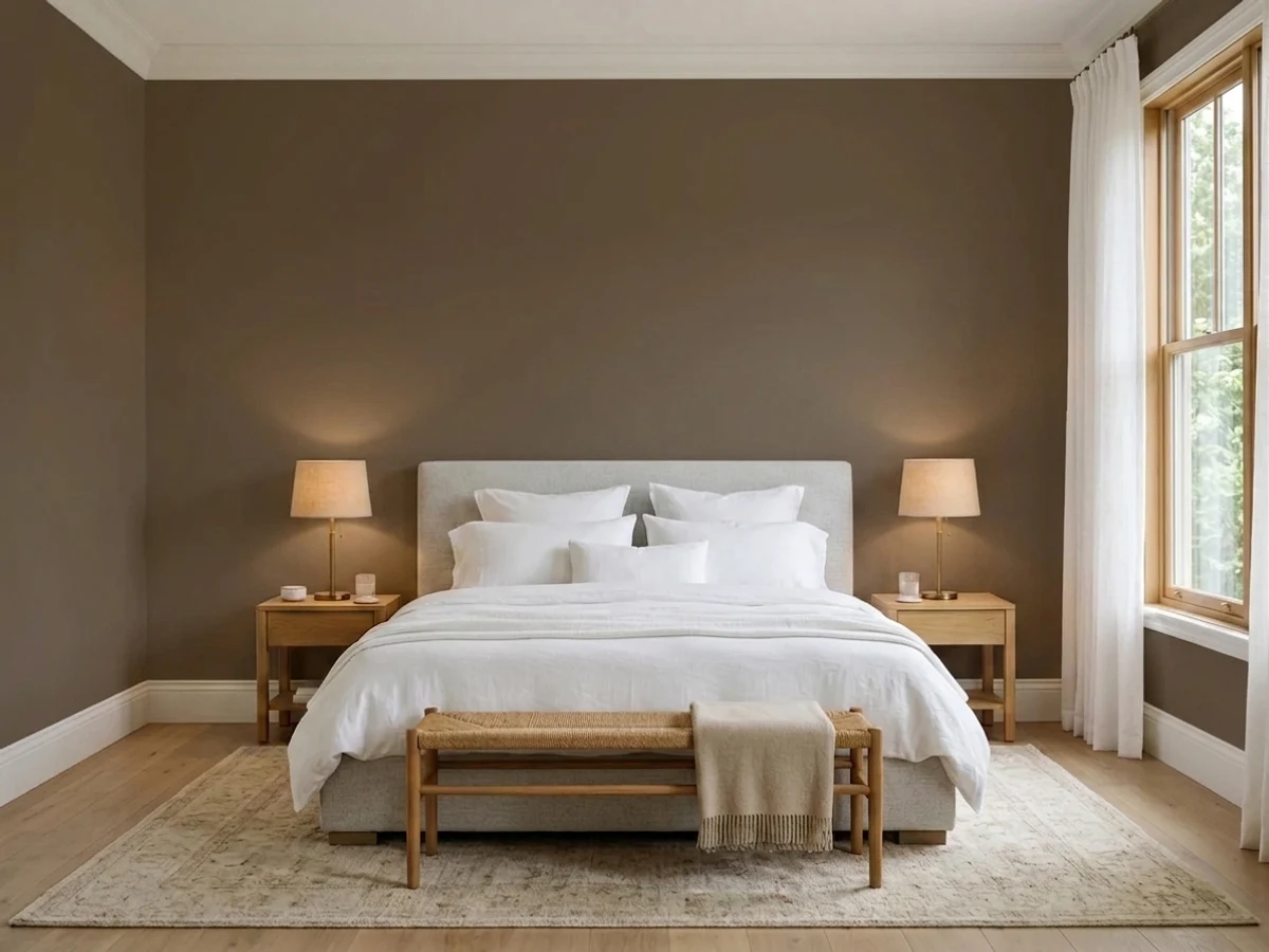
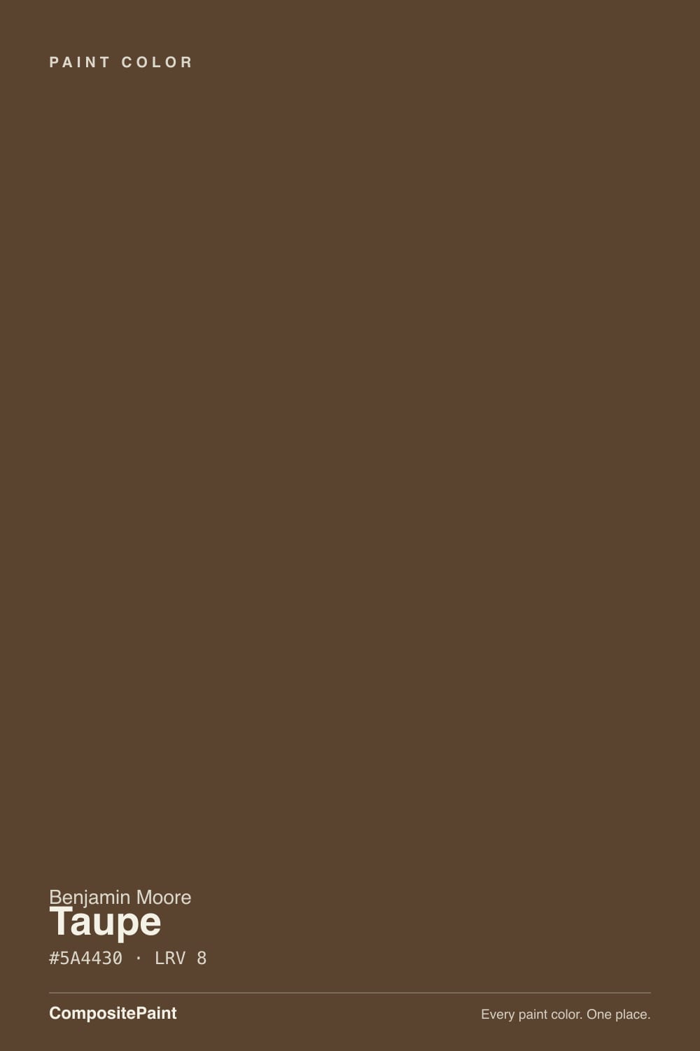
- 1Polished Mahogany3
- 2Taupe8
- 3Porpoise13
- 4Cavern Clay20
The Fast Verdict
Taupe 2110-10 is not the soft mushroom neutral the name promises. It is a near-black coffee brown at LRV 8, and it is one of the best warm darks Benjamin Moore makes — leather and espresso instead of the hard edge you get from charcoal or black. Used on purpose, in a study, a dining room, an island, or a wooded-lot exterior, it is excellent. Used by accident, because you searched the word taupe, it will shock you.
Studies, libraries and dining rooms you want to feel enclosed · kitchen islands and built-ins instead of black · powder rooms with warm lamps · exterior bodies and shutters on wooded lots
You wanted the light greige most people mean by taupe · your walls are patched, textured or badly prepped · the room is dim and you still want to see brown · your fixtures are chrome and your stone is cool gray
- A dark that stays warm — leather and coffee, not hard black
- Softer alternative to black on islands, vanities and built-ins
- Sits naturally with brass, bronze, oak, walnut and terracotta
- Excellent exterior body and shutter color on wooded lots
- Windowless rooms are a strength, not a compromise
- The name is misleading — most people mean a light greige by taupe
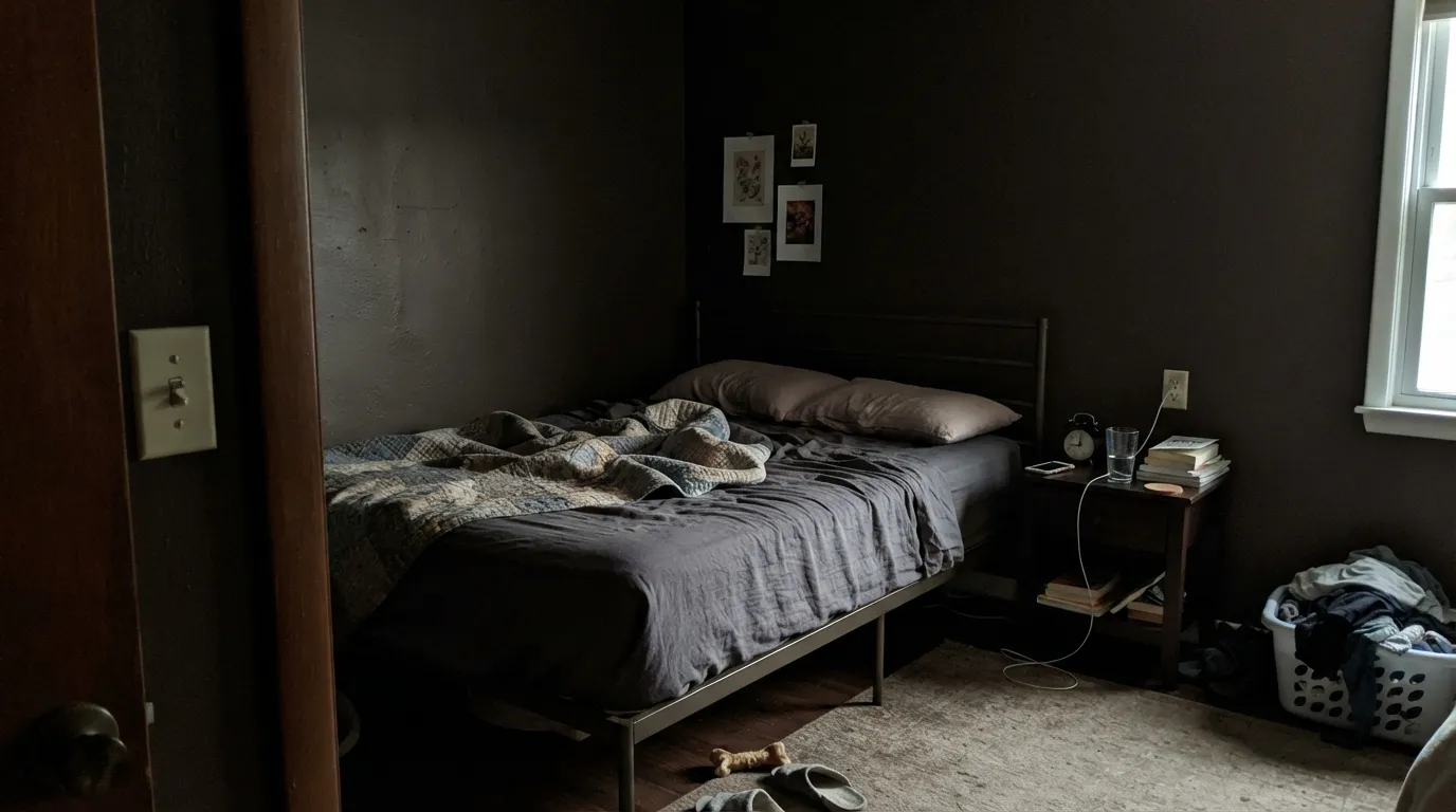
- Reads plain black in dim or north-facing rooms
- Shows every patch, seam and roller lap mark at LRV 8
- Touch-ups do not blend; deep base needs a tinted primer and two full coats
What Color Is Taupe, Really?
A very dark brown with a warm red-orange core. The hue sits at 29 degrees with 30 percent saturation, which is enough pigment to keep it from collapsing into a neutral near-black — there is real coffee and leather in it, and you can see that on a chip held in your hand. What you cannot see on a chip is how little of that survives on a wall, because the same warmth that reads rich at three inches reads as shadow at three feet.
At LRV 8 it reflects almost nothing. To put that in something you can picture: it is exactly as dark as Hale Navy HC-154 and Wrought Iron 2124-10, both also LRV 8. Those are the colors people call "basically black in the evening," and this one behaves the same way. It is not as deep as Bittersweet Chocolate 2114-10 at LRV 5, but the gap between 8 and 5 matters far less than the gap between 8 and a normal mid-tone wall.
Undertone in one line: warm red-orange brown — never gray, never green. If yours looks purple, that is a cool gray or blue-white next to it pulling the red forward, not a bad batch.
Where It Shines
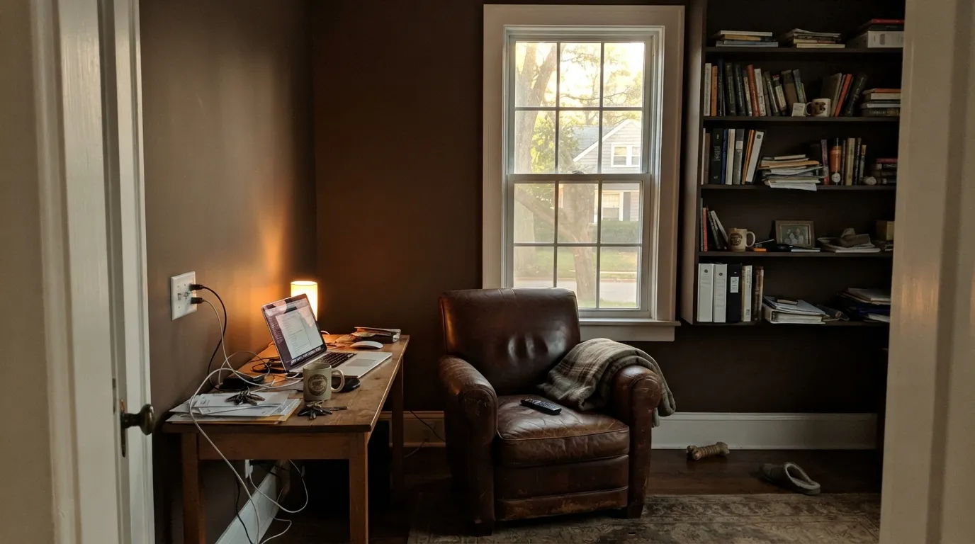
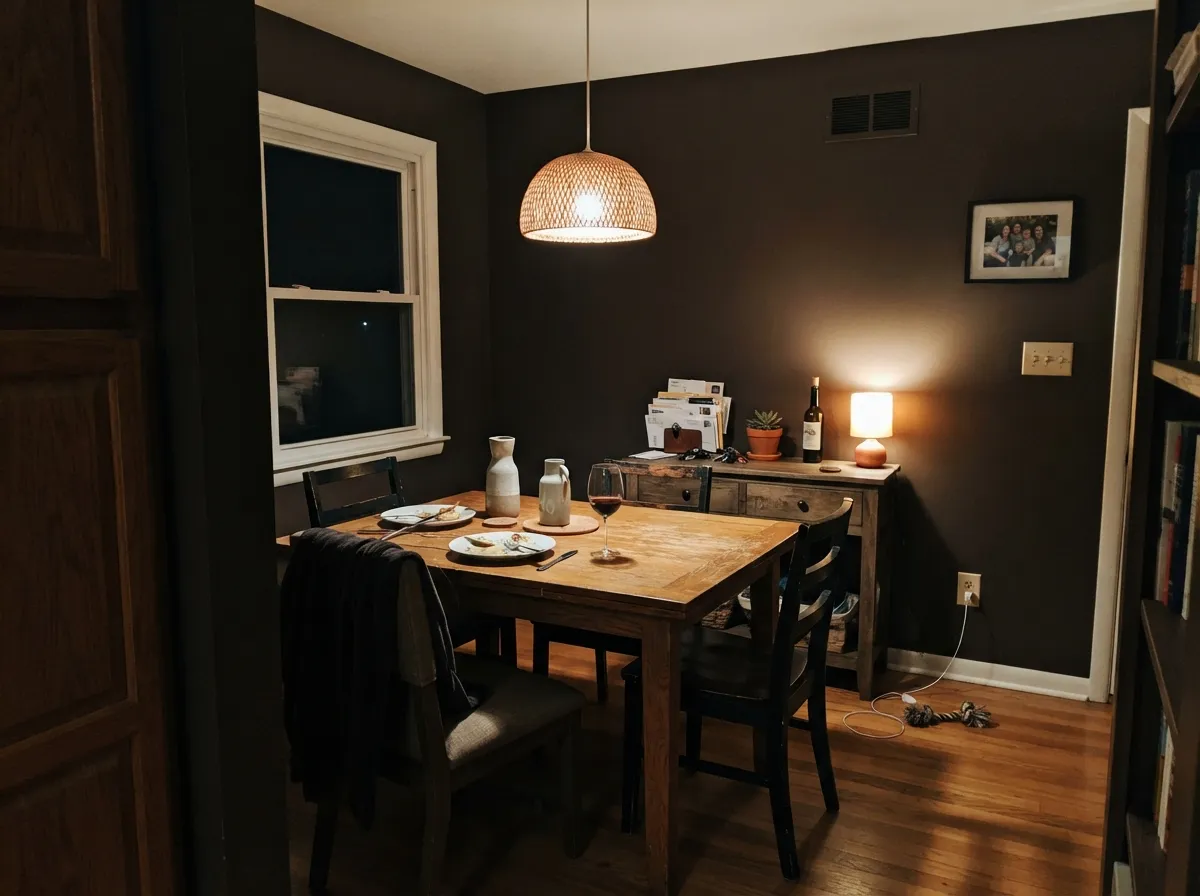
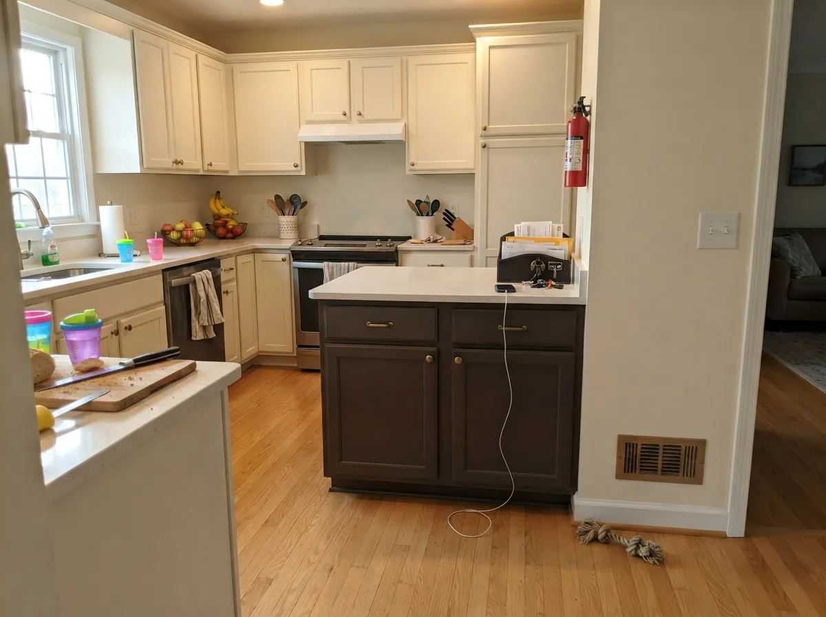
This color wants a room with a job. Studies, dining rooms, libraries and media rooms are where a low LRV stops being a problem and starts being the point, and it is at its very best on cabinetry and islands, where it gives you the weight of black without the hardness. Warm lamps and wood floors do most of the work.
Where It Fails
The unhappy stories about 2110-10 are remarkably consistent, and none of them are about the color being ugly. They are about people getting a different color than the one they thought they ordered, or a surface that was never ready for a paint this dark.
This is the number one complaint by a mile. Taupe, in normal use, means a light gray-brown mushroom neutral. This is the deepest step of the family at LRV 8, and people order it by name, roll it on, and describe the result as black. If you wanted the actual mushroom neutral, look at Revere Pewter HC-172 or Manchester Tan HC-81 instead.
Cool north light drains the red-orange and leaves you with a flat, dark neutral — you lose the brown and keep the darkness, which is the worst trade in the deal. Either commit to lamps and an eggshell sheen, or step up two full levels to something like Whitall Brown HC-69 at LRV 16, which still reads brown when the light is poor.
At LRV 8 every patch, every seam and every roller lap mark shows, and touch-ups almost never blend — they dry as visible squares. Deep base paint also hides poorly, so plan on a gray-tinted primer plus two full coats and one wet edge per wall. On rough or previously patched drywall, a satin or eggshell finish will broadcast it; use flat and accept that flat marks easily.
Room by Room
Small, enclosed, book-lined, lamp-lit: this is what the color was made for. Eggshell on walls so the sheen catches enough light to keep the brown visible, White Dove OC-17 trim in semi-gloss to keep the room legible.
Dark dining rooms only need to work after dark, which removes the LRV problem entirely. Candlelight and 2700K bulbs bring the red-orange forward. Pair with brass, warm wood, and a Steam AF-15 ceiling.
It makes a genuinely cocooning bedroom, but overhead-light-only rooms turn it into a black box. Add bedside lamps and a sconce, keep bedding and curtains light, and use eggshell rather than flat.
A windowless powder room is the lowest-risk place to use any LRV 8 color, because nobody expects daylight in there. Satin holds up to hand splashes and gives the brown something to bounce off. Great with unlacquered brass.
The best argument for this color over black. It gives the same anchor with a warmer read against oak floors and butcher block. Satin cabinet enamel, Swiss Coffee OC-45 on the perimeter cabinets, Revere Pewter HC-172 on the walls.
As a body color it flatters cedar, brick, and stone the way a cool charcoal never does, and it is excellent on shutters and sash against a light body. Keep the trim clearly lighter or the house loses its shape from the street.
Your Light Is the Risk
Direct sun pulls the red-orange forward and it reads like real coffee, not shadow.
Cool, flat daylight strips the warmth. You keep the darkness and lose the brown.
2700K lamps make it rich and soft. 4000K LEDs flatten it to gray-black — swap the bulbs.
Cans scallop a dark wall into bright arcs and black gaps. Add lamps or sconces.
Most complaints about Taupe are a light mismatch. Upload a photo of your actual room and see it on your walls — then ask for the same wall in north light or evening lamps before you buy a single sample.
Need It From Another Brand?
Any paint counter can custom-tint Benjamin Moore 2110-10 directly. If you would rather stay in one brand's own deck, these are the closest stock matches, measured as ΔE2000. Under 2 is a difference you will not see on the wall.
| Brand | Closest color | ΔE | LRV | |
|---|---|---|---|---|
| Sherwin-Williams | Van Dyke BrownSW 7041 · Sherwin-Williams | 2.7 | 7 | Color page → |
| Behr | Breakfast Blend280F-7 · Behr | 0.3 | 6 | Color page → |
| Valspar | Boston Brown Bread8005-9G · Valspar | 2.5 | 7 | Color page → |
| Dutch Boy | Cold Espresso442-7DB · Dutch Boy | 2.5 | 6 | Color page → |
| HGTV Home by Sherwin-Williams | Van Dyke BrownHGSW 2481 · HGTV Home by Sherwin-Williams | 2.7 | 7 | Color page → |
| Backdrop | It's a DateBD-IT · Backdrop | 2.9 | 7 | Color page → |
Similar Benjamin Moore Colors
The nearest shades to Taupe within Benjamin Moore's own range, ranked by perceptual color distance — useful when you want the same look a touch lighter, darker, or warmer.
WCAG 2.1: AA is 4.5 : 1 for normal text, 3 : 1 for large text, AAA is 7 : 1.
Taupe vs the Colors You're Also Considering
Every Taupe sample board has the same rivals on it. The numbers show the real lightness gap — then it comes down to which risk you would rather live with.
Pick this for the warmer, more orange read of the two.
Benjamin Moore 2111-10 · LRV 8Deep TaupePick this for a hair more blue in the mix — slightly cooler, slightly quieter.
Pick this when you still want brown to be visible in daylight.
Benjamin Moore 2114-10 · LRV 5Bittersweet ChocolatePick this for the deeper, near-black chocolate on cabinets and doors.
Deep Taupe 2111-10, hex #594334 at LRV 8, is the nearest neighbor. It carries slightly more blue in the mix, so it reads a shade cooler and less orange than 2110-10, though on a wall the two are hard to separate without a sample of each. Classic Brown 2109-10, hex #58453B at LRV 7, is darker and grayer again. Chocolate Sundae 2113-10, hex #5B3F36 at LRV 6, is the darkest and reddest of the group. Café Doppio CSP-210, hex #53473A, leans olive by comparison.
Across brands, Behr Breakfast Blend 280F-7 has a deltaE of 0.34, which makes it effectively the same color, though its listed LRV of 6 suggests it reads a touch deeper.
Sherwin-Williams Van Dyke Brown SW 7041 at a deltaE of 2.69, Valspar Boston Brown Bread 8005-9G at 2.5, and Dutch Boy Cold Espresso 442-7DB at 2.48 are all very close but worth sampling first. Benjamin Moore is sold through independent dealers, so carry the 2110-10 code when comparing.
Taupe Coordinating Colors
The rule with an LRV 8 wall is that the partners are doing the lighting. Everything you pair with it should be clearly lighter and clearly warm — a cream-leaning white echoes the red-orange base, while a blue-based white will tip the brown toward purple. Cool grays and icy whites are the one combination to avoid.
These are the partners that actually hold up next to it, whether you need trim, a ceiling, the room next door, or one colored note.
Taupe on Cabinets and Built-Ins
If you are only going to use this color once in a house, use it here. On an island, a vanity, a bank of lowers, or a wall of built-in shelves, a low LRV stops being a lighting problem and becomes mass — the object reads solid and deliberate. Compared with a true black, it keeps a warm edge that ties into oak, walnut and butcher block instead of cutting against them.
Two practical notes. Spray or lay off carefully with a fine finish roller: brush marks are as visible on dark cabinet doors as roller marks are on dark walls. And go satin, not gloss — a deep brown in high gloss shows every fingerprint and every dust mote along the top rails.
Taupe on Exteriors
Outside, the LRV that causes trouble indoors becomes an advantage. Full sun is far stronger than any interior light, so the red-orange finally shows on a big surface, and the house settles into a wooded or stone-heavy lot instead of standing out against it. It flatters red brick and cedar in a way a cool charcoal cannot, because it shares their temperature.
Contrast is the thing to get right. Keep trim, soffits and window sash clearly lighter — a creamy white is the classic move — or the architecture disappears into one brown mass from the street. It is also excellent used the other way around: a light body with this color on shutters, sash and the front door reads traditional and costs a fraction of a full repaint. Watch the north side of the house, which stays a full step darker all day.
Three Ready Palettes Built on Taupe
A color is never alone on the wall. These are complete combinations in the 60-30-10 pattern, with the reason each one holds together. Every one opens in the visualizer.
The dark brown takes 60 percent of the room, the warm white trim gives it an edge so the walls read as a decision rather than a shadow. Manchester Tan next door shares the same warm base, so the doorway feels like a step down in light, not a change of temperature.
Try this palette in your roomHere the brown is the 10 percent — one dark object in a light room, which is the safest way to use an LRV 8 color. Swiss Coffee and Revere Pewter both sit on a warm gray base, so the island reads as the deepest note of one family instead of a black hole.
Try this palette in your roomA warm dark body disappears into trees in a good way, and the creamy trim is what keeps the windows and corners readable from the road. The muted teal door is the one cool note, and against a red-brown body it reads considered rather than loud.
Try this palette in your roomTaupe FAQ
How many coats does it take, and do I need primer?
Plan on a gray-tinted primer plus two full coats. Deep base paints carry a lot of colorant and very little white, so they hide poorly over anything light. Skipping the primer is how people end up rolling a third and fourth coat.
Will roller marks and touch-ups show?
Yes, more than with any normal color. At LRV 8 there is no light bouncing back to hide a lap mark, so keep a wet edge and finish each wall in one pass. Touch-ups dry as visible patches; keep leftover paint and expect to re-coat a whole wall rather than dab.
Taupe 2110-10 or Bittersweet Chocolate 2114-10?
Taupe if you want the brown to still look brown in daylight — it is redder and a little lighter at LRV 8. Bittersweet Chocolate at LRV 5 is the near-black option, better for cabinets, doors and shutters where you want mass rather than color.
Is it too dark for a small bedroom?
Small is fine; dim is not. A small room with a decent window, bedside lamps and light bedding feels enclosed and calm. A small room lit by one ceiling fixture turns into a black box, and no sheen choice fixes that.
Does it work on kitchen cabinets?
It is one of the better uses for it, especially on an island or a run of lowers under lighter uppers. Use a satin urethane-fortified cabinet enamel and warm metal hardware — brass and bronze glow against it, chrome looks cold and disconnected.
What sheen should I use on the walls?
Eggshell in most rooms. Flat looks beautiful but eats the remaining light and shows fingerprints badly on a dark surface; satin bounces enough light to reveal every drywall flaw. Eggshell is the compromise that lets the brown show without spotlighting your walls.
Will it make my room feel smaller?
It will make the walls feel closer, which in a study, dining room or powder room is exactly the effect you want. In a room you need to feel open, it is the wrong tool — go up the ladder to Whitall Brown HC-69 at LRV 16 for the same warmth with room to breathe.
Have you painted with Taupe?
Rate it — one tap helps the next reader decide.
Ask a Question