Barista
The espresso-dark brown with a wine-red secret, reviewed honestly: the light that makes it glow, the rooms where it goes inky-black, and what to pick instead.

Jessica has spec'd whites and neutrals for more than 300 rooms and keeps a sample wall of painted drawdowns in her studio. Every color review is checked against real reader rooms in the comments and re-tested when a formula changes. About the testing process →
- 1Polished Mahogany3
- 2Barista8
- 3Porpoise13
- 4Cavern Clay20
The Fast Verdict
Barista is Benjamin Moore's answer to the espresso-dark cabinet trend: a deep brown built on a genuine red undertone, so it never quite flattens into plain chocolate. Under south sun or a warm lamp it turns burnished and almost wine-dark — the reason people reach for it on islands, front doors and moody dining walls. In a dim, north-facing room the same undertone disappears and the color reads as an inky, almost-black brown with none of that richness. At LRV 8 it is genuinely dark: plan for real light or real lamps, not both walls and expectations of daylight brightness.
Kitchen islands and cabinetry with good light · dining rooms and accent walls that want wine-dark drama · a front door with real sun exposure · home offices and libraries · anyone who wants brown with more personality than a flat neutral coffee color
You want a flat, neutral chocolate with no red in it · the room is dim, north-facing, and lamp-free · you're painting the whole exterior body, not just the door · your kitchen is small and already dark
- Genuine red undertone keeps it from reading as flat, muddy brown
- Turns burnished, wine-dark and expensive under real light or warm lamps
- Reads as a sophisticated warm near-black on cabinets, islands and doors
- Small doses — island, door, powder room — look considered, not heavy
- Built into BM's whole-house Affinity palette, so it coordinates by design
- Goes flat, inky and almost-black the moment the light or lamps disappear
- The red undertone surprises buyers who wanted a neutral coffee brown
- LRV 8 is genuinely dark — the wrong pick for a room that needs to feel bright
- Too much heat and weight for a full sun-facing exterior wall without trim contrast
What Color Is Barista, Really?
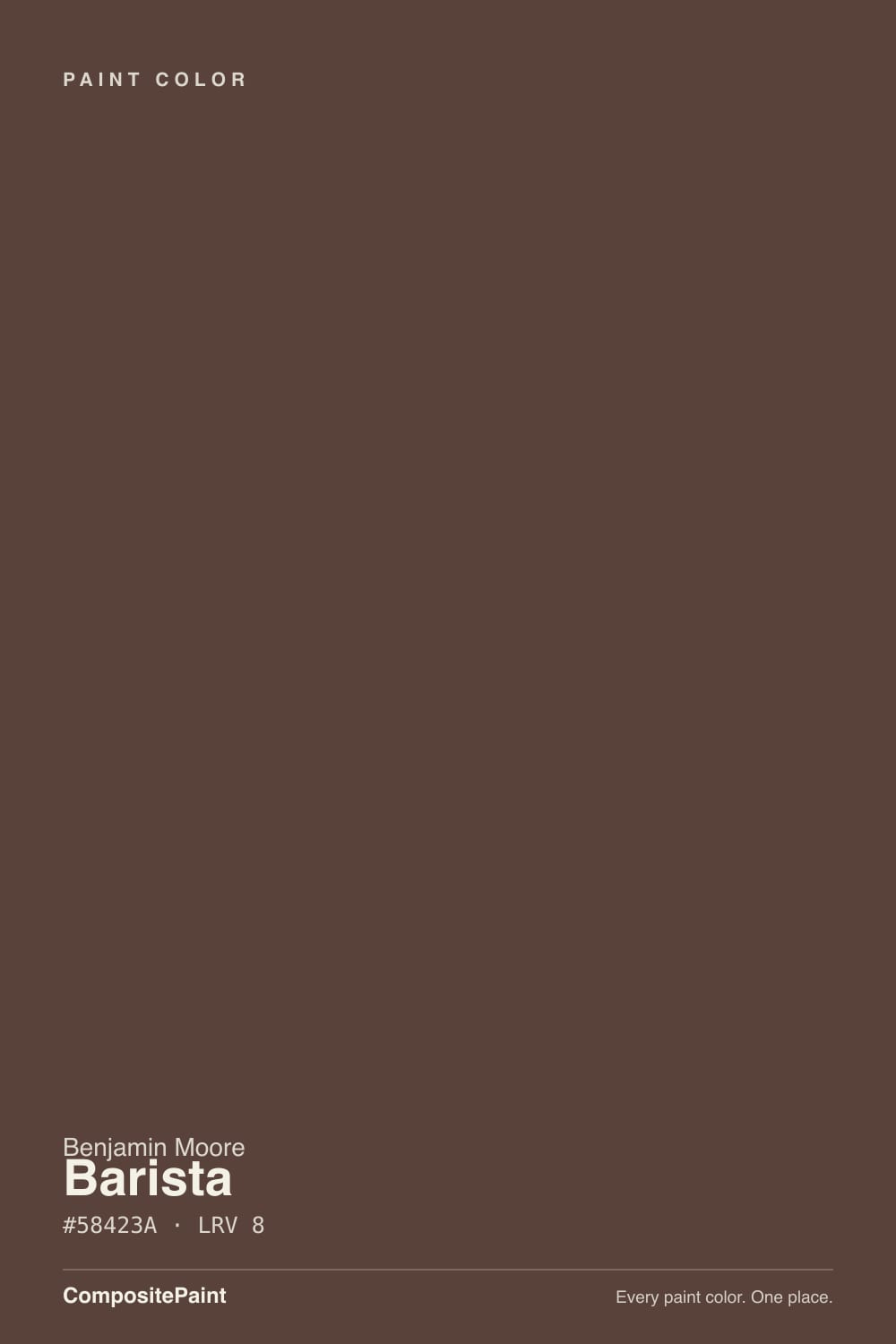
A deep espresso brown built on a genuine red undertone — Benjamin Moore's own description, "a sumptuous dark brown with a touch of red," undersells how much that red does. Take away the red and this is just another flat, muddy brown; leave it in and the color turns velvety and complex, closer to dark-roast coffee held up to a warm lamp than the beige-brown "coffee" shade sold everywhere else. It sits in the Affinity collection, Benjamin Moore's designer-curated palette built to coordinate across a whole house — a hint that Barista was picked to layer with other colors, not to stand alone as a whole-room neutral.
At LRV 8 it is a genuinely dark color — not a warm mid-tone brown, closer to near-black. That depth is the whole point on cabinets and doors, where it reads as a sophisticated near-black with warmth instead of a flat charcoal. But depth this low means light does almost all the work: in bright, direct light the red comes forward and the color looks burnished, almost wine-like up close; the moment the light drops, the red retreats and Barista collapses toward a dark, inky brown that can read nearly black in shadow. Plan the room around the light it will actually get, not the swatch under bright store lighting.
Undertone in one line: brown first, red close behind — never orange, never true black. If your sample looks flat and characterless, the light in the room is too cool or too dim; if it looks almost burgundy, that is warm lamplight or direct sun doing exactly what this color was built to do.
Where It Shines
Give it real light — south sun, a west-facing window at golden hour, or a warm 2700K lamp — and Barista does something a lot of dark browns can't: it goes rich and wine-dark instead of just going darker. That's why it shows up so often on kitchen islands and cabinetry, where good task lighting is already doing the work, and on dining room accent walls, where evening lamplight is the point. In small doses — a front door, an island, a powder room — it reads expensive and considered rather than heavy.
Where It Fails
Almost every regret story about Barista comes from one of three mismatches, and all three are predictable before the first coat. None of them are the paint's fault — but if your room matches one, sampling bigger will only confirm the problem.
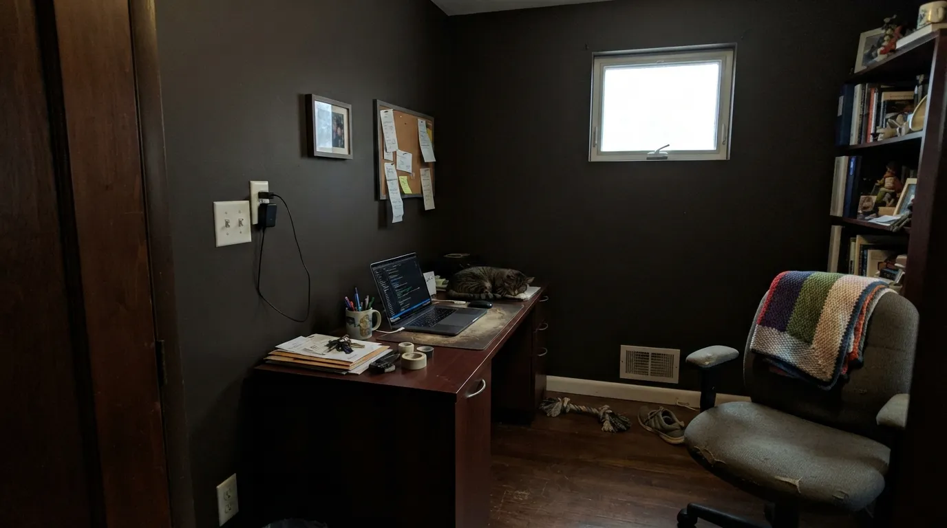
Take the light away and Barista's whole personality — the red, the burnished depth — goes with it. In a north-facing room or any space that runs on overhead fluorescents, it settles into a flat, inky brown that reads almost black in the corners and swallows the room instead of warming it. If you can't add warm lamps, this isn't your color.
The red undertone is not subtle once the light turns warm — under 2700K bulbs or direct sun it reads distinctly toward burgundy, closer to an espresso-and-wine hybrid than a flat chocolate. Buyers expecting a neutral "coffee brown" with zero red are the ones disappointed; if that's you, look at a flatter brown like Benjamin Moore Wenge instead.
On a front door or shutters, the depth and heat absorption are a feature. Across a full sun-facing exterior wall, a color this dark absorbs real heat and can look heavy without a contrasting trim to break it up — treat it as an accent color outside, not a body color.
Room by Room
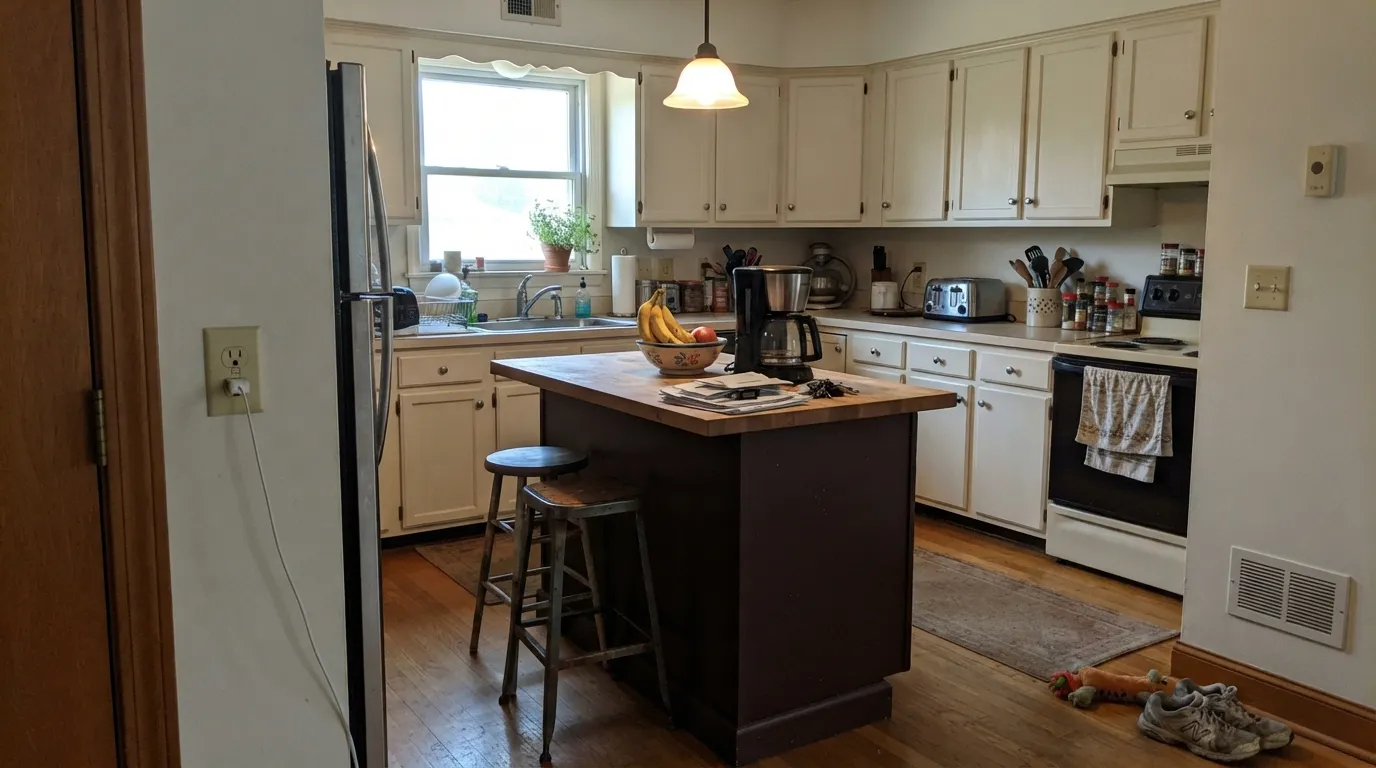
On an island or cabinetry with real daylight or task lighting, it reads high-end and grounded next to marble, quartz or butcher block. In a small, already-dim kitchen it can feel heavy fast — pair it with a warm white on the perimeter cabinets rather than using it on every surface.
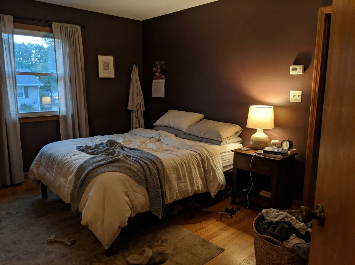
Full walls of Barista under warm lamps wrap the room in a genuine cocoon-like warmth. The red undertone reads as intimacy rather than gloom when there's a lamp doing the work; cream bedding keeps it from feeling heavy.
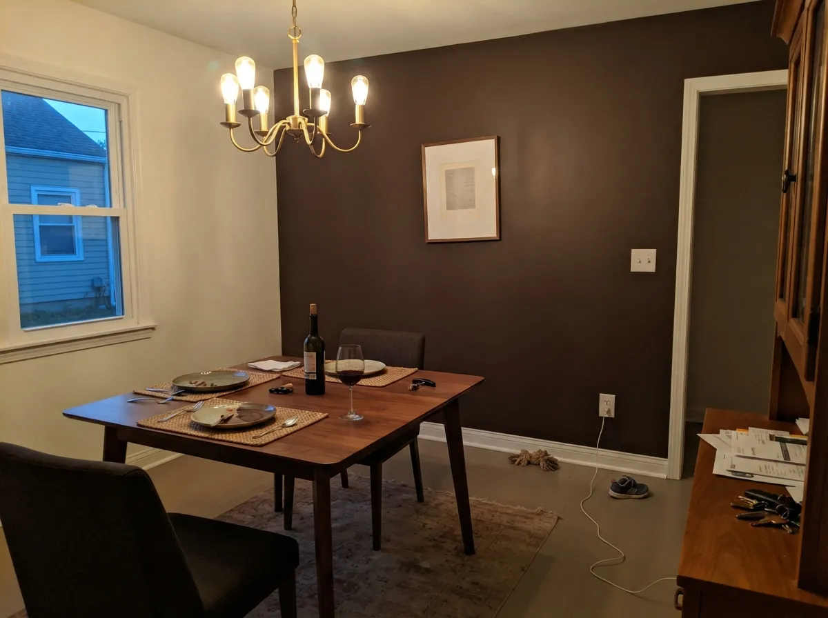
An accent wall or wainscoting behind the table, lit by evening lamplight or a chandelier, is where the wine-dark effect is most convincing. Keep the rest of the room lighter so the color reads as a considered choice, not the whole box.
Low, warm light flatters it the same way it flatters a den — walnut shelving, leather chairs and brass lamp light are its natural company, giving the room old-world weight without needing a fireplace to justify it.
On a door that gets direct light, it reads rich and warm rather than heavy — a genuine alternative to the usual black or navy front door. A shaded, north-facing entry with no direct sun is the one place it disappoints; sample the actual door before committing.
It can technically be used across a whole facade, but full sun on that much dark red-brown means real heat absorption and a heavy look without a contrasting trim to break it up. Better as the door or shutters than the siding.
Your Light Is the Risk
Direct sun or a 2700K bulb pulls the red forward and the color turns burnished, almost wine-dark up close — this is the effect people buy Barista for.
Cool, flat daylight strips the red out and leaves a dark, inky brown that reads almost black in shadow — the number-one "it looked different on the wall" complaint.
Cooler and quieter in morning east light, warmer and more wine-toned as afternoon west sun comes in — expect the same wall to read two different browns across the day.
Warm bulbs are close to non-negotiable here: they keep the red alive at night. Cool white LEDs flatten it toward a muddy, characterless dark brown.
Most complaints about Barista are a light mismatch. Upload a photo of your actual room and see it on your walls — then ask for the same wall in north light or evening lamps before you buy a single sample.
Need It From Another Brand?
Any paint counter can custom-tint Benjamin Moore AF-175 directly. If you would rather stay in one brand's own deck, these are the closest stock matches, measured as ΔE2000. Under 2 is a difference you will not see on the wall.
| Brand | Closest color | ΔE | LRV | |
|---|---|---|---|---|
| Sherwin-Williams | OtterSW 6041 · Sherwin-Williams | 1.4 | 6 | Color page → |
| Behr | Dark WalnutPPF-51 · Behr | 1.9 | 6 | Color page → |
| Valspar | Piano Brown1004-9A · Valspar | 2.2 | 6.3 | Color page → |
| PPG / Glidden | Racy Raisin16-24 · PPG / Glidden | 3.0 | 7 | Color page → |
| Glidden | Stewart House Brown50YR 06/081 · Glidden | 2.9 | 6 | Color page → |
| Dutch Boy | Wire Work416-7DB · Dutch Boy | 4.7 | 7 | Color page → |
Similar Benjamin Moore Colors
The nearest shades to Barista within Benjamin Moore's own range, ranked by perceptual color distance — useful when you want the same look a touch lighter, darker, or warmer.
WCAG 2.1: AA is 4.5 : 1 for normal text, 3 : 1 for large text, AAA is 7 : 1.
Barista vs the Colors You're Also Considering
Every Barista sample board has the same rivals on it. The numbers show the real lightness gap — then it comes down to which risk you would rather live with.
Pick this for the more pronounced red-wine undertone that shows up under warm light.
Sherwin-Williams SW 6083 · LRV 8SablePick this if your painter works in Sherwin-Williams — a near-identical warm brown at the same depth, filed by SW as an orange rather than a red.
Pick this when you specifically want that red undertone to show up under lamplight.
Benjamin Moore 2110-10 · LRV 8TaupePick this for the same depth with a straighter, brick-warm brown and less of Barista's wine-red swing.
Barista Coordinating Colors
The rule for coordinating with Barista: warm whites and warm woods let the red undertone show; anything cool or gray fights it. It pairs cleanly with cream and warm neutral whites, layers well with other warm browns and near-blacks, and holds its own next to brass and walnut. These are the partners that keep showing up in rooms that work:
Barista and the Espresso-Cabinet Trend
Dark kitchen islands and cabinets spent the last several years leaning black and charcoal-gray — dramatic, but cold under anything but bright light. Barista is part of a quieter shift back toward warm, brown-based darks: colors dark enough to read as moody but with enough red or brown warmth to stay inviting instead of stark, especially in kitchens that already run warm with wood counters and brass hardware.
Benjamin Moore built Barista into the Affinity collection specifically to solve the coordinating problem that trips up a lot of DIY dark-color choices — it was picked to sit next to the collection's other warm neutrals and darks without a fight, which is why it shows up so often paired with a simple warm white rather than styled as a standalone statement wall.
Barista With Wood Tones and Floors
Walnut, espresso-stained oak and other dark warm woods are the safest company for Barista — the browns read as one deliberate palette instead of two competing ones. It also does well against pale, bleached or gray-washed floors, which give the wall room to be the darkest thing in the room without a fight.
Honey oak is the one floor that needs testing first. Because Barista carries a genuine red undertone, it can push a golden-orange floor further toward orange in warm light, and the floor can pull the wall's red forward more than expected. It isn't a hard no — a large rug or a warm white perimeter breaks the pairing up — but sample it above the actual floor before committing to cabinets or a full wall.
Three Ready Palettes Built on Barista
A color is never alone on the wall. These are complete combinations in the 60-30-10 pattern, with the reason each one holds together. Every one opens in the visualizer.
White Dove perimeter cabinets keep the kitchen bright enough to give Barista's red undertone real light to work with, while the island carries all the drama in one contained dose. Wrought Iron on window frames or pendant fixtures adds a second dark note without competing for attention.
Try this palette in your roomSwiss Coffee keeps the room from feeling closed in during the day; Barista on one wall under evening lamps is where the color earns its keep. Taupe on trim or shelving stays in the same warm-brown family instead of fighting it with a cooler wood tone.
Try this palette in your roomA warm white body gives Barista's red undertone the sun exposure it needs to look burnished instead of flat; Kendall Charcoal shutters ground the look without adding a second warm color to compete with the door. Keep Barista to the door — a full body coat in full sun is more heat and weight than most houses want to live with.
Try this palette in your roomBarista FAQ
Is Barista brown or red?
Both, and that's the point. Benjamin Moore calls it "a sumptuous dark brown with a touch of red," and in real light the red does most of the interesting work — under a warm lamp or direct sun it turns burnished, almost wine-dark. In cool, flat light the red retreats and it reads as a plain dark brown. If you want a brown with zero red, this isn't it.
Is it too dark for a whole kitchen?
At LRV 8, yes for most kitchens — this is an island-and-accent color, not a perimeter-cabinet color, unless the kitchen has genuinely strong natural light. Pair it with a warm white like White Dove on the surrounding cabinets and let Barista carry the island.
Does it work for a front door?
Yes, on a door with real sun exposure — it reads rich and warm rather than heavy. On a shaded, north-facing entry with no direct light, it can look flat and almost black; sample the actual door at the actual time of day before committing.
What trim white goes with Barista?
A warm white — White Dove or Swiss Coffee — keeps the pairing soft. A stark, cool white will make Barista's red undertone look muddier by contrast instead of framing it.
Does it work with oak or walnut floors?
Walnut and other warm dark woods are its best match — the browns layer instead of compete. Honey oak is workable but can push both the floor and the wall toward orange in warm light; pale or gray-washed floors give the cleanest contrast.
Can I use it on a whole exterior wall?
It's built to handle it structurally, but treat it as a design choice, not a default: full walls in direct sun absorb real heat and can look heavy without contrasting trim. Most houses use it on the door or shutters, not the siding.
Have you painted with Barista?
Rate it — one tap helps the next reader decide.
Ask a Question