Espresso Beans
Behr's darkest warm brown, reviewed honestly: where it reads like real espresso, where it flattens to plain black, and what to pick instead.

Jessica has spec'd whites and neutrals for more than 300 rooms and keeps a sample wall of painted drawdowns in her studio. Every color review is checked against real reader rooms in the comments and re-tested when a formula changes. About the testing process →
- 1Mahogany0
- 2Espresso Beans6
- 3Porpoise13
- 4Cavern Clay20
The Fast Verdict
Espresso Beans is Behr's answer to the near-black-brown a lot of shoppers actually want: dark enough to read as black from across the room, warm enough up close to still say "wood," not "tar." Behr sells it right inside its Cabinet, Door & Trim enamel line alongside the regular wall gallon, which tells you exactly what it is for — kitchen islands, front doors, exterior trim, bathroom vanities. Give it real light and the brown comes forward; bury it in a dim corner and it just goes black.
Kitchen cabinets and islands · bathroom vanities · front doors, shutters, and exterior trim · dens and home offices with real daylight · anyone who wants black-cabinet drama without buying an actual black
You want a true, no-brown-at-all black · your kitchen or bath runs dim with little daylight · you're painting a small bedroom's four walls, not one accent · you're not prepared to prime and apply carefully — dark, near-black finishes show every roller lap and thin spot
- Reads warm espresso-brown up close, near-black from across the room
- Sold right in Behr's Cabinet, Door & Trim enamel line — built for the job
- Excellent on kitchen islands and cabinets in real light
- Strong, classic choice for a front door, shutters, or exterior trim
- Hides fingerprints and daily handling better than a true black
- Not a true black — disappoints buyers who wanted zero brown
- Goes flat and cave-like on four walls with no real daylight
- Unforgiving of a rushed or unprimed application
- Thin public track record — few independent long-term owner reviews to draw on
What Color Is Espresso Beans, Really?
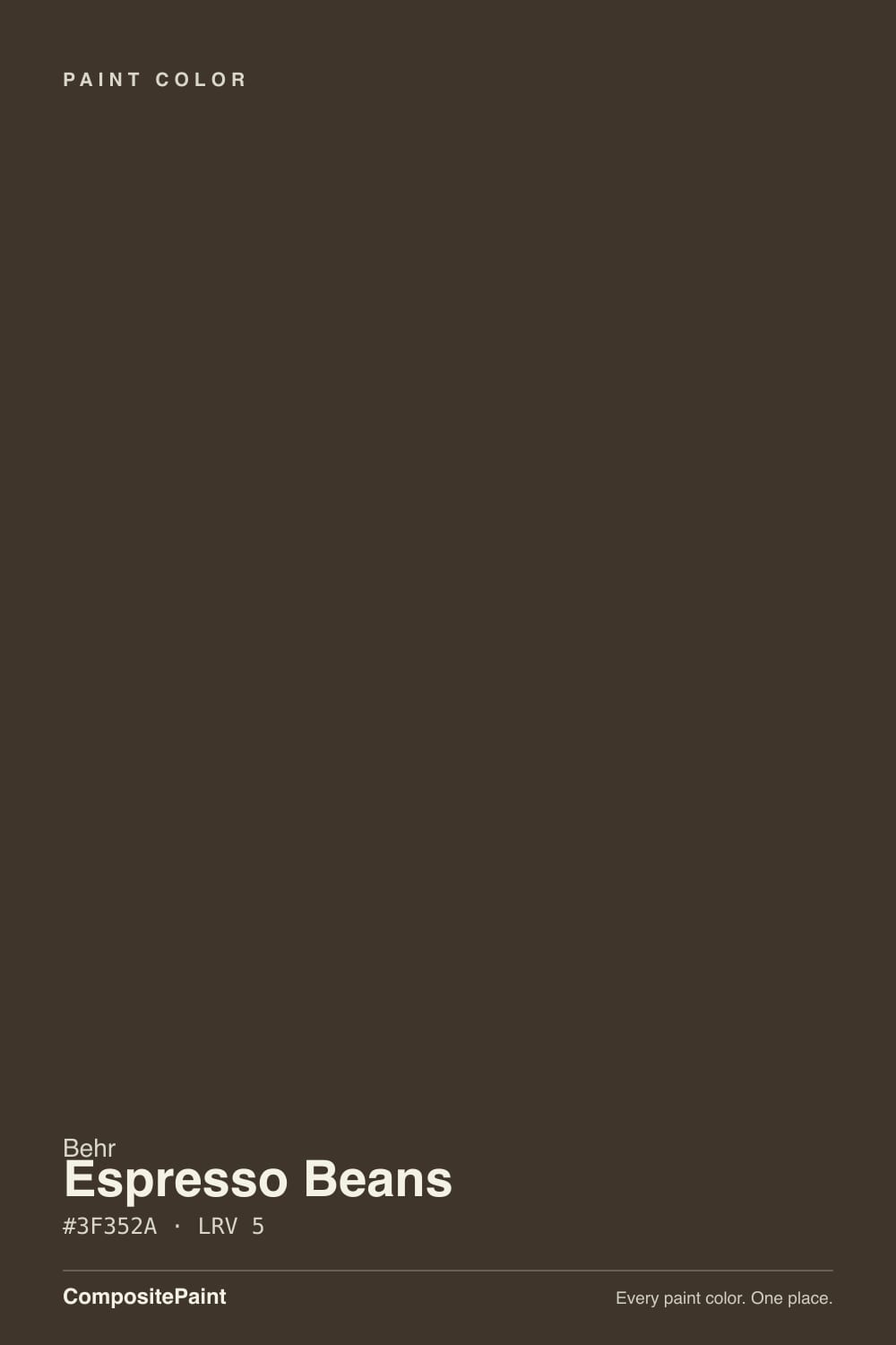
A very dark, muted brown built on a soft warm base — the RGB works out to roughly 63 red, 53 green, 42 blue, which is a textbook warm near-black: red and green both sit well above blue, so the color leans brown rather than the flat, undertone-free black you get when all three channels are close together. That is the whole personality of Espresso Beans: it is dark enough to photograph as black in a lot of listing photos, but in person it never fully loses the coffee-bean brown underneath.
At LRV 6 it is genuinely a near-black — one of the darkest colors in the Behr deck, in the same depth range as Behr's own Cracked Pepper. That depth is exactly why Behr positions it inside the Cabinet, Door & Trim Interior/Exterior enamel line (satin, semi-gloss, even high-gloss options) right next to the standard wall-paint gallon: this is a color meant to be applied carefully, in a finish that can take wiping down and daily handling, on surfaces — cabinets, doors, vanities, exterior trim — rather than rolled flat across four walls of a small room.
One honest limit on this review: Espresso Beans has not built up the kind of large public track record that bigger-name colors have — no Color of the Year run, no long Houzz or Reddit threads to mine for complaint patterns. Behr's own product pages and its Colorfully BEHR blog are the clearest sources we found, both pointing the same direction (cabinets, exteriors, doors), and we are grounding this review in that plus the color's own hex and LRV data rather than a mountain of owner anecdotes.
Where It Shines
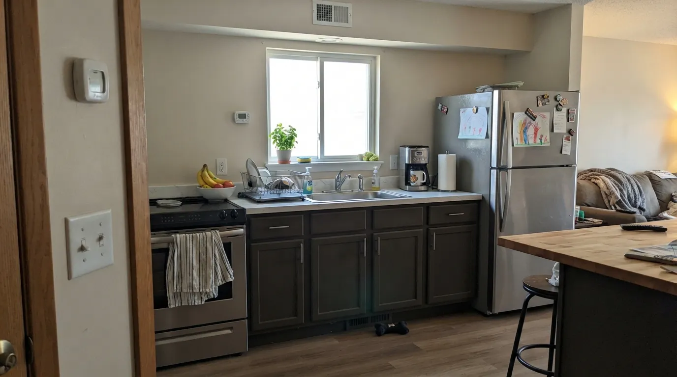
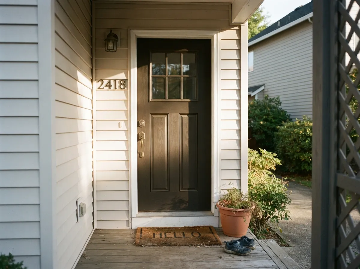
This color earns its keep on surfaces that catch direct light and get handled — not on a whole wall sitting in shadow. Cabinets and kitchen islands are its clearest home: with daylight hitting the door fronts, the brown comes through and the finish reads espresso-stained wood rather than painted black. Front doors, shutters, and exterior trim are its second home; full sun is the most flattering light this color ever gets, and Behr markets it specifically for exterior bodies, trim, and doors for exactly that reason.
Where It Fails
Almost every regret with a near-black color like this comes from one of three predictable mismatches. None of them are the paint being defective — they are the paint being asked to do a job it was never built for.
Espresso Beans is brown first, black second — it just gets dark enough that most rooms read it as black from a distance. If you open the can expecting zero warmth and get a color that flashes coffee-brown in direct light, that is the paint being honest, not defective. For a color with less brown in it, look at Behr's own Cracked Pepper or Sherwin-Williams Tricorn Black instead.
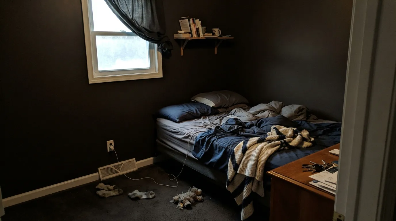
At LRV 6 this color reflects almost nothing back. On four walls of a windowless bath or a north-facing bedroom with no real daylight, it will read flat and cave-like rather than rich — the depth that looks great on a sunlit cabinet door disappears without light to bounce it around. Use it as an accent, a vanity, or a door in that kind of room, not the whole box.
Dark, near-black enamels are unforgiving about technique. Skip the tinted primer over a lighter cabinet color and you will fight coverage for coats three and four; rush the rolling and every lap mark, ridge, and thin spot shows under raking light in a way a mid-tone color would hide. This is a two-coat-minimum, properly primed job, especially on cabinets and doors that get raked by daylight.
Room by Room
This is exactly what Behr built the color for. On an island or full cabinet run under real kitchen light, it reads as a deep, warm espresso stain rather than flat black, and it hides fingerprints and daily handling far better than a true black does. Semi-gloss or satin cabinet enamel, and prime first if you are covering a lighter color.
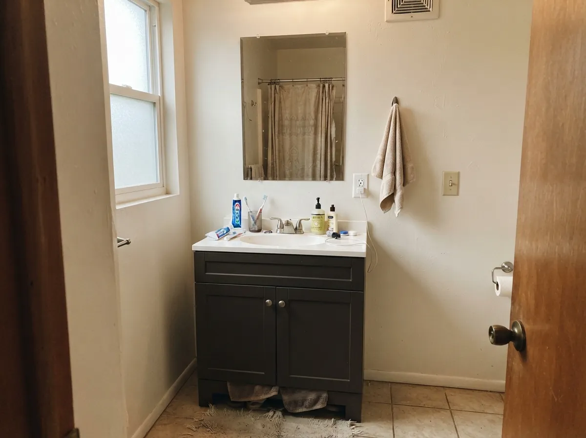
A weekend-sized version of the kitchen-cabinet move: paint the vanity, keep the walls light, and the room reads custom without betting the whole bathroom on a near-black. Satin or semi-gloss for the wipe-down durability a vanity needs.
Full outdoor sun is the most flattering light this color gets; the brown reads clearly against white or light-colored siding, and Behr's own exterior inspiration content leans on it for bodies, trim, doors, and shutters. Pair with a genuinely light trim white so the contrast reads intentional, not just dark-on-dark.
Built-ins, a single accent wall, or a reading nook with a window nearby all suit it — dark, warm color in a room that is used with a lamp on at night is a classic move. Skip it in a windowless interior office; there is no daylight to make the brown show.
Behind a headboard, on a single wall with a window nearby and warm bedside lamps, it can be genuinely cozy at night. Wrapping a whole small bedroom in it without real daylight is the fastest way to a room that feels smaller and darker than intended, not moody.
The depth and the careful-application requirement both work against a room that needs to be forgiving. Save this color for a surface, not a family hallway.
Your Light Is the Risk
Hitting a cabinet door or an exterior body head-on, the warm brown comes forward clearly. This is the light Behr's own exterior and cabinet photography leans on.
At LRV 6 there is almost nothing to reflect. In a dim room or a shaded interior corner it just reads flat black — the brown needs light to show up at all.
Morning and midday light keep the brown legible; as the room dims toward evening it slides steadily toward plain black before the lamps come on.
Warm 2700K bulbs held close (a vanity light, an island pendant) keep a hint of brown alive after dark. Cool white LEDs from a distance just read the color as black.
Most complaints about Espresso Beans are a light mismatch. Upload a photo of your actual room and see it on your walls — then ask for the same wall in north light or evening lamps before you buy a single sample.
Need It From Another Brand?
Any paint counter can custom-tint Behr PPU5-01 directly. If you would rather stay in one brand's own deck, these are the closest stock matches, measured as ΔE2000. Under 2 is a difference you will not see on the wall.
| Brand | Closest color | ΔE | LRV | |
|---|---|---|---|---|
| Sherwin-Williams | SealskinSW 7675 · Sherwin-Williams | 1.4 | 6 | Color page → |
| Benjamin Moore | Night Horizon2134-10 · Benjamin Moore | 0.3 | 6 | Color page → |
| Valspar | Ebony Keys8006-2G · Valspar | 2.4 | 6 | Color page → |
| PPG / Glidden | Phantom MistPPG1002-7 · PPG / Glidden | 1.2 | 6 | Color page → |
| Glidden | Phantom MistPPG1002-7 · Glidden | 1.8 | 6 | Color page → |
| Dutch Boy | Charcoal Brick405-7DB · Dutch Boy | 1.4 | 6 | Color page → |
Similar Behr Colors
The nearest shades to Espresso Beans within Behr's own range, ranked by perceptual color distance — useful when you want the same look a touch lighter, darker, or warmer.
WCAG 2.1: AA is 4.5 : 1 for normal text, 3 : 1 for large text, AAA is 7 : 1.
Espresso Beans vs the Colors You're Also Considering
Every Espresso Beans sample board has the same rivals on it. The numbers show the real lightness gap — then it comes down to which risk you would rather live with.
Pick this when you want the black to visibly stay brown, not flash any other color.
Behr PPU18-01 · LRV 5Cracked PepperPick this for a true black from the same brand — just watch for the violet flash Cracked Pepper gets in strong sun.
Pick this if you're already committed to Behr's cabinet and exterior enamel line.
Benjamin Moore AF-180 · LRV 5WengePick this if your painter works in Benjamin Moore — nearly the same near-black depth, a touch redder-brown.
Behr has a cluster of near-black browns, and the differences are small but visible where light hits. Bitter Chocolate (790B-7, LRV 4) is a touch darker and much less saturated, so it reads closer to a neutral black-brown; choose it when you want the depth without an obvious red cast, for example next to cool gray counters. Espresso Beans stays warmer and more clearly brown in daylight.
Bison Brown (780B-7, LRV 4) is also one step darker and sits very close in tone, but with a slightly softer, dustier feel. In a bright room the two are hard to tell apart; in a dim room Bison Brown goes black faster. Havana Coffee (N210-7, LRV 5) matches Espresso Beans for depth but leans more olive-green in its base, so it pairs better with sage and khaki schemes, while Espresso Beans favors red-based woods and warm whites.
If you are deciding, sample all of them on the actual cabinet or wall; at this darkness, your lighting will separate them more than the chips do.
Espresso Beans Coordinating Colors
The rule for coordinating with Espresso Beans is straightforward: put genuinely light, warm neutrals next to it so the near-black has room to read as dramatic rather than just dark. It pairs best with warm whites and creams, stays legible against bright trim, and works as a deeper anchor next to the lighter members of its own warm-brown family. These are the partners that keep showing up in rooms that work:
Espresso Beans on Exteriors
Behr pushes this color hardest as an exterior choice — its own inspiration content shows it running the full body of a house as well as doing quieter work on trim, doors, and shutters. Outdoor full sun is the single most flattering light this color ever gets: the warm brown reads clearly instead of collapsing into plain black, and the depth makes a modern or farmhouse-leaning house look grounded rather than heavy.
The pairing decides how well it works. Genuinely light, bright trim — a real white, not another dark neutral — gives the near-black body somewhere to bounce contrast off; stone, brick, or light siding all read well next to it. The mistake to avoid is pairing it with a second dark color for trim or shutters; two near-blacks side by side on a facade just blur into one dark mass instead of reading as a deliberate color choice.
Espresso Beans With Wood Tones and Floors
On cabinets and vanities, this color is effectively standing in for a wood stain, so it plays the same game real espresso-stained wood does: it loves contrast. Light countertops — white quartz, butcher block, pale marble — and brass or unlacquered-brass hardware all make the cabinet color read rich rather than heavy. Light floors, especially pale white oak, keep the kitchen from feeling like one dark mass floor-to-cabinet.
The one pairing to think through twice is matching it to an already-dark wood floor. Two dark warm browns close in value — dark stained floor, near-black cabinets — can blend into each other rather than reading as two deliberate finishes; a lighter floor or a painted island base gives the eye a place to land. We could not find independent before-and-after data on this specific pairing beyond Behr's own staged photography, so treat this as a general dark-cabinet principle rather than a claim specific to this color.
Three Ready Palettes Built on Espresso Beans
A color is never alone on the wall. These are complete combinations in the 60-30-10 pattern, with the reason each one holds together. Every one opens in the visualizer.
The classic dark-cabinet kitchen: warm off-white walls and bright trim keep the room from feeling closed in, and the near-black island or full cabinet run gets to do the dramatic work. All three are Behr, so the sheens and undertones are built to sit together.
Try this palette in your roomA warm, light body with genuinely bright trim gives Espresso Beans the daylight contrast it needs to read as dramatic brown rather than dirty black — the door and shutters carry all the depth, and the house stays legible from the street.
Try this palette in your roomCream walls keep a small powder room bright while the vanity carries the near-black drama; a mid-tone warm taupe in the accent layer bridges the two without adding a third loud color.
Try this palette in your roomEspresso Beans FAQ
Is Espresso Beans black or brown?
Brown first — a genuinely warm, low-chroma near-black. At LRV 6 it is dark enough to photograph as black in a lot of listing photos, and in shadow it will read black to the eye too. Give it real daylight on a cabinet door or an exterior surface and the coffee-brown underneath comes through clearly.
Is it good for kitchen cabinets?
Yes — Behr sells it inside its dedicated Cabinet, Door & Trim enamel line specifically for this. On an island or full cabinet run with decent kitchen light it reads as a rich espresso stain and hides fingerprints better than a true black would. Prime over a lighter existing color and use satin or semi-gloss.
What trim or wall color goes with Espresso Beans cabinets or doors?
A genuinely light, warm white — Behr Swiss Coffee or Ultra Pure White both work — gives the near-black enough contrast to read as intentional. A dim or already dark wall color next to it just reads muddy rather than dramatic.
Does Espresso Beans work on exteriors?
Yes, and it is one of the color's clearest strengths — Behr markets it for exterior bodies, trim, doors, and shutters, and full outdoor sun is the most flattering light it gets. Pair it with a light, bright trim white rather than another dark color.
Is it too dark for a small bathroom?
For all four walls of a small, dim bathroom, yes — at LRV 6 it will read as a cave without real daylight. As a single vanity in an otherwise light-walled bathroom, it is one of the color's best uses; the depth stays contained to one piece of furniture.
What sheen should I use?
For cabinets, vanities, and doors, satin or semi-gloss cabinet enamel — Behr sells exactly that finish under this color. For an occasional accent wall, matte or eggshell hides texture and roller marks better than a shiny finish would on a large flat surface.
Have you painted with Espresso Beans?
Rate it — one tap helps the next reader decide.
Ask a Question