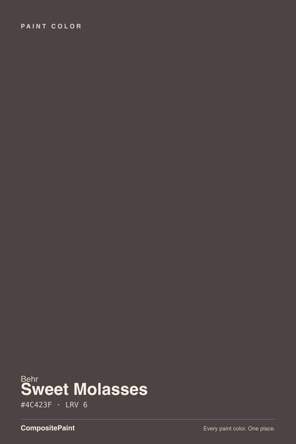
Sweet Molasses
Behr's warm near-black cabinet enamel, reviewed honestly: the light that shows its brown, the light that flattens it to plain black, and the mix-up at Home Depot that trips up first-time buyers.

Jessica has spec'd whites and neutrals for more than 300 rooms and keeps a sample wall of painted drawdowns in her studio. Every color review is checked against real reader rooms in the comments and re-tested when a formula changes. About the testing process →
- 1Mahogany0
- 2Sweet Molasses6
- 3Porpoise13
- 4Cavern Clay20
The Fast Verdict
Sweet Molasses is Behr's answer to the espresso-cabinet trend: a deep, muted brown with a warm red-yellow undertone, sold right in the Cabinet, Door & Trim enamel line so you don't have to hunt for a durable finish. In good light it reads exactly like its name — a rich, warm mahogany-brown. Cut the light and it collapses into a plain near-black with no personality left. It is a superb, dependable cabinet and trim color that asks for real light to prove it isn't just another black.
Kitchen cabinets and islands · front doors with a porch light or covered entry · bathroom vanities · built-ins and bookcases under real light · anyone who wants brown-black warmth instead of flat black
You want a true, unambiguous black — pick Cracked Pepper or Carbon instead · the room or door gets almost no daylight · you're ordering online and haven't double-checked the code, since Behr also sells an unrelated color literally named Molasses · you want the reddish warmth to read clearly at a glance, not just up close
- Genuine warm mahogany-brown, not a flat black, once the light is right
- Sold in Behr's own Cabinet, Door & Trim enamel — durable, easy to clean, good flow and leveling
- Reads as a confident alternative to an all-black door, island or vanity
- Deep enough (LRV 6) to hide handle smudges and daily wear on cabinets
- Cross-brand company: sits right alongside SW Urbane Bronze and BM Wenge in depth and warmth
- Dim or overcast light flattens it to plain near-black — the brown needs real light to show
- Easy to confuse with Behr's differently-formulated "Molasses" (S220-7) when ordering
- Not built or marketed for whole-room walls; four dim walls read as a cave
- Undertone is muted enough that it won't read clearly brown from any distance
What Color Is Sweet Molasses, Really?
Sweet Molasses is a very dark, low-chroma brown with a warm yellow-red undertone — Behr's own listings describe it in mahogany terms, and that is the honest read up close: brush it onto a sample board under a bright light and you get a genuine deep brown, not a black. The catch is chroma. Because the color is so muted, it takes real light to pull that brown forward; drop the light level even a little and the red-yellow warmth recedes fast, leaving something that reads as a plain, characterless near-black.
At LRV 6 this is a deep color by any measure — in the same depth range as Behr's own Cracked Pepper and Black Mocha, and darker than Sherwin-Williams Urbane Bronze (LRV 8). That depth is exactly why Behr sells it inside the Cabinet, Door & Trim semi-gloss enamel line rather than pushing it as a wall color: it is built to sit on a hard-wearing vertical surface under directed light — an island, a door, a vanity — not to fill four walls of ambient room light.
Undertone in one line: warm red-yellow, never cool, never true black — but muted enough that only close, bright light shows it. If your sample reads flat charcoal-black instead of brown, that is dim or overcast light doing exactly what it does to every color this dark; it is not a defect in the paint.
Where It Shines
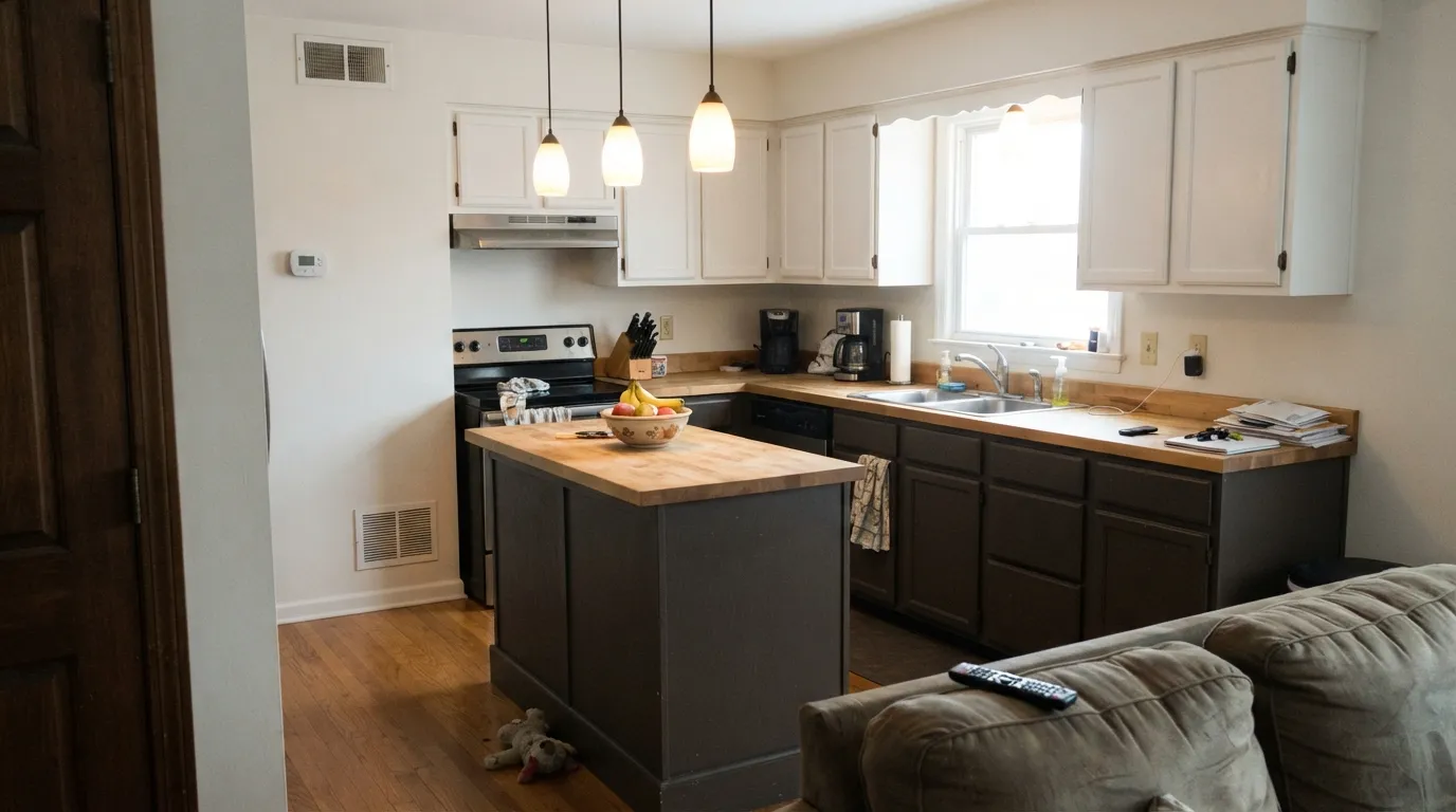
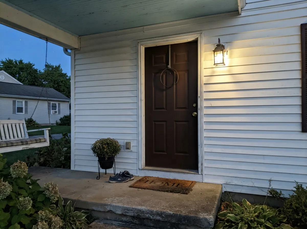
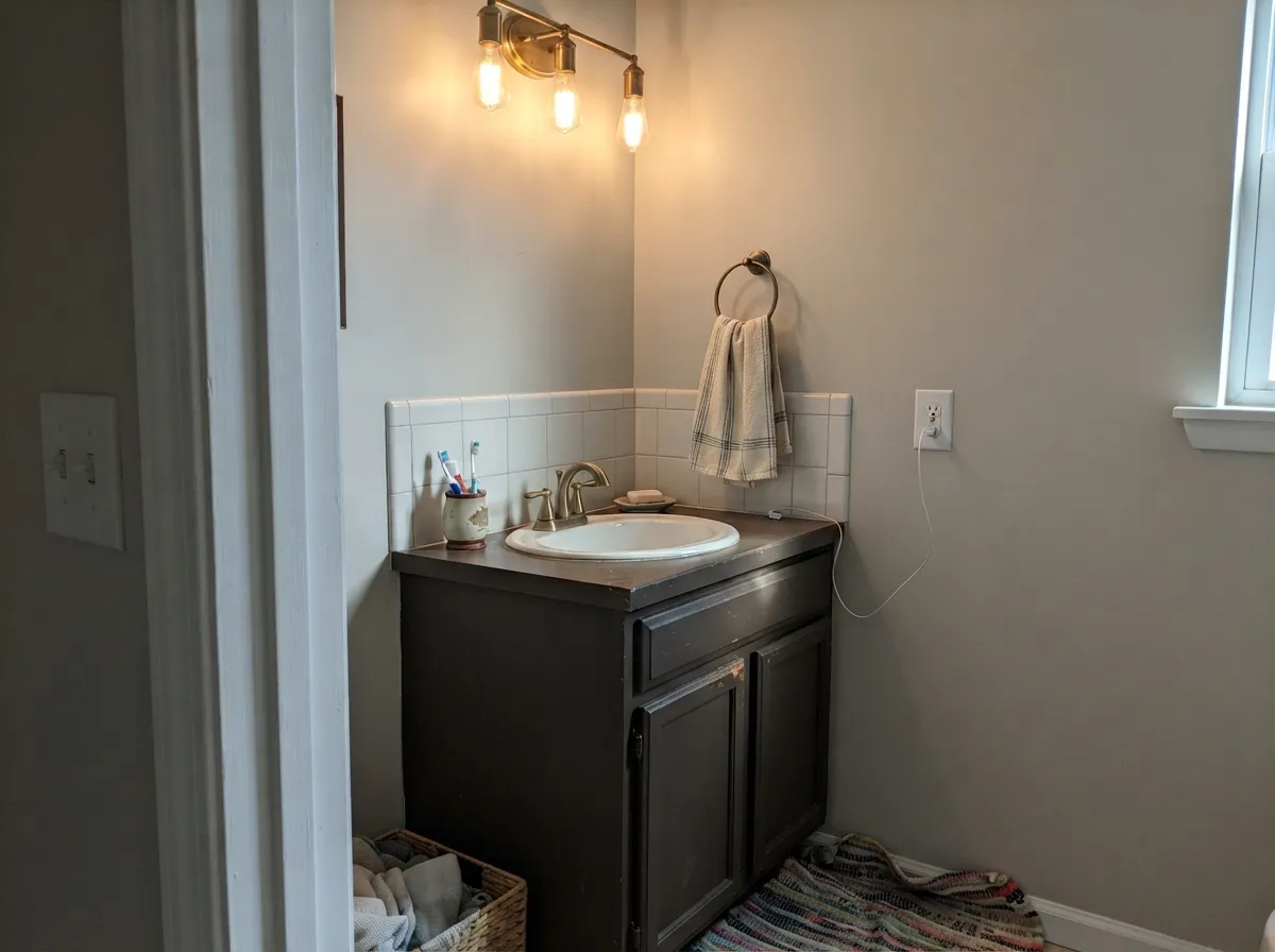
This color earns its name on a kitchen island under pendant lighting or a cabinet run that gets afternoon sun through a window — close, bright, directed light is where the mahogany-brown comes forward and the paint looks genuinely different from a plain black. It is sold as an enamel specifically for cabinets, doors and trim, and reviewers confirm the practical case for that: good flow and leveling, a smooth brushed or sprayed finish, and enough durability to wipe clean around handles. A front door with even a porch light at night, or a bathroom vanity under a vanity-light fixture, gets the same payoff — warmth close-up, drama from a distance.
Where It Fails
The complaints that follow Sweet Molasses fall into three predictable buckets, and none of them are really about the paint failing — they're about the color being asked to do a job it was never built for.
Behr sells two different colors with almost the same name: Sweet Molasses (PPU5-20, this review, a warm near-black brown built for cabinets and trim) and a separate, older color simply called Molasses (S220-7), sold in different Behr product lines. They are not the same paint. Double-check the code — PPU5-20 — before you buy, especially ordering online or matching a swatch someone else mentioned by name only.
At LRV 6, four walls of Sweet Molasses in a room without strong daylight reads as a cave, not a mahogany accent. This color was built and marketed for cabinets, doors and trim — vertical, bounded surfaces under directed light — not for filling a whole low-light room. If you want the depth on walls, keep it to one wall with a window, or add real fixtures pointed at it.
Because the undertone is so muted, casual or overcast light flattens Sweet Molasses to a generic near-black — most people won't clock it as "brown" unless they're standing close under good light. If the whole point of your project was a visibly brown door or cabinet (not black), test the sample in your actual light before committing; a warmer, higher-chroma brown like SW Sable or SW Rookwood Brown reads unambiguously brown at any distance.
Room by Room
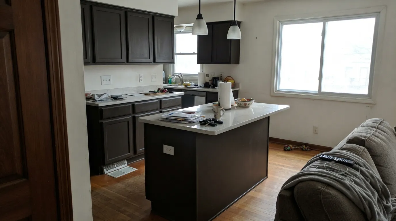
The job Behr built it for. Under cabinet lights or a window over the sink, the mahogany warmth is obvious against white uppers or a butcher-block counter. Semi-gloss cabinet enamel; two coats over a bonding primer on existing cabinets.
A confident, less-expected alternative to a true black door. It reads warm and inviting up close and still reads dark and dramatic from the street — but a door in permanent shade with no porch light loses the brown entirely and just looks black. Satin or semi-gloss exterior enamel.
A single vanity under a vanity-light fixture is a small, high-payoff commitment: brass or matte-black hardware and a light marble or quartz top both look expensive next to it. Cream or white wall tile keeps the room from feeling closed in.
Handsome behind glass-front cabinet doors or as a library wall of shelving, especially with brass reading lamps doing the close-range lighting job daylight would otherwise do. Skip it for shelving in an interior room with no window.
Works as a single dining-room or den accent wall that gets real daylight or gets a picture light aimed at it; in a north-facing or windowless room it goes flat and the accent disappears into a dark blob instead of adding depth.
Not what Behr built this color for, and it shows: at LRV 6 across four walls in ordinary room light, most readers will only ever see black. Reserve it for cabinets, doors, trim and single accent surfaces.
Your Light Is the Risk
Pendant lights over an island, a vanity fixture, a porch light — bright light at close range is where the mahogany-brown shows up clearly. This is the light the color was built to live in.
Cut the light level and the muted undertone disappears; most people will call it plain black in a shaded or overcast room. Fine if you wanted black — disappointing if you wanted the brown.
A Sweet Molasses front door in full sun reads a clear warm brown; the same door in permanent porch shade reads solid black. Walk the door's actual light pattern before you commit.
2700K under-cabinet or vanity lighting keeps the red-brown alive after dark; cool white LEDs flatten it toward gray-black. Pick warm bulbs if the brown matters to you.
Most complaints about Sweet Molasses are a light mismatch. Upload a photo of your actual room and see it on your walls — then ask for the same wall in north light or evening lamps before you buy a single sample.
Need It From Another Brand?
Any paint counter can custom-tint Behr PPU5-20 directly. If you would rather stay in one brand's own deck, these are the closest stock matches, measured as ΔE2000. Under 2 is a difference you will not see on the wall.
| Brand | Closest color | ΔE | LRV | |
|---|---|---|---|---|
| Sherwin-Williams | SealskinSW 7675 · Sherwin-Williams | 3.4 | 6 | Color page → |
| Benjamin Moore | Night Horizon2134-10 · Benjamin Moore | 2.5 | 6 | Color page → |
| Valspar | Ebony Keys8006-2G · Valspar | 4.2 | 6 | Color page → |
| PPG / Glidden | Phantom MistPPG1002-7 · PPG / Glidden | 3.0 | 6 | Color page → |
| Glidden | Phantom MistPPG1002-7 · Glidden | 1.7 | 6 | Color page → |
| Dutch Boy | Charcoal Brick405-7DB · Dutch Boy | 3.4 | 6 | Color page → |
Similar Behr Colors
The nearest shades to Sweet Molasses within Behr's own range, ranked by perceptual color distance — useful when you want the same look a touch lighter, darker, or warmer.
WCAG 2.1: AA is 4.5 : 1 for normal text, 3 : 1 for large text, AAA is 7 : 1.
Sweet Molasses vs the Colors You're Also Considering
Every Sweet Molasses sample board has the same rivals on it. The numbers show the real lightness gap — then it comes down to which risk you would rather live with.
Pick this for the slightly higher LRV and the clearer mahogany-red warmth once the light hits it.
Behr PPU5-19 · LRV 5Espresso BeansPick this for a darker, more straightforwardly coffee-brown near-black with less visible red.
Pick this for the deeper depth and Behr's own cabinet-grade enamel formulation.
Sherwin-Williams SW 7048 · LRV 8Urbane BronzePick this if your painter works in Sherwin-Williams — the same warm-dark idea, a step lighter and easier to keep reading as brown.
Sweet Molasses Coordinating Colors
The rule with Sweet Molasses is the same one that governs any deep, muted brown-black: pair it with real warm whites or creams, not stark cool ones, and let a lighter true brown do the work of reading "warm" at a distance where Sweet Molasses itself reads dark. These are the partners that keep showing up in kitchens and entries that work:
Why Behr Built This as a Cabinet Color, Not a Wall Color
Sweet Molasses doesn't live in Behr's ordinary interior-wall lineup the way a color like Blank Canvas or Swiss Coffee does — it's sold specifically inside the Cabinet, Door & Trim enamel line, in finishes built for hard-wearing vertical surfaces: semi-gloss and satin enamels with good block resistance and flow, formulated to level out into a smooth painted-furniture finish rather than a flat wall texture.
That framing tells you exactly what to expect from it. It is not competing with Behr's whites and greiges for whole-room wall duty; it is competing with wood stain and true black for cabinet doors, an entry door, or a vanity — a bounded, hard surface that gets cleaned, touched and lit up close, where a rich warm near-black earns its keep in a way it never would spread across four walls of ambient room light.
Sweet Molasses With Wood, Stone and Metal
Countertops decide more of this pairing than the wall color does. Butcher block, warm quartz, and honed marble with beige veining all sit comfortably next to Sweet Molasses because their warmth matches its own; a cool blue-gray quartz or stark white marble will read colder by contrast and can push the cabinet color toward looking flatly black rather than brown.
Metals are forgiving: unlacquered brass and warm gold hardware amplify the mahogany read, matte black hardware doubles down on the near-black side, and either one looks intentional. Polished chrome is the one metal that fights it, reading noticeably cold against the warm undertone.
Three Ready Palettes Built on Sweet Molasses
A color is never alone on the wall. These are complete combinations in the 60-30-10 pattern, with the reason each one holds together. Every one opens in the visualizer.
A warm white on the uppers keeps the kitchen bright while the island and lower cabinets carry all the depth; the warm cream wall color bridges the two instead of adding a third temperature to referee.
Try this palette in your roomBright white siding makes the door the whole story, and under a porch light Sweet Molasses reads as a warmer, more unexpected alternative to a true black door. Carbon shutters echo the depth without competing for attention.
Try this palette in your roomCream walls keep the room from feeling closed in while the near-black built-ins do the heavy lifting; Rookwood Brown on a door or trim run adds a lighter, visibly-brown note so the whole room doesn't read as a single dark mass.
Try this palette in your roomSweet Molasses FAQ
Is Sweet Molasses black or brown?
Technically a very dark warm brown, and up close under good light it genuinely reads mahogany. But it's muted enough that ordinary or dim light flattens it to what most people will call black. If you need it to read unmistakably brown at a glance, test it in your actual light first.
Is Behr Sweet Molasses the same as Behr Molasses?
No — and this trips people up. Sweet Molasses is PPU5-20, sold in Behr's Cabinet, Door & Trim enamel line. Molasses (S220-7) is a separate, differently-coded Behr color. Order by the code, not the name.
Is it good for kitchen cabinets?
Yes — it's one of the colors Behr specifically formulates into its Cabinet, Door & Trim semi-gloss enamel, and owner reviews of that line mention good flow, a smooth finish, and easy cleanup around handles. Pair it with a warm white on the uppers so the kitchen doesn't go entirely dark.
Does it work on a front door?
Yes, especially with a porch light or covered entry. Full daylight or evening light shows the warm brown; a door that sits in permanent shade with no fixture will read as plain black instead.
What white pairs with Sweet Molasses cabinets?
A warm off-white rather than a stark cool one — Behr's own Whisper White or Swiss Coffee keep the same temperature family so the kitchen doesn't feel split between two different moods.
Can I paint a whole room in it?
You can, but it isn't what the color was built for. Behr sells this inside a cabinet-and-trim enamel line for a reason — at LRV 6, four dim walls read as a cave rather than a rich brown room. If you want the depth on walls, keep it to one accent wall with real daylight or a picture light.
Have you painted with Sweet Molasses?
Rate it — one tap helps the next reader decide.
Ask a Question