Wenge
The near-black brown named after the wood, reviewed honestly: where it earns its keep on cabinets and doors, the flat-black trap in a dim room, and what to pick instead.

Jessica has spec'd whites and neutrals for more than 300 rooms and keeps a sample wall of painted drawdowns in her studio. Every color review is checked against real reader rooms in the comments and re-tested when a formula changes. About the testing process →
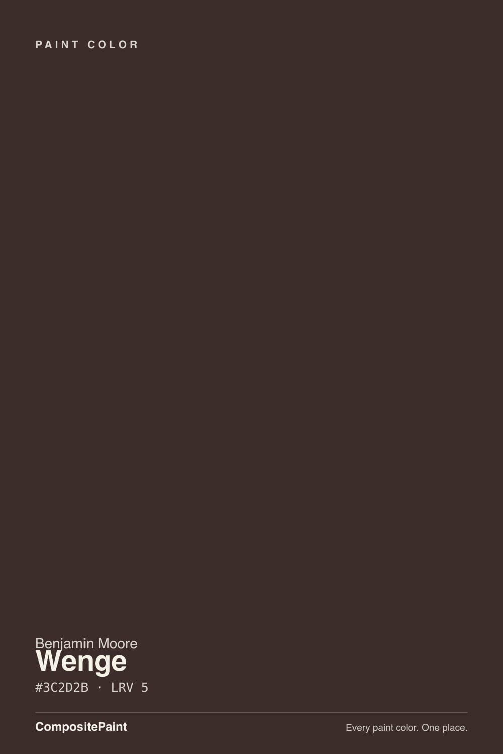
- 1Mahogany0
- 2Wenge5
- 3Porpoise13
- 4Cavern Clay20
The Fast Verdict
Wenge is Benjamin Moore's answer to the wenge-wood look: a warm near-black brown, not a true black, meant for cabinetry, built-ins, and doors rather than a whole room. At LRV 5 it barely reflects any light, so it rewards a deliberate dose next to a warm white and punishes a dim room with no lamp. It has no viral moment and no Color of the Year headline — it is a quiet, dependable Affinity-collection workhorse, and that is exactly the case for it.
Kitchen islands and lower cabinets · built-ins and bookcase walls · interior and front doors · anyone who wants a warm near-black instead of a flat true black
You want a true, neutral black (go Tricorn Black) · your room has no window or lamp nearby · you're painting four full walls with no real light source · your climate runs hot and sunny and you want it on full exterior siding
- A warm near-black brown, not a flat true black — keeps a whisper of warmth even at full depth
- Reads rich and grounded on cabinetry, built-ins, and doors, the way real wenge wood does in furniture
- Flatters brass, walnut, leather, and pale oak
- Holds its color under warm lamplight better than most true blacks
- A genuine workhorse accent — no trend timestamp, easy to defend for decades
- At LRV 5 it needs real prep — tinted primer and two full coats, or it looks patchy
- Reads flat and lifeless without a lamp or window nearby
- Shows roller marks and lap lines more than any mid-tone color
- Absorbs heat outdoors — check heat guidance before using it as full exterior siding
What Color Is Wenge, Really?
Wenge takes its name from the wood — a dense, blackish-brown African hardwood used in mid-century and contemporary furniture, prized for going almost ebony without turning cold or gray. Benjamin Moore's paint chases the same effect: it sits in the Affinity Collection, the brand's family of colors organized to be mixed and matched by undertone, and at SKU AF-180 it reads as the deepest, warmest member of that near-black lineup rather than a headline color anyone searches for by name.
At LRV 5 it is genuinely near-black — only a handful of Benjamin Moore's darkest colors sit lower. What separates it from a true black is the base: red sits noticeably above green and blue in its formula, so the color carries a whisper of brown even at full depth, the same way real wenge wood keeps a faint reddish cast under its near-black grain. Set it next to a true neutral black and Wenge looks warmer; set it next to a clearly brown color like Taupe and Wenge looks like it has swallowed all the light. That is the honest trade of any color this deep — it is defined more by how little light it reflects than by hue.
Undertone in one line: warm brown-black, never blue, never green. If a sample looks flat and lifeless, that is the absence of light doing its job, not a flaw in the paint — a color at LRV 5 needs a lamp or a window nearby to show any character at all.
Where It Shines
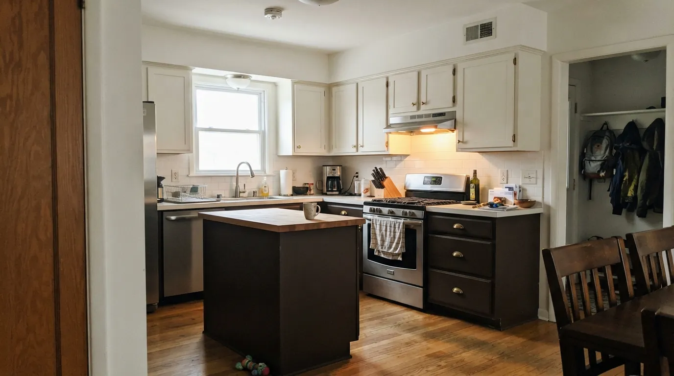
This is a color built for small, deliberate doses, not for four walls. Give it kitchen cabinetry, a bank of built-ins, an interior door, or a front door with warm lighting nearby, and it does exactly what wenge wood does in furniture — reads rich and grounded rather than heavy. Its natural partners are warm whites, pale oak, brass, and leather; against them it works like punctuation, not the whole sentence.
Where It Fails
Nobody complains that Wenge is the wrong color — they complain about using it the wrong way. Almost every regret story with a near-black this deep comes from one of three predictable situations, and all three show up before the first coat if you think it through.
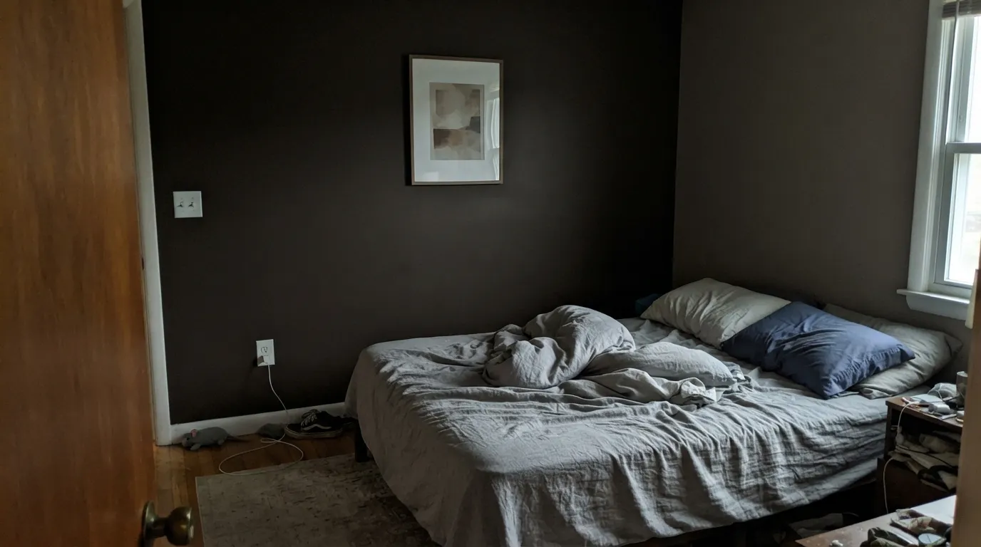
At LRV 5 the paint reflects almost nothing back — without a window nearby or a warm lamp, a Wenge wall or built-in just reads as a black hole in the room, all the brown warmth gone. This is the single most common regret with any color this dark: it needs light pointed at it to have a personality at all.
Deep, saturated colors show lap marks, roller stipple, and uneven sheen far more than a mid-tone ever would — a fast one-coat job over a light wall looks patchy the moment the sun crosses it. Prime with a tinted gray primer, plan on two full coats minimum, and keep a wet edge; this is not a color to rush.
Dark paint absorbs heat, and a near-black this deep gets hot enough in direct sun to stress some sidings and cause premature wear — check your paint's heat-resistance rating before committing it to a full south-facing wall. It is a safer bet as a front door or shutters than as the main siding color in a hot climate.
Room by Room
As a lower-cabinet or island color under a lighter countertop and warm wood open shelving, it is genuinely striking — brass hardware and butcher block both love it. Painting an entire small kitchen in it usually goes too dark; keep the walls or upper cabinets in a warm white.
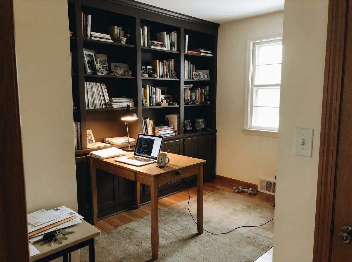
Built-ins, a bookcase wall, or a single accent wall in a room with a desk lamp and a window is exactly the scale this color wants. Leather, walnut, and brass reading lamps make it feel like a study rather than a cave.
Behind the headboard with warm bedside lamps it can be dramatic and cozy at once, but commit to real reading lights — a north-facing bedroom with no lamps on will just look like a dark hole after sundown. Keep the other three walls a warm white.
A Wenge vanity under a light stone top and brass fixtures reads custom and expensive in a powder room or small bath. Four walls of it in a windowless bathroom is the one combination to avoid — there is no light left to reflect.
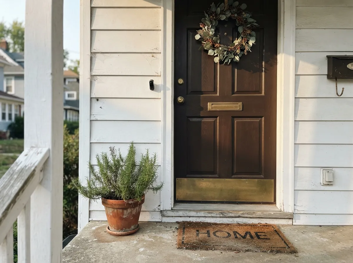
As a front door or shutter color against lighter siding it is a strong, warm alternative to true black. Full siding in a hot, sunny climate is the riskier bet — check the paint's heat guidance first.
A fireplace surround, built-in shelving, or a single feature wall near a window gives the room one deliberate dark note without swallowing the whole space. Pair it with a warm white ceiling and trim so the room still has somewhere to bounce light.
Your Light Is the Risk
Near a 2700K lamp or under-cabinet lighting the brown warmth comes forward and it stops reading as flat black. This is the light it was built for.
Daylight alone, with no lamp nearby, reads Wenge as flat ink-black — the brown character disappears entirely. Test it with the room's actual evening lighting on.
At this depth the sun's angle barely changes it — east, west, or north all read close to the same near-black. The real change is a lamp switching on, not the window direction.
Warm bulbs keep the brown alive on cabinetry and built-ins at night; cool white LEDs flatten it toward true black. Pick warm bulbs for anything painted Wenge.
Most complaints about Wenge are a light mismatch. Upload a photo of your actual room and see it on your walls — then ask for the same wall in north light or evening lamps before you buy a single sample.
Need It From Another Brand?
Any paint counter can custom-tint Benjamin Moore AF-180 directly. If you would rather stay in one brand's own deck, these are the closest stock matches, measured as ΔE2000. Under 2 is a difference you will not see on the wall.
| Brand | Closest color | ΔE | LRV | |
|---|---|---|---|---|
| Sherwin-Williams | RaisinSW 7630 · Sherwin-Williams | 2.5 | 3 | Color page → |
| Valspar | Noblesse Oblige8004-2G · Valspar | 1.9 | 3 | Color page → |
| HGTV Home by Sherwin-Williams | Jumping JavaHGSW 3081 · HGTV Home by Sherwin-Williams | 2.2 | 4 | Color page → |
| Magnolia Home | MomentsJG-150 · Magnolia Home | 4.5 | 4 | Color page → |
Similar Benjamin Moore Colors
The nearest shades to Wenge within Benjamin Moore's own range, ranked by perceptual color distance — useful when you want the same look a touch lighter, darker, or warmer.
WCAG 2.1: AA is 4.5 : 1 for normal text, 3 : 1 for large text, AAA is 7 : 1.
Wenge vs the Colors You're Also Considering
Every Wenge sample board has the same rivals on it. The numbers show the real lightness gap — then it comes down to which risk you would rather live with.
Pick this for warmth — Wenge keeps a whisper of brown that a true black never gives a room.
Sherwin-Williams SW 6258 · LRV 3Tricorn BlackPick this if you want a true, neutral black with no brown in it — this is the SW deck's reference black.
Pick this for more weight and a warmer, more deliberate brown-black — Wenge reads less green, more grounded.
Benjamin Moore 2124-10 · LRV 6Wrought IronPick this for the gentler, greener near-black that forgives more rooms — it's the softest one in the BM deck.
Inside the Benjamin Moore deck, Bucktrout Brown CW-180 at #352D2B and LRV 5 is the nearest relative and is a touch deeper and less red. Espresso Bean CSP-30 at #3B3230 and LRV 6 is marginally lighter and more neutral brown. Velvet Cloak CSP-480 at #382930 and LRV 5 pulls toward purple where Wenge pulls toward red. Black 2132-10 at #313132 is the true benchmark: put it beside Wenge and the brown finally becomes obvious.
Across brands, Valspar Noblesse Oblige 8004-2G at #3D2F30 and LRV 3 has a deltaE of 1.94, which makes it visually identical in normal room light. HGTV Home by Sherwin-Williams Jumping Java HGSW 3081 at deltaE 2.23 and Sherwin-Williams Raisin SW 7630 at deltaE 2.48 are both very close, so sample first. Magnolia Home Moments JG-150 at #3F3632 and deltaE 4.53 is close but visibly different side by side, reading a little browner and duller.
Wenge Coordinating Colors
The rule with Wenge is the same rule as any near-black: give it a warm white to bounce light off of, and keep the rest of the room's palette warm rather than cool. It pairs cleanly with creamy whites, pale oak, brass, and leather, and it layers well with lighter members of its own brown family instead of fighting a true gray or blue-black for attention. These are the partners that keep showing up in rooms that work:
Wenge Wood, and Why an Affinity-Collection Color Borrows Its Name
Wenge is a real wood — a dense, dark hardwood from Central Africa long used in mid-century and contemporary furniture and flooring, prized for going nearly black without turning cold or gray. Benjamin Moore's AF-180 is one of the paint colors built to chase that exact look: a near-black with a brown, not a blue or green, base.
It lives in the brand's Affinity Collection, a set of colors organized by family so a homeowner can pick coordinating tones without hiring a colorist. That is a quieter story than a Color of the Year headline, and it is the honest one: Wenge is not a color with a viral moment behind it — it is a dependable, well-made near-black that designers reach for on cabinetry and millwork precisely because it doesn't come with a trend clock attached.
Wenge With Wood Tones and Floors
Pale floors are Wenge's best partner: white oak, whitewashed wood, and light engineered floors give the near-black cabinetry or built-ins somewhere to land, and the contrast reads deliberate rather than heavy. Mid-tone oak works too, as long as the room has enough window light to keep both surfaces from merging into one dark mass.
The floor to watch is anything already near-black or espresso-dark — a dark wood floor under Wenge cabinetry doubles the depth with nothing to break it up, and the room can read like one unbroken dark plane. If the floor is already this dark, put a lighter counter, a pale rug, or a warm white wall between the two so the eye has somewhere to rest.
Three Ready Palettes Built on Wenge
A color is never alone on the wall. These are complete combinations in the 60-30-10 pattern, with the reason each one holds together. Every one opens in the visualizer.
White Dove keeps the main volume of the kitchen bright since Wenge absorbs almost all the light that hits it; Cloud White trim softens the woodwork instead of cutting a stark line against the dark island. Brass hardware and butcher block finish the look.
Try this palette in your roomTaupe and Wenge share the same warm-brown base, so the door and the built-ins read like one deliberate family instead of two different darks competing. Swiss Coffee keeps the rest of the room bright enough that the bookcase wall doesn't swallow the light.
Try this palette in your roomA warm-brown door and a soft green-black shutter read richer together than matching the two exactly would — enough difference to feel intentional. The no-opinion white siding lets both dark accents do all the talking.
Try this palette in your roomWenge FAQ
Is Wenge black or brown?
Brown, technically — at LRV 5 it is close enough to black that most people will call it black on sight, but the formula leans warm rather than neutral. Next to a true black like Tricorn Black, Wenge reads a shade warmer; next to a clearly brown color like Taupe, it reads almost black. It sits right at that boundary on purpose.
What's the difference between Wenge and Wrought Iron or Tricorn Black?
All three are near-black, but the undertone splits them apart. Wrought Iron leans soft and slightly green; Tricorn Black is Sherwin-Williams' reference true black, closest to neutral; Wenge leans warm brown, the way real wenge wood does. Side by side in daylight the difference is obvious — under mixed evening lighting, less so.
Can I paint a whole room in Wenge?
You can, but it is a serious commitment — at LRV 5 the room will feel noticeably smaller and darker than the sample chip suggests, and it needs real light sources (windows plus warm lamps) to avoid feeling like a cave. Most rooms that use it well keep it to one wall, the cabinetry, or the built-ins, and let a warm white carry the rest.
Does it work on kitchen cabinets or an island?
Yes — it is one of the better uses for a color this deep. On lower cabinets or an island under a lighter countertop, with brass hardware and warm open shelving nearby, it reads custom rather than heavy. A satin or semi-gloss cabinet enamel is worth the upgrade over flat wall paint.
How many coats does it take, and does it need a special primer?
Plan on a tinted gray primer first, then two full topcoats minimum — going straight over a light wall with a standard white primer usually means a patchy third coat to get even coverage. It is not a color to rush.
Is it good for a front door or shutters — will it fade in the sun?
It is a strong warm alternative to a true black front door, and it holds up fine in that small a dose. The caution is full exterior siding in a hot, sunny climate — dark colors absorb more heat, so check your paint's heat-resistance rating before committing an entire south-facing wall to it.
Have you painted with Wenge?
Rate it — one tap helps the next reader decide.
Ask a Question