Black
Benjamin Moore's plain-spoken true black, reviewed honestly: the rooms it makes look expensive, the dust-and-touch-up problem nobody warns you about, and when a softer black is the smarter buy.

Jessica has spec'd whites and neutrals for more than 300 rooms and keeps a sample wall of painted drawdowns in her studio. Every color review is checked against real reader rooms in the comments and re-tested when a formula changes. About the testing process →

- 1Cordovan Brown0
- 2Black5
The Fast Verdict
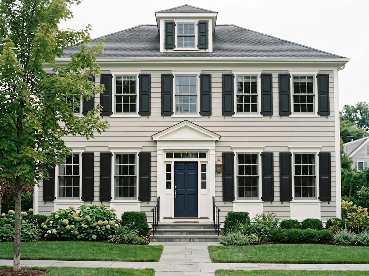
Most "blacks" are secretly something else — green-black, brown-black, blue-black. Benjamin Moore Black is the one that is just black: neutral, flat-out dark, with only the faintest cool tilt and nothing to argue with your wood, stone or metal. That neutrality is the whole product. Wrap a dining room in it and the brass, the candles and the white tablecloth do the talking; put it on a front door or a run of cabinets and it looks like money.
The catch is maintenance, not color — this is the finish that shows every speck of dust and flashes at every touch-up.
Dining rooms you want drenched, dim and candlelit · front doors, shutters and window sash · cabinets, islands and built-ins · powder rooms and small offices that should feel like a jewel box
The room has one ceiling light and no lamps · honey oak or cherry wood is staying · you hate dusting and touching up walls · you actually wanted a soft, warm, forgiving black
- Genuinely neutral — no green, brown or violet surprise on the wall
- Deep enough (LRV 5) that it never softens into dark gray
- Makes brass, marble, art and white trim look expensive by contrast
- Perfect small-commitment color: doors, sash, shutters, islands, built-ins
- Black is a permanent classic, not a trend you will repaint out of
- Shows dust, lint, pet hair and fingerprints like no other color
- Touch-ups flash; it wants two to three coats over anything light
- Gives no light back — a dim room with one fixture goes cave-like
- Lends no warmth, so orange-toned wood next to it only reads louder
What Color Is Black, Really?
A true neutral black, and the name is not marketing — it is literally called Black. It lives in Benjamin Moore's Color Preview collection, the deck of pure saturated colors, and its RGB values sit within two points of each other (27, 28, 29). That is what "no undertone" actually means in numbers: no green pulling it toward forest, no brown pulling it toward espresso, no violet waiting to show up in afternoon sun. Practical note for the paint counter — say the number, 2132-10. Ask for "black" at any Benjamin Moore store and the answer is another question, because there are dozens.
At LRV 5 it sits at the very bottom of the deck: it reflects almost nothing back into the room, so it stops behaving like a color and starts behaving like shadow. Everything you put in front of it gains contrast — white trim, brass sconces, marble, art, a plate of food. The flip side is that the wall itself has nothing left to show except sheen and shape, which is why finish choice matters more here than on any pale color, and why direct sun is not this color's friend: sunlight lands on the wall as graphite-charcoal and prints every roller lap mark it finds.
Undertone in one line: neutral with the faintest cool tilt — never green, never brown. If your sample looks blue-black, that is cool LED bulbs or a bright white trim next to it exaggerating the cool edge; if it looks charcoal-gray, that is direct sun bouncing off the sheen. Both are the same paint reacting honestly to the room.
Where It Shines
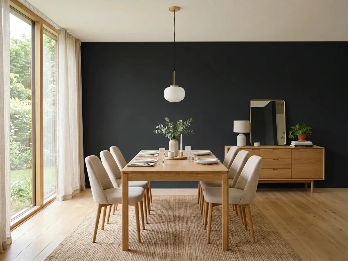
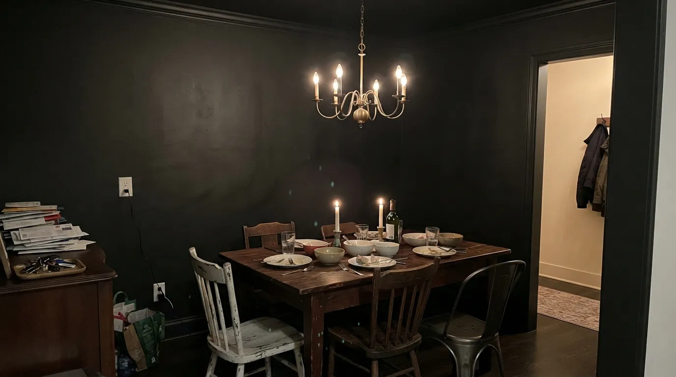
This color is at its best when it is either everywhere or nowhere. Drench a dining room — walls, trim, ceiling, all of it in matte — and the room stops having corners after dark; it becomes an interior, lit by a chandelier and whatever candles you own, and every plate and glass on the table looks staged. The opposite play works just as well: black used surgically on the things that should be crisp, a front door, window sash, an island, a run of built-ins, where it reads deliberate and expensive at a hardware-store price. What it needs in both cases is light with a source — lamps, sconces, candles, a window — because black repays light and punishes its absence.

Where It Fails
Nobody regrets black because the color was wrong. They regret it for three reasons that are all visible before the first coat, and all three are about the room and the upkeep rather than the paint. If one of these is your situation, sampling bigger will not save it.
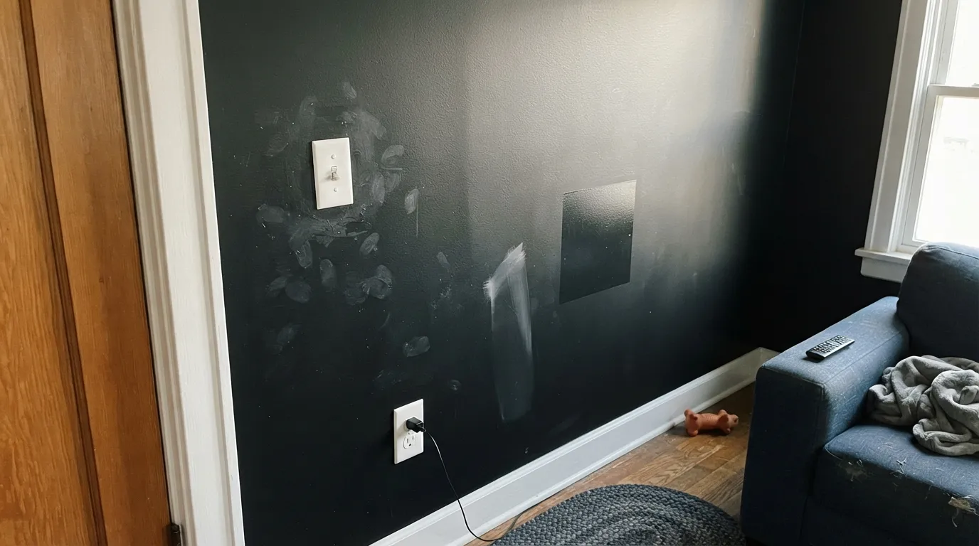
Dust, roller lint, pet hair, fingerprints around switch plates, the scuff where a chair back hits — black broadcasts all of it, and matte broadcasts it loudest. This is the number-one real complaint in owner threads, and it is not fixable with a better brand. Eggshell wipes clean and is the honest choice anywhere hands land; matte is for walls above chair height in rooms nobody touches.
At LRV 5 the walls give nothing back, so a single overhead light leaves the corners as pure void and the room feels smaller and flatter — the "cave" complaint. Black rooms that photograph beautifully always have three or four light sources: a chandelier plus sconces plus candles, warm bulbs, and usually a mirror. If you are not adding lighting as part of this project, this is not the paint.
Black lends no warmth and hides nothing — it just raises the contrast, so an orange-leaning floor or cherry dining set beside black walls reads louder and oranger than it did against beige. Walnut, dark-stained, painted or pale white oak all sit beautifully. If the golden oak is staying, put a large rug between it and the walls, or pick a warmer black like Black Beauty that meets the wood halfway.
Room by Room
The color-drenched dining room is the reason this paint is having a moment: walls, trim and ceiling all in matte Black, one good chandelier, candles, warm bulbs. Contrast does the decorating — white linen, brass, glass and a wood table all gain against it. Dining rooms are used at night and touched rarely, which is exactly the maintenance profile black wants.
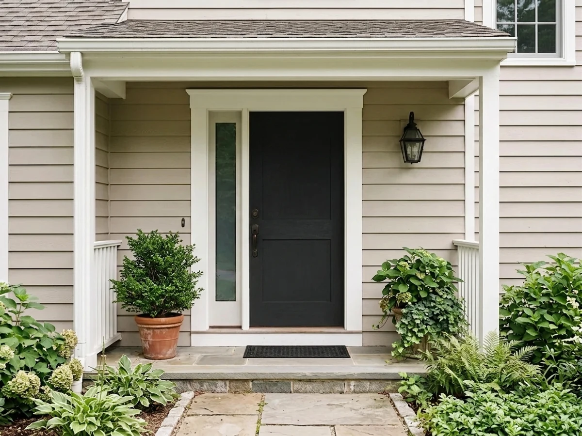
Black exteriors never date, and a neutral black is the safest one on a facade because it will not flash green or brown against brick, stone or a warm white body. Semi-gloss on the door for wipe-down and shine; expect a south or west-facing door to run hot and to need a refresh sooner than the rest of the trim.
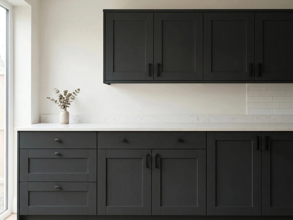
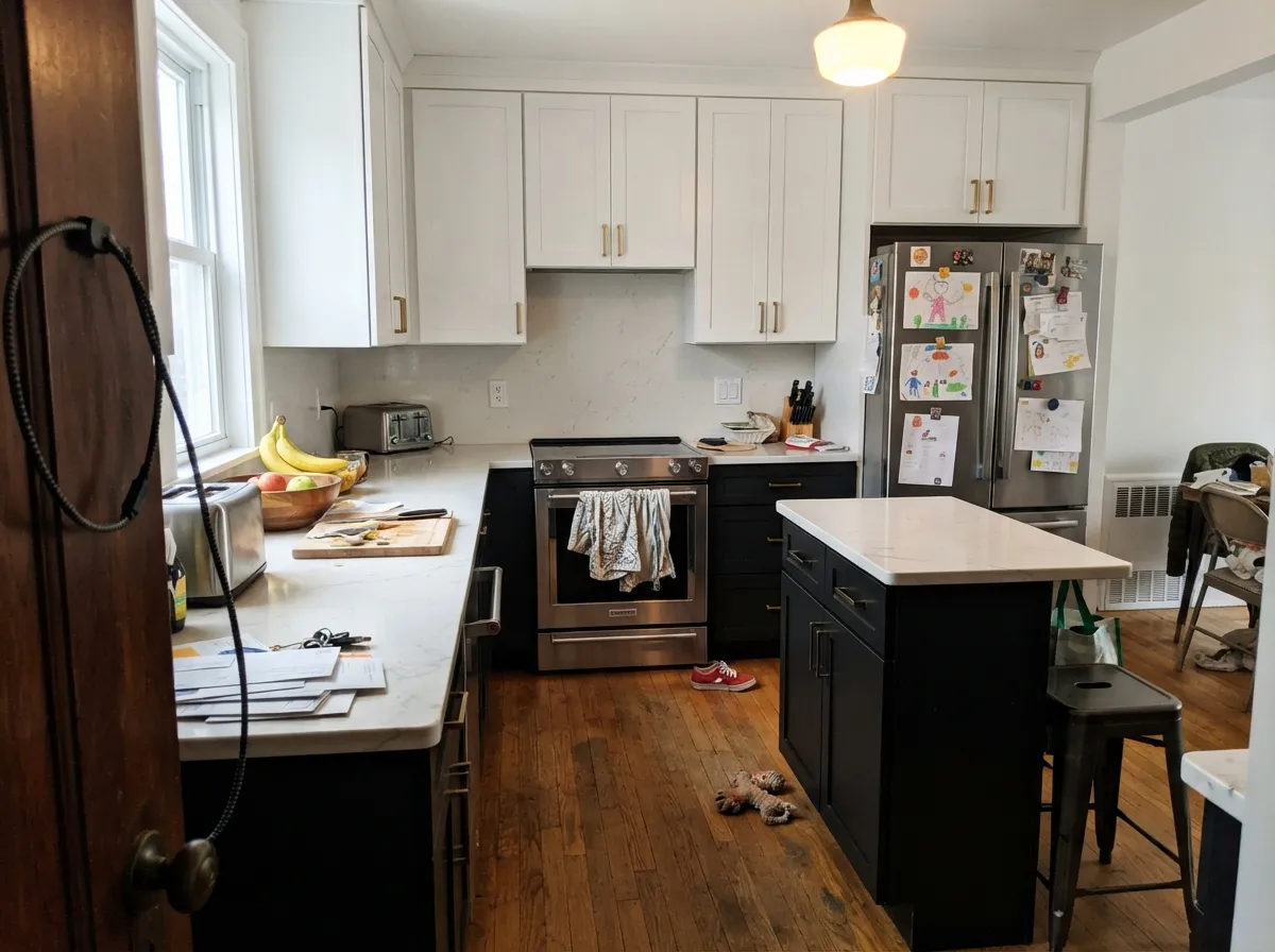
Black lowers under a light counter, a black island in a white kitchen, black built-ins around a fireplace — all of it works, and satin cabinet enamel is non-negotiable so knuckle prints wipe off. This is also the cheapest way to test whether you actually like living with black before you commit four walls to it.
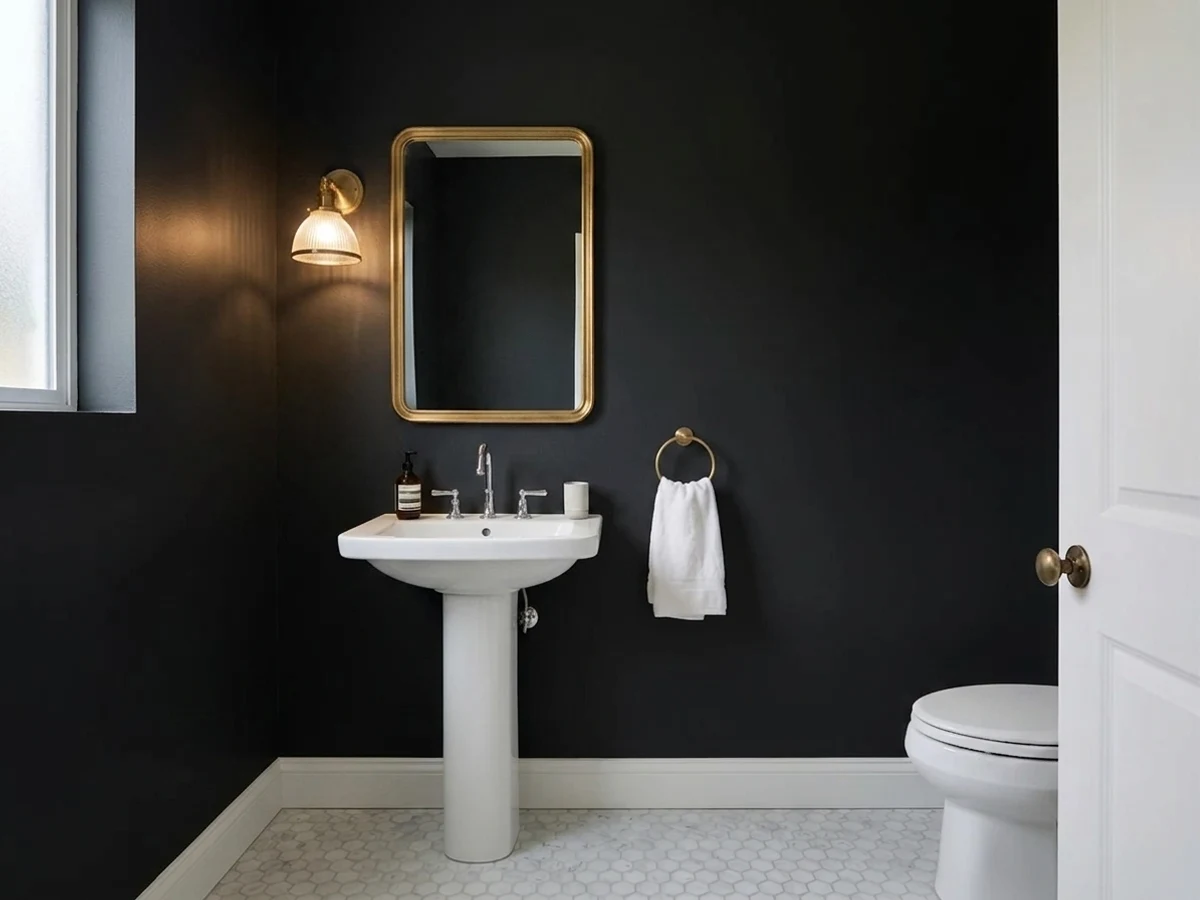
Tiny rooms take black better than big ones, because you are never far from the light source. Drench a powder room, add a mirror and one warm fixture, and the room reads custom. A small office or library gets the same benefit, with the bonus that screens sit easier against a dark wall than a bright one.
Black interior doors against pale walls is a designer move that costs one quart per door and instantly makes builder-grade hallways look considered. A single black accent wall is riskier: without a second dark note somewhere in the room it can read like an unfinished idea. Repeat the black in a frame, a lamp or a shelf and it lands.
A bedroom in black can be genuinely restful if there is real daylight and lamps at night; in a dim north bedroom it is where the regret stories come from. Living rooms are the same bet at larger scale. And whole-house black is not this color's job — for dark rooms flowing into each other, a black with a little more give like Iron Ore at LRV 6 is easier to live with.
Your Light Is the Risk
A chandelier plus sconces plus candles at 2700K is where black earns its money — the walls go soft and velvety and everything in front of them glows.
Cool, weak daylight with nothing to bounce off leaves the walls flat and lifeless, corners disappear, and the room measures smaller than it is.
Where the sun lands the wall reads graphite-charcoal rather than black, and the raking light prints every roller lap mark. It sinks back to true black by dusk.
2700K bulbs give it a soft, slightly brown-charcoal glow that flatters skin and wood. 4000K and up pull the faint cool edge forward and the walls turn hard and blue-black.
Most complaints about Black are a light mismatch. Upload a photo of your actual room and see it on your walls — then ask for the same wall in north light or evening lamps before you buy a single sample.
Need It From Another Brand?
Any paint counter can custom-tint Benjamin Moore 2132-10 directly. If you would rather stay in one brand's own deck, these are the closest stock matches, measured as ΔE2000. Under 2 is a difference you will not see on the wall.
| Brand | Closest color | ΔE | LRV | |
|---|---|---|---|---|
| Sherwin-Williams | Black MagicSW 6991 · Sherwin-Williams | 0.7 | 3 | Color page → |
| Behr | Spade BlackBNC-38 · Behr | 4.1 | 3 | Color page → |
| Valspar | Tomcat8006-12G · Valspar | 1.0 | 3 | Color page → |
| PPG / Glidden | Starless SkyPPG0995-7 · PPG / Glidden | 4.0 | 5 | Color page → |
| Glidden | Onyx Black00NN 05/000 · Glidden | 3.4 | 5 | Color page → |
| Dutch Boy | True Black438-7DB · Dutch Boy | 0.6 | 3 | Color page → |
Similar Benjamin Moore Colors
The nearest shades to Black within Benjamin Moore's own range, ranked by perceptual color distance — useful when you want the same look a touch lighter, darker, or warmer.
WCAG 2.1: AA is 4.5 : 1 for normal text, 3 : 1 for large text, AAA is 7 : 1.
Black vs the Colors You're Also Considering
Every Black sample board has the same rivals on it. The numbers show the real lightness gap — then it comes down to which risk you would rather live with.
Pick this when you want black with nothing in it at all, especially next to warm wood or brick that a blue cast would fight.
Benjamin Moore 2133-10 · LRV 3OnyxPick this if you want a black with a visible blue-violet cast — its numbers lean noticeably cooler, which reads richer and less absolute on a big wall.
Pick this when you want the black to stay strictly neutral and not soften toward brown-green in lamplight.
Benjamin Moore 2128-10 · LRV 4Black BeautyPick this for the warmest true black BM makes — the forgiving one over honey oak, cherry and warm brick.
Pick this for the Benjamin Moore version; on a wall the two are near-twins and nobody will pick them apart.
Sherwin-Williams SW 6258 · LRV 3Tricorn BlackPick this if your painter buys Sherwin-Williams — it is the same job, the reference true black in that deck.
Pick this when soft is the failure mode you are trying to avoid and you want the wall to read unmistakably black.
Benjamin Moore 2124-10 · LRV 6Wrought IronPick this when you want the idea of black without the absolute — it is the softest near-black in the BM deck, with a green-gray give to it.
Benjamin Moore actually has more than one color named Black. Black HC-190, at LRV 5 with hex 313132, is a step lighter and slightly softer; on a wall in good light it reads more like a very deep charcoal, where 2132-10 stays fully black. If you want walls that feel black but keep a hint of depth, HC-190 is the gentler pick; for doors, sashes, and cabinets where you want maximum crispness, 2132-10 wins.
Black Forest Green HC-187, LRV 5, looks black in dim light but its green base shows in daylight, especially outdoors. It flatters traditional exteriors, shutters, and doors near landscaping, while 2132-10 stays strictly neutral. Bucktrout Brown CW-180, also LRV 5, leans brown and reads warmer next to wood and brick. Choose one of those when you want a black that relaxes into its surroundings, and 2132-10 when you want the black to be unmistakably black.
Black 2132-10 Coordinating Colors
Coordinating with a neutral black is easier than with any other dark, because it takes no side on temperature — it will sit next to a warm cream or a crisp white without either one looking wrong. The decision is really about how sharp you want the edge: a bright white gives you a graphic, high-contrast room, a soft white gives you a quieter one. These are the partners that keep showing up in rooms that work:
Why Black Rooms Came Back — and Where This One Sits
Black walls spent the 2010s as a single accent wall behind a bed, and came back in the 2020s as an entire room. The mechanism is color drenching: walls, trim, doors and ceiling in one color so the room has no visible seams, a technique that flatters small, dark, night-use rooms — dining rooms, powder rooms, libraries — precisely the rooms people used to paint beige and never enter.
The wider trend has actually tilted warm. Benjamin Moore's 2026 Color of the Year is Silhouette AF-655, an espresso-and-charcoal dark rather than a true black, and most of the 2026 trend palettes lean toward warm-toned blacks and deep browns. That is worth knowing before you buy, because it tells you what Black 2132-10 is and is not: it is the cool, absolute, architectural version, not the cozy one. In a room full of walnut, wool and brass it reads sharp and gallery-like. If you want the enveloping, blanket-like version of dark, Silhouette or Black Beauty will get you there, and Silhouette's own review flags the one undertone you should sample for first.
Painting Black Without the Streaks
Deep colors are mixed into a nearly clear base, so they cover far worse than their depth suggests. Start with a gray-tinted primer, then plan two thin coats over a dark existing color and three over anything light. The classic mistake is trying to get there in one heavy coat: thick paint on a deep base dries unevenly, sags at the edges and leaves lap marks that only show up when the afternoon sun rakes across the wall.
Keep a wet edge and work wall by wall rather than stopping mid-plane — black is the most unforgiving color there is for flashing, and a seam that would be invisible in greige will be obvious here. Roll the whole wall corner to corner in the final coat, including the cut-in line, so brush and roller texture match.
Then plan for upkeep, because that is where the real reviews live. Buy an extra quart and label it. Touch-ups almost always flash a slightly different sheen, so the honest fix for a scuff is repainting to the nearest corner. And accept the dusting: a microfiber duster on the walls every couple of weeks is part of owning a black room, which is one more reason a dining room you use at night beats a hallway everyone drags a backpack down.
Three Ready Palettes Built on Black
A color is never alone on the wall. These are complete combinations in the 60-30-10 pattern, with the reason each one holds together. Every one opens in the visualizer.
Drenching works because there are no contrast lines to shrink the room — one matte black on every plane, and the chandelier becomes the only edge. Swiss Coffee in the hallway gives the eye somewhere to land on the way in, and the saturated red is the one deliberate flash of color; leave it out entirely if the dining set already brings warm wood.
Try this palette in your roomThis is the maximum-contrast version and it only works with a clean, crisp white — Chantilly Lace is the cleanest in the BM deck, so nothing next to the black looks yellowed or tired. Pale Oak in the next room lets the contrast stop at the doorway instead of running through the whole house.
Try this palette in your roomBlack belongs on the smallest, sharpest elements outside — sash, shutters, door — where it draws the house's outline. Putting the big secondary masses like garage doors in Kendall Charcoal instead keeps the facade from turning into a checkerboard, and White Dove's warmth stops the whole thing from reading cold.
Try this palette in your roomBlack FAQ
Is Benjamin Moore Black a true black or a very dark gray?
A true black. At LRV 5 it is at the floor of the deck, and its red, green and blue values are within two points of each other, so there is no hidden green or brown to show up later. The only time it reads gray is where direct sun hits the sheen — that is light on the surface, not the color underneath.
What is the difference between Black 2132-10 and Onyx?
Depth is the same; temperature is not. Onyx carries a clear blue-violet lean in its numbers, which many people read as richer and more expensive on a big wall. Black is the neutral one. Pick Onyx for cool-toned rooms with white marble and chrome; pick Black when there is warm wood, brick or brass around and you do not want the wall taking a side.
Will black walls make my dining room feel smaller?
Only if you light it badly. Black hides the corners, which can make a room feel either bigger and boundless or small and closed — and lighting decides which. Drench all four walls plus the ceiling rather than doing one accent wall, use warm 2700K bulbs, and add at least two light sources beyond the ceiling fixture. Rooms lit by one overhead fixture are the ones that feel like a cave.
What sheen should I use on black walls?
Matte for looks, eggshell for life. Matte swallows light beautifully and hides drywall imperfections, but it also holds dust and cannot be scrubbed. Eggshell wipes clean and is the better call in any room where chairs, hands or pets touch the wall. Trim and doors go semi-gloss, cabinets satin.
How many coats does it take, and can I touch it up?
Plan on two coats over an existing dark color and three over anything light, with a gray-tinted primer first. Two thin coats always look better than one thick one — thick coats on deep bases dry unevenly and leave lap marks. Touch-ups are the hard part: a dab of black almost always flashes a different sheen, so repaint corner to corner rather than spot-fixing, and keep the same roller nap you used originally.
Is it a good exterior and front-door color?
One of the best. A neutral black will not flash green or brown against brick, stone or a warm white body, which is exactly what goes wrong with cheaper blacks. Use an exterior-grade product in semi-gloss on the door, and go in knowing that a south or west-facing black door absorbs a lot of heat and will want refreshing sooner than the rest of the trim.
Have you painted with Black?
Rate it — one tap helps the next reader decide.
Ask a Question