Black Beauty
Benjamin Moore's warmest true black, reviewed honestly: the light where it turns rich and velvety, the rooms where it just goes flat, and what to pick instead.

Jessica has spec'd whites and neutrals for more than 300 rooms and keeps a sample wall of painted drawdowns in her studio. Every color review is checked against real reader rooms in the comments and re-tested when a formula changes. About the testing process →
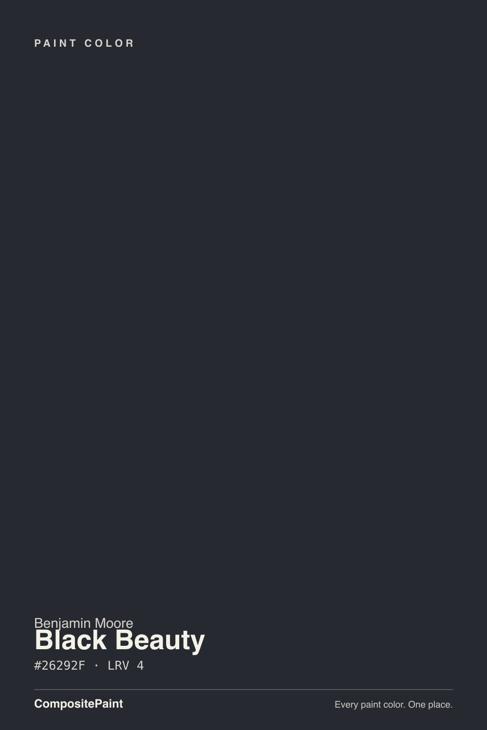
- 1Black Beauty4
- 2Oyster Catch9
The Fast Verdict
Black Beauty is what happens when a near-black paint actually commits: at LRV 4 it is genuinely dark, but a drop of warm brown-gray keeps it from reading like a hole punched in the wall. On a front door, an island, or built-in shelving under real light, it looks deliberate and expensive. Push it onto a windowless room with no lamps and it stops being a color and starts being a void — that is not the paint failing, but it will happen every time.
Front doors and shutters · kitchen islands and lower cabinets · home office built-ins with a real window · exterior trim on a light-colored house
You want a true neutral black with zero warmth · the room has no real light source · you're painting a small windowless powder room's only wall · you want a low-maintenance finish that hides fingerprints
- Genuinely dark (LRV 4) without going cold or blue-black
- Warm brown undertone keeps it from reading spooky or harsh
- Front doors, islands and built-ins look expensive and deliberate
- Plays beautifully with brass, walnut and warm whites
- A believable, versatile black that isn't chasing a trend
- Disappears into a flat void in rooms with no real light source
- Shows fingerprints, scratches and water spots on high-touch surfaces
- Not a true neutral black — will read warm to anyone who wanted cold
- Whole rooms of it need real lighting planning, not just a paint decision
What Color Is Black Beauty, Really?
A near-black with a warm, velvety undertone — brown-gray rather than blue-gray — and that warmth is the whole reason people reach for it instead of a starker black. Most true blacks are built cold and stay cold in every light; Black Beauty carries just enough brown warmth that under a lamp or in direct sun it reads less like a void and more like dark chocolate or aged leather. That is the trick that keeps it out of "spooky" territory and into "expensive."
At LRV 4 — as dark as paint gets before you cross into specialty blacks — it absorbs almost all the light that hits it. Put it beside Benjamin Moore's own Wrought Iron (LRV 6, deck character: the softest near-black in the BM deck) and Black Beauty is unmistakably darker and more dramatic; Wrought Iron reads as a rich charcoal by comparison, not black. Next to a true neutral black like Sherwin-Williams Tricorn Black, Black Beauty is the one that still shows a pulse of brown once real light finds it.
Undertone in one line: warm, velvety brown-black — never blue, never purple. If your sample reads flat and lifeless, that is a lack of real light in the room, not the paint; if it reads warm and rich, that is exactly what it is supposed to do.
Where It Shines
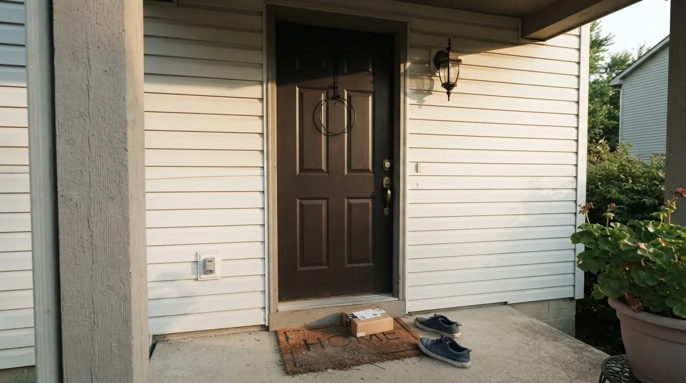
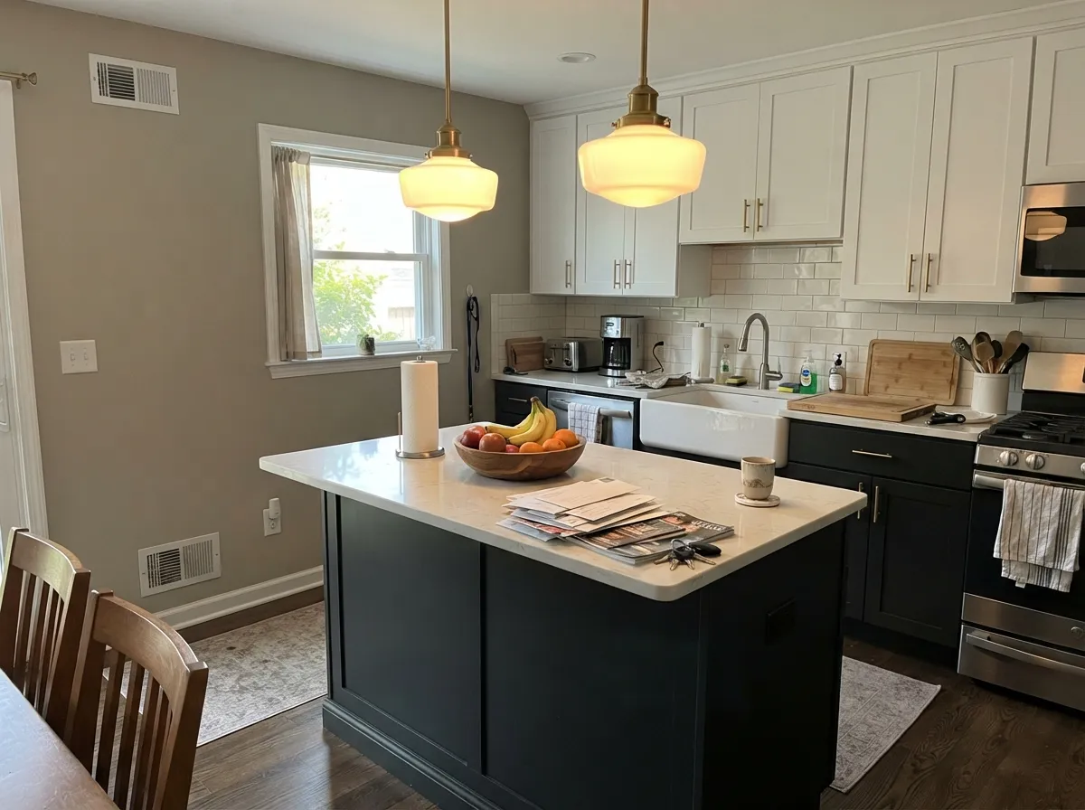
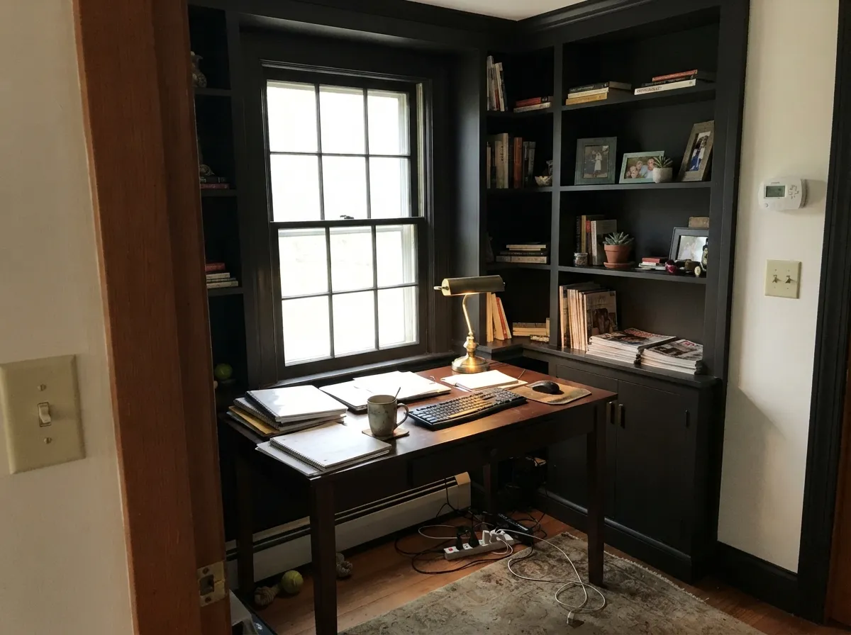
Give it a door, an island, or a built-in — something with edges and hardware to catch light — and it earns its name. Under afternoon sun or a warm brass sconce, the surface stops reading as a flat black rectangle and starts reading as a deep, textured brown-black with real depth. Front doors are its best-known job; the second is kitchen islands and built-in cabinetry, where brass or aged-bronze hardware plays off the warmth instead of fighting it.
Where It Fails
Almost every letdown story with Black Beauty comes from one of three situations, and all three are predictable before the first coat goes on. None of them are the paint's fault — but if your project matches one, this is not your black, or at least not for that surface.
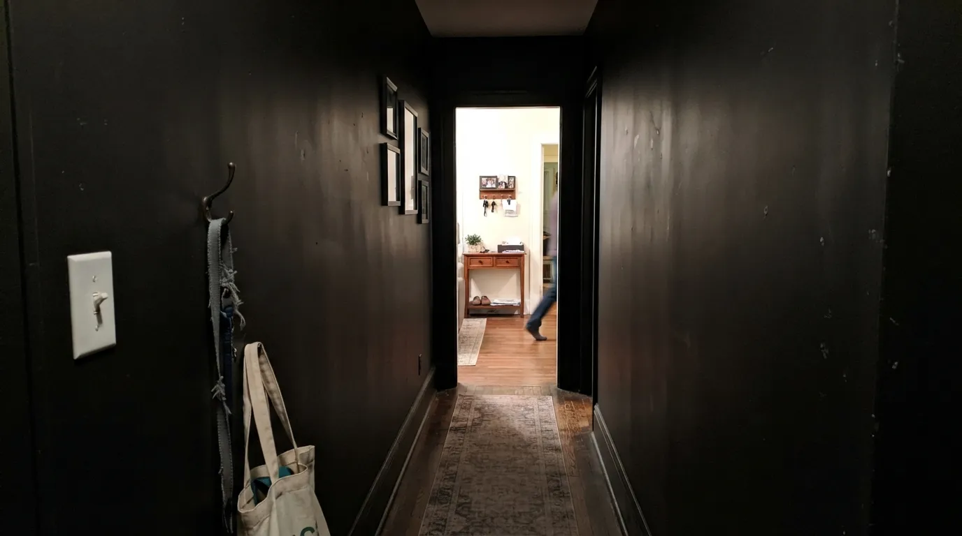
At LRV 4 the paint is already doing almost no reflecting; without a window, a lamp, or a fixture aimed at it to catch, it just reads as a flat, textureless hole — none of the promised warmth shows because there is no light left to carry it. This is the single biggest regret with any near-black: a windowless hallway or an unlit stairwell painted Black Beauty just disappears.
Black Beauty is warm on purpose — in bright daylight the brown comes forward, and next to a genuinely neutral black it will look faintly brown-black by comparison. If you want zero warmth and zero drift, go with Sherwin-Williams Tricorn Black instead and let this one be the color for people who want black with a pulse.
On a kitchen island or a heavily used door, black paint shows every fingerprint, water spot and light scratch that a lighter color would hide — this is true of every dark cabinet color, not just this one, and it is the most common regret in real kitchen renovations. A satin cabinet enamel and a habit of wiping it down cuts the problem in half; high gloss makes it worse.
Room by Room
Semi-gloss Black Beauty against a white or pale-neutral house body is the modern-classic combination realtors photograph. Brass or matte-black hardware both work; the warm undertone keeps it from reading harsh against warm siding.
Under pendant lights or daylight from a window, a Black Beauty island grounds a white-cabinet kitchen without going cold. Satin cabinet enamel; expect to wipe fingerprints off the edges near the handles.
Bookshelves and built-in cabinetry read expensive and intentional in Black Beauty, especially with brass reading lamps. Skip it in a windowless home office — there is nothing left to warm the color up.
One accent wall with strong afternoon sun or a floor lamp aimed at it works beautifully. The same wall in a north-facing room with no supplemental light just reads as a dark gap in the room.
A deliberately moody bedroom with warm lamps and layered lighting can pull this off on one wall or as trim; four full walls lit only by an overhead fixture is a common regret. Test with the lights you will actually use at night, not the ceiling light alone.
On shutters, garage doors and trim against a light-colored house, it reads as a crisp, warm-toned black rather than the harsher blue-black some true blacks give a facade in full sun.
Your Light Is the Risk
Full sun or a bright window is where the warmth actually shows — the brown comes forward and the paint reads rich instead of flat.
In a windowless hall or an unlit corner it just reads as a dark hole; none of the promised warmth survives without light to carry it.
Flatter and cooler under overcast morning light, warmer and more brown once afternoon sun or lamps take over.
2700K bulbs let the brown come through and the surface glow slightly. Cool white LEDs flatten it back toward a stark, characterless black.
Most complaints about Black Beauty are a light mismatch. Upload a photo of your actual room and see it on your walls — then ask for the same wall in north light or evening lamps before you buy a single sample.
Need It From Another Brand?
Any paint counter can custom-tint Benjamin Moore 2128-10 directly. If you would rather stay in one brand's own deck, these are the closest stock matches, measured as ΔE2000. Under 2 is a difference you will not see on the wall.
| Brand | Closest color | ΔE | LRV | |
|---|---|---|---|---|
| Sherwin-Williams | GreenblackSW 6994 · Sherwin-Williams | 3.2 | 4 | Color page → |
| Behr | Bitter Chocolate790B-7 · Behr | 2.0 | 4 | Color page → |
| Valspar | Fired Earth6011-1 · Valspar | 2.8 | 3.7 | Color page → |
| PPG / Glidden | Starless SkyPPG0995-7 · PPG / Glidden | 2.6 | 5 | Color page → |
| Glidden | Onyx Black00NN 05/000 · Glidden | 1.9 | 5 | Color page → |
| HGTV Home by Sherwin-Williams | Bohemian BlackHGSW 6988 · HGTV Home by Sherwin-Williams | 4.3 | 4 | Color page → |
Similar Benjamin Moore Colors
The nearest shades to Black Beauty within Benjamin Moore's own range, ranked by perceptual color distance — useful when you want the same look a touch lighter, darker, or warmer.
WCAG 2.1: AA is 4.5 : 1 for normal text, 3 : 1 for large text, AAA is 7 : 1.
Black Beauty vs the Colors You're Also Considering
Every Black Beauty sample board has the same rivals on it. The numbers show the real lightness gap — then it comes down to which risk you would rather live with.
Pick this for the softer, more livable black — Black Beauty holds a little warmth even in shade.
Sherwin-Williams SW 6258 · LRV 3Tricorn BlackPick this if you want a true neutral black with zero warmth — Tricorn Black never flashes brown, in any light.
Pick this when you actually want black — next to Wrought Iron, Black Beauty is unmistakably darker and more dramatic.
Benjamin Moore 2124-10 · LRV 6Wrought IronPick this if true black feels like too much — Wrought Iron is a full step lighter and reads as a soft charcoal, not black.
Black 2132-10 and Black PM-9, both at LRV 5, are the straight blacks in the line. Their hex values, #313132 and #2B2C2D, are nearly neutral, so next to Black Beauty's #26292F they look flatter and Black Beauty looks quietly blue. Black Forest Green PM-12, LRV 3, is the darkest of the group and pulls green instead.
Across brands, Valspar Dark Kettle Black 4011-2 at LRV 2.3 and Sherwin-Williams After the Storm SW 9685 at LRV 3 are very close, with deltaE values of 2.01 and 2.59; sample before you assume a swap works. Backdrop Hocus Pocus BD-HP, LRV 3, sits in the same band at 2.98.
Dutch Boy True Black 438-7DB and Magnolia Home Blackboard JG-05 are close but visibly different side by side, both a little lighter and less blue. Benjamin Moore is sold through independent dealers, so a cross-brand match is often a question of what is nearby rather than of color.
Black Beauty Coordinating Colors
The rule for coordinating with Black Beauty is simple: keep everything else warm. It pairs with warm whites and warm greiges far better than with anything cool or stark, and it loves brass, walnut and aged leather. These are the partners that keep showing up in rooms and exteriors that work:
Where Black Beauty Sits Among Benjamin Moore's Blacks
Benjamin Moore's deck has more than one near-black, and Black Beauty's job is the warm end of that lineup. Next to Wrought Iron (LRV 6, deck character: the softest near-black in the BM deck) it reads a full step darker and more dramatically black — Wrought Iron is the one to pick when you want the idea of black without fully committing. Compared to a truly neutral black like Sherwin-Williams Tricorn Black, Black Beauty is the one that still shows a pulse of brown warmth once real light hits it.
It does not carry a Color of the Year moment or a viral before-and-after — it is a working color, the one designers reach for when a client asks for "black, but not cold," and it does that one job reliably across doors, cabinetry and trim.
Black Beauty With Wood Tones and Floors
Warm wood is this color's best friend: walnut, white oak and aged leather all deepen the same direction Black Beauty already leans, so the pairing feels inevitable rather than styled. Espresso and other near-black stains work too, as a tonal near-match rather than a contrast.
Golden honey-oak floors are the one combination to sample first — the paint's warmth and the floor's warmth can either agree quietly or compete for attention depending on the exact undertones in your room, so put a real sample against the actual floor before committing an island or a full wall to it.
Three Ready Palettes Built on Black Beauty
A color is never alone on the wall. These are complete combinations in the 60-30-10 pattern, with the reason each one holds together. Every one opens in the visualizer.
A warm white body keeps the door from feeling severe, and Kendall Charcoal on the shutters is close enough in family to read intentional without competing with the door for the darkest spot on the house.
Try this palette in your roomRevere Pewter's warm greige keeps the whole room on the same warm side of the fence as Black Beauty, so the island grounds the space instead of looking like a mismatched afterthought. White Dove uppers keep the kitchen from feeling heavy.
Try this palette in your roomPale Oak is light enough to keep a window-lit office from feeling closed in, which is exactly what Black Beauty built-ins need to avoid the flat-void problem. White Dove overhead keeps the room from reading like a cave.
Try this palette in your roomBlack Beauty FAQ
Is Black Beauty a true black?
Not quite — it is a near-black with a warm, brown-gray undertone, which is exactly why people pick it over a colder black. In full daylight you can see a whisper of brown; a truly neutral black like Sherwin-Williams Tricorn Black will not do that.
What does LRV 4 actually mean for this color?
It reflects almost none of the light that hits it — among the darkest values paint reaches before you're into specialty blacks. In a room with real daylight or good artificial light it reads rich and deep; in a windowless space it just reads flat and dark, because there is nothing left to bounce back.
Is Black Beauty good for kitchen cabinets or an island?
Yes, especially as an island or lower-cabinet color under a lighter upper-cabinet white. Use a satin cabinet enamel, not flat — and know going in that fingerprints and light scratches will show, the same tradeoff every dark cabinet color makes.
What color goes with a Black Beauty front door?
A warm white or soft greige body — White Dove is the classic pairing — with brass or matte-black hardware. Avoid pairing it with a stark cool white; the warmth in Black Beauty reads best against something equally warm.
How is Black Beauty different from Wrought Iron?
Depth. Wrought Iron sits at LRV 6 and reads as a soft charcoal — genuinely dark, but clearly not black next to this. Black Beauty is a full step deeper and reads as an actual black with warmth in it, not a dark gray.
Does it show dust and fingerprints?
More than a mid-tone color will, especially in satin or semi-gloss near handles and edges — this is true of any near-black paint, not a flaw specific to this one. Matte finishes hide it better on walls; on cabinets, plan on wiping it down.
Have you painted with Black Beauty?
Rate it — one tap helps the next reader decide.
Ask a Question